My first year of shooting film Part 8
Since I started exploring film photography in the fall I have found myself on two more or less parallel paths: one is black and white photography, and the other is colour. Where up till now the black and white learning curve has been focussed on getting contrast, the colour path has been about finding colour at all! So far I’ve had mixed results with colour film to the point where I even feel robbed.
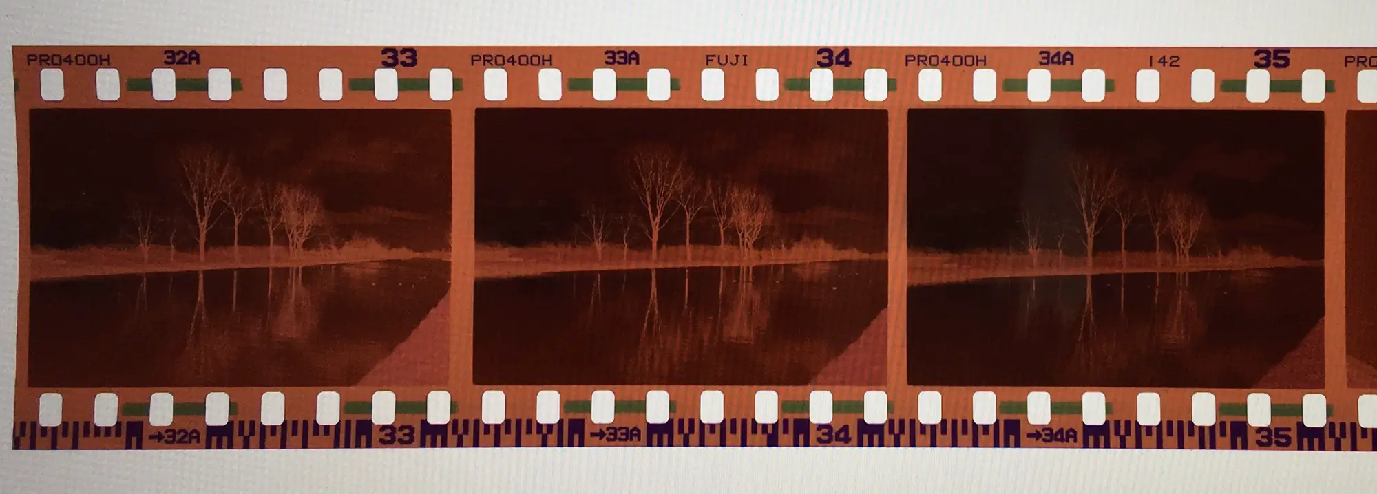
The colour photos that I have been happy with were all shot during mid-day. For example I had some nice result with Superia 200 I shot in the fall in the Peak District with my first film camera, a Minolta Hi-Matic 7s. But that was fall, and that was daytime. My favourite time for photography is around sunrise. I love the light and the special colours in the sky at this hour. However, I didn’t see it in my photos (I wrote a little about it here). I wasn’t sure if it had to do with over- or under exposing. Some suggested using Kodak Portra 400 instead of the fuji Pro 400H I had been using. But I still had a roll of Pro 400H in my Leica M2, which I had to finish first.
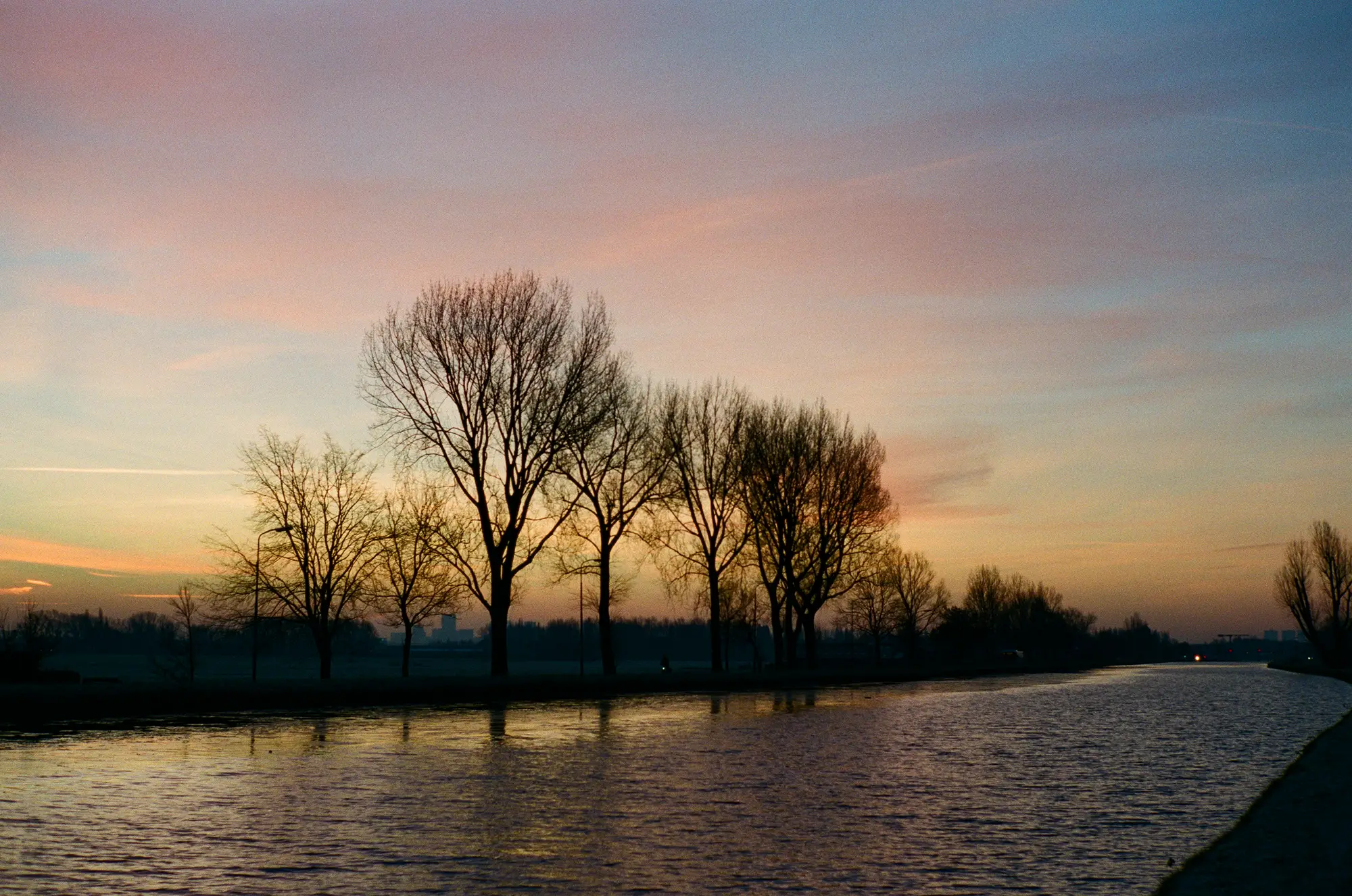
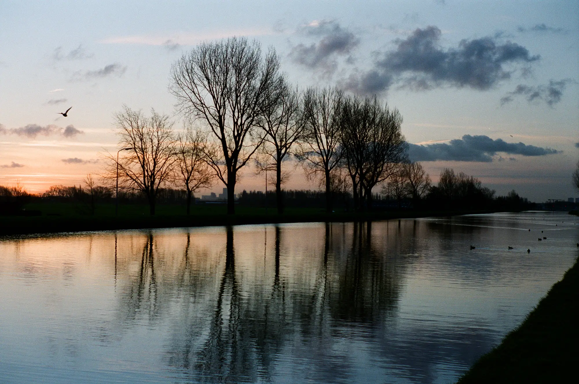
Well, I received the negatives and scans from the this film, and much to my surprise there is all the colour I could wish for! To be honest, I am not sure why this one is different, I thought exposure for the previous roll was pretty ok. But this time even the low-light early morning shots have plenty colour. For example the two photos below I shot on my way to work on a cold January morning, about 15 minutes before sunrise. When I compare the images to some of the digital photos I made that morning I can see that the colours are different, and are less saturated, but there is colour! I even prefer the film version as the result seems more painterly to me. For these photos I used my digital camera as a light meter and metered for iso 400, leading to 1/125 sec at f/2.8.
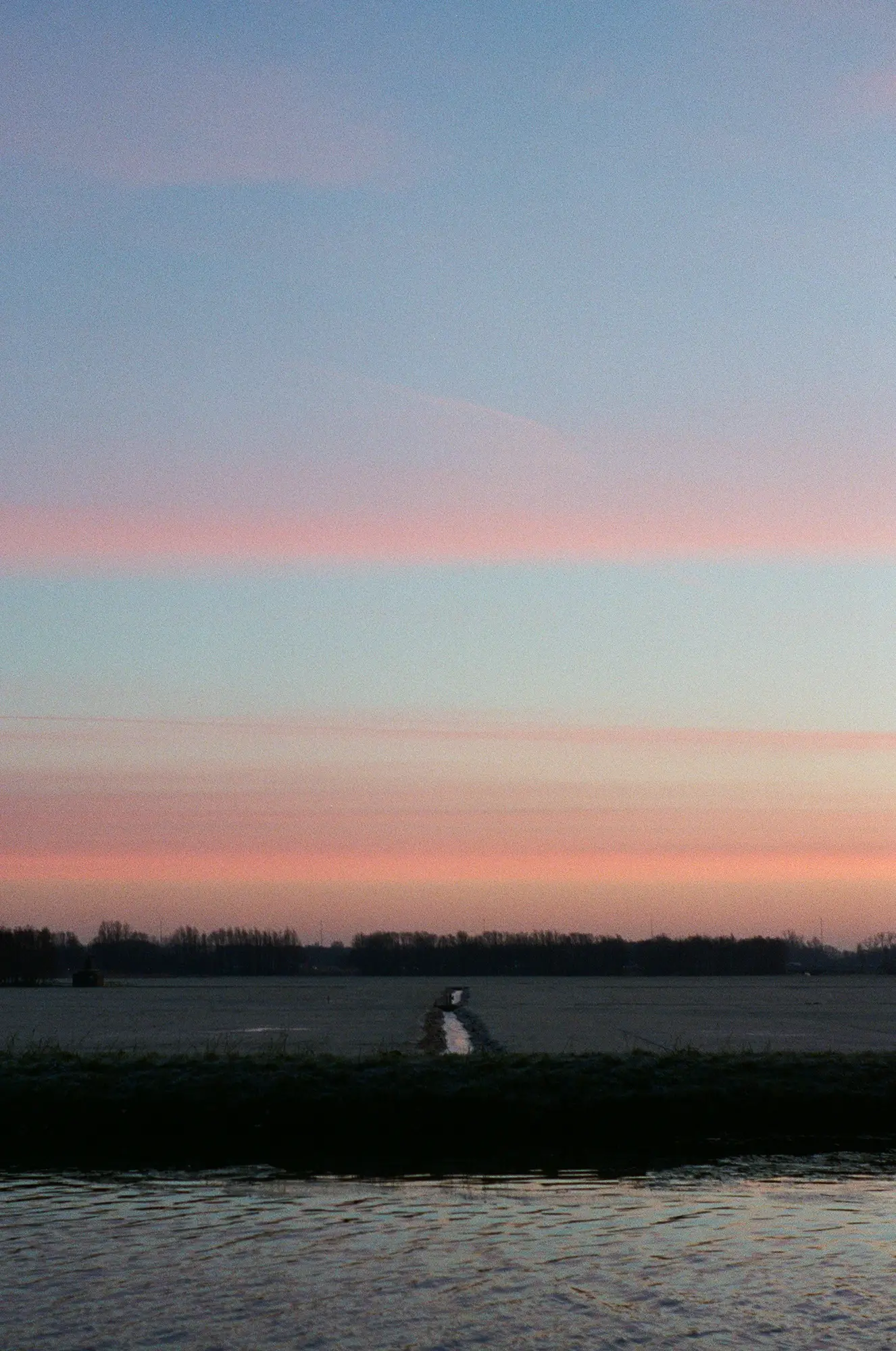
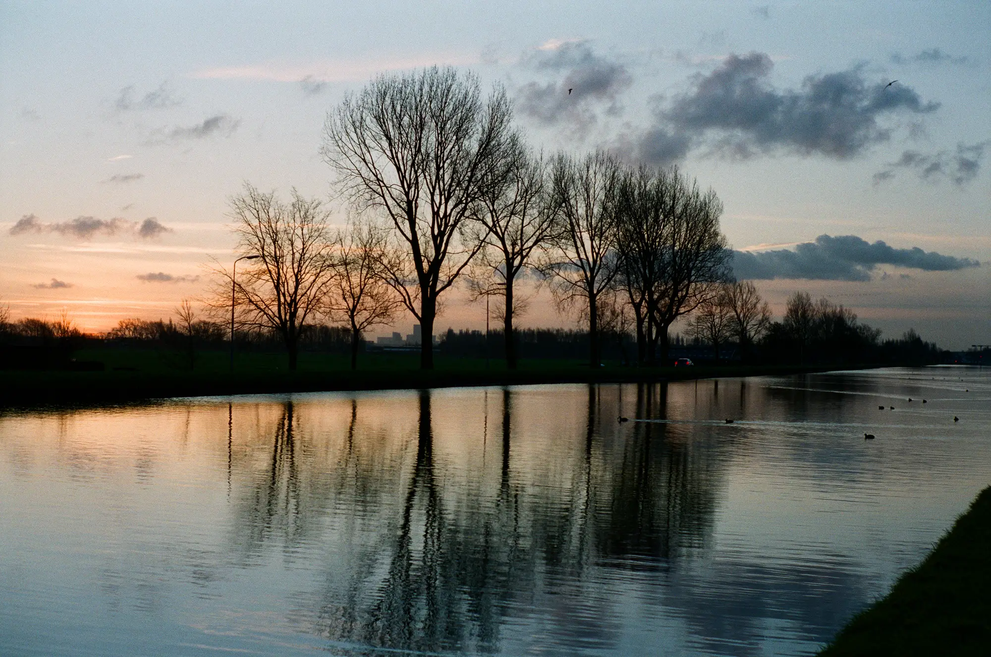
For the next two photos, taken on a different morning in the same week, I used a similar approach. Again, I couldn’t wish for more colour or for more saturation. By the way, this was a special week, with such amount of colour on a couple of mornings. Ok, it was cold, but I love January mornings like these!
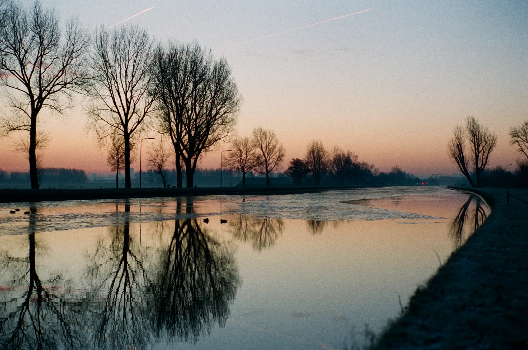
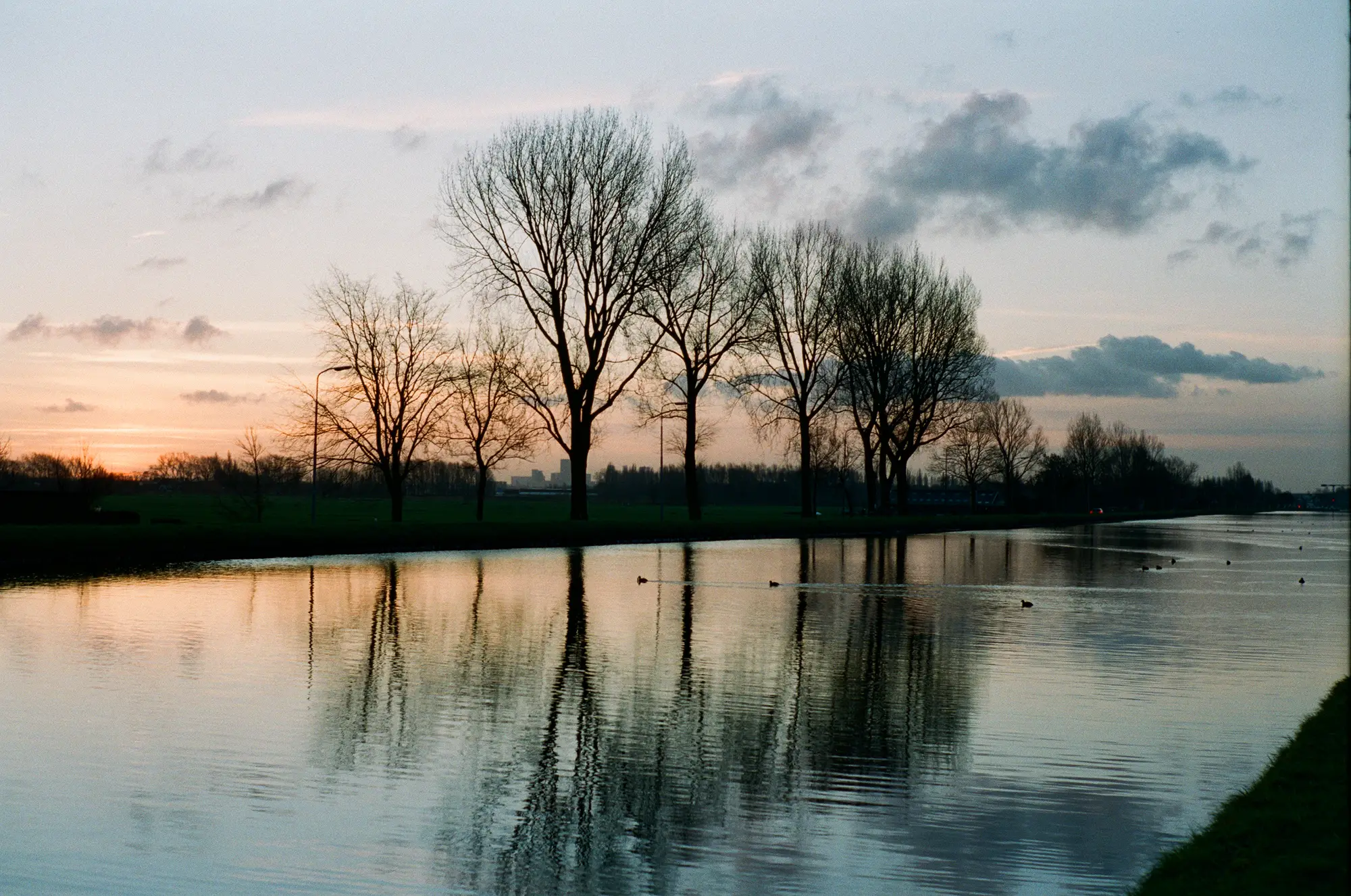
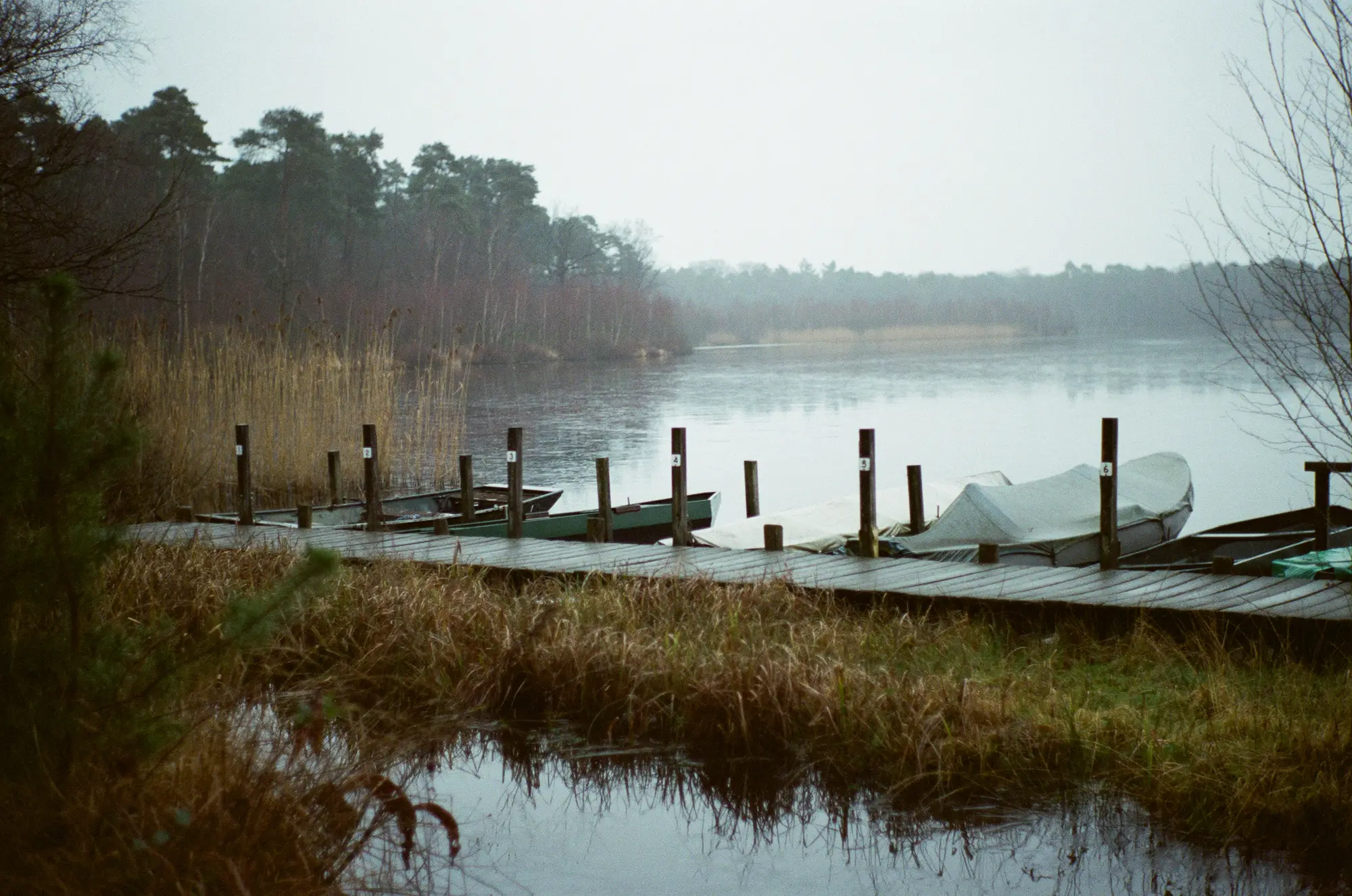
About 10 days later another beautiful sunny winter morning presented itself. This time I metered for iso 200. I think I had more margin to do so, as sunrise was getting later and there was more light available at the time I cycle here (these too were made on my way to work).
This morning I also did a little experiment with exposure. Metering with my digital M suggested 1/250 second for iso 200 at f/4. I wanted to see what even more exposure would do so I also used 1/125 and 1/60. Looking at the result I don’t see much difference, although the third one is a little light for me. But there is still enough to work with in post processing. Looking at the negatives I think the middle one is best, a dense negative with contrast, but still enough details in the sky. This would suggest that metering for iso 100 is indeed optimal.
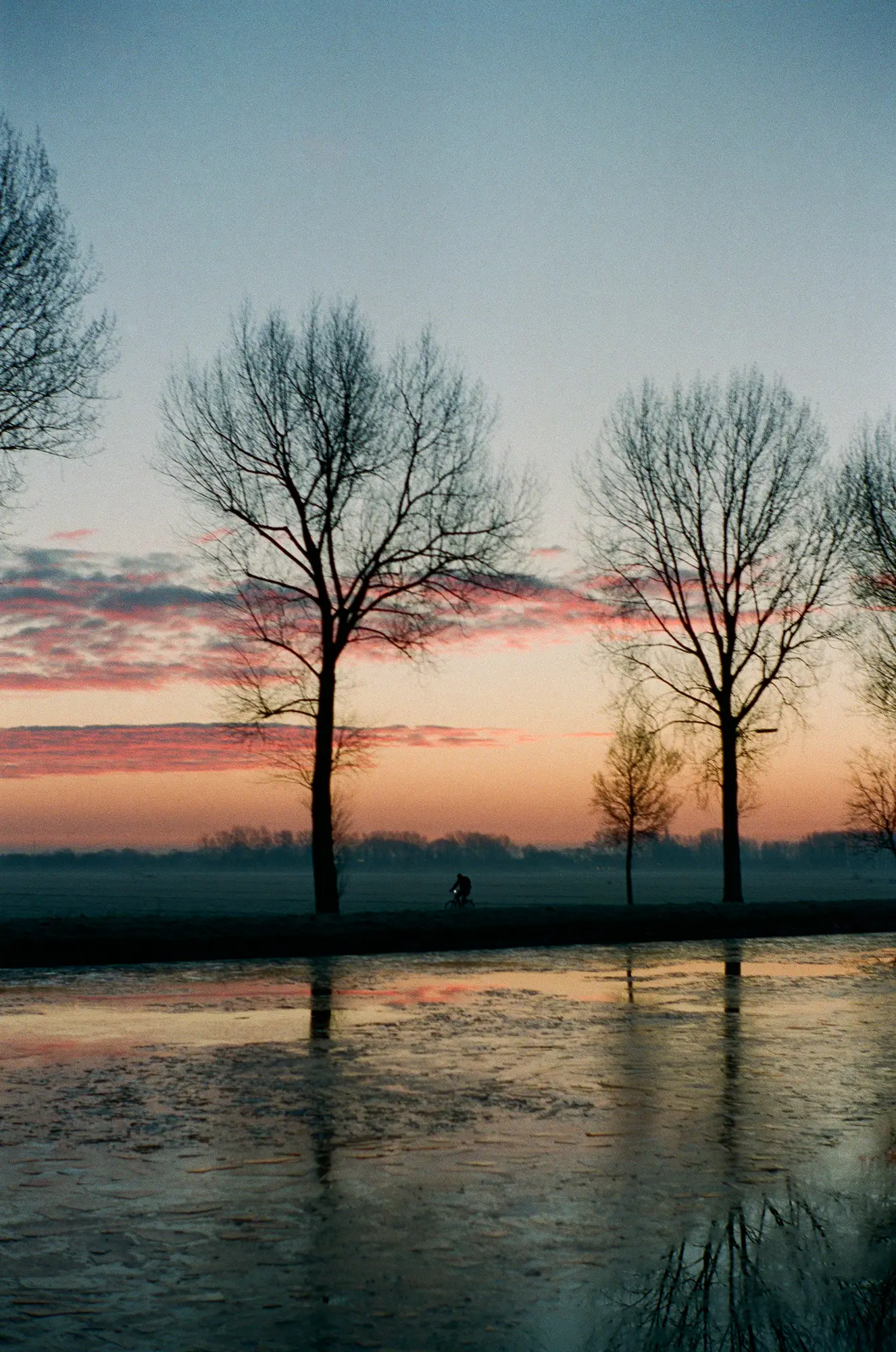
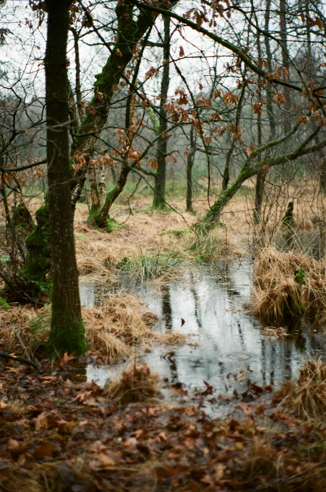
Since not every day is a sunny day I took some photos on a rainy morning. But even here, where it is before sunrise and it is raining, there is still enough colour.
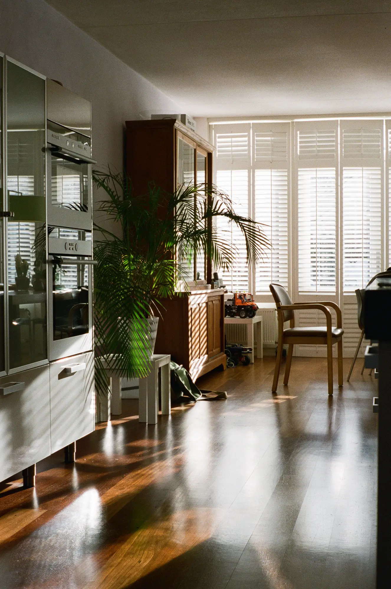
I also took a photo indoors. I included this one because I like how the light worked out in this photo. I was a bit surprised by this one, as it looks so much clearer than what I have seen so far. And I had to look really close to find the grain. Furthermore where the landscape photos are all more green than what I remember from real life, this one seems really true to reality colour-wise. For me it is still strange that this photo comes from the same roll and lens as the others (all photos from this roll were shot with the Summilux 50mm 1.4 type II). There is a difference in aperture, where most outdoor shots were made with relative large aperture due to the lack of light, this one was shot at f/8. I guess it shows that the lens is supposed to be sharpest at this value.
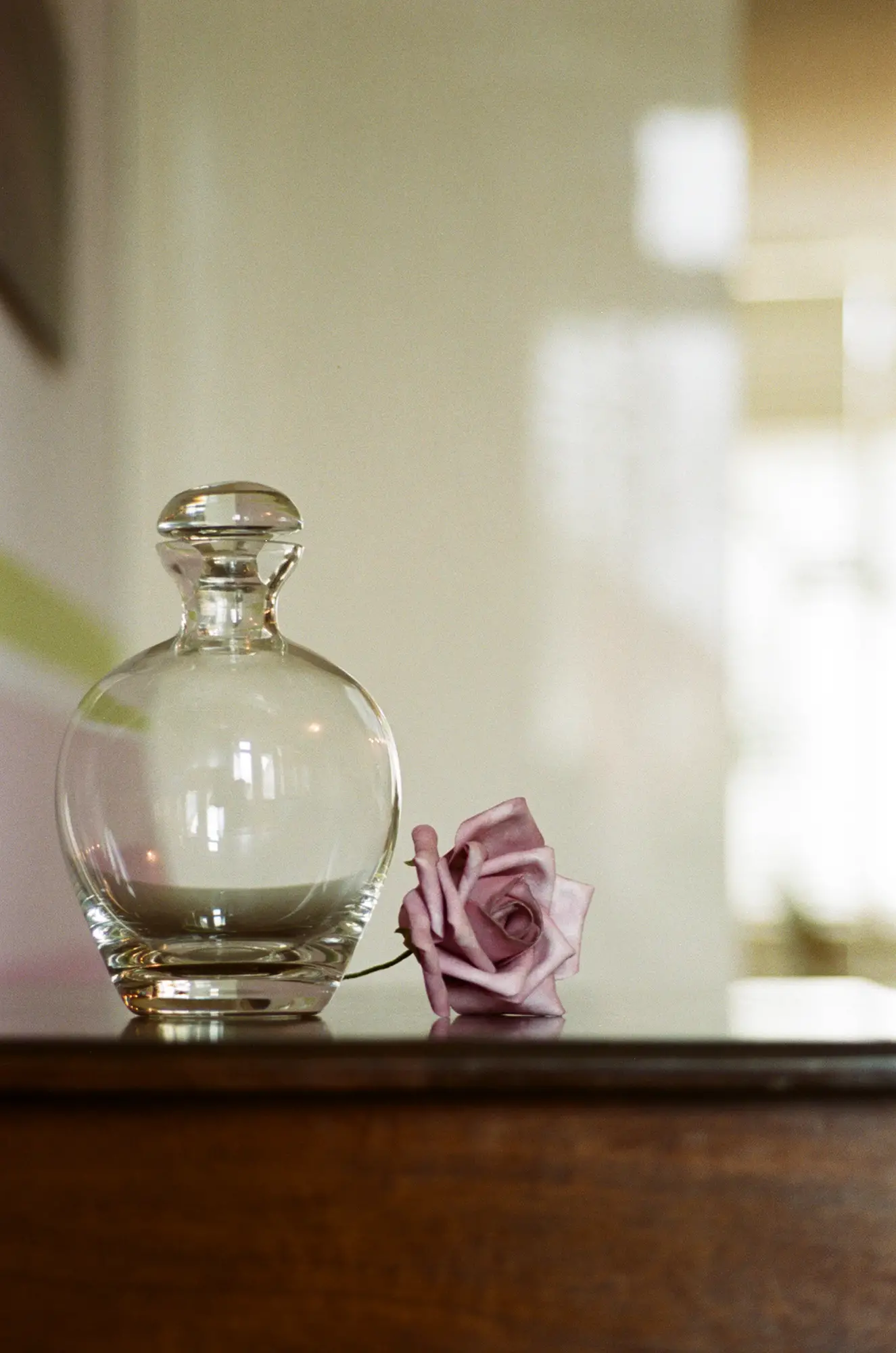
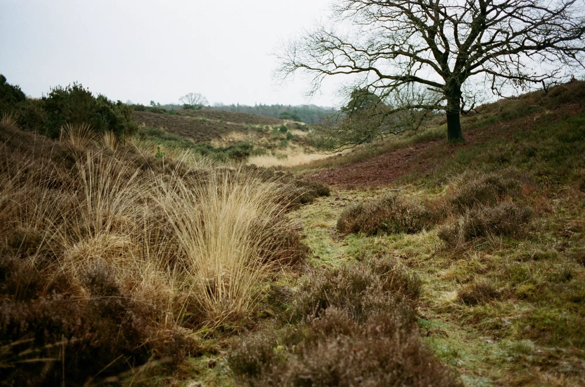
After the recommendations for Kodak Portra 400 I wanted to try that too, and the first results are shown below. The first two were shot indoors, the portrait even in the evening, but they do seem pretty nice in colour too. I used different lenses for this roll: the Tele-elmarit 2.8 90mm for the decanter and Summicron ASPH 35mm for the heather. I metered for iso 100 for the decanter, and I used a tripod since exposure time needed to be 1/8 seconds at full aperture (f/2.8). However for the portrait I metered for iso 200 as I shot this one handheld and I didn’t want to go below 1/30 second (shot at f/1.4) .

The last one was shot in the early morning again, as I prefer to take my photos. However this was a complete overcast day. I metered for iso 100, and I am pretty happy with the colour, as this is all there was in real life.
So all in all I am pretty happy with the result. I can’t say that I understand it really. I try to be more consistent with exposure but my metering is not always the same. I sometimes use my app, sometimes my camera. Depending on the light I meter for iso 100, 200 or 400. And apart from details that doesn’t seem to make all that much of a difference. Even when the photo could be improved with respect to grain or sharpness, there is colour, which was my first main concern.
I did shoot more Portra 400, but as the other photos were made in the Caribbean I decided that it wouldn’t be a fair comparison here 😉 . So I leave the results from that week for another post. All film for this post was developed and scanned by AG-photolab.
Thanks for reading, and as always Hamish thanks for having me!
Read Part 9 of my journey into film here.
Share this post:


Comments
Ehpem on Fuji Pro 400H & Kodak Portra 400 – Quest For Colour – By Aukje
Comment posted: 22/03/2016
I find that a really important variable is scanning. I mostly do my own scanning, but even then I get mixed results that can be quite different when I have a second try. I think the same must be true of many labs where they can tweak things to make it look more how the operator likes. If your earlier rolls were processed at at different lab, or by a different person in the same lab, then that might be part of the explanation. It might be worth trying to get some of the disappointing frames rescanned just to see if that is part of what is going on.
People that know way more about these things also point to the glass of different manufacturer's as having a significant effect on the colour. If I remember correctly (and if I don't, I hope someone sets me straight), such people claim great film colours from Minolta glass - so maybe that is influencing results as well? I have never noticed much difference between lenses I use (I rarely shoot with Minoltas, and only fixed lens versions), but then I have not done a deliberate set of tests to see if there is one that I can spot.
Comment posted: 22/03/2016
Comment posted: 22/03/2016
Comment posted: 22/03/2016
Comment posted: 22/03/2016
Erik Prestmo on Fuji Pro 400H & Kodak Portra 400 – Quest For Colour – By Aukje
Comment posted: 22/03/2016
Just another guy snapping off a few pictures, and writing a self-centered piece, sort of pictures as an excuse.....
I thought maybe it was an interesting story about a quest for real color, self-sufficient color, like taming color film via correct exposure maybe a few filters to get corrct colors (a lost art.....) and last but not the leasta quest for developing color film, which might turn out to be the single most imortatnt thing to keep color films alive.
I know we're ahead i technology here in sc andinavia, being nearly 100% digitized, (much like Japan, but there 10 to 30 times the population CAN keep film developers alive a little while longer), over here the one-hour shops disappeared 10 years ago, nowadays only 2 outlets still accept films to be developed in the second largest city in the country, and enlarged, almost exclusively 35mm film.
Pretty soon I expect one of theose outlets to stop accepting film and stop selling film as well.
Here where I live, noone is still selling film AFAIK, I have to travel one hour by bus or car to get a film, and have it developed as well. And once gone, it will never reappear.
So what to do? Buy film via the internet (got 20 films in today) and teach yourself how to develop film, B&W AND color. Since getting kits for developing film is way harder than getting films via the net (the costoms open chemicals and test for drugs, since they have no real knowledge og chemistry, one guy got clobbered, trying to fetch his chemicals in the post office, they tried to charge him with posession.
So the only vialbe solution, in order not having the chemistry contaminated by bafoons, is to buy chemicals separately and mix your own.....
Iwas hoping to find a soulmate, another fellow exploring a road to the future. Not so.
Read my harsh comments as nothing more than a little frustration, unless more people wake up to the realities of the digital catastrophe, film will be totally gone, once the economy dictates the last dev.&print-shop to close its doors, just like earlier processes, daguerre and tintype, what did them in was better, faster and cheaper processes, and in todays world that is digital....
Sorry I have to get back to my chemicals.
Comment posted: 22/03/2016
Comment posted: 22/03/2016
Thomas Risberg on Fuji Pro 400H & Kodak Portra 400 – Quest For Colour – By Aukje
Comment posted: 23/03/2016
Comment posted: 23/03/2016
Frank Lehnen on Fuji Pro 400H & Kodak Portra 400 – Quest For Colour – By Aukje
Comment posted: 23/03/2016
It's a shame that Fuji seems to be killing off their films one by one if you look at the results from your negatives. And what are posts worth if they don't come from you own soul, and are in fact self centered. Everyone knows himself best, so can write about his own experiences best.
Keep on exploring the wonderful (colorful) world of film - there's still plenty of it around!
Comment posted: 23/03/2016
jeremy north on Fuji Pro 400H & Kodak Portra 400 – Quest For Colour – By Aukje
Comment posted: 25/03/2016
Comment posted: 25/03/2016
Comment posted: 25/03/2016
Comment posted: 25/03/2016
My First Experience With Portra 400 - Guest Post by Aukje - 35mmc on Fuji Pro 400H & Kodak Portra 400 – Quest For Colour – By Aukje
Comment posted: 15/04/2016