5 Frames With An Olympus OM1 MD (Again) – By Julian Higgs

By julianhiggs

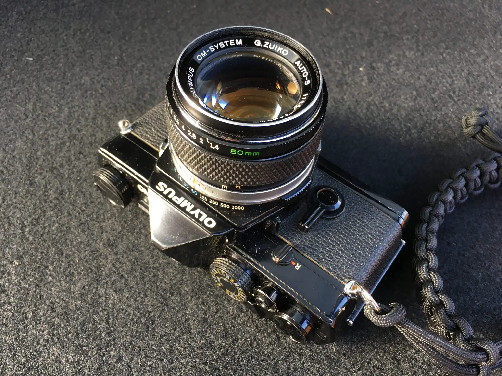
I’ve been in possession of what has become my favourite 35mm SLR, the Olympus OM1 now for about eight months. Truth be told I have not shot it as often as I was expecting. The honeymoon period with it has faded a little. Because I now know that I can get acceptable exposures on my favourite film stocks (and some not so favourite) without too much trouble, the unpredictability of a new camera has now become the reliable and consistent. But I love the all manual nature of the Olympus OM1, and the Zuiko optics are in my opinion, exceptional. Recently I’ve been doing some digital editorial and interior work, and for some reason I’ve either not been inspired to shoot this (or any other film camera) or just not had the opportunity. Is this something others find?

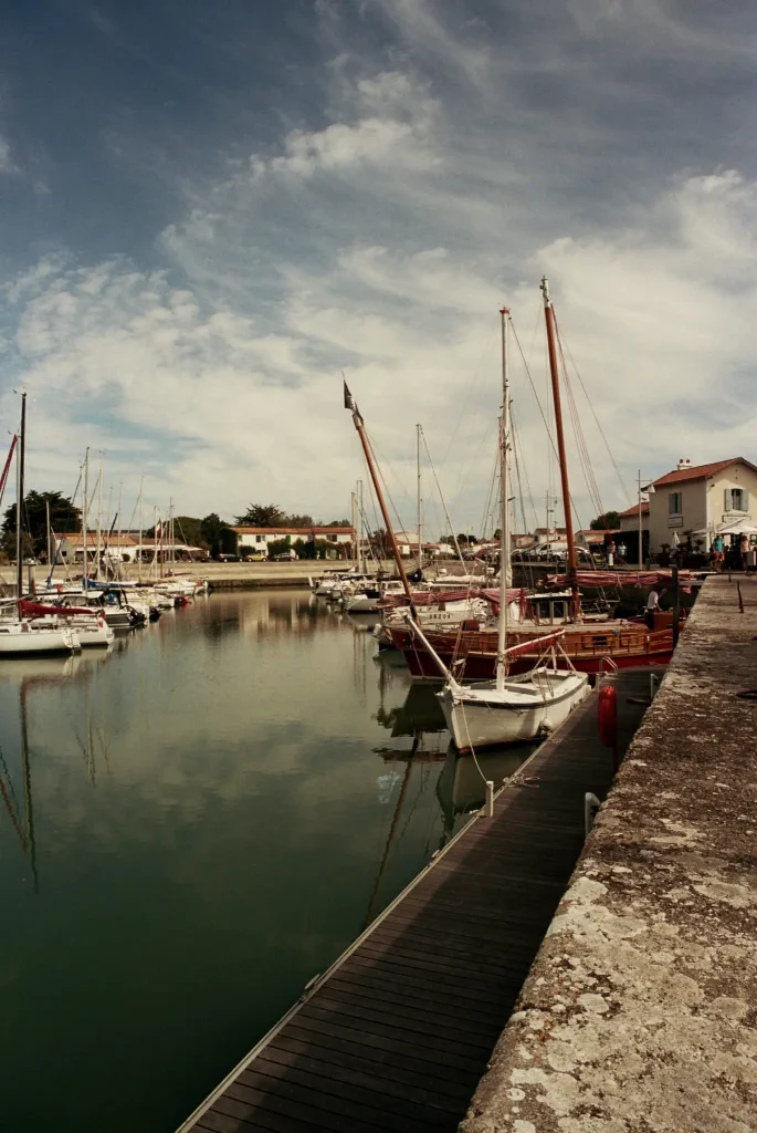
So when we booked a holiday trip to Ilê de Ré, France earlier this year, I had to take my beloved Olympus OM1 and the borrowed Zeiss Ikon along. Loaded with Kodak Portra 400 and Fuji ProH 400 respectively to see what I could get. I’d also recently bagged a bargain 24mm f2.8 from “the bay” and was looking forward to using that for the first time.

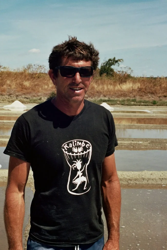
Here are a few frames from the first roll of Portra 400 in the Olympus OM1. I like documentary style work, and if possible street portraits or people at work. As well as of course the usually holiday snaps and landscapes. Documentary type shots make me feel like I’m not just a tourist. Concentrating on the real people that live and work in these places that we just visit and enjoy on a more superficial level.

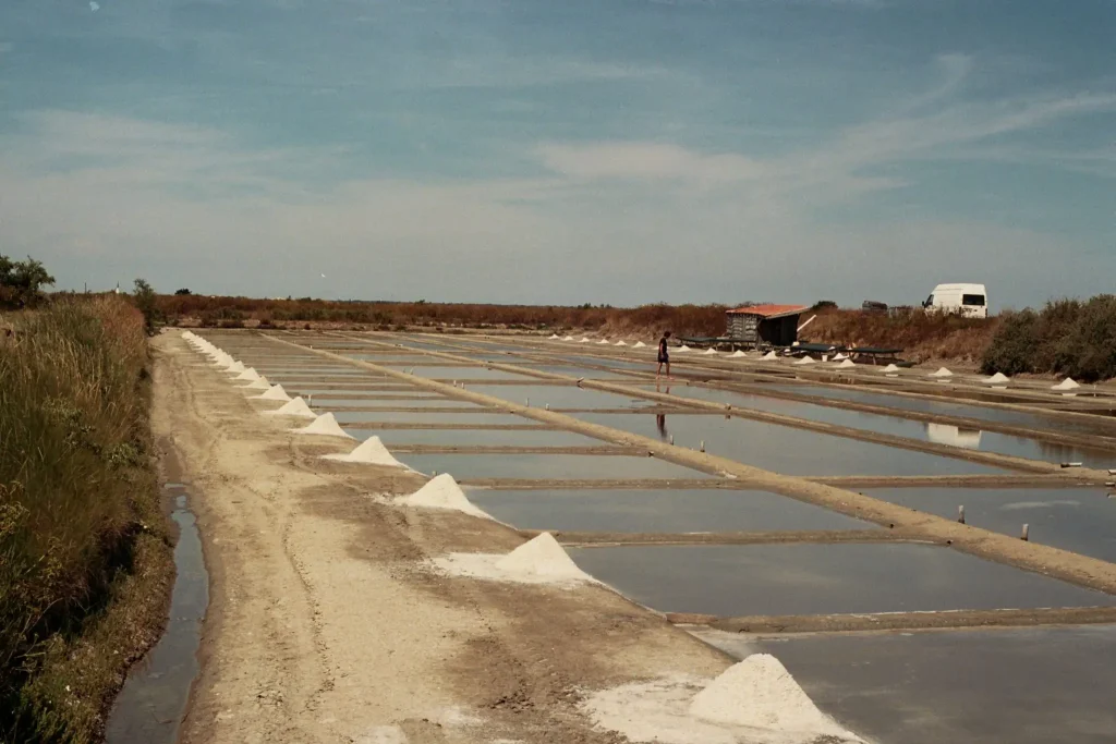
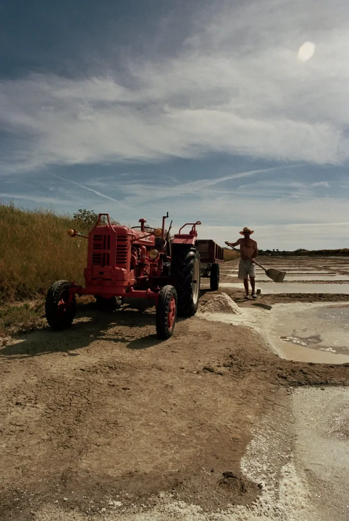
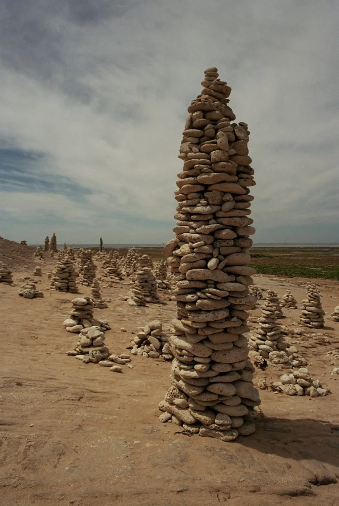
Ilê de Ré is famous for many things, sailing, holidays and camping some of the main things, but also salt production and oysters. The salt pans really caught my attention.it is hot manual work. In the days before tractors, donkeys pulled the carts wearing distinctively striped leggings to protect the, from the salt scrub in the wind. I couldn’t come home without some more interesting shots among the pans. Getting close and speaking to the people that you are about to photograph makes the experience all the more rewarding. Visceral even. I like that.

Salt Pans of Ile de Re
Salt Pans on the cycle track to Ars en Ré
Emanuel, salt pan farmer
Emanuel, working the salt pans in the sun.
Salt tractor
Collection of the dried salt still done by hand.
Marina at Ars en Re
The marina seafront at Ars en Ré
Land Art on Ile de Ré
Stones piled into land art at Phare des Baleines

Let me know what you think.

All my colour film is developed and scanned at Truecolour Imaging in Luton

If you would like to keep in touch with my work, visit any of the following.

www.julianhiggsphoto.com
www.instagram.com/julian.higgs

Share this post:

Find more similar content on 35mmc

Use the tags below to search for more posts on related topics:

Contribute to 35mmc for an ad-free experience.

There are two ways to contribute to 35mmc and experience it without the adverts:

Paid Subscription – £2.99 per month and you’ll never see an advert again! (Free 3-day trial).

Subscribe here.

Content contributor – become a part of the world’s biggest film and alternative photography community blog. All our Contributors have an ad-free experience for life.

Sign up here.

About The Author

By julianhiggs
A returning film photographer, musician and engineer. Darkroom owner and film lab experimenter. Always looking to see.
View Profile

Comments

Tom Sheppard on 5 Frames With An Olympus OM1 MD (Again) – By Julian Higgs

Comment posted: 02/10/2019

These images are quite exceptional.
Their colour and clarity are a credit to you and the camera gear that you were using.
Maybe a fraction underexposed, but who cares.
Well done you and good job Olympus!
Reply

Leave a Reply

Your email address will not be published. Required fields are marked *

julianhiggs replied:

Comment posted: 02/10/2019

Thanks Tom! They are a touch under I agree, but I do like the atmosphere it conveys. And the colours of Portra are lovely.

Reply

Leave a Reply

Your email address will not be published. Required fields are marked *

Aurelien on 5 Frames With An Olympus OM1 MD (Again) – By Julian Higgs

Comment posted: 02/10/2019

One small correction to your picture description : Phare des baleines and not Phares du Baleines. It means "whale's lighthouse".
Very nice colors. Maybe not true to life, but I rather prefer your warmer color tone. Nice!
Reply

Leave a Reply

Your email address will not be published. Required fields are marked *

julianhiggs replied:

Comment posted: 02/10/2019

Thanks, spelling and grammar (French or English) never was my strong point. Corrected. I like warmer tones. They seem to have more feeling. Especially with a sunny subject.

Reply

Leave a Reply

Your email address will not be published. Required fields are marked *

Mark on 5 Frames With An Olympus OM1 MD (Again) – By Julian Higgs

Comment posted: 02/10/2019

These images have an out of our time feel, perhaps from the near past. Hard simple work, well Captured
Reply

Leave a Reply

Your email address will not be published. Required fields are marked *

David Narbecki on 5 Frames With An Olympus OM1 MD (Again) – By Julian Higgs

Comment posted: 02/10/2019

Lovely photos! The colors and subject are great!
Reply

Leave a Reply

Your email address will not be published. Required fields are marked *

julianhiggs replied:

Comment posted: 02/10/2019

Thanks David, I do like Portra

Reply

Leave a Reply

Your email address will not be published. Required fields are marked *

James Evidon on 5 Frames With An Olympus OM1 MD (Again) – By Julian Higgs

Comment posted: 02/10/2019

I like the images and composition, but the color seems to be slightly yellow tinged. Is that due to the Oly lens coating, a filter or the character of Portra 400? As for the exposure, I also tend to slightly under-expose to minimally boost contrast and color saturation. It can always be pulled back a little in scanning or post processing.
Reply

Leave a Reply

Your email address will not be published. Required fields are marked *

julianhiggs replied:

Comment posted: 02/10/2019

Thanks James, I think the tone comes from Portra itself, as I've used other film stock and not seen it. I don't use colour filters. I try to slightly over expose on the in camera meter, so perhaps my meter is off a touch? Yes it can e changed in post, but I like what I get. :-)

Reply

Leave a Reply

Your email address will not be published. Required fields are marked *

Mark Persad on 5 Frames With An Olympus OM1 MD (Again) – By Julian Higgs

Comment posted: 02/10/2019

There is something about 400-speed film, I've not tried Porta, that just gets me. It has such texture and a timeless quality. As a real amateur, I have had periodic success with 400 but it's early days! I really like the photographs you took and please keep uploading to 35MMC. Mark
Reply

Leave a Reply

Your email address will not be published. Required fields are marked *

julianhiggs replied:

Comment posted: 02/10/2019

Thanks Mark, I really like Portra 400, I've used other stock, but I keep coming back to it. Give some a go! I intend to keep contributing if I can keep finding good subjects to shoot. Cheers!

Reply

Leave a Reply

Your email address will not be published. Required fields are marked *

Dan Dodd replied:

Comment posted: 02/10/2019

And if Portra is a bit too spendy when you're starting out, there's also Kodak Ultramax which gives very respectable results for half the price. I think I'm right in saying that Ultramax is the last 400 ISO consumer-grade colour film left from the major companies (does Fuji still make Superia X-TRA?)

Reply

Leave a Reply

Your email address will not be published. Required fields are marked *

Mark on 5 Frames With An Olympus OM1 MD (Again) – By Julian Higgs

Comment posted: 20/10/2019

Fun to see these images but the scans leave a lot to be desired.Some people seem to feel that the lenses or the film give the color, contrast and exposure to the film. They do but the entire point of color negative film is the ability to correct color.
As a former lab owner I can tell you we could very easily print various brands of film whether optically or digitally to seem almost identical to each other. Yes, there were some differences but they were slight.
These negs need to be re-scanned to cool them down and brighten them up. The other possible reason for blocked highlights and low contrast is fixer failure in processing that leaves undissolved silver salts in the emulsion causing some of this look.
Reply

Leave a Reply

Your email address will not be published. Required fields are marked *

julianhiggs replied:

Comment posted: 20/10/2019

Hi Mark, thanks for your very helpful comments. I see what you’re saying. I also understand that anything can be manipulated to look any way we want. I get that you could print everything the same if you wanted to, but for me that’s not the end result I want to achieve. If every film stock or lens can be manipulated to print the same colours, contrast or temperature then I may as well shoot digital in the first place and manipulate the character I see out of the original file (or negative). The expected or unexpected result that comes back from the lab is part of the process for me, and many others. I would not want to ‘correct’ every image to have the same look. At every stage of the image making process we are already manipulating the final result. From the quality of light through the lens/glass/coatings, the film stock the development (good or bad, correct/incorrect, whatever that is) scanning printing to the screen we view these scans on. It all feeds in to the final result. Yes I can and do sometimes mildly manipulate the file in post but generally keep scans as they come back. For me, it’s a moment in time captured and passed through the ‘filters’ of the process itself. That is what makes the memories for me.

Reply

Leave a Reply

Your email address will not be published. Required fields are marked *

Leave a Comment

Leave a Reply

Your email address will not be published. Required fields are marked *