Fujifilm Velvia 50 and an Aesthetic of Necessity

By David Hume

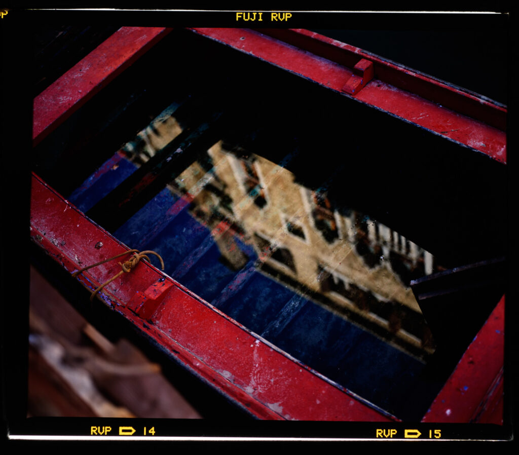
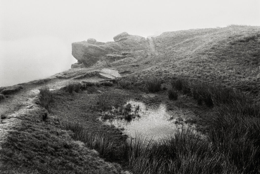
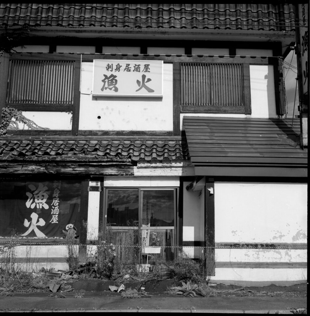
I’ve recently been digging through folders and shoeboxes, looking for photos I shot in Venice in January 1995. That was a painting trip, but of course I took some cameras with me, including a Mamiya RB67 – a medium format camera in which I shot Fuji Velvia 50.

You’ll notice I’ve gone a bit dogma in these scans and shown the frames uncropped with borders. Digitisation info is provided later in the piece.

I’ve written another piece about that trip, focusing on the Polaroid SX70 I shot, and you can see that here if you wish. I’m not quite sure why I took the RB67 with me. It didn’t really make sense in terms of the main aim of the mission which was to produce watercolour paintings for exhibition. After all these years my recollections are foggy, but I think I took the RB because at the time I was making some money shooting commissioned travel pieces for a wine magazine over here in Australia and thought maybe I could do a freelance story on food in Venice and pitch it when I got home.

Handheld, probably 1/4s? I can’t remember of course, but it’s easy to brace the RB for a steady shot. Daylight film under tungsten. I would have taken this for my “Eat Like a Venetian” story that never eventuated.

Another piece in the puzzle was that once I arrived in Venice I unexpectedly discovered a camera shop that did 24 hour E6 processing, so I could take my 120 Velvia in and pick it up the next day, see how it turned out and buy more film. Normally I’d shoot that sort of thing on 35mm, but I did not have a 35mm SLR with me – just a little Minox 35GT and my Polaroid SX70.
So because I could get this processing done and replace the film I shot, I ended up with more 120 transparencies than I intended, and to meander towards the point of this piece I recently found a few rolls I had forgotten about and so I digitised them.

Early light – still blue. She has a 35mm compact in hand and three camera cases round her neck. I wonder if she’ll do a piece for 35mmc…
Setup – I did actually cover the bright bits of the lightpad up, but even like this the Nikkor did not flare.

The Tech:

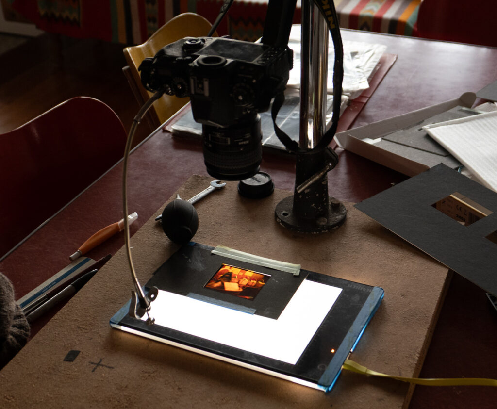
I will insert here a little piece about how I took these shots and the recent digitisation process, because what you’re seeing on screen of course are not the original transparencies; you’re looking at how your screen interprets the WordPress interpretation of my scans of those transparencies. And for what it’s worth, I’m pretty darned happy with how I digitised them. I think that what shows up on my colour corrected monitor at home is very close to the originals. I’m happy partly because it was so simple. I shot them with a Nikon Df and a nice Nikkor 60mm AF-D macro on a Kaiser Plano light pad. Camera set to Standard raw with white balance matching the Plano. The In-Camera settings (not Adobe Colour) were applied on import to Lightroom and no other adjustments were made. Manual exposure was set on what I gauged to be a pretty neutral slide and not changed. The files were then cropped and exported to jpeg. Bingo. You’ll notice I’ve gone a bit dogma on them and included the borders. This is because I’m using them in a book alongside Polaroids and so I would want them all cropped consistently, and no one crops Polaroids, right?

First ever Venice window selfie. I made a tradition of doing one every trip.

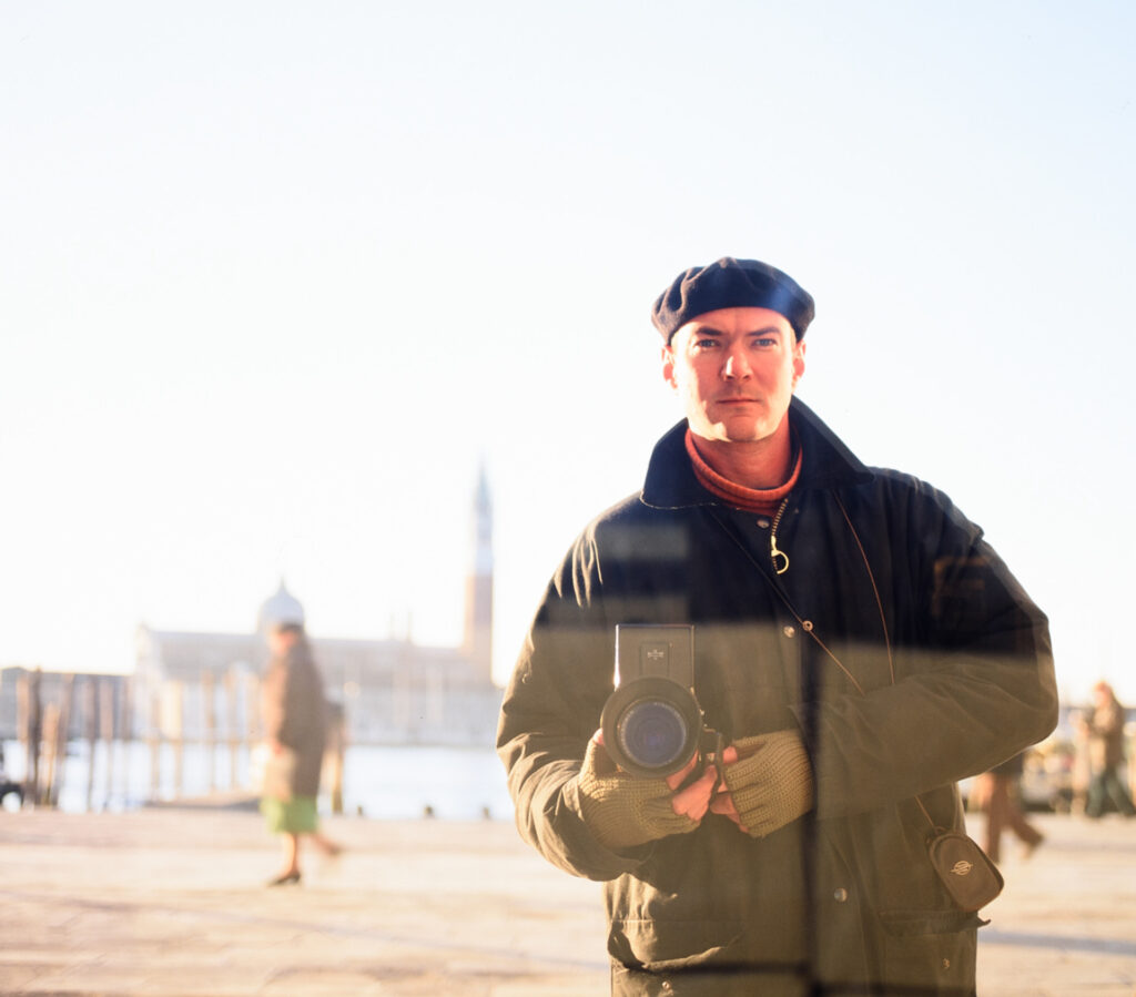
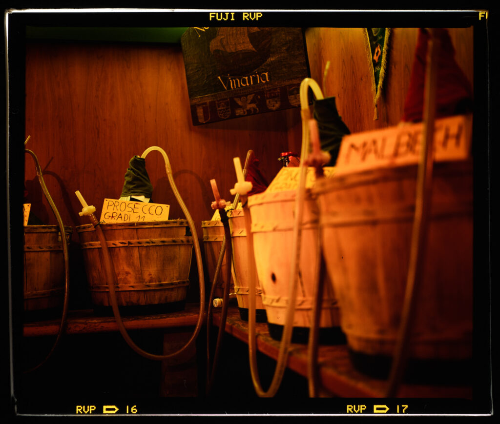
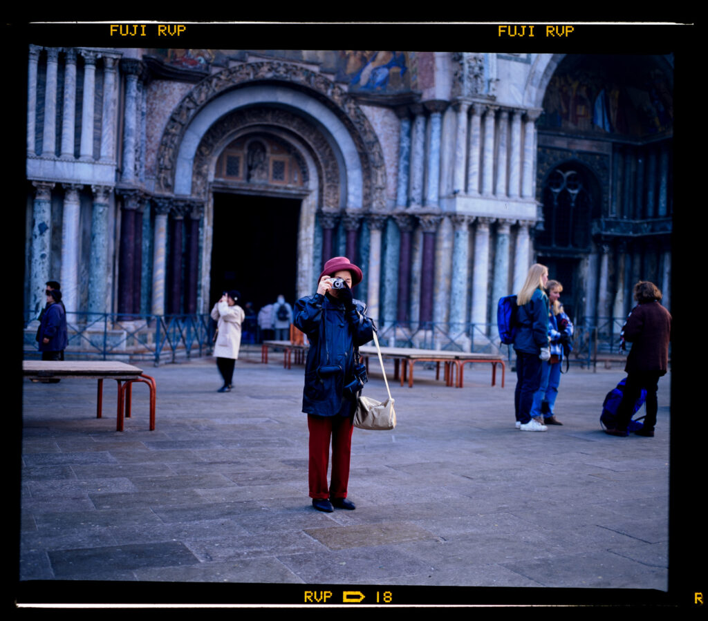
All these are handheld, and metered with a Weston Master V (inherited from my grandfather.) I used reflected or incident settings depending on the situation. I would generally have been pushing the limits on these. Except the demo window selfie they are probably wide open, maybe 1/15s.  Perhaps down to 1/4s in the wine shop.

Back to the Shots:

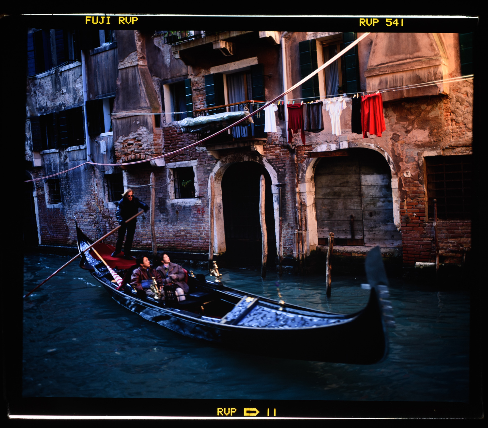
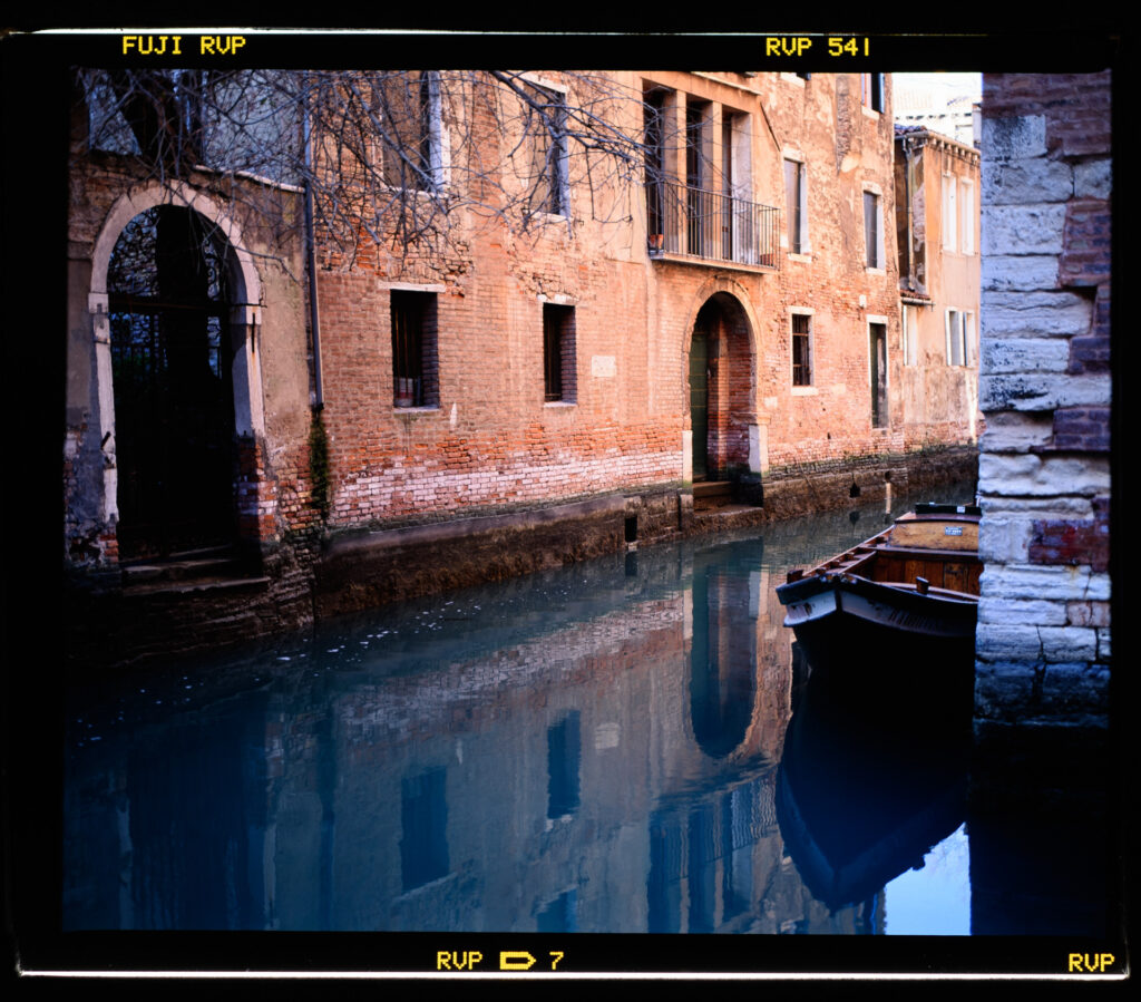
They now have a different purpose, (there’s a lesson here too about how it’s good to archive everything of course) and I am hoping to use them to go with little pieces of text I’m writing to describe that experience of being in Venice. The pictures that interest me now are less of a record of place and more about mood than they are about anything else.

Late afternoon light.

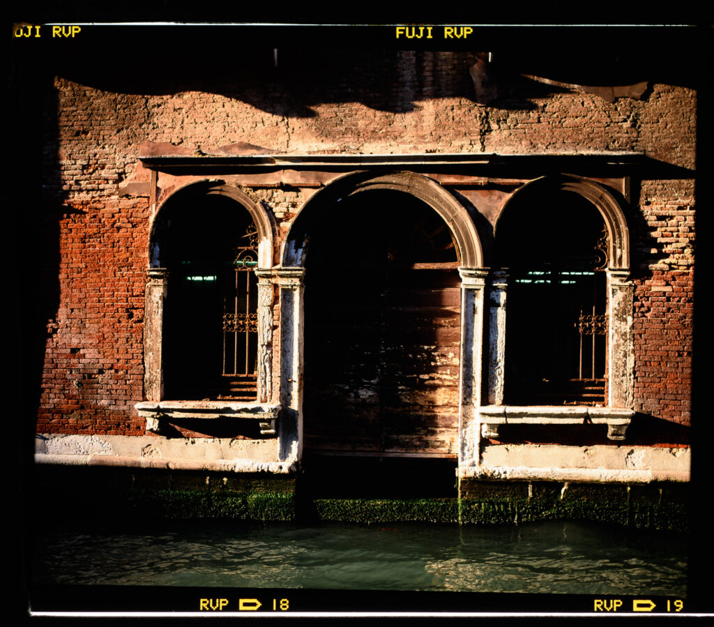
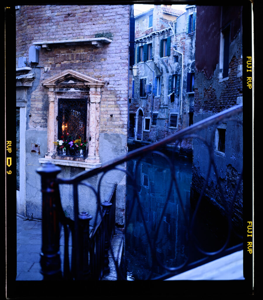
This is where I’m finding it interesting and is what gave rise to this piece; because my favourite shots – the ones I’m sharing here and the ones that I hope to use in my book – are not technically the best ones. They are not the ones I would expect an editor to have liked back in the day. Often they’re quite blocked up in the shadows, there’s blur, and the highlights are pretty much blown. But I’m finding there’s something about them that is now appealing. And so, here’s the question: is this look something I created deliberately, or is it more an artefact of working within the constraints of the medium?

This piece then, is a meditation on that idea. It’s part of an ongoing conversation about whether what we now call a “film aesthetic” (or in this case it might be the “Velvia look”) was ever a conscious choice, or whether it’s something that emerged from a set of physical limitations.

Early light.

And another part of the conversation is the nature of photography. How much are these images representations of the world, and how much are they objects in themselves? For what it’s worth I don’t think it’s one or the other, and I don’t think coming to a particular answer is particularly interesting. What I DO think is interesting is the conversation, and the range of ideas that can evolve from it.

So – what I feel I’m doing here is observing that Velvia had certain characteristics – even compared to other films of the time – slow speed, limited dynamic range (high contrast) and high saturation. Rather than view these as limitations, I’m choosing to lean into them, take advantage of them to form a particular aesthetic.

I took three frames of this; one with different focus (the reflected building was in focus) and one with another stop of light, but now I like this one best.

I also think it’s worth acknowledging that limitations aren’t a bad thing. They can guide, and help us to focus and refine. They can lead to an aesthetic coherence that is harder to find when there are too many options.

What I see now in these Velvia frames is not just a memory of Venice in winter, but a memory of working with a medium that required patience, attentiveness, and a willingness to accept its terms. At the time I didn’t think about that, because I had no choice, but now I look back with fondness and (yes) a degree of satisfaction.

So, as always, thanks for reading, and I hope these images and the thoughts behind them are worthwhile.

Share this post:

About The Author

By David Hume
David Hume is an Australian visual artist and photographer, best known for work depicting the Australian landscape. He also worked as a commercial editorial photographer for over 25 years, and has held a number of photographic exhibitions. He currently exhibits both painting and photography.
Read More Articles From David Hume

Find more similar content on 35mmc

Use the tags below to search for more posts on related topics:

Donate to the upkeep, or contribute to 35mmc for an ad-free experience.

There are two ways to contribute to 35mmc and experience it without the adverts:

Paid Subscription – £2.99 per month and you’ll never see an advert again! (Free 3-day trial).
If you think £2.99 a month is too little, then please subscribe and I can manually edit the subscription value for you – thank you very much in advance if this is what you would like to do!

Subscribe here.

Content contributor – become a part of the world’s biggest film and alternative photography community blog. All our Contributors have an ad-free experience for life.

Sign up here.

Make a donation – If you would simply like to support Hamish Gill and 35mmc financially, you can also do so via ko-fi

Donate to 35mmc here.

Comments

thorsten on Fujifilm Velvia 50 and an Aesthetic of Necessity

Comment posted: 19/08/2025

Incredible, David H. I used to shoot Velvia in 35mm, but this is something else entirely. And I really like your dogma!
Reply

Leave a Reply

Your email address will not be published. Required fields are marked *


David Hume replied:

Comment posted: 19/08/2025

Cheers Thorsten!

Reply

Leave a Reply

Your email address will not be published. Required fields are marked *


Scott Micciche on Fujifilm Velvia 50 and an Aesthetic of Necessity

Comment posted: 19/08/2025

Brilliant images and it is indeed a great camera for Venice. I always felt both Velvia 50 and 100 had perfect shadows and your images prove that once again.
Reply

Leave a Reply

Your email address will not be published. Required fields are marked *


David Hume replied:

Comment posted: 19/08/2025

Thanks Scott!

Reply

Leave a Reply

Your email address will not be published. Required fields are marked *


Curtis Heikkinen on Fujifilm Velvia 50 and an Aesthetic of Necessity

Comment posted: 19/08/2025

I really like these images, David. The color palette really works well. I generally prefer black and white as a format but you show what can be done with color. Outstanding piece!
Reply

Leave a Reply

Your email address will not be published. Required fields are marked *


David Hume replied:

Comment posted: 19/08/2025

Thanks!

Reply

Leave a Reply

Your email address will not be published. Required fields are marked *


Gary Smith on Fujifilm Velvia 50 and an Aesthetic of Necessity

Comment posted: 19/08/2025

David, I really like the shot entitled "Early Light". Nice shooting!

Although there was a time that I travelled with a slide carousel, I have never (as far as I can recall) shot any slides. Yours look great! When will we see you book?
Reply

Leave a Reply

Your email address will not be published. Required fields are marked *


David Hume replied:

Comment posted: 19/08/2025

Hi Gary, thanks. The book is much on my mind, I'm taking it slowly and seriously. Maybe early next year? I'm heading off to Ballarat in the morning tomorrow for the opening of the group show, and as part of the BIFB I've signed up for a portfolio review from four industry people and I plan to show the concept to them for feedback. In that show my piece is a lenticular, so I can't show it here, but if you are on Insta you can get an idea of it here: https://www.instagram.com/p/DNP8LAQz1qV/

Reply

Leave a Reply

Your email address will not be published. Required fields are marked *


Bill Brown replied:

Comment posted: 19/08/2025

David, interesting you did this lenticular print. I have been investigating this method for some of my personal Dallas skyline archive. I've got shots from 1979 and 2024 taken from almost the same location. I've looked at doing a postcard size to start. What opinions do you have about the process?

Reply

Leave a Reply

Your email address will not be published. Required fields are marked *


David Hume replied:

Comment posted: 19/08/2025

Postcard size is a great idea I think. I'm a novice at it, and all I'd offer is that it's very tricky and a steep learning curve. I'd say buy a kit with some lenses, try the software and have a play. I was lucky that someone gave me a lens to play with as a start. I had these done professionally (in the States, actually) and I also had some business-card ones done for give-aways. Jump in and good luck.

Reply

Leave a Reply

Your email address will not be published. Required fields are marked *


Bill Brown replied:

Comment posted: 19/08/2025

Thanks. Some beautiful shots here. Will be anticipating your book.

Reply

Leave a Reply

Your email address will not be published. Required fields are marked *


Jeffery Luhn on Fujifilm Velvia 50 and an Aesthetic of Necessity

Comment posted: 19/08/2025

Nice photos! I can't imagine dragging an RB 67 to Venice! Every time I took my RB 67 out of the studio I regretted it. Such a beast. Kudos to you for managing it.
Reply

Leave a Reply

Your email address will not be published. Required fields are marked *


David Hume replied:

Comment posted: 19/08/2025

Hi Jeffrey - No way I'd do it these days! But then I was younger, stronger and poorer. It was what I had... and I was confident with it I guess. But, I will say that all my camera gear on that trip fitted in to one shoulder bag, so it wasn't too bad. I just used to carry it with me without a bag on that trip though. I was wandering round with the express purpose of making photos with just one camera, one lens and a meter so it was not so bad (in hindsight)

Reply

Leave a Reply

Your email address will not be published. Required fields are marked *


James Evidon on Fujifilm Velvia 50 and an Aesthetic of Necessity

Comment posted: 19/08/2025

I had the RB 67 Pro, and like Jeff, I couldn't deal with the massive weight even though the images were great. I gave it up for a very nice Horseman Convertible 6x7/6x9 which optically is better than the Mamiya and very easy to carry around.
Reply

Leave a Reply

Your email address will not be published. Required fields are marked *


David Hume replied:

Comment posted: 19/08/2025

Yes - similarly I guess for me when I went back to Venice in 2019 to make photos; for medium format I took an Agfa Isolette III 6x6 folder. Smaller than a 35mm SLR even.

Reply

Leave a Reply

Your email address will not be published. Required fields are marked *


CHRISTOF RAMPITSCH on Fujifilm Velvia 50 and an Aesthetic of Necessity

Comment posted: 19/08/2025

Lovely images! What hit me really hard was that in the nineties you could (of course) get your E6 done in a day and then just buy more of almost any film you wanted for a reasonable price. I really miss that, having taken it for granted in the 1980s and 90s with no thought that this would ever change. Film photography seems to be going back to the days when it was the hobby of the rich. I have some shoeboxes of my own, full of slides. Perhaps it's high time for a dig? And yes - an RB67 in Venice! Well played.
Reply

Leave a Reply

Your email address will not be published. Required fields are marked *


David Hume replied:

Comment posted: 19/08/2025

Thanks! Yes in my town there was a dedicated E6 Pro lab that did one-hour processing five days a week. The price though? it used to be AUD $10 per roll and roughly that again for processing, so a bit under AUD $2 per frame $1.80 let's say. Adjusting that for inflation is a bit over $4 today. Today a roll of 120 E100 would cost me AUD $37 plus $22 for processing, which is about $6 per frame. So yes - 50% more adjusted for inflation, with the processing being about the same and the film being nearly double. Scanning though - that was astronomically dear in 1992! I can't remember but I had some ploaroids scanned from that trip and had to sell a kidney.

Reply

Leave a Reply

Your email address will not be published. Required fields are marked *


Geoff Chaplin on Fujifilm Velvia 50 and an Aesthetic of Necessity

Comment posted: 20/08/2025

The film / Velvia ethic? I remember a LF friend about 40+ years ago saying to me "shoot Velvia - high saturation - everyone's using it". Sometimes I think there's just a trend. Nowadays I think in many ways Velvia is the worst of all colour film - not what I thought in the past. The colours become childish exaggerations even abnormal. I can understand that this may be the photographer's intention in a certain context, once in a while, but an everyday colour film or a realistic representation it is not.

Great images despite my rant, and well done for using slow shutter speeds when required.
Reply

Leave a Reply

Your email address will not be published. Required fields are marked *


David Hume replied:

Comment posted: 20/08/2025

Yeah, it is a rant, isn't it Geoff? I can't say I agree with much of it, but because we're all friendly folk here who comment thoughtfully and respectfully, valuing a diversity of opinion, I'll reply to your points. The word I used is "aesthetic" not "ethic". Aesthetic is to do with how things look, whether they are nice, etc, while ethic is more to do with whether something is right or wrong. So an "ethic" of Velvia would be more to do with things like, "does shooting Velvia harm the environment?" or "Do the people who work in the Velvia factory get paid award wages?" So I'll rephrase what this post is about to clarify. The idea runs like this: Back in the days when I made these shots all we had was film. Looking at them now, with a degree of nostalgia, I ask myself, "Is this aesthetic (how they look) something I chose, or is it something that just happened because film was all we had?" Now, it does go a bit further than that - I chose to shoot Velvia, which even by the standards of the day was saturated and high contrast (I say this in my piece.) I have never viewed it as "the worst of all colour film." I saw it more like this: It was designed to be like that, particularly for landscapes and used alongside Fuji's other transparency films, particularly Provia, which was more neutral and better for portraits and the like. Personally, I used to shoot Sensia (like Provia but cheaper) for portraits and lifestyle, and I'd keep one body loaded with Velvia for shooting landscapes at dawn and dusk. I had to shoot transparency because this was for publication and transparency is what the magazine wanted. Let's now take this a little further still. Today, I could shoot digital, and then make it look like Velvia. Would I do this? Probably not, because it would look a little forced. I'm not saying I would never do it, but to my mind it's a bit like having a conversation with AI; even if it passes the Turing test (you can't tell from its answers whether it's a machine), but you KNOW it's a machine, then that changes things. So just last week I shot a roll of Ektachrome E100 and along side it I shot a Leica D Lux 8 and I made a Preset to make the D Lux look like E100. Then I changed the Preset to give me results BASED on the E100 but more to my modern tastes. Hope this helps and thanks for your compliments on the images!

Reply

Leave a Reply

Your email address will not be published. Required fields are marked *


Geoff Chaplin replied:

Comment posted: 20/08/2025

Typo on my part - I meant aesthetic and my comment is appropriate in that context. I don't think we fundamentally disagree - I'm saying I personally do not like the film though I can see situations where it might be appropriate (if one is seeking outlandish colours). I'm also saying many photographers choose Velvia because (years back) it was the trend or someone tells them its the best film rather than any conscious effort to appreciate what it does compared to other films and what the photographer is trying to achieve. I'm sorry if you read my comment as some sort of assault - it wasn't meant that way.

Reply

Leave a Reply

Your email address will not be published. Required fields are marked *


Alexander Seidler on Fujifilm Velvia 50 and an Aesthetic of Necessity

Comment posted: 20/08/2025

I never shot velvia but i think its strong character is clearly visible in you digitized images.
Different to some experimental films of today the look has a "harmony" of colors.
i like the aesthetics and your shots.
Reply

Leave a Reply

Your email address will not be published. Required fields are marked *


David Hume replied:

Comment posted: 20/08/2025

Thanks - Yes, I guess the only "new" transparency film is Ektachrome E100, which I've shot, but I can't really see the point of it. That is a much more forgiving, softer film than Velvia was.

Reply

Leave a Reply

Your email address will not be published. Required fields are marked *


Simon Foale on Fujifilm Velvia 50 and an Aesthetic of Necessity

Comment posted: 20/08/2025

Terrific pics David. Velvia totally works for your subjects here IMHO. Love the bluish one of the photographer, but they are all great. I also shot some Velvia in Venice, though quite a bit after you did (2008) and with a Mamiya 6, but I haven't put any scans online yet - they are just a handful of rooftop vistas, and nothing as compellingly moody as what you have presented here. I wrote a cheeky post about Velvia on 35mmc a couple of years ago: https://www.35mmc.com/04/09/2023/fujifilm-velvia-and-my-shallow-and-shameless-dumping-of-kodachrome/. When Velvia first came out it totally blew my mind and I shot heaps of it underwater in both the tropics and along the southern coast of Australia. It's perfect for things like nudibranchs, fish and other interesting marine critters. Even seaweeds. But it has its limits for some marine subjects, particularly gelatinous critters like salps and jellyfish, for which digital is a superior medium. I am still happily shooting Velvia, it's magic stuff.
Reply

Leave a Reply

Your email address will not be published. Required fields are marked *


David Hume replied:

Comment posted: 20/08/2025

Cheers Simon; I remember that post of yours, and looking back now, I think, "Gee I wish I'd shot more Kodachrome." I think I started shooting it purely for economics and archiving - it was a pretty bomb-proof solution for getting through airport Xray machines in the 80s/90s. Buy a four pack (three pack? I can't remember) send it off to get processed when you got home from Europe and you're done. And I'd noticed how my own family's photo history started to fall off when my grandfather stopped processing and printing B+W in his cellar darkroom. But because I was shooting Sensia for editorial stuff I got impatient, and I would shoot the kids on the end of work rolls etc and PKR fell by the wayside. I remember when I was shooting covers for Winestate magazine with the RB, it was all 120 and Velvia RVP was the ONLY thing that got shot. Going back to an earlier reply I made to Geoff above - the good thing is that I've invested an enormous (did someone say "unhealthy"?) amount of time in to looking at the aesthetics of it all, and I feel I'm developing the skills I need to make my own look from digital sensors. So I'd say the good thing is once you've seen the Velvia magic and know what you want, now it's possible to make it at home. (There's way more I could say about this - if you want a rabbit hole on what sensors can do now, look up the the Apple TV series "Disclaimer" and the ARRI S35 camera and its sensor.) Cheers.

Reply

Leave a Reply

Your email address will not be published. Required fields are marked *


Ibraar Hussain on Fujifilm Velvia 50 and an Aesthetic of Necessity

Comment posted: 20/08/2025

Wonderful series of photographs. Everything just works, the transparencies have a timeless look to them, I know that's cliche'd but for sure here it is true. and those 6x7 photographs are beautiful, makes me want to get one and go to venice
Reply

Leave a Reply

Your email address will not be published. Required fields are marked *


David Hume replied:

Comment posted: 20/08/2025

Cheers Ibraar... I'm conflicted - I have these memories and I love Venice of course, but at the moment I'm happy just to play with these and am not thinking of going back any time soon. These are a bit like the Polaroids I also have - you can't get the film any more so what I now have is all I'll have. I'll think of something though, I'm sure.

Reply

Leave a Reply

Your email address will not be published. Required fields are marked *


Leave a Comment

Leave a Reply

Your email address will not be published. Required fields are marked *