Ten (Temperate) Botanical Frames in Colour - Feature Image

Ten (Temperate) Botanical Frames in Colour

By Simon Foale

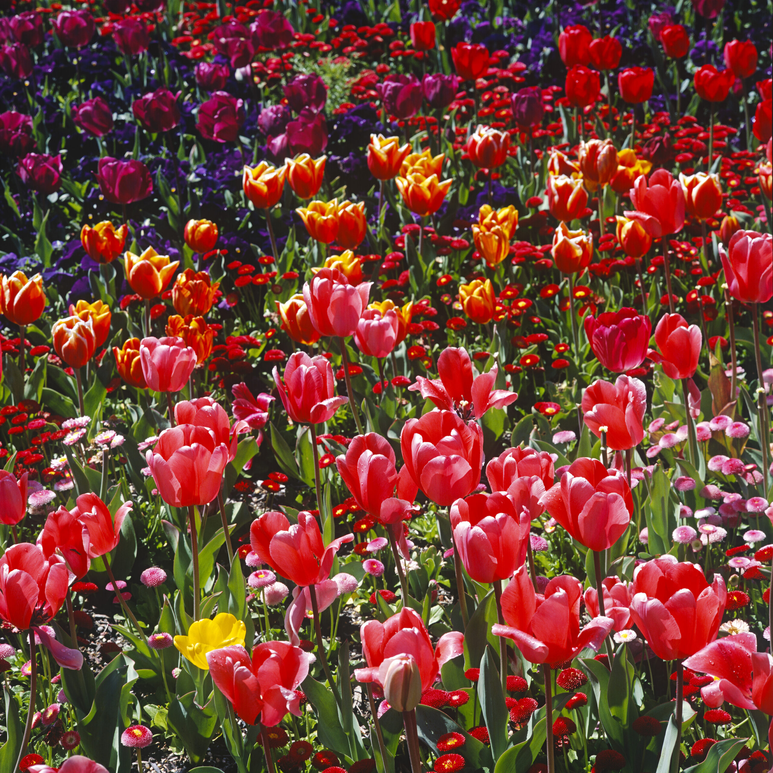
Back in March 2024 I posted a piece about how great plants can look when photographed in black and white. Now this is despite the fact that I don’t embrace any particular ideology about black and white film, and most of my photography, including BD (Before Digital) has been in colour. So of course, the counter-argument to the one I made in that piece was already percolating through my brain even as I wrote it, and I’ve been circling around the idea ever since. Obviously, plants are a magnificent photographic subject in colour! Flowers are fundamentally about colour. Yes I know some photographers have made superlative images of lillies and magnolias in black and white, but yeah, doing that with all of them is kind of missing the point, IMHO. So… I actually have two stories on this theme. Today’s is ‘one I prepared earlier’ (i.e. from my BD archive) and the second will be from more recent, tropical material.

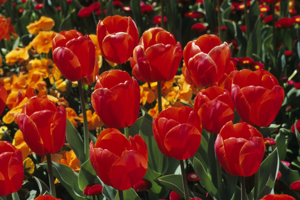
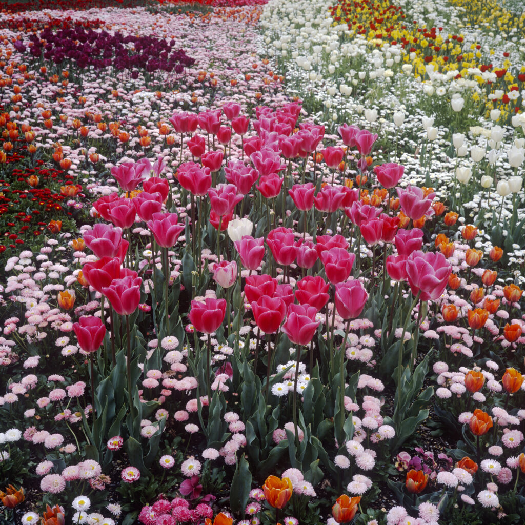
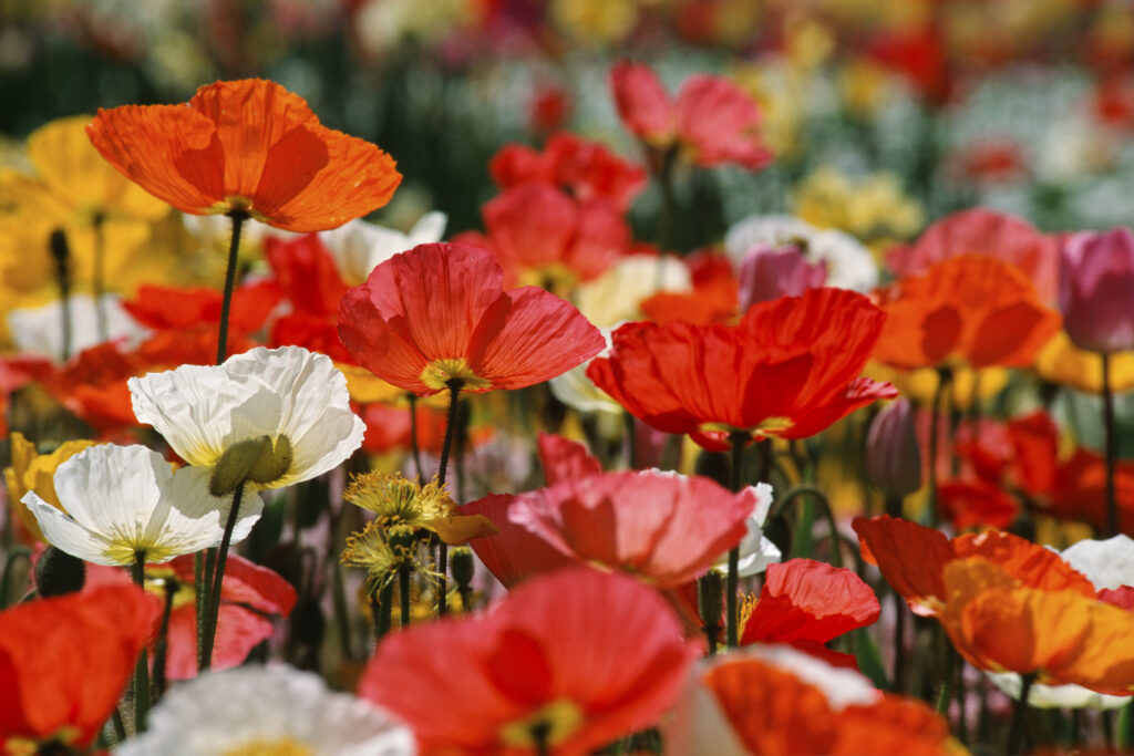
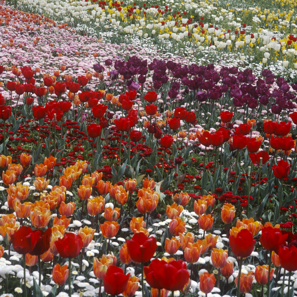
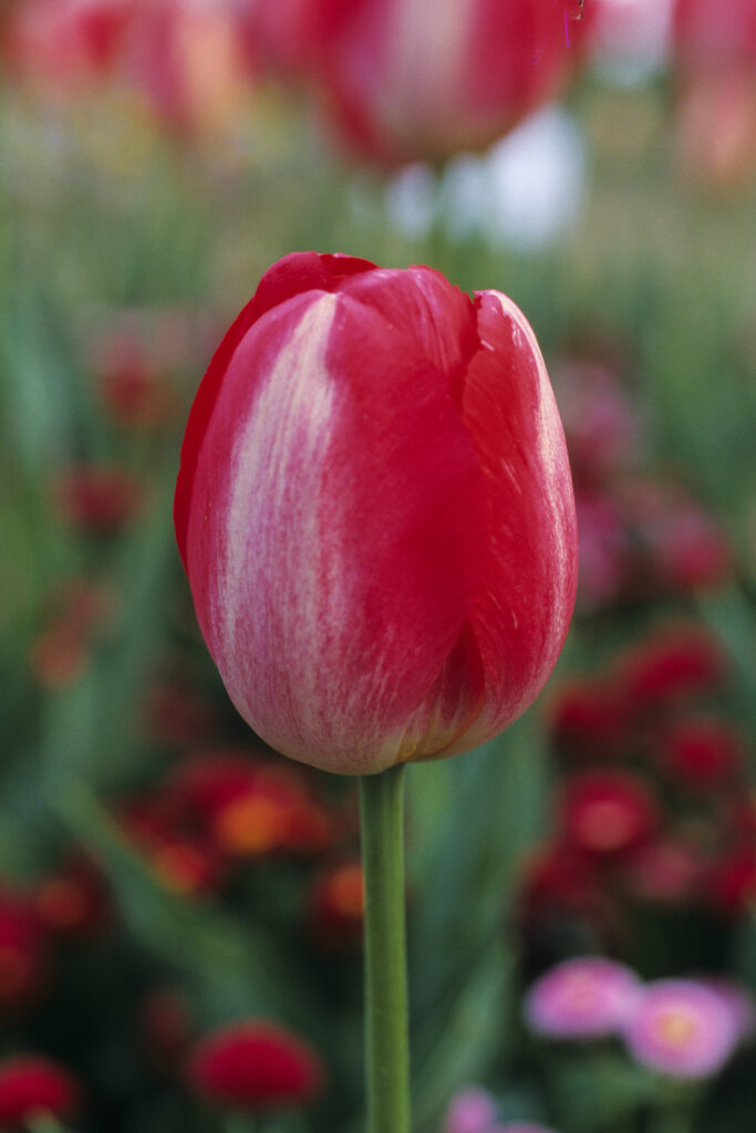
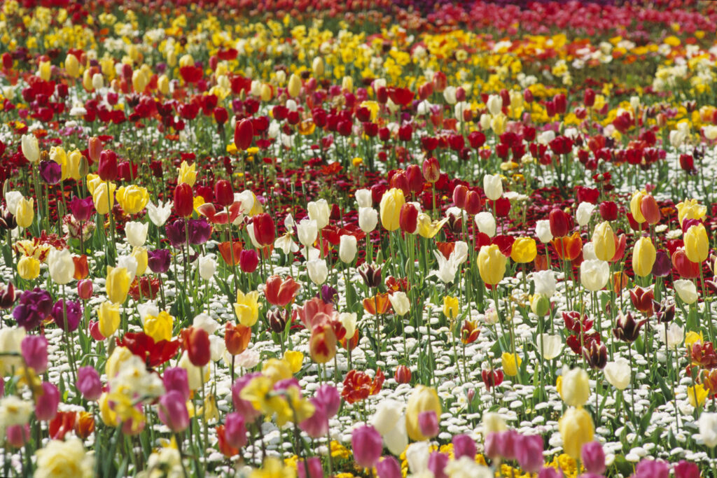
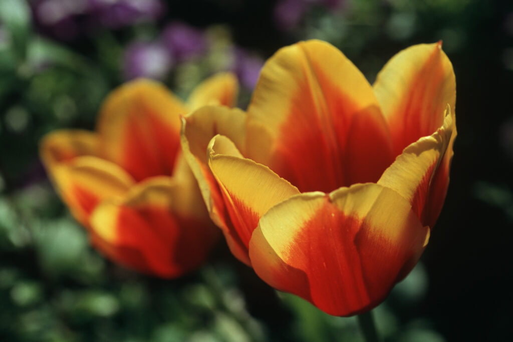
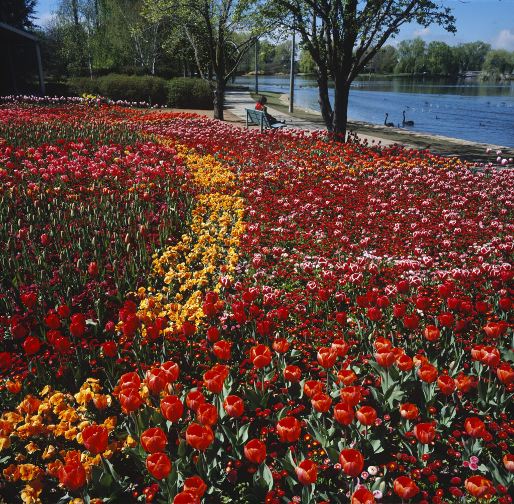
The images I’m presenting today were made in the early 2000s at an amazing event called Floriade, in the city many Australians love to hate, Canberra. I lived in Canberra for five years and I can tell you that it’s a terrific place to live, despite all the contempt directed at it by people who’ve never spent any time there. And Floriade is one of the many good reasons to visit the place, even if you don’t stay. It’s a spring flower festival that is dominated by northern hemisphere garden flowers, particularly tulips. Now Canberra also has a very impressive botanical garden, which of course features a wonderful selection of exquisite Australian flora, but if you want to feast your eyes on a veritable sea of exotic colour, you don’t want to miss Floriade.

The below images were made mostly with Fuji slide film (Velvia and Provia), shot with a Mamiya 6MF (using 50mm and 75mm lenses) and a Nikon F801S and a 60mm ‘Micro Nikkor’ lens. Transparencies were scanned with a Nikon Coolscan LS9000 at 4000dpi in 16bit colour, then converted to 8bit, downsized and uploaded as jpegs. I did little or no editing in post in terms of levels or colours. Floriade is located on the unceded lands of the Ngunnawal people (the name Canberra is a Ngunnawal word meaning ‘meeting place’).
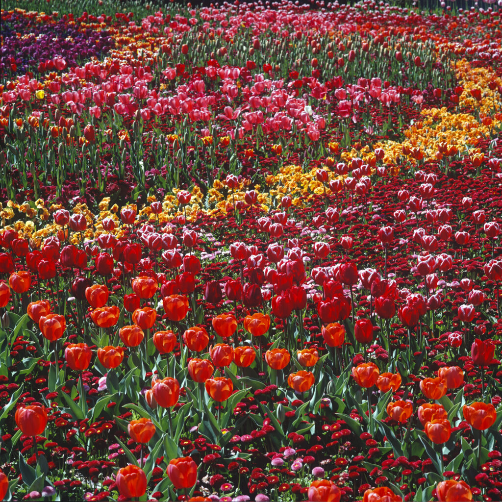
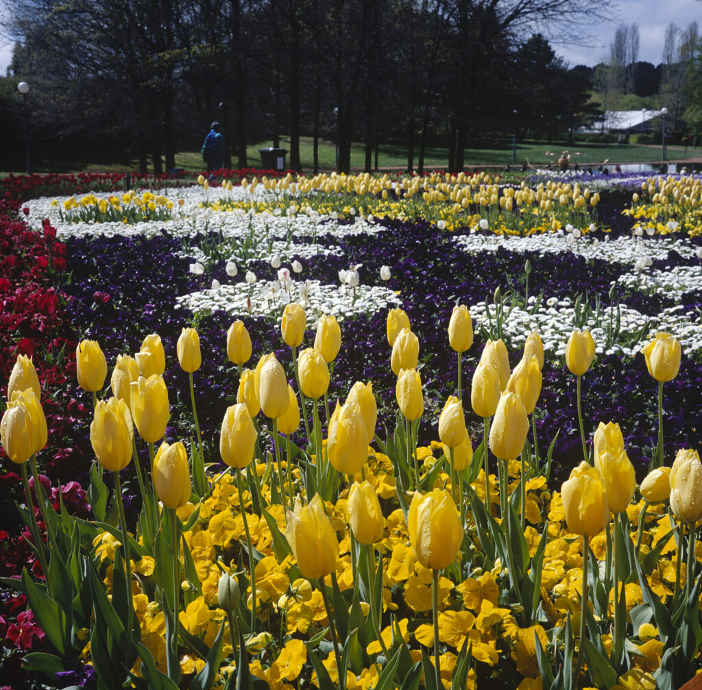
Floriade 1 (M6) Floriade 2 (M6) Floriade 3 (Nikon) Floriade 4 (M6) Floriade 5 (Nikon) Floriade 6 Floraide 7 (Nikon) Floriade 8 (M6) Floriade 9 (Nikon) Floriade 10 (M6)

Thanks for reading.

My Flickr page

Share this post:

About The Author

By Simon Foale
Repairing and trying out my late grandfather's 1914 No.1 Autographic Kodak Junior initially led me down the film rabbit hole but now that I'm here I might stay for a bit. I am currently based in North Queensland, Australia. I used film for over 20 years before digital but these days I'm keen to indulge my curiosity about some film types I never tried back in the day, including some of the so-called 'document' films. I also like sharing stuff from my film archive.
Read More Articles From Simon Foale

Find more similar content on 35mmc

Use the tags below to search for more posts on related topics:

Donate to the upkeep, or contribute to 35mmc for an ad-free experience.

There are two ways to contribute to 35mmc and experience it without the adverts:

Paid Subscription – £2.99 per month and you’ll never see an advert again! (Free 3-day trial).
If you think £2.99 a month is too little, then please subscribe and I can manually edit the subscription value for you – thank you very much in advance if this is what you would like to do!

Subscribe here.

Content contributor – become a part of the world’s biggest film and alternative photography community blog. All our Contributors have an ad-free experience for life.

Sign up here.

Make a donation – If you would simply like to support Hamish Gill and 35mmc financially, you can also do so via ko-fi

Donate to 35mmc here.

Comments

Ibraar Hussain on Ten (Temperate) Botanical Frames in Colour

Comment posted: 12/07/2025

Beautiful compositions
Beautiful colours flowers what can I say
Reply

Leave a Reply

Your email address will not be published. Required fields are marked *


Simon Foale replied:

Comment posted: 12/07/2025

Thanks Ibraar. I've enjoyed your recent flower pics too.

Reply

Leave a Reply

Your email address will not be published. Required fields are marked *


Gary Smith on Ten (Temperate) Botanical Frames in Colour

Comment posted: 12/07/2025

A spectacular burst of color to start my Saturday!

Thanks Simon!
Reply

Leave a Reply

Your email address will not be published. Required fields are marked *


Simon Foale replied:

Comment posted: 12/07/2025

Thanks Gary! Glad you enjoyed it.

Reply

Leave a Reply

Your email address will not be published. Required fields are marked *


David Hume on Ten (Temperate) Botanical Frames in Colour

Comment posted: 12/07/2025

Hi Tony - greetings from a South Australian currently driving through NSW and who will be going home through Canberra. Another coincidence; I am literally uploading Velvia photos on a story shot in Venice in 1995 with a Mamiya RB67. But to your shots - wow - the colour, particularly in the feature shot, is wild! There are some reds that Velvia really seems to hammer. Was that one a Velvia shot? Would you share a bit about your digitisation process, as I've just gone through that? I'm curious how you digitised, what you did in post, and how close you feel these look to the transparencies on a light box. For mine, I shot them with a Nikon Df and a nice Nikkor 60mm AF-D macro (maybe the same ens as yours?) on a Kaiser Plano light pad. Camera set to Standard raw with white balance matching the Plano. Camera settings (not Adobe Colour) were applied on import to Lightroom and no other adjustments. Manual exposure set on what I gauged to be a pretty neutral slide and not changed. Cropped and exported to jpeg. That was it, and I feel it very closely mirrored the originals, so I'm keen to hear about yours. Cheers, I seem to have missed your posts so far for some reason, but I see you've done lots, so I look forward to checking them out. (travelling down from Pt Macquarie today)
Reply

Leave a Reply

Your email address will not be published. Required fields are marked *


David Hume replied:

Comment posted: 12/07/2025

Simon I mean... where the hell did I get Tony from? Maybe because I was also writing to an Adelaide photog called Tony this morning. Sorry!

Reply

Leave a Reply

Your email address will not be published. Required fields are marked *


Simon Foale replied:

Comment posted: 12/07/2025

Gday David, Thanks for your comments and sorry not to have included some details on digitisation (I'll edit the piece now to include some). I bought myself two nice Nikon Coolscans in the early 2000s, shortly after acquiring my Mamiya 6MF - a 5000 and a 9000. The images in this piece were scanned on the 9000 at 16bit, 4000dpi, and Adobe colour space, then converted to 8bit, downsized and converted to jpeg for uploading. I didn't edit these scans much (if at all) in post, though I habitually tweak Curves in Photoshop for most scans just to get something that looks right on my Macbook screen. It's easy to over-egg Velvia's already intense saturation so I do try to avoid doing that. I used Velvia and Provia a lot in the '90s and early 2000s, and still have a small stash in my freezer. I wrote a piece about the film for this blog in Sept 2023: https://www.35mmc.com/04/09/2023/fujifilm-velvia-and-my-shallow-and-shameless-dumping-of-kodachrome/ So to clear up another thing, I didn't use the AF Micro Nikkor 60mm for digitisation, but for shooting some originals. It's a terrific and under-rated lens IMHO. However I did use that lens a lot back in the '90s to make slide copies on copy transparency film (and it worked brilliantly). That was when I was submitting original slides to stock photography agencies and wanted to keep a copy for myself. Looking forward to your Venice piece!

Reply

Leave a Reply

Your email address will not be published. Required fields are marked *


Simon Foale replied:

Comment posted: 12/07/2025

Gday again David, I didn't answer your specific question 'was that one a Velvia shot? (re the feature image). Yes it is. Most of the images are Velvia (which is definitely more saturated than Provia), but I scanned them a while ago, and the transparencies are all filed now (and many are in plastic mounts, as 6x6 'slides', making the process of verification a bit time consuming) and it would take me a while to dig them out and double check.

Reply

Leave a Reply

Your email address will not be published. Required fields are marked *


David Hume replied:

Comment posted: 12/07/2025

Cheers Simon - thanks for the info. I did have a borrowed CoolScan 5000 for a time many years ago and the results were superb, (but the pace was glacial!) I digitised a lot of 135 colour neg with it - no transparency though. I used to shoot editorial stuff on 135 Sensia 100 (people, wine and food) and 120 Velvia (for covers - which needed higher res and also paid more) in the early to mid 90s before I had ever digitised anything, but sometimes I would get copies of the scans back from the magazine in that hybrid film/digital time. I guess I wanted to know if the the featured image of your post was that saturated by choice and feel confident you're master of your domain in that regard, and it got me thinking because it seemed the reds and yellows in particular were clipping a bit and I wondered if you were going in hard with them to make a statement (I imagined the cover of a 1980s gardening magazine featuring "Colours of Spring!" which in turn made me think of what happens with film when you digitise it. - I don't agree with Geoff's comment below - (sorry Geoff if you're reading) I think the situation is much more nuanced than that, even though of course it's true "real colours aren't like that" (not least because there is no such thing as real colour, or maybe all colour is real, but let's move on.) Anyway - I'll go and have a read of things of yours I've missed, not least because I did a Kodachrome piece and one about shooting environmental portraits on E6 myself a while ago. Anyway - great to see this and I look forward delving into in to your back catalogue. (And I have a roll of 135 Provia 100 with me on my trip so maybe I'll look out for some flowers in our Great Nation's Capital!) Cheers.

Reply

Leave a Reply

Your email address will not be published. Required fields are marked *


Simon Foale replied:

Comment posted: 12/07/2025

Ah, I think I understand what you are driving at now. Yeah Velvia is totally capable of clipping (AKA blocking up) reds (as well as bright highlights) in some situations. Hadn't noticed it so much with yellow. Any clipping (or appearance of it) on the feature image here is on the original slide, as opposed to being an artefact of scanning or any tweaking in post. I have seen 'blocky' reds on a few Velvia transparencies in my time, and it's definitely a feature of the film. Several of the shots here, including the featured image, are shot in pretty harsh, direct sunlight (albeit backlit in several), so that additional contrast, with an already very contrasty medium, is likely contributing to any appearance of clipping. But as you suggest, I'm happily owning it! The aim is really to convey the eye-popping colour of Floriade. The colours of the actual flowers really are very intense, even if Velvia soups them up a bit. It's a stunning event to witness - I take my hat off to the people who plan the displays, because not only do they have to create appealing arrangements, but since tulips are bulbs, they have to get the timing right too!

Reply

Leave a Reply

Your email address will not be published. Required fields are marked *


David Hume replied:

Comment posted: 12/07/2025

Cheers Simon. Yep, thanks - we're on the same page there.

Reply

Leave a Reply

Your email address will not be published. Required fields are marked *


Geoff Chaplin on Ten (Temperate) Botanical Frames in Colour

Comment posted: 13/07/2025

Oh I loved your earlier B&W article! And this confirms what I thought about colour film or digital. YUCK!!!! Real colours aren't like that, and they are not constants, varying with the light and other factors, and oversaturated slide film particularly makes a farce of reality. It's like listening to a recording of music rather than a live concert - the former is a sad apology for the real thing. This is in no way a comment on your excellent photography, just a comment on the medium. More B&W please!
Reply

Leave a Reply

Your email address will not be published. Required fields are marked *


Simon Foale replied:

Comment posted: 13/07/2025

I suspected this one might draw you out Geoff! I agree that Velvia does not represent reality, but many would argue that this is not a problem - it just does with chemistry what the saturation and vibrance sliders do in Photoshop. Ansel Adams openly admitted to doing a lot of heavy dodging in the printing of 'Moonrise at Hernandez' to darken the sky, so that image doesn't represent reality either. I enjoy wild colours for some subjects, flowers included, and marine fauna especially. But I am working on another piece in black and white, featuring some recent images made with Kodak Technical Pan, which I have to say I really like, and I hope you will too :)

Reply

Leave a Reply

Your email address will not be published. Required fields are marked *


Ibraar Hussain replied:

Comment posted: 13/07/2025

Ah but they’re not supposed to be real nor to look real. For that get a modern digital ‘Forget how it looks, how dies it feel?’ A wise man once said

Reply

Leave a Reply

Your email address will not be published. Required fields are marked *


Ibraar Hussain replied:

Comment posted: 13/07/2025

*does

Reply

Leave a Reply

Your email address will not be published. Required fields are marked *


Geoff Chaplin replied:

Comment posted: 13/07/2025

I have no objection to images being different from reality - van Gogh's Cafe Terrace at Night for example which is in no way an accurate reflection of 'reality' but is a wonderful insight into the painter's reality. Velvia, or Photoshop, colours are generally (not always) simply over-saturated rather than an artist's thoughtful interpretation.

Reply

Leave a Reply

Your email address will not be published. Required fields are marked *


Geoff Chaplin replied:

Comment posted: 13/07/2025

And to reply to Ibraar - it feels yuck! blear! hoo-eeee!

Reply

Leave a Reply

Your email address will not be published. Required fields are marked *


Tony Warren on Ten (Temperate) Botanical Frames in Colour

Comment posted: 13/07/2025

I think your articles pinpoint the essential difference between colour and monochrome. The former, like these images, can only be achieved with a colour emulsion, whilst monochrome is all about light and form. I enjoy both, colour especially when it is so vibrant as here.
Reply

Leave a Reply

Your email address will not be published. Required fields are marked *


Simon Foale replied:

Comment posted: 13/07/2025

Thanks for this Tony, glad you agree.

Reply

Leave a Reply

Your email address will not be published. Required fields are marked *


Gary on Ten (Temperate) Botanical Frames in Colour

Comment posted: 13/07/2025

Spectacular shots and results, especially the closeups. I don't care if the color isn't "real." That is your choice as an artist, and I think you've just helped the flowers show their glory.
Reply

Leave a Reply

Your email address will not be published. Required fields are marked *


Simon Foale replied:

Comment posted: 13/07/2025

Thanks Gary, glad you like them.

Reply

Leave a Reply

Your email address will not be published. Required fields are marked *


Geoff Chaplin replied:

Comment posted: 13/07/2025

Gary, I agree colour's don't have to be real - but choosing Velvia gives the same colour shifts and saturations to every shot you take. Simon has very sensibly restricted the subject matter to a single genre and perhaps he loves those reds and deep saturations - I do not, and my reaction is the colours of the films do not help the flowers show their glory but the opposite. That's just my reaction and I know the majority of photographers have a different opinion, that's fine.

Reply

Leave a Reply

Your email address will not be published. Required fields are marked *


Leave a Comment

Leave a Reply

Your email address will not be published. Required fields are marked *