10 Botanical Frames in Black and White – Why on Earth Would You Do It?

By Simon Foale

Green is my favourite colour by a good margin, and it’s probably mainly because I like being around plants. I find lush tropical plant life relaxing and reassuring. It lowers the blood pressure and ups the serotonin production. I don’t think I’m alone with these responses. Green is also right in the middle of the visible spectrum, and its opposite on the colour wheel is magenta, the colour that, by some lines of reasoning, ‘doesn’t exist‘. Green represents life, fertility, sustenance. It’s a pretty special colour.

So why on earth would I want to photograph plants in black and white? Quite simply because plants also have amazing shapes, shades, textures and tones, which can sometimes be represented more strikingly in monochrome. Many photographers have pulled it off and many continue to do so. After shooting a roll of Double-X on various plants at the spectacular Cairns Botanical Gardens in May 2023, entirely on a whim, I was sufficiently pleased with the results that I decided to experiment with more botanical subjects using some other films, just for fun. Two great side benefits of shooting plants is that they don’t need any persuasion to stay put, and you don’t need a model release form.

The below ten frames were shot on five different types of film, using a total of four different developers. Notes on film and development accompany the images. Not all of the ten frames are actually of the green parts of plants, though most of them are. I provide tentative identifications for some. The first two were shot on Gimuy Walubara Yidinji Country (Edge Hill, Cairns) and the rest on Bindal Country (south of the Ross River, Townsville).
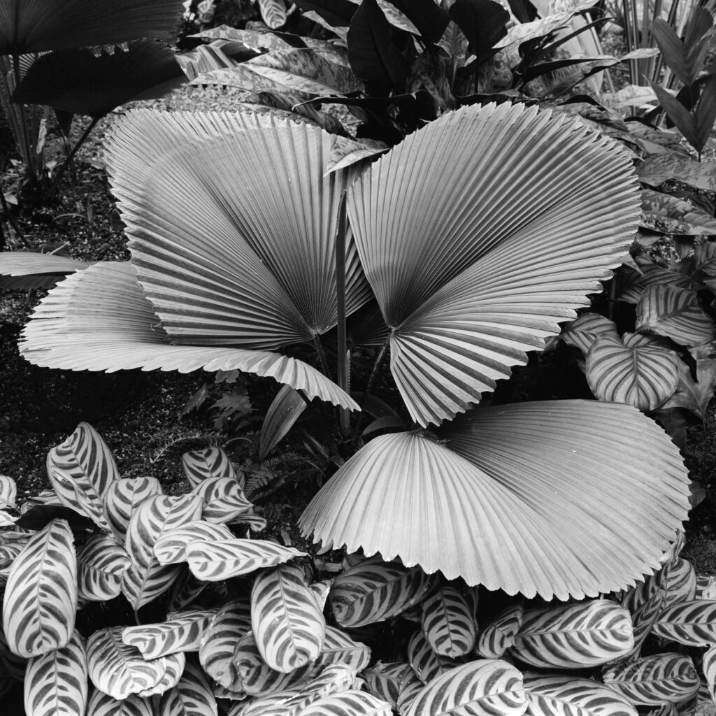
Licuala
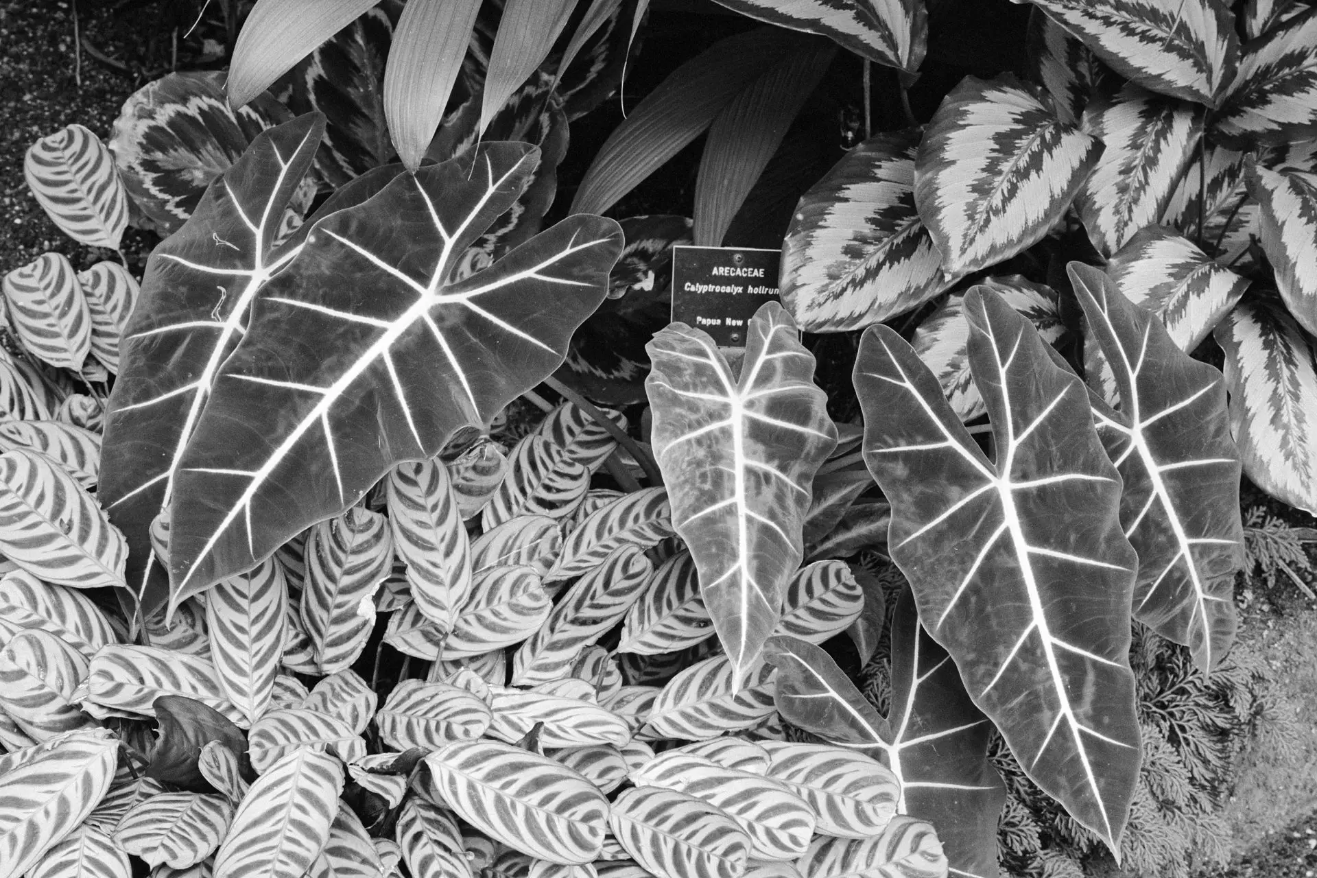
A short fan palm, possibly a species of Licuala, bordered by a striking ornamental aroid, at the Cairns Botanical Gardens. Mamiya 6MF, 75mm F3.5, Cinestill Double-X, developed in Xtol 1+2.

I really like the look of the grain on this and the next image. This film and developer also gave a much sharper look than I was expecting.
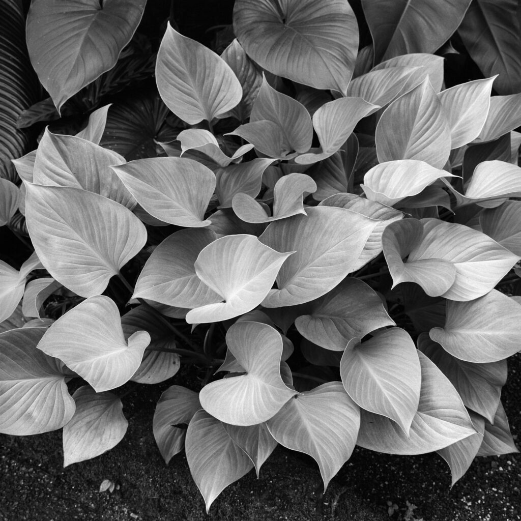
Ornamental aroids
A lovely ornamental aroid. Same location, camera, lens, film and developer as above.
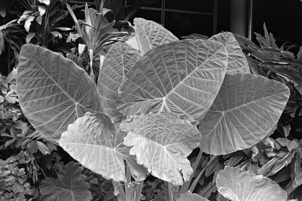
Large aroid
A large ornamental aroid (family Araceae) near my place in Townsville. Nikon FM2, Ai-s 50mm F1.8, Rollei Retro 80S (@ISO100), H@W Control.
curly Agave
Detail of an amazing curly Agave (sorry no ID, but it may be Agave americana) at the Townsville Palmetum. Tech details as for the previous image.
Ficus watkinsiana
Strangler fig (Ficus watkinsiana). Mamiya 6MF, 75mm F3.5, Ilford Delta 400, Rodinal 1:50. This combination produces a beautiful salt and pepper grain and lovely sharp images.

These plants are parasites in the sense that they use a ‘host’ tree for support as they grow and slowly enclose and ‘strangle’ it to death, by which time they are able to stand on their own and grow to become very large trees. I think the strangler fig is a great metaphor for what university administrations are doing to university academies in many countries, including mine. Just saying.
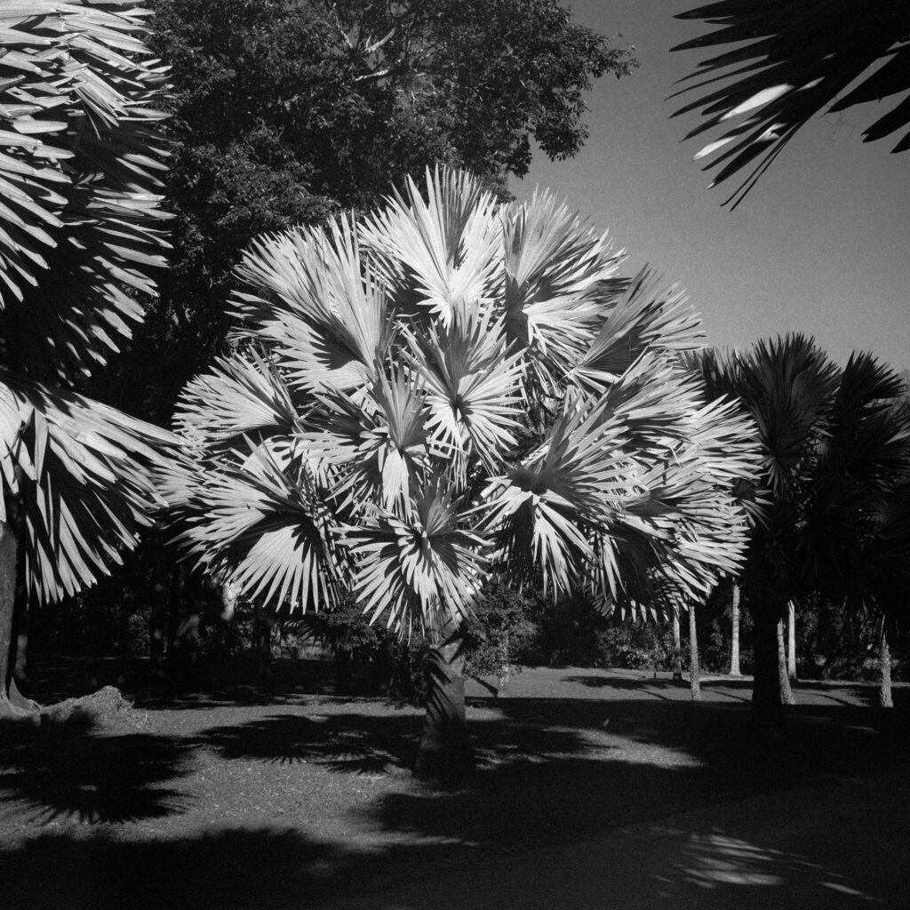
Bismarck Palm
Bismarck Palm (Bismarckia nobilis). Tech details as for above, except I used a yellow and a polarising filter here to darken the sky a bit.

I never get tired of shooting these impressive palms. This one is enjoying some late afternoon sunshine while its neighbours are mostly shaded.
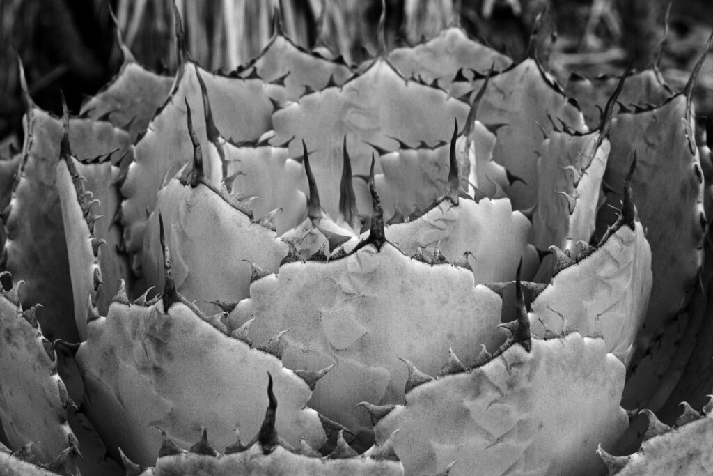
Agave potatorum
Detail of an Agave potatorum cactus at the Townsville Palmetum. Nikon F801S, Ai-s Micro 55mm F2.8, Rollei RPX25 (@ISO50), FX1 developer.

I like the way the impressions of adjacent ‘leaves’ can be seen here. The bendy spines are also kind of cool. FX1 is basically a diluted version of Beutler, which gives a pretty good compensating effect, a significant speed boost, and good acutance. The F801 has no mirror lock-up function, which worried me at first, since I was using shutter speeds of 1/8 and 1/15 for these shots. But it seems this very solid camera has enough weight to absorb mirror slap without any image-degrading vibration.
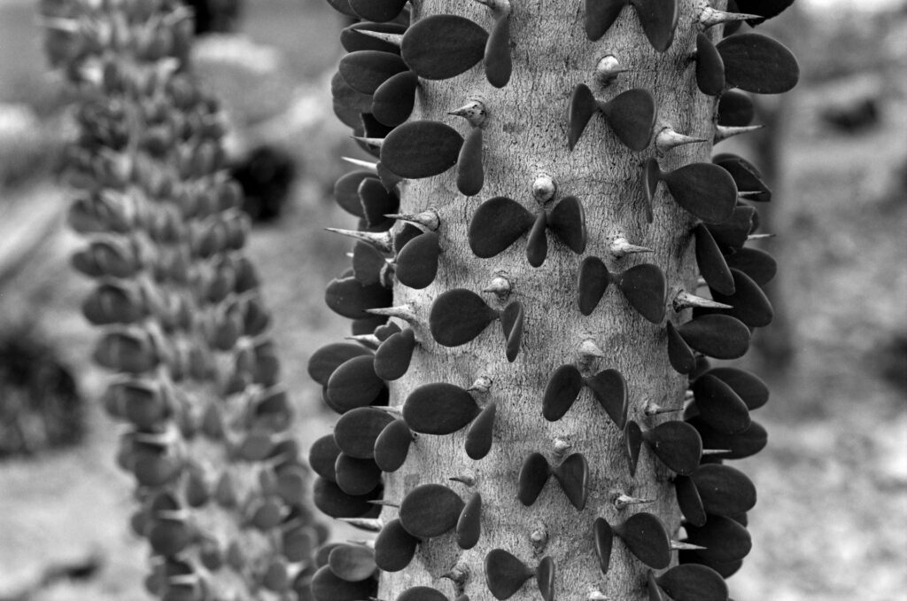
Alluaudia procera
Detail of Alluaudia procera at the Townsville Palmetum. This interesting cactus hails from Madagascar. Like Agave potatorum, it is no doubt the product of millions of years of adaptation to intense herbivore pressure. Tech details as above.
Aquatic aroid
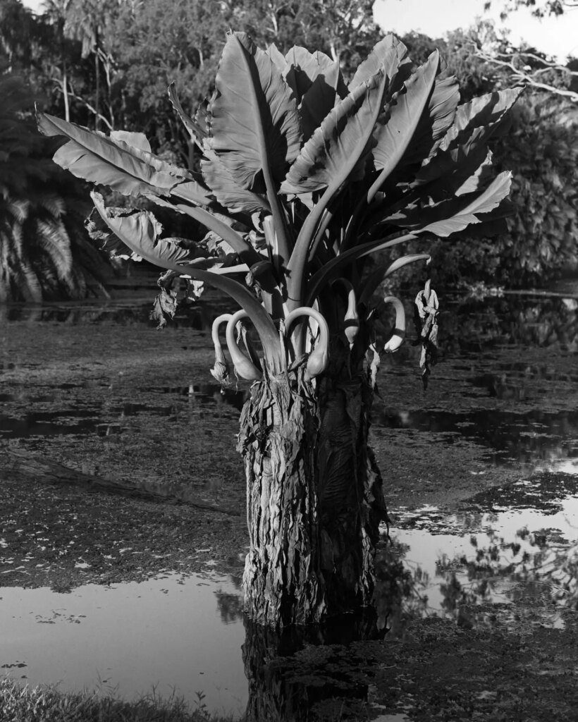
A large aroid (Araceae), possibly Alocasia macrorrhizos (Giant Taro), in the pond at the Townsville Palmetum. Hasselblad 503CX, Zeiss Planar 100mm F3.5, Agfa APX25 (expired 1996) (ISO12), Xtol 1+1.

This is the first time I have seen this plant with fruiting bodies, each of which contains maybe a couple of dozen marble-sized seeds. I recently bought a few rolls of 1990s Agfa APX25 just out of curiosity. The effects of age are indeed present on this roll, with the last two frames showing the imprint of the backing paper, and some uneven development. It’s also not quite as grainless as I expected but it’s pretty smooth. The tonal gradations are also quite nice. I’ve cropped the image to 4×5.
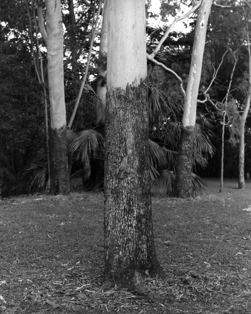
Corymbia tessellaris
Corymbia tessellaris (Moreton Bay Ash) – a magnificent eucalypt with a shiny white trunk and dark rough bark ‘socks’. This species is widespread in north-eastern Australia. Tech details as for 9, except this shot was exposed at ISO25.

One thing I’ve learned from this exercise is that some grainy films (Double-X and Delta 400 in this case) can make very pleasing (to me anyway) images of plants. Both Xtol and Rodinal produced great (albeit different) results in this set.

Some photographers argue that Retro 80S and RPX25 are the same film. I haven’t seen any evidence to counter that argument yet. They are both sharp, extremely fine-grained and work well in compensating developers like H&W Control and FX1 with ISOs of 50 and 100 routinely yielding great images. Both appear to have spectral sensitivities extending into infra-red and both make great images with red plus polarising filters. They both completely suck in 120 however, with every 120 roll I have shot so far imprinting ink from the backing paper onto the film. That includes rolls I have shot and processed within 48 hours of opening the wrapper, so I don’t think the tropical heat and humidity of northern Australia can be fairly blamed for this fault. This is a widely reported problem so I’m amazed that the company that produces these films doesn’t feel the need to address it. I have given up on 120 format of both these films for the time being. In 35mm they are both fine.

I hope you’ve enjoyed these images and I hope they support my introductory argument!

I would like to acknowledge the assistance of 35mmc member, Mathew C, for helping me with the identification of the two Agave species here.

My Flickr page is here.


Share this post:
Find more similar content on 35mmc

Use the tags below to search for more posts on related topics:

Contribute to 35mmc for an ad-free experience.

There are two ways to contribute to 35mmc and experience it without the adverts:

Paid Subscription – £2.99 per month and you’ll never see an advert again! (Free 3-day trial).

Subscribe here.

Content contributor – become a part of the world’s biggest film and alternative photography community blog. All our Contributors have an ad-free experience for life.

Sign up here.

About The Author

By Simon Foale
Repairing and trying out my late grandfather's 1914 No.1 Autographic Kodak Junior initially led me down the film rabbit hole but now that I'm here I might stay for a bit. I am currently based in North Queensland, Australia. I used film for over 20 years before digital but these days I'm keen to indulge my curiosity about some film types I never tried back in the day, including some of the so-called 'document' films. I also like sharing stuff from my film archive.
View Profile

Comments

Art Meripol on 10 Botanical Frames in Black and White – Why on Earth Would You Do It?

Comment posted: 05/03/2024

These are absolutely beautiful. Stunning even. Framed as a collection on a wall it would have great impact.
Doing what others might not sometimes is the best thing you can do.
Reply

Leave a Reply

Your email address will not be published. Required fields are marked *

Simon Foale replied:

Comment posted: 05/03/2024

Thank you so much Art, I appreciate the feedback. All the best with your photography.

Reply

Leave a Reply

Your email address will not be published. Required fields are marked *

Marco Andrés on 10 Botanical Frames in Black and White – Why on Earth Would You Do It?

Comment posted: 05/03/2024

The simple answer to the question: Because the images work. They speak for themselves. Powerfully. And they are a delight to the senses. By using monochrome you’ve made the viewer see the plants in a different light and become aware of their form and texture along with the interplay of shadow and light. They seem so real, so tangible. The Aroid is particularly riveting. Even though it is visual, I can almost touch and feel it. The Bismark Palm looks otherworldly, almost infrared, ghostly. For variety you’ve provided a range of viewpoints – from closeups to mid-distance. You’ve shown great respect for these living beings.
These images demand to be in physical world [printed and framed] in a more intimate setting and to be held and contemplated rather than merely viewed from afar or on a screen. Consider mounting them in an album or, even better, making a book, to tell their story.
Reply

Leave a Reply

Your email address will not be published. Required fields are marked *

Simon Foale replied:

Comment posted: 05/03/2024

Thank you Marco. Appreciate your generous and evocative comments.

Reply

Leave a Reply

Your email address will not be published. Required fields are marked *

Bill White on 10 Botanical Frames in Black and White – Why on Earth Would You Do It?

Comment posted: 05/03/2024

Well done, and informative. Some don't like plants/flowers in B&W, but I love it. Looking forward to Pepper #30. Hahaha!
Reply

Leave a Reply

Your email address will not be published. Required fields are marked *

Simon Foale replied:

Comment posted: 05/03/2024

Thank you Bill.

Reply

Leave a Reply

Your email address will not be published. Required fields are marked *

Daniel Castelli on 10 Botanical Frames in Black and White – Why on Earth Would You Do It?

Comment posted: 05/03/2024

The plants present you with line & shape. The tonal range enhances the graphic look of your work.
Did you use filters? I used to work w/ orange & red filters. Even a green or a blue filter will produce interesting results. Nice work.
Reply

Leave a Reply

Your email address will not be published. Required fields are marked *

Simon Foale replied:

Comment posted: 05/03/2024

Thanks for those filter suggestions Daniel. I've played around with infrared a bit but chose not to include any of those images here. The only image in this story for which I used filters was the Bismarck Palm (yellow and polarising). I've used red and polarising filters with the Bismarck Palms and that can produce a much darker sky (esp with Rollei Retro 80S and RPX25), which is quite dramatic. But I opted for a more subtle look this time.

Reply

Leave a Reply

Your email address will not be published. Required fields are marked *

Richard on 10 Botanical Frames in Black and White – Why on Earth Would You Do It?

Comment posted: 06/03/2024

Excellent!!! I know that most of those images would not have the mesmerizing appeal of light and shadow defining their texture if made in color. The green colors in botanicals usually reduce the textures into murky, hazy looking shapes that tend to blend together in indistiction... with the eye searching for the unique blemish, seed or fleshy scratch. Love them all.
Reply

Leave a Reply

Your email address will not be published. Required fields are marked *

Simon Foale replied:

Comment posted: 06/03/2024

Thank you Richard, glad you enjoyed the images.

Reply

Leave a Reply

Your email address will not be published. Required fields are marked *

Geoff Chaplin on 10 Botanical Frames in Black and White – Why on Earth Would You Do It?

Comment posted: 06/03/2024

Something I too have tried but with nothing like the success you have had. Excellent images and article! Delta 400 grainy? I shoot Foma 100 35mm developed in Rodinal and consider it not particularly grainy - we set the bar at very different levels!
Reply

Leave a Reply

Your email address will not be published. Required fields are marked *

Simon Foale replied:

Comment posted: 06/03/2024

Thanks for the feedback Geoff. I've enjoyed your Foma 100 images developed in Rodinal. In fact they have encouraged me to keep experimenting with Rodinal stand development, which I've had mixed success with, though the rolls that have worked have been great.

Reply

Leave a Reply

Your email address will not be published. Required fields are marked *

A.J. Boer on 10 Botanical Frames in Black and White – Why on Earth Would You Do It?

Comment posted: 06/03/2024

Very nice pictures! I love them.
Reply

Leave a Reply

Your email address will not be published. Required fields are marked *

Simon Foale replied:

Comment posted: 06/03/2024

Thank you A.J.

Reply

Leave a Reply

Your email address will not be published. Required fields are marked *

Will Brown on 10 Botanical Frames in Black and White – Why on Earth Would You Do It?

Comment posted: 06/03/2024

These are beautiful. I’ve never tried Cinestill Double-X, but I’ve had roll sitting here just waiting for some inspiration, and this is definitely it. I also have a fresh batch of Xtol and it looks like a match made in heaven. Do you mind sharing the development time/temperature that you used?
Reply

Leave a Reply

Your email address will not be published. Required fields are marked *

Simon Foale replied:

Comment posted: 06/03/2024

Hi Will, thanks for the feedback. I shot the Double X at 250 and developed it in Xtol at 1+2 dilution for 11 minutes, 30 seconds at 22 degrees Centigrade. Standard small tank agitation regime - 30 secs at the start and 5-10 secs every minute thereafter. The grain with this development is small, even, sharp and quite unobtrusive. I was really surprised by the overall sharpness of the negs and very happy with the tones. Cinestill Double X in 120 has a relatively transparent base and the negs sit nice and flat in the scanner. It's terrific stuff and I would totally encourage you to give it a go. Good luck and enjoy!

Reply

Leave a Reply

Your email address will not be published. Required fields are marked *

Mathew C on 10 Botanical Frames in Black and White – Why on Earth Would You Do It?

Comment posted: 06/03/2024

Hi Simon,

These are great botanical studies. Plants can look great in B&W, the work of Karl Blossfeldt caught my attention many years ago.

It looks as though someone has been switching plant labels. The rosette forming succulent labelled as Trichocereus is actually Agave potatorum and your 'curly cactus' is another member of the Agave family. Likely a variegated type of Agave americana. They're an interesting group of plants with many uses. The terminal flower stems are harvested before maturing and the sugar rich pulp is fermented to make Tequila. The terminal spines on the leaves can be used as sewing needles and the fibres in the leaves can be woven into sisal ropes (A. sisaliana).
Reply

Leave a Reply

Your email address will not be published. Required fields are marked *

Simon Foale replied:

Comment posted: 06/03/2024

Thank you so much Mathew for correcting that mis-identification of Agave potatorum. I have now updated the story accordingly. My botanical knowledge is rudimentary and largely confined to the Western Pacific and Australia, and I know next to nothing about American plants. I appreciate the ethnobotanical info about the Agave group also :) By way of reciprocation, you might enjoy this fascinating story about an early colonial connection between the traditional Philippine coconut spirit (tuba) and Mexican tequila: https://www.sapiens.org/culture/tequila-origins-tuba/

Reply

Leave a Reply

Your email address will not be published. Required fields are marked *

Kary Schumpert on 10 Botanical Frames in Black and White – Why on Earth Would You Do It?

Comment posted: 07/03/2024

These are quite lovely and I wanted more! I think in your photos there is something quite striking in the black and white when we're expecting greens. It helps the eye to see other aspects that might have been ignored in the vibrancy of the greens! Thank you for the inspiration! I loved all of these and your article! For about 10 years I lived in the far north of the midwest of the US, for college and my early professional years, and I was often seeking green and color in the stark grey of winter. I spent a summer working in the college greenhouse, starting and watering plants and falling in love with the greenhouse. Later in Saint Paul, I lived close to and visited the Como Conservatory often because it was cheap ($2 for each visit, no limit on time) and a lovely open and uncrowded spot that gave me my dreams of green, warmth, and vibrancy. Anyway, thank you for a lovely article that inspired both future action (visiting local botanic gardens and just plant wonders in my neighborhood, developing my own film, seeking bright colors in black and white, and paying attention to deep and often ignored details).Thank you!
Reply

Leave a Reply

Your email address will not be published. Required fields are marked *

Simon Foale replied:

Comment posted: 07/03/2024

Thank you for sharing these experiences Kary. I have never been to Saint Paul, but the Como Conservatory sounds like a fabulous place. I currently live in Townsville, which has three botanical gardens, including the Palmetum, where several of the images in this story were made, and all three gardens are wonderful places to wander and marvel at the beauty and mysteries of the plant world. All the best with your photography!

Reply

Leave a Reply

Your email address will not be published. Required fields are marked *

JC on 10 Botanical Frames in Black and White – Why on Earth Would You Do It?

Comment posted: 07/03/2024

Hi Simon,
the flickr link doesn't work for me.
What is your flickr name please ?
Impressive blackandwhite plant portraits here !!!
Cheers, Jens
Reply

Leave a Reply

Your email address will not be published. Required fields are marked *

Simon Foale replied:

Comment posted: 07/03/2024

Thank you Jens! My Flickr name is simonfoale The full url to my Flickr site: https://www.flickr.com/photos/57531507@N02/albums/with/72157674566716726

Reply

Leave a Reply

Your email address will not be published. Required fields are marked *

Paul Quellin on 10 Botanical Frames in Black and White – Why on Earth Would You Do It?

Comment posted: 07/03/2024

Very detailed and enlightening article in so many ways Simon, I really enjoyed it. The subject absolutely deserves the monochrome treatment given the fabulous shapes and patterns involved. I found the film comparisons very informative and the closing remarks about two of the films in 120, very telling. Thank you for a really good read.
Reply

Leave a Reply

Your email address will not be published. Required fields are marked *

Simon Foale replied:

Comment posted: 07/03/2024

Thanks for this Paul. Yes I'm really disappointed in those two Rollei 120 films - I really like them and would love to be able to use them in 120 format, but I have yet to shoot a roll of either that didn't have marks on the emulsion from the backing paper.

Reply

Leave a Reply

Your email address will not be published. Required fields are marked *

Leave a Comment

Leave a Reply

Your email address will not be published. Required fields are marked *