This is my contribution to the “One by Four” series that began with Scott Fergusson’s post four days before this one. You can see Scott’s post here.
To recap, Scott convened a gang of four, (adding also David Pauley and Dean Lawrence) who’d been discussing the values and trepidations around putting one’s work up and inviting critical dialogue, and we each put a work up for feedback from the others. We sent the work around by email and collated what came back into a series of posts, in which mine is the second.
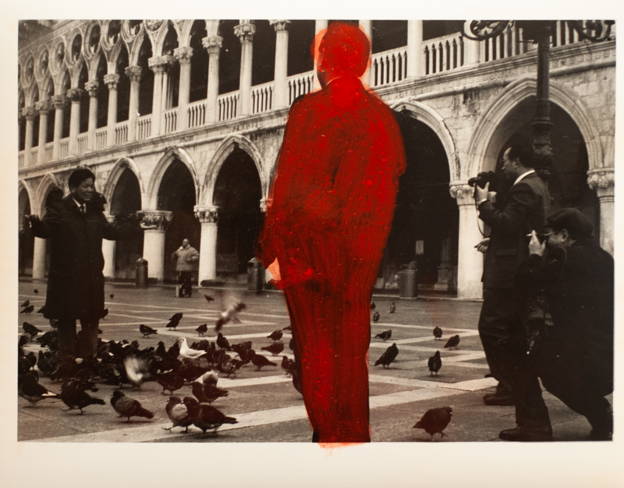
The title of my photo is “San Marco, Venice” silver gelatin print and oil paint 20cm x 25cm 1992-2019.
When it came my turn to throw an image up for the gang I did not want to pre-empt the discussion by saying anything about it before they saw it. Obviously it’s got a big red blob of paint in it, and I figured that if I explained what that was all about I’d be pushing the discussion in a certain direction rather than letting it just evolve naturally, so all I said about my image was that I viewed it as an experiment and it was not part of a series or a work that I would exhibit, and I left at that. In retrospect I should also have said that this image is from a negative I shot myself in 1992 (i.e. it’s not a “found image”) and that it’s a wet silver gelatin print I made myself in 1993 and then overpainted with oil paint in 2019. Okay: over to the discussion.
DEAN L: Oh dear. I’m seriously out of my depth here. I’ve never before seen an image like this. I’ve heard of artists painting over parts of their images, but never seen one, never mind studied one. I won’t for one minute pretend to know the reason for the figure to be painted red. It obviously has a reason, red jumps off the canvas/screen, so that intrigues me. I also want to look further to see what I initially missed. I’m also unsure as to what it is that I find so appealing. A few years ago I would just be confused, now I want to know why.
At first glance I thought Mr Red was a statue, so tall and dominant in the frame but that doesn’t work. What is he to the three other chaps? Anything or nothing? The one chap seems to be a reporter or such being filmed, interviewed by the other two. Which then leaves Mr Red. What is he? Even if he were not red, why is he so prominent in the frame? I honestly don’t know. I do know if I were to view this in an exhibition I’d be looking for quite a while.
DAVID H: Dean, thanks a lot, that is a very gratifying comment. One of my core beliefs is that because photography is visual medium a photograph needs to communicate visually first and foremost, without any back story, and a successful photo will get you in on first viewing but then also hold an interest over longer examination. I’m sorry that you felt out of your depth but I don’t think you need to. I think that’s part of a general problem in the visual arts; it’s a bit like people feel there’s a secret language and you have to be one of the club to get the meaning. That’s not my intention, and I’m trying to make work that speaks to everyone, whether or not they are arts practitioners. My goal is to make work that’s inclusive, and if you’re interested in this pic that’s all I could ask for.
DAVID P: I liked this photo when I first saw it – I still do – though I don’t pretend to understand it. The thickly applied red paint covering the central figure is arresting and seems on a lingering look to emphasize a certain weirdness in the original print. These three men seem to have a relationship to one another (I first saw the central figure and the photographer to the right as photojournalists or perhaps paparazzi pursuing the figure on the left, who has a commanding presence and seems to be in midst of speaking). Looking closer at Red Guy, who it turns out has no camera or other such role marker, this interpretation breaks down. I’m left wondering what the hell is going on, unsettled, and feeling like there must be a pecking order here — as with the inevitable San Marco pigeons — but not one I am destined to understand. Formally though I still like the original composition (it has a classic feel to it) and the brisk reworking/revision/desecration of it that comes with the red paint. Am eager to hear more about this experiment…
DAVID H: Thanks David P. There’s some overlap with your observation and Dean’s and I’ll just repeat that it’s great from my point of view that the picture holds your interest. To reveal something of the original photo, this is a group that I came across in Saint Marks Square, from memory early one morning (and this is borne out by lack of other people around and the fact that the chairs aren’t yet out by the cafes.) It’s not obvious from this print, but at the time it seemed pretty clear to me that these were Japanese businessman on a trip. I could hear them talking and it looked like they were having a bit of early recreation in the square but they were all dressed in suits and ties and treated each other in a pretty formal manner. Scott also commented on this below. What’s interesting is that it was that feature – their composition, the relationships and the pigeon cliché that prompted me to take the picture in the first place, but then as I moved on and returned to it later with the red paint my focus had changed and I was no longer so interested in that. It was nice to be reminded by your comments that there was actually a reason that I took this photo in the first place!
SCOTT F: When I first look at this photo, the hand-painted figure in red dominates, as I’m sure you intended. For a certain prolonged moment, that big splash of red at the centre of the frame is all I could really manage to think about. The quality of the painted layer is somewhat careless/slapdash, or ‘expressionistic’ if I were to use more of an art critic terms. The contrast between paint layer and the underlying photo taken in one of the great architectural spaces of Europe is very interesting.
It takes a minute for all of the interesting details of the photo layer of the image to start to emerge and resolve in my mind. It would be unsurprising to me if you told me that this was a shot you found of some important moment in Italian politics from the 1960’s. The more I look at it the more incongruous the underlying image becomes — it feels like some kind of public-facing event with a speaker and some photojournalists covering what he has to say, but there is literally no one else there but the two photographers, the speaker, a random person in the deeper background, and the mysterious red figure. It looks like a press conference for pigeons!
DAVID H: Thanks Scott and your own back story is way more interesting than the sad truth that the genesis is just a prosaic bunch of businessman and not a great political event. This would be clearer too if you cloud see the original and not just a scan on WordPress, because in the print you can just see that the main guy has a pigeon on each shoulder.
But now you know that part of it I can address the big red elephant in the room.
The main reason for the overpainting is to change the nature of the work from a record of an event into something that becomes an aesthetic object in itself. I want the viewer to not to think of it as a representation of four guys in San Marco, but rather as a piece of paper with silver halides and oil paint on it that has become an image with its own life. That’s not an original or hard-core artistic ruse and like I say this is a bit of a punctuation point in developing work; perhaps like an entry in a visual diary. I made it at a time when I was exploring new ideas that eventually came together in an exhibition that you can see on my site here, or directly on the gallery site here. I want to keep this piece about the discussion process and not about where my work ended up, so I’ll leave it at that. It’s interesting that the possibility that is was a found photo came up, because I was to a degree referencing the work of the American artist John Baldassari who would sometimes paint over areas in found photographs, thus changing their meaning. I’ll also add that the red is also a nod to Rubylith masking, where a sheet of translucent red (the colour of a safelight in darkroom printing,) is something our eyes can see but that the paper cannot. But I will leave enough as enough but certainly invite anyone who cares to look those things up or ask for more detail/links in the comments.
Thanks to my collaborators Scott Fergusson, David Pauley and Dean Lawrence for this fun exercise. The discussion round Scott’s post has been great, and to reinforce his comments – feedback, thoughts, critiques on this work; are all welcome and encouraged. Thanks all for reading.
Share this post:
Comments
Charles Young on One By Four – A One Shot Story Told by Four Photographers
Comment posted: 14/10/2025
Comment posted: 14/10/2025
Comment posted: 14/10/2025
Comment posted: 14/10/2025
Ibraar Hussain on One By Four – A One Shot Story Told by Four Photographers
Comment posted: 14/10/2025
A vivid contrast with the pigeon man being photographed, as if an Alien has just appeared who wasn't supposed to be there!