This post came as something of an outgrowth of my big spring/summer 2025 Black & White Survey which featured in five installments here on 35mmc. As I was moving through the late stages of the b&w survey, which consisted of pushing many of the popular 400 ISO films two stops to 1600, Hamish suggested it might be interesting to see what happens when I tried pushing color.
I didn’t hesitate a second. One, I’ve discovered I’m a bit of a sucker for a ‘project’ related to my newfound hobby of film photography, and Two, I was so pleased by the results of my experiments/experiences pushing b&w films that I was keen to see if I could enjoy the same benefits using color film.
It took a while to get this project on its legs. I was still working through the black & white survey, and pushing color felt like a 35mm application, so I had to go one roll at a time on the M3, while still shooting black & white films for Part 4. The first roll I tried pushing was some Kodak Ultramax I had in the fridge. I had picked up a couple of rolls inspired by a post of David Pauley’s where he shot a roll in NYC at dusk going into night.
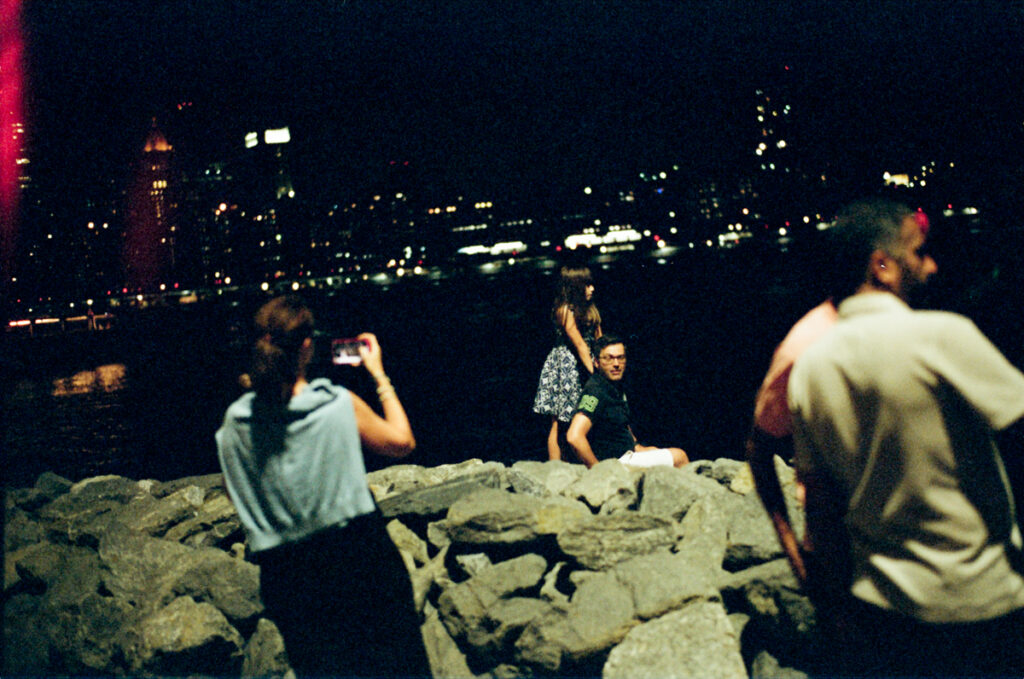
My first shot was an attempt at a night shot in Provincetown, MA on the last night of a family trip.
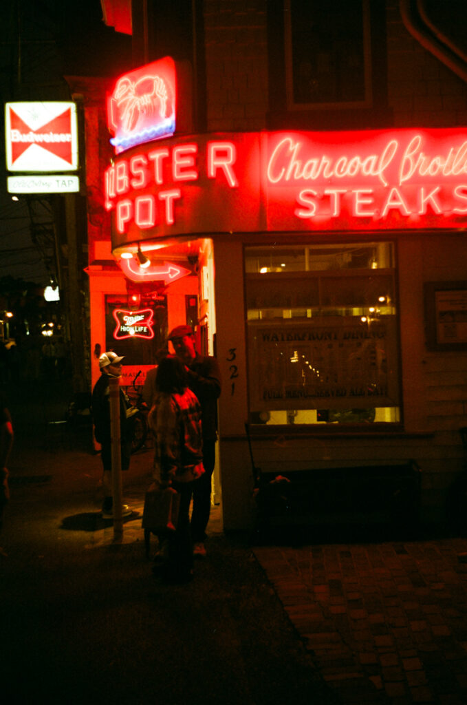
The red neon is so dominant that it doesn’t tell me much about other colors in the spectrum, but I like the atmosphere of the shot and the deep blacks hold up nicely against the figures that show up in pools of light.
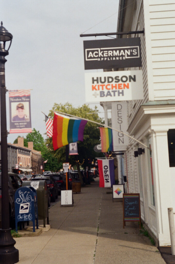
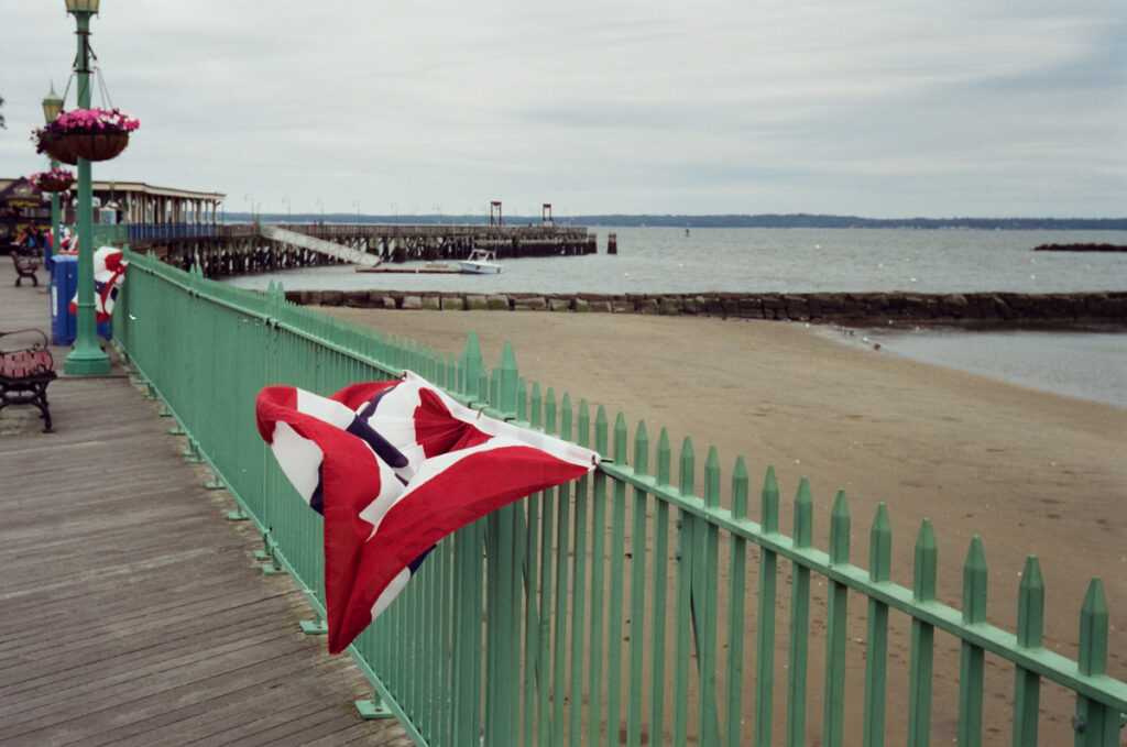
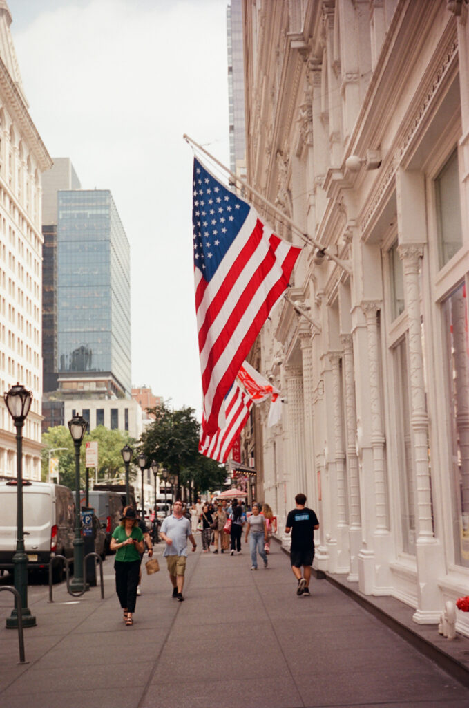
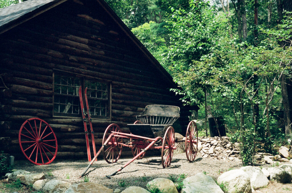
Our next outing was to a gallery opening in Hudson, NY. This sidewalk shot is nothing to write home about — the high midday sun isn’t my favorite and it wasn’t my finest moment in terms of hitting focus, but I include it here to give a feel for how Ultramax renders color with the help of a rainbow flag for reference.
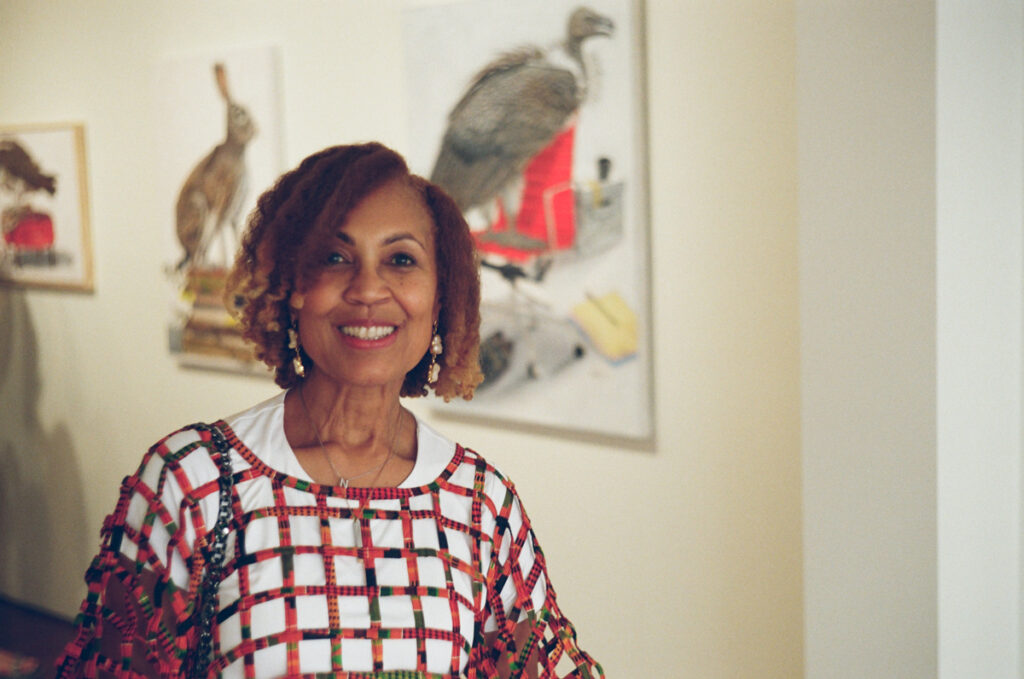
I also tried an indoor portrait at the gallery opening, and thought it looked pretty good.
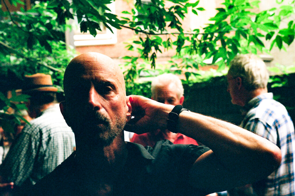
An outdoor portrait of a friend in much trickier lighting was not uninteresting, but maybe more dramatic than pleasing, perhaps with too much detail lost in the blacks. To be honest, this frame feels like it would be much better in monochrome, c’est la vie. As an initial foray into pushing color film, Utramax was a bit of a mixed bag for me.
Next up, I tried Cinestill 400D, having read that Cinestill films were among the best color films to push. Since I was shooting color, I decided to try a location where there was plenty of it, a local amusement park just outside of NYC.
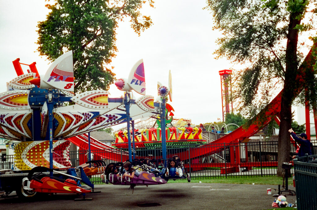
This shot of one of the rides shows very strong performance in rendering bold colors even in somewhat drab overcast conditions, but there’s something going on with some halation around the edges of the trees and the rides against the bright sky. Cinestill has a bit of a reputation for halation with light sources at night and it may apply here to a brightly backlit scene in daylight.
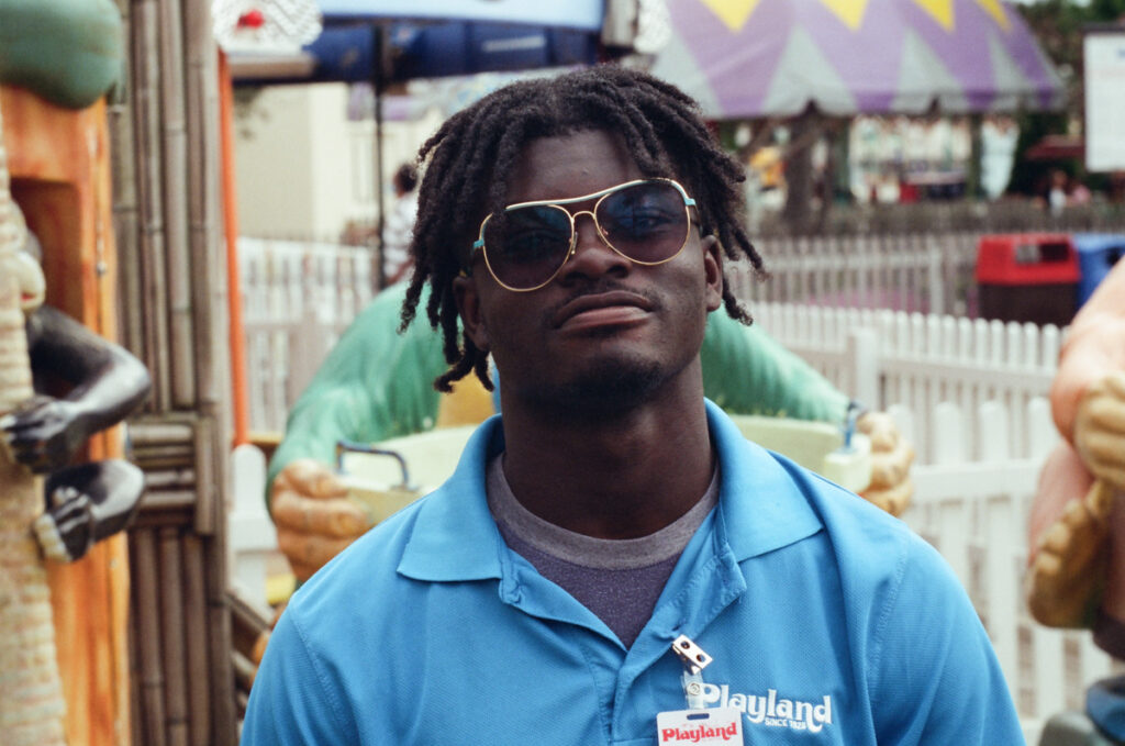
This portrait, shown previously in my Jamel Shabazz post, is a favorite and looks technically great as well.
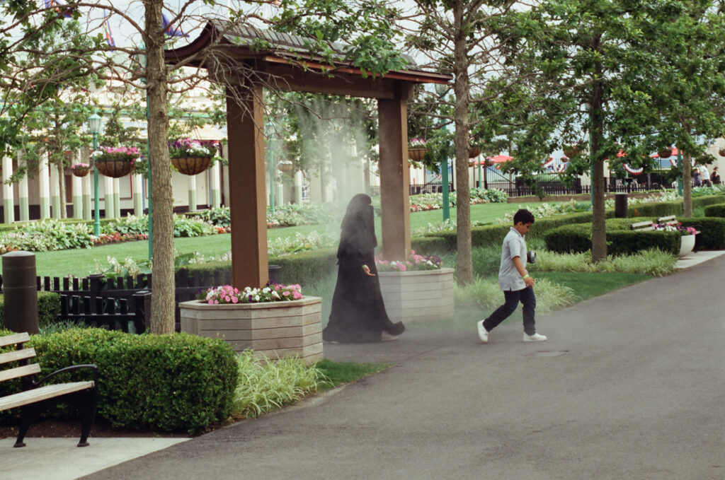
I love the way the mist plays against the almost silhouetted figure of the woman crossing through the cooling spray. There is a faint whiff of ‘sci fi’ iconography in the image, as if someone has just been transported from another planet or universe thought that portal. I love the way people from cultures from all over the world happily mix and share NYC, so maybe there’s something to the ‘portal from a faraway place’ to this image.
I think the color and details of the bunting flowing in the wind are spot on and look great.
I also gave Cinestill 400D a run out at night on the Brooklyn waterfront.
Putting the halation issue to the side for the moment, I am pretty impressed with Cinestill 400D when shot at 1600. I think it holds up quite impressively in terms of grain, sharpness and detail, and the colors seem very accurate to the best of my memory. With the possible exception of the nighttime shot, I don’t think it would be easy to identify shots like these as having been pushed two stops. I think they are very competitive with color shot at box speed.
Next up was a roll of Portra 400.
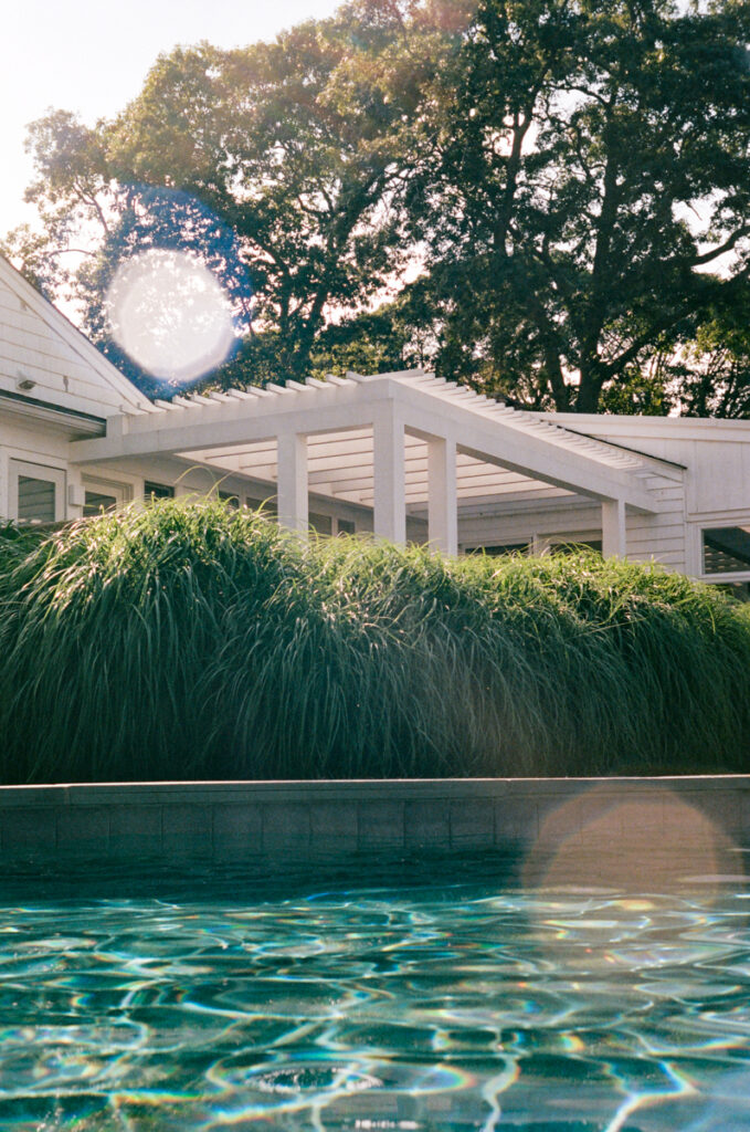
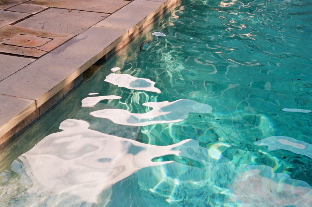
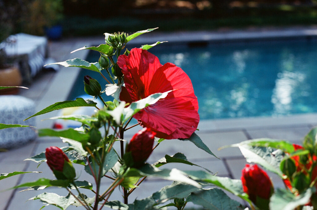
I like the richness of the colors in the shot of the pool and the flare and bokeh from the strong sunlight. (I’m also glad I have the older Summitar with the 10-bladed aperture instead of the hexagon on a shot like this.)
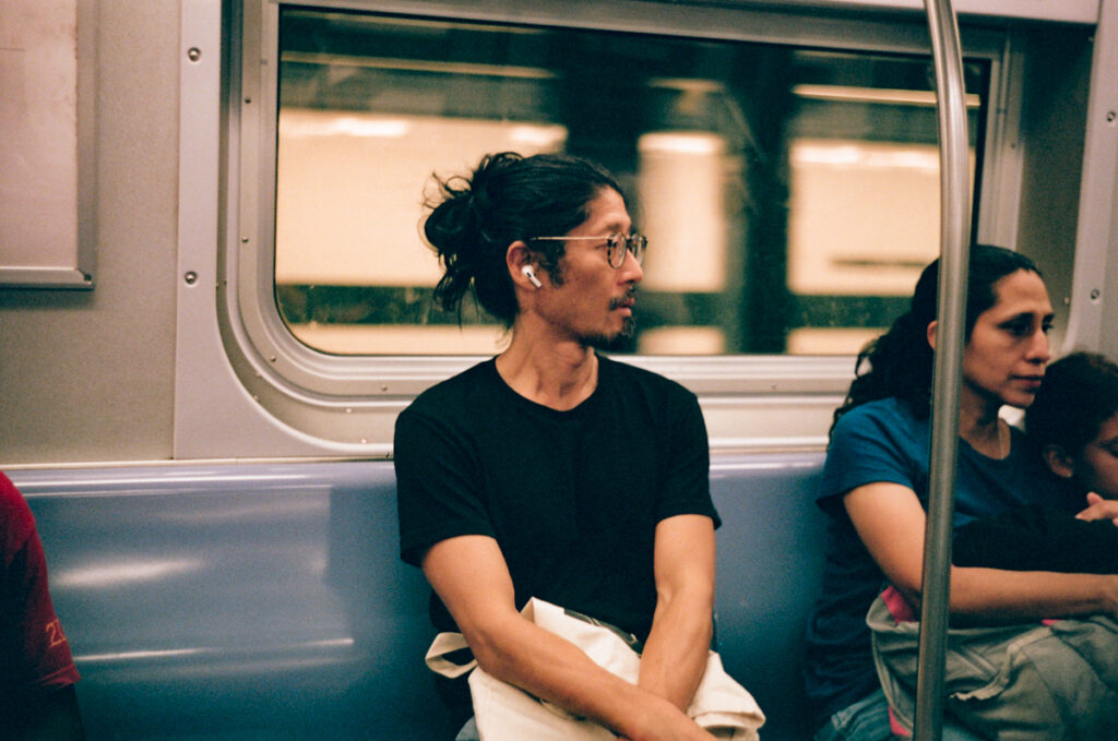
Portra 400 also does pretty well in lower light situations, like here in the NYC Subway…
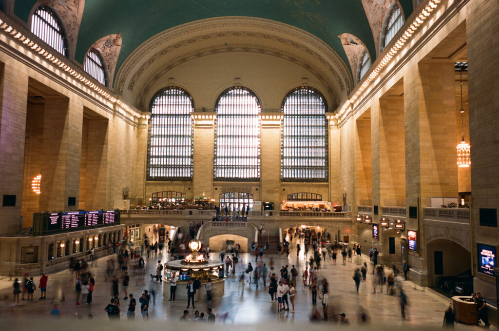
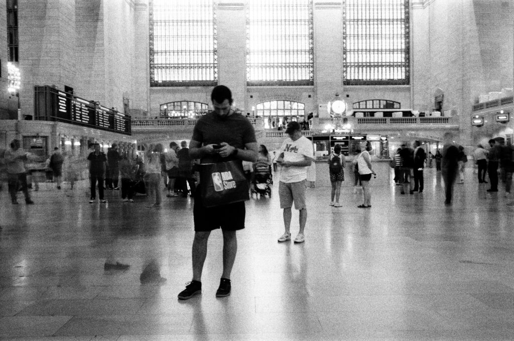
… or for a long exposure in Grand Central Terminal.
I think Portra 400 looks quite good when pushed in high, medium and low light situations. I don’t see anything distracting or problematic in the grain or sharpness, and I’d say the colors look pretty accurate to me.
Upping the ante a bit, I tried some of the 800 ISO color stocks pushed two stops to 3200. First up was Cinestill 800T.
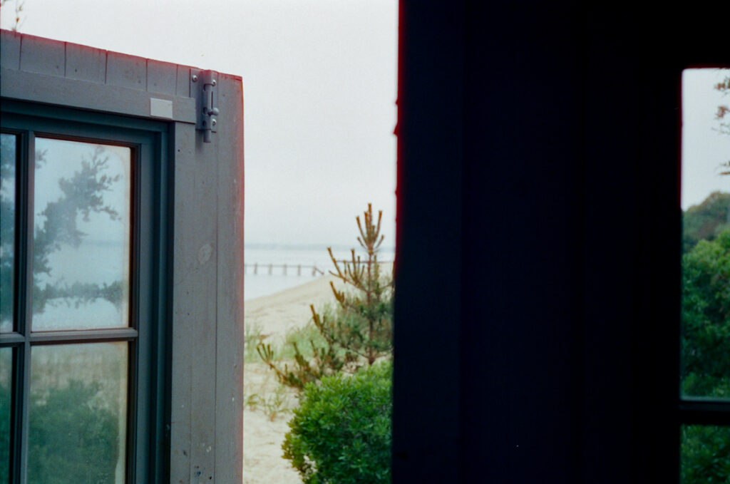
This is a favorite and feels a bit dreamy and poetic with the misty overcast Shelter Island waterfront framed by the slightly open doorway. But again with Cinestill, there’s something going on with halation at the edges against a backlight, in this case a pretty soft back light. Perhaps that gives this frame a vintage feel like an old print that has faded a bit, but I think that might be a post hoc rationalization on my part as much as an actual virtue of the shot.
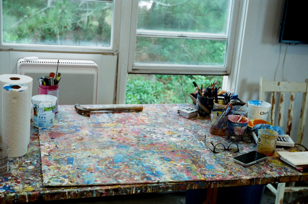
Good range of colors on the painter’s table, if a bit muted.
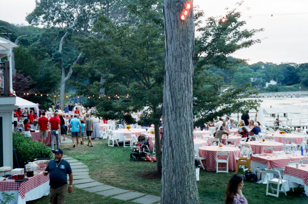
Again, some halation on the light bulbs, and generally soft but accurate color rendering at this 4th of July celebration that was actually on July 11th because it was much more affordable for this small Long Island community to schedule their Fireworks a week after the holiday.
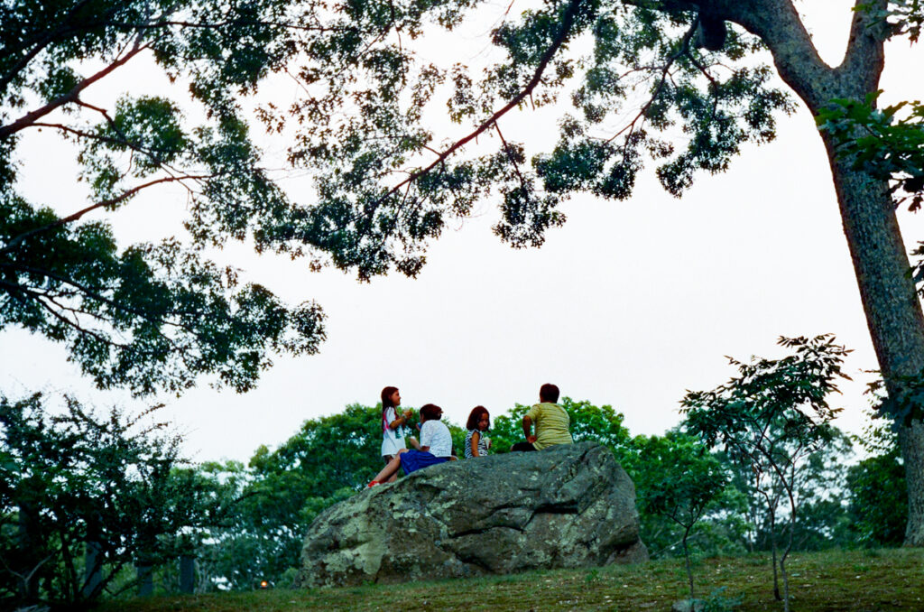
While there are a couple of shots I like quite a bit creatively from this roll, including the shot through the open door and the children waiting for the fireworks, I can’t say that I feel all that excited about Cinestill 800T on a technical level so far. While preparing this post, I was looking in my Lightroom Library at my overall results on 800T, and I realized the rolls I shot at box speed don’t look all that great to me either. Perhaps I’m missing something in terms of shooting a Tungsten balanced film? I’ve tried shooting with and without corrective tungsten to daylight filters (a Leica “A” filter) and indoor lighting isn’t as easy to predict in terms of color temperature in the era of LED lighting. Hmmm…
Ok, on to Portra 800…
That’s more like it.

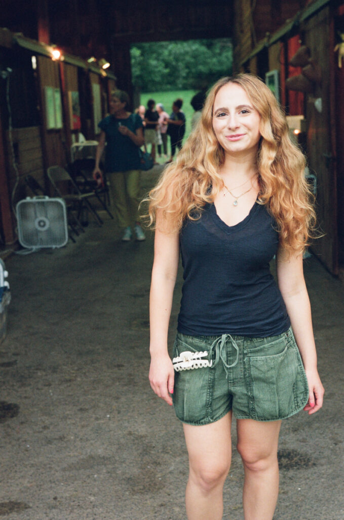
These shots are from “Upstate Art” weekend, where artists from all over the region showed their work in pop-up exhibits all over the Hudson Valley, including here in a friend’s converted stable. I like this shot of a very sweet & shy, but talented artist posing for a portrait in her way.
I think Portra 800 looks quite natural in this shot of a young filmmaker who was showing a reel of her films in one of the barn stalls.
I’d say Portra 800 holds up pretty well at 3200. I think the grain and sharpness hold up well, and the colors look pretty good to me.
My last stop on the tour of pushing color films was Fujifilm 400 Color. I haven’t shot a lot of Fuji, and I remember some kind of rumor that Fujifilm Color was repackaged Kodak Ultramax. I’d welcome any insights into that situation from the readership, but if it is repackaged Kodak, this wouldn’t be the first time I’ve shot the same emulsion twice under two different labels (and came up with different results)…
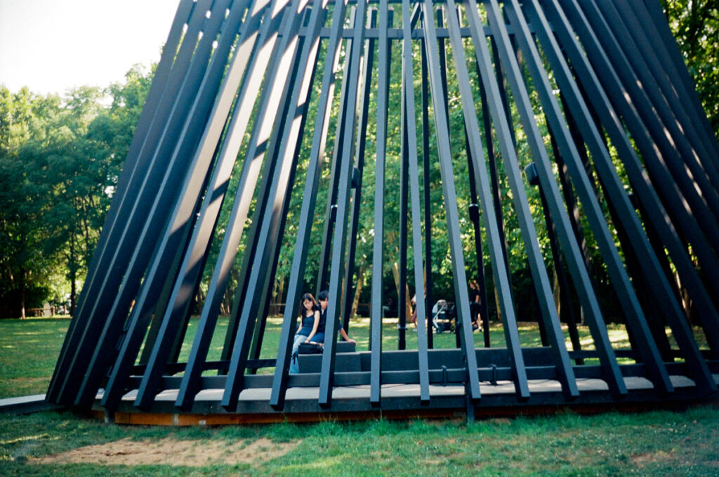
I like the tonal range going from deep black shadows to bright highlight in this shot of a young couple in Torkwase Dyson’s immersive sound sculpture, Akua, currently installed in the Brooklyn Bridge Park.
I also went inside AKUA and took a few shots while enjoying the sound montage. Here Fujifilm holds up very well with strong colors and no halation against the strong backlight of the midday summer sky.
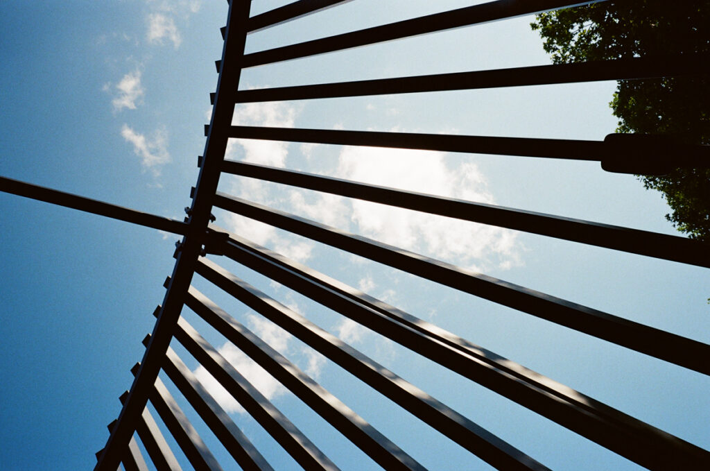
More good tonal range from Fujifilm 400 Color, without losing details when going from deep shadows to bright highlights.
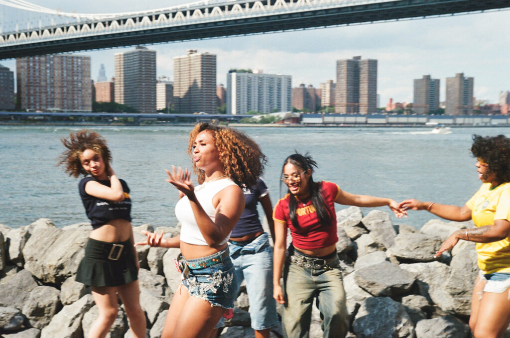
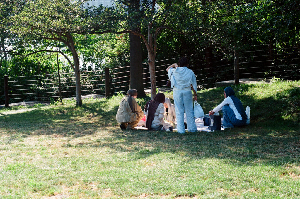
These young women looked like they were having a great time shooting a music video on the Brooklyn waterfront. Based on this one roll, I would say that Fujifilm 400 Color does very well when pushed and is on par with some of the other 400 ISO color stocks in this survey, even without taking its relatively friendly price point into consideration. I see more Fuji in my future!
And that’s what I’ve got! I’m very happy to hear from the readership about films I may have missed, noting that for the moment I have avoided the ‘novelty’ color films that boost, suppress or invert certain parts of the spectrum, as well as any non C-41 films, since they require either a specialty lab or separate developers. I’m also a little shy about Lomo 800 and the new or old Phoenix films, but am open to people who’ve had good experiences with stocks I haven’t hit.
In terms of how I’d rate the different films, I’d probably go with Portra 400 as the ‘best in class’ for providing great results and super reliable performance. But this survey’s ‘Darkhorse,’ Fujifilm 400 is close on Portra 400’s heels and a great bargain alternative if you’re trying to stretch your film budget.
I have more complex feelings about Cinestill 400D. 400D was probably my overall favorite in terms of grain, color rendering and detail, but I’m scratching my head a bit about how I feel about the halation. Thanks to a wikipedia article shared by 35mmc stalwart Geoff Chaplin, I am now aware that part of Cinestill’s manufacturing/design process is the removal of the anti-halation layer when they convert it from motion picture to still film to make it work in C41 developers. Without the anti-halation layer, apparently strong light will reflect back off the pressure plate onto the film during exposure, creating the glowing ‘bleed’ on the edges of light sources. This raises a bit of a conundrum, especially if part of the appeal of Cinestill is in how well it does when you push it one or more stops… Hmmm.
I suppose if you love Cinestill 400D in every other way, you have to “learn to stop worrying and love halation” (homage to Dr. Strangelove intended) or figure out how to compensate for it it while shooting, as it is literally baked in to the physics and chemistry of those films. I think I might grow to like the halation as a bit of an ‘effect’ when doing dusky or night shots with glowing lightbulbs where it can be a creative choice a bit like trying to get flare or strong bokeh. I think I like it less when it’s a ‘bleed’ around the edges of doorways and trees in bright daylight, which feels like a mistake or a problem. I like shooting with backlight when I can and so might want to think about the best times to shoot 400D. It may be worth the effort, because halation aside, again I think I might like 400D the best of all the films in this survey.
I hope that this post is useful for the 35mmc community and anyone interested in pushing color films. I’ll confess that this ‘project’ was a good bit less exciting to me than my much bigger and deeper look into black & white emulsions. I think that may be down to the relatively fewer options in color film out there on the market and because to my eye, there isn’t as wide a creative range separating the different options. You can find major black & white choices that go from super fine grain to very chunky, and varying levels of contrast to give very different looks and feels. It feels like the most salient creative choices in color come down to whether you want to embrace halation as an intended effect, and/or try to figure out how to take proper advantage of a tungsten balanced emulsion, which I haven’t really figured out yet. Maybe another project down the line…
With those caveats, the excellent news is that — as in the B&W survey — doing this post has freed me from the fear of pushing color film. I hope it will do the same for anyone reading this!
CODA: While waiting for this post to go online, I actually pushed a roll of Ektar one stop to 200 while trying out a Leica R6.2. I think it looks pretty good!
I guess the takeaway from my R&D into pushing both color and B&W is that going forward I’ll be thinking of a film’s ISO rating as more of a polite suggestion than a stern command…
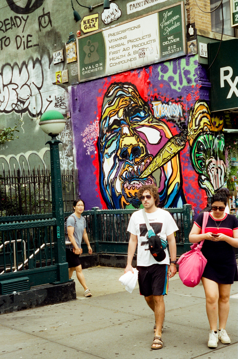
Featured Image: 2ND AVENUE F TRAIN STOP, Leica M3, Leitz Summitar 50mm f2, Cinestill 400D @ 1600
Share this post:


Comments
Geoff Chaplin on Pushing Color – A Survey of Popular Color Films Pushed By Two Stops
Comment posted: 18/09/2025
Reiner on Pushing Color – A Survey of Popular Color Films Pushed By Two Stops
Comment posted: 18/09/2025
Great article!
David Hume on Pushing Color – A Survey of Popular Color Films Pushed By Two Stops
Comment posted: 18/09/2025
Comment posted: 18/09/2025
Thomas Wolstenholme on Pushing Color – A Survey of Popular Color Films Pushed By Two Stops
Comment posted: 18/09/2025
But then, perhaps much of all this is more a matter of taste. Nevertheless, this is useful information. Thank you for undertaking this project.