Gravity on Pause – A One Shot Story

By Andrea Monti

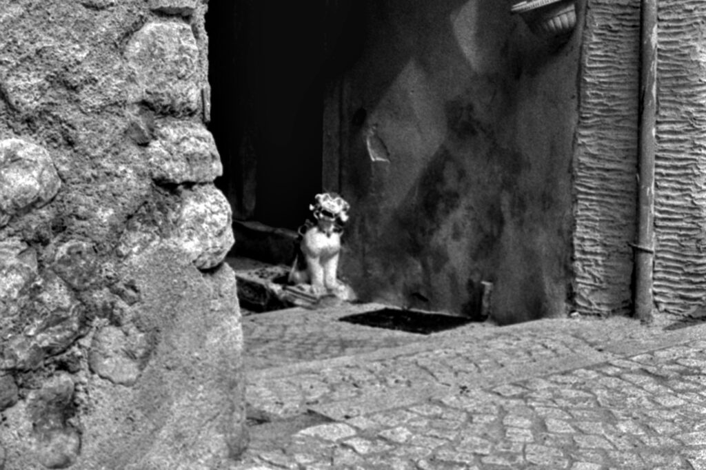
This a casual shot taken while I was wandering around without actually thinking about taking photographs. Setting aside the photographic quality of the image for a moment, I was amazed that it looks far better in black and white than it did when it was initially shot in colour.


Actually, when I first saw it, I blamed the kit (a Summicron M and an X-T5) for such a poor performance. The main subject is in focus and the aperture and shutter speed are correct. There are no issues with the white balance or tint. Nevertheless, I’m not particularly impressed by this photo.

By contrast, the black-and-white version is, please forgive the pun, a horse of a different colour. The performer naturally pops out from the screen, as demonstrated by how its left shoe in the foreground stands out from the three in the background.

This version of the original image has rehabilitated the photo kit of choice, still it raises a new set questions: is it possible that, when used with a modern 40 megapixel camera, a lens made in the early seventies may struggle with colours and is still usable in black and white? Or was the difference between the two versions simply down to chance or an error on the photographer’s part?

To further explore the matter, I plan to mount the Summicron on a Fujifilm X-T4 to see how its 24-megapixel sensor performs in colour and black and white. This will allow me to test the suspect that new sensors are less tolerant toward old lenses.

Youngsters don’t respect elders anymore, do they?

Share this post:

About The Author

By Andrea Monti
My name is Andrea Monti. I’m an Italian free-lance journalist, photographer and – in my spare time – an hi-tech lawyer. The works I am more proud of are covering live jazz, pop and rock concerts for an Italian online music magazine and Opera and prose for a 200 years-old theatre. I also do sport photography mainly in athletics and fighting disciplines. You may find out more about me on https://andrea.monti.photography
Read More Articles From Andrea Monti

Find more similar content on 35mmc

Use the tags below to search for more posts on related topics:

Donate to the upkeep, or contribute to 35mmc for an ad-free experience.

There are two ways to contribute to 35mmc and experience it without the adverts:

Paid Subscription – £2.99 per month and you’ll never see an advert again! (Free 3-day trial).
If you think £2.99 a month is too little, then please subscribe and I can manually edit the subscription value for you – thank you very much in advance if this is what you would like to do!

Subscribe here.

Content contributor – become a part of the world’s biggest film and alternative photography community blog. All our Contributors have an ad-free experience for life.

Sign up here.

Make a donation – If you would simply like to support Hamish Gill and 35mmc financially, you can also do so via ko-fi

Donate to 35mmc here.

Comments

Martin on Gravity on Pause – A One Shot Story

Comment posted: 19/09/2025

Youngsters don’t respect elders anymore, do they?....

Never did, honestly. ;-)
Reply

Leave a Reply

Your email address will not be published. Required fields are marked *


Gary Smith on Gravity on Pause – A One Shot Story

Comment posted: 19/09/2025

And you are leaving the conversion to black and white up to each of us!
Reply

Leave a Reply

Your email address will not be published. Required fields are marked *


Richard Arbib on Gravity on Pause – A One Shot Story

Comment posted: 19/09/2025

I prefer your color version to the black & white. The dancer has much brighter colors than the others. The color contrast makes him stand out more than in the black & white photo.
Reply

Leave a Reply

Your email address will not be published. Required fields are marked *


Tony Warren on Gravity on Pause – A One Shot Story

Comment posted: 19/09/2025

Just shows how personal taste influences reaction to an image doesn't it. The mono version has more impact for me but the colour is attractive because the break dancer has the only colour (apart from the rubbish bin!) to make him stand out. Tonal contrast for the mono and colour contrast in the other. That bin...ouch!
Reply

Leave a Reply

Your email address will not be published. Required fields are marked *


Leave a Comment

Leave a Reply

Your email address will not be published. Required fields are marked *