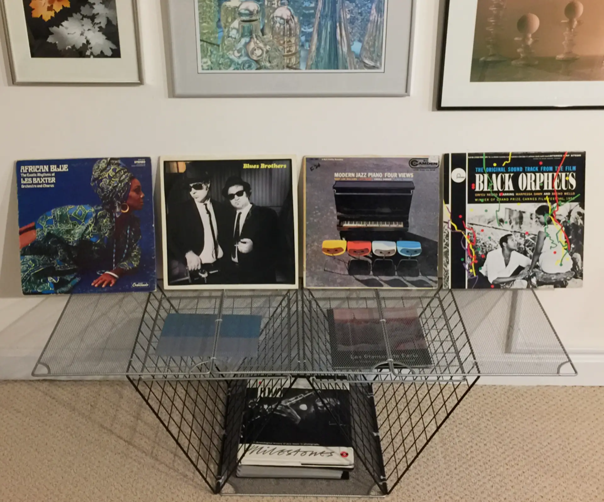
In my basement photo gallery/office, I don’t rotate my prints as often as I should. To lessen my guilt a bit, I keep the gallery “fresher” with a rotating exhibit of artful LPs. And I didn’t need to buy expensive album frames or hammer nails in the wall to do it.
Graphics and Stories Over “Value”
It’s well known that bespoke drawings and paintings by famous artists have driven demand and prices for some vintage albums to great heights. Coming immediately to mind are the Beatles’ 1st-state Yesterday and Today “butcher cover” and Andy Warhol’s “banana” covers for the Velvet Underground & Nico.
Other examples abound. A surprising one is Jackie Gleason’s fairly well-known 1955 easy-listening LP “Lonesome Echo.” A good friend of his– Salvador Dali– painted its cover image and supplied enigmatic jacket notes on how to interpret it. And since Dali created the art specifically for the record, many consider each album to be a limited-edition Dali print! As a result, the Discogs music database indicates that it has recently sold for between $2.25 and $30.43 USD.
But since this is 35mmc, I’ll focus here on albums with photo covers. They may not yet enjoy comparable prices and “collectability,” but MoMA’s 2015 announcement that it expanded its LP-cover-design collection with more photography suggests that this could change.
History indicates it might for albums that:
- Bear images shot specifically for them by well-known photographers. (While many albums feature Ansel Adams photos, as far as I know, they were all licensed, and Ansel never shot for specific LPs.)
- Had fairly limited distribution and/or low survival rates. (Fortunately, all LPs are inherently limited editions… with some more limited than others.) Usually, the most “valuable” albums are both limited in supply and high in demand.
- Have interesting design, layout or production techniques. (Another Warhol reference here… to his “peel” and “zipper” covers.)
- Are inherently rare for other reasons. For instance, “mono” versions of albums normally mastered in stereo– and vice versa— may be in more demand than their common variants. But this isn’t always the case.
- And as you’ll soon see, a good backstory can help!
Digging for Treasures
I display albums more for their music, graphics or interesting backstories than their market value or collectability. I never deliberately bought with those in mind. But when I began this article, I wondered how many potential collectibles I may have snagged over the years without even knowing it.
So I spent several enjoyable evenings peering through a loupe at the photo credits for 400 albums (not a big number by audiophile standards). The following shots display some of my better finds.
NOTE: The following albums aren’t in the opening image. I wasn’t familiar with their photographers, and want to research them further.
But here’s what I found for four better-known shooters:
Pete Turner
Five of my LPs have Pete Turner covers. He apparently had a special relationship with jazz producer Creed Taylor, so some of his covers could have been bespoke… while others may have been licensed from stock. Below are two normal albums and one gate-fold that Turner shot for Stanley Turrentine:
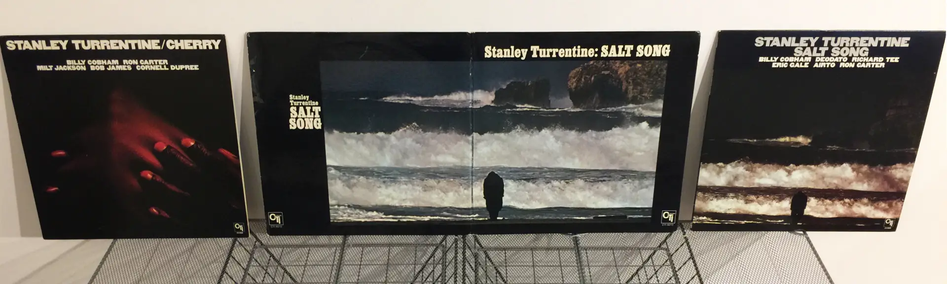
NOTE: The gate-fold album in the middle and the normal album to its right are both “SALT SONG” and have the same tracks. The gate-fold came later, and I surmise it may have been released because Turner’s photo was too dark on the earlier sleeve. But I could be wrong.
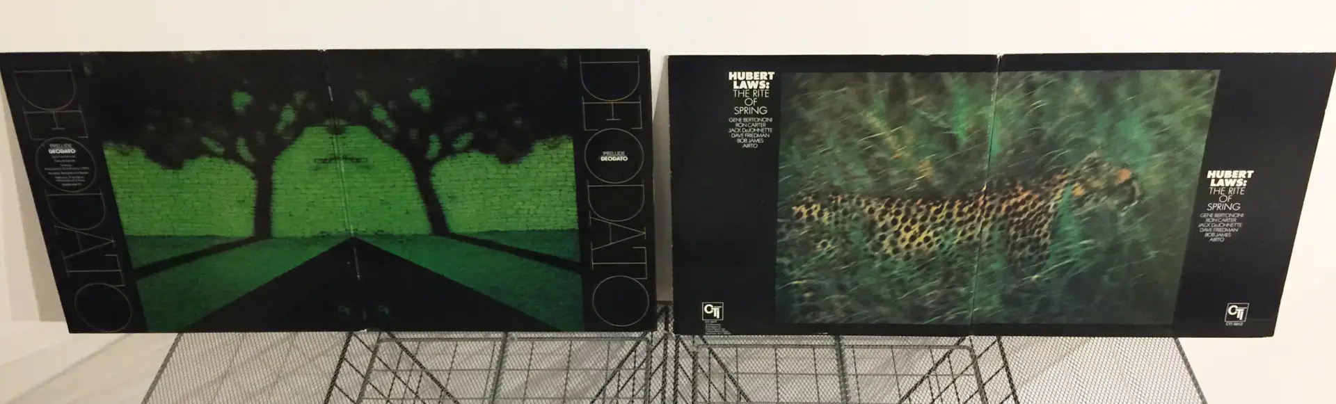
And here are two Turner gate-folds for Deodato and Hubert Laws. Funny how much they look like flat-screen TVs! (I once had more Turner LPs… but gave some to a friend.):
Francesco Scavullo
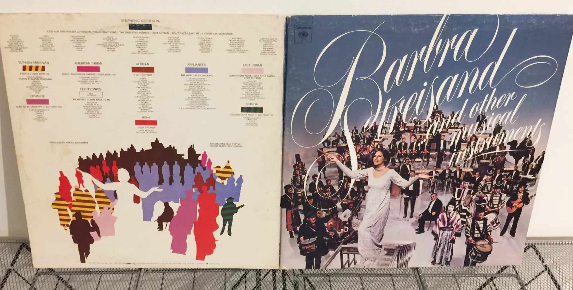
Francesco Scavullo shot these covers for Barbra Streisand, Judy Collins (both front and back portraits), Gato Barbieri and Donna Summer (a tri-fold album):
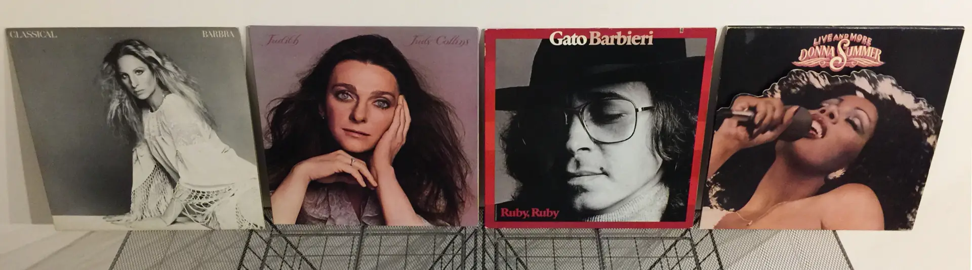
Scavullo was a well-known photographer both in (and beyond) the music biz.
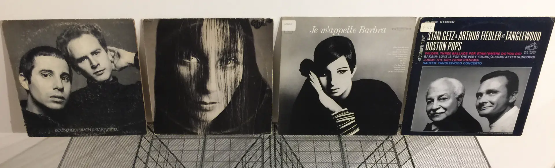
Richard Avedon
I was pleased– but not surprised– to find four Richard Avedon covers: for Simon & Garfunkel, Cher (front and back portraits), Barbra Streisand, and Stan Getz&Arthur Fiedler:
And a Surprise!
But my most surprising find was this 1950 Pablo Casals “Prades Festival” cover by the great Margaret Bourke-White (her credit line is along the upper-left edge):
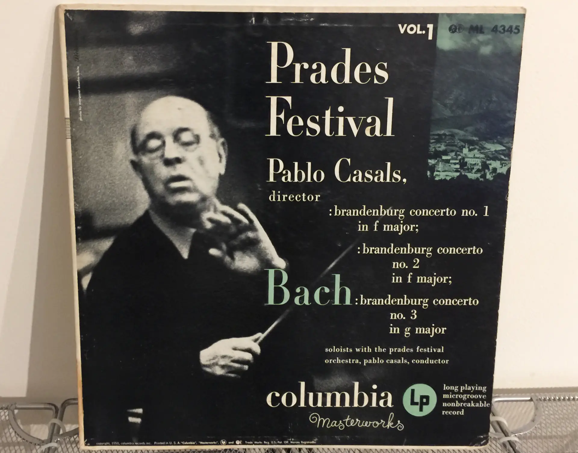
According to the above link, she was “the first photographer for Fortune, the first Western professional photographer permitted into the Soviet Union, Life magazine’s first female photographer, and the first female war correspondent credentialed to work in combat zones during World War II.”
I wonder how many other old, easily overlooked, albums Margaret and her mid-century peers blessed with their immense talents? They may tick many boxes of future collectability.
Realistically Though
Even blessed with a bespoke Bourke-White cover, and with probably few other copies out there, the above album may still be best treated as a conversation starter over cocktails at my gallery wall! Discogs supports this, indicating that collectors recently paid from $2.25 to $15 for the album. But demand is still low for such records and their perceived “worth” is not high.
That may also apply to the other albums in this article. Yes, MoMA is exhibiting more photo covers. But that may be more for their graphic interest than their monetary value. Still, LPs don’t have to be worth a lot to liven up a room!
Don’t Discount Quirky!
A Gutsy Streisand:
Historically, some albums become popular– and perhaps even collectible— simply because they’re quirky or have a cool backstory. Here are three that I found in my stacks:
In November 1973, my family witnessed what to this day has to be one of the bravest live television specials ever. Titled Barbra Streisand and Other Musical Instruments, it was reportedly broadcast to “improve Streisand’s image and sound” (whatever that was supposed to mean).
Her manager decided to make it a “world music” event, which should have been fine. And Barbra reportedly requested that she be accompanied by “some of the world’s greatest musicians.” Instead, she got:
- One well-known musician (Ray Charles) plus the “world’s greatest musical-saw player”
- A 150-piece orchestra that included players of the Darabuka, Ching Ya-Grin, O-daiko, Koto, Chippewai tom-tom, Axatse, Boo-Bams, Twanga, Elephant Horn, Jingle Stick, cow bells, wind chimes, bagpipes, Swanee whistle, handclaps, fingersnaps, and a hand-crank organ
- A whole household’s worth of electrical appliances (large and small)
- A “heavenly chorus”
- And dialog written by, among others, Larry Gelbart (of Mash fame).
If you’d like to hear this inspired insanity, a 30-minute video (of the later CD) is on YouTube. If you can survive Barbra’s stressful opening exercises, what follows is strangely cool… with some stunning arrangements in what amounts to a very extended medley.
NOTE: “The Sweetest Sounds,” “I’ve Got Rhythm” and “Glad to be Unhappy” are especially nice numbers… with the latter perhaps unintentionally apropos of what Barbra was going through!
Sadly, the above vid includes a couple so-so pieces that aren’t on the LP, and omits the TV broadcast’s rousing closing number: “The World is a Concerto/Make Your Own Kind of Music” (where many appliances get their say). But thanks again to YouTube, here it is.
Unfortunately:
- Most critics panned the broadcast and album.
- It was reportedly “Streisand’s lowest selling studio album of her entire career.” (Translation: Maybe relatively rare.)
- And it was “one of four studio albums released by the singer not to receive certification from the Recording Industry Association of America.” (Why???)
But it’s also famous because of all that! And it’s the most boisterous, energetic, bizarre, and at the same time wildly creative LP in my collection. So blend a cocktail, lower the lights, launch the above videos, crank the volume… and hear her great pipes triumph over wind machines, teakettles, hair dryers, telephones, toothbrushes, vacuums, washing machines, and… oh yes… a final toaster!
And “Gitarzan’s” Manilow “Cover”:
Another singer/songwriter whose moods I like is Barry Manilow. Here are the fronts of his “Tryin’ to Get the Feeling” album (with photos by drummer, photographer, and album designer Lee Gurst) and “Gitarzan” Ray Stevens‘ parody/tribute “The Feeling’s Not Right Again” (with photos by his own studio):
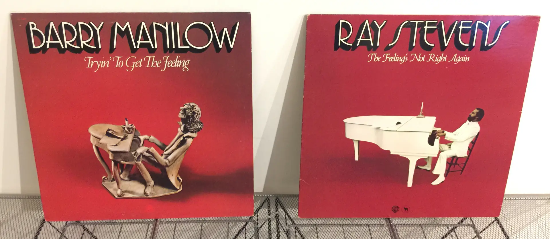
I think I get what’s going on! And here are the backs:
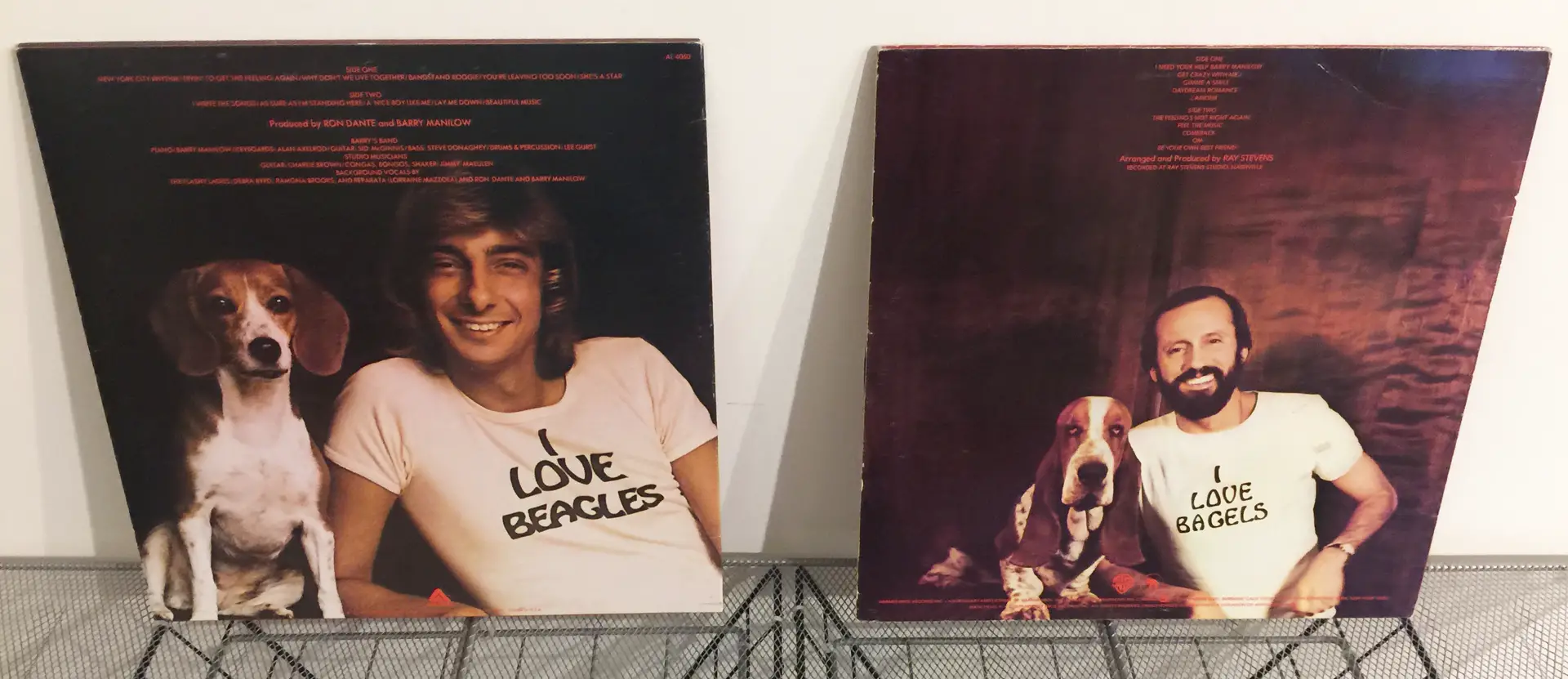
Yep… Got it!
Stevens’ songs and arrangements are great on their own. But they’re also SO Manilow. And the spoofed covers are genius.
How did Manilow respond? Reportedly, by telegram:
“I’m knocked out by the record. It’s the most flattering thing to happen to me in a long time. I hope it’s a really big hit for all of us.”
Again, despite such albums’ monetary worth (or lack thereof), imagine the cocktail-hour conversations that such quirky covers can launch… especially with the LPs spinning in the background!
More Research Needed
My albums revealed many other photographers (and jacket designers) who were new to me. I plan to research them and perhaps do a future update.
But I hope I’ve inspired you to loupe your own LPs, proudly display your favorite finds, and especially, to “make your own kind of music/sing your own special song”!
–Dave Powell is a Westford, Mass., writer and avid amateur photographer.
Share this post:


Comments
Bill Brown on Punch Up Your Decor with Photographic LP Album Art!
Comment posted: 20/08/2023
Anyway, the laserdiscs are the same size as LP's and the covers are wonderful with numerous gate-folds containing movie stills. Many movies on LD never made it to DVD or the remaster to DVD never felt the same to me, South Pacific-1958, comes to mind. The audio on the LD feels much more compelling compared to the sanitized DVD.
I've never looked at the photo credits of my LD collection but this certainly peaks my interest. Most art supply stores sell frames sized for albums so this is another option for display. As a professional illustrator/artist the digital platforms seem ho-hum for displaying creative work. I much prefer original hand rendered artwork over digitally perfect and sanitized equivalents.
I'll stop showing my age and sign off but not without saying thanks for showing a sometimes overlooked connection between film photography and music.
Comment posted: 20/08/2023
Anders Lewis on Punch Up Your Decor with Photographic LP Album Art!
Comment posted: 20/08/2023
I love your LP collection! Album covers have such fascinating history and artistry to them (which is often overlooked). One of my favorites is the cover for Japanese guitarist Masayoshi Takanaka's "Brasilian Skies" (specifically the 1978 edition in which Takanaka is sitting in a chair on the beach in a linen suite with a "thumbs up"). I think I need to look out for the photographers of album covers more as their art, possibly more than those of others, I see every day.
Great article!
Comment posted: 20/08/2023
David on Punch Up Your Decor with Photographic LP Album Art!
Comment posted: 21/08/2023
I discovered music photographer Henry Diltz many years ago, and read the story of his taking the cover shot for Crosby, Stills & Nash's debut album. They happened on an old house with a couch out front and grabbed some shots. They went back next day to get some more, only to find the house had been torn down! I only recently discovered that the S&G photo was by Avedon. So now I will start looking more carefully! Thanks again.
Comment posted: 21/08/2023