Inspired by a post from Alexandre Kreisman, I wanted to present some misses to the community to look for ideas and opportunities for growth. Below, you’ll find 8 images that I was intentional with, but which just didn’t pan out the way I’d envisioned. I am hopeful some of you readers will offer your feedback and input with these frames. I find that, in addition to being fun and engaging, these discussions move my work forward in ways that simply viewing images never has.
Near misses
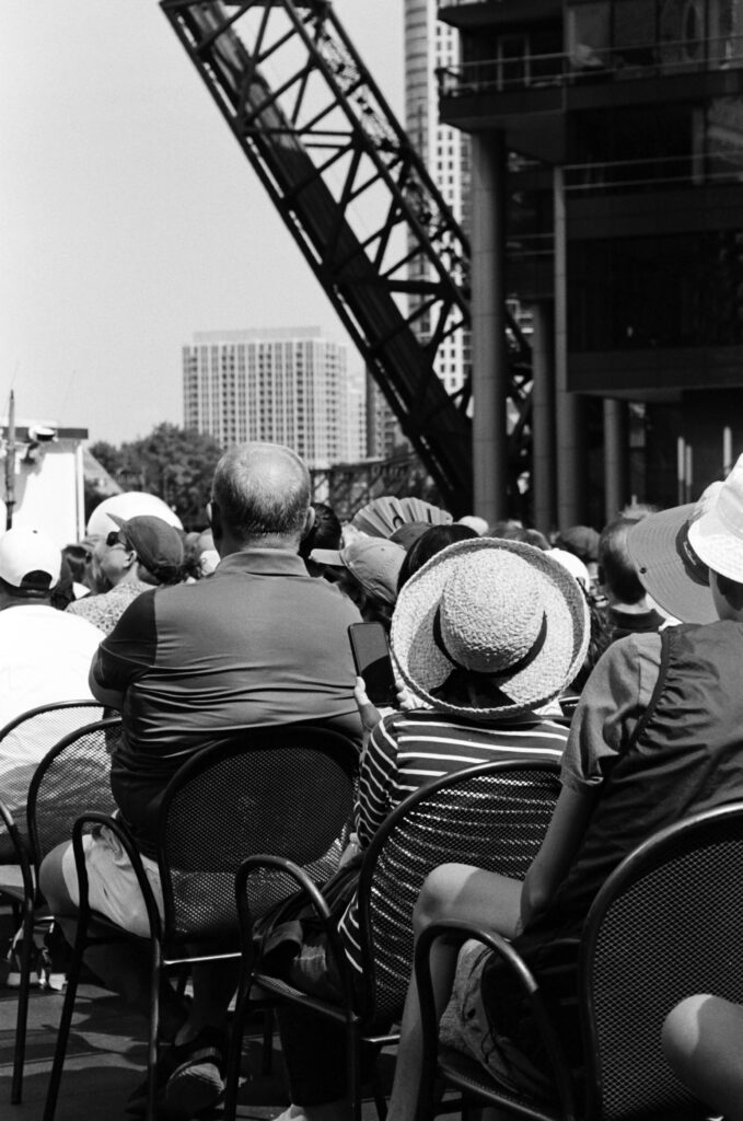
Here, the subject is the lady in the hat, but she doesn’t stand out. I didn’t want to use narrow depth of focus, and I wanted the scale of distant buildings, but somehow, this just falls entirely flat. Uninteresting subject, too many irrelevant elements? Tri-x 35mm at box speed.
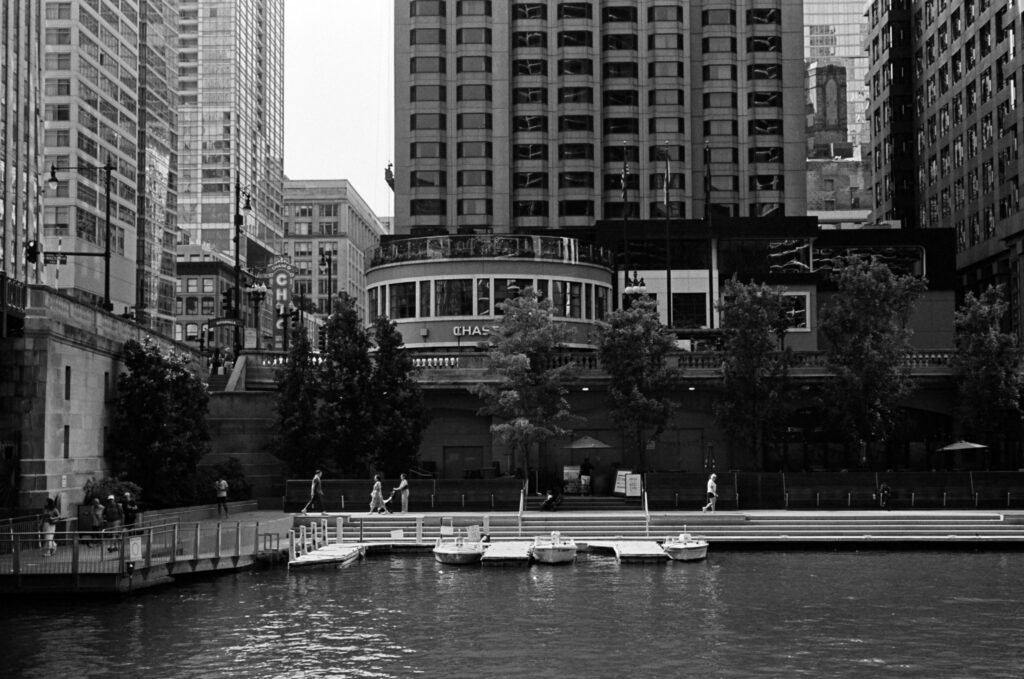
I so badly want this image to be great. I like the geometry, the scale, the various human, natural, and architectural elements. It doesn’t feel busy, but it just doesn’t have the “it” factor I was hoping for at the moment of exposure. Also Tri-x box speed.
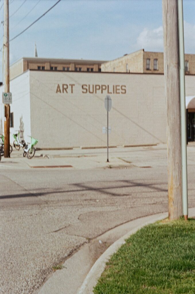
Ok, let’s ignore the missed focus and tune in to the fuzzy concept. The first thing that jumps out is the lack of clear subject; was it supposed to be the building? While I like the curve of the curb, the bright green stands out and carries far too much visual weight for its roll in the composition.

Cool light, decent colors, but what’s the story? I’m fine with words sometimes, but I don’t want it to be the subject, and it feels like it is here. These words bear no connection to the rest of the image.
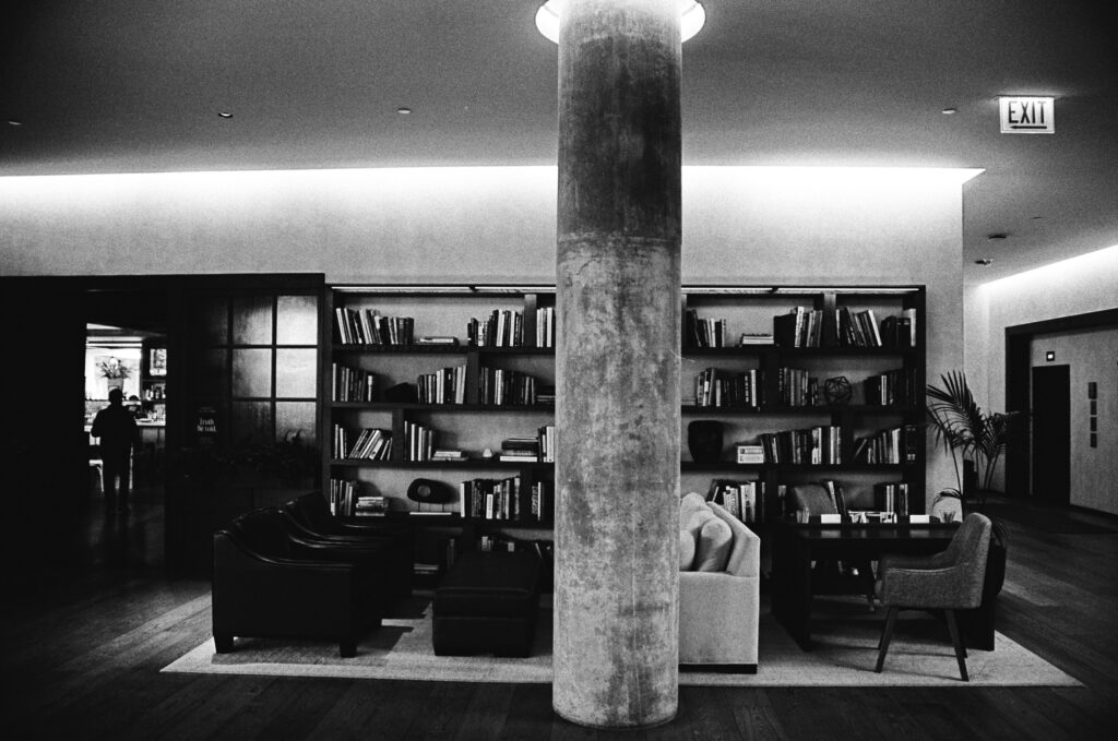
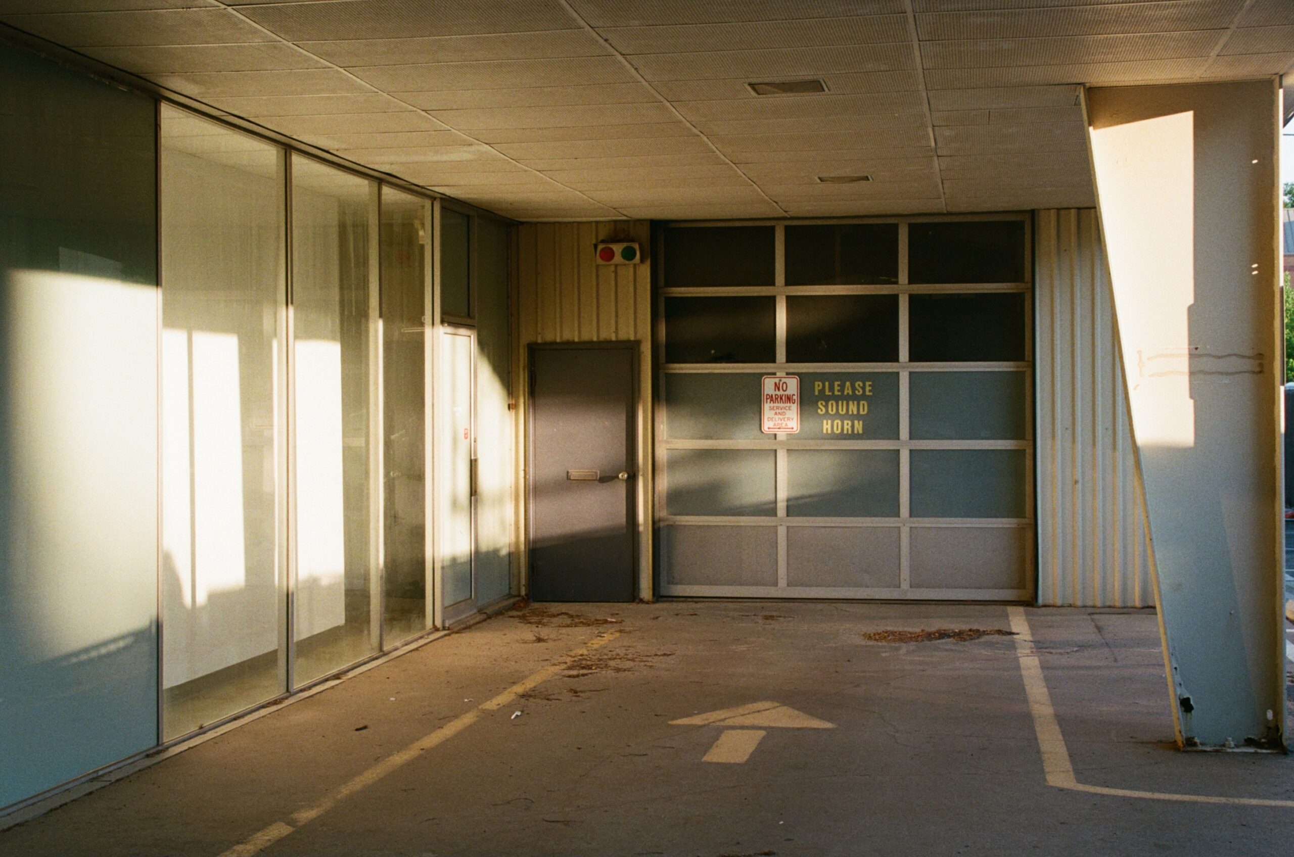
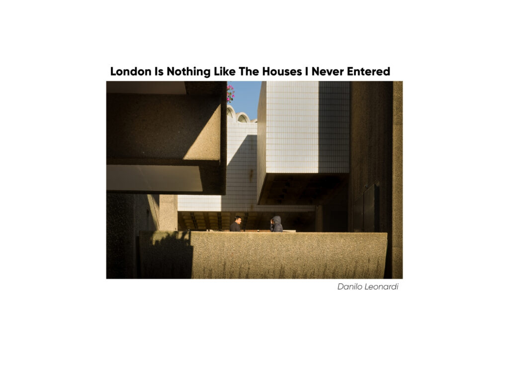
Tri-X exposed at 3200 and pushed 4 stops (6400) at the lab in development. I think this frame had potential- which is why I shot it- and there are some aspects that work. The contrast from the scene and the chemical push, the silhouette in the doorway, and the prominence of the concrete beam are strengths to me. Some hang-ups are the warped lines thanks to my 28-85mm 3.5 Nikkor zoom at its widest focal length, the distracting exit sign, and the shooting angle, which I think is not angled enough. I didn’t want it straight on, but this angle just feels like I tried to hit straight on but missed.
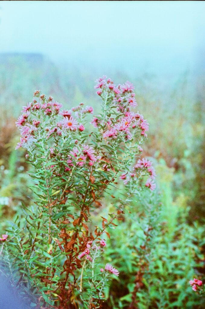
I considered this image in my post about Phoenix I. I like the pink against the cool green/gray and fog, but there is something about the placement against that background that I feel could be better. I was working around a chain link fence so I couldn’t get lower like I wanted, but I do wish I could have put those thistles more against the fog so they rose up above the backing greenery. This is another one I really want to like, but despite being satisfied with colors, focus, sharpness, and texture, it simply isn’t what it could have been. I did also struggle with aperture. In this lighting, I had the choice to go f8 on my 50mm 1.4, but I think I opted for f4 to throw the background into bokeh to a greater degree. In retrospect, I think I failed to consider how effectively this lens can get that nice blur even at smaller apertures when the lens is at its close focus distance. The separation is what I wanted, but not all of the flower is in focus, which I was aiming for.
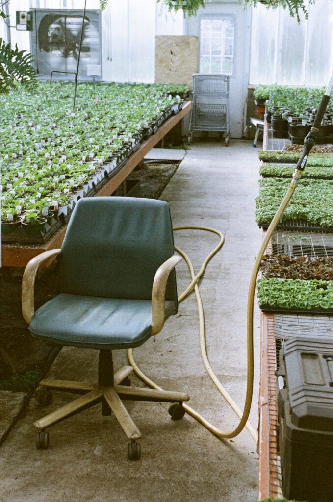
I like the subject and the scene here, as well as the colors and grain of the Lomo ‘92. I’ve played with cropping off upper sections more and less drastically, but can’t find a good ratio. I like that there are essentially two colors, and I enjoy the line created by the hose, but I just couldn’t fine an angle that put every element just where I wanted it. As a side conversation, I’m curious what people’s thoughts are regarding moving things in a scene: against the rules or simple “building” the scene you want?
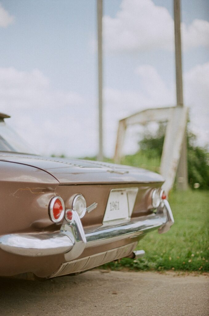
Starting with the obvious: not enough of the subject is in focus. I wanted to blur the background, and I actually like how that part turned out, but I really did not get even 20 percent of the car sharp enough. I should have stopped down 1 or 2, and focused on the license plate.
In advance, I really appreciate the time you’ve taken to look through and read. I know time is precious and any amount we give to an endeavor is time we lose for other things.
Eagerly awaiting insights from this wonderful community,
-Michael
Share this post:


Comments
Hamish Gill on Reflecting on a few of my own failures
Comment posted: 21/01/2026
The issue with the shot is, imho, just the angle. It's not quite on or off angle enough to feel quite right.
I also think the shot of the chair would work if you just straightened it a bit
Comment posted: 21/01/2026
Comment posted: 21/01/2026
Stephen Fretz on Reflecting on a few of my own failures
Comment posted: 21/01/2026
I don't do much BW and don't feel qualified to comment on them. But yeah, your color is pretty dialed in as is.
Comment posted: 21/01/2026
Comment posted: 21/01/2026
Comment posted: 21/01/2026
Steve Harper on Reflecting on a few of my own failures
Comment posted: 21/01/2026
Might have problems with that as comments are supposed to be totally positive. I know because he has censored me from the comments before as he was right to do so.
Comment posted: 21/01/2026
Alexandre Kreisman on Reflecting on a few of my own failures
Comment posted: 21/01/2026
Good for you!
I'll only talk about the image the makes me snap and please do not take this too harshly, it's just a critique based of how I woud have taken/processed those shots!
Please sound horn : As hamish pointed out the angle is weird, i would have taken this by kneeling in front of the arrow and taken the shot
The Lady with the Hat: Add some vignetting and crop a bit, personally, i would do a square.
Art Supplies: I would have taken the wall from the other side of the wall.
6400 iso: unfortunately cropping s difficult, you may remove the sign, but for me it is the silhouette and surrounding that are too dark
building and marina : I think just dodge and burn the image and you will have what you are looking for.
Hope this helps!
Cheers
Alex
Comment posted: 21/01/2026
Comment posted: 21/01/2026
Darren Nelson on Reflecting on a few of my own failures
Comment posted: 21/01/2026
The river shot (is this Chicago?) might work better in color. Not enough contrast in BW
I agree with others I like the parking garage, maybe too much space on the pavement.
The chair shot I might have tried for a lower angle.
Love this idea, might post my own.
Comment posted: 21/01/2026
David Brancaleone on Reflecting on a few of my own failures
Comment posted: 21/01/2026
Comment posted: 21/01/2026
Paul Quellin on Reflecting on a few of my own failures
Comment posted: 21/01/2026
Comment posted: 21/01/2026
David Hume on Reflecting on a few of my own failures
Comment posted: 21/01/2026
Comment posted: 21/01/2026
Comment posted: 21/01/2026
Curtis Heikkinen on Reflecting on a few of my own failures
Comment posted: 22/01/2026
Anyway, these thoughts are what occur to me. A few of the images that I noted resonate more with me, but I’m not sure I would consider any of them to be a failure. Thanks for posting them and requesting reactions. I enjoyed thinking about them.
Comment posted: 22/01/2026
Geoff Chaplin on Reflecting on a few of my own failures
Comment posted: 22/01/2026
Comment posted: 22/01/2026
Comment posted: 22/01/2026
Walter Reumkens on Reflecting on a few of my own failures
Comment posted: 22/01/2026
Comment posted: 22/01/2026
Comment posted: 22/01/2026
Sroyon on Reflecting on a few of my own failures
Comment posted: 22/01/2026
I like "Sound Horn". My eyes are naturally drawn to pretty light, so for me that was the main subject and not the text. If anything I might have cropped out the pillar on the right.
I also like "Art Supplies" and I personally don't think the grass is too bright. It adds to the surreal and artsy (reinforced by "art supplies") feel of the image. Or if it bothers you, you could selectively desaturate the grass in post, to temper its visual weight.
Speaking of post, and to answer your question, I think moving objects around is okay for some types of commercial and art photography, but not for images which implicitly or explicitly purport to be documentary.
And continuing on the post-processing theme, for the bookshelves photo, you could consider using software to correct both barrel distortion, as well as perspective distortion/straightening (similar to using a tilt-shift lens).
Once again, thanks for the interesting post and the nice images which made me look longer and deeper than I look at most photographs these days :)
Comment posted: 22/01/2026
Ibraar Hussain on Reflecting on a few of my own failures
Comment posted: 22/01/2026
Burn in the rest subtly especially the sky with a vignette
She’ll stand out
Comment posted: 22/01/2026
Ibraar Hussain on Reflecting on a few of my own failures
Comment posted: 22/01/2026
A
Little work with digital darkroom / darkroom on the BW and some tweaking curves would solve everything
Bringing out what you want and vision
Rollin Banderob on Reflecting on a few of my own failures
Comment posted: 22/01/2026
1 - I'm not getting a connection between the people and buildings. If the hat is of interest feels like a horizontal of the heads would work better???? Perhaps the structure of the round chairs and the hat is more interesting than the buildings.
2 - I think as has been said, some dodging with contrast, and burning would give it the pop and bring out the content you want.
3 - A style of photography I struggle with so feel I can not give useful insight.
4 - When I first saw it on my phone thought maybe too lose, but now on a monitor, and I bet more so properly printed I like it! Has feeling, details to notice, relationships to think about. I think a case when the awkward angle adds to it.
5 - The way the pillar is cut off at the top bothers me. I don't find the exit sign a distraction, and think cropping to just above it makes the image stronger. I like the silhouette to discover.
7 - I like the similar color of the hose and part of the chair, but I think how the hose enters the frame is not working real well for me. Maybe stepping to the right it would be better? As to moving things this image feels like a found scene, but in the end that is up to the artist.
8 - I feel the arch in the background pulls away from the car, and all the space at the top does not add to the composition. A car with great lines like this I don't think the license plate is where I would place the focus. The colors work well.
Good work overall, and again thank you for putting yourself up for feedback!
Comment posted: 22/01/2026
James Billings on Reflecting on a few of my own failures
Comment posted: 23/01/2026
But thinking a bit more about why it didn't work out is probably what I should be doing!
Comment posted: 23/01/2026
bikenerd on Reflecting on a few of my own failures
Comment posted: 24/01/2026
'Please Sound Horn' looks like something I would shoot. I dig the color palette and the light on the wall to the left. I might brighten the arrow and white lines to make them more clearly the subject.
I also love the colors of the Greenhouse Chair shot. Maybe I would have moved a couple steps to the right, to make the background the table full of plants. But obviously I can't see what else that would have changed.
Great stuff all in all, nobody hits the mark 100% (or even 50%) of the time. Sometimes when I get scans back or go to edit my digital shots, I wonder what the hell I was looking at when I tripped the shutter.
Comment posted: 24/01/2026