Perhaps not the typical way a project is started!
Going through my reel of photos from 2025, for Hamish’s Photo of the Year competition, made me realize that many of my photos had a subject, or at least a supporting element, that was red. Not just red bricks either, I mean cars, fall foliage, even chairs, just anything that can be red. It got me thinking: why? Is it just statistics? Alternatively, I do like the color red, so is it something I am subconsciously drawn to? I still haven’t figured out the answer yet, but I wanted to make a project out of it.
For fun, I picked several of these photos to share, with red in different amounts, from different sources, adding to the photos in different ways. Do you notice anything similar in your reels, is there a color that tends to appear in your photography?
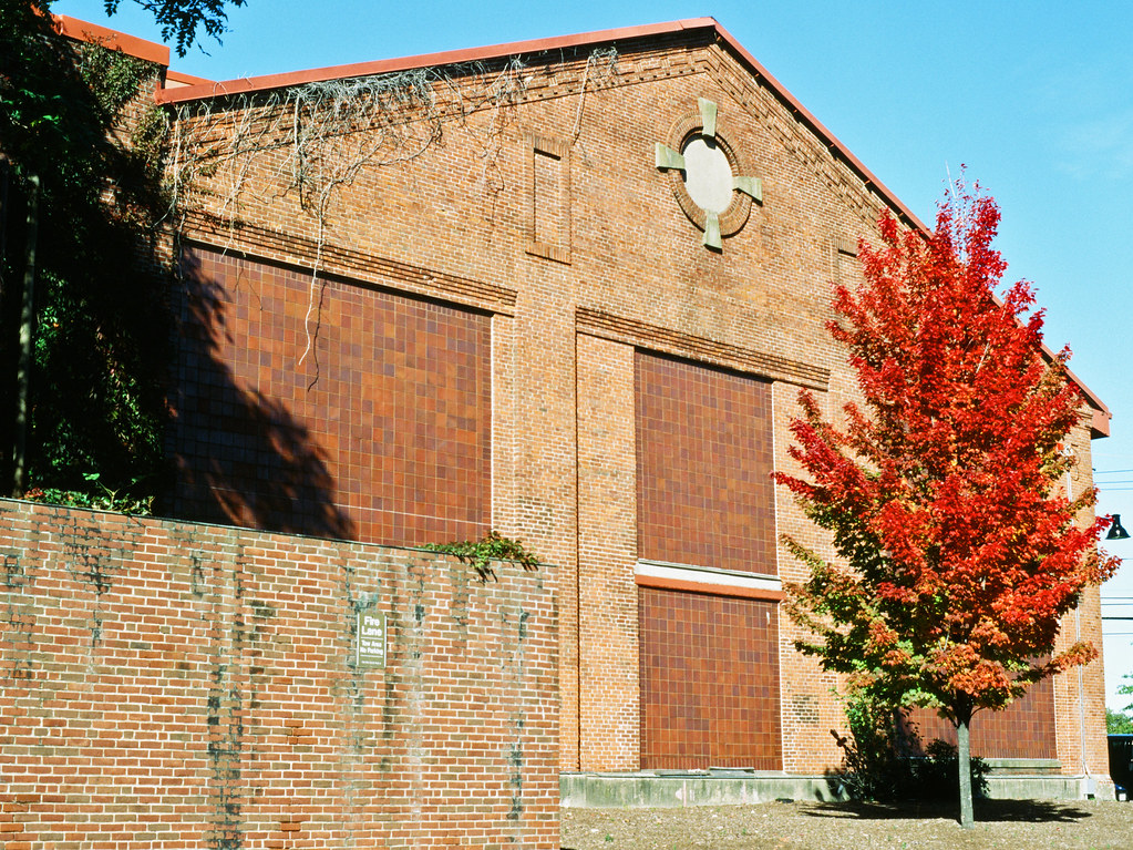
Of course, starting off with the foundational photo of this project. When I drove by, this combination of old brick building and single red tree looked so picturesque together, an encapsulation of the urban fall and a study of the color red for me. It helped me realize the trend of red in my shots, because after I went over the scan, it led me to look at my other shots. Ektachrome is great at that time of the year, but this is definitely my favorite shot of all from last fall.
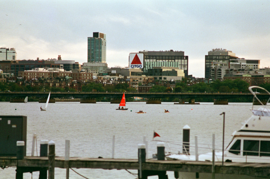
Unlike the Ektachrome photo, this was not taken for the sake of capturing the red sail. I just wanted to take a photo of some of Boston’s iconic sights, the boats and Citgo sign, together. Yet, sitting at the center, I think it ties the whole photo, both themes & colors, together nicely. Interestingly, Color Mission appears to render reds more warmly, with some gold or orange undertones, rather than the colder rendition of Ektachrome for example.
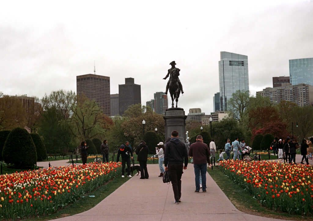
As the rest of the city is dull, drab, and slowly waking up from winter, the tulips are here to lead the way. I took this with my Voskhod on a cloudy morning last spring, and with their bright color, the tulips just stand out so intensely. Especially compared to the humans peeping them, and against the rest of the vegetation in the Boston Public Garden. Springtime here is really beautiful, and I’m very much looking forward to experimenting again with photographing these tulips next season.
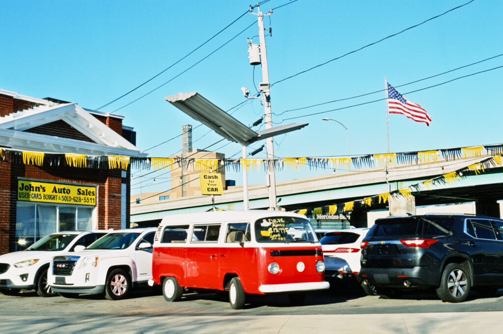
Mirroring the tulip photo, just with metal instead of nature, I unashamedly took this shot because of this fun, bright, red, Kombi sitting on that lot. Its presence beautifies the dealership by an order of magnitude, and even the specks of red in the taillights and flag seem to emphasize its color for me. All ready for a trip down the hippie trail.
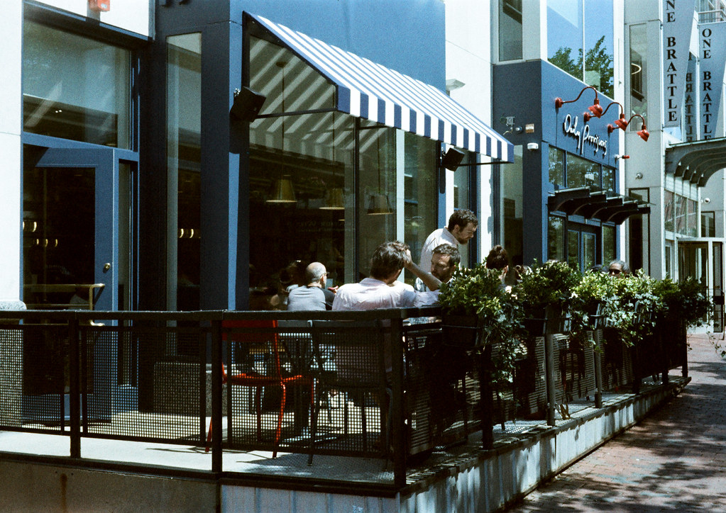
ORWO NC400 is a cold, blueish film, but it gives rich reds, so it can create contrasting scenes like this. In this café, the empty seat is red, while the others are a plain grey. Who is the seat for? Why is only one red? To my eyes, the little touch of red, yet very bright red, in this scene, emphasizes the blue and cold whites of the café.
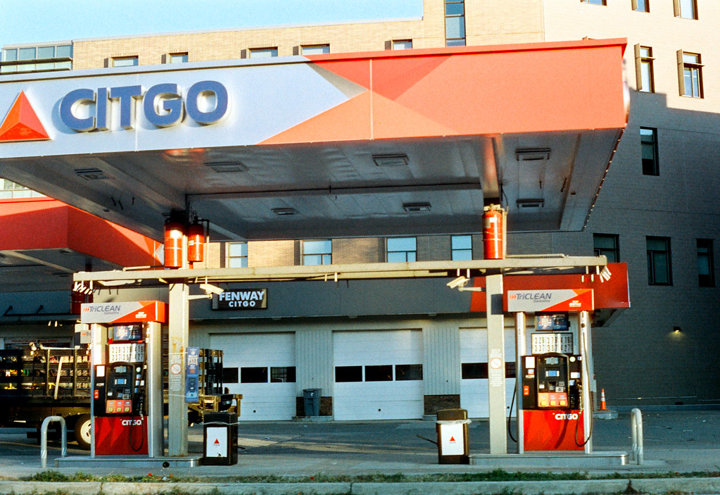
Much like its older brother, ORWO NC200 (in this case Opticolor 200) also gives excellent reds. In this case, the entire gas station is more red than not! Unlike NC400, NC200 trends warm, perhaps not as much as Adox Color Mission or Kodak Gold, but much more than their previous color films. This gives a more cozy feeling to my eyes, and I really liked how it enhanced the early morning sunlight on this station. Just waiting for the first customer of the day (not me)!
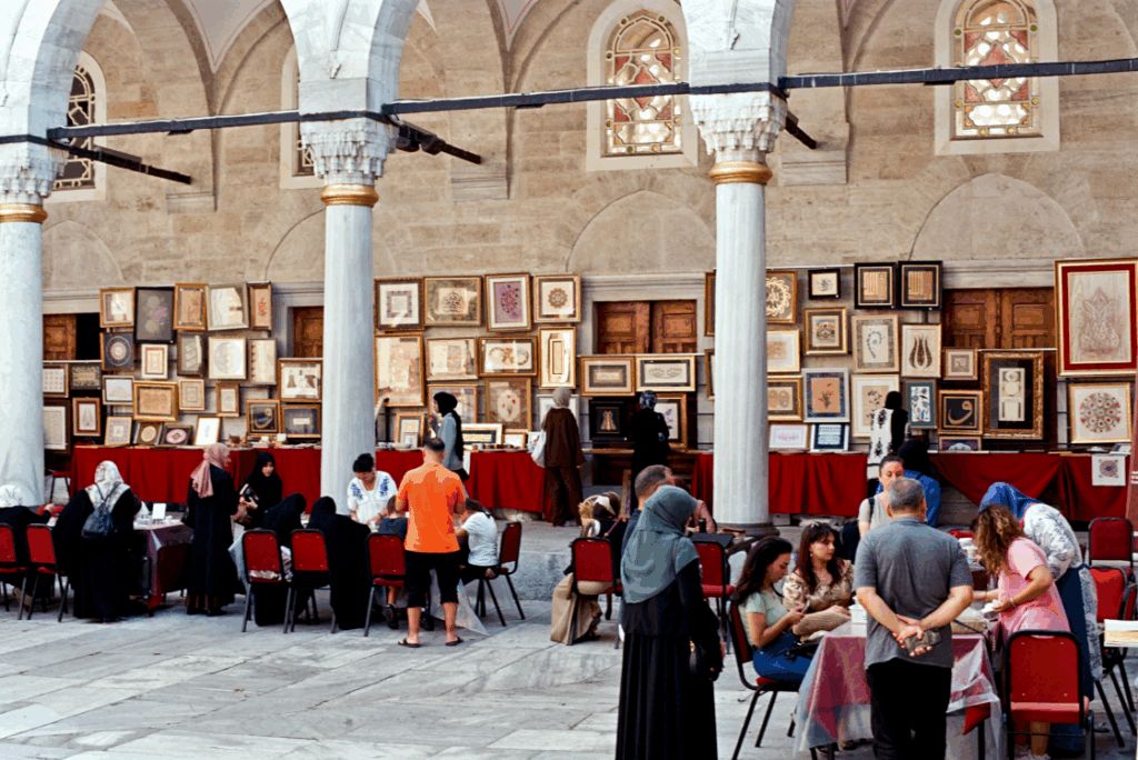
Lastly, some of you might remember this photo from my Istanbul story, a photo of an art exhibition in a mosque. Using a photo from Turkey almost feels like cheating, given that red’s the national color, but I think it’s okay in this case! The velvet tablecloths and chair covers are a darker, richer red than the previous photos, and I feel like it gives a sense of elegance to the setting, and it also nicely contrasts against the art on sale & the people there browsing it.
Thank you so much for reading to the end! I hope this was interesting to you, and I wish you many great photographs in this new year.
Share this post:


Comments
Ibraar Hussain on A Kettle of Red
Comment posted: 25/01/2026
Comment posted: 25/01/2026
Comment posted: 25/01/2026
Walter Reumkens on A Kettle of Red
Comment posted: 25/01/2026
"Colours have a powerful effect on our emotions. They can evoke a rich palette of moods within us. For us, red is closely associated with the idea of fire and heat. Red also signifies danger, power and aggression. It is the most vivid, striking and exciting of all colours. We can see how intense the effect of red is from the fact that even the smallest splash of red in a photograph immediately attracts our full attention." I can certainly appreciate these observations. There are currently six cars of different colours parked near my house. The red car catches my eye first, even though it is not the closest one.
Thank you for sharing your good wishes. I wish you a good time and many more great photos.
Comment posted: 25/01/2026
Comment posted: 25/01/2026
Geoff Chaplin on A Kettle of Red
Comment posted: 26/01/2026
Comment posted: 26/01/2026
Stephen Scarlett on A Kettle of Red
Comment posted: 27/01/2026