In response to this recent 35mmc article, reader Toby Van de Velde asked for an article about my digital-infrared workflow. The more I thought about it, the more useful I thought it might be. So here it is!
I lean toward simplicity in processing my digital-IR files. And we’ll get to that. But for IR especially, the workflow that leads to final images really begins:
Before Leaving Home
This phase is easier when you begin exploring digital IR. You usually own one IR-ready camera and bandpass filter, and need to make fewer equipment decisions.
But later, you may own several cameras and lenses, with different IR-response characteristics… plus bandpass filters of varying strengths and color responses. Before heading out to shoot, you could choose to bring everything or– easier on your back– take just that will deliver a desired “look.”
In the interest of space, I won’t detail those decisions here. Instead, I refer you to this excellent FAQ page on Kolari Vision’s website. It’s the best discussion I’ve seen about the different types of IR-bandpass filters on the market and the images they can produce. It’s also a source of ideas and inspiration. (NOTE: I’m not affiliated with the company.)
Generally, though, the most popular IR-bandpass filter (labeled “720,” “R72” or “89b” depending on the manufacturer) admits just a little red light along with near-infrared wavelengths. It provides good tonal contrast for black-and-white conversions, but also admits enough visible light to support interesting color effects. It’s a great first filter.
Always Test New Gear for IR Hot Spots!
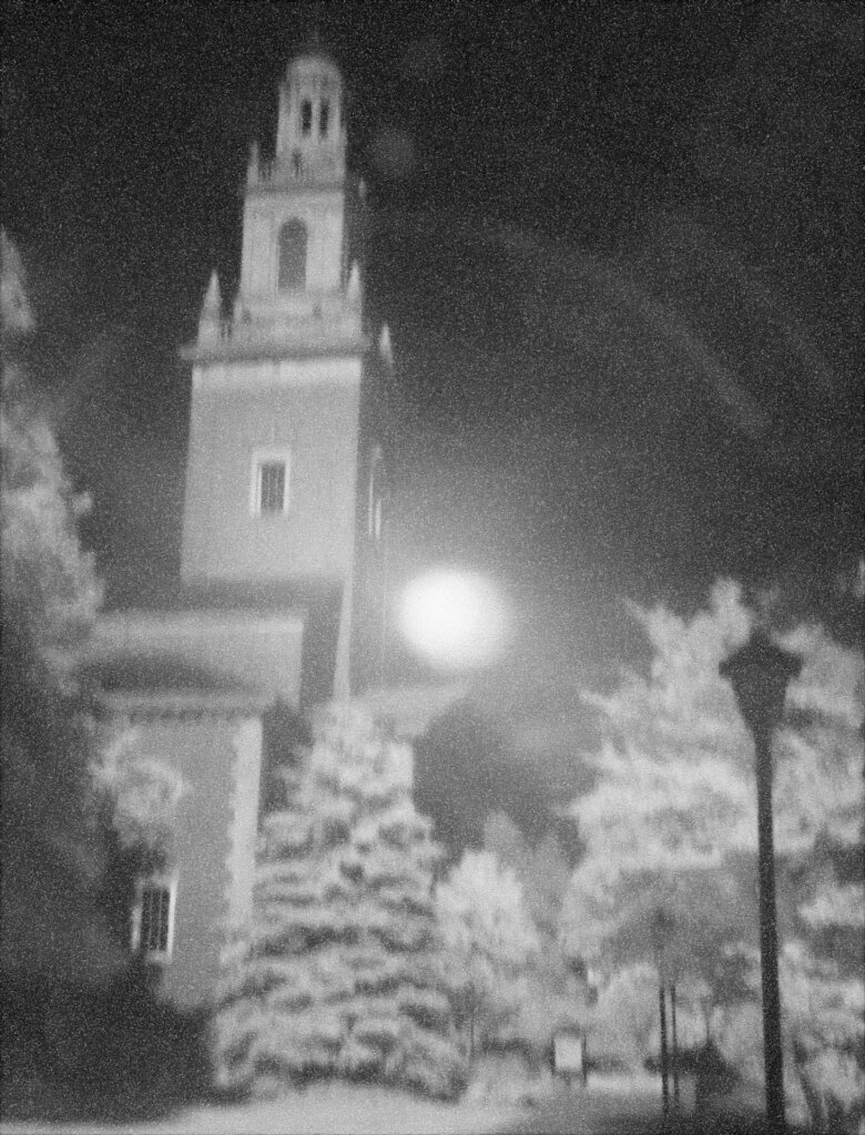
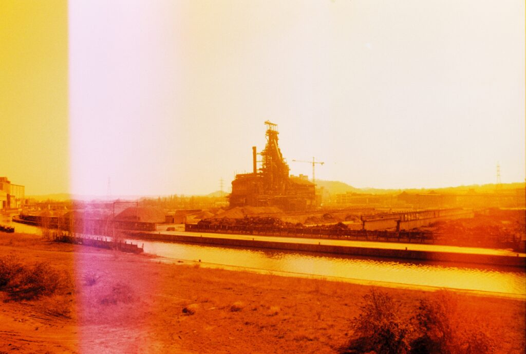
But before shooting IR seriously with any camera, run some sunny outdoor tests. See if you get “hot spots” in your images. If you do, move on to a different lens or camera. For example, here’s an extreme hot spot from my beloved (but IR-unfriendly) Minolta DiMAGE A1:
Anyway, just remember that the workflow to your final IR images depends a lot on the equipment you take with you, and the type of image you want to achieve. And then come important decisions to make:
While Shooting
What you do in the field dramatically affects your results. Specifically:
- IR photos tend to look best when shot on bright sunny days. Darker cloudy lighting often results in lower contrast and more digital noise. (There may always be exceptions to this– depending on the camera, lens, IR filter and shooting environment.)
- The location of the sun also produces widely varying effects. Whenever possible, try to shoot subjects from different angles and directions.
- Note the clouds! Infrared often reveals details that aren’t visible to the eye. And the appearance of sky and clouds will, again, depend on the location of the sun with respect to your lens. So pay attention to this in the viewfinder. Occasionally, you might even spot mysterious things! One afternoon, I shot into a gathering thunderstorm. The sky looked blandly gray, but the photo revealed a large, dark ring hovering on-edge in the air above the trees. To my thinking, it was probably either an invisible UFO or a tip-on view of rotating tornadic winds. I hope the former… but either would be cool!
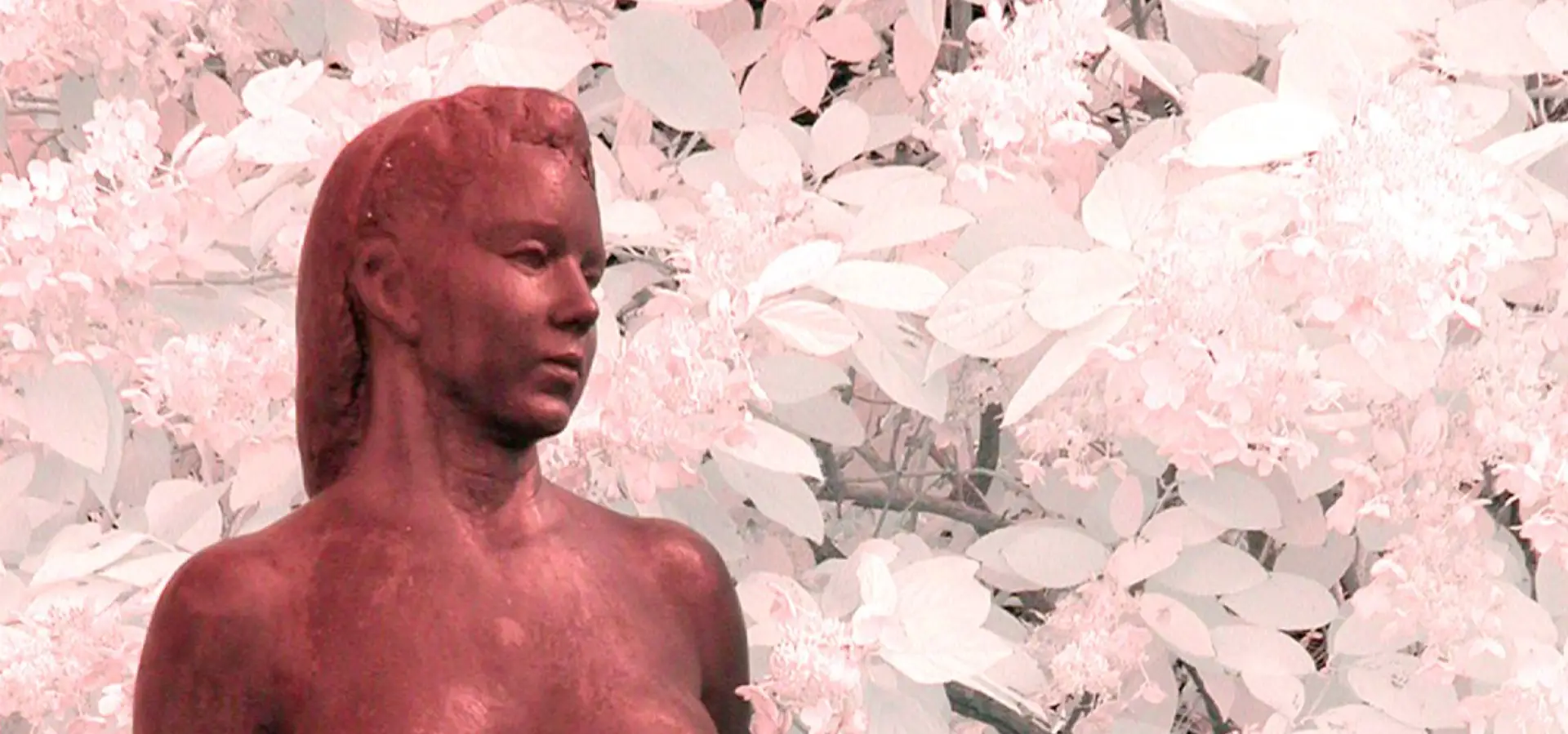
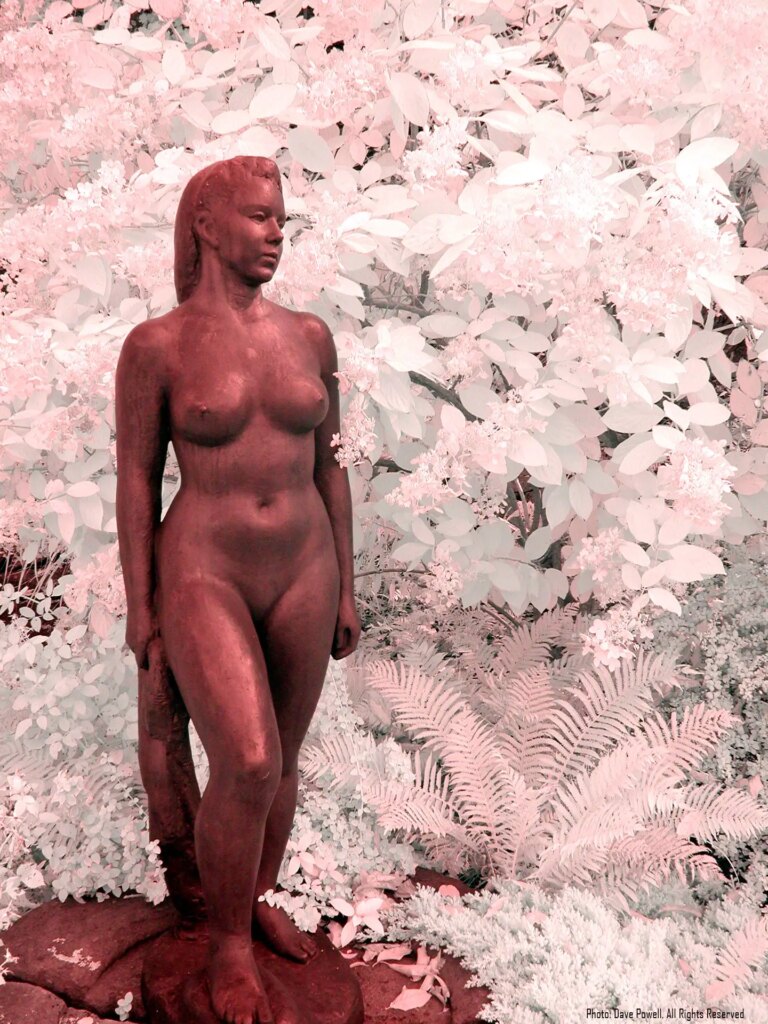
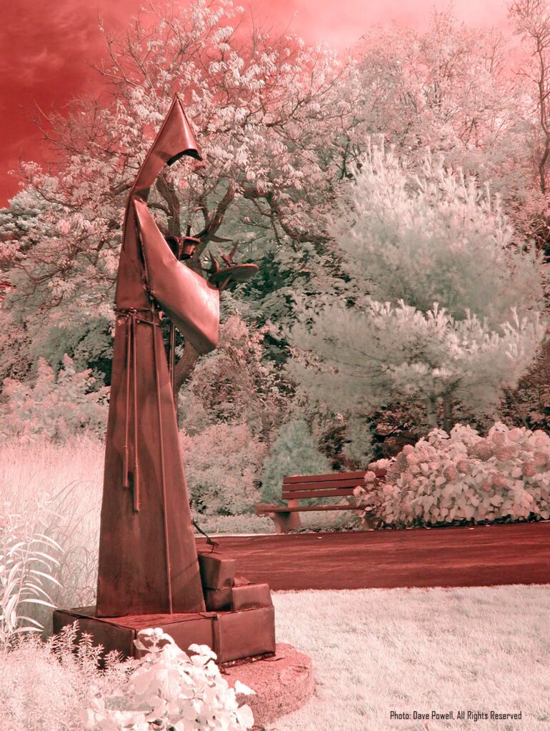
- And the most dramatic digital-infrared images often include both plants and man-made objects. Chlorophyll in leaves reflects infrared massively, and often makes plants look like they’re covered in snow. (Man-made objects tend to take on darker, more natural, tones.) To use this effect to great advantage, let plants backlight or even illuminate man-made subjects! The lovely sculpture in the following photo was actually buried in the bush’s deep shade, and my visible-light photos were grim. But infrared rays reflected by the leaves of plants all around the sculpture lit her up! Always look for ways to use this gorgeous effect:
On Returning Home
Back at home, image management is the next important step for all photography. My management approach is basic, but effective. I store all photos in appropriately named folders within folders for each year. I didn’t remember that I shot the above photo in 2016, but only had to open a few of my 20xx folders to find the OMAA subfolder and its images.
Within the subfolder for a specific shoot (like OMAA), I have two sub-sub folders:
- Originals – Which contains files copied directly from the camera, and
- Processed – Which starts as a full copy of the Originals folder, but is where I do image chimping and editing.
I also keep all folders backed up online and on two portable disk drives.
Guard Your Originals!
It’s important to safeguard your original files! I can’t tell you how many times I’ve browsed mine, and found new love for images that I hadn’t even liked before.
Or, you– like Ansel Adams with his famous “Moonrise, Hernandez, New Mexico”— might someday want to reinterpret a favorite photo. As Adams aged, he reportedly made 1,369 unique prints of Hernandez… usually to boost the contrast between its moon and dark sky, and make the gravestones below them more visible.
But let me share an extreme example of the importance of saving master files! I took the above IR hot-spot photo in 2006, during a personal reunion with Denison University in Granville, Ohio. While there, I had lunch with Dr. Mike Michelson– my former astronomy professor. And when he learned that I knew Photoshop, he rushed me back to his lab.
He specialized in archeoastronomy— the study of how past civilizations understood the sky and used it in their cultures. Ohio is famous for its ancient Moundbuilder culture, and Mike believed he had discovered a new mound buried in a grassy field near Denison’s campus. He tried to photograph its shape on a night when moonlight grazed across the grass at a shallow angle. And he hoped that Photoshop would reveal where the grass was just a little mounded.
A great idea! But he didn’t know Photoshop, and had thrown lots of functions and filters at the poor JPEG over a period of months… if not years. I’d never seen such extreme JPEG “checkerboarding”! Fortunately, Mike still had the original file, and some instantaneous Levels adjustments revealed exactly what he wanted!
Two takeaways are to:
- Save your Originals and chimp/edit copies of its files in your Processed folder (or whatever you call it).
- And if you think a JPEG file will require lots of editing, Save or Export it (depending on your image editor’s options) as a TIFF file. It’s an uncompressed format, and opening, editing and saving it– even thousands of times over a period of years— will avoid a gradual buildup of JPEG compression artifacts. And when you’re finally done, save the TIFF as a new master file and convert it back to a clean JPEG for printing, posting or whatever.
And Finally…Editing
As you see, digital-IR workflow begins long before image editing starts. And for me, this last stage is usually quick and simple. That may change when I start experimenting with effects like color-channel mixing/swapping. But for now, the following steps are usually all I do to make digital IRs look their “natural best”:
- I first Rotate and Crop the image as desired.
- Then, I open the Levels window, and in its Red, Green and Blue channels, drag the Black-Level slider to the right until it just reaches the image histogram’s rising left slope… and the White-Level slider to the left until it just touches the histogram’s descending right slope. This usually restores the image to the “natural IR colors” the camera saw. TIP: On histograms with long, flat leading or trailing tails, watch the image while you move a slider. You may spot a point of extremely diminishing returns!
- Next, I return the Levels display to its Master setting (which affects all three color channels simultaneously), and adjust the Gamma slider until I like the image’s overall look. TIP: You could also re-select individual color channels in the Levels window and further adjust their Black-Level, White-Level and Gamma sliders to experiment with toning effects.
- If desired, I make slight Cloning, Dodging, Burning, Brightness/Contrast, Shadows/Highlights and Curves adjustments.
- And finally, I Merge and Save my changes into the file. Your program might do both in a single Save or Export (depending on the software used).
That’s my usual procedure. Occasionally, more steps are involved– for things like noise reduction, lens-distortion fixes, black-and-white conversion, and so on. And if I ever sharpen an image, it’s only after I resize it for a specific use. But I usually accomplish everything I normally need in the above five steps.
Depending on the camera, lens and filter used, these basic five steps may have little effect, as the following photos illustrate:
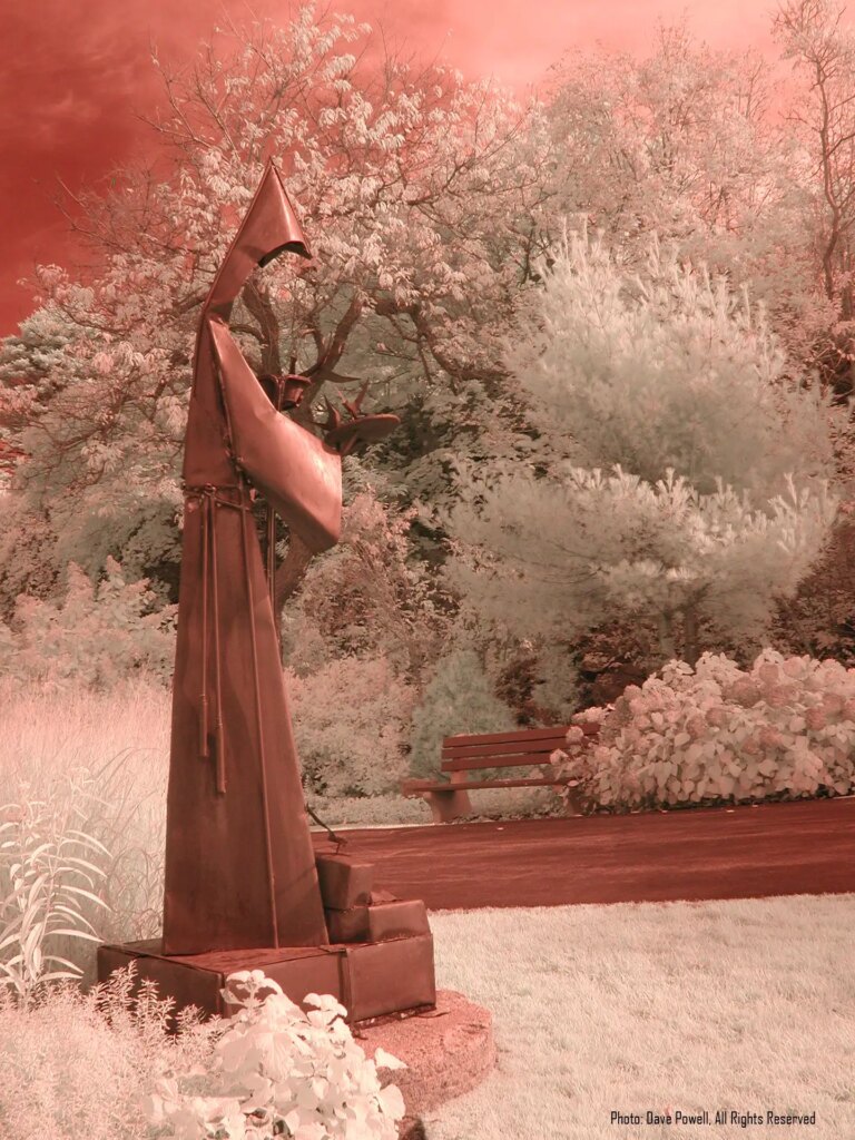
Small changes like these usually occur when the tones that a camera “sees” in its Red, Green and Blue channels spread almost entirely across each channel’s histogram– from no tone to full tone. It’s actually a good thing! It means that the camera and IR filter work well to not overly compress incoming tones into narrow portions of the histograms. And as long as I have the original unedited file, I can later revisit it any way I like.
Final Thoughts
Digital-infrared photography calls for the same skills as visible-light work… but adds unique ones of its own. Its workflow, however, doesn’t have to be complicated. And I’d love to see readers’ other tips and ideas in the comments below!
NOTE: I don’t currently use Photoshop or GIMP. So some of my terms may differ from those in your image editor (though the basic concepts will be the same). My current editor of choice is Affinity Photo, a powerful British product that, at this writing, costs $55 for a lifetime Mac or Windows license and $20 for iPad. I especially love Affinity’s combined crop/rotation tool, its built-in RAW editor (which it calls its Develop Persona), and the fact that its clone brush shows exactly what it will paste into an image when you click. (This enables very precise alignments when copying pixels from one place to another.) Affinity is different enough from Photoshop to require a small learning curve. But its online Help is… helpful!
–Dave Powell is a Westford, Mass. writer and avid amateur photographer.
Share this post:


Comments
Bill White on Digital-Infrared Workflow Begins Before You Leave Home – By Dave Powell
Comment posted: 02/11/2022
I sure wished I had read an article like this a month or so ago. As usual, I learned the hard way with many failures. An article like this goes a long way towards success.Thanks for taking the time.
Bill
Comment posted: 02/11/2022
William on Digital-Infrared Workflow Begins Before You Leave Home – By Dave Powell
Comment posted: 22/04/2023
I said to myself you have the statue with a limited amount of foliage but positioned perfectly, so go outside end shoot it. And man it was like my first subject compositional whatever-have-you that was able to get as close aligned with what I wanted in my mind versus what the final result was.
You’re so right about the varying effect of different things that can take place and that’s for me the coolest yet the most challenging part. I may be a bird photographer but with this, it’s such an unknown result. You can start with a rough idea, but anyway I digress.
The greatest breakthrough I’ve been able to identify and pretty much almost every time now set in camera is my white balance. It is like you mentioned-- and articulated so in your article-- beyond important and even though I guess theoretically if you shoot in RAW you can adjust the white balance, I think that rule gets thrown out the window with IR photography. And it took me about a year to even understand (even though I tried in vein to understand what it meant to expose the greens with your white balance). But then I finally did and realize that your goal is to set the white balance so that eventually in your viewfinder the foliage is already white. I never knew this.
With the iOS filter and an October camera, once a while, these colors (especially blue) will come through the filter. And it’s pretty much a less ideal scenario, because you get your white foliage along with a very like interesting shade of blue that gives you more control so now you have got your white foliage set and then you had that blue color.
Anyway it’s ta great process and I have look forward to continue with it.
William Alexander Kazmarck fb
ig gothicserpantphotos
Comment posted: 22/04/2023