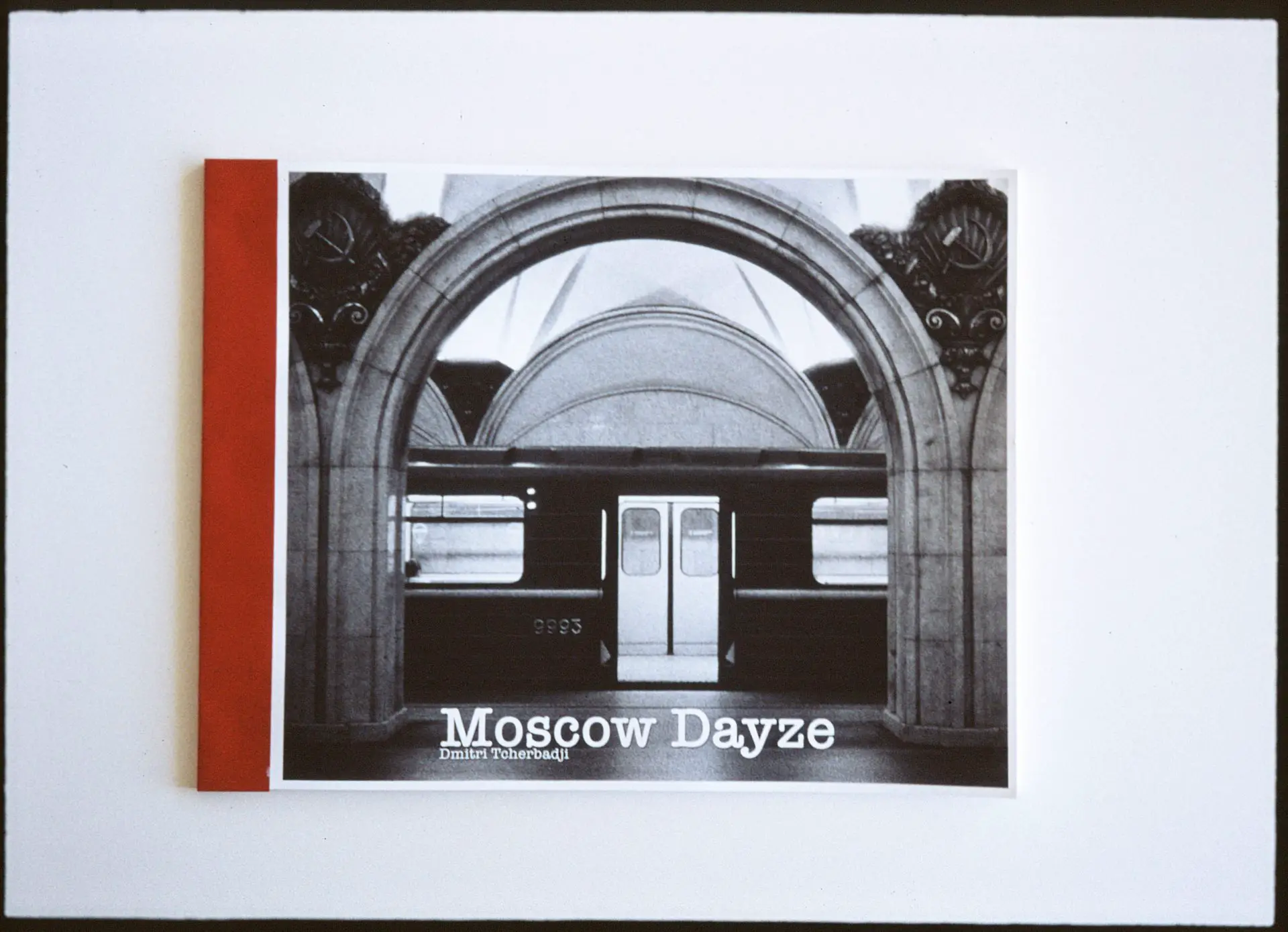
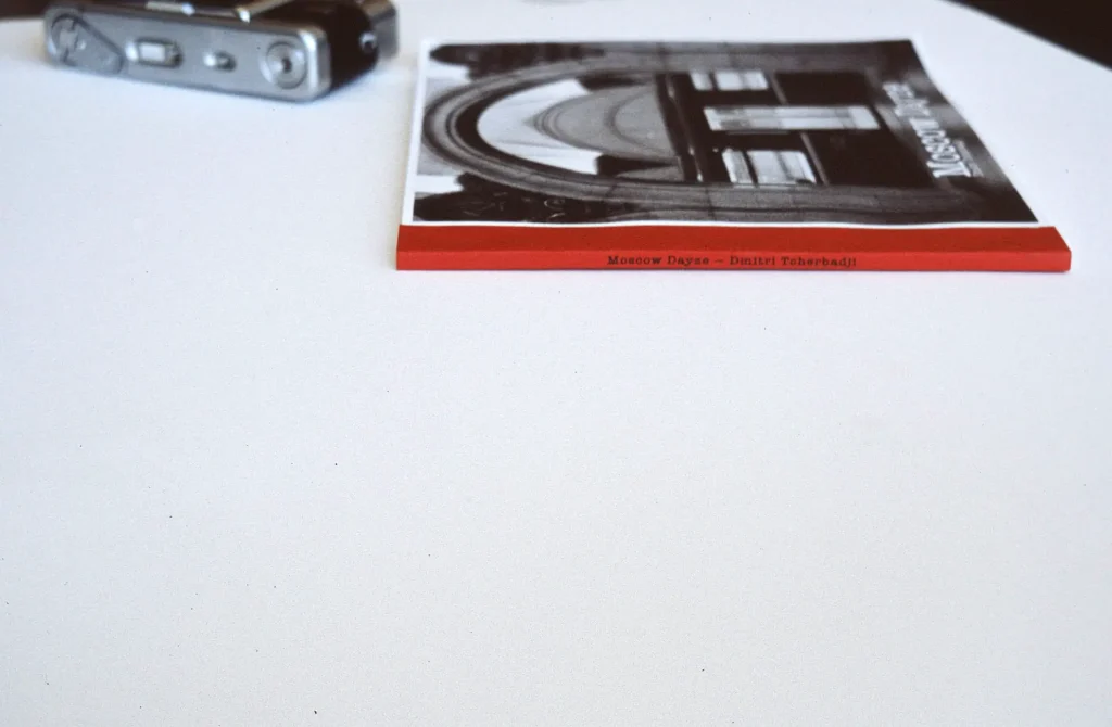
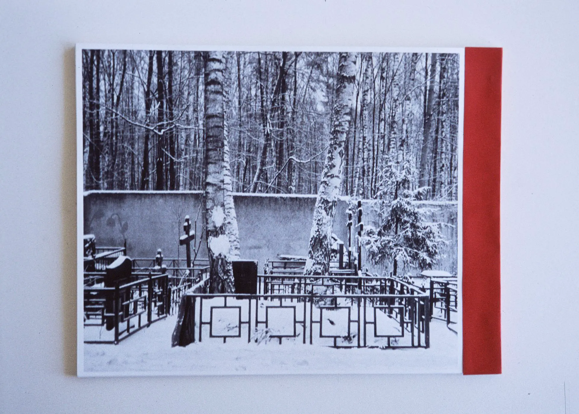
This book, like any other, is a neat stack of paper with a thin layer of printer ink covering 76 pages in photographs and type. Wrapped at its spine with a bright-red cardstock — reminiscent of my expired Soviet passport and the flag it represented. Inside these pages is a story of my deep cultural shock amidst family death on the eve of the global pandemic.
In this article, I will go over my process of putting together a 76-page photo essay into print, focusing primarily on photography selection, layout, typography, and some of the written edits. I published a couple of posts about the techniques involved in its printing and binding earlier — feel free to follow those links after you’re done with this read.
I hope that you’ll find this read informative for your next creative project or deem it an entertaining introduction to the zine world of self-publishing.
Forming book concept after all the photos have been taken.
The images that I had after my two weeks in Moscow could not have been staged. It was a necessary trip to deal with my grandmother’s death, and it was the first time back in Russia after living 20 years elsewhere.
A long-time obsessive photographer, I took my film cameras on the plane with hopes of capturing this event accurately but with no thought given to the photographs’ future. Only weeks later, having reviewed the scans, I realized that what I got on film must become a book. I felt that way because the story they carried was important enough to me, the top photographs were all technically well-done, and I had enough material to share what I thought would be an adequate amount of detail to form a captivating story.
But getting a few good photos isn’t enough to make a book. I wanted to tell my story so that others could understand, connect to, and see themselves in. And for this to happen, there has to be some structure to the project.
My first few days of working on this book involved printing drafts of the photographs — all of them — and shuffling them to see what would make a good visual story. I found that it was a lot quicker to move the sheets around physically than to tinker with the Adobe InDesign interface.
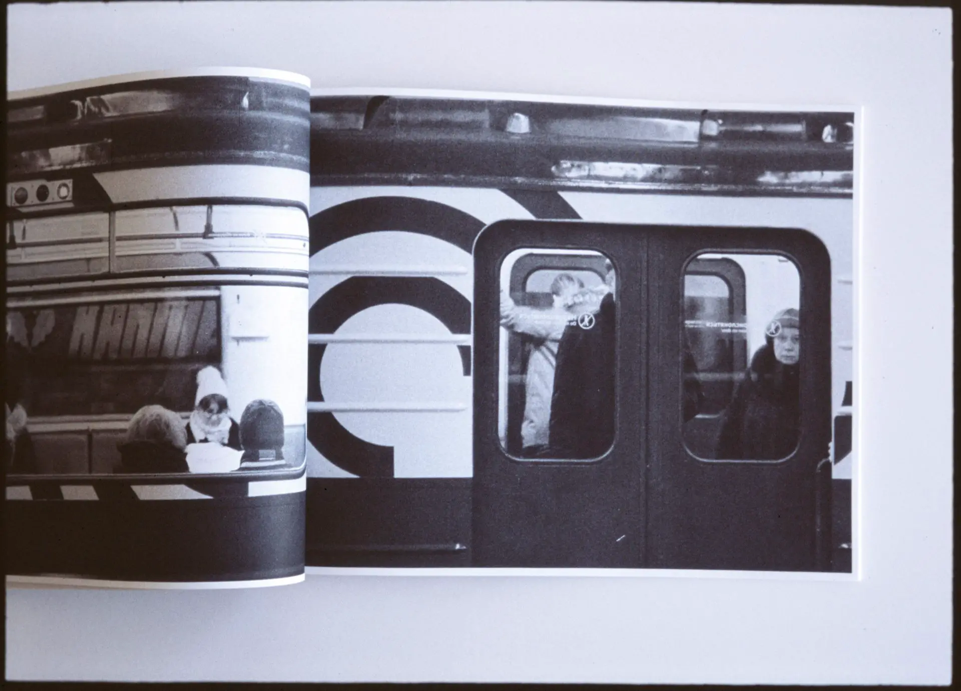
Because the material seemed autobiographical, I’ve decided to lay the imagery in the approximate sequence I acquired the photos. Starting with boarding the plane in the dead of winter, then on to meeting the people at my new destination, traversing the unusual Russian subways, neighbourhoods, and eventually switching to more intimate images from the flat where I used to live as a kid. As you can see, the plot here isn’t particularly twisted or complex, but it seems to work well in captivating the audience as they follow the footsteps along — as I later confirmed with the first readers.
Up until I’ve had all the photos in a pile that resembled something I could see myself publish, I wasn’t sure what kind of a book it’ll be or the actual story it would tell. But after I had got a good overview of the material I was working with, I could begin to form a visual narrative.
Creating the “flow.”
For a photobook, where imagery is everything, arranging frames in the order they were taken is not enough. You may have heard of the concept of an uninterrupted “flow,” or a feeling that the images belong next to each other. The texture, subject, contrast, grain size, and geometrical elements all play a role in creating a sequence that makes the reader feel as if they’re being led through the story deliberately and without a stumble.
The technique that I used to get closer to that point of “flow” is imagining that my photos are a series of stills from a movie — with clever transitions, defined acts, matching contrast, and a sequence that makes sense for the viewer. I paid particular attention to the images that would sit next to each other on the opposite pages; I looked for a balance between having them something unique while ensuring that they look like they belong next to each other.
That meant, sometimes, matching portraits to portraits, buildings to buildings, etc. Other times, I looked for images that contrasted each other while retaining some elements of similarity. But most of all, I’ve searched for combinations that felt captivating and intriguing, letting my gut feeling override the simple concept of matching. This gut feeling was driven by the dozens of photo books and zines that have awed and inspired me.
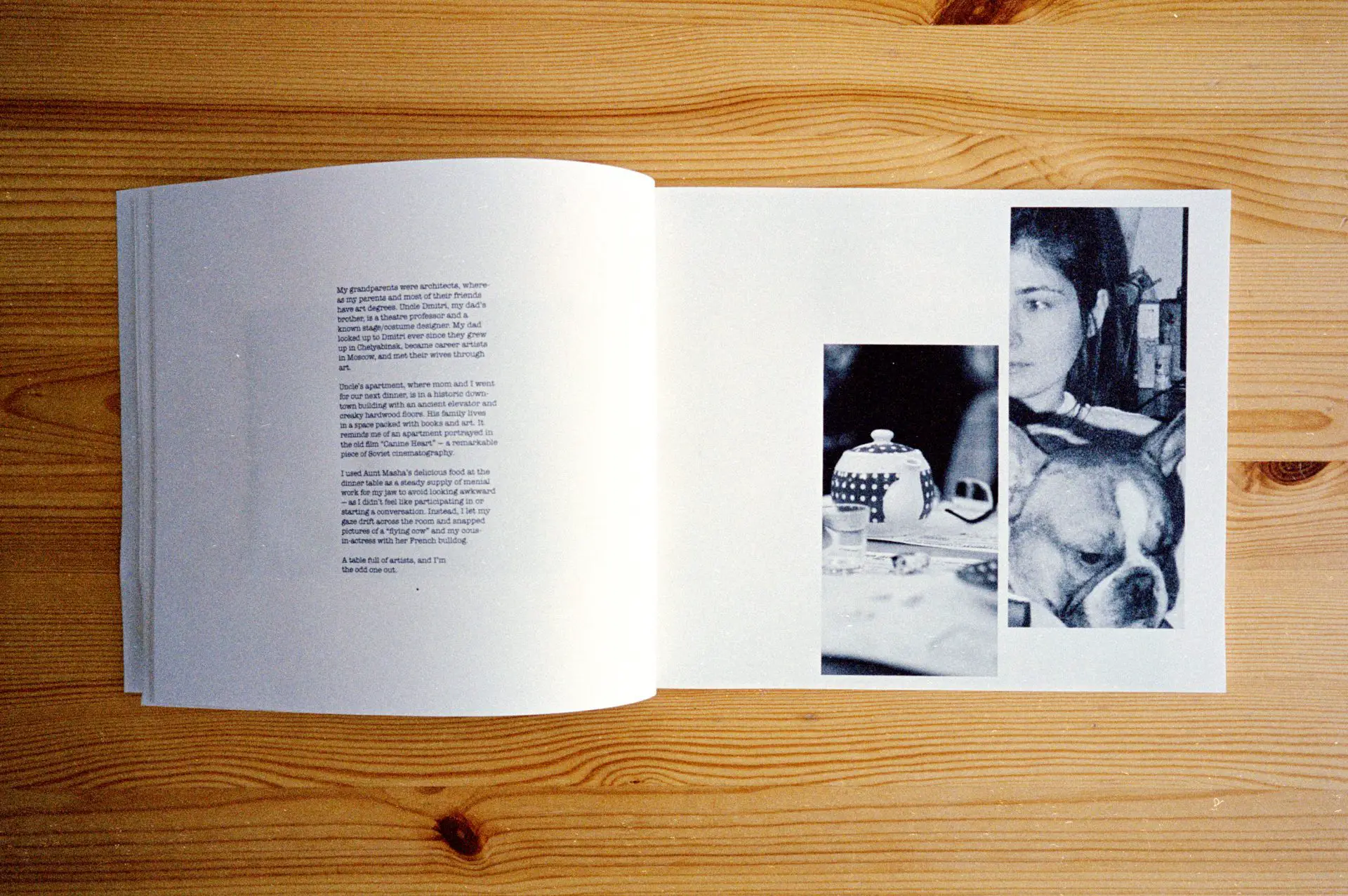
The scenes that I broke up the story into, such as “the intro,” “the flight,” “dinner at aunt and uncle’s,” and “the subways,” are where I allowed myself to “reset the flow” to let the reader know that either another day has passed or that I moved to a new place.
Design & typography.
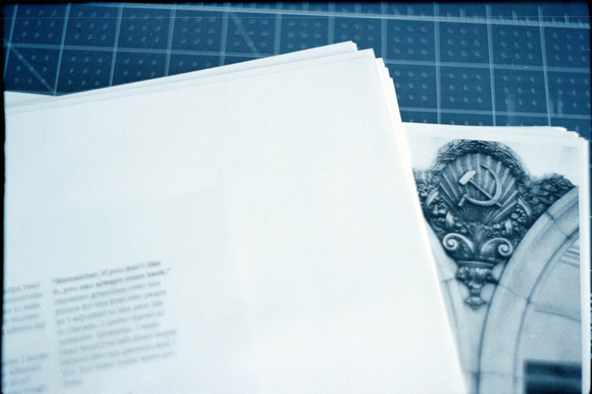
I’ve been designing websites for over two decades. Over that time, I’ve internalized concepts like white space, legibility, and how shapes affect our gaze. But my inspiration for this book’s design lies in other printed works — both famous and unknown. I wanted this project to utilize the power of bound paper with full-page spreads, half-page spreads, and semi-hidden images that force the reader to interact with the book by spreading the pages wider.
The majority of the photographs in this book occupy a plain rectangle in the middle of the page. But when the storyline called for excitement, I blew up the images across the pages, masked, or arranged them creatively.
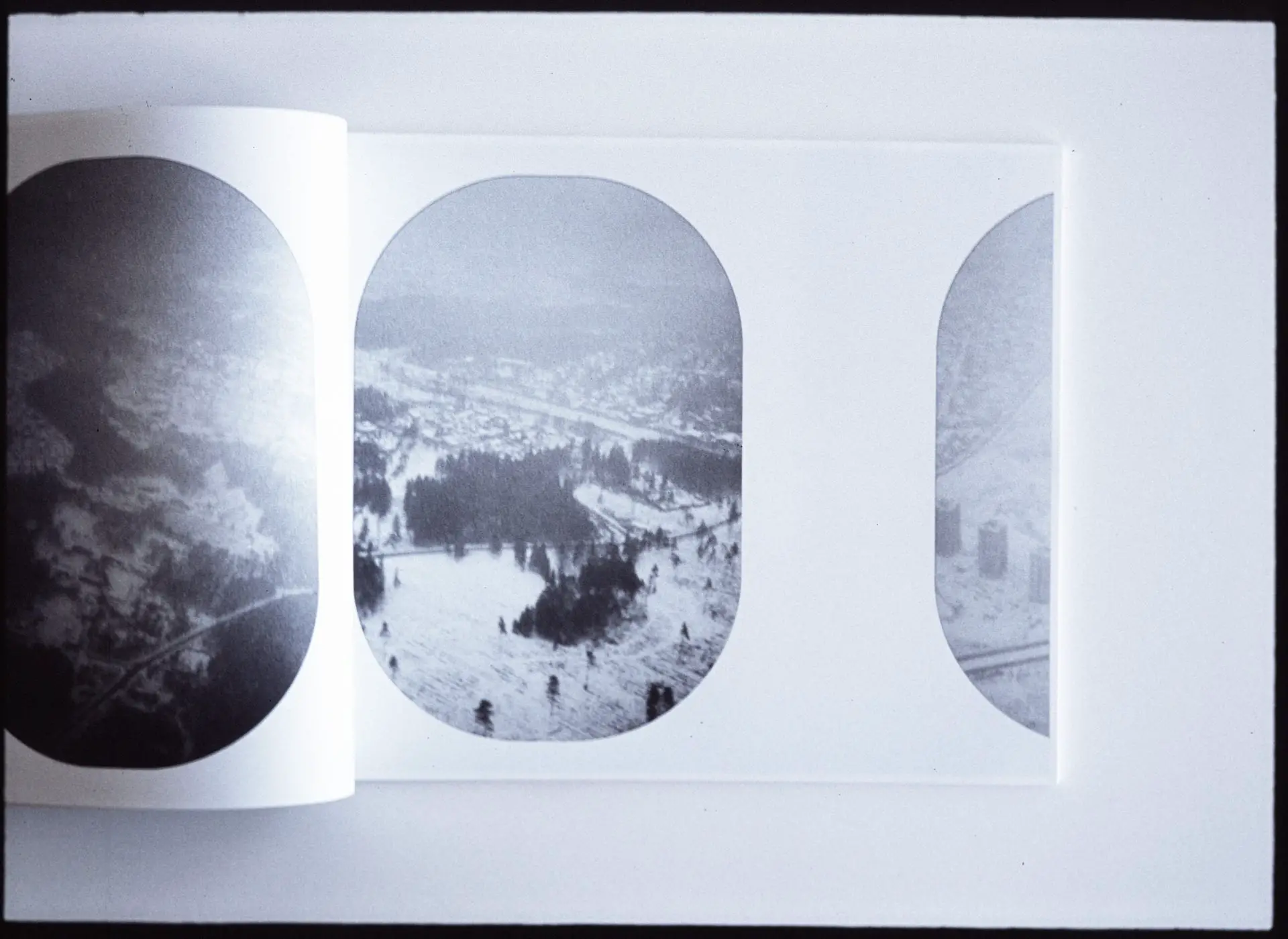
The images I got back from the trip were captured on various film stocks — all 35mm, but some were colour, and others were black and white. Their grain size and contrast levels varied greatly, even after being converted to monochrome, especially as I’ve decided to crop many of them differently. And of course, the printer made everything look different — but thankfully, as I was planning to print at home, I could run lots of tests with various ink levels and paper types. So I’ve spent lots of time playing around with the Photoshop Curves tool, various levels of sharpening, and enlargement to ensure that the readers’ “flow” does not get broken up because of technicalities like that.
When the time came to pick the font, I’ve decided to go with something that resembled a typewriter in a classic newspaper style (I’ve even split my text into columns in that manner). Only one option was available on Google Fonts that suited my vision: American Typewriter; it did so perfectly: the type is grungy with a lot of effort divulged into appearing as if the words were the result of ink transferred from a ribbon by a metal form. A perfect pairing for a hand-bound book.
Story draft.
By the time I was finished with the text, there were just over 2,000 words, the same length as this article. But it was one of the most challenging strings of sentences I’ve ever put together.
I write a lot in my past time and at work. So it isn’t uncommon for me to come up with two to five thousand decent words in a day. This project, however, demanded to have the photographs followed by poetic prose — a style of writing intertwined with strong visual language. It had to communicate my thoughts and emotions without hiding behind facts and references while also being easy to understand for someone from a completely different walk of life.
Inexperienced in this writing style, I’ve spent over a month pouring over each sentence, adjusting things, and thinking of ways to express myself literally. By the end of that 30+ day session, I’d only got the general shape of ideas ready, but it was good enough to begin sharing some of it with the rest of the world.
Kickstarter & coming up with the book’s name.
By the time I’ve got to the point of talking about my project publically, I was mentally and creatively exhausted. Not sure if it were the sleepless nights working on this and other projects or the pandemic that got to me first. I was ready to leave it at a few copies for myself and close friends but decided to launch a mini project on Kickstarter to see whether it would interest someone other than me.
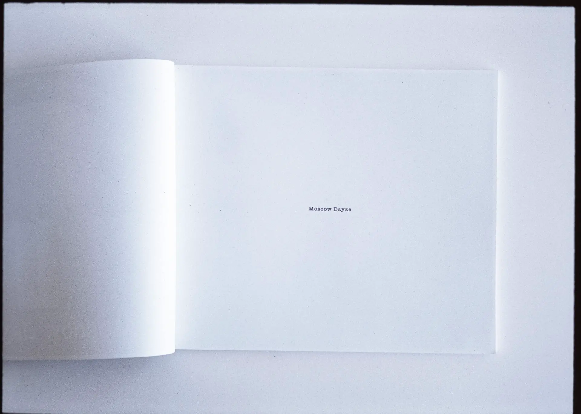
Moscow Dayze
But before it could go live, there had to be a name for this book. I won’t say that what it ended up being named is particularly genius, but it came to me pretty quick and felt right. The book got named Moscow Dayze, where Dayze is a combination of “days” — that I spent in Moscow over the course of the photographs being taken and as a child — and daze, which is how I felt throughout the entire experience on the ground.
Lucky for me, there seemed to be plenty of interest, despite the fatigued promotional effort on my end. The project was awarded the “Project We Love!” badge from Kickstarter, had a small feature on Kosmo Foto, was fully funded within two days of launch, and ended up receiving 757% of its modest goal.
I was again encouraged to finish what I’ve started, to polish the book into something that I can call my best effort to date.
Editing process.
By the time I got my funds and spent them on printing materials, I was fairly satisfied with what I had laid out in InDesign. But it wasn’t perfect — I wanted Moscow Dayze to be perfect since this is the first publication in this world that I call “a book that I wrote.” The lack of excellence, I determined, was there because I could not take the place of a reader, particularly that of a reader keen on details.
I must thank my wife for the following hours she spent reading my drafts and providing feedback. There had to be at least five versions of this book that she went through and left comments on. It was certainly helpful to have her be grammar and written-style savvy (she’s a teacher), but the most helpful hints I received were questions, “what does this mean?” and “could you make this more straightforward?” The missing bits I filled in with my thoughts but forgot to write down and the imprecise expressions of my feelings.
We also spoke about Moscow Dayze a lot when I wasn’t writing. Just speaking about the topics covered in my drafts helped me get a better perspective on what it is that I am trying to do.
I spoke to my mom about this work as well; her picture’s in the book, and I wanted to know her perspective.
After all those edits, is Moscow Dayze really perfect? What if the people closest to me filled in some of the “invisible blanks” with their ideas about me? I rang my old friend in Ottawa to give it a fresh read and to hear his honest feedback. And I am glad that I did — despite the reads, re-reads, and software like Grammarly, he was still able to find issues with style and clarity in my text.
Though I still call Moscow Dayze “my book,” I am forever thankful to Jacob and, especially, Betty for helping me bring it to the level I’ve envisioned.
Follow-up with first readers.
With the written word and images sorted, I sent the book to a couple of first readers. I was expecting to hear more suggestions on improving it, but their responses instead gave me the signal that it was ready to print:
I love it! I couldn’t put it down since it arrived on Saturday. It’s mesmerising. Very heartfelt and wonderful images, and excellent writing.
— Danilo Leonardi.
I love the way you selected the photos to match the text, and the words to match the feeling the photos evoke. There is a strong quality of the photographic concept, and obviously a great selection of images, but what stands out is the overall feeling of memory and nostalgia, as filtered through the emotions of a grown man who steps back in time, when both personal and general history has changed so dramatically. I also love the layout of the spreads, so congratulations from my part, I am truly happy I returned from vacation to such a well done trip down memory lane.
— Crina Prida.
Now that it’s published.
I’ve had a great pleasure writing about the process of making Moscow Dayze on 35mmc, a website I’ve been following and admiring for a very long time. In addition to the opportunity to be published here, I’m hoping to spread awareness about this project. Of course, I would love some of you to buy a copy, but I am also happy to chat about the aspects of bookmaking I may have missed in this read. And I would love to hear the stories you may wish to put in print.
Please feel free to leave a comment below or reach out on Twitter.
Share this post:


Comments
Charles Higham on ‘Moscow Dayze’, From Russia With Film: Bringing a Self-Published Photo Book to Life – by Dmitri Tcherbadji
Comment posted: 05/10/2021
Comment posted: 05/10/2021
Robert Guanci on ‘Moscow Dayze’, From Russia With Film: Bringing a Self-Published Photo Book to Life – by Dmitri Tcherbadji
Comment posted: 05/10/2021
Comment posted: 05/10/2021