My first year of shooting film Part 7
A couple of months ago I wrote a guest post about my first roll of Tri-X. In fact it was my first roll of black and white ever. I wasn’t sure about the results, thought they lacked contrast and impact. And I was definitely unaware of what might have caused the look of them. But here’s the beauty of this community: I received quite a lot of comments, people giving useful feedback and taking time to write down suggestions on how I could improve my photography. I cannot express how much I appreciate your feedback and your support, I love the discussion and it really helps me going forward.
Apart from the support and feedback there was also a nice guy named Graham, that did not only suggest that a yellow filter could be useful, he even offered me to send me his spare one! How cool is that? I am amazed by this generosity, sending his filter to someone he has never even met. And I am amazed that we are, or to keep it close, that I am able to connect to people around the world that I would not have been able to connect with 20 years ago. Yay for the internet!
I must admit that a big part of why I enjoy shooting film is being part of this community. When I started to be serious about my photography I started looking online for people to connect with, to share photos with, and to exchange tips and tricks with. I tried several media: Flickr, Facebook, Instagram, Pinterest and Twitter. I joined several groups centred around different aspects: beginners, Leica, landscape, etc. But it was in the film community that I found most inspiration, even before I tried it myself. And with inspiration I do not necessarily mean the images, I also find lots of beautiful digital photos online, but mostly I am talking about the way people discuss their photography, what is being said about photography and how people interact. Somehow in the film community I find a language and a tone of voice that suits me. So everyone who takes the time to read my posts and helps me with suggestions, thank you for including me!
Now back to photography, lets talk about the suggestions that were made with respect to my black and white photography:
- A bit of post processing helps and is completely normal: I sometimes feel, I don’t know where it comes from, that one shouldn’t do that. Something about film should be pure? The strange thing is that I don’t have reservations about processing my digital files. I do believe that as long as you’re not in journalism anything is allowed to create an image that you like. However, somehow with film I have read too many times that people particularly like film because they don’t need post processing. So I got reminded of the fact that in achieving your preferred look post processing is normal, and that the people in the lab cannot know what you want specifically, nor have the time to fine tune every image individually.
- Use a yellow filter. As a yellow filter will reduce the amount of blue light, but not red and yellow, contrast should be increased, specifically in the skies. And as Graham kindly sent me one, I used a yellow filter on my Olympus with my next roll.
- Ilford HP5 got mentioned a couple of times: also worth a try.
- My own observation: It takes some time to get used to a certain type of (film) look. When you are used to looking at a certain type of images, trying something new can look and feel strange, and therefore wrong. Well let’s start with the ‘strange and therefore wrong’, this is of course not true. But you need confidence to stand behind something that is not mainstream. For me, being new at film photography (for how many months can one say that they are a newbie?) I need time to really evaluate the results. Ok, they look different, but is that good or bad? Is it what I want, is it a step in the right direction, or is it indeed not working out? I guess I am slowly progressing, understanding better what I like. I also notice that I should hold out my judgement for a couple of weeks. Look at my photos regularly, and see which ones keep standing out to me.
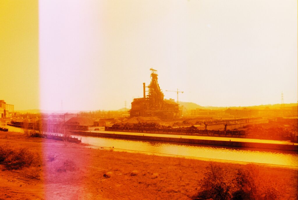
I tried to combine all suggestions in one roll 🙂 Not very scientific of me, changing more than one parameter at once, but hey, I get impatience sometimes… Just as a reminder, I shot the roll of Tri-X from the previous post with an Olympus 35 SP, and the images shot in this post were shot with that camera as well. I intended to return it when I bought my M2, but somehow I can’t seem to part with it… So this time I shot a roll of HP5, and used Graham’s yellow filter. I also did some post processing, but not with every photo (check the caption). And, although cautiously, I must say that I like the results. There is room for improvement of course, but I am enjoying black and white more than I thought. I shoot a lot of colour, because most of the time colour is what catches my eye first, but I want to explore this direction too.
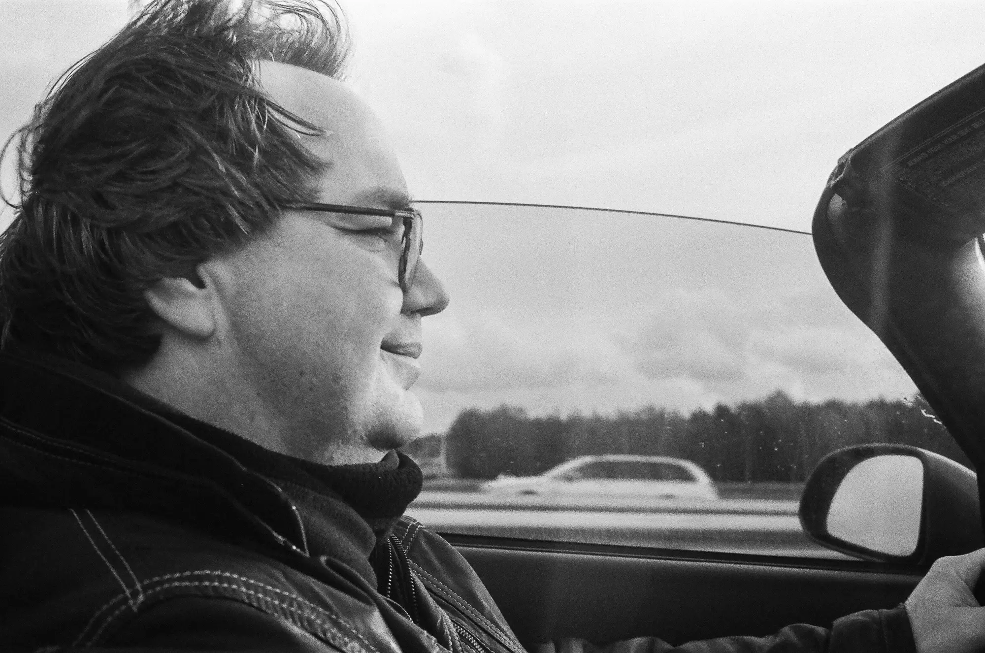

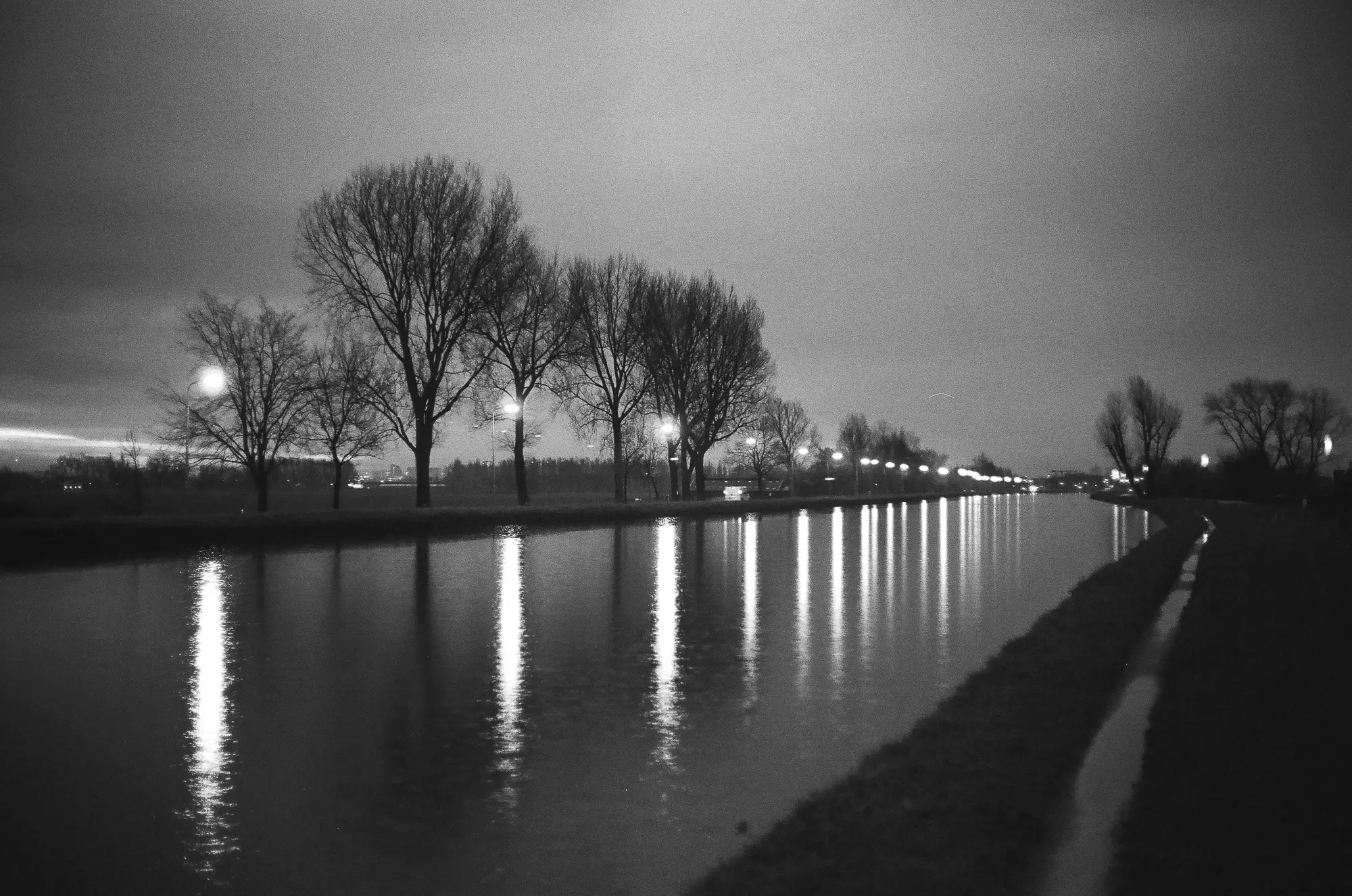
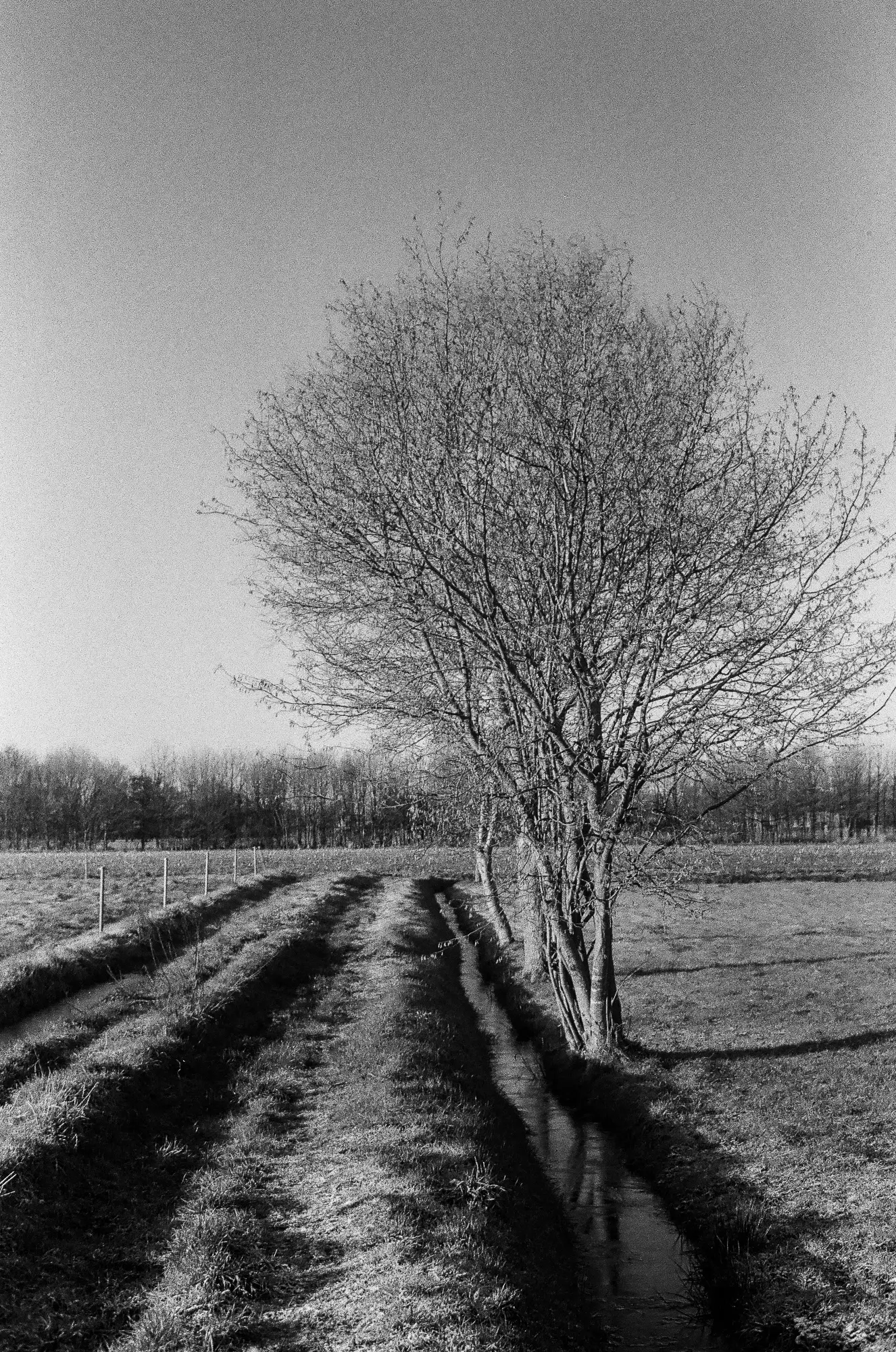
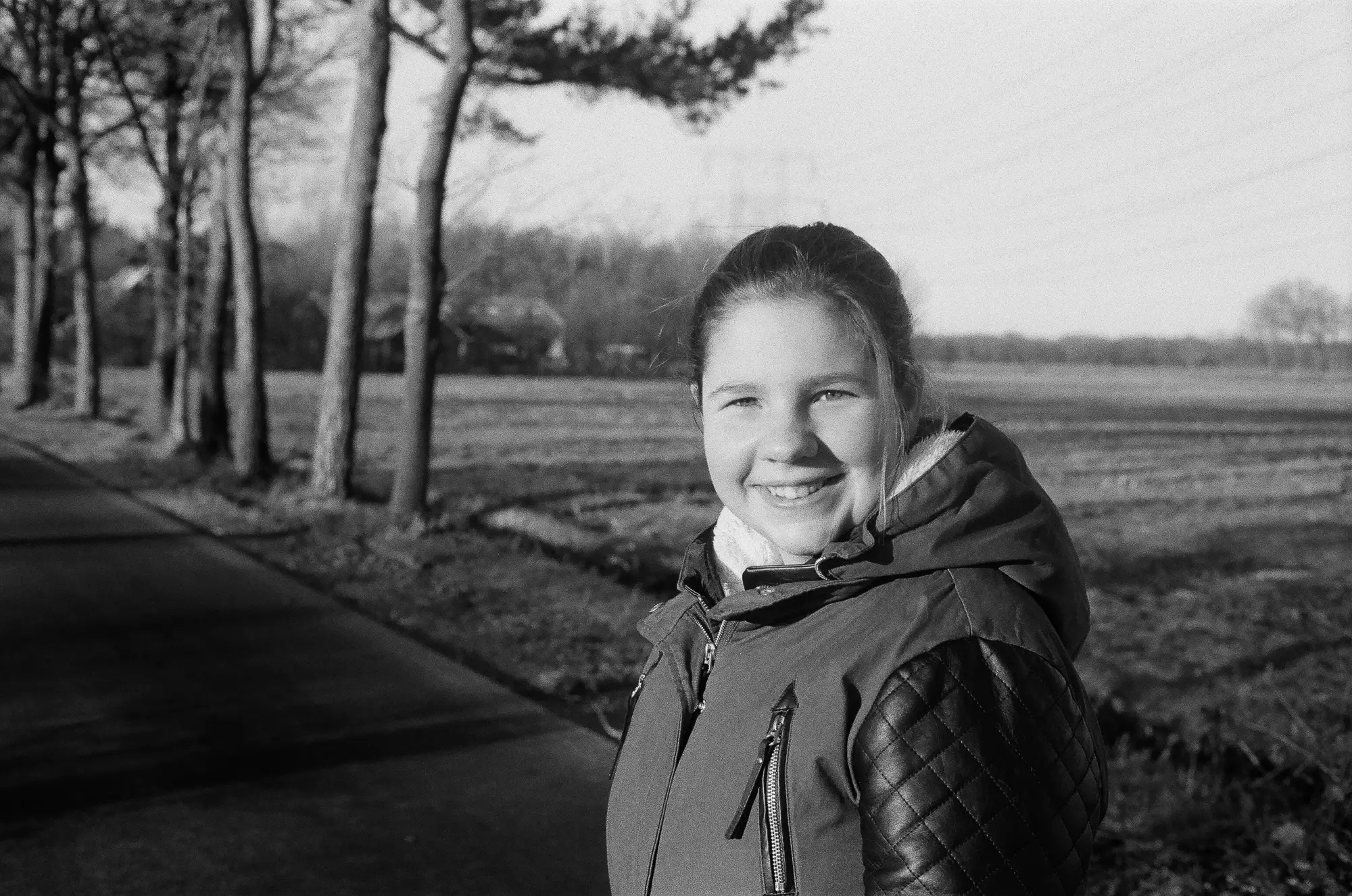
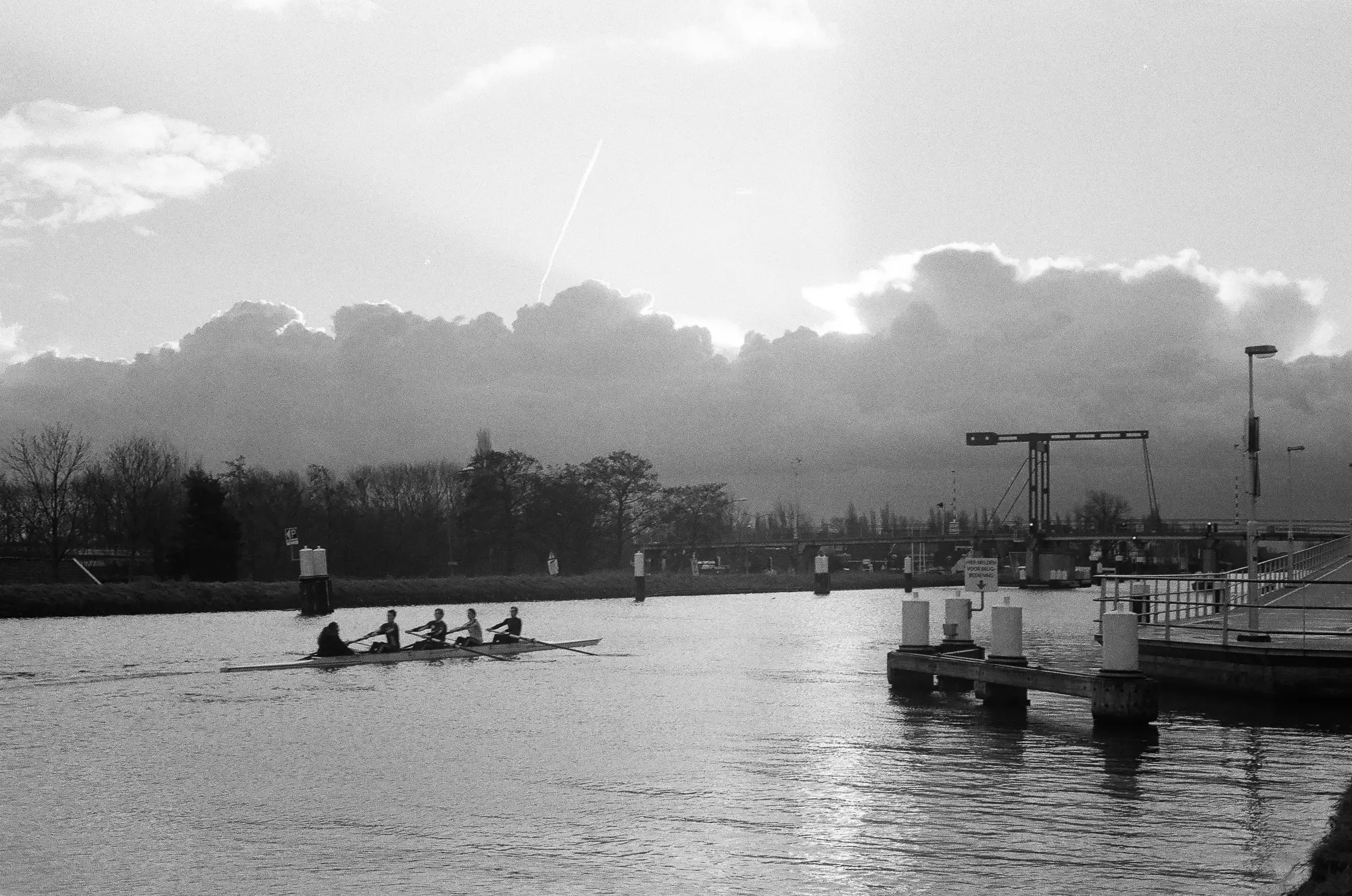
So here are the results. It’s a mixture of subjects as there are a lot of days that I only take one photo. I am missing a bit of sharpness in some of the photos, but they are growing on me. Currently I have my M2 loaded with HP5+, so I am curious to see if that will make a difference. Apart from sharpness, or lack thereof, there is something I like, but I still cannot pinpoint what it is. That not only holds for the images itself, but also for shooting film in general. I get drawn to it, although the results are not always like I expected them to be. Apart from the sympathetic community, there is something else. I think it has to do with the fact that it’s like a puzzle, and I love the process of solving it. From that respect I should hope that it is going to take a long time before I can create images that I want, because maybe after that the magic is gone! Well, I don’t know, somehow it is like there is a promised land of beautiful images when I solve the puzzle of film photography 🙂 . But I am also afraid to think like that, because then I might get disappointed from having too high expectations…
Graham: thank you so much for lending me your yellow filter!
Thanks for reading, and Hamish, thanks for having me!
Read Part 8 of my journey into film here.
Share this post:


Comments
Hamish Gill on The Yellow Filter And Why I Love This Community – by Aukje
Comment posted: 12/03/2016
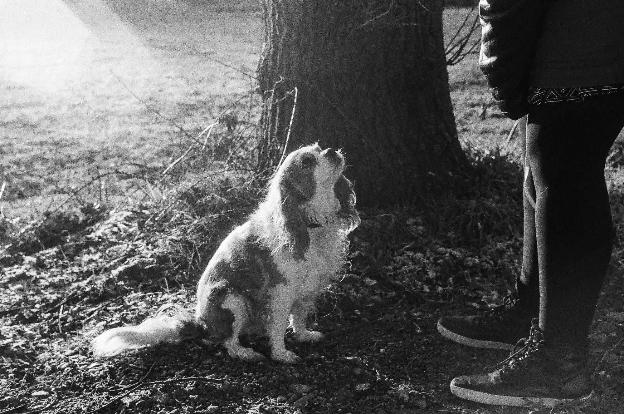
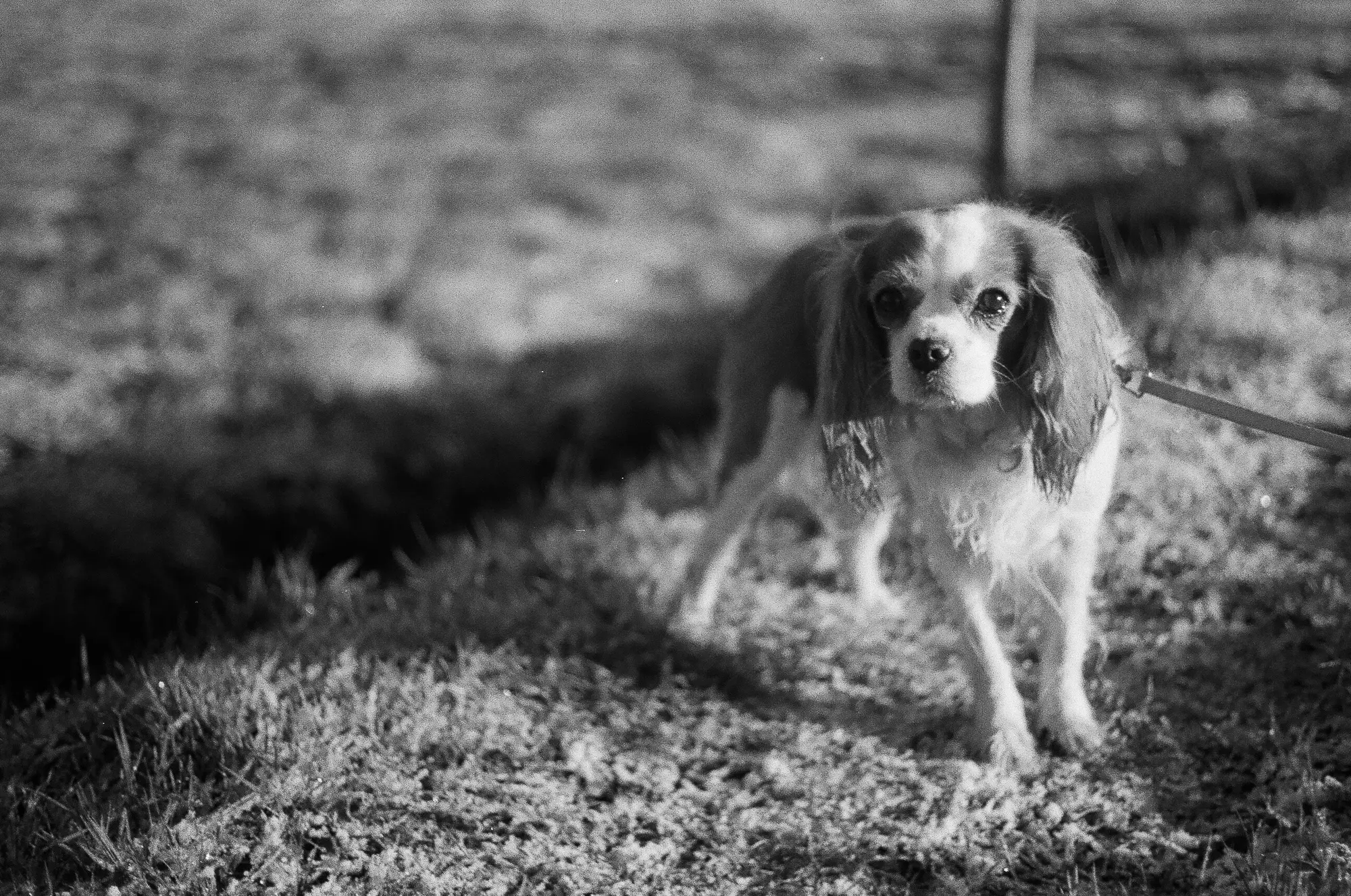
Some great shots here, as always - I love the shot of the dog! Out of interest, are you craving even greater contrast? I'm just thinking you might want to try a more modern lens. Lenses like the ones in these old Olympus cameras are quite low contrast which is definitely going to result in flatter images. Modern lenses with modern coatings are much higher contrast. This higher contrast glass gives results that have more overall contrast, but also look perceptibly sharper.
Have a read of this post, it might bring a bit more clarity to what I am trying to explain
Comment posted: 12/03/2016
Comment posted: 12/03/2016
Marty on The Yellow Filter And Why I Love This Community – by Aukje
Comment posted: 12/03/2016
Comment posted: 12/03/2016
jeremy north on The Yellow Filter And Why I Love This Community – by Aukje
Comment posted: 13/03/2016
Like Hamish I am not enamoured by the low contrast I wonder if the filter you used was plastic or perhaps in some way blemished as there is a veiled look on all of these images which, for me, somewhat lessens their impact.
Great post even so Aukje :-)
Comment posted: 13/03/2016
Comment posted: 13/03/2016
Rob MacKillop on The Yellow Filter And Why I Love This Community – by Aukje
Comment posted: 13/03/2016
I see nothing wrong with doing some digital post processing, especially of exposure and contrast, as these are things you would do anyway if you were in the darkroom. Eventually you might want to set up your home film development lab - something I've never done.
Comment posted: 13/03/2016
JKLPHOTO on The Yellow Filter And Why I Love This Community – by Aukje
Comment posted: 13/03/2016
Learning to use film is definitely a process. "Seeing" light (and how it will render on film) is probably the most important part of shooting the latent image (since you have no instant feedback). Old rules, like have the sun behind you, seem to have gone out the window. In fact, shooting into the sun (several of your images) is "de rigueur" but will lead to reduced contrast for several reasons; light hitting the lens (or filter) and lack of enough exposure to fully develop shadow detail are two reasons. And certainly older lenses are less flare resistant.
The fact that the last couple of images needed no processing is due to light direction and quality. With no diffusion, the sun is a tiny and very contrasty source.
To paraphrase "Finding Nemo", Just keep shooting!
Comment posted: 13/03/2016
Graham Ashton on The Yellow Filter And Why I Love This Community – by Aukje
Comment posted: 14/03/2016
I read your write up (and the comments) with interest.
Working out why a black and white film photo looks the way it does is something that I'm learning comes with experience. I don't have an awful lot of it, but I've been developing my own rolls at home for a couple of years. That experience leads me to a few suspicions about why your results might look the way they do, but I'm well aware that I'm very much on a learning curve here myself.
I clicked on most of your photos (to enlarge them), and was struck by the grain. Both the size, and the structure. It looks far more harsh and speckly than I'm used to. I think both are likely to be a result of the developer and technique used. It'd be interesting to know what developer the lab used.
Before I chose my developer (HC-110) I followed the advice of Ted Forbes (he has a great Youtube channel, and made quite a few videos on B&W film). He suggested visiting Flickr and searching for the name of a film, and a developer. Then sort the results by "Interesting" to get good photos floating to the top. By browsing various combinations you can get a good feel for what's possible with various film/developer combinations.
If you try that, make sure to keep an eye out for medium format images. They've got a lot more detail than the equivalent on 35mm, but I often forget to check when scanning lots of images!
Also bear in mind that the technique has a big impact (e.g. agitate too much, or develop for too long, and you'll get very different results).
Here are some photos shot on HP5 , that I developed at home, using HC-110.
https://www.flickr.com/photos/grahamashton/albums/72157663556631716
If you enlarge one of those photos and compare the grain pattern to your HC-110 shots, you'll see it's starkly different. They're both grainy, but the grain on your roll is more speckly. Harsher.
Aside from developer/technique, the only other thing that I can imagine would affect it would be exposure. Did you allow for the one stop of light that will be lost by the yellow filter?
With regards to whether the camera/lens is at fault here, I'd be very surprised if using a different lens would fix the problems I'm seeing. Hamish has far more experience than I do when it comes to recognising the effect a lens can have on the results, and perhaps he's looking at another characteristic of your shots. What do you think Hamish? I'm thinking that lots of potential sharpness has disappeared in the grain structure.
There are many people who say the lens on the 35SP is the best lens ever to grace a fixed lens rangefinder. On the front of the lens it says "G. Zuiko". The "G" means it's got seven elements (G being the 7th letter in the alphabet). Most of the lenses on high quality fixed-lens rangefinders of the era only had 6. The 35SP has a reputation for sharpness. I put a roll of HP5 through mine recently, but unfortunately haven't any results to share yet, for comparison.
I think Hamish is right about modern lens coatings, but I'm not really seeing the effect of coatings as your biggest issue (as I understand modern coatings are great for taming flare and increasing micro contrast).
So to sum up my thoughts, I think it's too early to blame the camera or lens, and that the most likely cause is the development (either the chemicals or the technique).
By "technique" I'm thinking about something like the amount of agitation the lab used when the film was in the developer, or the temperature of the wash water. Both can have a big impact on the amount of grain. The temperature of the wash water can cause "grain clumping". It's unlikely a professional lab is getting that wrong, but you never know.
I'm afraid I just don't have enough experience of changing these variables to confidently suggest what's causing it…
The other thing worth pointing out is that you get less grain (and therefore more detail/clarity) with lower ISO films. I wouldn't go there yet though, as you're not getting the results you should be with HP5 .
My advice would be to find out what developer was used, then change just one variable on your next roll.
I'd be happy to develop a test roll for you if you post it – I've got one roll of HP5 waiting for a second roll (my tank takes two rolls), and I don't see myself getting out with the camera in the next few weeks, so that first roll will be waiting a while!
Comment posted: 14/03/2016
Comment posted: 14/03/2016
Comment posted: 14/03/2016
Comment posted: 14/03/2016
Comment posted: 14/03/2016
Comment posted: 14/03/2016
Comment posted: 14/03/2016
Ken Hindle-May on The Yellow Filter And Why I Love This Community – by Aukje
Comment posted: 14/03/2016
I'm actually having similar thoughts about old lenses at the moment. I recently found a beautiful Yashica Lynx 5000 at a jumble sale and have really bonded with its mechanical solidity. I haven't had chance to shoot with it yet, but looking at Flickr photos taken with that camera it seems like the lens is quite sharp but noticably lacking in contrast so I wasn't sure whether to add contrast in post or try filters. My instinct is to try a yellow or orange filter but because the Yashica doesn't have through-the-lens metering I'd have to correct for the filter factor manually on each shot, which could quickly become a pain. I'm going to try my first roll without and then see how I feel.
Comment posted: 14/03/2016
Charles on The Yellow Filter And Why I Love This Community – by Aukje
Comment posted: 16/03/2016
Comment posted: 16/03/2016
Miriam Woodburn on The Yellow Filter And Why I Love This Community – by Aukje
Comment posted: 05/05/2016
www.miriamwoodburnblog.co.uk
Comment posted: 05/05/2016
Bruno Chalifour on The Yellow Filter And Why I Love This Community – by Aukje
Comment posted: 29/06/2020
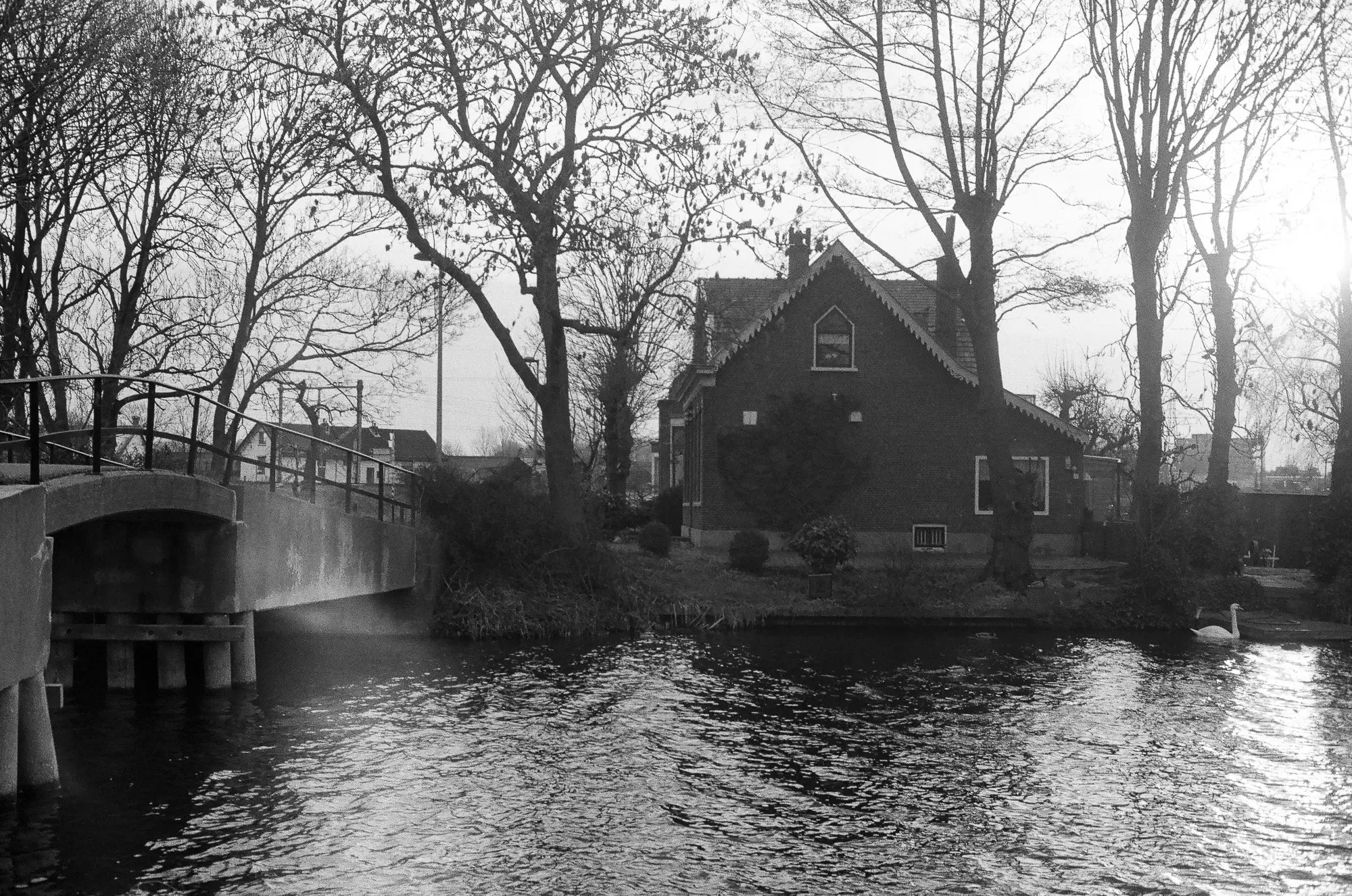
1-post-processing: whether analog or digital sometimes you need none sometimes you need some in order to compensate for how the light is dispatched across your frame that may not match the idea you had of the experience and of its visual rendition as a photograph. What experience brings to the table is both a knowledge and an intuition of what a scene could look like once photographed (G. Winogrand) or once subtly processed (yes I wrote "subtly" because the result of over processing either in the darkroom or on a computer might be spectacular but rarely holds... it gets boring and predictable in the vast majority of examples I have come across. Now film does not mean no processing (Baldus's view of the St Trophime cloister in Arles in 1852 took the stitching, in the darkroom, on 13 negatives). Other examples can be viewed in many famous prints by Ansel Adams (one of the prophets of Straight Photography): "Moonrise Over Hernandez" (the sky would not be what it is without heavy burning in the darkroom), "Monolith" (red filter and ferricyanide), "Mount Williamson", etc. ... For instance your first image (in my humble opinion though that may not match your intention) of house river bridge suffers from muddy tonality and too much density for what seems to be your main subject (anything but the sky). The exposure is fine for the sky but because of the propensity of film to respond to blue light, even with a yellow filter is the subject is backlit, a balanced exposure is almost impossible to obtain (in the 19th century, with negatives over-sensitive to blue) photographers had to make two photographs/exposures (one for the sky and one for the rest), so the problem is not new (although far easier with digital as the problem has been partially solved by the light-sensitivity of the sensor (different from film) and the fact that blue pixels only account for 1/4 of the total number of pixels.
2-assessment of one's work: it is a tough one. You need references outside your own photography. Look at other people's work, especially those known for the proficiency in printing (E. Weston, A. Adams, Robert Adams, Mark Ruwedel, John Sexton,...); study their "style" and figure out a value scale (what you like and what you do not). Try to emulate those whom you like as part of "apprenticeship" which gives you a good base for comparison and evaluation... and ultimately growth.
3-film processing: control your temperature (especially developer and agitation). The coarseness of the grain in your images, especially when it is not necessary and does not bring any "plus' to the atmosphere of your images, results of a few choices (400 ISO film of course but here mostly processing where agitation and choice of developer (and its dilution) play a great role (Try Kodak X-Tol at 1 1 dilution or even 1 3).
4-I totally subscribe to JKLPHOTO's remark: it is all about learning to see light, focus more on that maybe (as important if nor more than subject... one can argue that the real subject of a photograph is light.
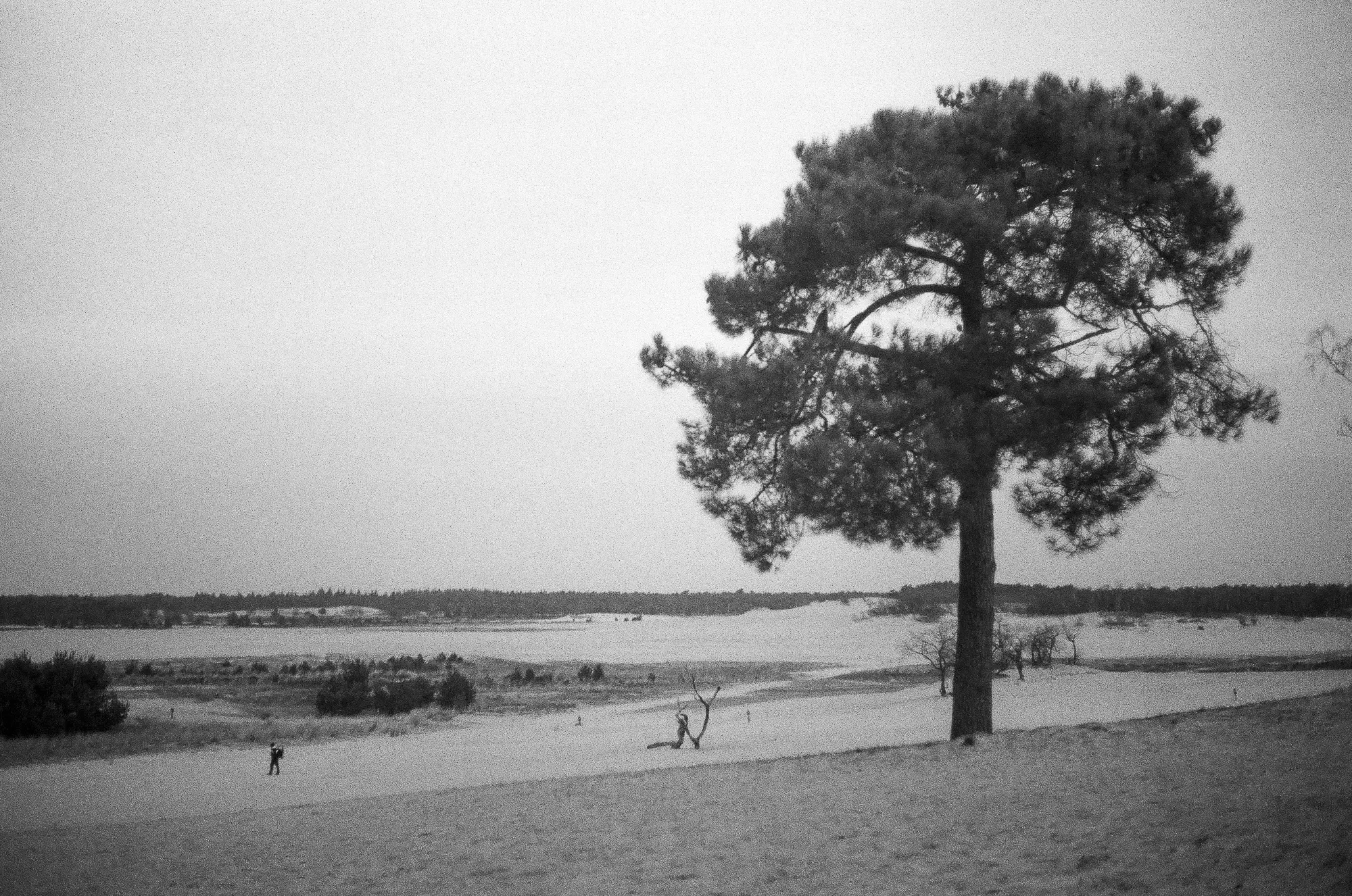
5-Some of your images show vignetting when it is not useful (mother and child and photographer), your Summicron should take care of that. Finally to give you some reference (regarding where I come from and what I expect in a photograph), I think the image of the dog in the middle of the image (in front of the trunk of a tree), looking up to the person whose two feet and legs show up in the right third of the image is very successful in terms of exposure, composition, story-telling, quality of the light (the flare here is not a problem for me, its direction points to the main subject, the dog; its presence make this a "real" photograph and not a drawing or a painting, it successfully adds spices to the dish. Bravo!
Comment posted: 29/06/2020
Bruno Chalifour on The Yellow Filter And Why I Love This Community – by Aukje
Comment posted: 29/06/2020