I was first made aware of Paul and his photos through an article he wrote for JCH. The article, which can be found here, is about his current relationship with photography and fitting it into the busy schedule of being a family man. He talks about the initial buzz of having children to take photos of, but that through this period digital lost it’s magic for him. He talks about a return to film, and then that even though parenthood means your opportunities or perhaps variety of subject matter might seem to be less, it becomes more about making the most what opportunities you have to take photos … This, and much more of the article, very much hit a chord with me! So much so in fact, that I got in touch with Paul to acknowledge the common ground.
I can’t imagine all photographer fathers have an identical experience, but my experience of becoming a father and how my photography was influenced really felt fairly similar to that which Paul describes. Where we perhaps differ is that I was initially driven to find a smaller digital camera (I bought a sony RX100) before I realised that actually what I needed was a smaller film camera. Finding just how easily I could fit such cameras as the Yashica T5 and Ricoh GR1 into my life as a parent and then how positive these cameras made me feel about my photography was pretty much the driving force behind the birth of this blog!
Anyway, I digress slightly, the point of what I am saying is that myself and Paul, through the arrival of children had a shift in the way we approach photography. The most notable effects of this shift, were the switch back to film photography and the switch to fitting said photography around our lives rather than into them …
You may wonder what all this has to do with Paul’s photo zine? Well, I asked Paul to sell me one, he was kind enough just to send it me in return for my thoughts on the photos… I received the book a few weeks ago now, and in that time it has stayed on my desk at work, where it has been flicked through a good few times. Sometimes with idle interest as I chat on the phone and sometime as I take a break from whatever else I am doing.
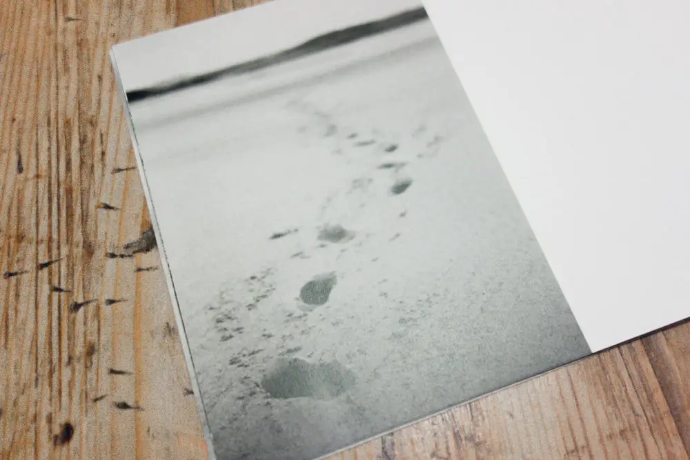
I like Paul’s photos, but I initially found it hard to articulate why. Specifically his images in this photo zine seem to tick the boxes for me. For landscapes, they are for the most part, bordering on, to out and out bleak, with the possible exception of the penultimate image in the book; a set of footprints leading off into an out of focus background. It stands out for me as the only image with a sense of ‘human’ warmth, maybe the parent in my put his child’s feet into those prints, and I imagine that as being Paul’s attraction to the shot? Not sure, and not sure it matters really, other than that as I as it as an image appears different to me than the rest.
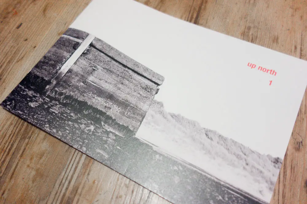
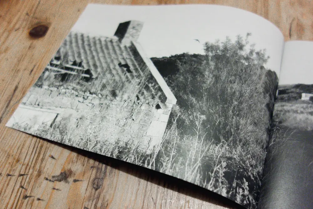
The rest of the images in the book range from derelict buildings to distant shots of static caravans to shots of the beach with very distant people, some of whom may be fishing from the shore. The thing that holds them all together is, as I mentioned previously the bleakness! Maybe the title “up north” and the fact that they are all taken in Budle Bay (which after a quick google maps search revealed to me a place that is basically as far north of England as you can get) makes me prejudge them? I’m not sure, but one way or another, I see bleak, and I like a bleak photo!
I use the word bleak… It’s certainly as I say, to my mind the right word for the content of the images. For the composition though, I think understated is a better word! This again is something I most certainly like in an image!
In the digital hi-def world we are fed so much highly polished perfectly sharp landscape photography, quite often it is golden hour, with exaggerated colours and unusually broad dynamic range… I don’t have anything against this sort of photography, I just don’t find it particularly interesting or expressive. It’s also pretty easy to achieve with a half-pretty bit of coastline, a digital camera, a stack of software and probably more importantly, a lot of available time on your hands … something a certainly don’t have on my hands!
The sort of “bleak” or “understated” photos that are contained within Paul’s zine aren’t reliant on the golden hour, or even necessarily a clear sky, they are instead simple but very effective compositions. The attraction to these sort of images is not as obvious as it might be to the aforementioned digital in-your-face landscapes, and I think for me that is probably the beauty in them. They are undoubtedly aesthetically pleasing, but in a much more subtle way.
I suspect all this makes me sound a snob, or at very least a contrarian? Liking photos that aren’t so obviously pretty and preferring a more subtle aesthetic definitely sounds like the ideals of a snob doesn’t it?? For me, of course, it’s not like that … What I see are photos, very nice one at that, taken by someone, just like me, squeezing photography into a lifestyle where by rights it almost doesn’t fit. I don’t have the time or the inclination to get up at the crack of dawn and capture a beach sunrise. If I’m at the beach it’s because of my daughter and we wouldn’t take her there at the crack of dawn, or dusk for that matter! If I am going to spend my day doing something, what my better half and daughter want from the day comes way before where I might want to go to take photos. But where ever we go, my camera comes too, and whilst there it’s very likely that the obvious aesthetic isn’t readily available anyway. The enjoyment for me is hunting out the less obvious … And that is exactly what I see and enjoy so much in Paul’s work!
There is no reliance on obvious, not even any obvious reliance on the oft advised “Every photo should tell a story” – at least not in the same way your average street photographer might try to tell a story. The photos proportionately rely on a subtle but pleasing aesthetic. Yes they portray the bleak surroundings they were taken in and that is in itself a story, but the story in these images is for me slightly more. Due to having shared a similar change in my outlook toward photography as Paul, and due to that change coming about through parenthood, and of course I suppose due to Paul arguably having a similar style to me … I feel a connection to the images I see… I suppose, in a way I tell my own story through them… and that for me is a far more profound enjoyment to have of another person’s photography than simply seeing or interpreting a simple tale told through observation a stand alone image. At least to my mind…
So, were this a simple “review” of Paul’s zine, the outcome would be a “recommended, buy!” and buy from here! 🙂
Cheers for reading …
Hamish
Share this post:


Comments
Paul Schofield on Thoughts on ‘up north 1’ and a little common ground shared with someone I’ve never met …
Comment posted: 14/11/2013
Comment posted: 14/11/2013
jojonas on Thoughts on ‘up north 1’ and a little common ground shared with someone I’ve never met …
Comment posted: 15/11/2013
Paul, I gotta say that the layout looks interesting from these shots. bare minimum to enhance the shots.