3 cameras, one film. The Leica CL, Canon Rebel K2, and Diana Mini take on Lomography Turquoise in an attempt to get to the heart of this gloriously strange film and see what it can do.
Landing on a gallery full of Lomography’s LomoChrome Turquoise film is arriving at another planet to find color as we know it turned upside down. Yellows and oranges become blues, blues become orange, greens turn sea green/emerald, and reds become a rich shade of purple.
Lomography sent me a few rolls of Turquoise to test out and this is my cross-my-heart honest review of the film. Let’s dive in…
Review Summary in Brief: The Short of It
If you don’t have much time, here is my abridged version of the review, highlighting several features:
Colors: Experimental (deep blues, bold oranges, rich emeralds, lush purples)
Exposure Latitude: Moderate (Variable ISO 100-400)
Grain: Moderate
Film Quality: Good (no noticeable scratching or imperfections)
Type: Color Negative
Chemistry: C41
Number of exposures: 36
Film base after processing: Mostly flat with a slight curl to sprocket edges
Price: USD 12.90 (for 35MM & 120) and USD 8.90 (for 110) per Lomography’s website
Perfect for (personal preference here): Strong light, clear skies, and a bold mix of colors; photographers that like to experiment or shake things up
Brand: Lomography
Full Review: The Long Version
Firstly, a few things to say before we dive into the meaty bits…
I’ve never met a film I didn’t get on with. Each one has characteristics that can be seen as either pros or cons, depending on your personal taste. Film can be tugged and dragged and shaped into whatever the artist decides they want. No film is inherently bad or good, only that it might work or not work for the photographer’s intent or purpose. With reviews, I love to know the personal tastes and preferences of the reviewer to better frame the content within the review.
That being said, my personal tastes vary extensively since I love to experiment with everything. I do find the Lomochrome experimental films very exciting. Metropolis is one of my favorites of all time. Purple is so fun as well. Now Lomography Turquoise brings it to another level.
Some people love it, some people don’t understand it, and some people don’t like it. Which is okay. Rarely is one thing meant to have success with absolutely everyone. If you are someone who likes to experiment with colors and get results that are different from the color film “norm”, then this film would be perfect for you.
I’d place myself in the camp of loving it. Whenever I’m in the mood to get wild with film, I would reach for this one. Turquoise, Purple, and even Metropolis are great boosters for when you feel stuck with photography or maybe a little dissatisfied with current work, what I call the photography blues. Especially if you have never tried them before.
Lomography Turquoise Overview
Before we get into the testing and results, let’s shine a light on the features and specifications of the 2021 LomoChrome Turquoise XR 100-400. First of all, this is not a completely new film. It’s actually been reviewed on 35mmc before! Check out this piece by Hugo Mireles (known as Gran Angular on Instagram here) on the Turquoise version 1.0 here.
Lomography brought Turquoise back due to demand from the film community after initially launching it in 2014. Somewhere along the way, the manufacture ceased. However, while you might recognize the colors generally, it is a new 2021 formula. The film is part of the LomoChrome range of experimental films Lomography created with wierd and wonderful chemical formulas and emulsions.
Lomography says on its product website:
The long-lost and much-loved LomoChrome family member is back! We have received countless requests from our Community to revive this Turquoise treasure so, without further ado, meet the brand-new LomoChrome Turquoise 2021 formula! The craziest member of the color-shifting family, this turquoise treasure will take you on a trip to the magical forest of mushroom houses where everything is blue or aqua, maybe cobalt, emerald, or cyan. You might even get a glimpse of gold. (Source: Lomography)
They have made it available in 35mm, 110, and 120 formats for development in C-41 chemistry. The film has a moderate exposure latitude which Lomography has suggested using any ISO between 100 and 400 without having to push or pull in development. The film canisters are not DX coded, so if you are using a fully automatic camera with no manual ISO settings, the camera will likely default to 100. If you want to shoot at beyond 100 for the extra speed, a camera with manual ISO settings would be helpful.
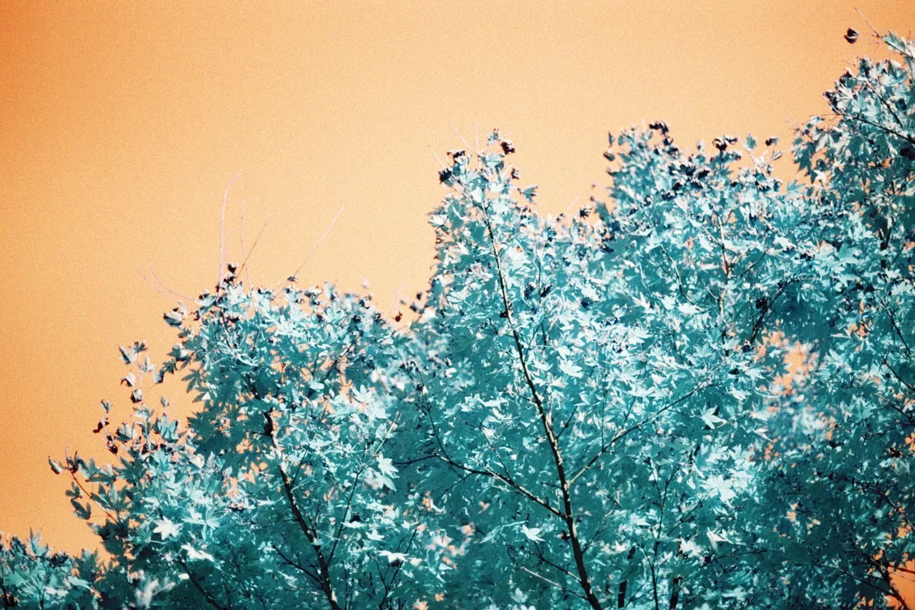
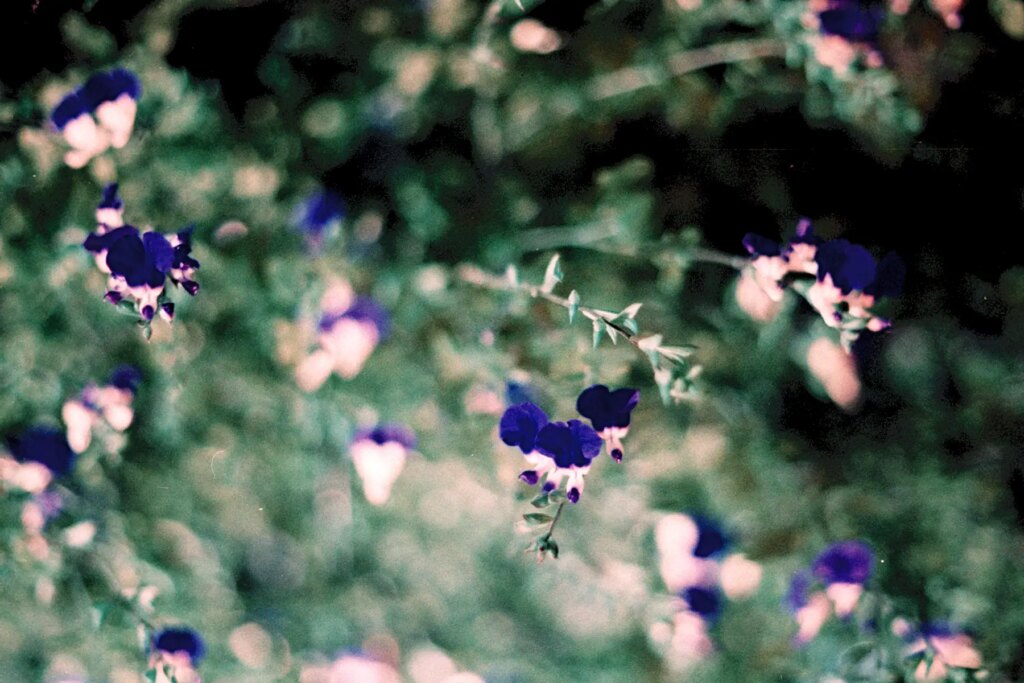
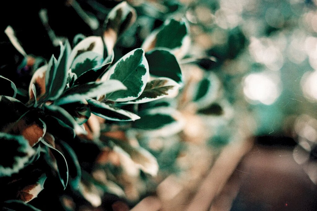
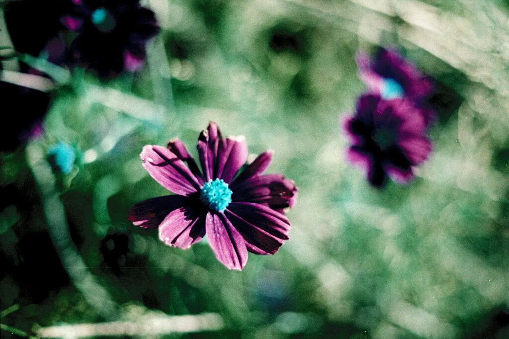
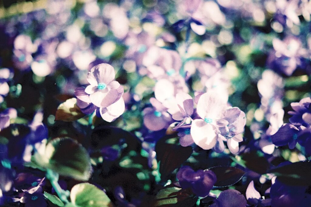
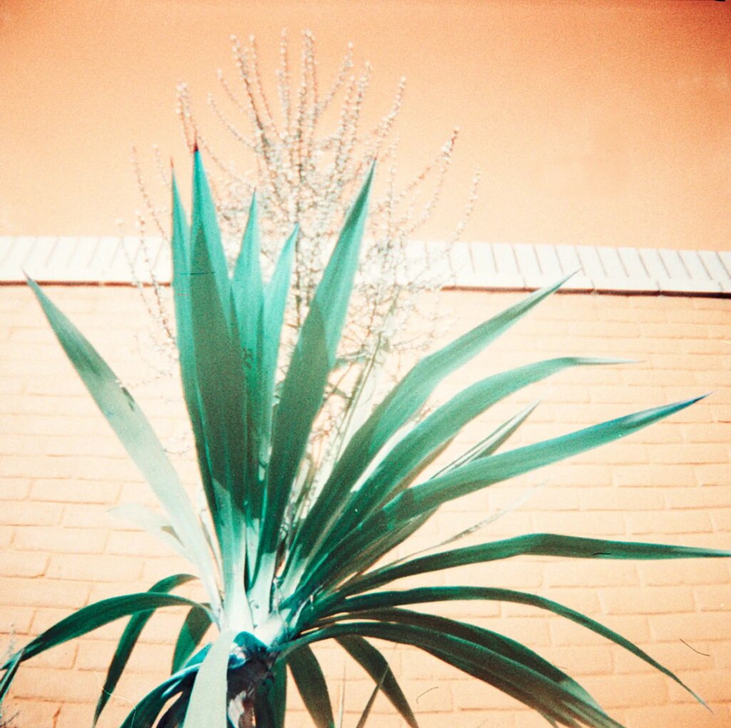
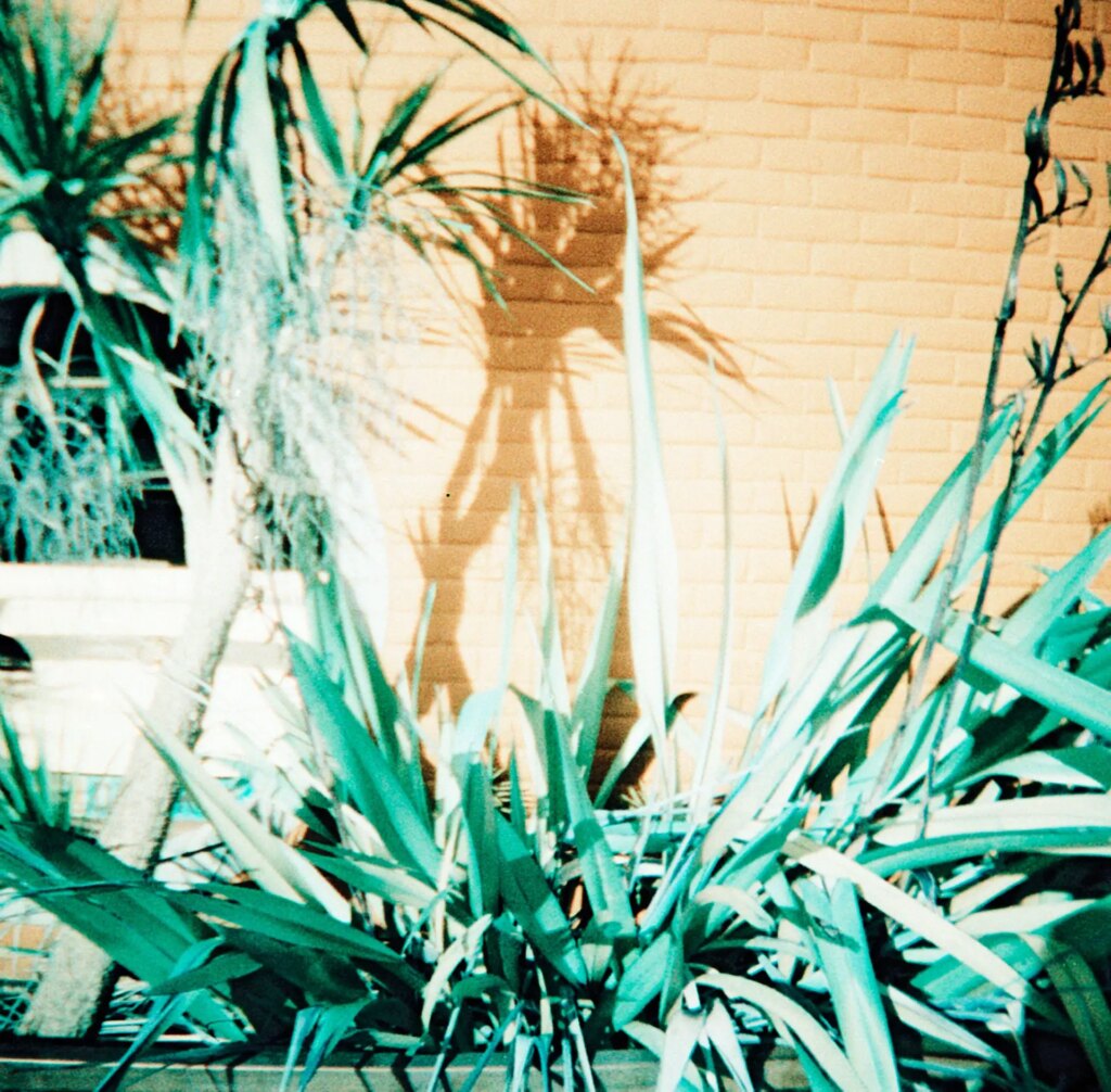
Greens go emerald, reds turn purple, and yellows and oranges turn blue. As you will see in the sample images, yellows turn a light blue color while oranges morph into a deeper shade. So, the brightness and shade of the colors will affect the scale of transformation. The boldest changes are more noticeable on sunny days or when you have strong light. Muted colors don’t feed this film’s soul (for my taste). You can see this in some of the images I took of more neutral scenes below. Depending on how trippy you want your images to get, having a lot of light and bright bold colors will help you along the magical forest/mushroom spectrum.
The film is selling for GBP 12.50 (35mm and 120) and GBP 7.50 (110) on the Lomography online store with a minimum order quantity of 3.
Testing and Results
I tested the 35mm format version with three different types of cameras to get a sense of how the film would look with each type. We have the crispy Leica CL, the bokeh master Canon Rebel K2 with the 50mm F1.8, and last but not least, the super fun Diani Mini shot in square format. All rolls were set to ISO 400. Analogue Wonderland developed the film and I scanned it, making slight adjustments to taste. I favored contrast and saturation with this set, finding the punchy look more pleasing or suited to the film. Depending on your process and taste, the results might be different. Seeing a few other photographers and their results though, while the contrast and saturation levels may vary across preferences, the color characteristics and grain remain similar. Matt Loves Cameras and The Old Camera Guy have two great Youtube reviews on this film that are worth checking out.
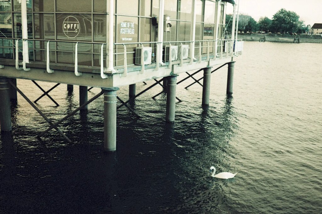
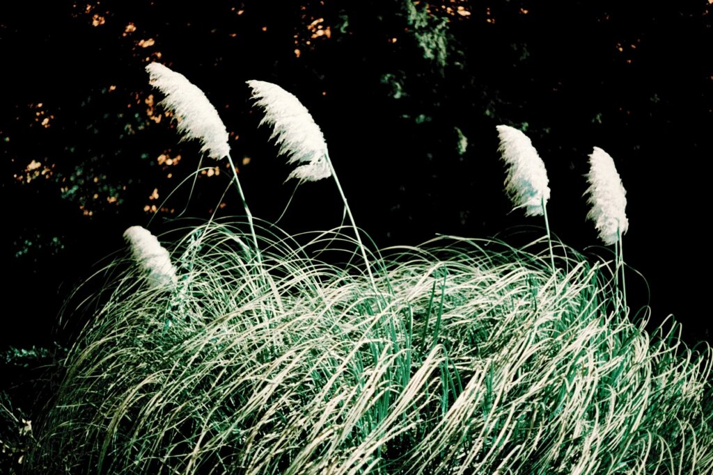
Leica CL & the Minolta Factor
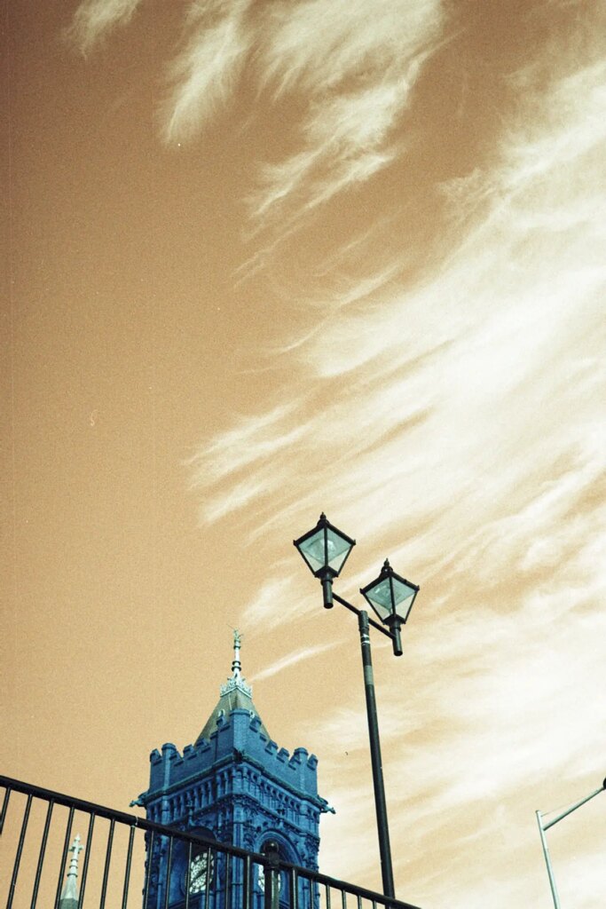
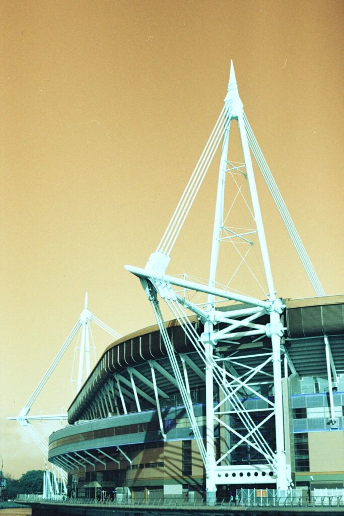
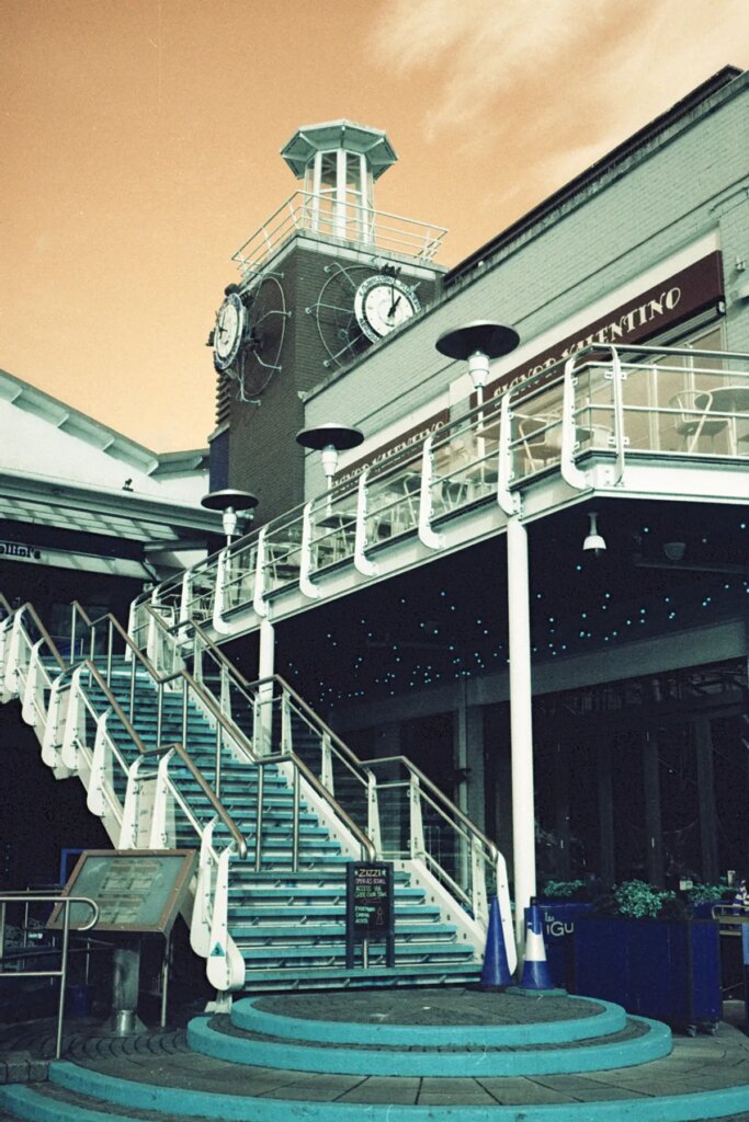
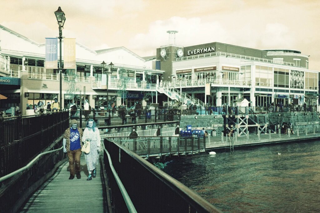
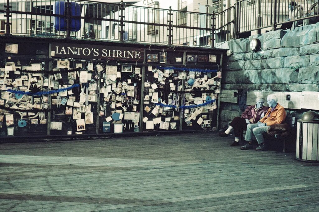
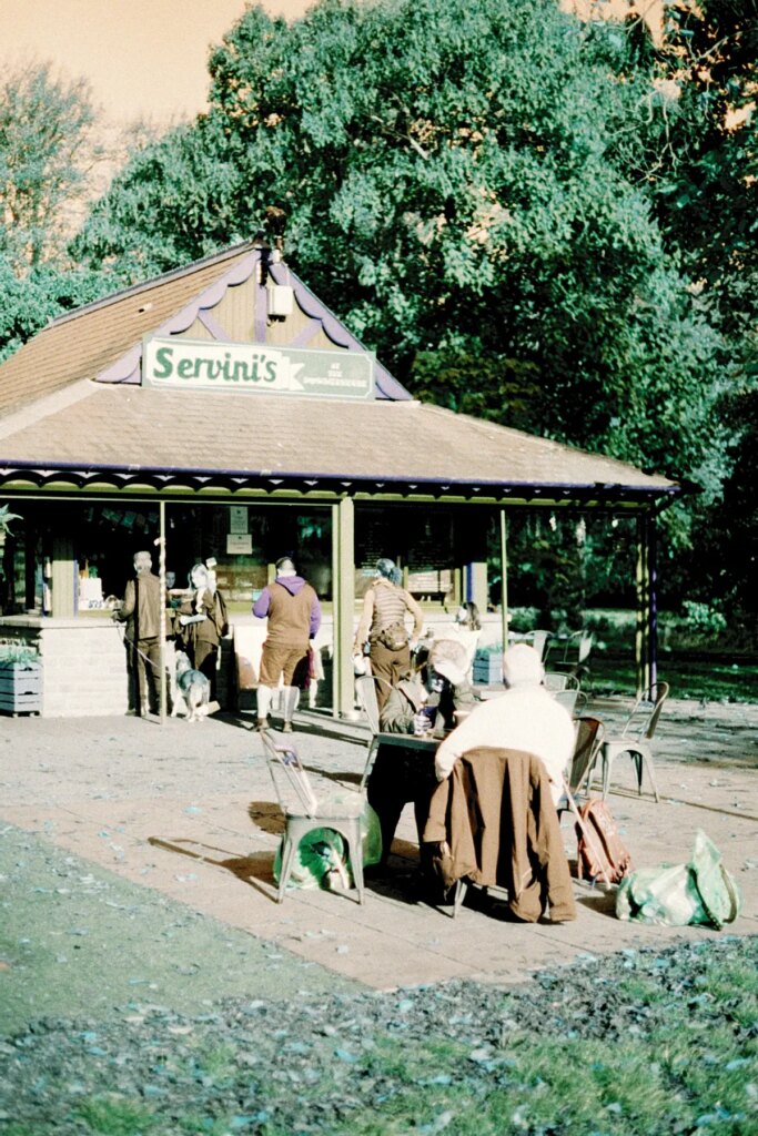
The first camera up to bat is the Leica CL. Grabbing the Minolta-made gem, I headed down to Cardiff Bay to capture some of the last warm-ish autumn weather. It was late in the afternoon so the light was not as powerful which led to some of the flattest images of the whole test. My favorite ones I shot first when the sun was at it’s brightest for the day.
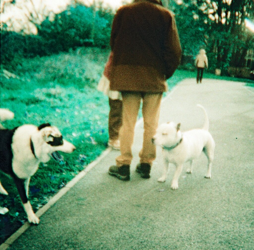
An image of my colorfully dressed partner shows most of the color shifts of the film in one go. He was wearing a bright red jacket over a bright blue hoodie, a bold red hat, and royal blue sneakers.
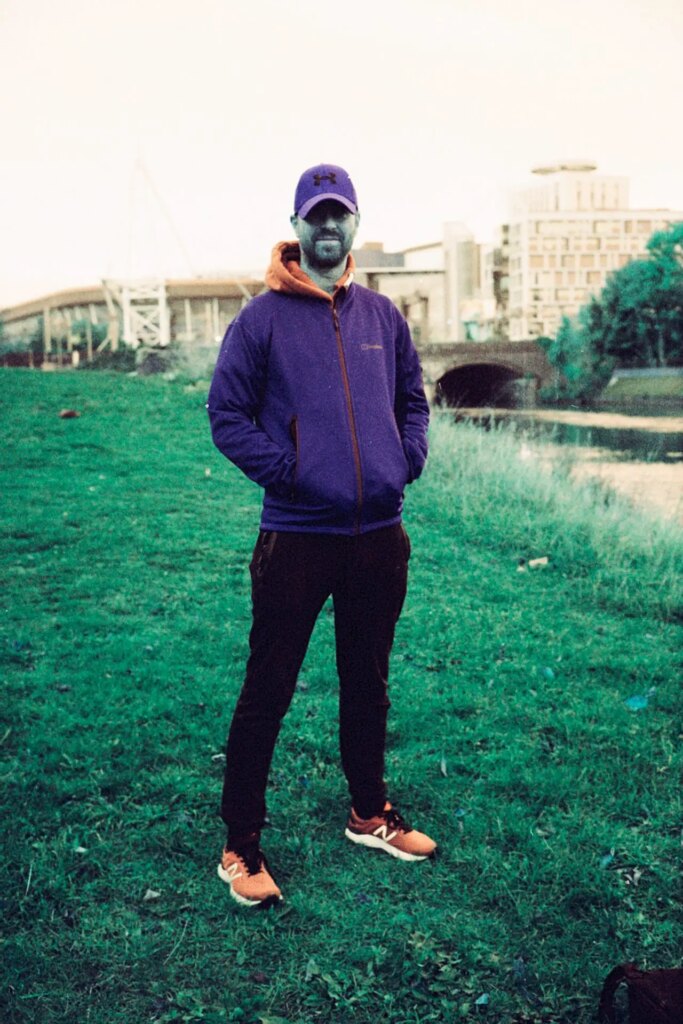
One of the most interesting features of this film is that it turns humans into blue folk! This image, along with other portraits I have seen, shows the effect on the skin. It’s absolutely strange and I’m not convinced it is to my taste yet, but interesting nonetheless!
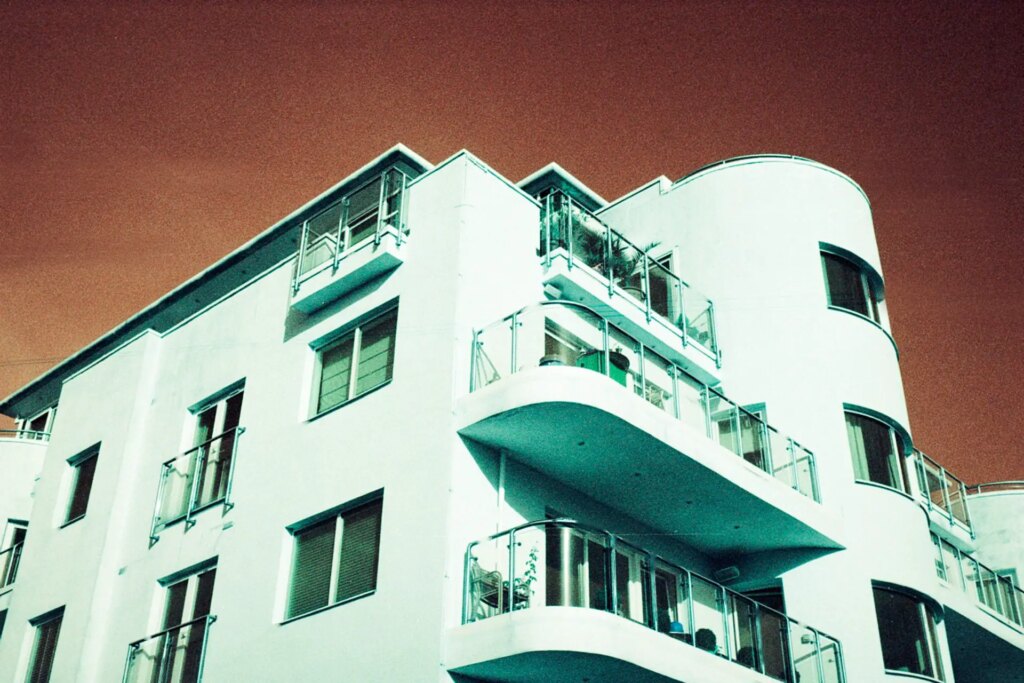
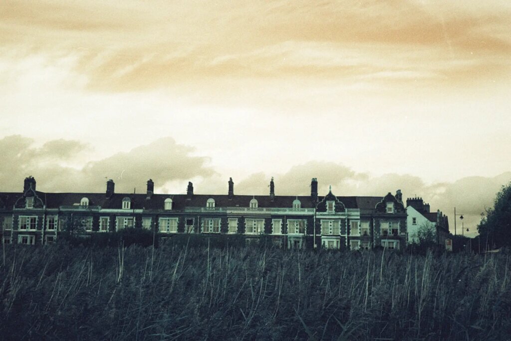
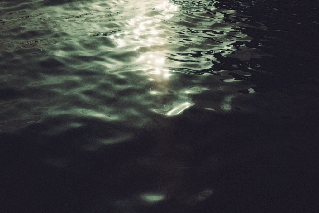
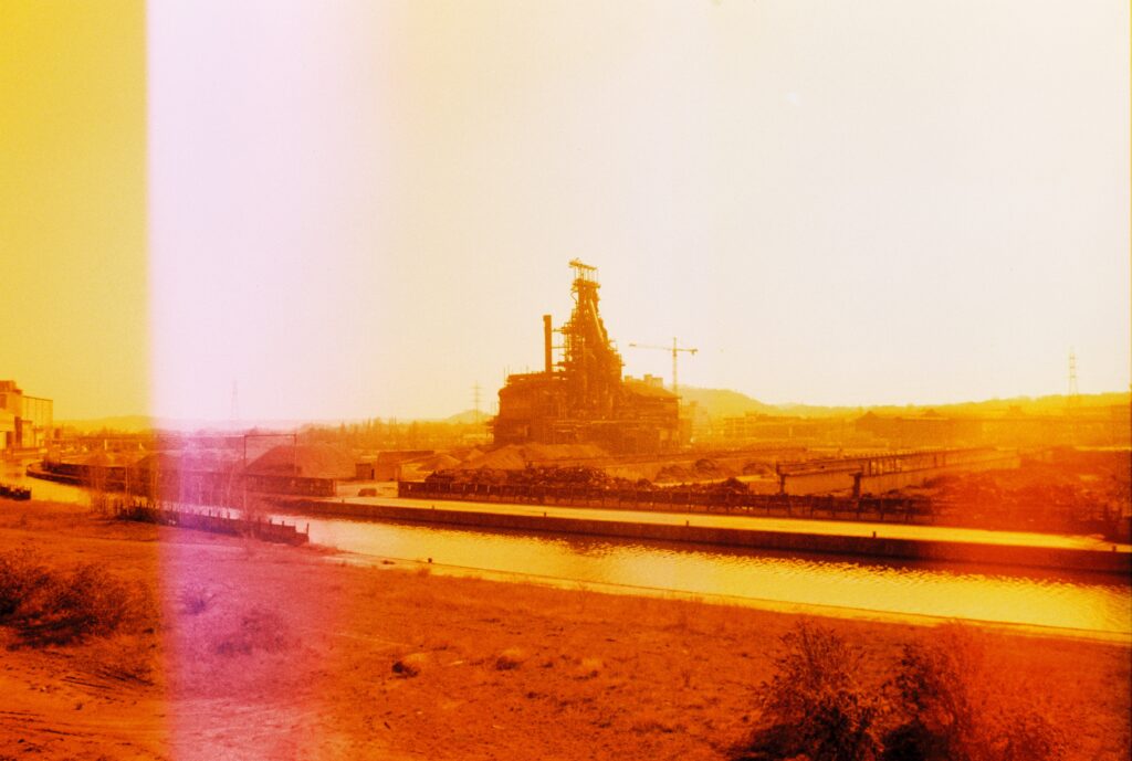
The cloud cover became heavier as the afternoon faded into a muted sunset which cast a dampened dull shade on the second half of the roll. Many of the images here have a very strong blue/green look with a weak orange sky. Mainly due to the lack of a strong cloudless blue sky in these ones along with a less diverse color set.
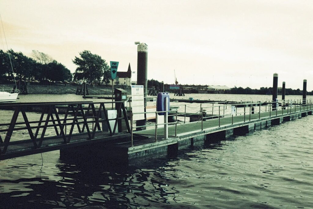
I also photographed a few scenes on the water, mainly to confirm what I guessed from seeing other’s sample images where images of water remain blue/green.
Canon Rebel K2 & 50mm F1.8
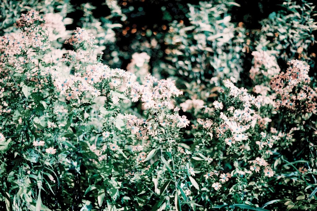
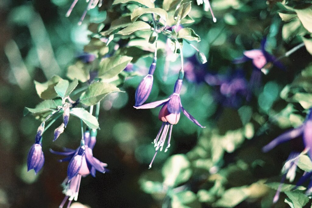
The goal with this chunky bokeh Rebel was to capture nature at its trippiest. To boldly go where no film has gone before. To seek out exciting colors and see how they would transform through Lomography Turquoise. In the UK, the weather doesn’t turn too cold until November, so there were still plenty of autumn colors and flowers to capture.
Marching down to Bute Park in Cardiff for an early morning walk with a mission, I found a plethora of colors. It was a bright sunny day with relatively clear skies. The light was strong. Blooms were showing off. Many leaves still clung to their branches, chlorophyll nowhere in sight. A slight breeze was kicking what leaves had fallen already across the paved park pathways.
Taking advantage of the bokehlicious-ness of the canon lens, I shot most subjects at F1.8. The results are a few of my favorites out of all three rolls.
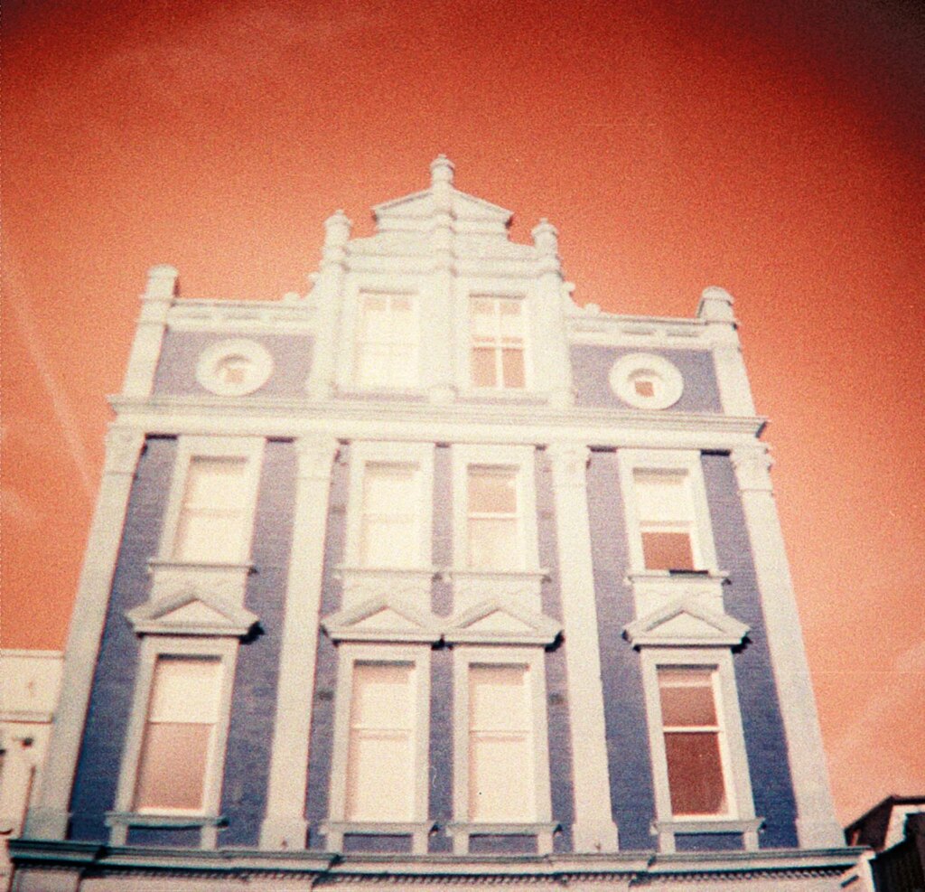
My ultimate favorite is this image of a tree with pure bright yellow leaves set in front of a clear blue sky. I’m a huge fan of light blue in general, so much so that this color combination hits me right where it counts and if I had to pick one scene to shoot Turquoise again, it would be this combination of colors.
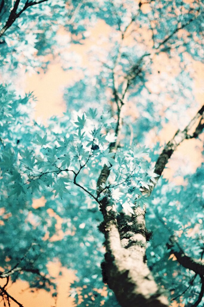
Like most color films and photographic images in general, I think Lomography Turquoise shines in the sun. Light is the first and most important stop in the journey to making a photograph. So where there is great light and an interesting subject, there is a powerful photograph. On the roll with the Canon Rebel K2, there weren’t many (if any) images I didn’t like. This is likely due to having brighter light and subject matter that I feel fits the film’s strenths.
Diana Mini
Undoubtedly one of the coolest and cutest cameras out there, the Diana Mini is quite the chameleon. It is able to shoot in half frame or square format, with flash or without flash, and has the ability to do multiple exposures. There is a black cat that dizzies itself on the wind-on knob but also playfully encourages you to use more film!
I selected the square format for this roll because once you’ve made your choice, Diana does not let you take it back. Unless you want to unwind the whole roll you’ve shot and reload it. No, the choice must be set at the beginning before the film is loaded. Then the format is locked in for the duration of the roll.
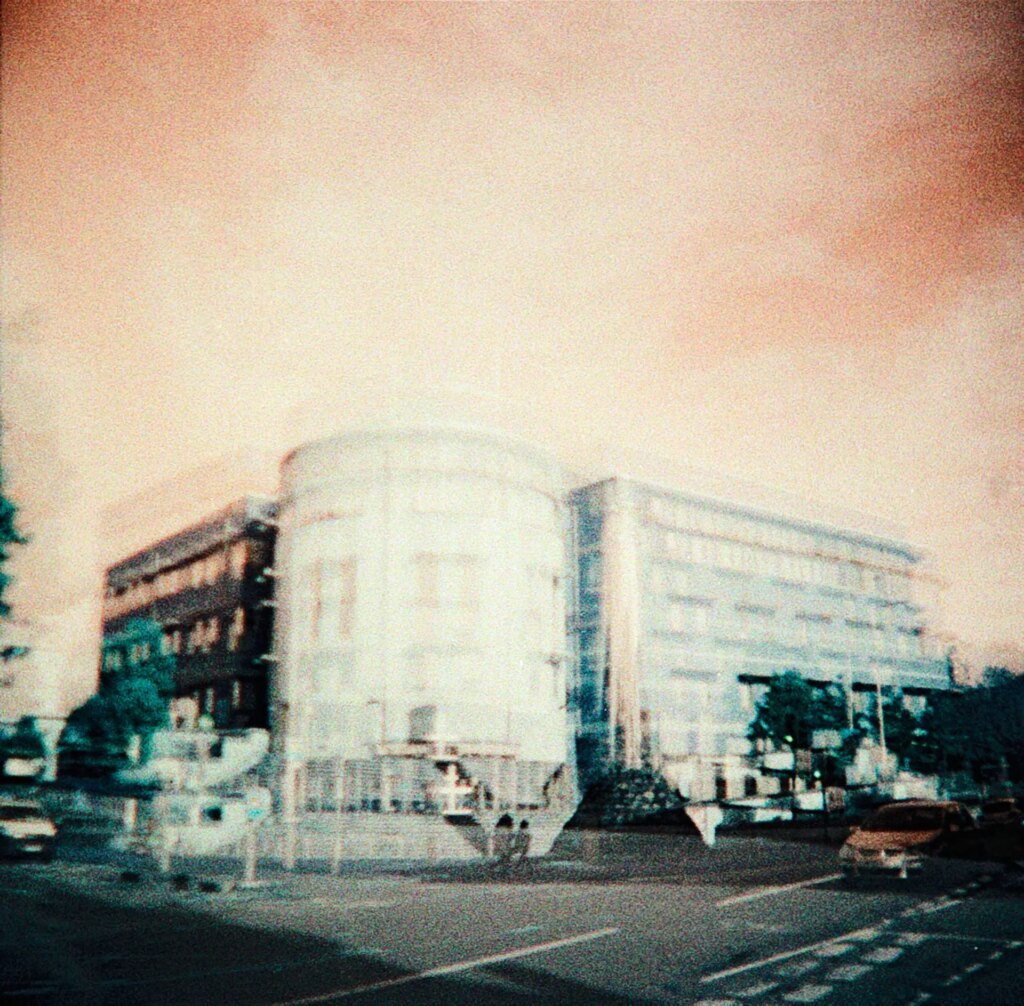
This camera is wicked fun and it would be a shame not to use the experimental features. So I attempted a few multiple exposures. I say attempted because, well, you can’t really tell in many of them. The ones below where you can tell is my best attempt. I have a lot more practice to do here clearly!
Diana suited Lomography Turquoise. It’s a well-matched pairing. The vibes are 100% what I imagine when I think of Lomography, their ethos around photography, and the passionate community that uploads their photos to Lomography’s social website.
While the Diana images were not as crisp as my two other cameras, this was in part due to my lack of excellence in the art of distance estimation. This camera is not meant to be tack sharp though and I really like the more low-fi Turquoise results here.
Final Thoughts
Lomography Turquoise intrigues me. It intrigues me in a way where I want to explore and exhaust the film to see what it can do at length, perhaps even to ad-nauseam. After shooting three rolls, I feel left with only a taster. I’m ready for the main course now. I didn’t even touch what this film can do with colored filters!
35mm is my usual and preferred format, mostly for its economy and ease, but I’m headed on to try Turquoise in 120 and 110 next. Medium format negatives are impressive to look at and yield different characteristics. It would interesting to test out how Turquoise behaves on a larger scale.
Concluding thoughts on specific aspects:
On grain: Having shot all three rolls at 400, most of the resulting images have noticeable grain. It’s not too heavy, but it’s definitely there. My personal taste with the amount of grain varies. I love a clean low ISO image as much as the next Ilford PanF 50 or Ortho 80 fan, but also appreciate the role grain plays in faster films. It depends on the subject matter, but with cameras like the Diana Mini and films like Turquoise, I love leaning into that wonderful heavier side of grain.
On film quality: I didn’t notice any scratching or imperfections with the film. Often if there are scratches, it is hard to pinpoint the cause. Sometimes it’s the camera, other times it’s the film, and occasionally the processing methods (but extremely rare if at all with a good lab). Other than a few dust spots from my home scanning (inevitable), no issues with the film quality with Turquoise!
On subject matter and light: There are certain situations/subjects where I would not likely use this film, but that doesn’t mean you can’t. Quite the opposite. I’d encourage anyone to try this film in any way they want! Only personally, I would avoid a few things after testing it for myself: muted or neutral scenes without much color variety and portraits. Completely personal taste, but I can’t quite get behind the blue skin tones. My favorite subject for this film would ideally be a bright sunny day or strong artificial light including as many different colors as possible, reds, yellows, blues, greens, etc. My second favorite scene is only bright yellows and blues. This look is incredibly appealing and off-the-rails awesome.
Ok, now it’s your turn. Tell me what you think of Lomography Turquoise! Have you shot it yet? What camera would you pair with this bold and strangely beautiful film?
To find out more information or perhaps order some film for yourself to try, head over to Lomography’s website here.
Want more Lomography Turquoise content? Come on over to Youtube here where I also made a video on Turquoise which is mostly a lot of fun filming of me shooting the film.
Share this post:


Comments
Bill White on Lomography Turquoise 35mm Film Review
Comment posted: 16/01/2023
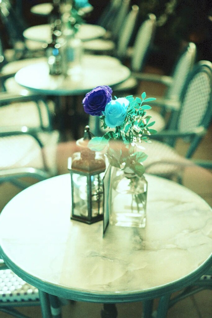
The red and yellow rose on the table in a vase is my fave.
Bill
Jerry Scoby on Lomography Turquoise 35mm Film Review
Comment posted: 16/01/2023
Ben Garcia on Lomography Turquoise 35mm Film Review
Comment posted: 18/01/2023
I absolutely agree that subjects should be well-lit and colorful for best results. Then again, that applies to most color films imo! Low-contrast/shadowed scenes all came out a little muddy and disappointing.
After seeing your results here, I'm drawn more to the less-plastic, more modern cameras for using this film. Those sharp images from the CL are really cool! Whereas I'm sure someone more creative than me can get great "lomo" images, those architectural shots almost look like painted/multi-format illustrations from the 60s-70s.
Technician on Lomography Turquoise 35mm Film Review
Comment posted: 21/01/2023