The film community is a high point of the internet. Coming back to film after a 20+ year hiatus was facilitated by all of the excellent work that has been done over the last few years. My return home would have been a painful, stressful, and expensive affair without the help everyone (thanklessly) offered me. All topics from camera selection to processing were thoughtfully explained online and directly with helpful people in person and in some of the forums.
From time to time, however, I feel that the film community (like any community) can be an echochamber of ideas. As an outsider, at times, my experience was inconsistent with the orthodoxy of the film community. One of those experiences pertains to film stock selection. As you will read, I’ve reconsidered how I use and select color film. When compared to the advice I find online, it seems that I have something of a contrarian approach to how others use and select film. This approach is the basis of my thesis about color film selection within the context of modern hybrid workflows.
My Thesis – Introduction
My thesis is that if you digitize your negatives, you shoot general purpose film and not specialty film (e.g. Ektar, tinted film, etc), and you shoot it as the manufacturer intended (e.g. without pushing or pulling) the film stock you use isn’t as important as you may think.
My suggestion is that you can simply pick your film stock based on speed, latitude and grain.
Although there are some caveats, many differences between film stocks (including most of what you find online in film stock comparisons such as differences in color and contrast) are largely negligible when applied to real world situations.
For that said, is is worth noting that if you are printing directly from a negative, you can probably ignore this discussion in its entirety – this is a discussion aimed squarely at those who shoot color film within a hybrid workflow.
The Digitization Factor
We have all seen the YouTube videos and online comparisons comparing different film stocks. Invariably the reviewer focuses on minor color differences and/or contrast between the film stocks. If you have any interest in 35mmc, you know exactly what I am talking about. My thesis is that these comparisons may be as much as about looking at differences between scanners and assumptions made during digitization by their lab or in their home scanning workflow rather than inherent differences in the film stock.
Stated another way, the results you see online might be bogus if you scan film at home or use a different lab than the one the reviewer used.
My thesis does not question the orthodoxy that there are native color differences inherent in film stocks due to different dye sets and technologies (e.g. the root of the refrain that Kodak film is warmer than Fuji). Rather, this thesis suggests that these differences are subtle and only apparent when comparing film side by side, obtained under test conditions, and balanced to a known value grey card. Using jargon borrowed from medicine, this thesis suggests that the native color differences between films is “clinically insignificant.”
All Scanners and Software Make Assumptions
My path toward this thesis started when I compared the results I was getting from two different labs. As a film newbie, I expected similar results yet they were different. The thesis crystallized when I started home processing and using Negative Lab Pro (NLP) to scan my images.
The NLP software forces a user to make a number of assumptions when converting negatives. The core of my thesis is that these assumptions are as important, if not more important to the final look and feel of the resulting image, as is the film stock used to obtain the image.
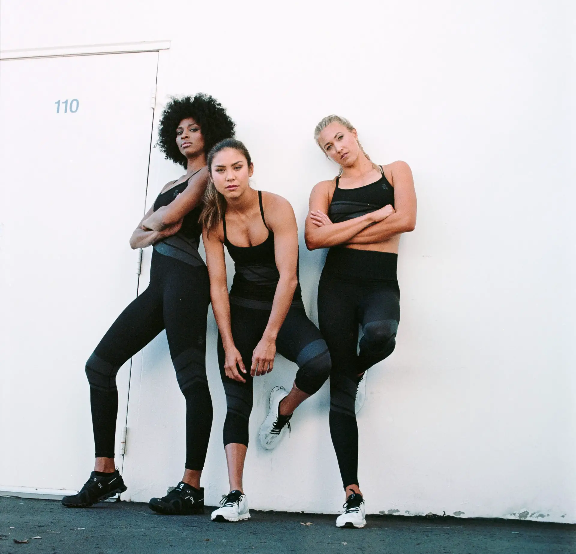
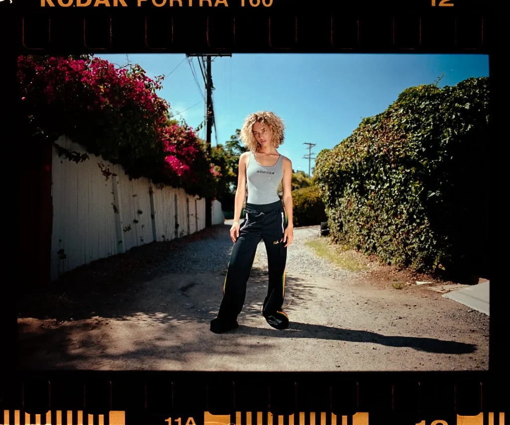
Here is an example. Please tell me which film I used, Fuji Pro400H or Portra 400?

If your answer is, “This is a silly exercise.” You are correct. It is silly. There is no way to tell from just looking at the image and that is the point. We have been told repeatedly that Fuji is more green and Kodak is warmer but depending on how I white balance the images, the color can be anything from warm to cool or green to magenta.
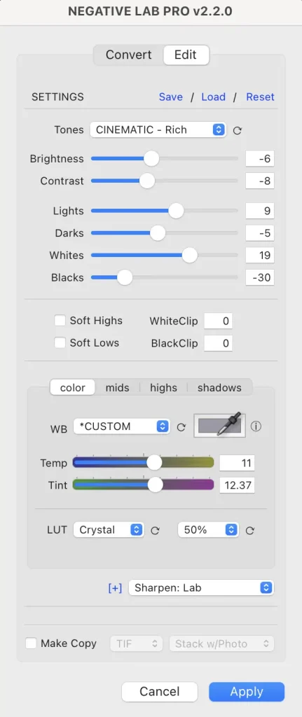
Below is a screenshot of the NLP white balance menu.
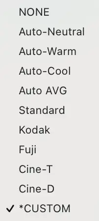
My contention is that these settings are as important or more important to the color of your image than the filmstock you use.
As an example of how important the scanner settings are to the overall look to the image and why I feel that minor differences in film color are not as important as scanner settings, consider the following two images. The only difference between the two is the white balance preset I chose in NLP.
I would even venture to guess that the pastel “Portra look” that is so popular among YouTubers and in the film community is as much about how the film is exposed (e.g. over exposing by a few stops) and adding tweaks in post processing as much as it is about an inherent characteristic of the film stock. For reference, Kyle McDougal explains how he gets this look and it leans heavily on post processing.
Considering that at least in some circles, Portra has become synonymous with the pastel “Portra look.” it may be of interested to note that my results with Portra don’t have the pastel “Portra look” unless I want them to look that way. As an example, this is an image where the client wanted anything but a pastel “Portra look.” This particular client (a very demanding and sometimes feisty client) prefers contrasty and saturated images. I shot this image at box speed, exposed for the higlights, and allowed the shadows to go black. These images were processed only with the options available in NLP. A screenshot of the NLP settings is also included for reference.
Taking a deeper dive into the NLP options, and getting past the white balance presets, there are also selections for different film scanner LUT’s. These LUT’s have a dramatic difference in the contrast in the image.
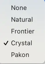
Whether or not these LUT’s accurately reflect what goes on in a Pakon, Frontier, or Crystal scanner in the real world is not entirely relevant to this discussion. What is relevant is that there are known or at least perceived differences between the different lab film scanners and these differences are large enough that the NLP designer, Nate Johnson, thought it would be important to include scanner LUT options in their interface.
As an another example, Hamish from 35mmc, touches on this topic and says in his Kodak Portra 800 review:
“I also found the results out of the Noritsu to be quite impacted by the slight yellowish-orange cast this scanner is quite well known for.”
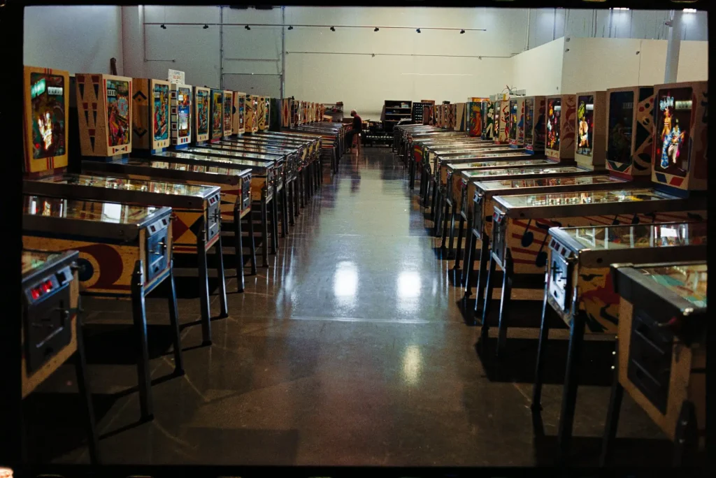
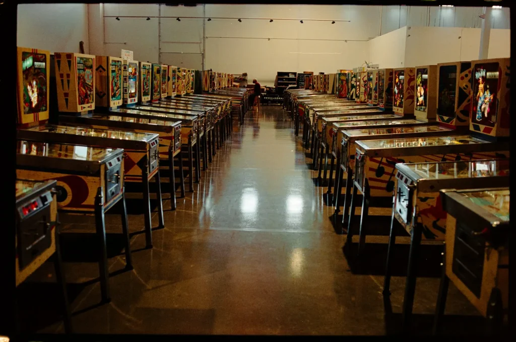
As an example, these two images were processed in exactly the same way in NLP with the exception that I used a Crystal LUT for the first image and a Pakon LUT for the second image.
Image using NLP Crystal LUT vs. Same image using NLP Pakon LUT
This discussion of different lab scanners suggests that even if you send your film to a lab it is possible that you are going to see differences in your scans depending on which lab you use. It is possible that at least one of the differences I found when sending my images to two labs was because of different scanner hardware and/or tastes of the lab technician.
To wit, in a discussion had with with Duncan Gammon from Silverpan Film Lab myself and Hamish had within the process of creating this article, he concurred and suggested that users should expect to see differences between labs depending on how the commercial lab scanners are set to run. For example, Duncan explained that if they were to set their Noritsu scanner on auto, the scanner would attempt to colour balance everything across the whole roll. As a general rule it does an accurate job but can be tricked by underexposed negatives or scenes with large contrasting primary colours. As a result of this, he explained,
“We very deliberately don’t set the machine on Auto, instead, we colour correct and judge each image to get the best out of the machine.”
He further commented that,
“It’s important to dig deeper under the hood with these machines so that the operator has control over what is being corrected and when. For example, the ‘Fuji green’ myth is dispelled when you balance the scan correctly on the Noritsu.”
In short, although there are differences between commercial film scanners when used with AUTO settings, the reality is that one scanner can be made to look nearly the same as another scanner with an adjustment of the settings.
The Take-Home So Far
The take home message so far is that if you are finding that your results don’t exactly match your expectations based on the film stock comparisons you find online, this should not be surprising. Although there are real differences in color and contrast between different film stocks (more on that in a minute), if you are home scanning be cautious about going too far down a rabbit hole trying to tweeze out differences between film stocks when you are deciding which film to use because, ultimately, these differences might not be as impactful to your images as you might have been lead to believe.
My thesis is that your lab and/or home scanning settings may have a bigger impact on your final image than the filmstock you chose. As a corollary you might also expect that if you are sending to a lab for processing/scanning your results differ from what you see in online comparisons if you don’t use the same lab as the reviewer doing the comparison.

Differences Between Film Stocks
This Doesn’t Mean that there are no Differences Between Film Stocks.
I am not suggesting that there are no, real world, differences between film stocks. Differences between film stocks are well documented and include differences in film speed, grain, latitude, and color palette.
To repeat what I said at the beginning of this article, my thesis suggests that the major, relevant, differences are film speed, grain, and latitude. Conversely, color palette, although it receives much of the attention in film comparisons, is a comparatively minor difference when considered in a hybrid film workflow.
Color Pallete
When I discuss “color palette”, I am referring largely to the vibrance or saturation of images produced by a given film stock in a perfectly color balanced image. For example, let’s say you have a roll of Portra and a roll of Ultramax and you are shooting the same portrait with both films. Once you’ve correctly color-balanced both shots of the scene (such that a neutral grey patch in the scene appears grey), the skin tones in the Portra shot should look much more natural and somewhat desaturated than the skin tones in the Ultramax. Ultramax is expected to have more vivid colors.
In a discussion with Nate from Negative Lab Pro, again had between myself, Hamish in the preparation of this article on the relative contribution between the native film color palette and effects of processing, he advised that both the native film-specific color palette and the assumptions made during processing both have an impact on the final image.
However, the impact of a film specific color palette is more subtle and won’t necessarily be noticeable in all types of scenes. So, whilst Nate advises that if you really want Portra skin tones it is better to start with Portra. Similarly, if you want rich reds and lush greens you are better off starting with Ultramax and adjusting from there, we between us broadly agreed that:
- In the vast majority of cases, the effects of processing are so significant they overwhelm the relatively small contribution of the filmstock.
- Many people have goals for the look of the image that don’t necessarily comply with the native film color palette.
- Native film color palette may not actually be considered by the technicians at a lab or by the photographer home scanning
Therefore, given all of the variables in a hybrid workflow, it is difficult (if not impossible) to determine what contribution the native color palette is contributing to the image anyway.

Lattitude Speed and Grain
This discussion of the native color palette does not mean that all film is interchangeable. Nothing could be farther from the truth. Film selection remains important but rather than concern ourselves with color pallet, it is my suggestion that the important, real world, differences between film stocks that we should be concerning ourselves with are:
Latitude
As a general rule, the professional films such as Portra or the now defunct Fuji Pro400H can handle wide swings in exposure and still provide you with a usable image. Conversely, the consumer level films (Kodak Gold, Color plus, etc) have a much narrower exposure range that will provide you with a usable image. My personal tests support this which should not surprise anyone. This information can also be gleaned from the film characteristic curve. A full discussion of characteristic curves is outside the scope of this discussion but can be found here
Speed/Grain
Faster film (higher ISO film) as a general rule has more grain. If you like grain, choose the faster film. If you don’t, choose the slower film if the lighting condition allows. My personal tests directionally support this assumption but I have, on occasion, found that the relationship between film speed and grain is not always 1:1. Moreover, consumer grade film at equal ISO is expected to be more grainy than professional grade film at the same or similar ISO.
Choosing film, Simplified
And so, if your main considerations when choosing a film stock should be based primarily on how forgiving the film is to shoot, cost, grain, and speed, you could, as I do, ask yourself the following questions
- What speed film do I need for the lighting situation and speed of my lens to get a proper exposure?
- How much grain do I want or, conversely, can I tolerate?
- How much time do I have to dedicate to obtaining perfect exposure?
- How critical is perfect exposure across the image?
- How much can I afford to spend?
My Current Film Selection Paradigm
Easy to say, perhaps, but this is the process I now work with, and I have found it to work very well for me. I certainly find myself less confused/overwhelmed than I did when I first returned to film.
When I returned to film, given the environment I found online, I believed that there was a “best” film. Many of the people writing and speaking about film shot Portra in one form or another so I assumed that there was a good reason. Several months later, however, I was talking with the folks at Acme Camera in Salt Lake City and was given a tip that went something like,
“Shoot Proimage 100. It is all I shoot. Cheaper and similar results to Portra.”
This was echoed by another person at Camera Exposure in San Diego. In a third example, I was speaking with a person at Encinitas Camera asking about the differences between Colormax, ProImage 100, and Kodak Gold and they recommended,
“The differences are so subtle it doesn’t matter. Pick the speed you want.”
The final blow to my belief that there were dramatic differences in film stocks other than latitude, grain, speed, and cost, came during testing for an upcoming film/motion project where I will be shooting film at 8 fps. During my testing for that project (video below) I was comparing the various inexpensive film stocks because blowing through 100 rolls of Portra for a 45 second video would be significantly more expensive than 100 rolls of something Iike Ultramax.
What I found was that Kodak Gold, Ultramax 400, and Proimage 100 were essentially interchangeable. Below is the actual clip where I was comparing the different filmstocks. What I found was that none was better than another and I honestly don’t remember which is which. I also believe that if I told you it was Portra, it is possible that you wouldn’t know or care any different.
As such, to turn th eabove 5 questions into a practical approach for selection of film, I now use the following decision matrix when choosing color negative film:
- Step 1: Assess the lighting situation. Pick an appropriate film speed.
- Step 2: Assess the lighting situation. If it is expected to be variable or high contrast, I will use Portra. If it will be constant or low/even contrast will choose ProImage 100 or Ultramax 400.
- Step 3: If I wont shoot a whole roll of film in one setting, I choose portra 400 to give me some latitude for future use.
It is that easy.
Some Final Considerations
For all that, I do want to make a few final comments on color film types, film availability and the validity of reviews you might find online:
Film Discontinuations
Although film differences might not be as big as some assume, that does not mean that we should fail to lament when a film stock gets discontinued. Even though I largely only shoot Kodak film these days, I still feel that it is a shame when other film stocks get discontinued. More is always better when it comes to variety and competition. Although I don’t feel, given my workflow, that the differences between Kodak and Fuji or other general purpose film are practically significant, more competition in the market is always better when it comes to pricing and film availability. I am right there with the film community when a film stock is discontinued.
Speciality Films
Remember: This thesis does not apply to specialty films, slide film, or black and white film.
I have not used every film stock but from the ones I have used, I would like to exclude from this conversation what I call specialty films such as Cinestill, Ektar, and any and all of the tinted films that make your images purple, red, gritty, groovy, or have film leaks baked into the emulsion. Please limit this conversation to the general purpose films that were intended for general purpose photography. Trying to recreate film effects from specialty film in post would be a burden that I am not prepared to attempt.
I have not used slide film in at least 30 years. I do not know how this new paradigm will translate to slide film. I do, however, use black and white film from time to time and at least from my limited experience with black and white film I do not believe that this film selection paradigm will work for black and white film either.
Film Reviews
This also does not mean that all film comparisons you see online are irrelevant.
There are film comparisons you will find online that are put out by labs describing the results you will find in their lab. These are important if you send your film to their lab. For example, The Darkroom has many film stock comparisons on their Instagram stories. More labs should offer this service.
As a corollary, my recommendation is that unless you fully understand the workflow of the photographer offering a film stock comparison, including the lab processing the images or, in the case of a home processing setup, the scanner and scanner software, software settings, etc. that comparison might not apply to your situation.
Moreover, all film stock comparisons should include at least some discussion of this topic – just as Hamish does in his Portra 800 review.
Conclusions
My thesis is that if you are going to be digitizing your negatives at any point, whether at home or by a lab – unless you are shooting speciality films – the assumptions made during digitization are as important, or more important, than the film stock you choose.
When picking film, my suggestion is that your main concerns are film latitude, speed, and grain. Everything else, although there are differences, these differences, including the native color palette, are secondary.
I therefore would encourage anyone reading this not to lose sleep over which film stock you choose. As long as you pick a film that allows you the speed and exposure latitude to get a proper exposure in your shooting situation, with a grain that you find acceptable, do not stress over which film stock you are using.
Hamish likes portra 800 as much as he does because, within his workflow, he gets colours he wants with less tinkering than with other films. That might be because the native color pallete is closer to what he wants, or more likely, its native palette combined with how he has it scanned and how he processes it in lightroom. His choice to use Portra 800 is as much about his workflow as anything else.
You are encouraged to consider this thesis and experiment with film to see which works the best in your workflow to achieve the look you want. Whether you feel that the native color palette is critically important to your workflow or you find, like Hamish has with Portra 800, and I found in my own film selection paradigm, factors other than the native color palette may ultimately be as important or more important than what you have come to understand about choosing film stocks in the past.
I am hoping that this thesis forms the basis of further discussion. Whether the community ultimately agrees or rejects this thesis, when considering a hybrid film workflow, we can probably all agree with Nate from Negative lab pro when he states,
“When people describe liking the look of a certain film stock, they are really liking the combination of the film stock plus the processing.”
A quick closing statement
This article was written by me, Matt Wright with a little support from Hamish who agrees wholeheartedly with the contents above. Throughout the process of writing this article, we contacted Nate Johnson of Negative Lab Pro and Duncan Gammon of Silverpan Film Lab. There is no financial relationship with any of the companies discussed in this post including Kodak, Fuji, The Darkroom, Negative Lab Pro, SiverPan Film Lab, Acme Camera, or Camera Exposure.
If you would like to read more from me, please feel free to check out my website Leica Lenses for Normal People, you can also find me on instagram: leicalensesfornormalpeople
If you do have something to add to this discussion, please comment below!
Share this post:


Comments
Dave Walker on Picking your Color Negative Film Stock – An Alternative Approach – By Matt Wright
Comment posted: 16/08/2021
TonyD on Picking your Color Negative Film Stock – An Alternative Approach – By Matt Wright
Comment posted: 16/08/2021
Comment posted: 16/08/2021
Comment posted: 16/08/2021
Comment posted: 16/08/2021
Kodachromeguy on Picking your Color Negative Film Stock – An Alternative Approach – By Matt Wright
Comment posted: 16/08/2021
Comment posted: 16/08/2021
Phil on Picking your Color Negative Film Stock – An Alternative Approach – By Matt Wright
Comment posted: 16/08/2021
Comment posted: 16/08/2021
Neal A Wellons on Picking your Color Negative Film Stock – An Alternative Approach – By Matt Wright
Comment posted: 16/08/2021
To amuse myself, I tested many cameras and film last year and this. I shot about 140 rolls last year and so far 107 rolls this year, about equal color and black and white. What did I discover?
I now buy Kodak Ultramax 400 the most for my all-around color film. Pro Image 100 is my second color film when I want/need less speed. I have used Portra 140 and 400 as well as Ektar but reserve them for my 120 cameras. Lomo Tiger and Metro work for 110 as well as some expired Kodak emulsions
For black and white, Ilford HP5 is my high speed film from 400 to 3200 while I use Ilford FP4 for cameras that don't need or can't use a high speed.
One other thing to consider for B&W; do you need infrared? I shoot a good bit of IR film and my go-to combination is JCH Streetpan 400 and a 720nm infrared filter. If you want a bit of extra grain, the JCH is nice too. I've used `about 204 different B&W films over the past two years.
I'm still playing around with oddballs like Washi F and S but it's more for fun than quality.
I develop and scan all my film at home.
Thanks for a great essay.
Comment posted: 16/08/2021
Kurt Ingham on Picking your Color Negative Film Stock – An Alternative Approach – By Matt Wright
Comment posted: 16/08/2021
(Most 'amateur' comparisons - lenses, film, cameras, etc. are ludicrous in terms of controls, but at least they are having fun)
Comment posted: 16/08/2021
Kurt Ingham on Picking your Color Negative Film Stock – An Alternative Approach – By Matt Wright
Comment posted: 16/08/2021
Andrés Tapia on Picking your Color Negative Film Stock – An Alternative Approach – By Matt Wright
Comment posted: 16/08/2021
Since our visual system « white balances » in real time, we already have a processed view of the scene. Add to that the fact that people have different gamuts [extreme example. red/green colour blindness]. …
Consider how many different gamuts are involved in rendering a scene from initial image to final form.
Input: the scene [lighting conditions, colour temperature]
Taking: lens, film [lighting conditions and exposure]
Scanning: lens, sensor [includes artefact correction since each pixel only registers one component R, G or B]
Inverting and post: monitor [¿calibrated?], visual perception of the person doing the correction [heavily influenced by the monitor and viewing conditions, the intent etc.].
And these are not the only « variables »
In the end choosing a film is highly personal.
Comment posted: 16/08/2021
Phil Steelandt on Picking your Color Negative Film Stock – An Alternative Approach – By Matt Wright
Comment posted: 16/08/2021
I like your no nonsense approach (both here and on your LLFNP site).
You make a very solid point... today we are using a MIX of analog and digital technology.
This is a completely different way of shooting, processing and looking at pictures compared to the 80-ies.
I can recover today much more information out of my scan than when I was completely dependent of the choise of my film and the lab.
Look, I have a decent flatbed scanner (Epson V850) with Silverfast Ai and their "negafix" option.
I didn't understood why I had to tweak so often the "Negafix" to obtain a Tiff to start with ...even in B&W !
I don't have as much latitude with a scan than with a digital RAW, but I never had such a latitude 40 years ago!
I had to shoot most of my commercial fotos on reversal film for printing.
Indeed, let's compare things in their real context:
If you choose to go the whole analog way, your film stock will be a first choice.
If you go for the mix of both worlds, you will probably offend some "die hards", but what a freedom now.
Thanks for your fantastic article.
Comment posted: 16/08/2021
Alan Jones on Picking your Color Negative Film Stock – An Alternative Approach – By Matt Wright
Comment posted: 17/08/2021
I can't make my lab scans of Pro Image 100 look like Portra 400 - I've tried. Could I make Kodak Gold look like Portra 400? Yes probably, given the right (bright) lighting conditions. Pro Image appears just too yellowy to me and has this vintage looking flatness to it. However, I could easily make Portra 400 look like Pro Image (add yellow white balance and grain) and make Portra look like Kodak Gold (saturate, crush blacks, add grain). The amazing thing about Portra 400 is how you can absolutely hammer the bejezus out of it digitally to get the look you want - and still holds up. Ektar seems to be the polar opposite of this.
Comment posted: 17/08/2021
David Hume on Picking your Color Negative Film Stock – An Alternative Approach – By Matt Wright
Comment posted: 17/08/2021
Sroyon on Picking your Color Negative Film Stock – An Alternative Approach – By Matt Wright
Comment posted: 17/08/2021
Speaking of which, I shoot more BnW than colour, and yes I believe the same applies to BnW too. Possibly even more so, because the developer, time, agitation, etc. gives you finer control over the contrast curve, acutance and grain – and that's before you even get to post-processing or darkroom printing. Ironically, one intrinsic (and imho underrated) feature of BnW film which really does make a difference to the look is colour sensitivity. Orthochromatic and infrared film are the more extreme examples, but extended red sensitivity film like Rollei Retro S or orthopanchromatic film like Acros also have a distinct look – and not in a way which can be easily simulated in post. Thanks for the article!
Dom on Picking your Color Negative Film Stock – An Alternative Approach – By Matt Wright
Comment posted: 17/08/2021
Khürt L Williams on Picking your Color Negative Film Stock – An Alternative Approach – By Matt Wright
Comment posted: 17/08/2021
THANK YOU!
Comment posted: 17/08/2021
Bill Brown on Picking your Color Negative Film Stock – An Alternative Approach – By Matt Wright
Comment posted: 17/08/2021
Thanks for a great article. There have always been photographers with hybrid workflows. After all is said and done if there's nothing for the individual to contribute to the process then what's the point.
Comment posted: 17/08/2021
Phil Snaps on Picking your Color Negative Film Stock – An Alternative Approach – By Matt Wright
Comment posted: 19/08/2021
That's my complain about these software. They turn neg scans into a neutral image and ask you to re-create the mood, to make deliberate choices, instead of trying to extract what's already there. Does it have a color cast, like a sunset? Boom, removed, you usually have to tell it hey, add those pink-orange tones because that's how it was shot. In such a workflow, yeah sure, emulsion doesn''t matter that much as it is closer to shooting raw.
Comment posted: 19/08/2021
George on Picking your Color Negative Film Stock – An Alternative Approach – By Matt Wright
Comment posted: 24/08/2021
William Watts on Picking your Color Negative Film Stock – An Alternative Approach – By Matt Wright
Comment posted: 04/10/2021
Scanning 35mm film negatives by Khürt Williams on Island in the Net on Picking your Color Negative Film Stock – An Alternative Approach – By Matt Wright
Comment posted: 19/02/2022