I’m a little late to the party with the release of Harman Azure – it was launched a few weeks back, but I was out of action in the run-up so I only had a chance to shoot one roll and was late sending to be processed. So here I am a few weeks later sharing my thoughts in the hope that at least a few of you don’t go on the internet aside from checking this website. Of course I’m being slightly facetious, but in true Harman style, this release seems to have been handled really effectively. As per the Phoenix films and Red, I saw a lot of articles and podcasts popping up, and even watched this car crash on YouTube (for the unfamiliar, that’s a joke – Paul and Graeme are good friends of mine…). But does it deserve all the hype?
For me personally, the short answer is probably that I am unlikely to shoot this film again. But – and this is a pretty massive “but” – anyone who knows me will already know that I’m far from a regular shooter of experimental films. For me, they are intriguing one-offs that sit in a corner of the marketplace that just doesn’t appeal to my creative imagination.
For the sake of this article though, let’s just ignore that perspective. I’m completely comfortable with the cognitive dissonance I experience when it comes to these sorts of films, and if you have any doubts about them as part of your own photography, then it’s my belief that you should be too. Whilst I might not like experimental films as part of my personal photographic experience, I can absolutely see why others do, and struggle why some others take such issue with them.
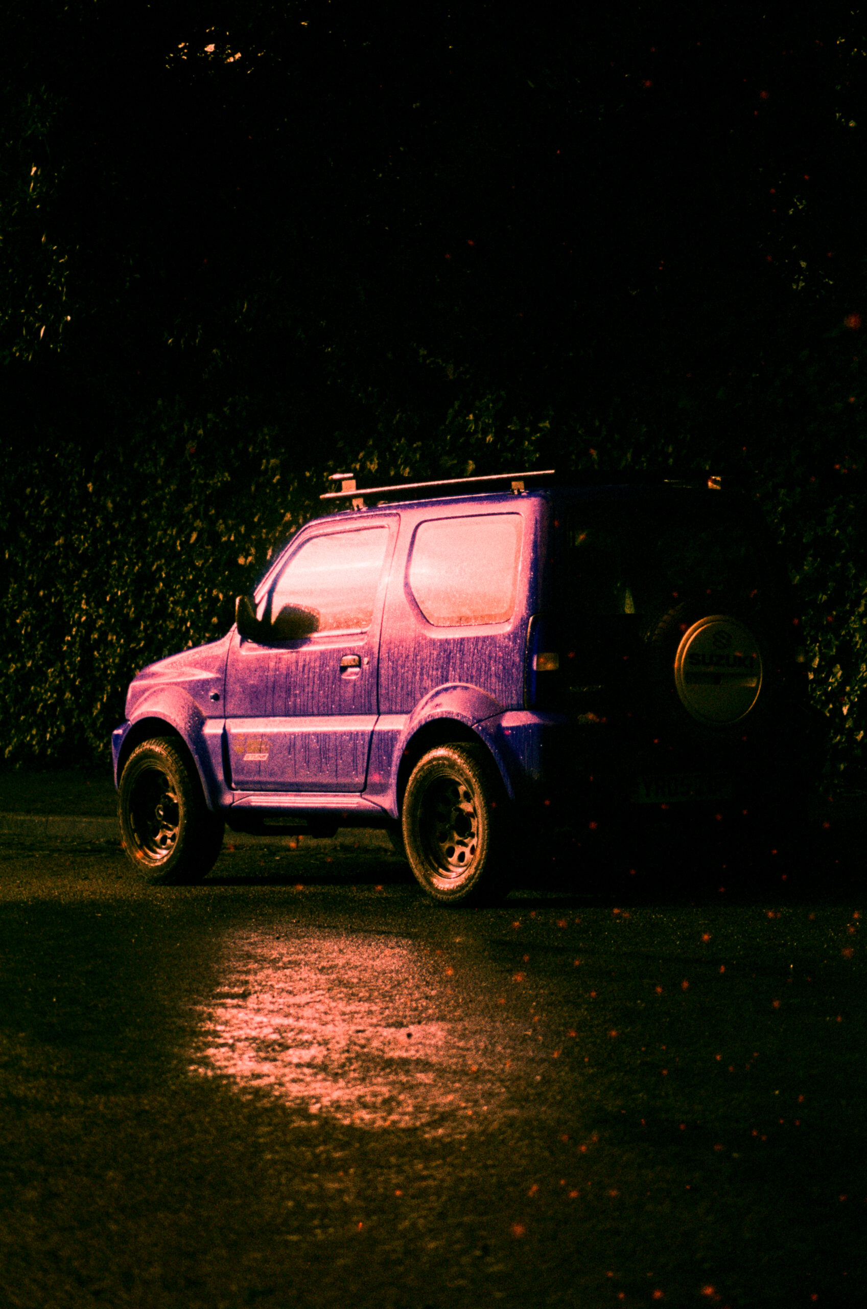
The reality is, films like Harman Azure provide people with creative options. Like black and white films, they create an abstraction of reality that in the right hands can make for some really quite compelling results. For me personally, to parrot what’s said in this article, I think best results are achieved with simple/minimalistic compositions. I’m also not really a fan of results that contain people, as the abstracted skin tones just look weird. But again, these are just my personal thoughts – I’m sure some people out there will want to embrace the weirdest ways this film can impact results.

So what’s actually going on here?
Well, as far as I can gather, the craziness of the results is the product of colour channels being switched. In this case, the blue and red channels have been swapped around. I was trying to get my head around what this meant and why the results across the whole spectrum seem impacted to some degree. Having experimented with colour channel switching in the digital domain, I’m not entirely a stranger to all this, but it’s still quite interesting to try and get your head around what’s going on. After a bit of Googling I found Harman’s own data sheet on the film to be the most useful resource… in hindsight, I should have probably looked there first. You can find the full data sheet here. It’s all useful as it also talks about exposure, processing, development, various scanning options, how Noritsu and Fuji will bring different looks to the outcome, etc. but the bit that does the heaviest lifting for me is this little diagram:
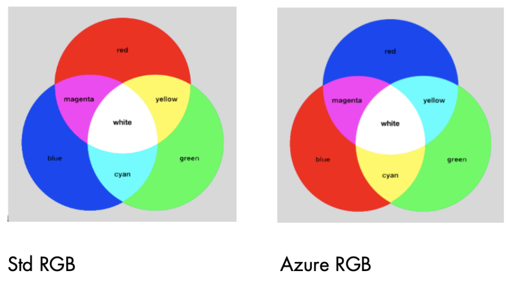
As you can see, the green channel remains unchanged, but as you can see the blue and red channels have been swapped. Now look closer and you can see that the colour names remain in the same positions, despite the colours changing: blue is red, red is blue; cyan is yellow and yellow is cyan. Of course, the spectrum of colours as we perceive them are practically infinitely more varied, but if you can get your head around that diagram, you’re going to be able to begin to understand how a film like Switch Azure is literally switching colour channels to create the effect. Also usefully contained within the data sheet is a section the talks about the impact of this switch on colours in the real world:
Pink and orange sky, blue brickwork, strange coloured fruits, e.g. cyan bananas, blue tomatoes and strawberries, blue skin tones. Common objects like post boxes, signs, buildings and vehicles are transformed and in the natural world; flowers, trees, landscapes and wildlife become strange and unfamiliar. Sunsets become inverted with cool blues and purples.
From there, it should be quite easy to work out what the impact of shooting carious different colours might be. And of course the answer to the question as to why green colours are impacted despite green not being switched is that some greens might have more blue in them, and some might have more red in them, not to mention all the rest of the colours in the spectrum.
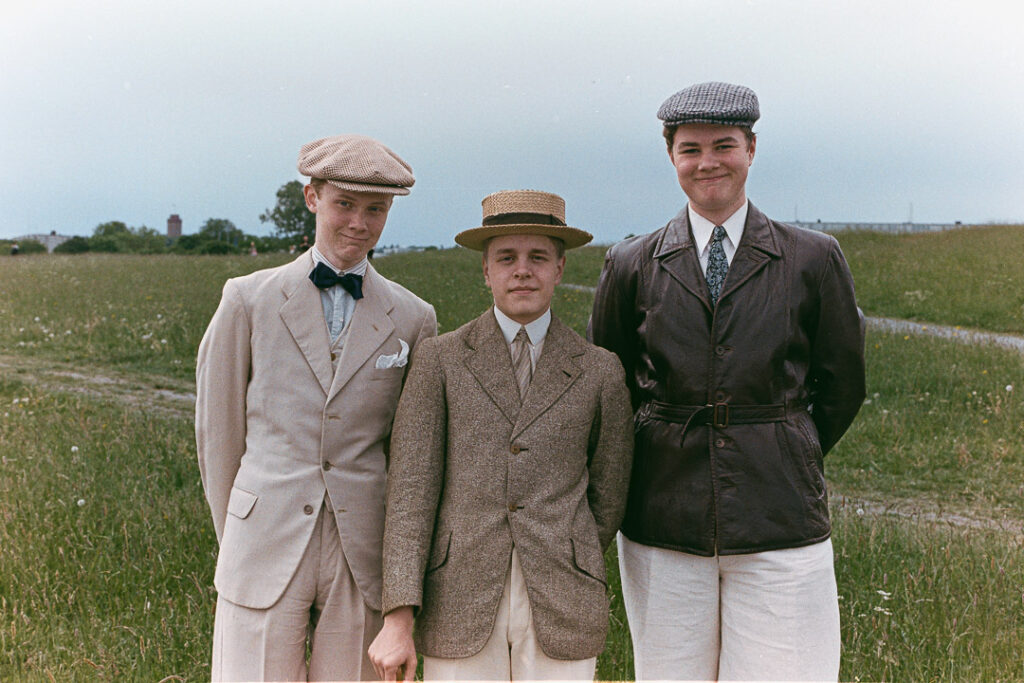
Some photos
Now, as I mentioned, I’ve been a little bit out of action. I had a minor operation that I’m fully recovered from now (well pretty much), but it knocked me out for a couple of days. The after effects of general anaesthetic and the joys of being inflated with carbon dioxide for the benefit of laparoscopy were not factors I’d taken into account before going into surgery… both kept me off my feet for a few days. But anyway, moaning aside, it did mean I wasn’t getting outside much, so my roll was a little ruched when I did, and not particularly diverse in subject matter. Still, I got a few shots:


More here
Compared to Lomochrome Turquoise
Some of you might be thinking you’ve seen results like this before. Lomochrome turquoise is indeed a very similar film. I’m waiting for someone to do a side by side comparison – if anyone sees one and wants to share it in the comments, that would be great. For now though, I’m working on the idea that they’re probably fairly similar. This will no doubt have some people moaning about this stuff being pointless when another similar film already exists. I personally don’t take this view at all – the more the merrier. It’s not like there’s only one type of black and white film on the market, and many different types out there are also actually pretty similar. The same can be said of conventional colour film too, so I see no reason why two red/blue colour switched films can’t exist. Hopefully Harman will go on to make a version of Lomography’s purple film too, and maybe other types of switched colour films too.
Harman and the future of colour film
And don’t forget, these experimental films – just like Pheonix 1 and 2 and Harman Red – are all going to be part of the journey for them as a company. Bringing out and selling these films is going to be generating revenue that will be helping them reach their ultimate goal of bringing a true colour film or two to market. Which if you ask me has to be a positive outcome!
Final thoughts
Harman Switch Azure is not my type of film. I like films like Portra 400 and 800 that give nice “real” looking colours. Call me boring, but that’s the way it is for me. It’s not that I have zero interest in these sorts of experimental films, I just don’t see them as part of my photography – I’m much more interested to see what other people manage to achieve with them! My shots have certainly not been my favourites either – I really like the ones in this post, and as I’ve said, I agree with the sentiment about simple compositions working best. But that’s just me and those guys… the point of films like these is for them to be experimented with. Like all of Harman’s film types so far, they encourage creativity and in many ways embody the serendipity that a lot of people – especially the younger generation of film photographers – really embrace when turning to film photography. Not for everyone, and certainly not for every subject matter, but give the right creative talent, I’m expecting to see a lot more great results from Harman Switch Azure!
Share this post:


Comments
David Pauley on Harman Switch Azure
Comment posted: 24/03/2026
GS on Harman Switch Azure
Comment posted: 24/03/2026
Neal Wellons on Harman Switch Azure
Comment posted: 24/03/2026