The English language lacks a dedicated word to describe the colour light-blue. In the same manner, for instance, that ‘light-red’ is called pink, and ‘light-purple’ is lilac, there is no blue equivalent. Other languages treat light-blue as a concept in its own right. In Ukrainian the colour is called блакитний {blakitnyi} which translates approximately as ’sky’ – approximately, because the structure of the language transforms the word into an adjective form.
Inanely, I find my mind fixating on these linguistic details when I see the colours of the Ukrainian flag posted on social media in signs of solidarity. So much of the flag’s iconography relates to that specific shade of sky blue. Being unable to name it in English, to evoke it and all that it represents with a single distinct word, feels like an erasure of something, a closed door to an ‘other’ cultural space.
Though I was born in what is present-day Ukraine, I am not Ukrainian. It is complicated. The region is complicated. The history is complicated. The nationalities, ethnicities, and boundaries are complicated. And it is all about to become more complicated, as the current conflict and its fallout produce more trauma, more displacement, more dissociation. It is not my intent to talk about the politics of it here, or to curate sympathies toward this conflict while neglecting harrowing events elsewhere in the world. But I want to talk about seeing – and not seeing.
What is it that we see, when we look at cultures that are inherently ‘other’? Can we ever get past the obvious iconography, past the stereotyped imagery? Or do these things function as a highly effective veil, keeping us from the substance that defines this other cultural space? When it comes to former-Soviet cultures, the iconography can be so strong it is almost perceived as caricature-like. Which, in turn, can have dehumanising effects.
In Ukrainian, blakitnyi is not just about the existence of a single word to describe a pastel colour. The idea of light-blue, or sky-ish, is afforded a great deal of cultural and artistic space. And it is the inability to cross over to that space, to that sky-ish frame of mind as it were, that creates a schism. Is it possible to support that which we don’t understand? Or in doing so, are we merely supporting our own projections? It may not matter in the immediate sense, when support is badly needed in very concrete terms. But it matters, I feel, in the long-run.
And then there is the question of displacement. When the richness of a cultural tapestry that one has proverbially always stood, sat, and slept on, is pulled out from underneath, what is left but a schism?
In the past I have struggled at being perceived as a diasporic artist. Billing me in that manner and interpreting my work through that lens, was unnecessary, I thought, and reductive. It was only later in life, having gained exposure to the work of many contemporary artists, writers, and photographers with migratory pasts, that I acknowledged the similarities. And it is less about the subject-matter than it is about the feeling of the work. A certain sense of claustrophobia to the imagery. A desperation. A hopelessness. A failed struggle for control over one’s surroundings. ‘There is a certain recognisable brand of chaos to the work of post-Soviet artists,’ a college professor once said to me, and it sent me into a spiral of self-doubt. It is not easy to accept that one’s creative energies can be reduced to that.
There is no word for light-blue in English, and neither are there words for certain thoughts and emotion I’d like to succinctly share, but can’t. I have stopped feeling frustrated by this, and have tried instead to express these things through craft and photography. In the series I am currently working on I have started to combine the two: The tableaux style photos utilise garments I’ve made over the years, to pose questions about trauma, performance, and memory.
If this missive seems vague and abstract, my apologies – and I do acknowledge it is both of these things. Admittedly I myself did not know where I was going with this piece and how I would relate it to photography. But I think the relationship is implicit, and so perhaps it is best after all that I give readers the opportunity to formulate their own thoughts on the subject – using this stream-of-consciousness piece as a trajectory.
___
NOTES
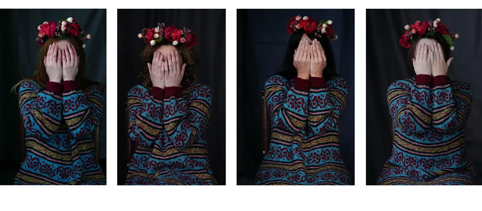
Header Image:
4 panels from the ongoing series Jadwiga {I am in the leftmost photo}. All images taken with a Leica CL and a Summicron-C 90mm lens. The dress was hand-knitted using Donegal tweed and designed based on a combination of Eastern European decorative motifs.
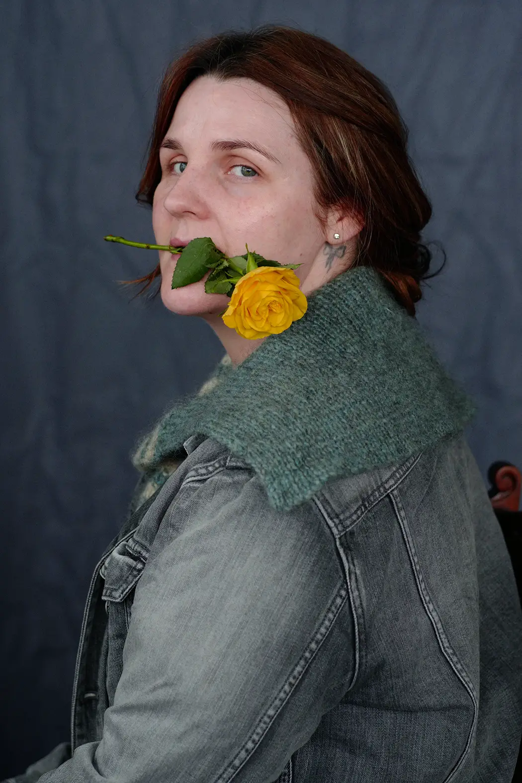
Second Image:
from the ongoing series Flora. Taken with a Leica CL and a Summarit 75mm f2.4 lens. The top was hand-knitted using Swedish heritage-breed wool, designed based on the turn of the 20th century sailor aesthetic.
Ailbíona McLochlainn is a photographer, knitwear designer, and recovering academic, based in Ireland. For additional information and lots of pictures to look at, visit www.ailbiona.com
Share this post:


Comments
John on No Word for Light Blue – By Ailbíona McLochlainn
Comment posted: 25/03/2022
Comment posted: 25/03/2022
theo vervloet on No Word for Light Blue – By Ailbíona McLochlainn
Comment posted: 25/03/2022
PASTEL BLUE IS THE COLOUR ORIGINALLY OF VEGETABLE PLANT PASTEL THAT GAVE AN ENTIRE INDUSTRY IN SOUTH OF FRANVE IN THE REGION TOULOUSE ALBI. THE PASTEL PLANT HAD YELLOW FLOWERS WA TREATED AND GAVE SURPRISINGLY A BLUE COLOUR THAT WAS DILUTED IN ALL BLUE TINTS. THE MOST USED WAS BLUE PROVENçAL AND WAS IMPOSED BY THE ADMINISTRATION FOR DOORS, WINDOW BLINDS, AND A LOT OF MORE. THANKS FOR YOUR POST. THE PASTEL PLANT BLUE WAS REPLACED BY THE IMPORT OF OVERSEAS BLUE AND INDIGO. THRE IS A REVIVAL NOW VERY ACTIVE.
Comment posted: 25/03/2022
Thorsten on No Word for Light Blue – By Ailbíona McLochlainn
Comment posted: 25/03/2022
Comment posted: 25/03/2022
Terry B on No Word for Light Blue – By Ailbíona McLochlainn
Comment posted: 25/03/2022
Other naming principles relate to a specific hue, such as Prussian blue, or Royal blue, or one in the UK "pillar box red" with most knowing what this is. Although a google search seams to favour branded hair dyes over the real thing!!
I love that very colourful knitted jumper, although I'm not of the right gender to pull it off.
Comment posted: 25/03/2022
Lee on No Word for Light Blue – By Ailbíona McLochlainn
Comment posted: 25/03/2022
And in order for me to come close to determining what basic color something is, there needs to be enough of the color to stand out from whatever is around it. I have learned over the years that I it's just not worth it for me to get too engaged in a color discussion. The best way I can come up with to describe being colorblind is that I just don't have the word association with color and I have no confidence in my own ability to discern colors. I see colors, but I don't really know what many of them are.
As you might imagine, this can pose a challenge photographically. I just see the world differently and I have absolutely no idea what I'm missing out on, but it's probably a lot. So you can keep your "cerulean", your "azure", your "lilac", your "cobalt". I'll just call it blue and hope that I am right.
Comment posted: 25/03/2022
Bud Sisti on No Word for Light Blue – By Ailbíona McLochlainn
Comment posted: 25/03/2022
By the way, I do so love your description of yourself as a "recovering academic"! May I borrow it for my own use?
Comment posted: 25/03/2022
Michael J on No Word for Light Blue – By Ailbíona McLochlainn
Comment posted: 26/03/2022
Comment posted: 26/03/2022