My Favorite Photo of 2025?

By David Pauley

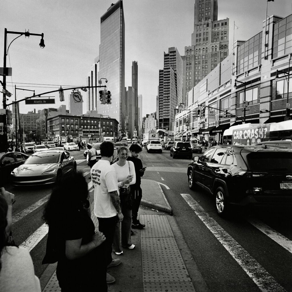
As I write these words it is mid-September, with almost a third of 2025 yet to go, yet I’m nonetheless fairly certain that the image above will turn out to be my favorite of the year. I wasn’t expecting this when I took the photo or when I processed and scanned the film. I’d gone out for a walk across the Brooklyn Bridge mainly for the pleasure of stretching my legs on a pretty evening but also to test out a “new”—in fact, a rather ancient—lens, a 1935 Leitz Hektor f6.3 I’d recently acquired. Impressed with the moody skies, I loaded my Leica III with color film (Kodak UltraMax 400).

Here’s the original scan:


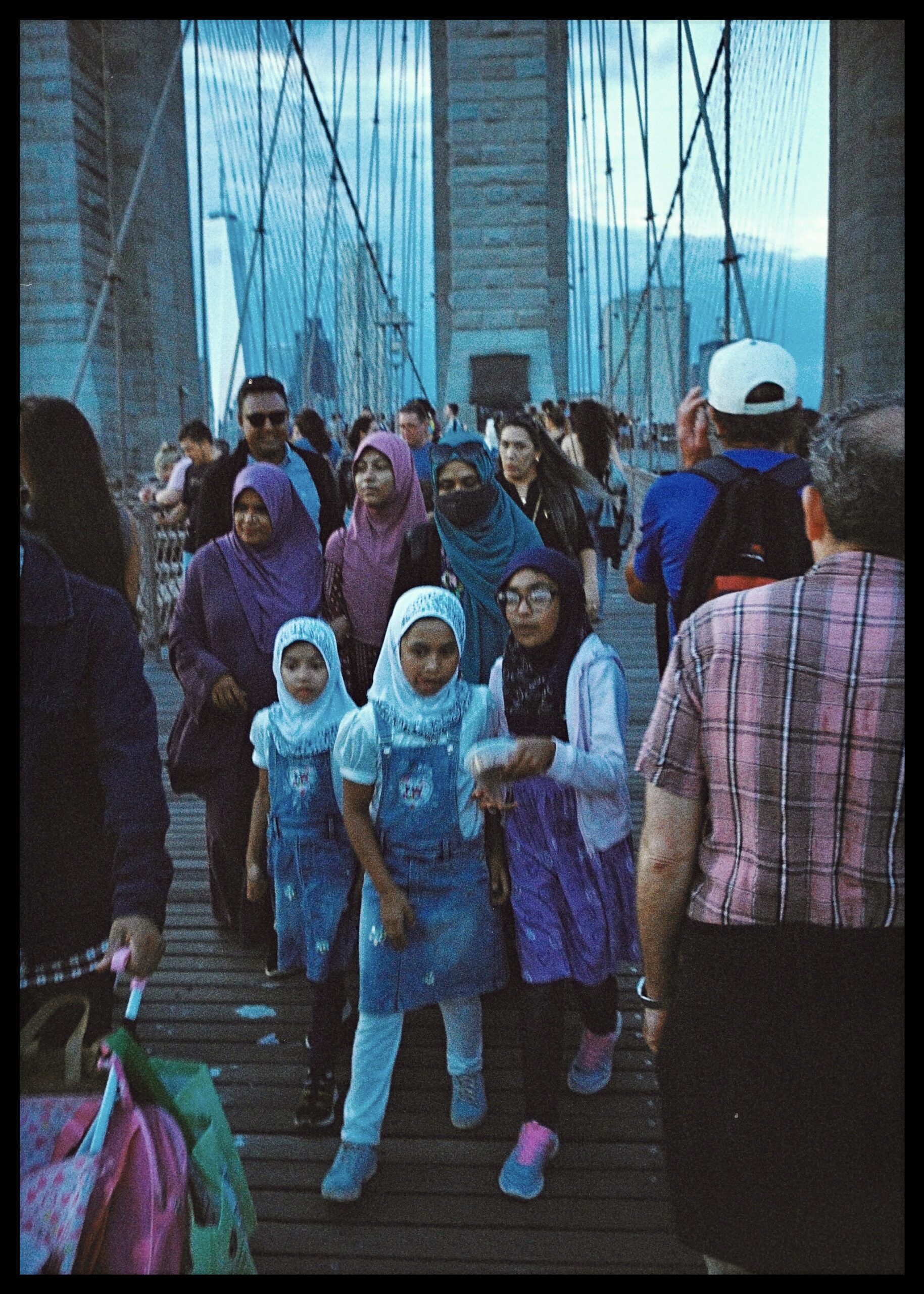
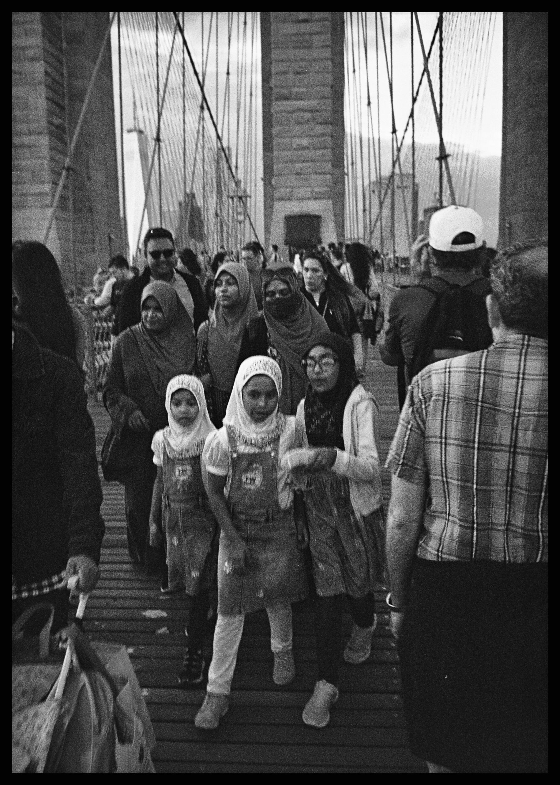
Although I remembered taking the picture of these girls and having some hopes for it, something about the scan didn’t sit well with me. The idea of making it monochrome only came to me in the darkroom, later, where I’d recently had some success printing black and white photos from color negatives. Boosting the exposure (by opening up the aperture or increasing the time the enlarger projects the image onto the paper) and using filters to increase contrast can with certain C41 negatives yield superb black and white prints. After undertaking these procedures and moving the paper through the chemistry under the red safety lights, I switched on the overheads:


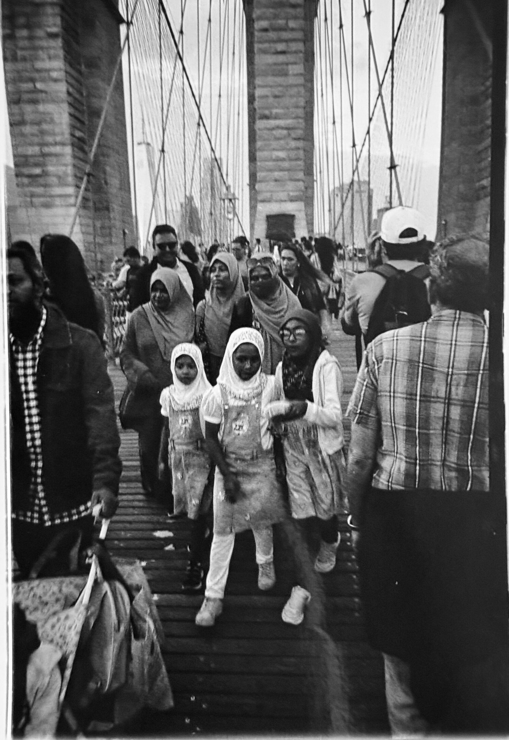
The monochrome palette of the Ilford multigrade RC paper for me transformed the image. Suddenly my eyes were drawn, as they had been when I fired the shutter, to the girls and to the trio of women behind them, the whole family grouping framed by the jostling crowd and the familiar stones and cables of my city’s most iconic bridge. The image now seemed to cohere, and in its somber, unassuming way perhaps to say something about the difficult year.

(Please excuse the odd swirl in the lower portion of my iPhone photo of the finished print, the last image in this post. It’s a reflection caused by the chemicals in the fixer tray).

Thanks for having a look.

Share this post:

About The Author

By David Pauley
I'm a Brooklyn-based photographer and psychoanalyst. My journey with photography began in middle school in the late 1970s and revived in 2019 when I bought a used film camera and installed a darkroom in my basement. For 2025 I've decided to use just one camera, a Rolleiflex 2.8F, to document the year. While I am not on social media, you can reach me at [email protected].
Read More Articles From David Pauley

Find more similar content on 35mmc

Use the tags below to search for more posts on related topics:

Donate to the upkeep, or contribute to 35mmc for an ad-free experience.

There are two ways to contribute to 35mmc and experience it without the adverts:

Paid Subscription – £2.99 per month and you’ll never see an advert again! (Free 3-day trial).
If you think £2.99 a month is too little, then please subscribe and I can manually edit the subscription value for you – thank you very much in advance if this is what you would like to do!

Subscribe here.

Content contributor – become a part of the world’s biggest film and alternative photography community blog. All our Contributors have an ad-free experience for life.

Sign up here.

Make a donation – If you would simply like to support Hamish Gill and 35mmc financially, you can also do so via ko-fi

Donate to 35mmc here.

Comments

Gary Smith on My Favorite Photo of 2025?

Comment posted: 27/10/2025

A nice composition David however I don't think the color to black and white did you any favors. In my opinion, the faces of the three children are significantly darker than they ought to be. Just my two cents.
Reply

Leave a Reply

Your email address will not be published. Required fields are marked *


David Pauley replied:

Comment posted: 27/10/2025

Hi Gary -- I really appreciate your feedback, which tracks with those of others here, always valuable. The iPhone scan of the print in the fixer (under harsh white light) seemed to exaggerate the darkness of the faces, though I agree that pulling back a bit more is much more pleasing aesthetically.

Reply

Leave a Reply

Your email address will not be published. Required fields are marked *


Gary Smith replied:

Comment posted: 27/10/2025

Just to see what I could get, I took your color image ran it through a denoise pass then converted to b&w and got (what to me was) a nicer rendering of the girls.

Reply

Leave a Reply

Your email address will not be published. Required fields are marked *


David Pauley replied:

Comment posted: 27/10/2025

Thanks Gary! I will give that a try. The grain on the Ultramax is pretty distracting for sure.

Reply

Leave a Reply

Your email address will not be published. Required fields are marked *


Charles Young on My Favorite Photo of 2025?

Comment posted: 27/10/2025

Interesting photo ... shows the multicultural mix of the crowd!
I suggest lightening up (holding back) the faces of the girls and women in the foreground.
Reply

Leave a Reply

Your email address will not be published. Required fields are marked *


David Pauley replied:

Comment posted: 27/10/2025

Agree 100%, Charles! Thanks for your feedback.

Reply

Leave a Reply

Your email address will not be published. Required fields are marked *


David Hume on My Favorite Photo of 2025?

Comment posted: 28/10/2025

Hi David P! Yep, regarding the colour/B+W thing, I'd offer the following. Firstly it's a bit hard to judge the B+W print on the basis of the iPhone snap in the fixer tray, and I may be doing the B+W a disservice because of this, but I feel that the harmony of the colours of the clothes of the group of six unifies them as a group in the composition in a way that does not happen in the mono. And the colour also adds a three dimensionality to the figures. The warm tones in the skin of the girls brings their faces forward from the blue of their headdress (not that I'm suggesting the fabric is blue, just the scan) and the coloured grain is more sympathetic to their expressions, which I feel are more nuanced in colour. I feel that this might be more than just a matter of dodging them - the youngest girl on the left has an expression of wonderment in colour which seems to have changed to one of concern in the mono, for example. I'd not view the colour scan as an end point for the colour though. You could certainly play with in many ways if you felt like it. But I'd also say that it's delightful to hear of the experience of the image being transformed as you saw it in the tray, so that might a good feeling to trust!
Cheers, David H.
Reply

Leave a Reply

Your email address will not be published. Required fields are marked *


David Pauley replied:

Comment posted: 28/10/2025

Hi David H. -- and thanks so much for your thoughtful reading and response to this photo. I love that you called attention to the expression of the girl on the left, which I agree has a different emotional cast in the color version. Some of that is an artifact of a not so great scan but not all of it. I can see the case to be made for the color image but still always prefer the monochrome one, which for me at least draws the eye in a bit more than the color version. Clearly that only applies to my eyes, however! I may fiddle a bit more with the negative in the darkroom and if I get something dramatically different -- rather unlikely -- will send you a snap of it. Thanks again.

Reply

Leave a Reply

Your email address will not be published. Required fields are marked *


David Hume replied:

Comment posted: 28/10/2025

I’m very glad to hear that you are not changing from monochrome David P. While there were some things that I saw in the colour that I did not see in the mono, it’s a whole ‘nother matter whether or not that means changing your vision for the photo. And of course I would say no, don’t change it. I am enjoying these longer form discussions ons that seem to be popping up here.

Reply

Leave a Reply

Your email address will not be published. Required fields are marked *


Alexandre Kreisman on My Favorite Photo of 2025?

Comment posted: 28/10/2025

Hi David,

This is a nice print!
If I may say, try FB paper, the result will be even more satisfying and pleasing to the eye.
Also, If you can, try the cold light source from Heiland, comparing to the filters it's like night and day + so much more easy to use with a good f-stop timer ....

Nice one!
Cheers
Alex
Reply

Leave a Reply

Your email address will not be published. Required fields are marked *


David Pauley replied:

Comment posted: 28/10/2025

Thank you for the kind words, Alexandre! I was fresh out of FB paper when I made the print but have some on the way. I have an 8x10 enlarger -- a beast -- with a cold head that is in a different location than my primary darkroom, but will definitely give it a try the next time I'm there with this color negative. Very exciting! Thanks again.

Reply

Leave a Reply

Your email address will not be published. Required fields are marked *


Alexandre Kreisman replied:

Comment posted: 28/10/2025

hey David, Send us the finish result, it would be interesting to see it and you techniques. i've always wonder at the DarkRoom as from my experience there are no books, no precise technique but your own formula and you eye when first seeing a neg under the light: what filter will? split filter? do I have enough details, ..... Happy printing! Alex

Reply

Leave a Reply

Your email address will not be published. Required fields are marked *


David Pauley replied:

Comment posted: 28/10/2025

Will do, Alexandre!

Reply

Leave a Reply

Your email address will not be published. Required fields are marked *


Jeffery Luhn on My Favorite Photo of 2025?

Comment posted: 28/10/2025

David,
I agree with Mr. Hume that the monochromatic image looses a lot. The subjects of greatest interest don't stand out as much. I've never had much luck printing color negatives with B&W paper after Kodak discontinued their Panalure paper. That was a good product.
It's hard to imagine a foot traffic location with a wider swath of humanity than that bridge. Maybe the arrivals gate at NYC or SFO airports?
Jeffery
Reply

Leave a Reply

Your email address will not be published. Required fields are marked *


David Pauley replied:

Comment posted: 28/10/2025

Thanks for your comment, Jeffrey. I couldn't agree more about the Bklyn Bridge being a microcosm of humanity. I have a plan sometime this fall to park myself near one of the piers with a LF camera (4x5 in all likelihood, though 8x10 would be awesome...but not on a windy day!) and just blast away. Alas I never experienced Kodak's Palaure paper. Between 1993 and 2019 when I was away from film photography I certainly missed out on a lot! Take care.

Reply

Leave a Reply

Your email address will not be published. Required fields are marked *


Stefan Wilde on My Favorite Photo of 2025?

Comment posted: 28/10/2025

I am always amazed by the skills on display on 35mmc. Your skill at capturing fleeting moments with fairly old equipment is admirable, but so is the expertise of those who comment here! While I guess everything has been said regarding the relatively dark faces of the girls in the print, I can absolutely see where you're coming from when you say the print draws your eye. For me that has a lot t do with the contrasty, dramatic sky in the color scan that has largely been eliminated in the print. That, to me, is a definite improvement as it knocked the scan a little bit out of balance. It is just too distracting in my book. The scan to me is much more focused on the group of girls. So, with a few tweaks as suggested by others, to me, the print is a winner.
Reply

Leave a Reply

Your email address will not be published. Required fields are marked *


David Pauley replied:

Comment posted: 28/10/2025

Thank you Stefan for helping to articulate what I also found distracting about the color scan. The sky for certain distracts me, as does the colorful plaid shirt of the guy on the right of the frame (my husband, as it happens -- he's feeling duly chastened for being a photo bomber!). Agree with you completely about the amazing depth of knowledge and skill on display here from which I gain so much. I'm also pleased you like the photo! Thanks!

Reply

Leave a Reply

Your email address will not be published. Required fields are marked *


Dean Lawrence on My Favorite Photo of 2025?

Comment posted: 29/10/2025

David, what a moment you have caught on film. Unusually for me I much prefer the colour version the best. I'm blessed or cursed with having really bad vivid dreams of vampires and zombie apocalypse. Maybe this skewed my thoughts when seeing the mono version. In mono I had the sense of disaster, or perhaps people merging into a strange and dangerous world. The metal structures, that brooding sky, sharks back to the film, The Times Machine, where people were taken by the Morlocks underground. It's more than likely my nightmares are affecting my waking mind, but first impressions last.

So because the scene is nothing to do with doom colour definitely wins.

But I do love the mono version purely for the way my ( warped) brain translated it. I wish I had taken this shot I'm not surprised it's a favourite.

Dean.
Reply

Leave a Reply

Your email address will not be published. Required fields are marked *


David Pauley replied:

Comment posted: 29/10/2025

Hi Dean -- your "doom" response is so interesting! For many Americans, this frame would be instantly recognizable as the Brooklyn Bridge, but your associations remind me of how much the impact of a photo rests on prior knowledge one has of the context, etc. Thanks so much!

Reply

Leave a Reply

Your email address will not be published. Required fields are marked *


Scott Ferguson on My Favorite Photo of 2025?

Comment posted: 29/10/2025

Hey David,

Fascinating post, as usual!

I think shifting to monochrome was a really interesting creative fix/enhancement for a very interesting shot. I prefer the monochrome, but I find the look of both versions quite interesting -- the color has a very interesting look that feels a bit muted and at the same time certain colors popping, like the pinks and blues. It reminds me of a technique that was popular in cinema 20 or so years ago called "bleach bypass" that gave color film a very distinctive look and was often used for sequences like flashbacks to battle scenes reflecting the PTSD of the person having the flashback.

On the technical side, as I recall, the lens you're shooting with is a 28mm f6.3, so you don't have much latitude to open up on an overcast day. There is definitely a vintage look to both versions that's very interesting and fitting given the vintage of the gear you are using. To me, this image, in either color or b&w has the feel of classic journalistic photos and I think of moments where populations are on the move, perhaps during wartime or conflict or disaster, as opposed to people visiting one of NYC's great landmarks. I think that quality is enhanced by the brooking sky and that you are capturing people in motion and seemingly not noticing that you are shooting them, even though you had to be pretty close if you were shooting with a 28mm.

I'm assuming you grabbed this shot without engaging with the family that is the main subject. I like to shoot people in various cultural and national costume/clothing when I'm out and about, but I'm often a little hesitant with Islamic people knowing that in some branches of the faith, they are very averse to being photographed. That hasn't stopped me from shooting, but I am often a little hesitant/cautious about it and probably don't get shots nearly as good as this one as a result.

I think it's fun that you're more or less ready to announce that this is likely to be your 'photo of the year' for 2025, which has made me think of what my photo of the year might be. Maybe a pitch to Hamish to do a end of year post where anyone/everyone can submit a single favorite photo of 2025 that we could all enjoy!

Cheers,
s
Reply

Leave a Reply

Your email address will not be published. Required fields are marked *


David Pauley on My Favorite Photo of 2025?

Comment posted: 30/10/2025

Hi Scott,

Thanks so much for your response. I was as you deduced pretty close to this family grouping. When I grabbed the photo with the 28mm Hektor they were I believe focused on another photographer, a family member, who was setting up for a shot with a IPhone. I did not ask permission and indeed didn't devote more than 30 seconds on the photo as I was zone focusing at f8 or f11 while walking and didn't have to fiddle with the rangefinder. I would say that despite some involved portrait sessions with strangers' cooperation (as with my previous piece here) when doing street work I still often err on the side of taking the shot and worrying about permission, or not worrying about it, later. I know you go about this differently and am intrigued by doing more of that given the great results you've gotten.

As for a more general favorite frames of the year series here on 35mmc, I think it sounds great!
Reply

Leave a Reply

Your email address will not be published. Required fields are marked *


Ibraar Hussain on My Favorite Photo of 2025?

Comment posted: 31/10/2025

What a shot - the framing, composition, the layers - all works so well.
I like both, the color reminds me of transparencies from the 70ies with that distinctive pop.
the BW is a fantastic blend of tone
Reply

Leave a Reply

Your email address will not be published. Required fields are marked *


Leave a Comment

Leave a Reply

Your email address will not be published. Required fields are marked *