
I’ve seen some very nice posts on this site over the last couple of weeks, Scott Ferguson, Ibraar Hussain and myself even got to start critique about some posts, which I find marvellous. It is, for me, the way to grow, to learn, and try new tips from others.
One thing I haven’t seen yet is shots that should have been keepers but weren’t for some reason. I also haven’t seen much in the way of a dedicated form of criticism. Also, I thought this might interest you a bit.
I will present you a few shots, give you my point of view of why they failed and hopefully you will join me and give me your advice or thoughts in the comments. Good/bad, it doesn’t matter, what I’m looking for is constructive criticism. To grow from your experience, point of view, and your mistakes too.
What do you think?
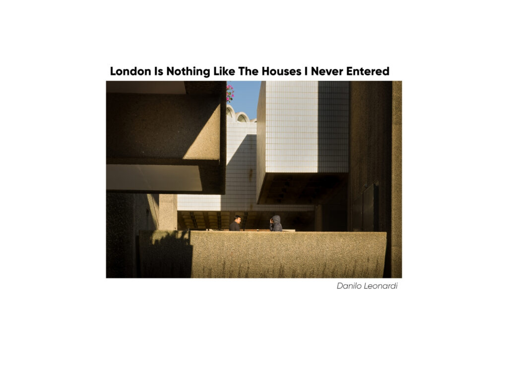
So let’s start this adventure into the past with the first shot (at the top of the post above). This was taken with the Leica M240 + 35 Lux. For me it’s a no brainer: bad composition (look at the part of the chandelier in the upper right corner. The people are not on any point of the rule of third, eventually, I should have waited for the lady with the dog to be out of the picture (negative space) and the couple speaking, not him on his phone. What’s your take on it ?
The second photo (below) was shot with an M9 Monochrom and a Cron 75 Apo. It was a cold day in Boston, with beautiful light, unfortunately no one in the street. I was attending a photo workshop.

So, I like the mood and lighting of the image, however the pole shouldn’t be there. If I had moved 2 meters to the right (and maybe advanced a little), that would have let the subject wouldn’t have been obstructed in the picture, and the shot could have been a keeper for me.
Next one. A nice reflection. I loved how she was struggling to choose and saw her arm moving, thus I focused and shot, as there would have been no second chance!

What makes it uninteresting for me is simply my own bloody reflection that messes the shot up completely. Imagine it without my fuzzy self!
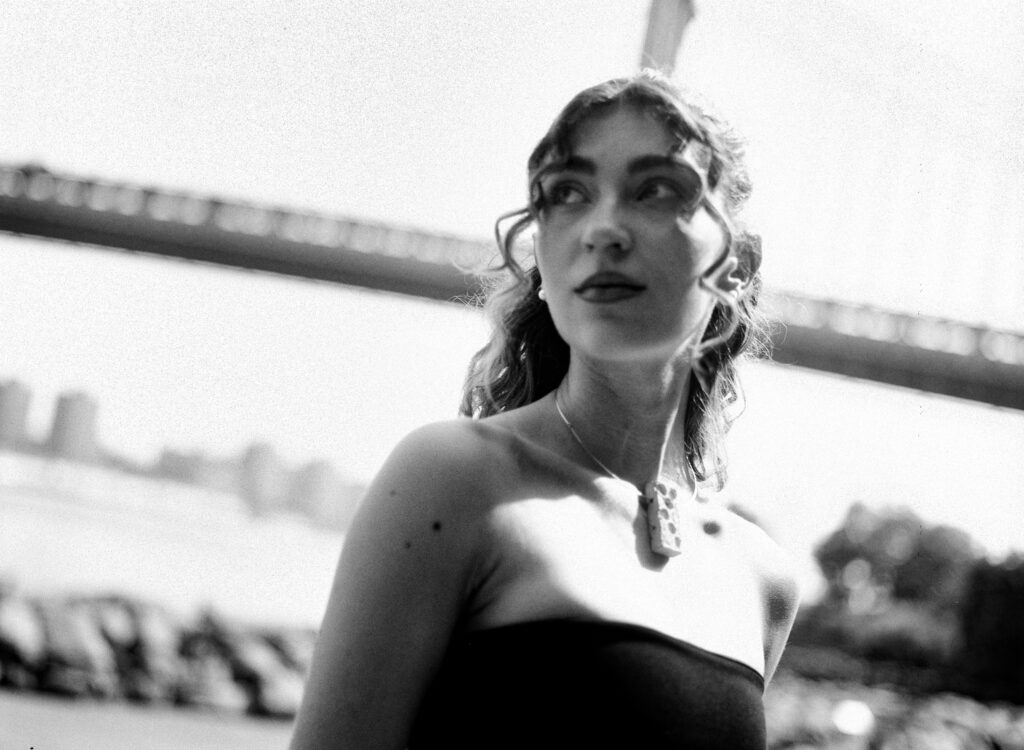
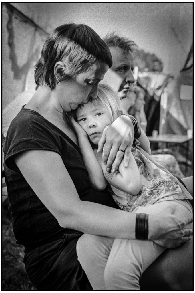
For this next one, we were around 10 people, all friends of one or more in the group. The mood was cool, very dim light, it was taken with an R8 and the 100mm Apo.

Conclusion: Wrong lens. It forced me to shoot at 1/12s (which I wasn’t accustomed to at the time). I should have taken the 75 cron instead. Its widest aperture is f/2, which is a whole stop brighter than the 100mm. One stop can be a lot, and it would have given me better framing, better focusing, and an overall better picture.
The next shot was taken late afternoon, again with the 100 Apo and the R8 at f4. The down angle is simply due to the fact that he was stood on a stage.

Love the mood, however he turned his face whilst I was pressing the shutter release. If I had have practiced more how to focus with an SLR, I would have had the right moment! Also, a shot from the other side would have turned out better I think.
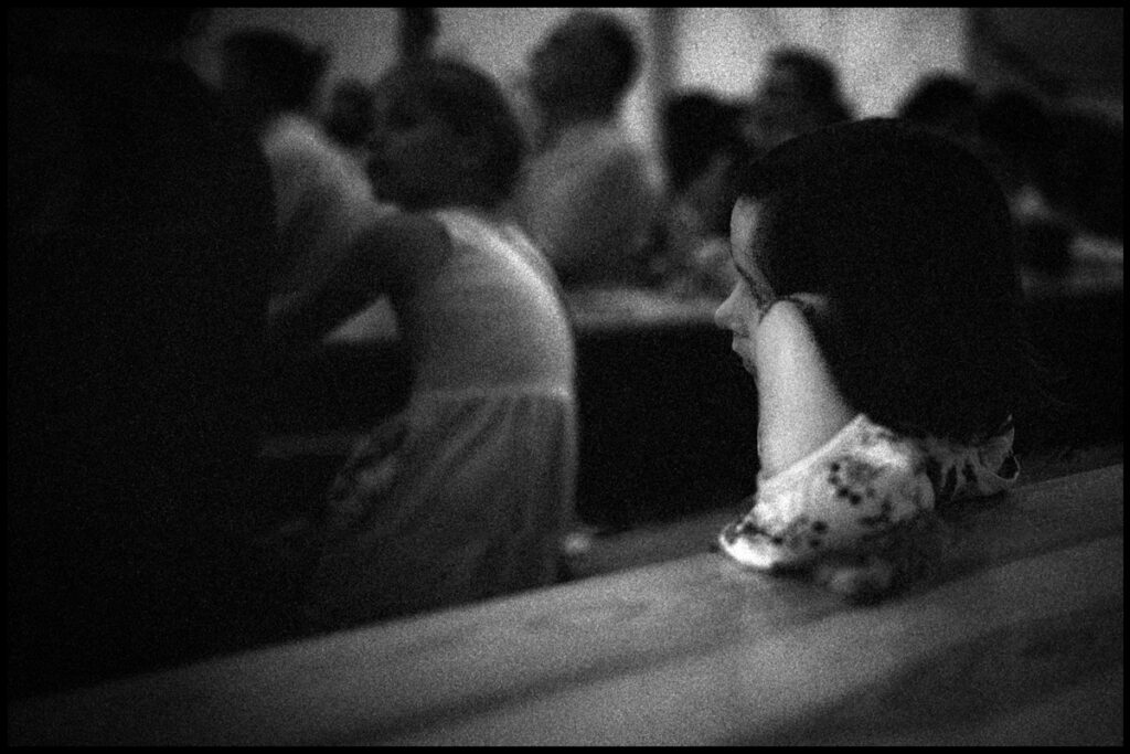
This next shot was a spur of the moment shot that captured this person step on the windowsill. I acted by pure instinct, and this was the shot I took.

With hindsight, If I were to have moved back about a meter and composed slightly differently, I could have had his feet in the frame and not the top of the window which feels much less important to the shot.
The last one is a recent one. Shot with a Leica MA and a 35mm Lux.

Wrong choice of lens, should have gone with the 75mm, as my subject here are the two little girls in the back on the right. Yes, I could crop, but there is not enough definition to do so, and even with resolution, they are not in the right place. My framing was for that little girl with a 35. Conclusion: I need to think more before shooting, shoot with INTEND and THINK before acting!
I learned the hard way to “kill my babies”, and I’m glad as posting these would have reflected badly on my page, and would not reflect at all what I am capable of. It’s as simple as that from my point of view.
What’s yours?
Cheers
Alex
Share this post:


Comments
Andrew Gurthet on Reflecting on a few of my failures
Comment posted: 05/12/2025
Comment posted: 05/12/2025
Michael Flory on Reflecting on a few of my failures
Comment posted: 05/12/2025
Comment posted: 05/12/2025
Neil Lloyd on Reflecting on a few of my failures
Comment posted: 05/12/2025
Now this brings back memories, I use to do this all the time, constantly analyzing where I'd gone wrong. I would pick every frame apart which then turned to frustration and disillusionment. As time went by though, I enjoyed my photography less and less. I reached the point where I didn't pick up a camera for a couple of years believing I couldn't take the perfect picture. Now, I just laugh at my mistakes and leave it there, it was a weight off my shoulders, I'm content with one or two okay ones these days but if I get a real gem then I'm over the moon.
You know where your compositions went awry and that is half the battle but I like them, they're natural, warts and all and just being out and about with a camera is a pleasure in it's self. Thanks for sharing.
Comment posted: 05/12/2025
Michael Murray on Reflecting on a few of my failures
Comment posted: 05/12/2025
Image 1: I think the tight looping chandelier in the top right echoes the hoops in the floor. Perhaps it is more hectic and less clean, but I always like it when the edges aren’t perfectly clean- it seems more natural and less contrived. I also like the perspective, the presence of three figures, and the blatant appearance of a device in each person’s hand. However, I think, like you intimated, that the composition would have been more refined if a moment occurred where every device was out of sight. Black and white feels like a timeless format, and the screens put a clear time period in center stage.
Image 2: What works? Backlighting, mist/water, figure in almost total silhouette. Again, I concur that the placement of the post is off, but I think not by much. Even if you shifted a step right, not a full 2 meters, moving the post maybe a quarter inch left in the frame, you’d have your subject more separated. I actually think the post is a net benefit to the composition: it gives scale to your anonymous subject in a way that would otherwise be absent.
Image 3: I reflected on this one before reading your notes. I also like using reflections as secondary elements in composition, but here I think they overshadow the subject(s) too heavily. Perhaps a polarizer would have reduced them slightly without eliminating them.
Image 4: For me, the error here isn’t in the motion resulting from the longer shutter, or the softer focus, it is in the placement. If your subject’s dominant eye was at least centered- or better yet slightly right of center from the perspective of the viewer, it would be more balanced. As it is, the direction of the gaze gives us imagined leading lines straight out of the frame. I wouldn’t have only panned left and eliminated the ear ring and hair detail, however. Instead, I’d think about stepping back a foot, allowing that nice detail to remain but also place that dominant eye in a more pleasing location.
Image 5: You’re spot on: need a little bit more of the face.
Image 6: Again, you’re right to note a step back would have fit your interesting subject totally in frame. Looks like he was bookended by a couple other performers, anyway. I didn’t see you mention which lens this was, but my guess would have been a 50. With 35, or even a wild 28, I often find I like including more of the scene in these spontaneous moments. You can always crop slightly, but you can’t add back in what was cut out of the initial frame.
Final image: I have to disagree here. I think the focal length was right on. The background elements aren’t distracting, rather they give a stage for your characters to perform in. However, I would change something. A lower, almost ground level POV, might add some drama and allow you to reduce a bit of the space taken up by the foreground and move the suggested horizon line away from center.
Thanks so much for inviting some feedback and reflection!
Comment posted: 05/12/2025
Tony Warren on Reflecting on a few of my failures
Comment posted: 05/12/2025
I always began my comments by trying to understand what had drawn the photographer to take a particular photo and whether their efforts had succeeded. Continuing comments sought to bring out why or why not that had been successful. Just to say something intrudes at the top right for example is just nit-picking without context.
The most useful activity for me has been membership of postal groups whose members circulated boxes of prints that members commented on with proforma crit sheets. These groups fostered quite close relationships which made any comment worth considering.
In a way, these forums nowadays can provide a similar platform so your suggestion has merit. I know that joining one such group in the 1970's helped my development considerably. Perhaps Hamish should add a suitably titled category to the subject bar below the masthead.
Comment posted: 05/12/2025
Comment posted: 05/12/2025
David Hume on Reflecting on a few of my failures
Comment posted: 05/12/2025
But anyway, just to focus on my favourite one here - the lamp post. I love the light, the contrast, the shadow detail, and I actually love the lamp post down the middle! - I think there's a great sort of three-stripe composition possibility there. For me the thing that's not fixable is the guy's arm hitting the pole. It just needs a bit of separation - a bit of air in there. That's just a timing thing or a step to the side. And you've cropped that frame, right? (the ratio is no longer 2:3 so I figure you have) - and if you're shooting an M9 monochrome it's not like you're running out of resolution, so maybe there's something else on the card you could revisit?
Comment posted: 05/12/2025
Comment posted: 05/12/2025
Comment posted: 05/12/2025
Scott Ferguson on Reflecting on a few of my failures
Comment posted: 05/12/2025
What a great idea for a post! I’ve included some of my ‘failures’ in various posts, mostly to show growth and progress, but also to seek advice and feedback, but never had the idea or the bravery to do a whole post about failures!
That being said, some of your failures are better than some of my successes, starting with your first image. I really like this photo, the unusual angle with the bold graphic shapes. I also don’t mind and indeed like some of the ‘flaws’ you point out — I think my tastes run toward a looser vibe with a bit of the energy and unpredictability of life in the mix as opposed to over polished perfection.
Your second photo feels like something between a ‘near miss’ or an accidental snap. If you had framed out that pole entirely, I think it would be a very solid if not excellent photo of a lonely figure walking down a moody alleyway in the winter. I might like a bit of the pole or some other foreground object in a less prominent position as a bit of that kind of virtuous ‘imperfection’ that I like about your first image, but straight down the middle feels a bit severe. I’m curious how deliberate and thought through this frame is from when you were taking it?
The shot of the kids looking at backpacks is another near miss for me, and maybe in the same way as the pole. Given the right prominence and placement in the frame, I think your reflection could have been very interesting. I think Vivian Maier is very good at that sort of thing. But like the pole, your reflection is imposing itself on the ‘main’ image a bit too strongly and centrally. Could you see it in the viewfinder when you were lining up the shot?
I agree on the wrong lens on the super close up of the woman, and I have the same problem of getting shots that are a fraction of a second off from what I was trying for when people turn their heads or move unpredictably. It’s a hazard of shooting people who are doing something that is active and my solution is usually to keep shooting. Sometimes it can take me a while to synch up with the combination of whatever camera I’m shooting with and the person I’m shooting and how they like to move. That kind of situation usually takes a higher ratio than other kinds of shooting. I just went to a concert the other night and was using an electronic point and shoot with a bit of a shutter delay and ended up shooting over two rolls, most of them flawed but some flawed in interesting ways.
I LOVE the shot of the man on the windowsill, and will happily forgive the small framing imperfections, which I might not have worried about if you hadn’t pointed them out. I also struggle with cutting off feet and leaving too much headroom a lot of the time — it may be related to the location of the focus patch while I’m dialing in the shot. But this is a fantastic image and beautifully exposed. So much personality and life! Did you shoot more of these performers? I’d love to see them!!
I agree there is something a little unsatisfying about the framing of your last shot, but it’s really close to being a really cool photo, and it might be greatly improved just with some cropping to get rid of too much foreground lawn and extraneous details on the right and left of frame. While your intention/attention may have been on the two girls, I feel like there is a very interesting ‘story’ that would include all four of them. I think the contrast of the two girls who are working on some kind of art project together, contrasted with the girl who looks a bit lost in thought looking for inspiration for her art project, contrasted with the mildly disdainful looking girl in the headphones who doesn’t seem like she can be bothered with her art project is a very interesting moment. Did you shoot more angles while you were there?
Thanks for sharing these Alexandre! I might have to start looking at some of my ‘out-takes’!
Comment posted: 05/12/2025
Paul Quellin on Reflecting on a few of my failures
Comment posted: 05/12/2025
I really like that first photo as a social commentary, it's from an unusual perspective and the negative space helps tell the story... people riveted to the spot on account of their phones.
For number 2, I wonder if the moment and the light would still have been there if you rushed forward and to the side, a shame, though the light is still fabulous.
Number three is just one to try again another time. I wonder how some photographers can get reflection shots seemingly on the fly without appearing the the glass... witchcraft?
Number 4 isn't a spoiled shot for me. It's still a nice in the moment photo. I am sure I read that having a less than perfect image in some situations, is better than coming away without an image.
In number 5, there is an interesting dynamic for me. I like the fact we get a good view of the proximity of the microphone to the mouth... we know he's not pausing, we know he's really using that mic. With sunglasses on and shot from a low perspective, I wonder if it might not have worked any better even if he turned toward the camera anyway.
For number 6, it sounds as though you did well to get this. I suspect time to compose was a luxury you didn't have, it still makes an intriguing image that makes us wonder about the rest of the story.
For number 7, I am not so sure it isn't the right lens choice, the wider view provides contents. We know this is some sort of outdoor event. Again the photo has a number of intriguing elements that make the viewer wonder what was taking place.
From reading your article, it was clear to me you had already diagnosed each image and reached sound conclusions and I don't think any of the photos are wasted. I was reminded of the old 'f8 and be there' press adage. You were there with a camera, you pressed the button and you have a record. To me, not taking a shot because it may not come out perfectly, sometimes leaves us the poorer for it.
Thank you for a different and thought provoking read.
Comment posted: 05/12/2025
Charles Young on Reflecting on a few of my failures
Comment posted: 06/12/2025
pretend you did it on purpose and go on to the next note.
Comment posted: 06/12/2025
Markus Larjomaa on Reflecting on a few of my failures
Comment posted: 06/12/2025
Personally, I like owning a lot of kit as much as anyone: I have an SLR system with 35, 50, 105, 180 and 300mm lenses and both M and Barnack Leicas with 15, 35, 40, 50, 90 and 135mm. And that's just for 35mm... Sure, there are situations that require certain kit. I wouldn't go birding with a 15mm! But especially when it comes to documentary style / street / candid people photography, I can't help but think that instead of contemplating which lens I should have used to get a better result I should simply stick with a single focal length (for me that would be 40mm) and learn to use it so well that I could get "perfect results every time without even thinking about it".
David Stakun on Reflecting on a few of my failures
Comment posted: 06/12/2025
A great discussion, one similar to those I have with myself over and over again!
I love film photography, but I wish I could get more than a half dozen "keepers" on a roll of 36. Too often, my shots look nothing like what my brain originally envisioned. My most common failure? -- losing the "decisive moment," as Cartier-Bresson called it, as I fumbled for the right lens, the right angle, the right lighting, the right focus and so on. Perfection demands time, something we seldom have.
A mentor once advised me never to discard a disappointing photo. It might look much better on a different day, when you're in a different mood. Also, it's better to shoot than to not-shoot. You never know what might emerge.
By deciding to shoot, you did meaningful work, in my opinion. I congratulate you on the close-ups of the woman's face and the man in the hat. The motion blur in the shot of the lady adds a dreaminess that would have been lost had the focus been spot-on. Losing the face of the guy with the microphone results leaves more to the imagination, something that art is supposed to do. The viewer wonders, "Who might he be? A politician? Singer? Cattle auctioneer? Hmmmm." Great results!
Dave
Comment posted: 06/12/2025
Rollin Banderob on Reflecting on a few of my failures
Comment posted: 22/01/2026
1 - There is visual intrigue with the circles on the floor, and then figuring out the giant shoe gets me involved in the image. When I first saw it on my phone thought the shoe sitter detracted, but now on a proper monitor see she is talking on the phone so works, and actually adds to the tech relationships shown. With a photojournalism background I like the chandelier as not being perfectly clean makes it real to me. And in the age of machine produced images I'm hearing less than perfect is actually finding favor. As well the light's curves work.
2 - I don't mind the pole, but the guy's outline touching it I think is what makes it now work well. Glad to see you are not afraid to crop.
3 - Your reflection adds another layer, but I find the large dark area at the right to not help. Cropping it out gets her out of dead center and makes the conflict with the truck stronger - kinda like is getting this giant backpack going to crash my back.
4 - Nice moment in the expression, but ya the blur leans to feeling like a mistake instead of intentional. Wondering if not the wrong lens, but incorrect ISO?
5 - For me just does not work.
6 - I like the moment, crop up from the bottom so cutting off part of the shoe does not feel like a mistake, and embrace the chaos. Not sure if need the stone and even all of the bricks across the top.
7 - You covered need to be tighter.
Comment posted: 22/01/2026