My first year of shooting film Part 5
In my last post I shared the results of the first roll shot with my Leica M2. I had mixed feelings, mostly missing colour, and was not sure if exposure was right. I got some useful feedback, but as you all know, the turnaround time of film is quite long. So my second and third roll were already sent to a lab when I read your suggestions. However, I was able to put some advise into practise: reading the negatives. A couple of people recommended studying the negatives to learn about exposure.
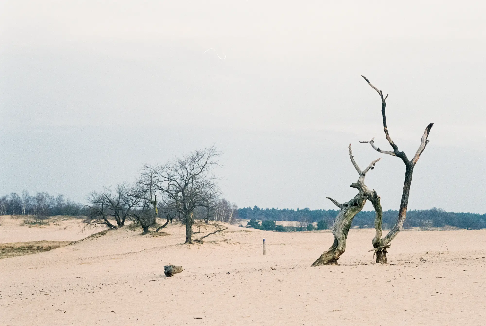
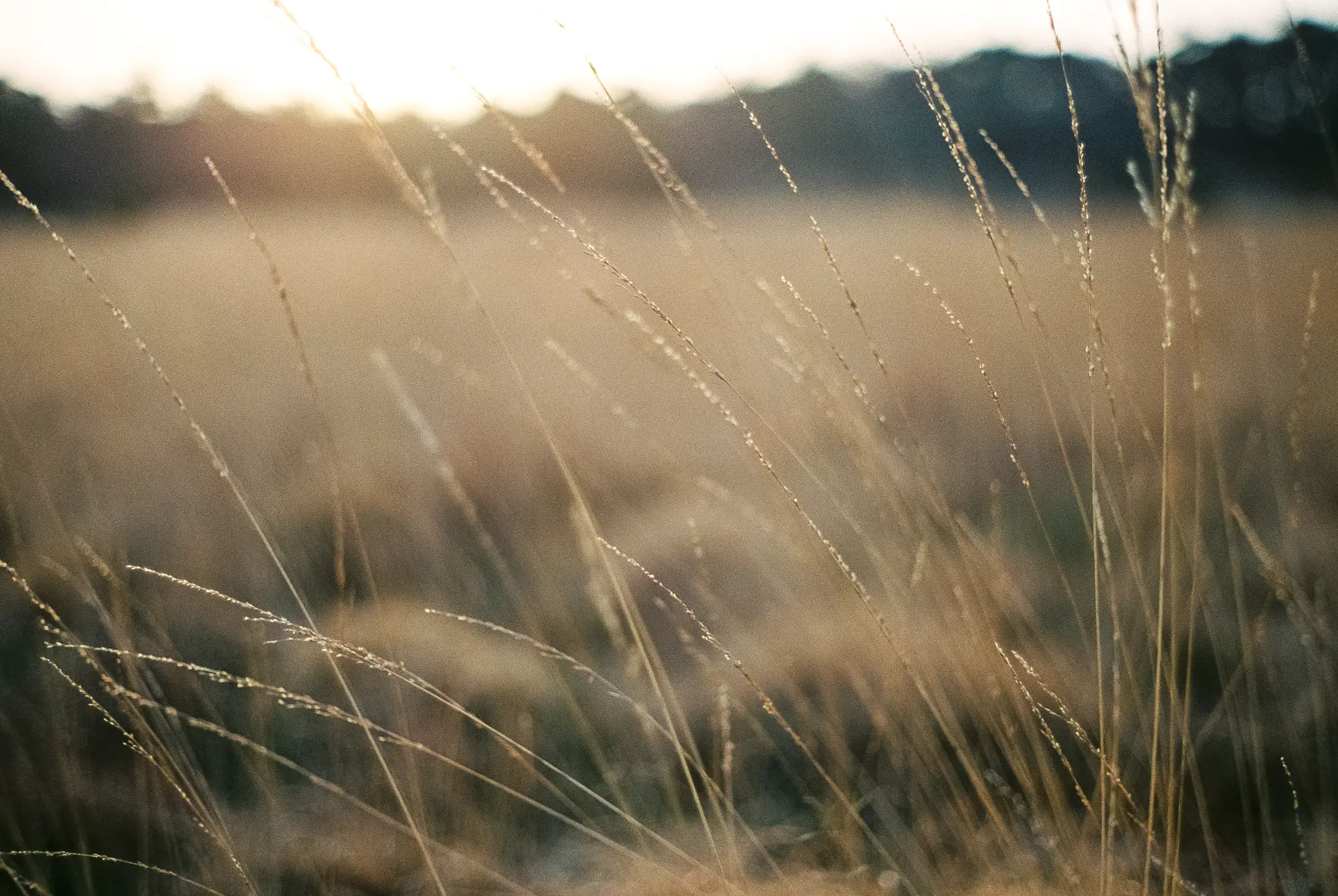
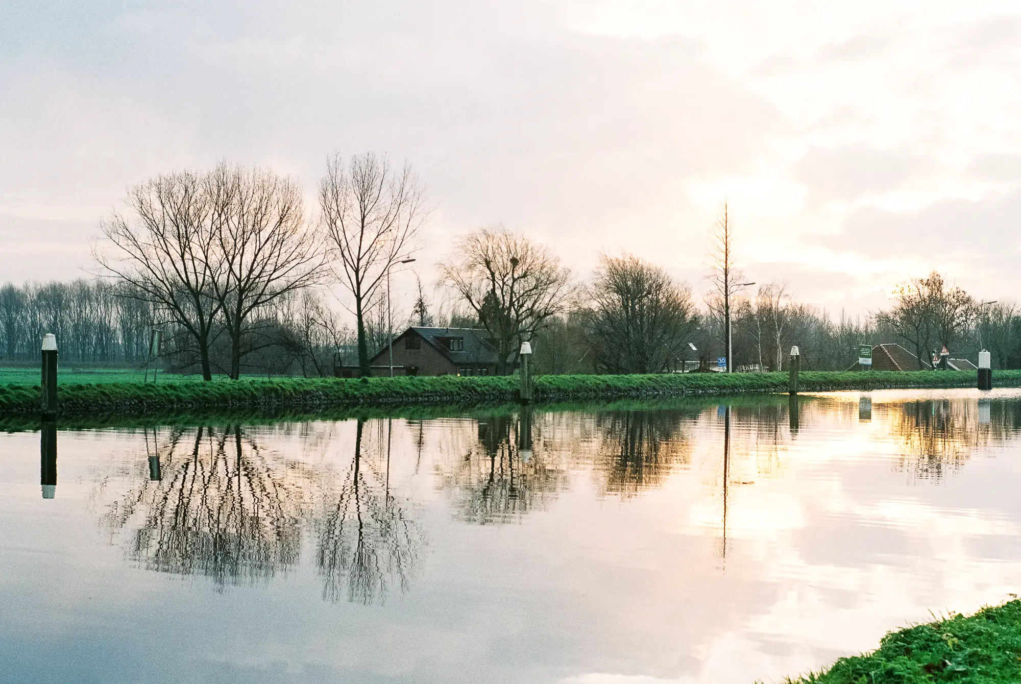
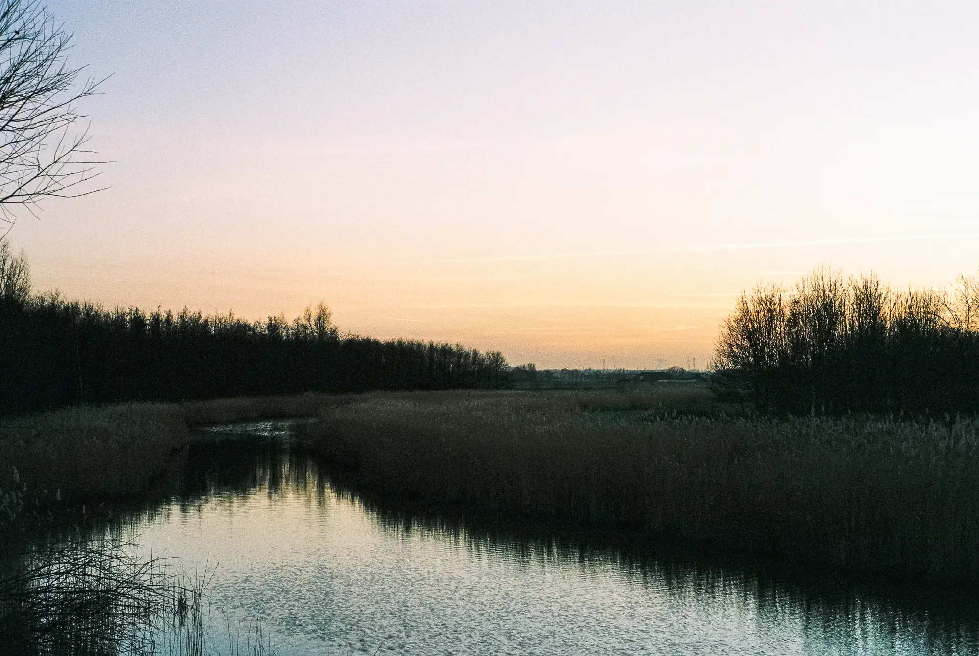
For example the photo on top of this post: I think this is my favourite of the roll, but I have the same reservation with it as I had with my last roll. I remember that there were a lot of pretty colours in the sky (pink/purple and blue), which I don’t see in the photo. I don’t know if it’s overexposed (making the sky too white), underexposed (washing out colours), or a film type that has little saturation. So let’s check the negative of this photo.
Small intermezzo: I did not know what to look for, so I started with a google search and found this website with a short explanation in how to read your negatives: http://www.theonlinedarkroom.com/p/how-to-read-negative.html. Most of you will probably know all of this, but for a newbie like me it was pretty useful. Very short summary: to evaluate exposure check the shadows:
- Overexposed photo’s lead to very dense/dark negatives with hardly any clear parts.
- Underexposed photo’s lead to very thin/light/transparent negatives, with no detail in the shadows.
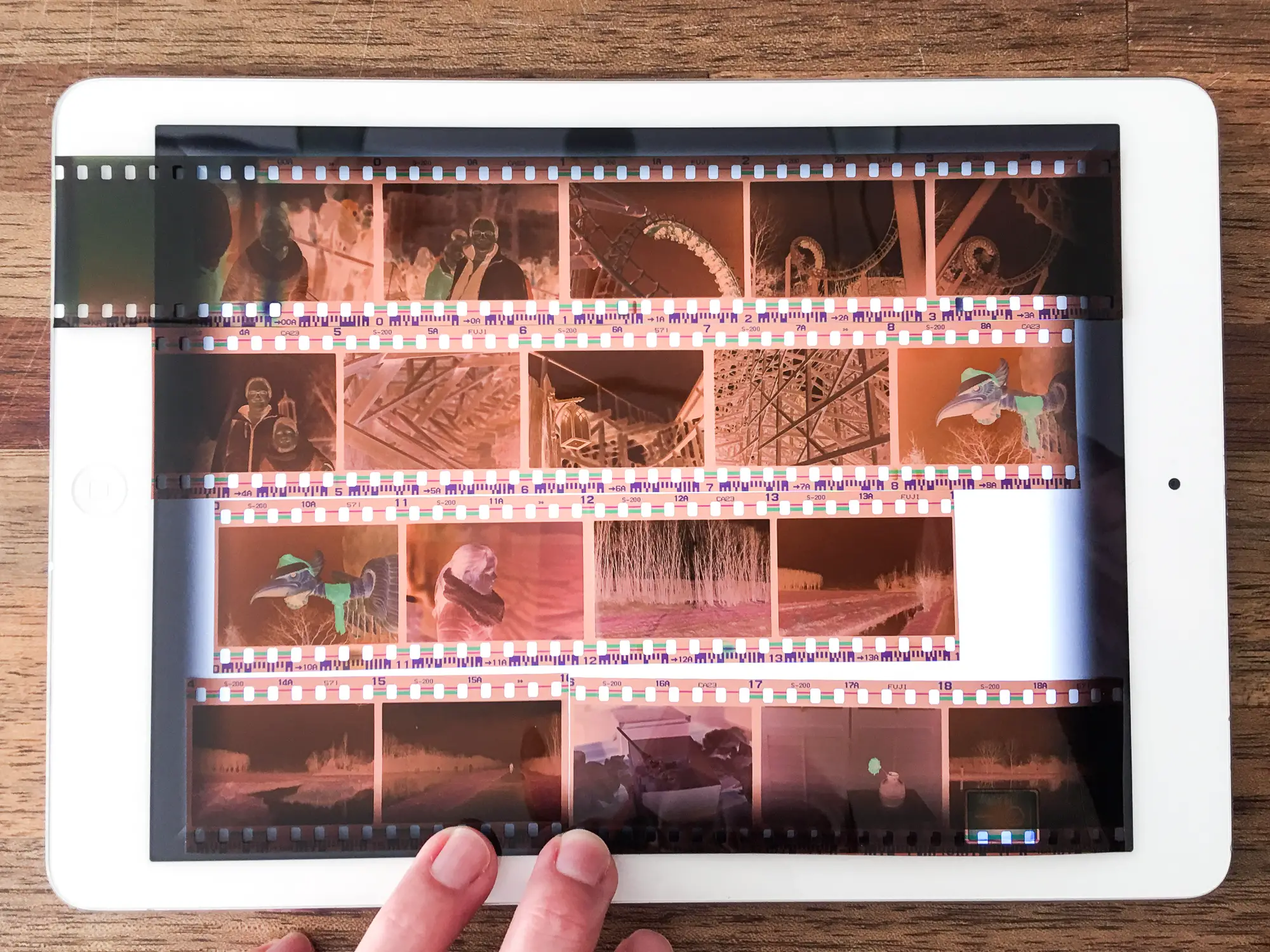
Furthermore I downloaded the free app ‘Negative Viewer’ to my iPad to help watching the negatives. The app basically turns your iPad into a light box.
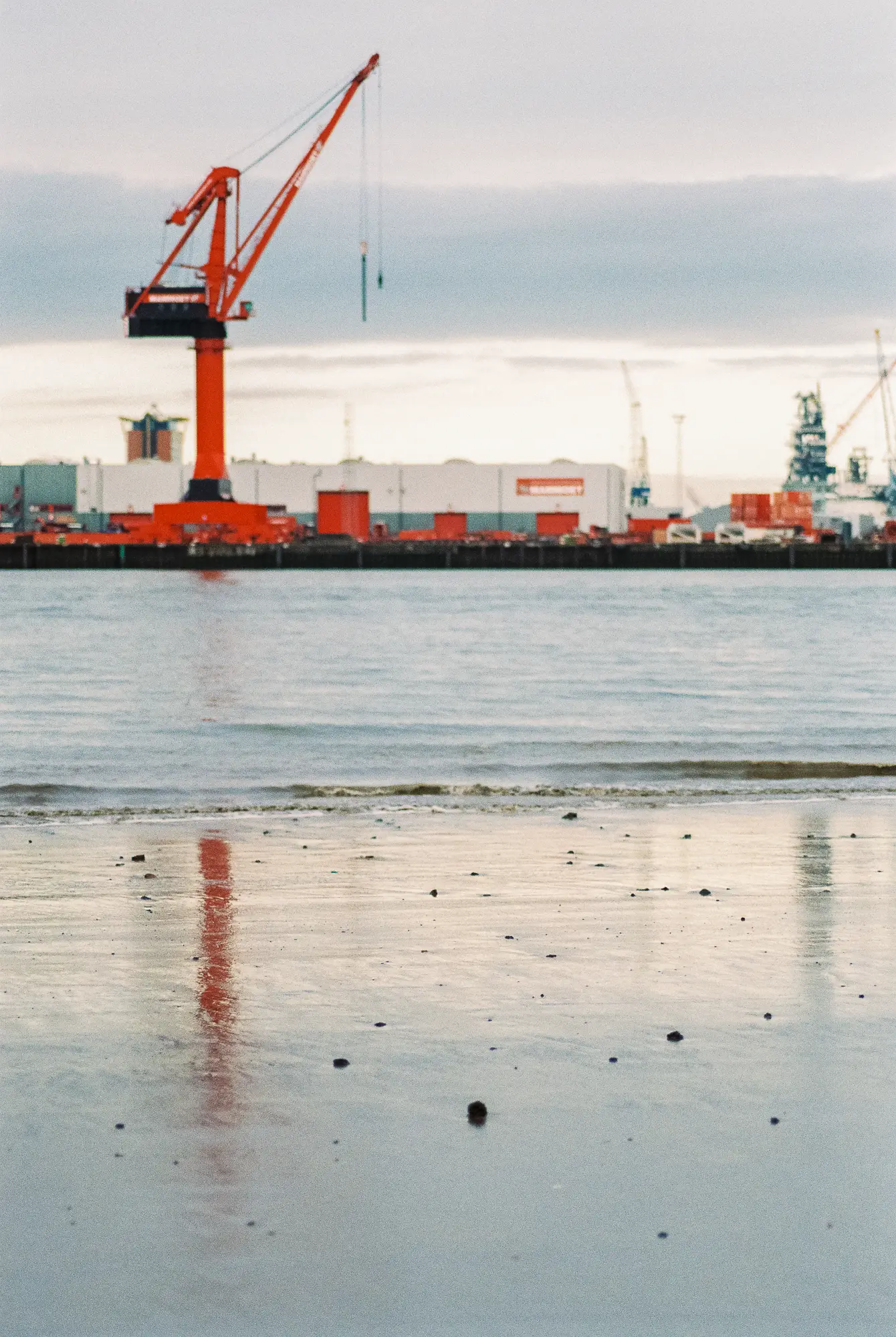
So, here are a few of my negatives from roll #2, which was Fuji Pro 400H (as was roll #1), the top photo is nr 30, bottom right:
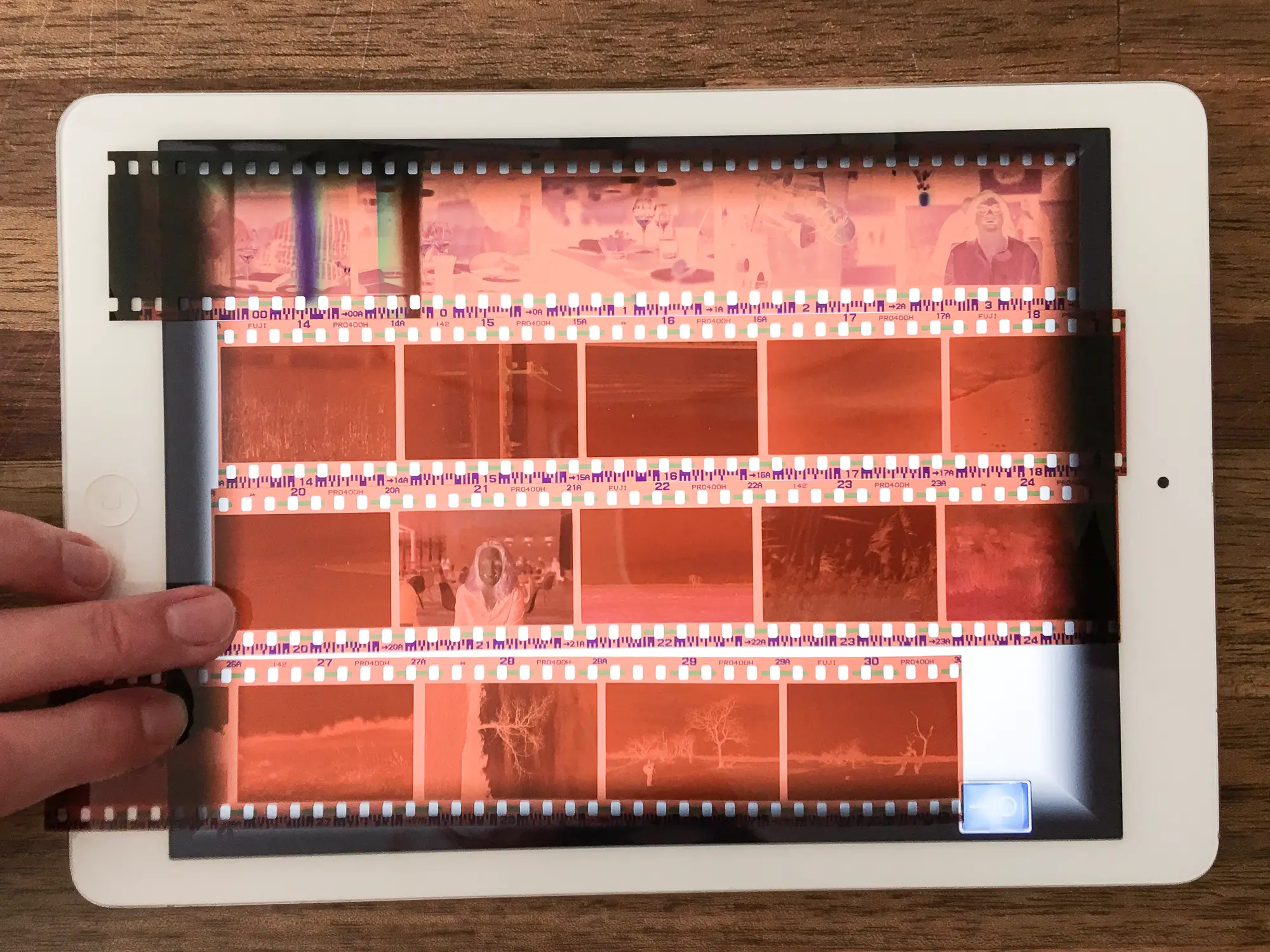
The top row of the negatives, being very light, are clearly underexposed. I expected that since they were shot in a restaurant with dim light (I used my maximum handheld exposure: f/1.4, 1/30 s). Photo nr 30, the photo on top of this post, seems pretty ok to me though, not too dark and clearly not underexposed.
Some suggested to evaluate the density of the negatives by checking if you can read a newspaper through it. As I didn’t have a newspaper at hand, but already had the negatives on my iPad, I switched to iBook to get some text underneath the negatives.
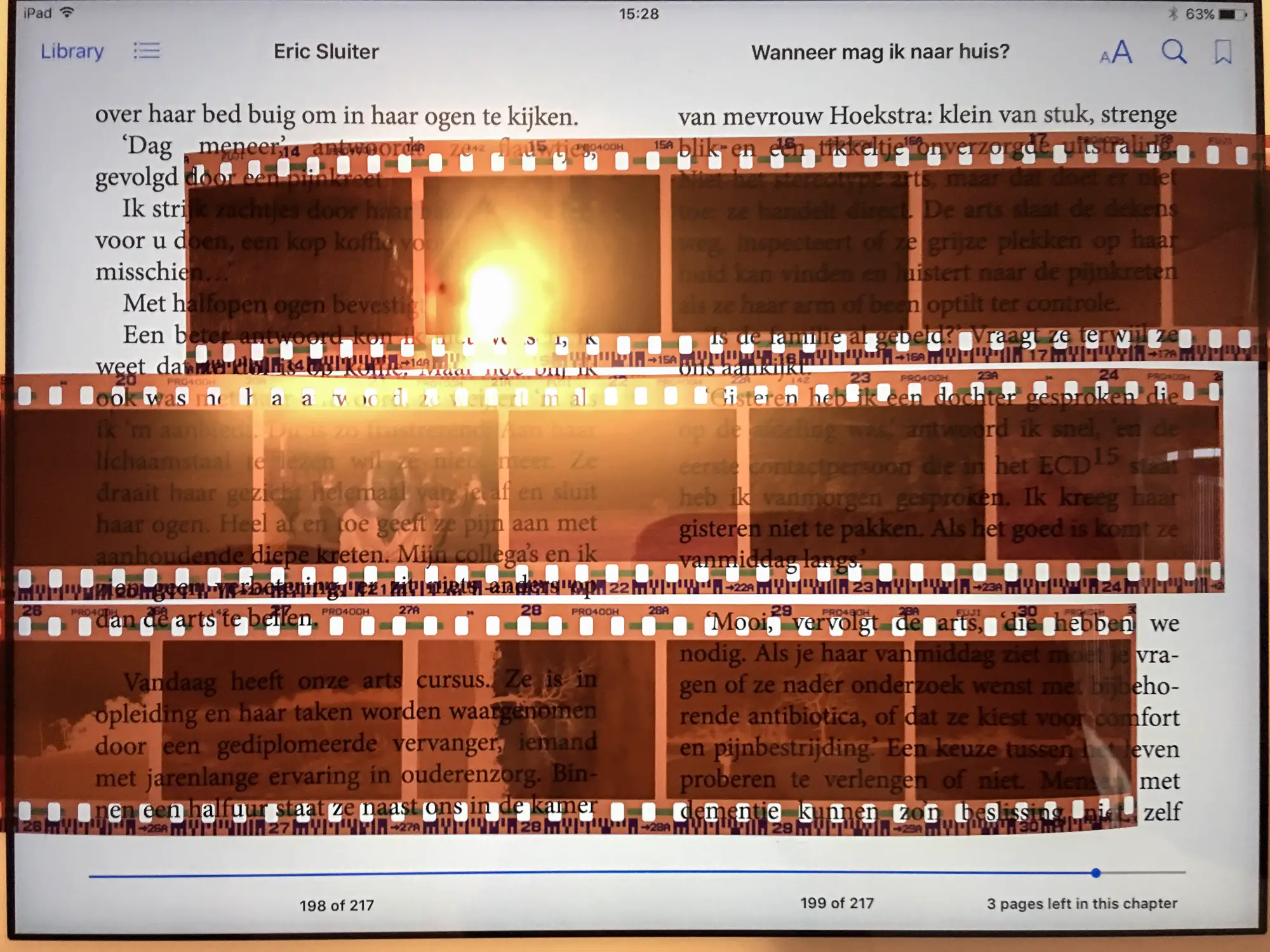
Again, photo 30 seems dense enough, but not too dark to be over-exposed. I tried some different setting in post-processing, but that didn’t improve it all that much. This would lead me to the cautious conclusion that the film type (Pro 400H) is the main contributor to the lack of colour. Here are some more photos from that roll:
I also shot a roll of Fuji Superia 200, the negatives are shown below on the iPad. More colourful images here as I visited an amusement park with my niece. You are bound to find colour there, and on top of that it was the most sunny day of the entire winter so far.
Btw, I also found a nice trick that some might like (and for sure some will absolutely hate 🙂 ): if you want to view your negatives in positive color, you can view them through your iPhone camera by using the ‘Invert Colour’ option. You can assign this function to the triple-home-button in Settings/General/Accessibility/Accessibility Shortcut. This enables easy switching between normal and inverted colours. My negatives would then look like:
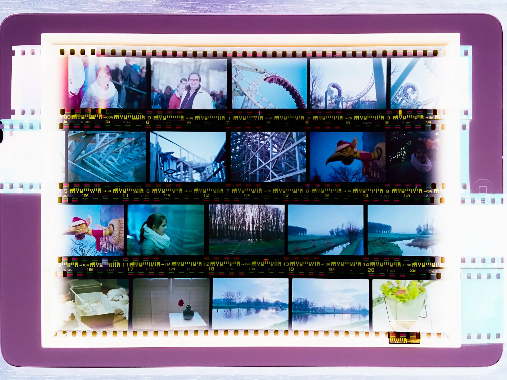
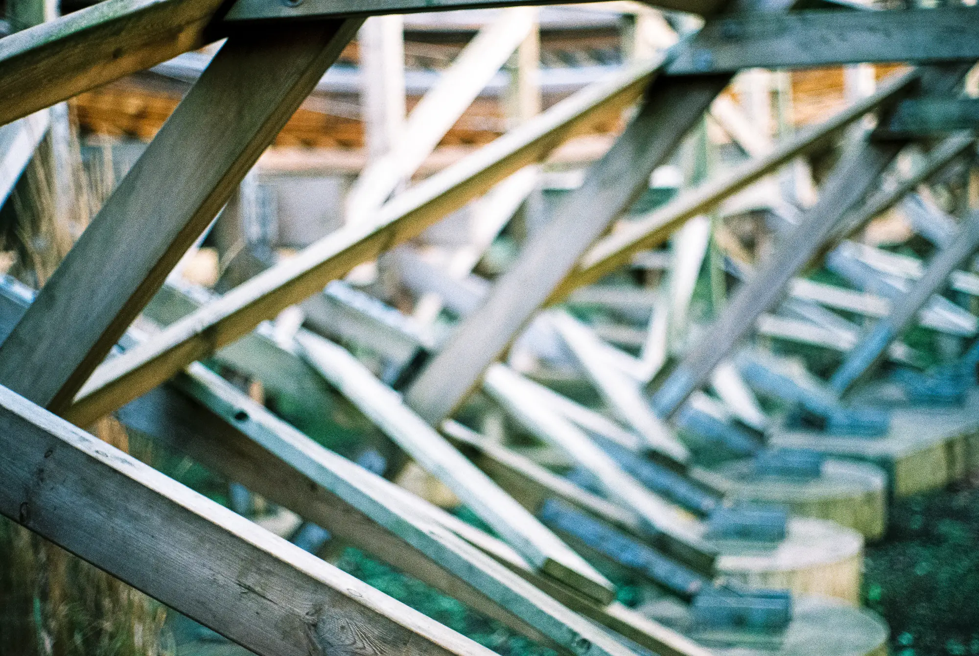
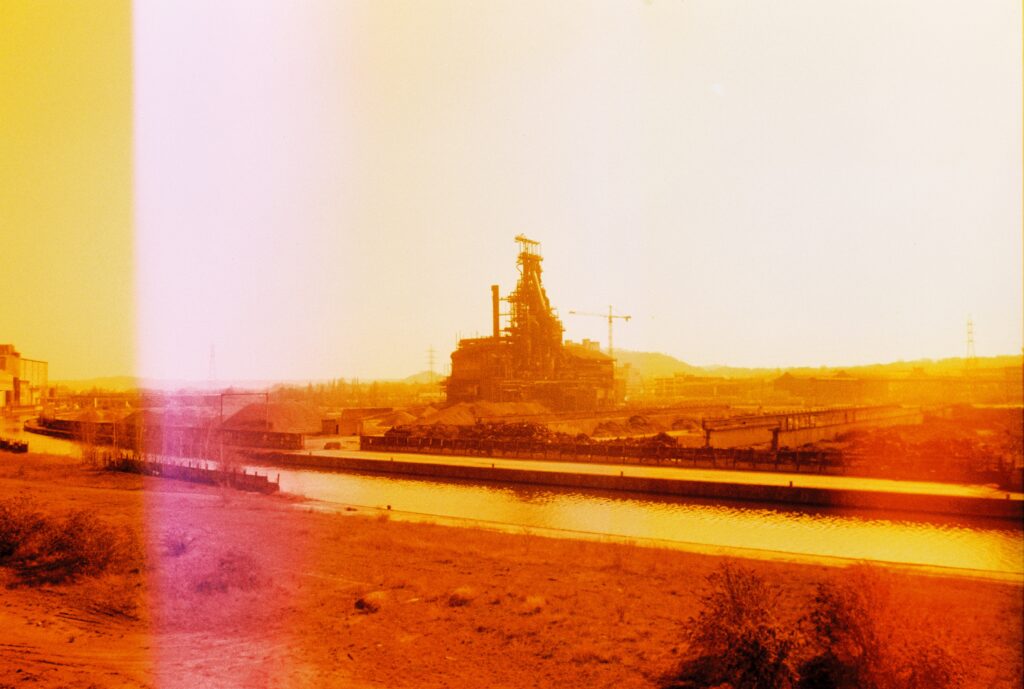
Definitely more colour here! My favourite of this roll is the roller coaster. In this image I absolutely adore the colours. I must say that this photo was made almost mid-day, and like I said on a very sunny day with clear sky. So the light was completely different then with the photos above, which were made in the early morning.

I made another photo of this roller coaster, and here the colours are much different, and I don’t like them at all. I metered with an iPhone app before I made the first one. This second one was made shortly after, and probably with a different angle towards the sun. This lead to over-exposed image. Again I learned this from the negatives, this one is photo 3A, and the negative is clearly darker. Without looking at the negatives I might have thought they were underexposed because of the greyish colours and some grain. But the negatives clearly show that it was not under-exposed. I guess Superia is not that flexible when it comes to over-exposure. Or the development was wrong, but for now I am going to assume that a professional lab will do a good job here.

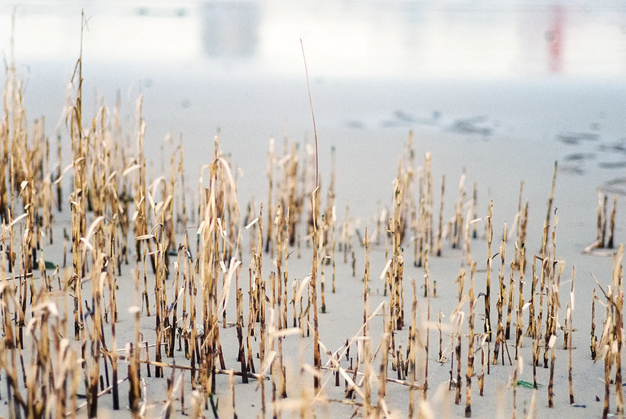
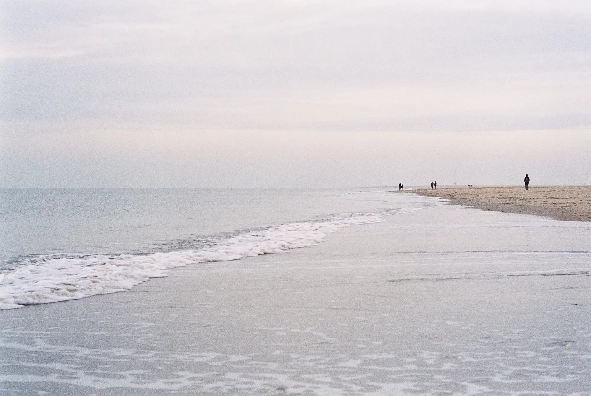
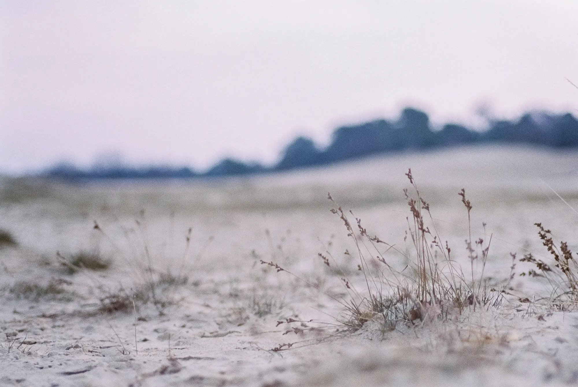
Some more photos from this roll:
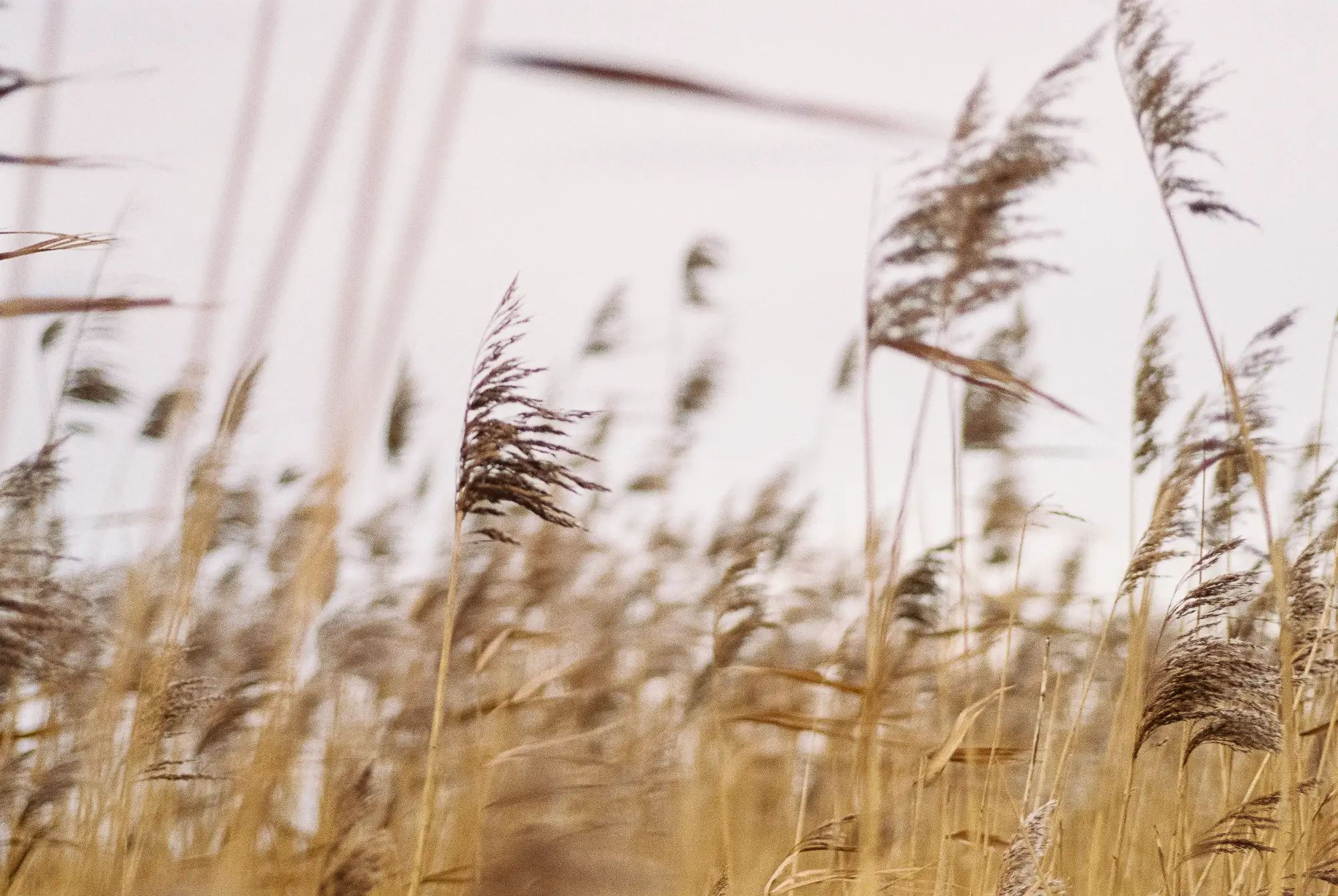
The two photos below show that is difficult to catch colour in the sky in the early morning (it’s photo 15A and 18A, the negatives seem dense enough to me so exposure must have been about right):
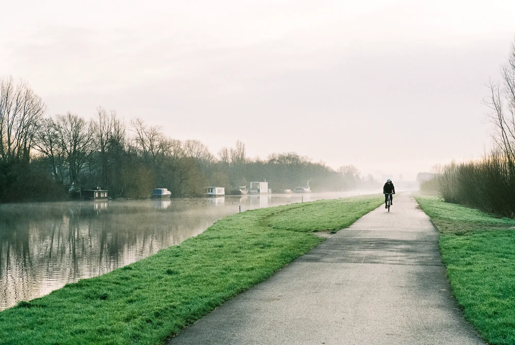
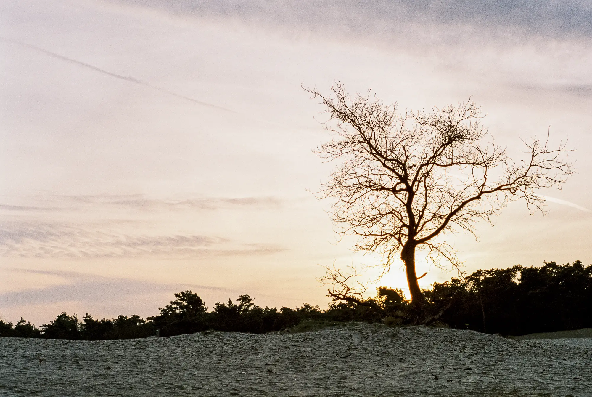
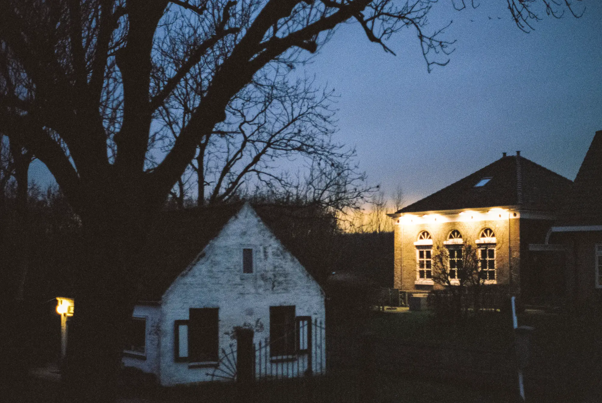
Two photos made in the evening, which I am fairly happy with. The top one is clearly underexposed, it also shows in the negatives, but I like it anyway. It was dark, and the image captures what I wanted to show. In the bottom photo the colours are not as full as I remember them, but I like how they turned out on film.
One thing that happened to both rolls this time is that the first two photos had clear light stripes in them. I guess I need to advance some more film before I start shooting? However with this next photo where the light goes straight through the middle of my nieces face, I still like the result. I think it adds some cool colours 🙂


Both rolls were developed by MeinFilmLab.de. I tried this lab instead of AG photo lab because the mail between Germany and The Netherlands is slightly faster than between the UK and The Netherlands. They use a Frontier scanner instead of a Noritsu, which might lead to cooler colours. I have one more roll of Fuji Pro 400H at the lab, but my M2 is now loaded with Kodak Portra 400 like some of you suggested. Can’t wait to see the differences!
Thanks for reading, and Hamish thanks for having me!
If you’re interested, you can find my digital photos on www.whataukjesees.com
Read Part 6 of my journey into film here.
Share this post:


Comments
Hamish Gill on My First Roll(s) With A Leica Film Camera Continued – Guest Post by Aukje
Comment posted: 04/02/2016
Comment posted: 04/02/2016
Geloen Pieter on My First Roll(s) With A Leica Film Camera Continued – Guest Post by Aukje
Comment posted: 04/02/2016
So the best thing to do, is as soon as you rewound the film, is pop it in a black container or put gaffertape over the slit.
Comment posted: 04/02/2016
Comment posted: 04/02/2016
Eddy on My First Roll(s) With A Leica Film Camera Continued – Guest Post by Aukje
Comment posted: 04/02/2016
Comment posted: 04/02/2016
Rene on My First Roll(s) With A Leica Film Camera Continued – Guest Post by Aukje
Comment posted: 04/02/2016
Nice photos and nice iPhone trick.
Comment posted: 04/02/2016
Frank on My First Roll(s) With A Leica Film Camera Continued – Guest Post by Aukje
Comment posted: 04/02/2016
Do you see any big difference between the AG and MeinFilm scans? I ask this as I currently use the german lab and I am quite happy with the results.
Thank you!
Frank
Comment posted: 04/02/2016
Niko on My First Roll(s) With A Leica Film Camera Continued – Guest Post by Aukje
Comment posted: 05/02/2016
Comment posted: 05/02/2016
jeremy north on My First Roll(s) With A Leica Film Camera Continued – Guest Post by Aukje
Comment posted: 05/02/2016
I look forward to seeing your next set.
Comment posted: 05/02/2016
Alex on My First Roll(s) With A Leica Film Camera Continued – Guest Post by Aukje
Comment posted: 05/02/2016
I shoot a lot of ektar now. I always under expose it a little bit and get the results I like. Could be an option for you in the future.
Comment posted: 05/02/2016
Comment posted: 05/02/2016
Dagmar on My First Roll(s) With A Leica Film Camera Continued – Guest Post by Aukje
Comment posted: 05/02/2016
I absolutely love the combination of vintage Leica M2, analogue film and the shiny iPad, used as lightdesk and particularily, the tip with inverting colours!
Cheers,
Dagmar
Aukje on My First Roll(s) With A Leica Film Camera Continued – Guest Post by Aukje
Comment posted: 05/02/2016
Tony on My First Roll(s) With A Leica Film Camera Continued – Guest Post by Aukje
Comment posted: 05/02/2016
Comment posted: 05/02/2016
Tony on My First Roll(s) With A Leica Film Camera Continued – Guest Post by Aukje
Comment posted: 05/02/2016
J-BO on My First Roll(s) With A Leica Film Camera Continued – Guest Post by Aukje
Comment posted: 05/02/2016
Ik ben een fan ;)
Comment posted: 05/02/2016
Dan James on My First Roll(s) With A Leica Film Camera Continued – Guest Post by Aukje
Comment posted: 10/02/2016
I don't have a Leica or the lens you use, but I wonder if it is known for producing (or not producing) vibrant colours?
A couple of years ago I bought a Sony NEX camera with the sole intention of using my vintage lenses on it (M42, Pentax K mount and Minolta SR mount), with adapters. I have done mini tests of the same scene with say four or five comparable lenses in the same mount by using the NEX.
With all other variables constant - the scene, the ISO, the aperture, the shutter speed etc - I knew that any difference in the images (especially in their colours) would be purely down to the character of the lens used.
I thought that most lenses would give near identical results, but was amazed at the variation in colour and tones. It taught me that different lenses render colour quite differently, and then of course with film we have the emulsion as another variable. It also helped me choose my favourite lenses with that direct feedback from a digital camera, that would have taken weeks or months shooting film, though I can and do now take that knowledge of the len(es) into my film shooting.
So I wonder if the lens you're using is not known for vibrant colours and you might be better with a different one that is? (I have no experiences of Leicas as I say, so others I'm sure will be able to comment on your specific lens!) So you're not doing anything "wrong" with your exposing, that's simply what the lens is able to create?
Dan
Comment posted: 10/02/2016
Nick on My First Roll(s) With A Leica Film Camera Continued – Guest Post by Aukje
Comment posted: 02/05/2016
If that's your focus and you want to shoot colour negs, I'd suggest Ektar 100, which almost looks like transparencies if you shoot it well. Or you could just go all in and have a crack with Velvia 50 - you definitely won't lack for saturation!
Comment posted: 02/05/2016
Comment posted: 02/05/2016
Patrick Norman on My First Roll(s) With A Leica Film Camera Continued – Guest Post by Aukje
Comment posted: 28/05/2016
Good on you for shooting film! And colour neg film at that! Colour negative is probably the toughest to learn photography from. It takes a bit of skill to read and understand what you are looking at for exposure, contrast and saturation. Even sharpness can be a bit challenging to judge, especially on 35mm film. These days you need a good lab that runs a lot of C-41 so your film is processed properly. In a lower volume lab, chemistry oxidizes and results in poor colour balance resulting in colour cross over. You will be chasing your tail trying to figure out what is going on.
There's lots of advice given on this blog and I am not wanting to step on any toes, but there are a few misconceptions. Colour negative film, like all films, there is only one exposure(density). The correct one. The idea of film having a lot of "latitude" is a bit of a myth coming from not understanding how film works. You can sometimes get away with an under or over exposed negative, but it is far from ideal. Film has a set contrast curve. In over exposing, one pushes the lighter(whites) tones higher into the shoulder of the curve. This compresses the tones resulting in less tonal separation(blocked highlights). Kodak Tri-X is wonderful because of it's shoulder and toe sections of the curve are gentle resulting in more tonal separation. This also is why people say it has a lot of "latitude". But even Tri-X will easily 'block' if exposure is not controlled, resulting in less tonal separation. I'm trying not to get too technical, but correct exposure is important. Placing the exposure on the "best" part of the the curve is paramount to yield a high quality print or scan.
The colour negative films, Portra 160 and 400 has a similar curve to Tri-X. A gentler curve gathering move usable information, especially in the whites(eg. wedding dresses). All colour neg film was designed to be printed on RA-4 paper(fixed constrast). Taking this in mind, if the photographer wants more saturated colour, they would choose a film that would provide this. If you are scanning the film, this is not important. Keep in mind, saturation is product of contrast. I personally shoot Portra 160 for my colour work. It is perfect for gathering as much information when shooting as possible. After scanning, you can easily adjust the curve in Photoshop to make it look like any film made. Shooting a more contrast/saturated film to scan only will limit you from the beginning.
Have you shot E-6 film before? If you or anyone wants to learn about correct exposure, this is the only way to do it. In the beginning, you will be all over the map. This is a good thing because you can now start to learn. In time, you will start to understand how to expose. I think a lot your frustration with your film shooting is because there are too many variables in colour negative film that are not controlled. They are hard to control, especially for a beginner. Scanning colour negative film adds even more variables.
Aukje, hope this helps a little bit. Just to let you know, It's not your camera! I also don't believe in "Bad Light". It's about matching your subject to light quality to create your desired photograph. Keep shooting and feel free to ask any question.
Patrick
Comment posted: 28/05/2016
Comment posted: 28/05/2016
Comment posted: 28/05/2016
Comment posted: 28/05/2016
Fuji Pro 400H & Kodak Portra 400 - Quest For Colour - By Aukje - 35mmc on My First Roll(s) With A Leica Film Camera Continued – Guest Post by Aukje
Comment posted: 05/06/2020