When the digital tsunami overwhelmed the world of picture-taking in the mid-2000s, I bought various digital camera and used them for color work. However, I continued to take black and white film photographs. In particular, I slowly used my stash of Kodak Panatomic-X in medium format cameras. To me, the traditional silver gelatin photon-capture technology just looked better and more authentic for the my type of urban decay photography. I became re-familiar with an old friend, Tri-X, using it in Burma and Cuba. In the last couple of years, I have been using film almost exclusively.
Starting in 2017, I tried color negative film again after a gap of many years. This was in response to some scenes which jumped out and said, “I am in color!” So far, I have primarily used Kodak Ektar 100 but also some long-expired Ektar 25 in 120 size. The results have been very satisfactory. Sure, it is not as “perfect” as digital, does not have the dynamic range, giga-pixels, or all the other statistics, but so what? But then we have the photographer’s dilemma: when is it better to record a scene in color or in monochrome? Should I always emphasize forms and textures and record in monochrome? Is the color data sometimes such an important part of the scene, I should embrace it it? Here is an impromptu experiment to compare color with black and white of the same scenes. I will not say which I prefer in these examples, but comments or criticisms from readers are most welcome.
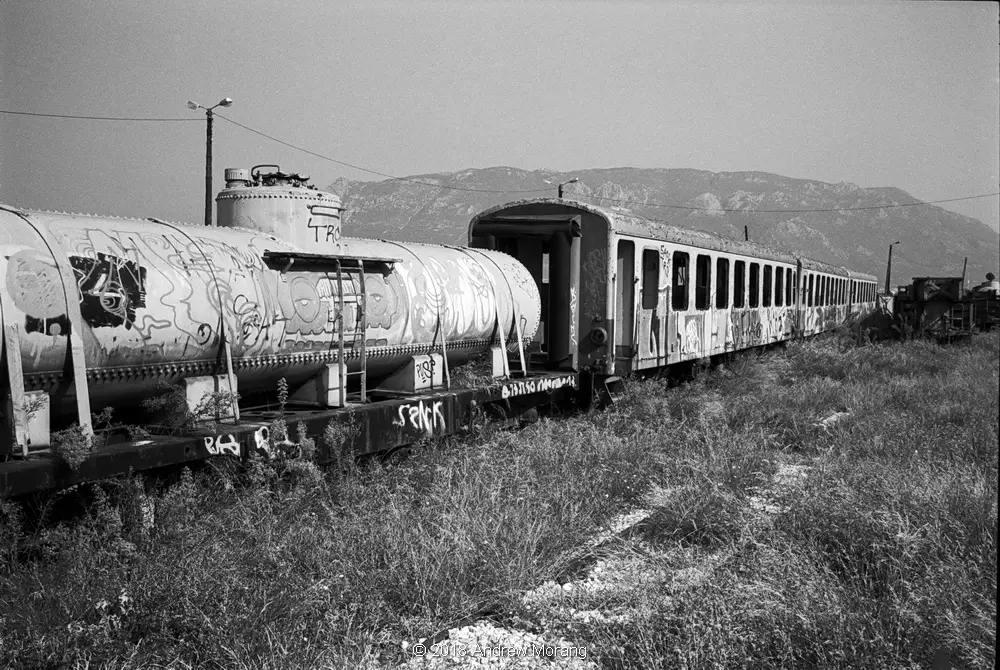
Greece
This is the now-unused railroad station in Corinth, Greece. The old 1-meter rail line from Athens to the Peloponnese has been closed and partly replaced by the new Athens Suburban Railroad. The new train uses a different right-of-way, so the old rail yard sits unused, slowly being covered with grass.
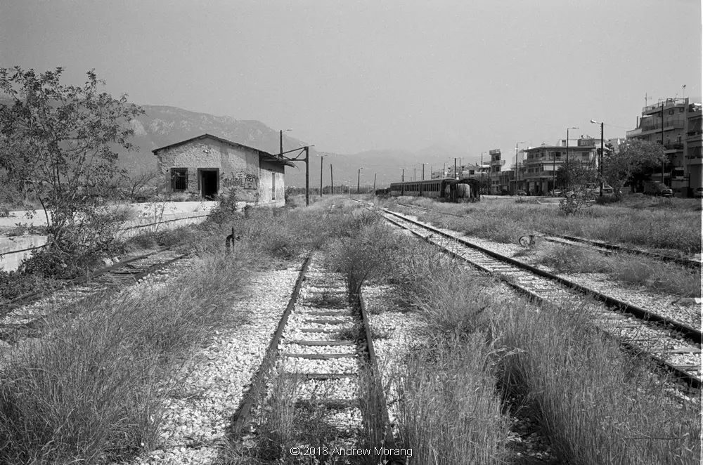
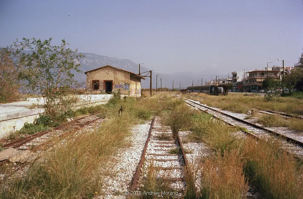
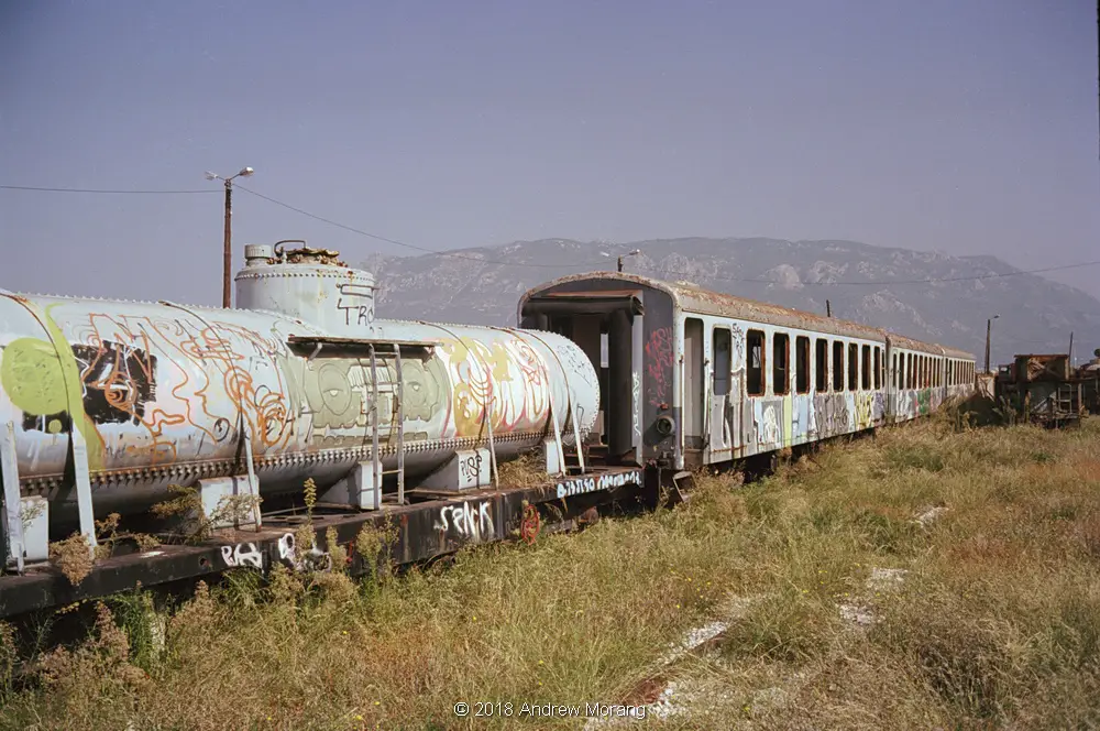
This was a brilliant sunny day, and the Greek sun makes any site cheerful. I took digital images here in 2011 on a gloomier day.
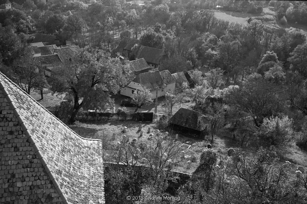
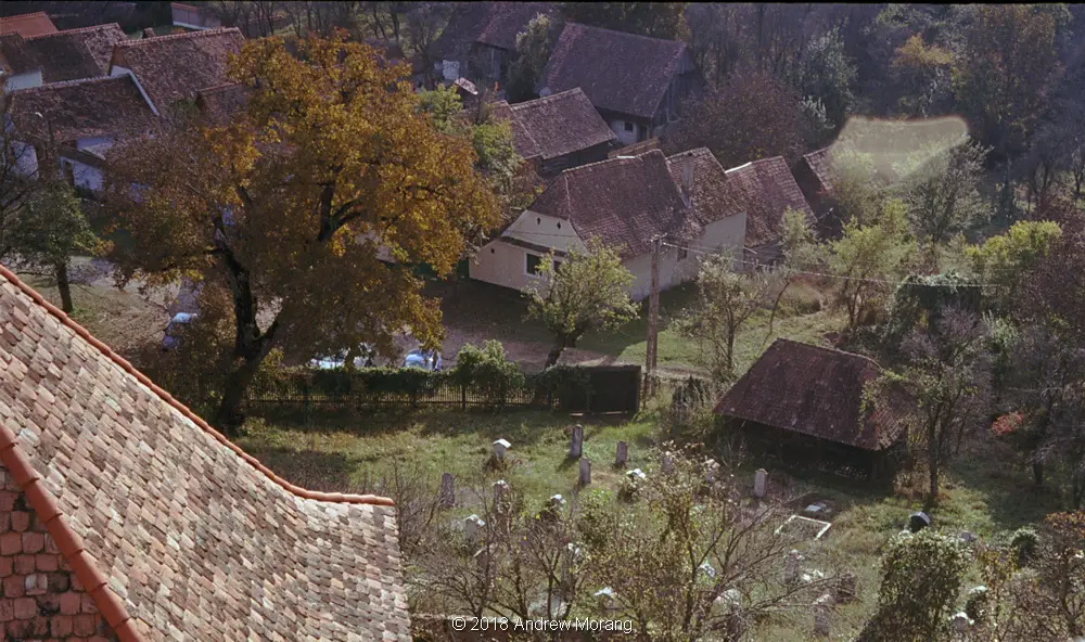
Romania
Romania is full of interesting old fortified churches. This one is in Viscri, a traditional village north of the Transylvanian Alps. You can climb several sets of steep steps to access the guard balcony in the steeple. In the example below, one photograph is 24mm while the other 35mm, so the comparison is not quite the same.
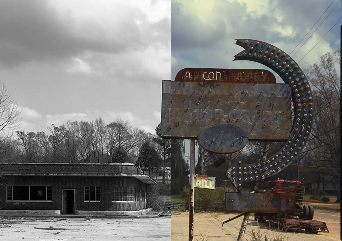
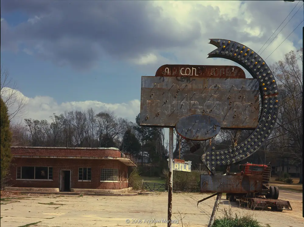
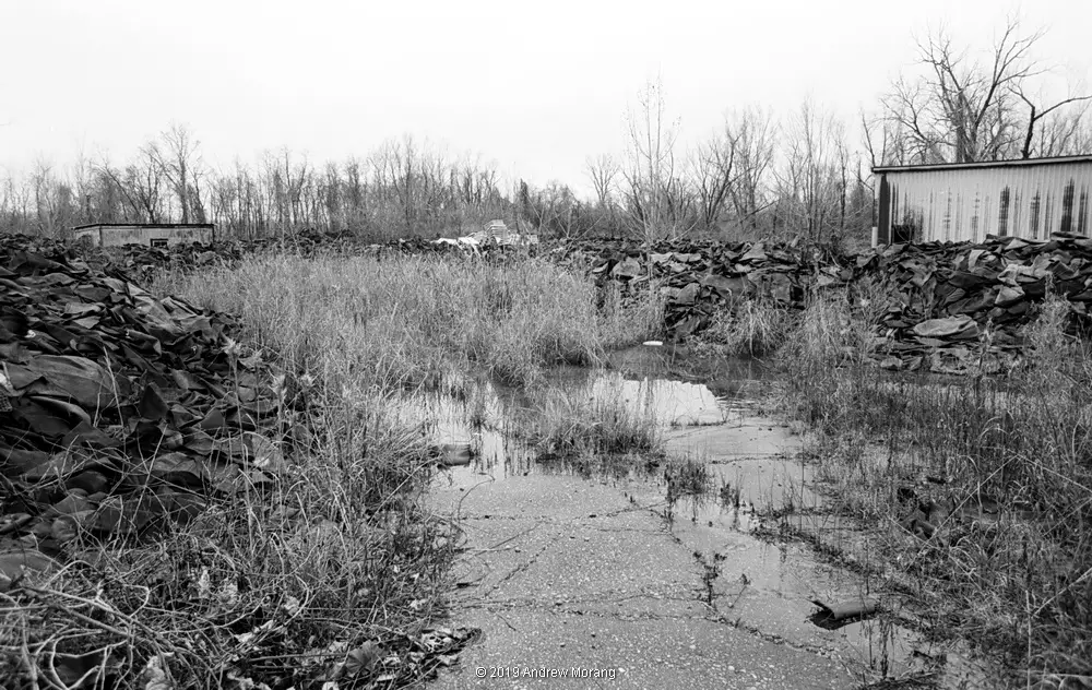
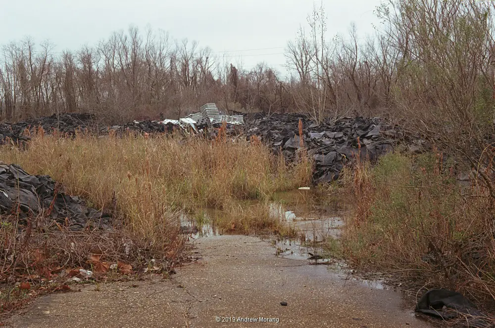
Mississippi
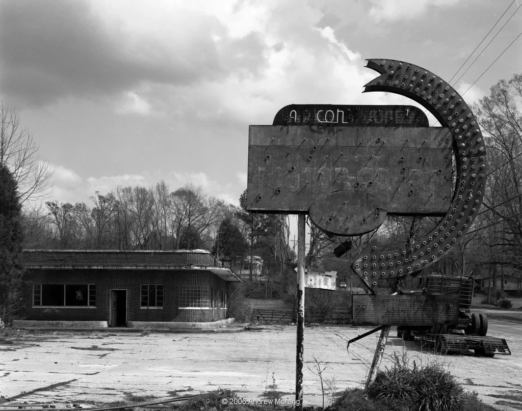
I looked through my files and found two 4×5″ frames of a long-abandoned restaurant on Highway US 80 near Vicksburg, Mississippi. In its prime, the sign must have been quite spectacular, blazing with hundreds of incandescent light bulbs and neon lettering.
South of Vicksburg, an abandoned rubber reclaiming factory sits at the end of appropriately-named Rubber Way. Mountains of tires and inner tubes are lying on the ground. The mosquito habitat must be horrible in summer. It is probably good snake habitat, as well, and by now, some alligators may have moved into the ponds. (For you non-Southerners, this is not a big deal. We have alligators in almost all water bodies; they are rather cute, but just don’t mess with them.) The comparison below is from different focal length lenses, so the coverage is slightly different, but I hope the ambience (dead factory ambience?) comes through.
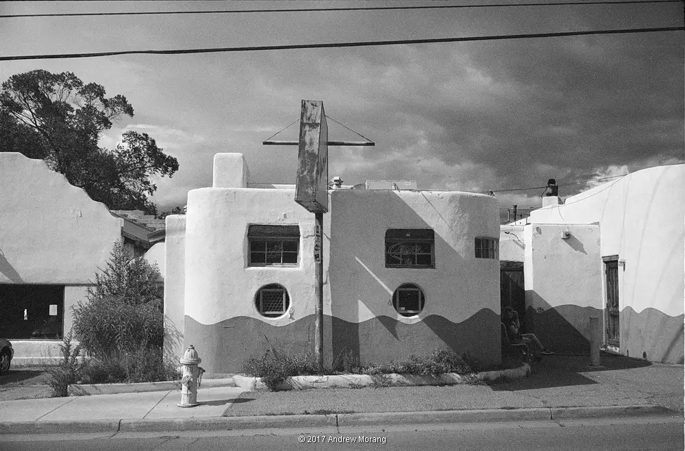
New Mexico
I passed an interesting little restaurant in Santa Fe, New Mexico. Here, the only color image in my files was a digital frame from a Fujifilm X-E1, but the monochrome was from Kodak BW400CN film. Santa Fe during the monsoon (mid-summer) can have spectacular skies.

Kathmandu
The mannequins in Kathmandu are very interesting. Most resemble European ladies with 1960s hair styles. My anthropologist friend said they look like European ladies because they were European – recycled from the fashion and department store industry. But there are so many in Kathmandu, I suspect most now are mass-produced in India, complete with these interesting hair fashions. Without further ado, here are some of these lovelies.
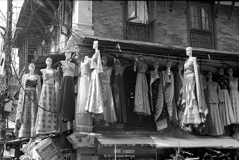
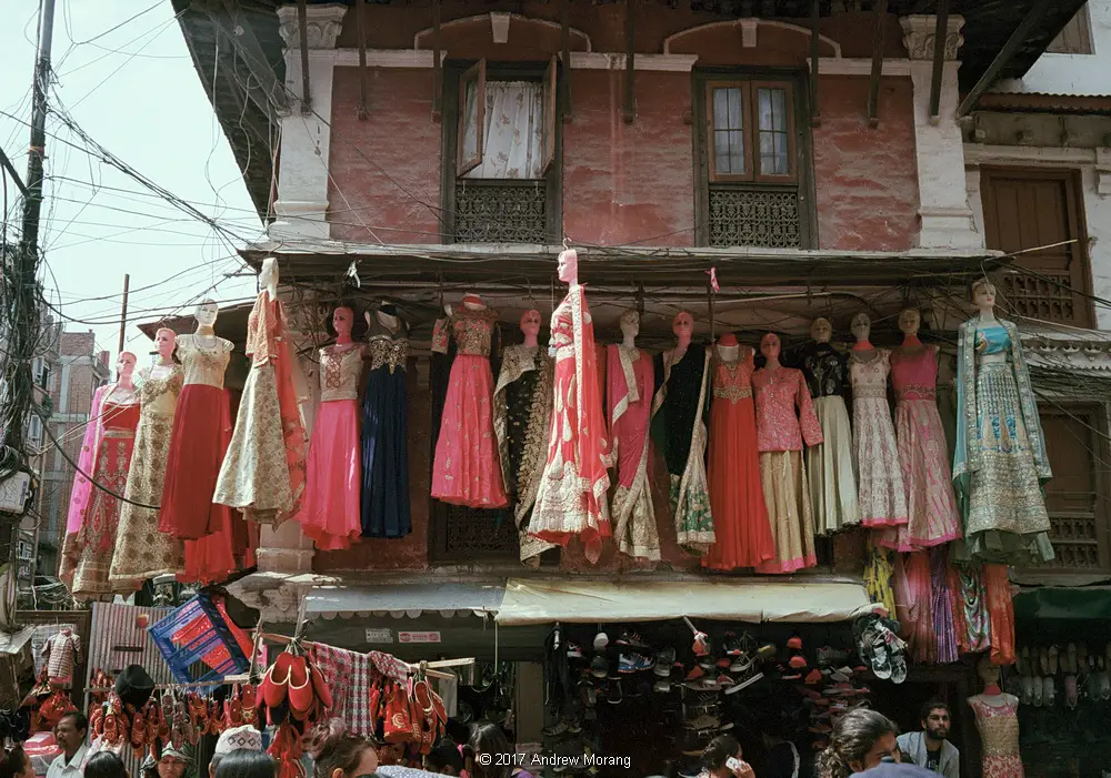
If you are interested in more pictures of Kathmandu, please click here or here. For more on these lovely ladies, click here.
Closing Thoughts
Dear readers, I cannot make up my mind. In some locations, the colors jump up and say, “Photograph me!” But in others, monochrome helps me concentrate on the textures and shapes.
Maybe I should use both media, the best of two worlds. From a purely technical point of view, with 135 film, I can pack an extra camera body; they usually are small enough. With medium format, I could buy a second back for my Hasselblad. With 4×5″, the film holders are reasonably compact and easy to switch when the camera is on a tripod.
Robin Wong, a photographer in Malaysia, recently wrote some thoughts on monochrome. He wrote, “I find it liberating to strip all colors away and go straight to the core of the image – the idea, the message or the emotion.” Well-expressed, indeed… but most likely I will continue to experiment and use both media.
You can keep track of my photographic wanderings at Urban Decay. Thank you all for reading.
Share this post:


Comments
Chris Denyer on Dilemma Dilemma: What Shall I Use, Color or Black & White? A Short Comparison – by Andrew Morang
Comment posted: 07/05/2019
Chris
Comment posted: 07/05/2019
Michael Kay on Dilemma Dilemma: What Shall I Use, Color or Black & White? A Short Comparison – by Andrew Morang
Comment posted: 07/05/2019
Wayne on Dilemma Dilemma: What Shall I Use, Color or Black & White? A Short Comparison – by Andrew Morang
Comment posted: 07/05/2019
theo vervloet on Dilemma Dilemma: What Shall I Use, Color or Black & White? A Short Comparison – by Andrew Morang
Comment posted: 07/05/2019
Kind regards.
Terry B on Dilemma Dilemma: What Shall I Use, Color or Black & White? A Short Comparison – by Andrew Morang
Comment posted: 07/05/2019
I suspect that the reason colour, for me, worked better with this image, is the somewhat muted nature of the palette in which there is insufficient natural contrast for it to have worked in b/w. Of course, the film type may be contributing to this. This is in stark contrast (pun intended) to your b/w images which do have contrast.
Tony on Dilemma Dilemma: What Shall I Use, Color or Black & White? A Short Comparison – by Andrew Morang
Comment posted: 07/05/2019
John Furlong on Dilemma Dilemma: What Shall I Use, Color or Black & White? A Short Comparison – by Andrew Morang
Comment posted: 07/05/2019
All the others so clearly emphasise your 'Urban Decay' theme when presented in mono.
BC on Dilemma Dilemma: What Shall I Use, Color or Black & White? A Short Comparison – by Andrew Morang
Comment posted: 07/05/2019
In the light of these examples it seems that the choice is a conceptual one, by this I mean it is based on your intention, your project. One needs to isolate one central intention, define one specific project. It is necessary for coherence and facilitates communication with an audience. If one is mostly photographing for oneself, and only the single image, as a singular little moment of happiness generated by the photographic activity matter, then either works whenever it happens. There is one certitude, if experienced photographers does not photograph the same subjects or the same subjects the same way depending which of BW and color they use, so there is actually a difference.
Two strategies come to my mind to answer your dilemma and simplify your life as a photographer (as well as to make your photographing more “efficient” if you are working on a specific project). Choose either color or BW and photograph accordingly and stick to the one you have chosen throughout the project (which means you adapt your vision to the chosen medium and work WITH it, understanding its advantages and its flaws, getting the best of both (advantages and flaws [grain for instance for Tri-X]). They are different media and comparing them does not quite work in the sense that I do not think it provides any definitive answer. Difficult to make a mayonnaise with butter or a good croissant with oil, both are fatty media though. They each have their use in specific circumstances. Using one when you should have used the other does not quite work. Film kinda forced us to do that when, as is the case when everyone starts, we only had one camera (except for large format for which it is easy to load two different backs) or only one back (in case of a medium format camera such a Hasselblad, Bronica, Mamiya, or Rolleiflex (SLR)). I must say that I now principally work with digital cameras in spite of having kept too many of my previous film cameras but when I leave my house for a project I have chosen whether I am going to photograph in color or BW. In the latter case I record my images in both Raw and JPG format and the jpgs are set to BW (sometimes with a yellow-filter simulation). Of course with the Raw format I have access to color should I need it but it is mostly to be able to specifically process to the BW one I need (plus the increased exposure latitude). Using a mirrorless cameras (and there are more and more of them) is also an advantage as the photographer can visualize the BW image in the viewfinder (and its precise exposure). If still using film you have to decide not only between BW and color but which film goes best with which project (issues of contrast, grain, sensitivity, color accuracy arise) or carry tons of equipment… It is in the end just a matter of knowing where you find meaning and pleasure in your photographic activity. For some it is the results, for others the process, for most different degrees of both. All the best and thank you again for sharing.
Nick Lyle on Dilemma Dilemma: What Shall I Use, Color or Black & White? A Short Comparison – by Andrew Morang
Comment posted: 07/05/2019
Dan Stevenson on Dilemma Dilemma: What Shall I Use, Color or Black & White? A Short Comparison – by Andrew Morang
Comment posted: 07/05/2019
In your examples the black and white prints really speak to the slow decacy of these unused places so I prefer them as a rule. However, the last example of the manikins works both ways. Perhaps because it is a mix of old with new.
Comment posted: 07/05/2019
Dan Castelli on Dilemma Dilemma: What Shall I Use, Color or Black & White? A Short Comparison – by Andrew Morang
Comment posted: 07/05/2019
You could not control color - it was left up to a darkroom tech to make your prints from 'chrome slides.
You could control B&W by doing your own darkroom work. If you didn't do your own work, we didn't consider you a 'real' photographer.
Ashley Carr on Dilemma Dilemma: What Shall I Use, Color or Black & White? A Short Comparison – by Andrew Morang
Comment posted: 07/05/2019
I’ve been shooting black and white film almost exclusively for nearly 4 years now as I decided, for conceptual reasons amongst other things, that this project would be shot on black and white. If I come across a scene that I don’t think tonally would be suited to black and white film I don’t think ‘oh this would work better in colour’ I just realise that there isn’t a picture to be made.
Another project I’ve got starting up was decided to be colour as that medium lent itself better to the subject than black and white. Again, not so much as for the look of colour, more from the conceptual point of view.
This approach makes the decision between colour and black and white very easy for me.
Comment posted: 07/05/2019
Simon Panter on Dilemma Dilemma: What Shall I Use, Color or Black & White? A Short Comparison – by Andrew Morang
Comment posted: 08/05/2019
Krishna Kumar on Dilemma Dilemma: What Shall I Use, Color or Black & White? A Short Comparison – by Andrew Morang
Comment posted: 08/05/2019
Choice of the film, in my opinion, Black & White or Colour is dictated by the subject and not by the photographer.
But sometimes one may be compelled by the desire to employ either of the two notwithstanding the subject .
With 35 years of living with cameras, lenses and film, I can only shoot in colour and convert the image to B&W through Photoshop editing and be left wondering why the results are not the same as those with Kodak T Max or Ilford Delta and the rest ... in terms of sharpness, contrast and depth ... !
So much said, I think one must accept the limitations of the digital technology which comes nowhere near its analog predecessor
leaving us with no choice than to accept the possible and not the desirable ... !!!
Arne Leskovsky on Dilemma Dilemma: What Shall I Use, Color or Black & White? A Short Comparison – by Andrew Morang
Comment posted: 08/05/2019
Pierre-Alix Favillier on Dilemma Dilemma: What Shall I Use, Color or Black & White? A Short Comparison – by Andrew Morang
Comment posted: 10/05/2019
Great article
I think in your case, the "urban decay" theme very much appeals to the use of B&W. personally, I love to shoot slide film and B&W, along with CineStill 800T in the evening. I am slowly trending towards Ektachrome and Tri-X as my go to emulsions, and I am now trying to get to know them better. I also tend to find that in very sunny situations I prefer colour, whilst in more low light, I trend to go towards B&W, which means I only really need these two emulsions to cover the ISO spectrum.
What Im trying to get to is I think the question is more complicated than Black and White or Colour, it really is about the emulsion.
In your case I am convinced some of these shots would look amazing in Kodakrome for example if it was still being made. Personally again, I don't like Ektar, and I don't think the reddish tones suite the pictures well, so its hard to compare them to the black and white shots which look great. Again, its an emulsion thing.
The solution for me is to put all the film stock on the same level, colour OR black and white, and pick the best one, not start the argument with an OR in the middle.
All the best
Pierre
Comment posted: 10/05/2019
Nigel Skipper on Dilemma Dilemma: What Shall I Use, Color or Black & White? A Short Comparison – by Andrew Morang
Comment posted: 10/05/2019
Dorian Farrimond on Dilemma Dilemma: What Shall I Use, Color or Black & White? A Short Comparison – by Andrew Morang
Comment posted: 11/05/2019
Pinewood Motel works better in colour because the colours are just so nice. Great choice on Ektar 100 too, the colours blow me away.
Sroyon on Dilemma Dilemma: What Shall I Use, Color or Black & White? A Short Comparison – by Andrew Morang
Comment posted: 13/05/2019
Fabi on Dilemma Dilemma: What Shall I Use, Color or Black & White? A Short Comparison – by Andrew Morang
Comment posted: 08/07/2019
I generally am more of a larger format shooter so I guess color 35mm just doesn't really do it for me. With B&W love the grain and embrace it. Keep shooting!
Tom on Dilemma Dilemma: What Shall I Use, Color or Black & White? A Short Comparison – by Andrew Morang
Comment posted: 26/01/2022
Comment posted: 26/01/2022