There is something fascinating and also strangely intangible to color negatives. I have been home developing C41 for 10 years and I tried lots of scanners, software and workflows in detail.
I started with a plustek including silverfast software which was not a bad combo to be honest. But it was very slow and made this terrible sound while scanning. In this early learning phase I really had a problem to find out how a certain filmstock should look. Applying the correct film color profile in the software looked awful. I never understood how this is meant to be working. So what I did was to start searching through the different profiles to get a decent result. But the “correct” result was intangible for me.
Then, some years ago, i started with 24 x 48mm wide negatives. Of course my 35mm scanner could not do the job. The logical solution for me was camera-scanning which gave me the possibility to scan any film size one can think of. But it did not, not at all, make the color more natural, beautiful or correct.
But let me move to the present. I will skip some of the steps in my searching process to the point where I am now. I want to share what I found to be a good workflow and some interesting comparisons of what 4 different camera sensors get out of the negative. And I did what I had been interested in for a quite a long time – I compared two different C41 chemicals.
Four full frame cameras
For the last years I had been using a Canon 5D (mark 2,3 and finally 4) as my digitizing camera. To see if the performance could be improved I made a comparison of the following cameras:
– Canon 5D4 30 mpx
– Sony A7R2 42 mpx
– Nikon D800 36 mpx
– Nikon D850 45 mpx
The lens I used is the AF Micro Nikkor 60mm 2.8 which can be recommended as a great performer, and also be found on this helpful list Hamish shared here: Macro lenses
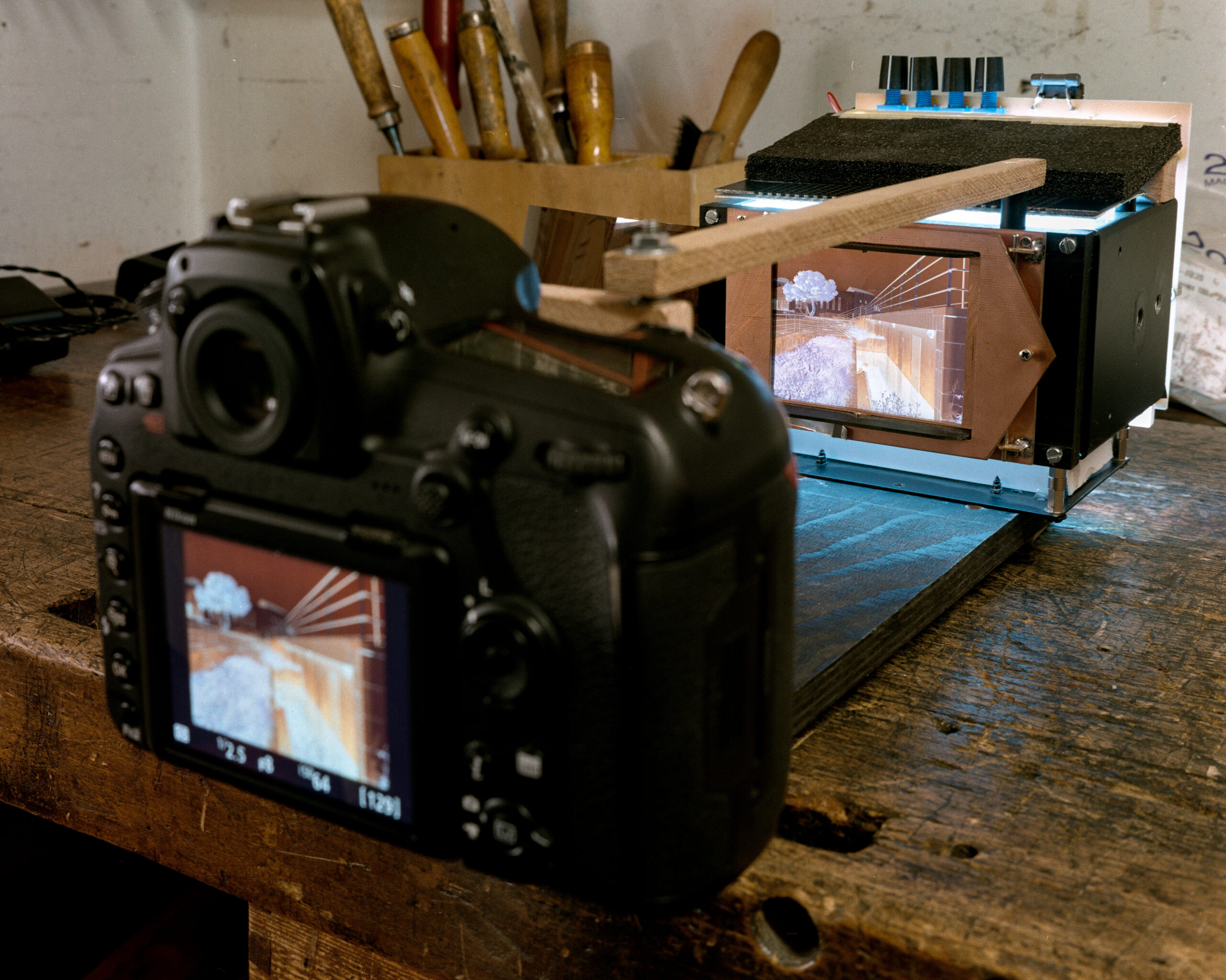
The cameras had been adapted to the Nikkor on my scanning device, where the lens stays mounted (and focused). The device contains a film holder and the light source. I really invested a lot of time in my RGB + UV adjustable light source. That I adjust to have a “white balance over all”. But for this comparison I did not touch the knobs, of course all cameras had the same backlight color.
I picked out two negatives and shot (scanned) them with matrix metering and saved them as a RAW files on all cameras. My next step is to develop the RAW files in Darktable with the following editing:
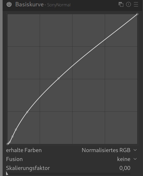
1. apply a customized gamma curve, that reduces contrast to keep the color in the (later inverted) highlights. (I have three of these curves to apply for different scenes or looks)
2. do a white balance over the whole image.
3. assign a LINEAR REC 2020 color profile.
Slide to the right: original camera curve – slide to the left: my custom curve
Finally the negatives are exported as tif files – 16 bit uncompressed of course.
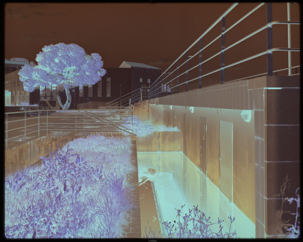
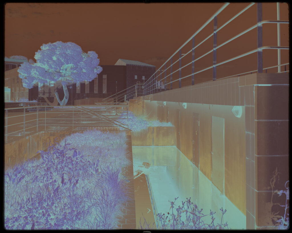
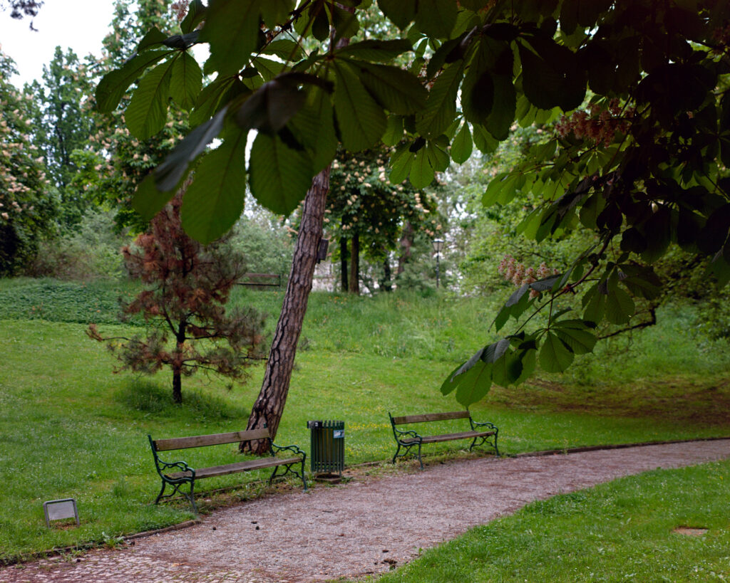
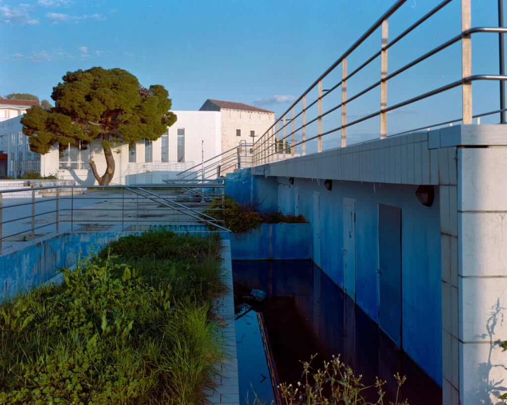
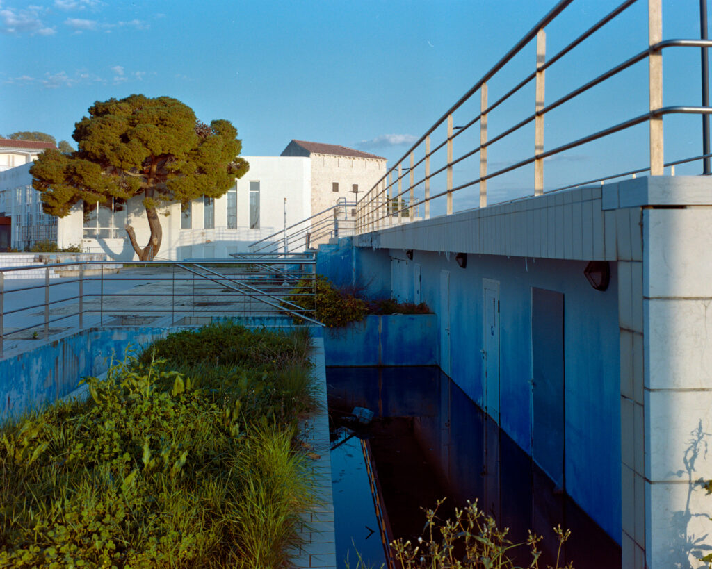
The prepared tif negatives are then inverted using vuescan software. I found vuescan the most neutral looking tool with simple enough RGB filtering to balance every shot. On the park-shot all the sliders were in neutral position, while on the pool-shot I tweaked highlights a little to red.
There are some basic adjustments i use:
1. film stock: GENERIC
2. color space scanner: default (sRGB)
3. color space film: Rec.2020
4. color space result: ECI RGB
5. color space monitor: the calibrated profil of my monitor
The Color
I am aware that the whole color thing depends a lot of your personal taste – especially this step of inverting, so what I am searching for is a rich and colorful look.
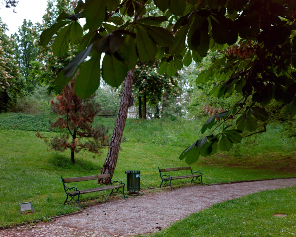
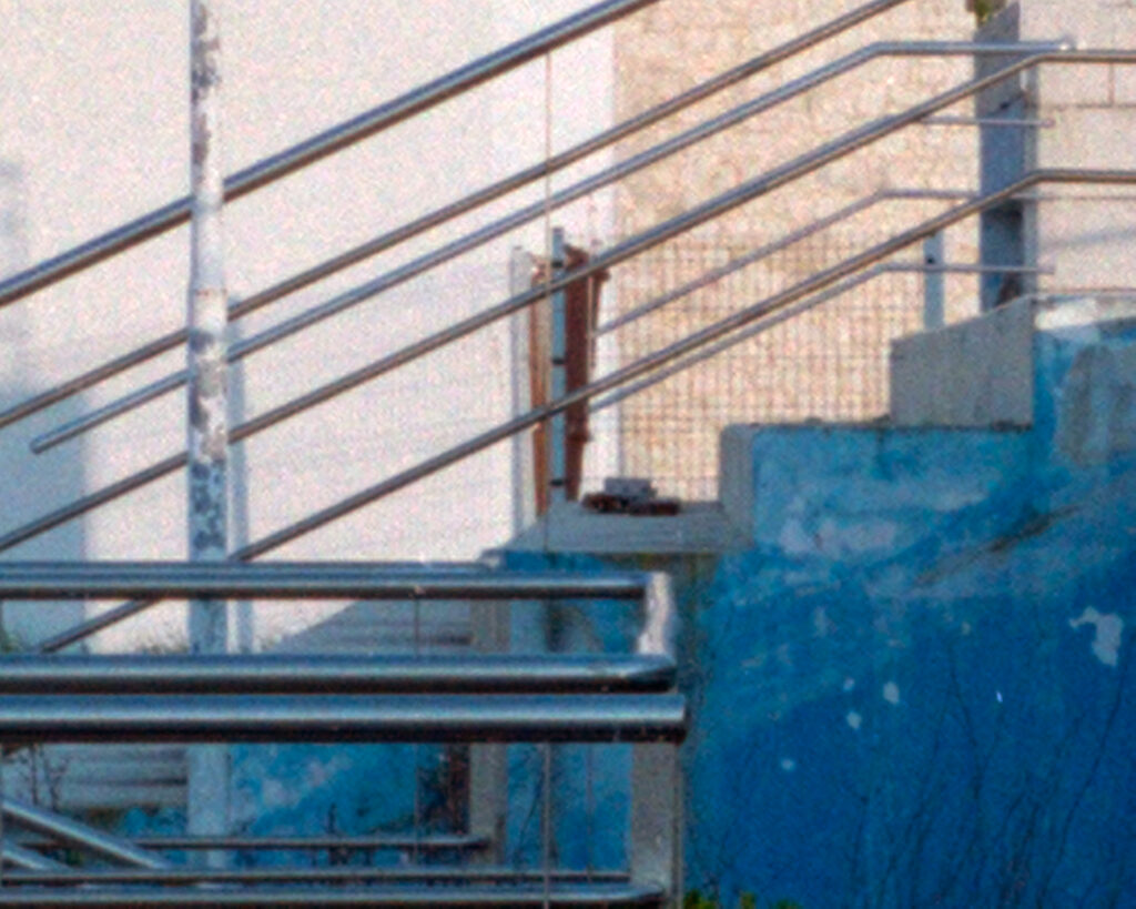
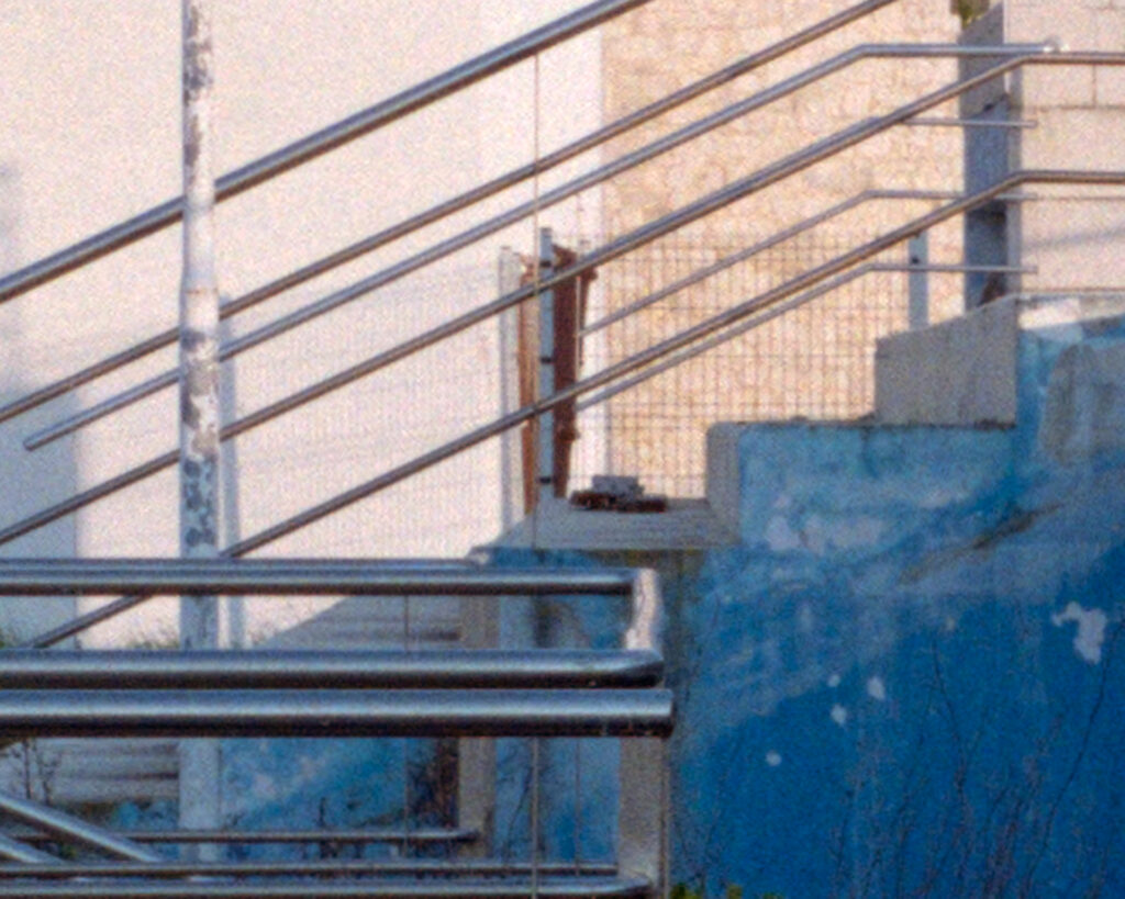
Slide to the right: 5D4 – slide to the left: D800
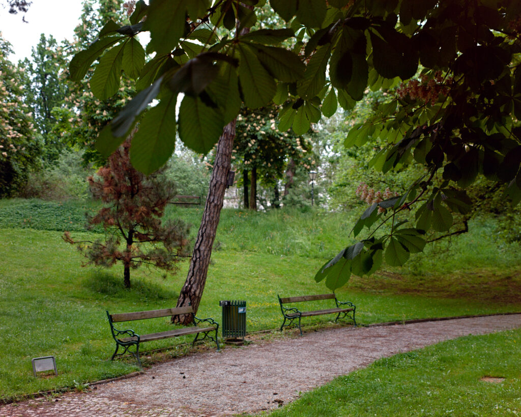
Slide to the right: A7R2 – slide to the left: D850
The most interesting thing for me is that looking at the tif – negatives there are only very slight differences visible from all sensors. But once inverted differences appear. To be honest it is very hard to tell which is better than the other. It depends a lot on the picture. The 5D4 and the D800 to my eyes are a little more colorful than the others but the Canon with less color contrast and the Nikon less balanced.
Slide to the right: 5D4 – slide to the left: D800
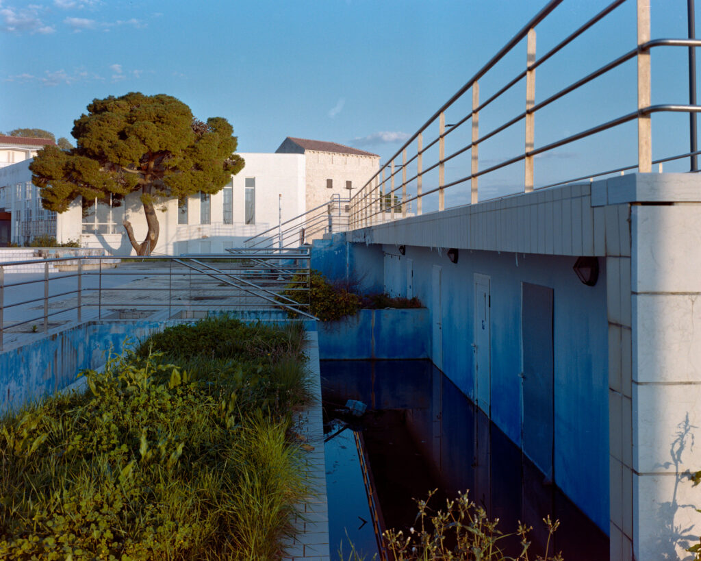

Slide to the right: A7R2 – slide to the left: D850
The A7R and the D850 are the closest overall with the D850 more red in the highlights and more red-green kontrast. Interesting but not important: I perceive the biggest difference between the two Nikons. All the results you see here are the output of vuescan, No post processing applied.
I think this is rather nerdy stuff and maybe your visual perception is very different than mine, so I hope the images are able to show what could be the point for you, and also if you don’t care at all, you might be a better photographer as I am.
Resolution
The second property I was interested in improving was the resolution/sharpness.It turned out like you would have probably expected: the resolution improves with the megapixels. But the amount of improvement surprised me or in other words the amount of details captured on a 70 x 56 mm negative needs lots of sensor resolution. For a 35mm negative the resolution will be high enough for sure, but there is nothing wrong in rendering the grain in all its beauty.
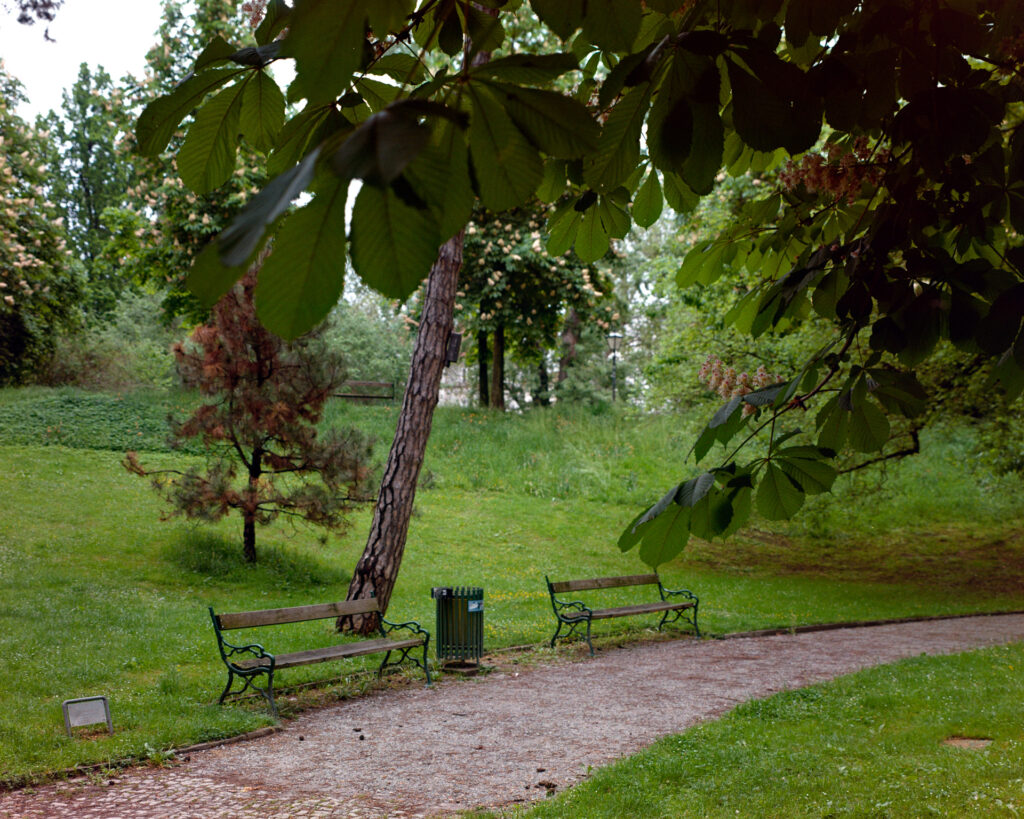
Slide to the right: 5D4 – Slide to the left: D850 about 300%
C41
Tetenal Colortec C41 was the developer kit I bought at my local dealer for years. After some delivery crisis, we all experienced, I switched to cinestill C41 which I liked for its low weight (its a powder to be mixed with water) because I like buying my stuff on photo walks with a light backpack.
These two kits are simplified because the bleach and the fix bath are combined. I read somewhere that 3 bath C41 with seperate developer, bleach and fix baths were more accurat in the results. So this time I gave it a try and bought a 2,5l Jobo 9240 C41 kit. I shot 4 identical shots out of my kitchen window (to keep this part simple) and cut the film in the darkroom to be able to develop the pieces in fresh cinestill and jobo kit one after the other.
The difference was surprising from the moment the negatives were dry. The “orange” of the unexposed film area was very different I could clearly see. And so are the results. Of course I used identical software settings for this two images.
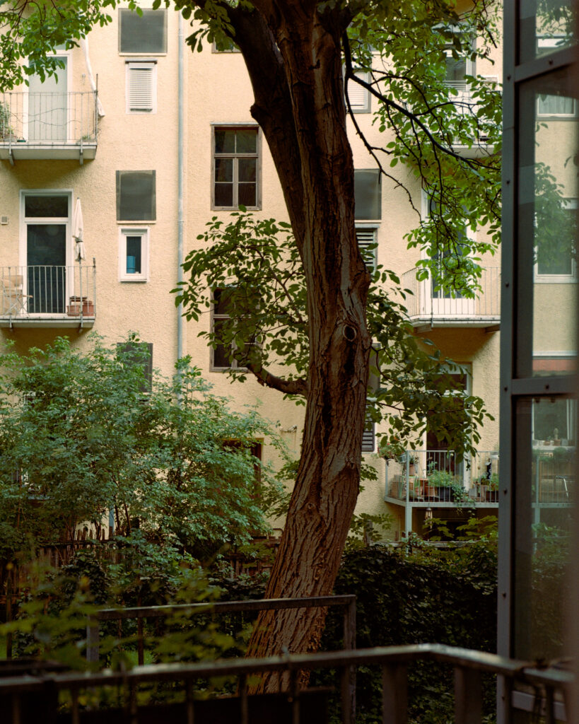
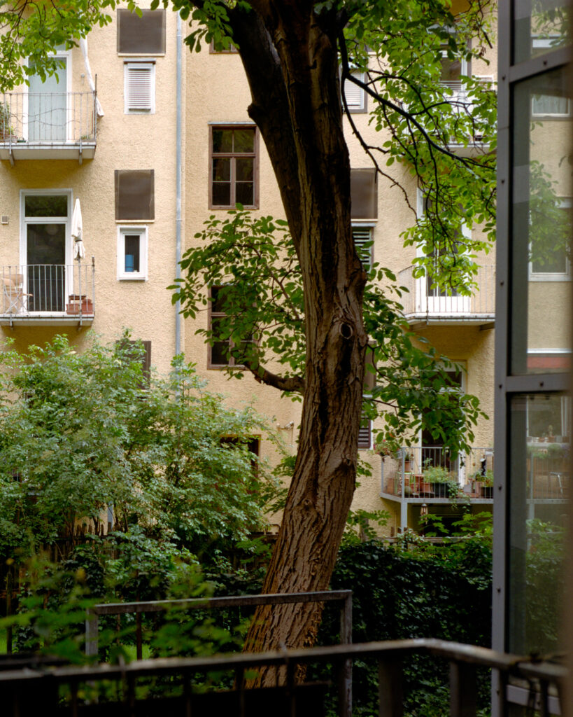
Slide to the right: 2 bath C41 – Slide to the left: 3 bath C41
I think this is the real thing. A big improvement. The 2,5l Jobo kit can be mixed, for example, in 5 x 0.5l units that is what I do. They say in their datasheet that the mixed developer only last 7 days but I used it over 3 weeks and it seems to be consistent so far. I probably will never do a comparison new/old chemicals. The result of this test is very clear for me the 3 bath process I much better and will be my go to developer.
When I started C41 developing I read that it should be a standardized process. That lead me to the conclusion that the manufacturers of the chemicals are all cooking the same soup. But as I recently studied the datasheets of different C41 products I had to state that timing and temperatures are not the same. And also the curves of aging differ a lot.
Camera Decision
So my decision, not extra clear in color rendering, was at last made for color contrast and for the high resolution. Nikons last dslr. When I started using the camera I found the function to frame your RAW file in camera to 5:4 or square which is a cool thing to reduce your amount of of data when you digitize different aspect ratios than 3:2. Another feature of the D850 is the feature “in camera negative inverting” as you can see this doesn’t really work:
Intangible
There was a time when I wanted to learn analog color printing, to be able to create the REAL look of the film. But I found nobody in Austria who does it or who could teach me color printing. The only serious information I found was a set of youtube videos. After learning a little bit about the process I knew it is way to complicated. So I changed my mindset a little bit in the direction that my color and esthetic results do not necessarily have to be like any specific filmstock or classic film look as long as I like them.
I hope there were some things of interest for you – thanks for reading.
Share this post:


Comments
Sorin Lazarescu on Camera scanning color negatives – some nerding and search for beauty
Comment posted: 07/09/2025
I have been trying a rather long list of technical solutions, or at least what I THOUGHT to be, a long list of technical solutions, of digitalizing my film rolls; suffice to say I was never completely happy with the results. I even contributed to the creation and launch of modern SLR film scanning software and hardware; in the end, the results were always less than I used to get from a scanning lab. I mean it was so frustrating, and not only because of the comparative costs involved, that I always ended up by saying U woyld sticm to the lab.
I do not know if SUCH is your experience but I do know that I always hardly wait to get
So, I think, if one takes into consideration, REALISTINGLY, the time one spends in developing and SLR scanning the film rolls, one will always come to eventually realize that one would be better off using the local lab.
Simon Foale on Camera scanning color negatives – some nerding and search for beauty
Comment posted: 07/09/2025
Comment posted: 07/09/2025
Bill Brown on Camera scanning color negatives – some nerding and search for beauty
Comment posted: 07/09/2025
There are so many variables that arise with color printing, especially digital color printing. Every paper stock has it's own look. Some require more tweaking when a desired outcome is to be achieved. Do you have a color balanced viewing environment? This can be it's own rabbit hole by itself. I've scanned on 2 different Imacon scanners over the years but we have now switched to a Fuji GFX 100. Yes, resolution does make a difference. The biggest plus though in moving to camera scanning is our ability to use Capture One Pro as the processing software. I'm also on an Eizo CS2731 monitor. Nothing impacted my printing output more than this monitor becoming a part of my workflow. Nerdy is where I live as a day to day digital darkroom specialist.
Correct color, authentic color, natural color is all in the eyes of the beholder. Are you wanting to be true to a specific look of a particular film stock or do you have your own look?
Thanks for taking the time to get into the weeds a little bit. It can make each of us decide what we really care about. I have some things I call my non-negotiables. Those things have to be a part of every image I produce. After that all bets are off.
Comment posted: 07/09/2025
Comment posted: 07/09/2025
Comment posted: 07/09/2025
Comment posted: 07/09/2025
Gary Smith on Camera scanning color negatives – some nerding and search for beauty
Comment posted: 07/09/2025
I guess I'm not a film purist because after all of that I still fiddle with the color and grain/noise using various s/w tools to get something I like (which likely has nothing to do with the actual film stock I've used).
Thanks for sharing your journey!
Comment posted: 07/09/2025
Bob Janes on Camera scanning color negatives – some nerding and search for beauty
Comment posted: 07/09/2025
I realise that the time may now have passed, but the Plustek 135/135i scanner would be able to do a 24x48 image... However I realise that camera copies do open up a wealth of options :-)
Comment posted: 07/09/2025
Mark Harrison on Camera scanning color negatives – some nerding and search for beauty
Comment posted: 08/09/2025
In some ways printing from colour negative in the darkroom was much less complicated. However for this to be true you needed to have a properly replenished temperature controlled roller processor so you could be sure that you would always get consistent results, I used a Durst Printo setup. The RA-4 chemistry is standardised and there was a limited choice of paper manufacturers, I used Fuji Crystal Archive. With that in place and using the same chemistry and paper there are a very few variables, just colour balance using the C,M & Y dichroic filtration on the enlarger and the exposure. You could print the same negative at a later date with the same settings and the prints would be identical.
The other main advantage seemingly missing from 'camera scanning' software is that you could print a contact sheet and judge the filtration needed for different frames from that film with different lighting conditions, quite minor and logical adjustments really. You could get quite close first time with the aid of test strips. Of course there is no safelight so I made a test strip frame that I could use in the dark, and essentially an 'f-stop' timer.
That said I love the huge range of papers from Inkjet 'photo' printers, but I don't love the complexity and hit & miss results from colour negative camera scanning software.
Comment posted: 08/09/2025