In Part 1 of my ongoing five-part series about darkroom technique, I talked about how to set up a fully-functional darkroom for black-and-white printing for less than £100, in a small flat with no dedicated darkroom space. Now if you’re like me, having set one up, you want to start printing as quickly as possible. Who wants to know about the intricacies of split grade printing, or the mathematical relationship between exposure and contrast? Well I do, actually, but maybe later – right now I’d rather be printing! So in Part 2, I walk you through the creation of two prints, using the bare minimum we need to know to make a decent print.
Preliminaries
What Part 2 is not
This part is not quite a beginners’ guide. Which is to say, I won’t systematically go through all the steps involved in printmaking – how to mix the chemistry, insert your negative into the enlarger, and so on. Not because these steps are not essential, which they are, but because they’re already covered on numerous other websites. Two such guides which I can recommend are the ones by Ilford and Darkroom Dave (if there are any others which you found helpful, please add them in the comments).
…And what it is
Rather than the step-by-step mechanics, I’ll focus on two things which I didn’t see much of when I was starting out, and which I still don’t see now.
The first is contrast control; most online guides are confined to exposure control only, or at best make a passing reference to contrast.
The second is more important, but also more abstract – decision-making. How do we choose the appropriate exposure and contrast for the final print? “By looking at a test strip,” you may say, but that still dodges the hard question.
I can’t – and won’t even attempt to – provide a definitive answer to the hard question. I don’t believe it can be reduced to an algorithm or formula, though that hasn’t stopped people from trying. One bit of oft-repeated wisdom maintains that a print should have a full range of tonal values from pure white to solid black. I like Ansel Adams’ riposte: there’s no reason why all images must contain all tones, any more than a piano composition must include all eighty-eight notes of the keyboard (Adams trained to be a classical pianist before he became a photographer). But I digress.
As I say, I can’t tell you how to print your photos, but what I can do is a form of show-and-tell – not dissimilar to my approach to darkroom set-up in Part 1 – on how I print mine. To that end, section 2 below describes the fastest, easiest route I know to getting a decent print. In sections 5 and 6, I walk you through my process of making two actual prints, using, as promised, the bare minimum we need to know (more advanced techniques will be covered in subsequent parts).
Two disclaimers
First, to repeat a disclaimer I made in Part 1: I am not an expert! I’ve been printing for a year and a half, so I’m an enthusiastic student at best. But I read a lot, practise as much as time allows, experiment with different techniques and try to learn from other printers. Indeed, this series is less of a guide, and more of a way to share my experience and approach, get feedback from other printers and learn some new things. If it helps someone else, even better.
Second, the ‘prints’ you see here are, of course, digital scans of analogue prints. You will just have to take my word for this, but the physical prints are richer and more beautiful than the scanned versions as viewed on a computer screen. Having said that, I’ve tried to reproduce the prints as faithfully as I could. If you want more details about the scanner and other equipment used to produce the images, please see the Tech Notes section below.
Right – enough talk, let’s print!
Printing made easy
At a basic level, there are just five easy steps to making a decent print:
- Insert the negative into the negative carrier, then raise or lower the enlarger head to the desired magnification.
- Focus the enlarger lens at its widest aperture, then stop down to a middle aperture (f/5.6–f/11).
- Expose a test strip at 4–5 different time intervals, develop, then pick the appropriate exposure.
- If you think the print may benefit from higher or lower contrast, make one or two more test strips at higher or lower contrast grades.
- Make the final print at the most appropriate exposure and contrast grade.
So that, in short, is the quick and easy (but surprisingly effective) way to get a decent print – something you can probably achieve, or may have already achieved, even in your first or second printing session. But the summary glosses over the hard question I alluded to above: How do we determine the ‘appropriate exposure and contrast’? Hopefully, sections 5 and 6 will shed some light. But first, a quick summary of key concepts. This is the easy part, especially if you know a bit about photography already.
The easy part
Exposure, aperture and time
Exposure in this context refers to the amount of light the paper receives, which in turn controls how bright or dark the print is. As with photography, there are two basic ways to control exposure: (a) aperture (of the enlarging lens) and (b) time. Likewise, an exposure of, say, 10 secs at f/8 is equivalent to 20 secs at f/11. The difference is that in traditional enlarging, other things being equal, a longer exposure produces a darker image, not a brighter image as with photography.
In step 2 above, I recommended focusing at the widest aperture for maximum brightness but stopping down for printing. That’s because, like camera lenses, most enlarger lenses are slightly less sharp at their widest and narrowest apertures; the sweet spot is usually between f/5.6 and f/11. In addition, with many enlargers including mine, when printing a normal (i.e. not greatly under- or overexposed) negative on 8×10″ paper, one of the middle apertures will generally give exposure times of 10–20 secs. This is a Goldilocks exposure – long enough to allow for easy dodging and burning, but not so long that there’s a risk of enlarger vibration (or simply getting bored). However, your mileage may vary depending on your enlarger light source, enlargement size, paper characteristics and so forth.
Contrast
Exposure controls the overall lightness or darkness of the print. Contrast refers to the difference between its light and dark areas.
Print contrast is measured in grades. From low to high, these are Grade 00, 0, 1, 2, 3, 4 and 5, plus intermediate grades (e.g. Grade 0.5, 1.5 … 4.5). Generally speaking, low-contrast negatives benefit from being printed at higher contrast grades, and vice versa.
There are two main ways to control print contrast. The first is using variable contrast (VC) papers and an enlarger with some form of filtration (e.g. multigrade black-and-white filters or yellow and magenta colour filters – both work for black-and-white contrast control). The second, which I don’t recommend unless you really know what you’re doing, is graded paper. This doesn’t require filters but does require a different box of paper for each contrast grade.
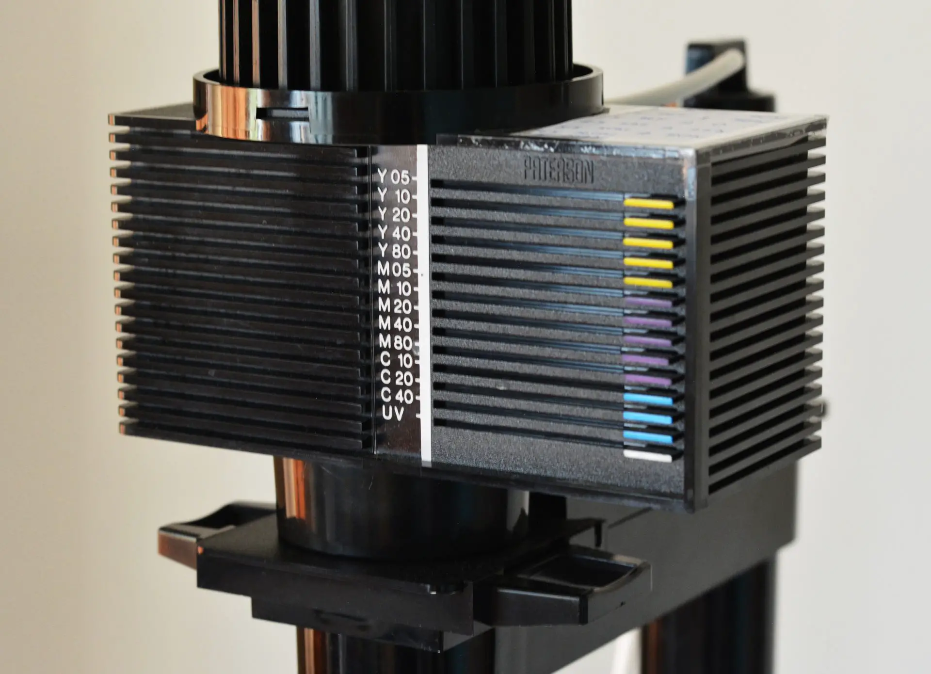
My enlarger, pictured above, has a colour head. So in this series I’ll generally talk in colour-filter terms, but most of what I say also applies to multigrade filters and graded papers. On my enlarger, an unfiltered exposure corresponds to Grade 2, which also happens to be the ‘normal’ grade. Yellow filters lower contrast (e.g. 50Y = Grade 1 and 90Y = Grade 0) while magenta filters increase it (e.g. 35M = Grade 3 and 80M = Grade 4).
These are the basics – if you want to dig deeper, Tuts+ has a more detailed guide to contrast control.
The hard part
The core concepts are easy. Perhaps the hardest part of printing – the one which takes a lifetime to master – is judging exposure and contrast.
Most websites I’ve seen dodge the issue, focusing on the mechanics rather than aesthetic and creative choices. Others resort to generalities: “The best exposure is the one which looks right.” Or, “You learn to judge with experience.”
In videos you can at least see what the printer chose, but the choice is rarely explained. (“Right, 10 seconds looks good, let’s go with 10 seconds,” is hardly an explanation.) Moreover, videos have inherent limitations of resolution and tonal reproduction …especially if shot in a darkroom! A piece like this one allows more scope for detailed documentation of the print-making process, for explanation and reflection, and – as a practical matter – for higher quality images than is currently possible with video.
The phrases “appropriate exposure” or “appropriate contrast” are harder to define than to illustrate. Luckily, illustrate is what I propose to do – not necessarily the concepts themselves, but my own attempts in pursuit of this goal. In other words, watch me groping in the dark – sometimes literally! – and let’s see what we can learn in the process.
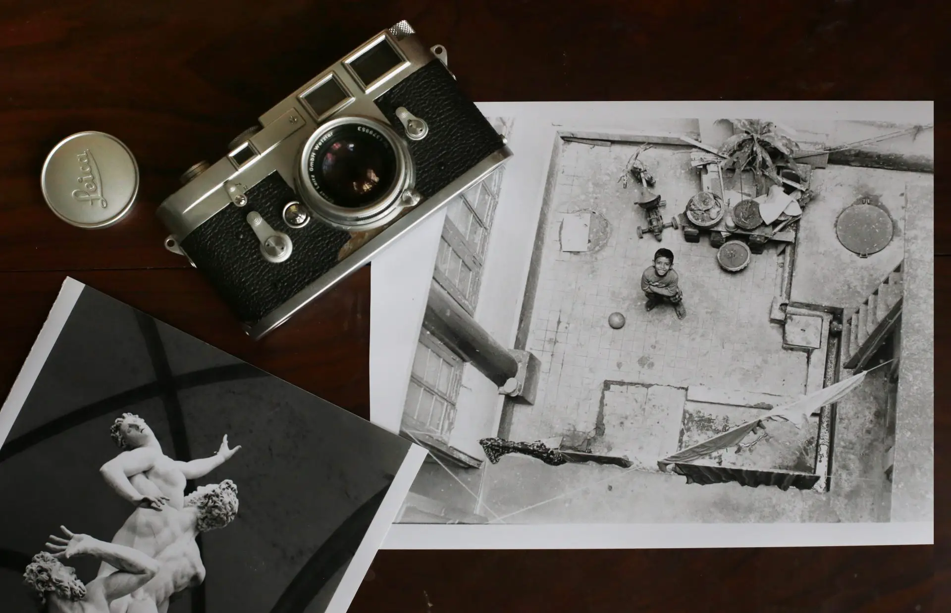
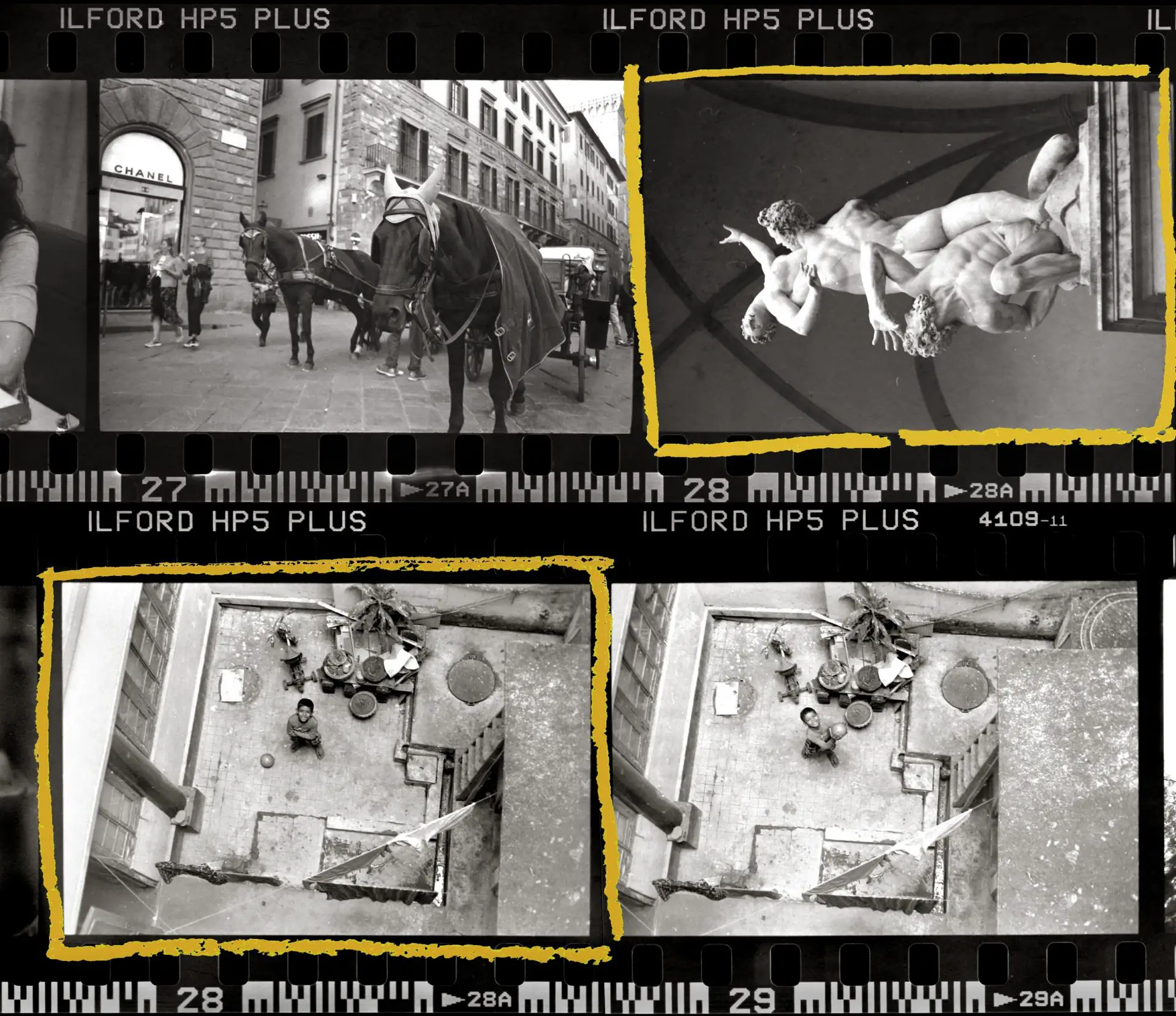
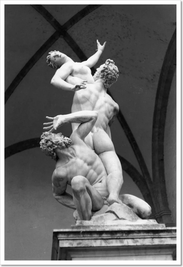
Print 1: Abduction of a Sabine Woman
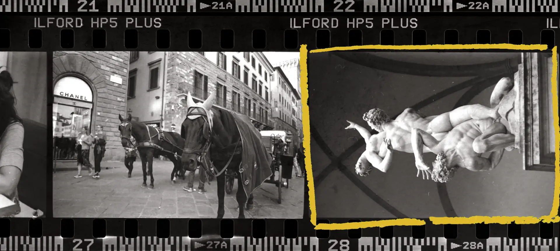
I took this photograph of Giambologna’s 16th century masterpiece at the Piazza della Signoria in Florence. The figures, carved from a single block of imperfectly-shaped marble, glowed ethereally in the soft late-afternoon light, and I remember thinking, “Well, good luck capturing that on film.” Anyway, I did what I could, choosing a low angle, and a perspective where the lines of the figura serpentinata are echoed by the soaring arches behind. I overexposed by one stop so that the marble would look light, as it did to my eye, and not a muddy grey (placing the marble in Zone VI, if you’re into Zone System terminology).
Test strip for exposure
The purpose of my first test strip is to assess the appropriate exposure. As with much else in darkroom work, everyone seems to have a different approach to test strip-making. Even the recommended sizes vary: from one long 11×1″ strip (David Vestal, The Art of Black and White Enlarging) to half or one-third of a sheet (Ansel Adams, The Print) to a whole sheet (Bruce Barnbaum, The Art of Photography). Larger test strips use more paper, but also provide more information. I mostly print on 8×10″ paper, and I use one-sixth of a sheet (2⅔×5″) as my default test strip. But it varies depending on the photograph I’m working with or how confident I feel. Do whatever works for you – there are no rules.
For the sculpture, I first printed a 2⅔×5″ test strip at f/8 with no filtration, with exposures of 5, 10, 15, 20 and 25 secs. With a red filter over the lens so as not to expose the paper, I placed a strip in the area which was of most interest to me, showing both the sculpture and some of the background. Then, covering four-fifths of the paper with a piece of cardboard, I removed the red filter and started my count.
At T+5 secs, I moved the cardboard to reveal another fifth, at T+10 secs yet another, and so on until the final 5 secs (T+20 to T+25), when the whole strip was exposed. Thus, the first step to be exposed – the lowest one on the test strip – got a 25 sec exposure, the second one got 20 secs, and so on. The result was the test strip you see below (ignore the white areas at the bottom; that’s where I held the strip in place with my fingers).
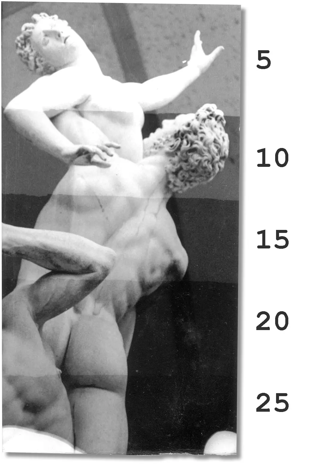
With some photos I deliberately make unequal or angled steps to capture specific areas of interest, but for this one I went with equal, horizontal bands. For such strips, I find it helpful to place a sheet of paper underneath with guidelines at 1″ intervals, as shown below. With this simple modification, I can print equal steps, rather than end up with a haphazard distribution.
Going back to the test strip, the 5-sec step looks far too light to me, with no highlight detail. 10 secs looks about right, maybe a trifle light. 15 secs is a bit darker than I would like; the shadows on the sculpture are now well-defined, but the vault roof in the background is starting to lose detail. That detail is mostly lost at 20 secs, and completely lost at 25.
From here, I could have proceeded straight to a final print at 12 secs, which seems about right to me. Or I could have done another test strip, say for 10, 11, 12, 13 and 14 secs, to fine-tune the exposure. However, so far we’ve only tested for exposure, and not for contrast.
Test strips for contrast
On most colour enlargers including mine, an unfiltered exposure, like I made for the previous test strip, is equivalent to Grade 2. Based on the Grade 2 test strip, you can try to guess if the image might look better with higher or lower contrast, and accordingly make additional test strips.
For this photo, for example, I would normally do a test strip at Grade 2.5 or 3, or perhaps both. I feel lower contrast (Grades 00 through 1.5) would lead to too little separation between the sculpture and the vault roof. And by the time the deepest shadows turned black, the highlights would turn dull grey. Very high contrast (Grades 3.5 through 5) would wipe out the more subtle detail of the marble forms, reducing them to stark highlights and deep shadows.
Nevertheless, for purposes of demonstration, I made additional test strips at Grades 1, 3 and 4 – all at f/8 and 5, 10, 15, 20 and 25 secs as before. Between strips, I changed the filter settings to ‘dial in’ the appropriate contrast. (In fact, based on the optimum Grade 2 exposure which we know already, we can make educated guesses about the optimum exposure for other grades, but I’ll leave that for Part 3).
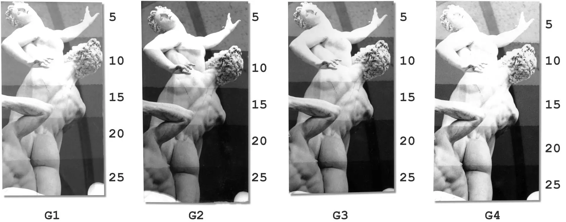
My original choice, 12 secs at Grade 2 (about halfway between 10 and 15 secs), still looks good to my eyes. My second choice would probably be 15 secs at Grade 3.
The final print
Having determined the exposure and contrast, we come to the easy part. Switch back to Grade 2 (the chosen contrast grade) and expose a full sheet of paper for 12 secs (the chosen exposure) at f/8. What do you think?
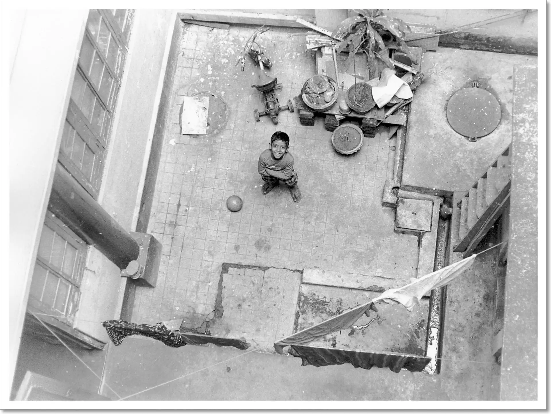
Print 2: Godai in the Courtyard

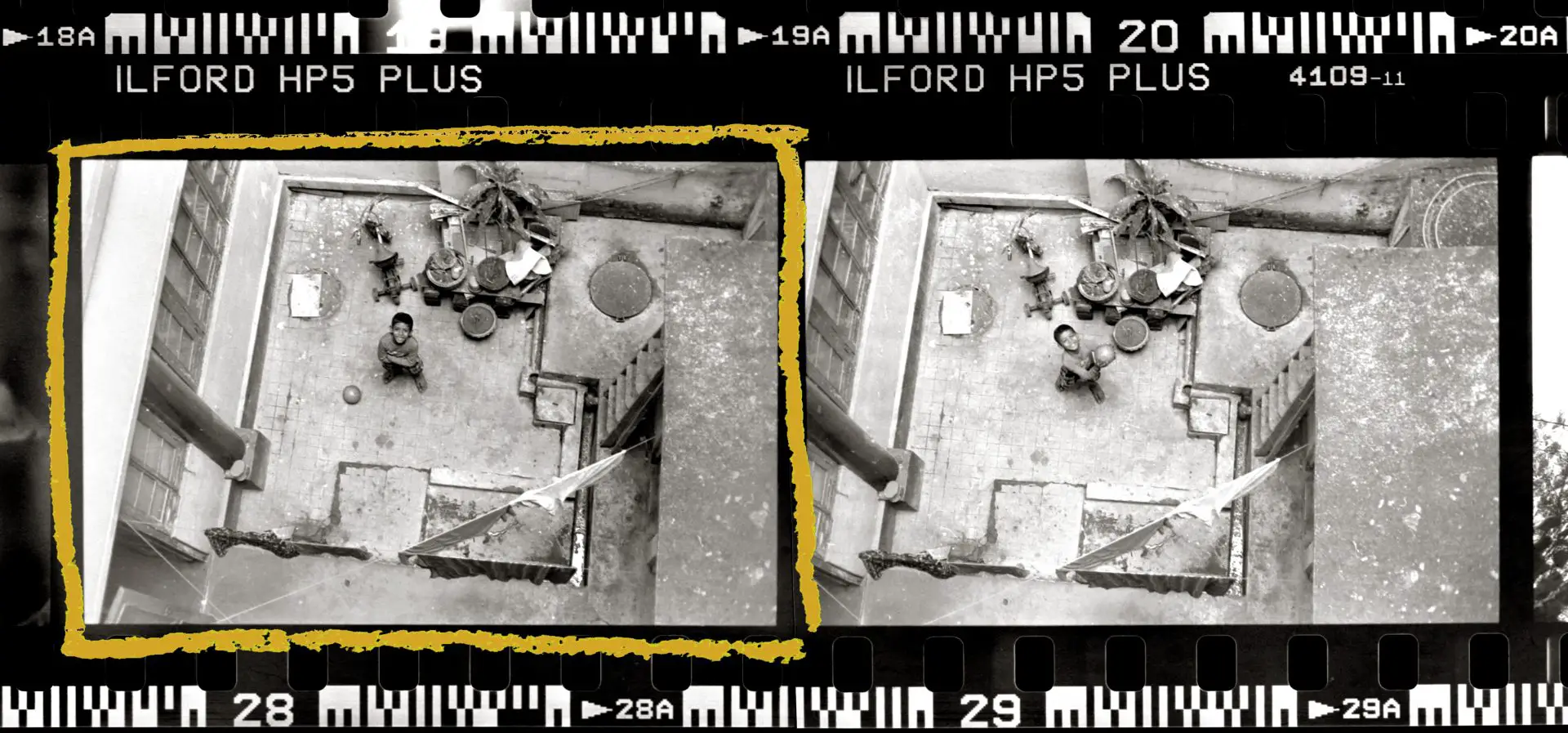
My little friend Godai is notoriously camera-shy. One time I asked him why, and he said, “I don’t like people saying, ‘Sit here, stand there.’” So I said, “How about if I don’t tell you anything? Just be in the courtyard and do what you like.” While I focused from the balcony above, Godai threw his football up at me (frame 29). But frame 28 is my favourite, where he’s grinning cheekily and plotting his next move.
Cropping
I printed the previous photo without any cropping at all. For this one, I decided to crop some of the ‘dead space’ on the right, resulting in a bigger enlargement factor. Bigger enlargements need the enlarger head to be higher. This, incidentally, reduces the intensity of light hitting the paper, which necessitates more exposure.
Localised test strips
For the previous photo, I made what’s called a continuous test strip, where different parts of the image receive different exposures. As you can see from the final print which had uniform exposure, the highest figure is about a half-stop lighter than the lowest. The effect is exaggerated when the highest step in the test strip also gets less exposure than the lowest, making it hard to judge the right exposure.
But at least all four steps in that strip contained a meaningful part of the image. In the photo of Godai, only one or two steps would fall on him; three or four steps would just show sections of courtyard. The risk is that in the final print I reproduce beautiful texture and tones on the courtyard floor, but the subject himself is too light or dark (your reckoning may of course be better than mine).
Godai’s photo, for me, is a good candidate for a localised test strip, where the same part of the image receives different exposures.
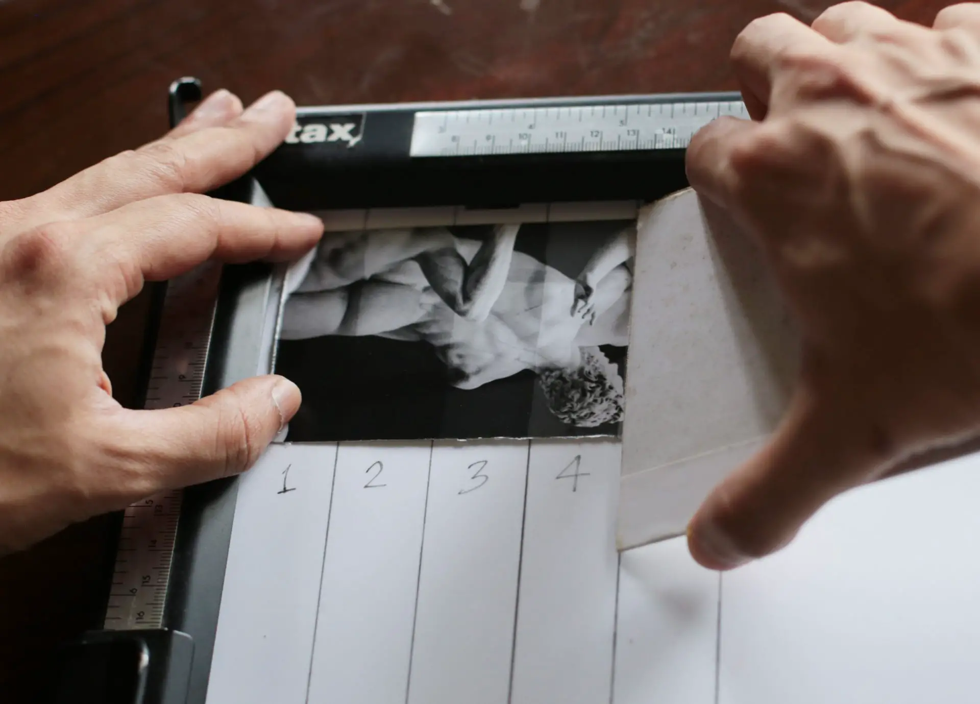
From one of my standard 2⅔×5″ test strips, I cut four equal strips of 2⅔×1″. I then placed them one by one at the same spot on the easel, and exposed them for 5, 10, 15 and 20 secs at f/5.6 at Grade 2. (I picked f/5.6 rather than f/8 as in the previous photo because this is a bigger enlargement (see above), and also a slightly denser negative.)
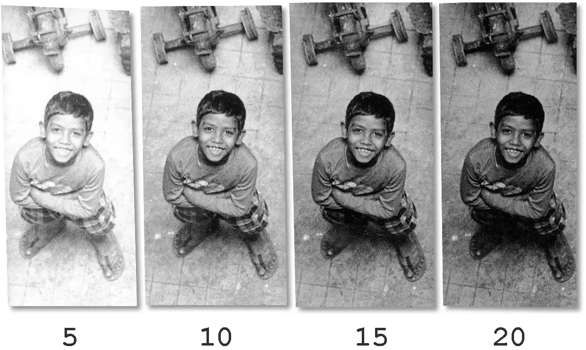
Compared to a continuous test strip, the process of making a localised test strip is more involved, but the upshot is being able to do a like-for-like comparison. Luckily, we don’t have to individually expose and process each strip in sequence, which would be highly tedious. Under the safelight, I cut the four test strips and wrote 5, 10, 15 and 20 on the reverse with a ballpoint pen for easy identification. I placed the first strip under the enlarger, and the other three securely inside a thick book to protect them from enlarger light. After giving the first strip (marked 5) a 5-sec exposure, I put it in the book and brought out the second strip (marked 10). Having exposed all four strips in this way, I put them in the developing tray and processed them together, saving about 10 precious minutes of my life.
Of the test strips, the first is clearly too light – it has a bleached look, and even his hair, one of the darkest parts of the image, does not reach solid black. Strip 3 looks a bit dark, and in strip 4 we lose most of the detail below his arms. I liked both the exposure and the contrast of strip 2 (10 secs at f/5.6), so I went straight to the final print.
Final print – Grade 2
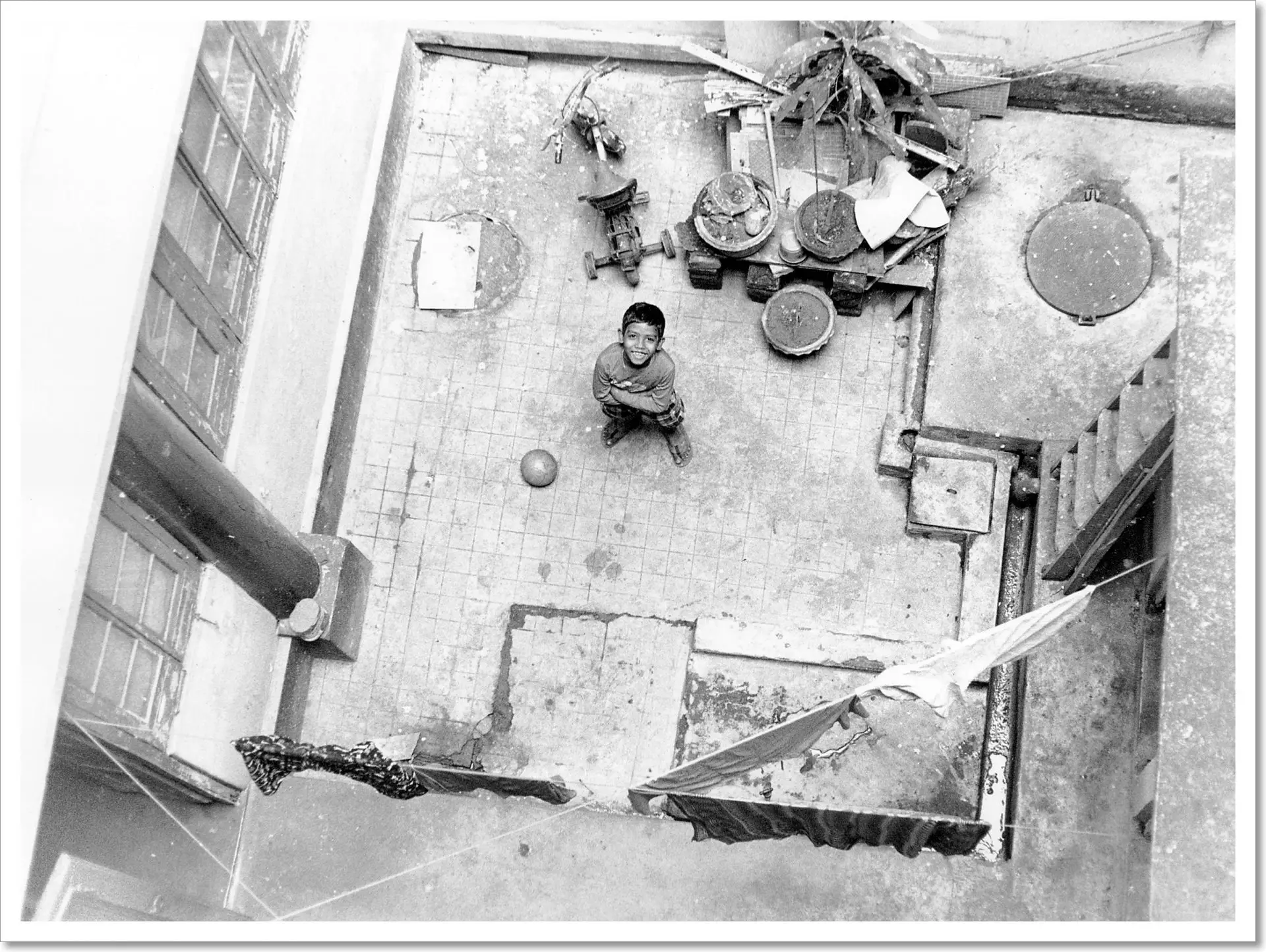
On seeing the full print, however, I wasn’t wholly satisfied. To my eyes, the courtyard has not enough texture, and the window-ledge on the left is distractingly bright. His hair and lower body are dark though, which suggests that a higher contrast grade, or indeed more exposure at Grade 2, would result in further loss of detail. An alternative is to move to a lower contrast grade – ‘taming’ the highlights and creating more tonal separation (that is, more and subtler greys) in the courtyard floor.
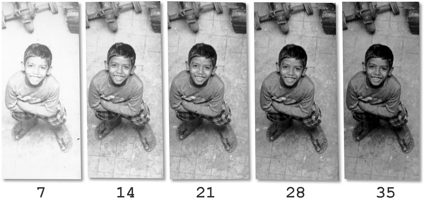
Grade 1 test strips
Accordingly, I made five more test strips at Grade 1, exposing them for 7, 14, 21, 28 and 35 secs at f/5.6 (I extended the exposure times because I know from experience that at lower contrast grades, longer exposures are needed to achieve deep blacks).
Final print – Grade 1
I then made a second full-size print, which you see below. It was 30 secs at f/5.6, a shade darker than step 4.
The courtyard now has more tonal separation as I had hoped, and there is a hint of texture on the window-ledge on the left. Godai’s hair is the same shade, fulfilling my goal of preserving the deepest blacks.
The effects of reduced contrast are especially evident in the three clothes drying at bottom right – like a serendipitous shade card. In the second (lower-contrast) print, the dark cloth below is made lighter, the ‘middle grey’ cloth just above it stays the same shade, and the white cloth to its right has more highlight detail – a satisfying demonstration! This is best seen in the comparison below; the first print (Grade 2) is on the left and second print (Grade 1) on the right. Which one would you pick? Or would you go with something else entirely?
Choices
Every photograph is different, but I think reflecting on the choices that go behind the making of a final print is still useful, and can inform the printing of other, very different photographs. It certainly helps me, in that it clarifies my thinking, and I’ll be delighted if it helps you too.
And of course, every person is different – we can have disparate but equally valid ideas about how a photograph should be printed. For that matter, my own ideas can change in the space of days or even hours. So if you took the time to read all the way to the end, even if you’ve never set foot in a darkroom before, I welcome your thoughts on my methods and choices, and what if anything you’d have done differently. For this part, I set out to do only ‘straight prints’ with no local manipulations, using the most basic process I know of. But feel free to say if you would use other techniques for these photographs, or how you would dodge and burn, for example.
Tech notes
This section is just for completeness (and for nerds). Feel free to skip it.
Abduction of a Sabine Woman was shot on a Leica M3 with a 50mm Summicron f/2 (v1 collapsible) on Ilford HP5 Plus at EI 400, developed in Ilfosol 3.
Godai in the Courtyard was shot on a Minolta X-700 with a 50mm MD Rokkor f/1.4 on Ilford HP5 Plus at EI 400, developed in Ilford ID-11 1+1.
Both photos were printed on Ilford Multigrade IV RC (Pearl) 8×10″, using a Paterson colour enlarger with Paterson 50mm f/3.5 lens, and developed in Adox Adotol Konstant.
I scanned the prints with an HP Scanjet G4010, with sharpening and other corrections turned off. I processed them minimally in Photoshop, mostly just setting the black and white points and annotating exposure times and contrast grades. An onscreen image will always look different to a silver gelatine print, but I would say the scans are close enough.
Next up: Part 3!
That’s it for now – see you next Monday for Part 3! If there’s anything specific you’d like me to cover, let me know in the comments and I’ll see what I can do. Thanks for reading!
Share this post:


Comments
thorsten on Knowing Little, Aiming High – Darkroom Technique Part 2 – By Sroyon Mukherjee
Comment posted: 13/04/2020
Comment posted: 13/04/2020
Comment posted: 13/04/2020
Comment posted: 13/04/2020
Rock on Knowing Little, Aiming High – Darkroom Technique Part 2 – By Sroyon Mukherjee
Comment posted: 13/04/2020
Comment posted: 13/04/2020
Jelle Vonk on Knowing Little, Aiming High – Darkroom Technique Part 2 – By Sroyon Mukherjee
Comment posted: 13/04/2020
Comment posted: 13/04/2020
James T on Knowing Little, Aiming High – Darkroom Technique Part 2 – By Sroyon Mukherjee
Comment posted: 13/04/2020
One thought with regular test strips though, I find it's easier to progressively cover up the strip, that way you can see how much paper you have left.
Comment posted: 13/04/2020
Geoff on Knowing Little, Aiming High – Darkroom Technique Part 2 – By Sroyon Mukherjee
Comment posted: 13/04/2020
Comment posted: 13/04/2020
Terry B on Knowing Little, Aiming High – Darkroom Technique Part 2 – By Sroyon Mukherjee
Comment posted: 13/04/2020
There are some excellent books on the subject of b/w printing. Probably one of the best is "Ilford Monochrome Darkroom Practice" and a recommended read for those who wish to explore further when following your articles.
Something that one doesn't come across on the internet when scanning film, but is referred to in a number of books on the subject, is input sharpening. Nearly all scanners provide this essential part of the scan and the advice is not to switch it off. Output sharpening can be performed in software. Now it could be that you prefer only output sharpening and switching input sharpening off, but you may like to compare both scans with and without input sharpening. Another scanning trick with film is to scan a b/w negative as a positive; there are subtle differences, but this scan preserves highlights better. If your scanner automatically provides a positive image from a negative, scanning as a positive will give you a negative scan which you will need to convert in PP. This has nothing to do with your printing, of course, but it is something you may wish to consider when putting your work online.
Comment posted: 13/04/2020
Glenn Sherman on Knowing Little, Aiming High – Darkroom Technique Part 2 – By Sroyon Mukherjee
Comment posted: 13/04/2020
Comment posted: 13/04/2020
Jose Lucero on Knowing Little, Aiming High – Darkroom Technique Part 2 – By Sroyon Mukherjee
Comment posted: 14/04/2020
Comment posted: 14/04/2020
Ruediger Hartung on Knowing Little, Aiming High – Darkroom Technique Part 2 – By Sroyon Mukherjee
Comment posted: 15/04/2020
Maybe an add-on to save paper and time without splitgrade....
You are right in making a full frame test strip but you can pull out a lot more of information out of it. Right grade depends if blacks or highlights are running ahead. Nicely explained in this video....
https://youtu.be/woXZb8gjG4o
Comment posted: 15/04/2020
Bruno Chalifour on Knowing Little, Aiming High – Darkroom Technique Part 2 – By Sroyon Mukherjee
Comment posted: 16/04/2020
As you said you welcome feedback and I do not know a more depressing situation as silence I will risk a few comments:
First I must say you are an optimist, and I like your enthusiasm: “the fastest, easiest route I know to getting a decent print.” Personally, the more I learnt the more I realized my ignorance and the more older prints I threw away. My experience is, but I must be slow (I have no problem with that, that’s just the way I must be), that it takes months if not years first to realize what a good print is (for oneself) then how to achieve it. It takes a lot of practice. For me this was neither easy nor fast. Readers if you do not succeed in a fast and easy way, just be patient, there are many rewards.
“I am not an expert! […] But I read a lot, practise as much as time allows, experiment with different techniques and try to learn from other printers.” I am not… but… I am? ;o)
A few tips for the reader:
“Insert the negative into the negative carrier”, > maybe add shiny (non-emulsion side) up and with the top of the image towards you (kinda upside-down)
“Focus the enlarger lens” > a focusing aid (sort of loupe) does help.
1-“Expose a test strip at 4–5 different time intervals, develop, then pick the appropriate exposure.” > I would not be that casual about the “developing” part; my experience is that it is crucial for good and repeatable results (duration, temperature, and agitation).
2-“make one or two more test strips at higher or lower contrast grades.” > you may want to explain this step (different grade papers, multicontrast, filters, color head…) plus, as you approach it later in your instructions: get an idea of the right exposure FIRST, and then work on contrast (otherwise it can be maddening and a source of frustration, waste of time and money).
3- “Make the final print at the most appropriate exposure and contrast grade.” > you may want to explain what “appropriate” is.
“So that, in short, is the quick and easy (but surprisingly effective) way to get a decent print” > if a novice following this achieves anything they will not throw out in 3 months or 3 years I’ll be definitely surprised. “even in your first or second printing session.” > Good luck with that prediction (I could never achieve that).
“How do we determine the ‘appropriate exposure and contrast’?” yes maybe this should have been mentioned/elucidated before the rest (above) otherwise your reader will have printed something, wasted his/her time and money and now is realizing what was wrong with the approach.
“The difference is that in traditional enlarging, other things being equal, a longer exposure produces a darker image, not a brighter image as with photography.” Have you ever used color transparencies… like the obviously infamous “Kodachrome”? Printed Cibachrome/Ilfochrome? Instead I would say, printing form a negative image (BW or color) to get a positive print… , or “in the negative/positive” process…
“That’s because, like camera lenses, most enlarger lenses are slightly less sharp at their widest and narrowest apertures” you are right about “a lens is a lens, whether on a camera or an enlarger,” however fact the reasons for first focusing at the widest aperture are 1-it is easier to focus with a bright image, 2-it is more accurate to focus with a shallow depth of field (wide aperture), stopping down the lens will take care of film curvature (the film/negative not being strictly flat, especially when exposed to heat (coming from the light source of the enlarger).
“the sweet spot is usually between f/5.6 and f/11.” It is not so much that there is anything “sweet” there but that most lenses perform better away from their extremes (for purely physical/optical reasons which we do not have to explain here).
“when printing a normal (i.e. not greatly under- or overexposed) negative on 8×10″ paper, one of the middle apertures will generally give exposure times of 10–20 secs.” > 1-Please define what a “normal paper” is; 2-not all papers have the same sensitivity to light depending on whether they are bromide or chloro-bromide papers. And as you accurately pointed out the exposure will awfully depend on the intensity of the light source (and the density of the negative without it being “greatly under- or overexposed.”
“Contrast refers to the difference between its light and dark areas” > I would rather phrase it as follows: high contrast = few middle tones (grays) and subtleties, fast transition from white to black (punchy image at the expense of mid-tones (grays that usually give most of the information, such as volume and depth), low contrast = very progressive transition from white to black involving a lot of mid-tones (grays) and subtleties (may look flat pushed at an extreme).
A third way to control contrast is through which developer you use and at what dilution and temperature.
“ I overexposed by one stop so that the marble would look light,” … that depends where you measured the light (the background is rather dark and already leading you to overexpose, unless you measure the light off the statue itself, if you overexpose this you will be overexposed beyond salvation… obviously you know what you are doing but your text is taking shortcuts and it may mislead people.
You did not specify it, but the way you proceed suggests it: yes, in printing one should go for figuring out exposure first before dealing with contrast. I would recommend making a test strip with a grade two filter (or equivalent filtration on a color enlarger) rather than with no filter as people would get a better idea of the final exposure if they change filters (usually very little modification from grade 1 to grade 3).
As said before I hope readers will pick on your enthusiasm and try their hands at printing, an activity with great rewards but that I would not qualify as “fast and easy” if one wishes to get and shares those “rewards” I have been mentioning. All the best.
Comment posted: 16/04/2020
Cat-and-Mouse with Exposure and Contrast - Darkroom Technique Part 3 - by Sroyon Mukherjee - 35mmc on Knowing Little, Aiming High – Darkroom Technique Part 2 – By Sroyon Mukherjee
Comment posted: 20/04/2020
Split Grade Printing – Darkroom Technique Part 4 – by Sroyon Mukherjee - 35mmc on Knowing Little, Aiming High – Darkroom Technique Part 2 – By Sroyon Mukherjee
Comment posted: 27/04/2020
Dodge, Burn and Other Heresies – Darkroom Technique Part 5 – by Sroyon Mukherjee - 35mmc on Knowing Little, Aiming High – Darkroom Technique Part 2 – By Sroyon Mukherjee
Comment posted: 11/05/2020