Part 3 is the most (only?) technical part of my ongoing series about darkroom technique. If you like technical, you’re in for some fun. If you dislike technical, maybe skip the bit about f-stop timing, and the exposure compensation tests at the end. But some of the other stuff, like the expose for the highlights rule, yield rewards even when followed in a general, non-technical way.
If you really dislike technical, feel free to skip this part entirely and carry on printing using the trial-and-error method described in Part 2, or whatever other method works for you! Or check out the bit about making your own localised strip device (LSD), a simple tool for making test-strip printing faster and easier. The next two parts – split grade printing and dodging/burning – will have less theory and more prints.
The problem with quick and easy
In Part 2, I shared a ‘quick and easy’ process for making a decent print, using the bare minimum we need to know. The basic steps are simple enough:
- Do a test-strip to pick the best exposure at Grade 2.
- Assess whether the print could benefit from higher or lower contrast, and accordingly do one or more test-strips at higher or lower contrast grades.
- Pick the best exposure/contrast combination and make the final print.
This gets us fast results, which is what I wanted when I was starting out, but it involves a healthy dose of guesswork. Three doses, to be precise – one at each step.
Exposure at Grade 2
First, we don’t have a well-articulated basis for selecting the best exposure at Grade 2 (throughout this series, by ‘exposure’ I mean the combination of aperture and time – the two main ways we control the amount of light falling on the paper). Sometimes, on one step of the test strip, the highlights look right but the shadows are too light (or too dark). On another step, the shadows look right but the highlights are too dark (or too light). Which do we pick?
Higher or lower contrast
Second, we assess whether Grade 2 has the right contrast – or if the print needs higher or lower contrast – entirely by eye. For that, we either rely on experience (but not all of us are experienced), or we make lots of test strips at different contrast grades.
In practice, when I was starting out, I often found that the prospect of having to do so many more tests was too daunting. Being impatient, I would convince myself that Grade 2 looked good enough. A year later, when I printed some of those negatives again, I realised some of my old prints had too much or too little contrast. Adjusting accordingly, I was pleasantly surprised by how much better the new prints looked.
Exposure at the new grade
Third, if you recall Godai in the Courtyard, I first did a Grade 2 test for 5, 10, 15 and 20 secs at f/5.6. I liked 10 secs, but thought Grade 1 might look better. Now, how do we know what the exposure should be at Grade 1? I could do another test for 5, 10, 15 and 20 secs at Grade 1, but there’s no guarantee that the ‘right exposure’ would be in that range. That’s because, when we change the contrast grade, more often than not, we need to change the exposure too.
Indeed, the Grade 1 exposure I eventually picked for that print was 30 secs at f/5.6, which wasn’t even in the original range. Without knowing how contrast affects exposure, we’re guessing in the dark – making test strips at various exposure increments, hoping to hit upon something that looks broadly ‘right’ and then perhaps refining further. We’re playing cat-and-mouse with exposure and contrast, and the mouse is winning.
What’s worse, if we don’t know which exact contrast grade we want, we may have to go through this rigmarole for multiple contrast grades. That’s a lot of guessing, and a lot of test-strips.
Luckily, there are better ways. This part is about how to take much of the guesswork out of all three steps. As Ctein says, “Save a tree: learn to print.”
Two new techniques
Before I get into the nuts and bolts of contrast control, I’ll mention two things I do differently from when I started out printing a year and a half ago – namely, localised test strips and f-stop timing. I came across both these techniques in a book called Way Beyond Monochrome, and they have, as motivational speakers would say, Changed My Life (perhaps an exaggeration, but they’ve certainly made me a more efficient and hopefully a better printer).
If you’re unacquainted with these methods, I recommend trying them out. But mainly I’m just sharing my methods and why I use them. There’s a saying in beekeeping (another one of my hobbies) that if you put two beekeepers in a room, you’ll have three opinions. Darkroom printing is a bit like that. If you prefer your own methods – continuous test strips or traditional (linear) timing, for example – that’s totally fine; I’m not out to persuade anyone!
A second reason to mention these is to provide context for whatever I say next – not just in this part but in the rest of this series. In Part 2 I used continuous test strips for the first print and linear timing for both, because they’re easier to grasp, and also what most beginners are familiar with. But once I made the jump, after minor (perhaps inevitable) teething troubles, I never looked back. So all the prints I show from here on in employ the new methods.
Fortunately, these methods are mutually independent. So if, for instance, you like localised test strips, but f-stop timing drives you round the bend, you can totally skip that section (just remember that if some of my test-strip increments look odd, it’s because I’m using f-stop times). Nearly everything I say in this series is technique-agnostic.
Localised strip device (LSD)
I already introduced localised test strips in Part 2 – it’s where the same part of the image receives different exposures (as opposed to continuous test strips where different parts of the image receive different exposures). A little-known side benefit is that localised strips look like Warhol silkscreens, which I like. Here’s a comparison of test strips from Part 2: continuous on the left and localised on the right.
The big, and for me, decisive benefit of localised test strips is that I’m comparing like with like. In the continuous test strip above, the uppermost figure was already lighter. The effect is exaggerated by the uneven exposure, making it hard to make a meaningful comparison. Indeed, after I discovered localised test strips, I find looking at a continuous test strip almost frustrating – like it’s trying to tell me something, but I’m not sure what.
However, the process I described for making localised test strips in Part 2 is a little involved: you cut strips of paper, expose them individually under the enlarger while shielding the other strips from light, then process them together. The process is simplified by a simple cardboard ‘device’ I made – a much-simplified version of a wooden apparatus described in Way Beyond Monochrome (the book I mentioned earlier). It costs nothing and takes 10 minutes to make, but makes the whole process much faster and easier.
My localised strip device (LSD) is designed to print five 1″ steps on my default test strip size of 2⅔×5″. I mostly print on 8×10″ paper, and I when I have a few spare minutes in the darkroom – while fixing a print for example – I cut a few sheets into sixths (2⅔×5″ each), giving me a ready supply of evenly sized test strips. (If I need smaller or bigger ones, I can always cut them later.) So my measurements are tailored for my 2⅔×5″ strips and for five-step increments, but you can of course adapt them as you like. You also need an easel with a paper guide for accurate positioning (an L-shaped piece taped to the baseboard will also do the job).
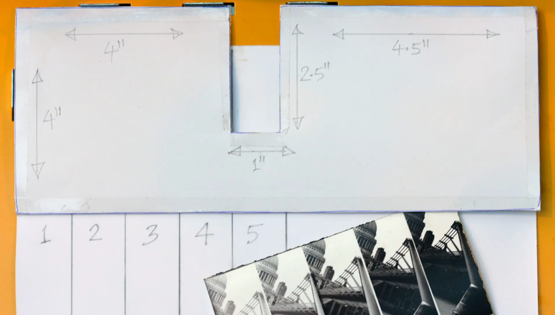
The LSD has two parts – a cardboard mask with the dimensions shown above, and a sheet of paper with guidelines at 1″ intervals. I painted the top side of the mask white so I can see the whole of the projected image, and the bottom side black to minimise reflections, but these are not essential. Its use is easier to demonstrate than to describe. (This is, of course, a simulation under natural light using an already developed strip.)
Place the ruled paper, test strip and cardboard mask, in that order, against the top left of the paper guide. With the red filter over the enlarger, move the setup, including the paper guide, until the mask slot lies below the area you want to expose on the test strip. Make an exposure for the longest increment of your choice.
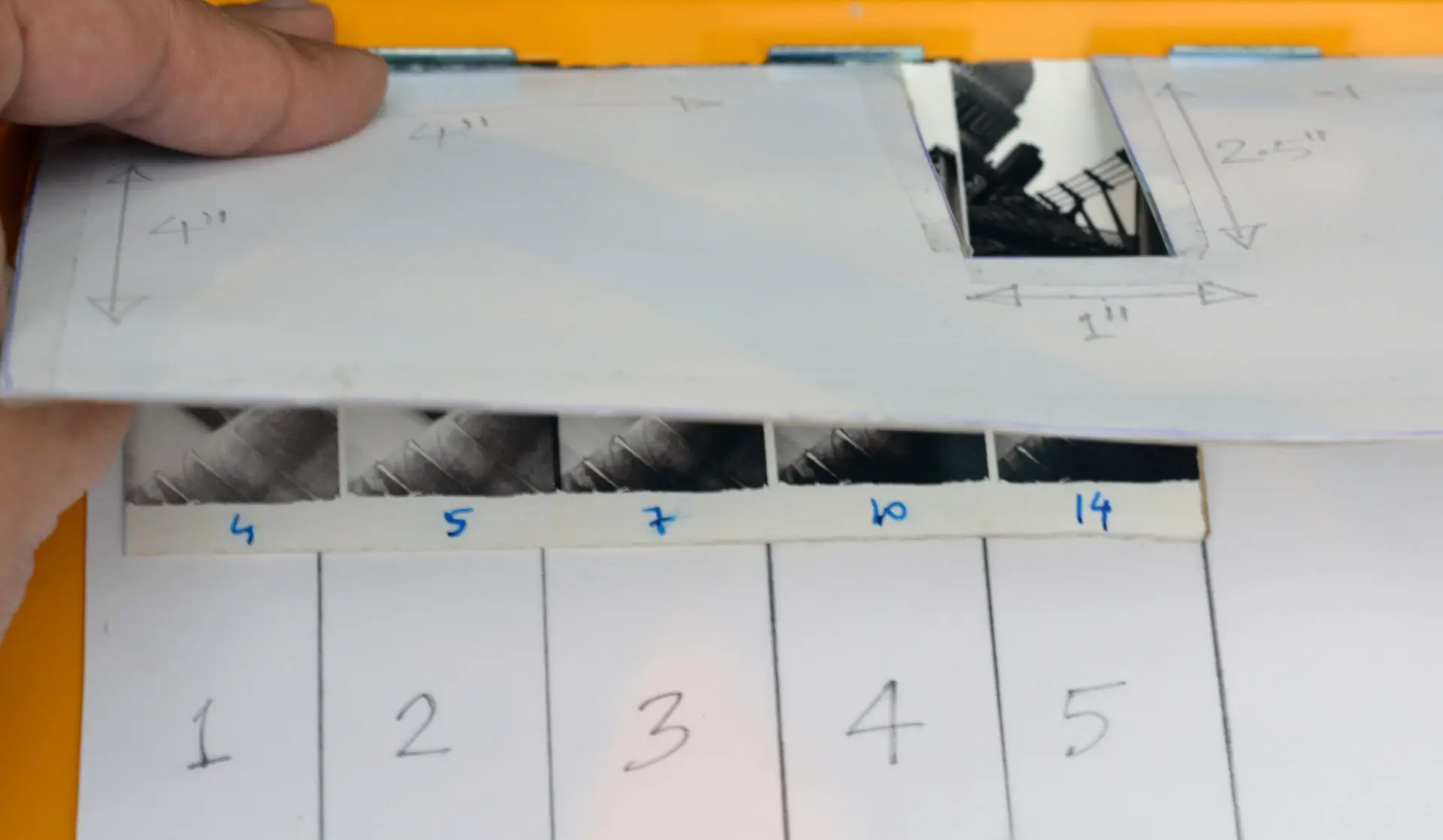
Lift the mask, align the left edge of the test strip against the first guideline and its top edge against the paper guide. Replace the mask, aligning it as before against the top left of the paper guide. Make an exposure for the second longest increment.
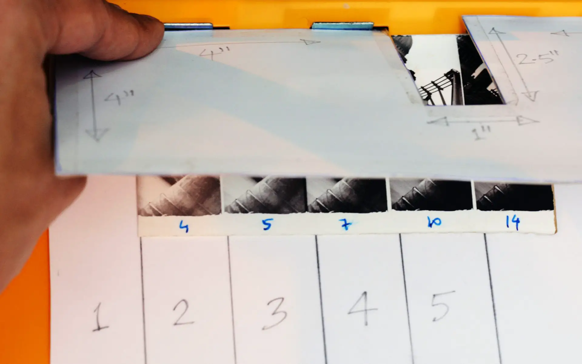
Make all five exposures in this way, moving the test strip each time to the next guideline, exposing a different part of the paper. Essentially, you’re moving the paper while holding the mask in the same position – the opposite of what you do with continuous test strips.
After five exposures, develop the test strip as normal, and voilà! You have five different exposures of the same image area on the same strip.
F-stop timing
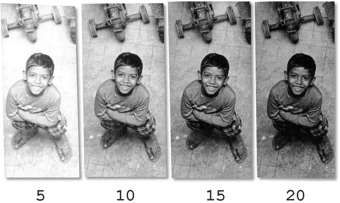
Like most printers, I started out doing ‘linear’ test strips which have equal increments – say 5, 10, 15 and 20 secs, like the strip above. But if you look carefully, the second step looks much darker than the first, the third step looks a little darker but not as much, while the fourth step looks only slightly darker. There’s a reason for that. From 5 to 10 secs is a 1-stop jump. 10 to 15 secs is 0.6 stops, and 15 to 20 secs is only 0.3 stops.
When evaluating relative brightness, our eyes tend to perceive a sequence of one-stop increments (where the time doubles with each step) as ‘equal’ increases. That’s why in photography, one stop of aperture doubles the light entering through the lens, and why shutter speeds (1/500, 1/250, 1/125…) and conventional ISO speeds (100, 200, 400…) both follow a doubling sequence. Increasing exposure in stops (or half-stops or quarter-stops) results, at least in my eyes, in a more uniformly increasing sequence. The test strip below, made for a print which I’m saving for Part 4, follows a half-stop sequence.
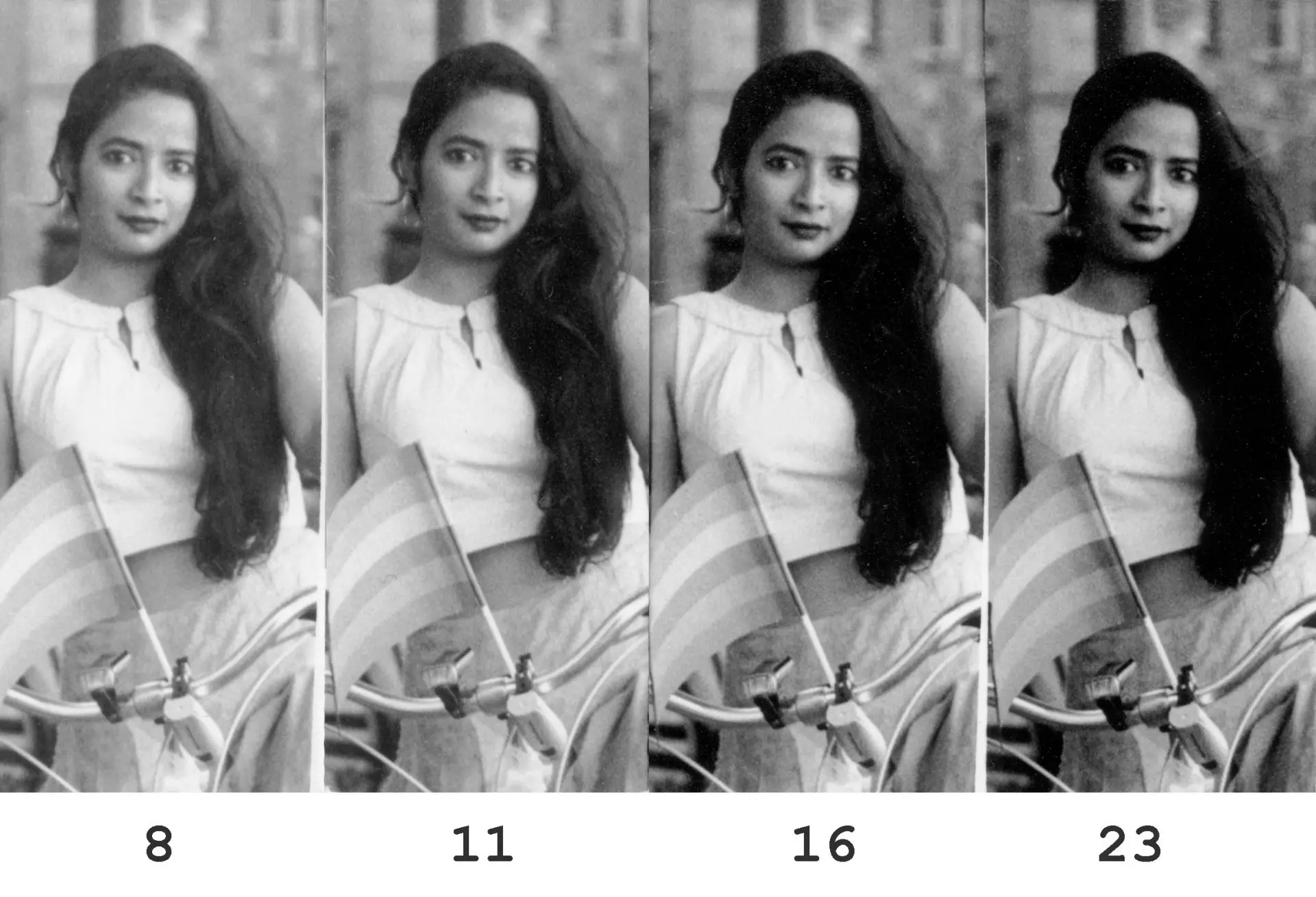
You may (or may not?) be able to see the difference more clearly in the two strips below. The first strip is linear. The second strip follows f-stop times – each step is a half-stop darker than the last.
Again, to me, the second step of the first (linear) strip looks significantly darker than the first, while the last two look quite similar. From left to right, the first strip darkens rapidly at first, and then tapers off. The second (f-stop) strip looks more uniform.
Among other things, f-stop timing (and f-stop thinking) also make it far easier to estimate times for dodging and burning. A 5-sec burn to a print which had a 5-sec base exposure adds one whole stop, while a 5-sec burn to a 20-sec base exposure adds only 0.3 stops. But a half-stop burn is a half-stop burn, regardless of the base exposure.
The flip side – everything has a flip side! – is that f-stop times are harder to calculate than equal increments of, say, 4 or 5 seconds. To add x stops to a base exposure B, the formula is B×2^x. So in the strip above, 8 secs is the base exposure, and the next three steps are 0.5 stops, 1 stop and 1.5 stops higher (8×2^0.5 = 11, 8×2^1 = 16 and 8×2^1.5 = 23, each rounded to the nearest integer).
I solved the calculation problem – as I try to solve many other problems in life – by making a spreadsheet. You simply enter the base exposure, and the spreadsheet spits out half-stop and quarter-stop increments in both directions, rounded to the nearest second. The spreadsheet is public, so feel free to use it if you like. I anyway keep my phone (face-down) in the darkroom as a metronome, so I can also use it to consult f-stop times on the spreadsheet.
Another silver lining is that the half-stop sequences for integral powers of 2 (such as 2, 4 or 8 secs) follow the aperture sequence which most photographers are familiar with (2, 2.8, 4, 5.6, 8, 11…), where each number is the previous number multiplied by √2. So often, I don’t even need to consult the spreadsheet.
Even so, all of this is admittedly trickier than the classic 5, 10, 15 and 20 secs. As I said, I’m just sharing what works for me. In your darkroom, follow what works for you!
And with that, we’re ready to delve deeper into exposure and contrast.
Determining Grade 2 exposure and contrast
We can control print contrast using variable contrast (VC) paper, and filters to control the colour of the enlarger light (see Part 2). Paper manufacturers release datasheets which tell you which filters to use to achieve a desired contrast grade. (I won’t specifically talk about graded papers because I’ve never used them, and nowadays, few printers do, but most of the principles still apply.)
As I hinted above, we want to see a test strip and determine (a) what the Grade 2 exposure should be, (b) whether to increase or decrease contrast, and (c) if so, how to find the exposure at the new grade.
Expose for the highlights
The classic approach to solving the first two questions is summed up in three short lines in Ansel Adams’ The Print (at least that’s where I first encountered it; the idea may well be older than the book):
the low-density areas (high values in the print) are determined primarily by exposure, and higher densities (low print values) are then controlled by changes in contrast.
To elaborate:
- Find the highlight areas of the print (the denser areas of the negative) where you want to preserve detail. Concentrate on the textured highlight areas (Zones VII–VIII, if you’re into Zone System terminology), not the parts which you want to print as pure white.
- Do a test strip – at any grade, but most printers start with the ‘normal’ grade, i.e. Grade 2 – to evaluate the appropriate exposure for the highlight areas. Again, look only at the textured highlights, ignoring the whites, midtones and shadows.
- Having determined the highlight exposure, now look at the shadows, in order to evaluate contrast. Look only at textured shadows (Zones VII–VIII), not pure blacks. If the shadows are too light (grey and washed out), user a higher contrast grade. If the shadows are too dark (dense and blocked-up), use a lower contrast grade.
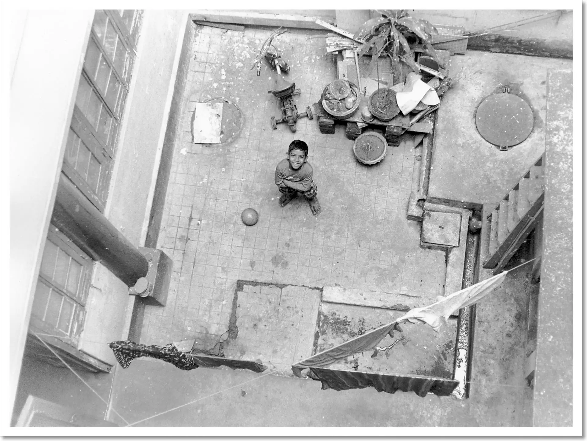
I illustrate the approach in more detail later on by making a print from scratch, but here’s a quick example. I printed Godai in the Courtyard (below) by a trial-and-error method in Part 2. But if I were using the ‘expose for the highlights’ approach, I would use the ledge on the left or the white cloth at bottom-right as a textured highlight area for exposure evaluation, and Godai’s shadow for contrast evaluation.
In Way Beyond Monochrome (the third time I’ve mentioned it – clearly I love the book), the authors sum up the approach even more succinctly: Expose for the highlights and control the shadows with contrast. The ‘rule’ for printing, therefore, is a kind of reversal of the well-known ‘rule’ for shooting and development: Expose for the shadows and develop for the highlights.
Shadows early: reduce contrast (SERC)
An alternative, equivalent approach is to ask, “Who arrives first?”
This ‘rule’ is as follows. Look at the test strip steps from light to dark. If the shadows ‘arrive’ before the highlights – that is, if we see nice, deep shadows while the textured highlight areas are still blown – move to a lower contrast grade. If the highlights arrive first, while the shadows are still weak, move to a higher grade.
To remember this rule, I use the mnemonic SERC (shadows early: reduce contrast). The opposite is implied – highlights early: increase contrast. Again, the approach is much easier to follow when demonstrated rather than explained in the abstract – for that, see my illustrative print below. (The approach is also shown in this video; thanks Ruediger for mentioning it in a comment.)
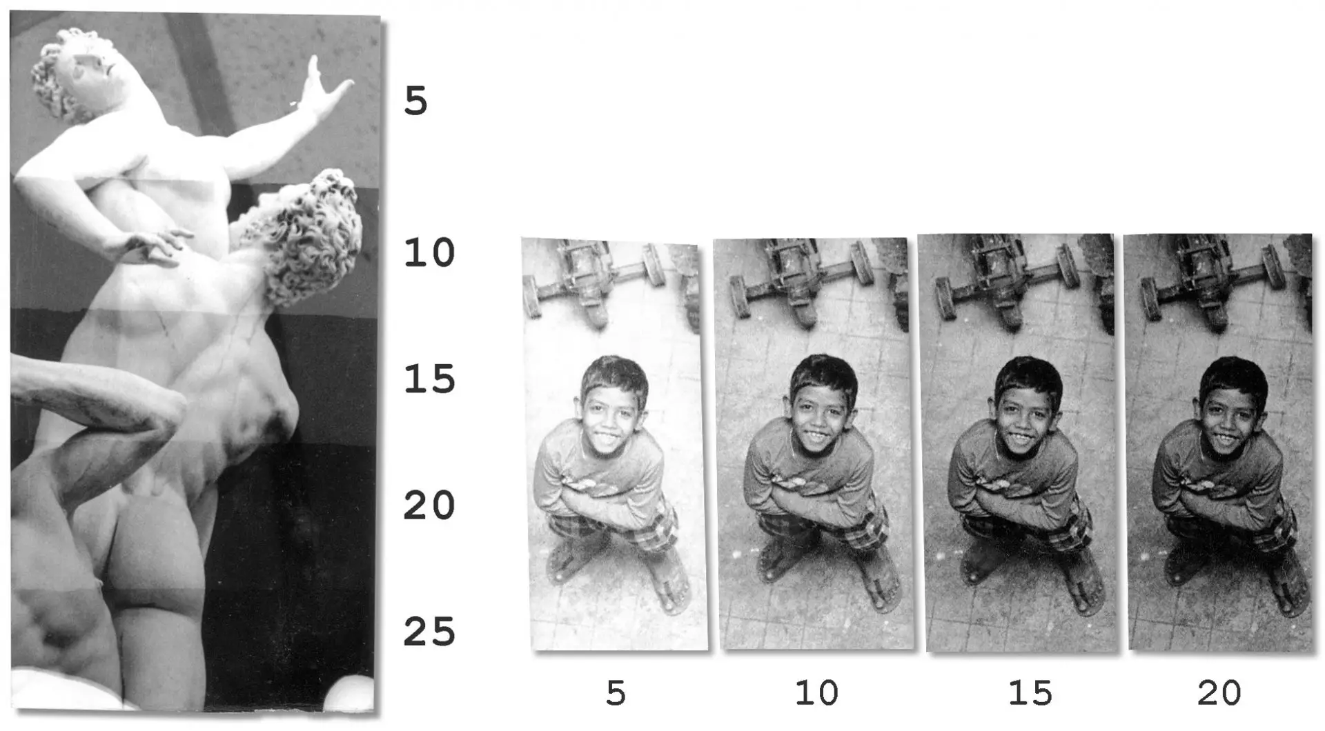
As a quick example, here are the Grade 1 and Grade 4 test strips for Abduction of a Sabine Woman from Part 2.
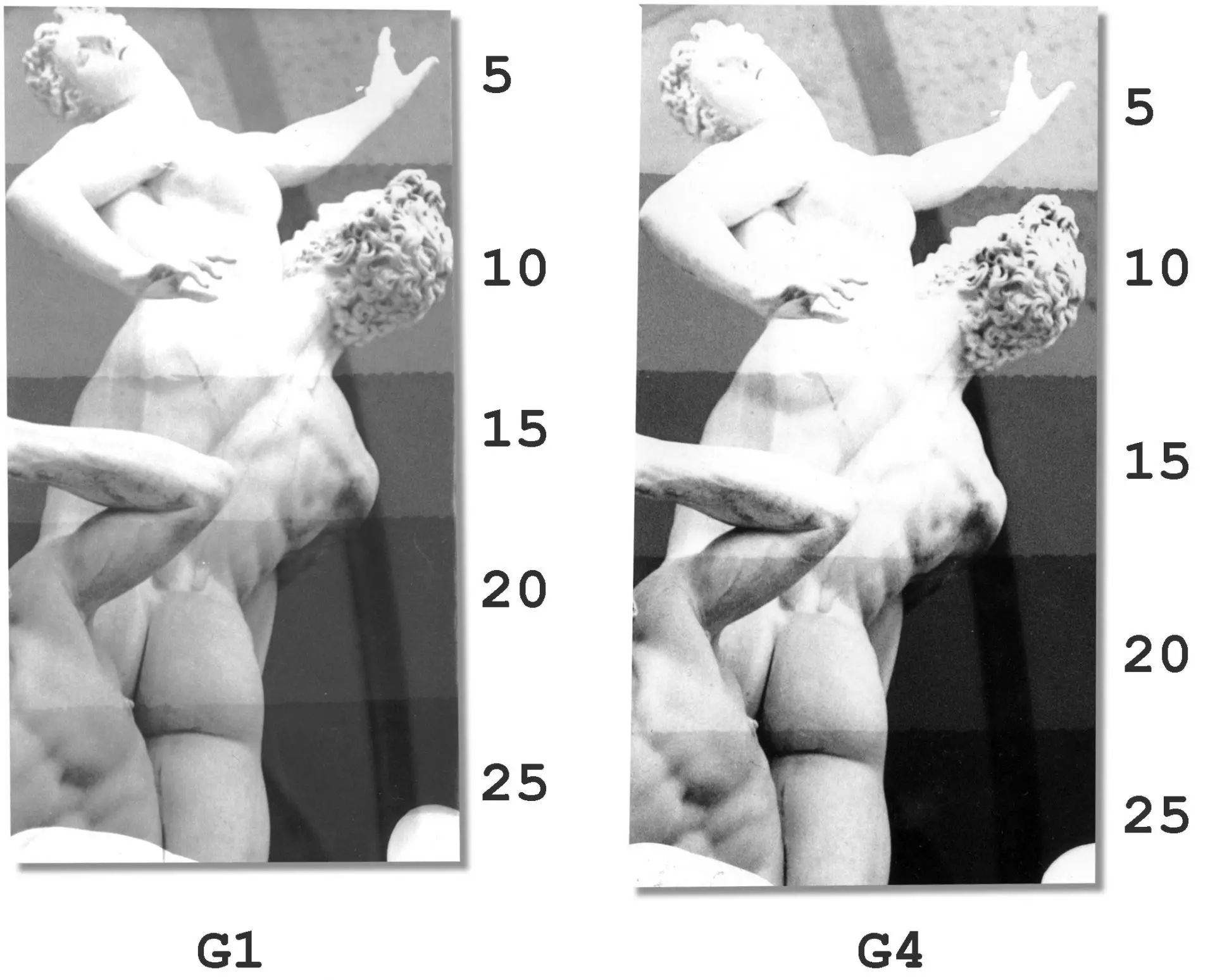
At Grade 1, the highlights arrive at 15 secs, but the shadows are still too light at 25. The highlights arrive early, so we need more contrast.
At Grade 4, the shadows arrive at 15 secs (see the man’s right shoulder), but the highlights are still blown. This indicates that we need less contrast. Indeed, I eventually printed at Grade 2, which is in between the extremes shown above.
What about midtones?
Both expose-for-the-highlights and SERC are somewhat counterintuitive. When evaluating a print, we tend to pay more attention to the midtones. But the rules tell us to look first at the highlights and then at the shadows, ignoring midtones altogether. It’s a leap of faith, in a way: look after the highlights and shadows, and the midtones will take care of themselves.
It took me some time to learn to consistently recognise the important highlight and shadow areas, and to focus selectively on those extremes, ignoring all the midtone information. But once I got the hang of it, as you’ll see from my sample prints, it took much of the guesswork out of exposure and contrast evaluation.
Determining exposure at the new grade
In Part 2, we were estimating the appropriate Grade 2 exposure, and also whether the print needs more or less contrast, purely by eye. Expose-for-the-highlights or SERC, whichever we use, give us something to hang our hat on. We now have a basis both for selecting the appropriate Grade 2 exposure (when the highlight areas reach the desired tones) and also for deciding whether to raise or lower contrast (if the shadows are too light or too dark, respectively). They also tell us that at the new contrast grade, we should hold the highlight tones constant.
So the third and final question is: if we move to a higher or lower contrast grade, how do we know what the exposure should be to hold the highlight tones constant? In other words, we want to know what exposure compensation to apply when moving between contrast grades.
The no-compensation myth
The waters are muddied by a piece of ‘wisdom’ that I often see on online forums and even in some books: that VC papers are manufactured in such a way that Grades 00 through 3 require no exposure compensation, and Grades 3.5 through 5 require an exposure compensation of +1 stop.
This is wrong! If you’ve never encountered this myth, count yourself lucky and skip this section. Otherwise, I’m here to tell you that it’s incorrect for two reasons. First, it only applies (and only to an extent) to black-and-white multigrade filters, not to colour filters which are used for black-and-white contrast control by a lot of printers including myself. (The reasons are not particularly relevant, but if you’re interested, feel free to ask me in the comments.)
Second, even with multigrade filters, only one specific tonal value – a light midtone, technically reflection density 0.6 – remains constant between grades 00 through 3 (again, if you want more detail I can explain in the comments). As for all other tones, increasing contrast darkens shadows and lightens highlights, while decreasing contrast lightens shadows and darkens highlights. In both cases, shadows are affected more than the highlights.
In short, if you’re using multigrade filters, and if you want to hold that light midtone constant, no exposure compensation is required when changing between Grades 00 to 3 (and +1 for Grades 3.5 to 4). But if you use colour filters like I do, or if you want to hold the highlights constant, as expose-for-the-highlights and SERC require, all bets are off.
Testing
There are ways to determine exposure compensation for both multigrade and colour filters, and for tones other than the 0.6-density light midtone. Very few books go into this level of detail, and most which do use sensitometric techniques. These require (at least) a reflection densitometer and a transmission step tablet. Having neither, I devised a way to do this test without any additional equipment (of course I may not be the first, please let me know if you’ve seen it someplace else).
Printing without testing
I describe my exposure compensation test in section 6, but I realise not everyone has a love of numbers or the inclination to do rigorous tests. So for the next print, I’ll apply expose-for-the-highlights/SERC to determine (a) the Grade 2 exposure and (b) which contrast grade to use, but I’ll gloss over how I determined the test-strip exposures for the new contrast grade.
If I hadn’t done exposure compensation tests for my enlarger, I may have had to make additional test strips to find the right exposure for the new grade. But with experience, and even without testing, we eventually develop a sense of how much compensation is required.
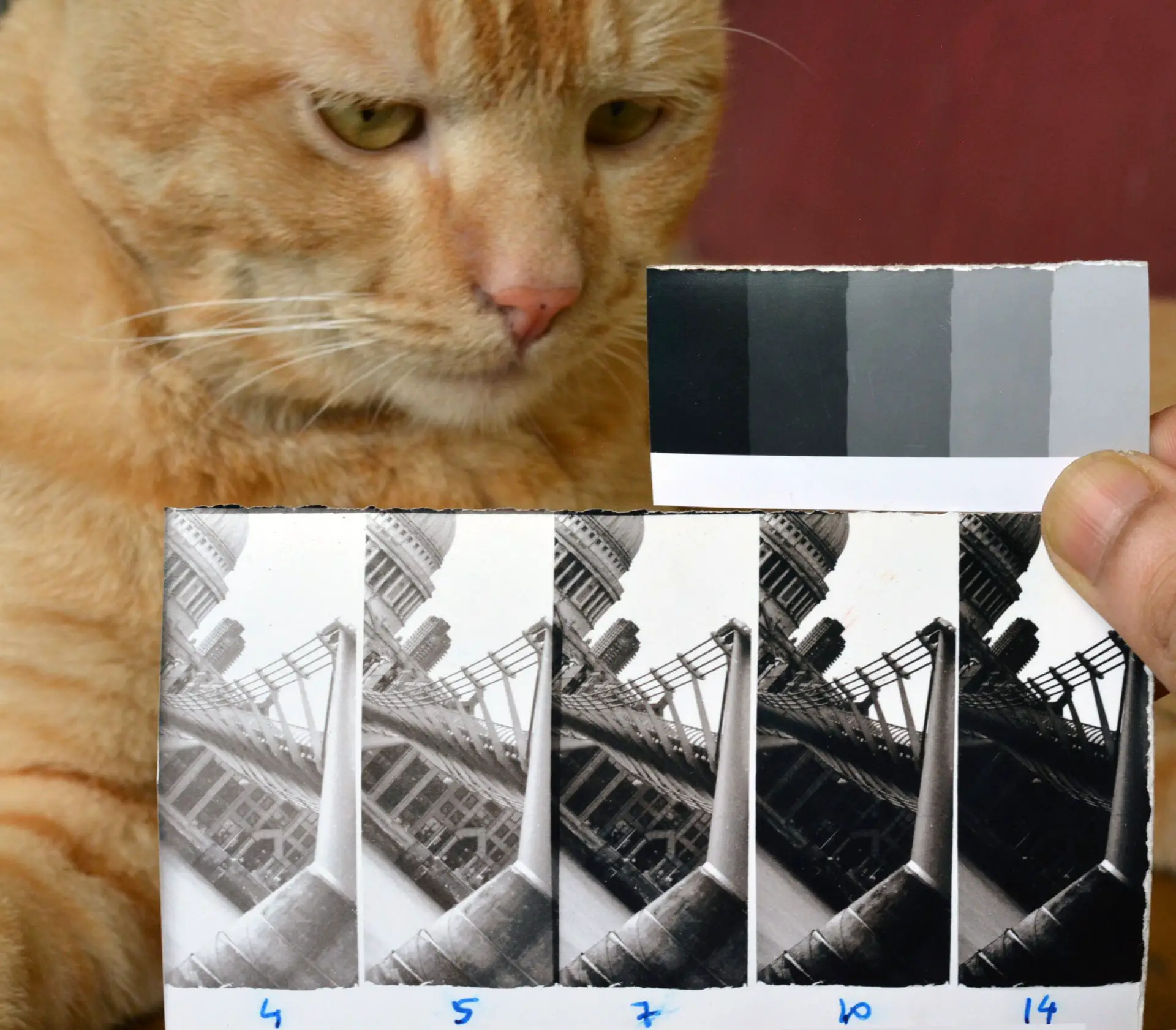
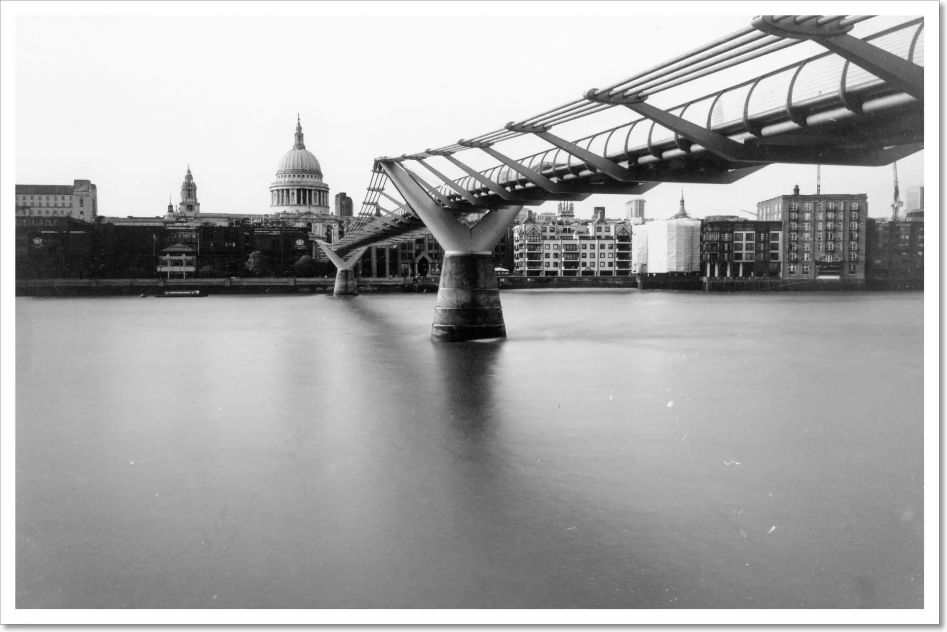
Print 1: Millennium Bridge
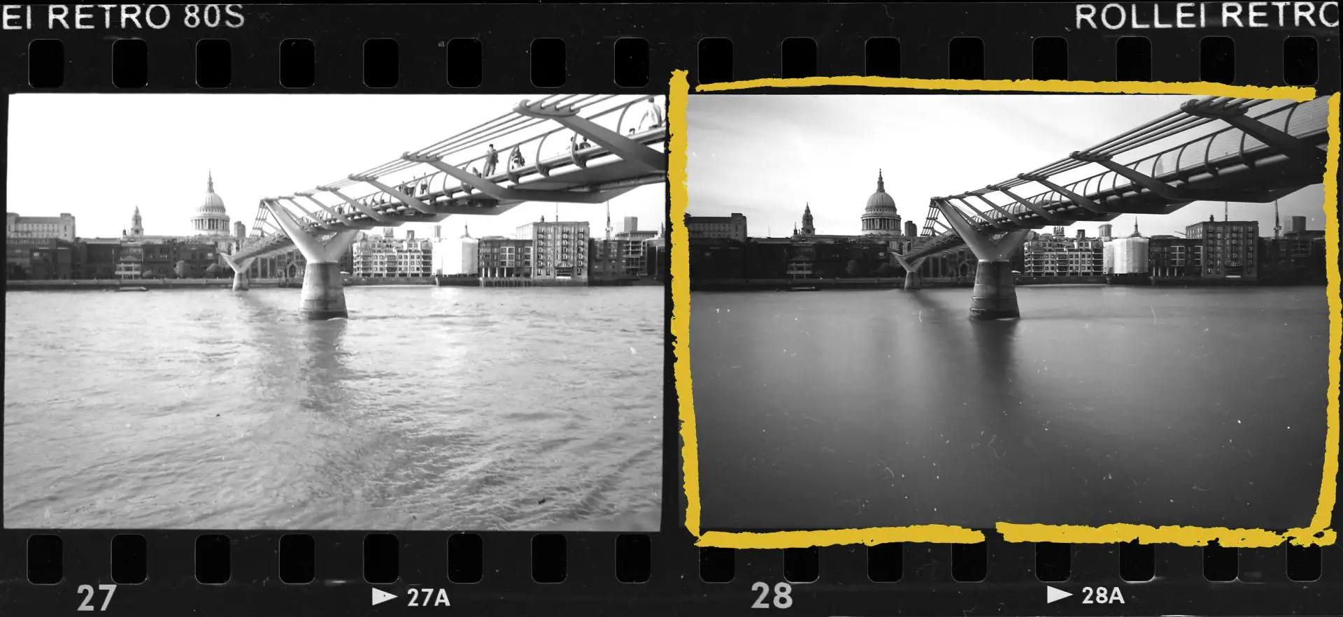
I took this photograph from the south bank of the Thames in London, looking north towards St Paul’s. With the camera on a tripod, I used an ND-10 filter and a 15-sec exposure to make the water look smooth and render the pedestrians invisible.
The previous photo, frame 27, is a more ‘realistic’ representation, shot at 1/125 sec. That frame, actually, is correctly exposed. For frame 28, I guessed the reciprocity failure of the film, and it looks like I under-compensated.
Expose for the highlights
I started by making a localised test strip, using my LSD, at Grade 2, with exposures of 4, 5, 7, 10 and 14 secs at f/11. The exposures increase in half-stop increments, which is what I typically use. But of course you can use quarter-stops, third-stops, full-stops or even linear increments – whatever you like.
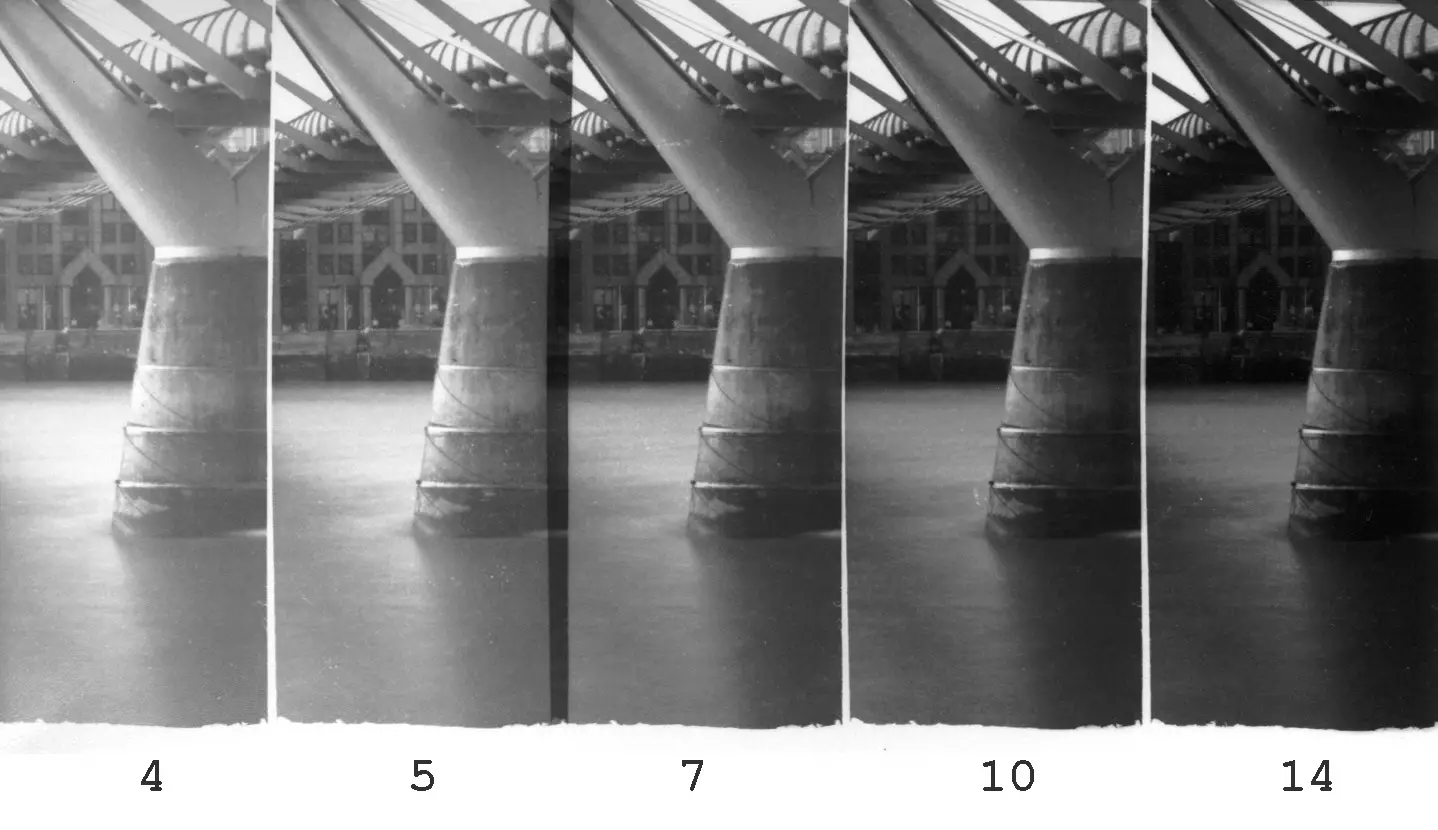
The section of the image which I chose for the test strip is not the most obvious one. It includes little of the bridge and no part of St Paul’s. Nevertheless, it has a textured highlight area which I wanted to retain – the patch of sunlit water just to the left of the pier. And it has a textured shadow area of interest to me, just below the branching of the pier.
To me, the highlight area looks good at 5 secs, but the shadows are still too light – they ‘arrive’ only around 10 secs. This indicates that we need more contrast. At this juncture, a funny thing happened.
The mind plays tricks
I took this photo on Rollei Retro 80S, which, at least in the way I expose and develop it, has fairly high contrast. The film also has a very clear base, which makes the projected image on the baseboard look contrasty. As a result, I had got it into my head that this print would need a contrast reduction. Despite what expose-for-the-highlights and SERC were telling me, I just couldn’t believe that the print needed more contrast. I double- and triple-checked the test strip, and read and re-read the rules to make sure I hadn’t got them the wrong way round. I even made an additional test strip at Grade 1 which looked awful, and only then was I finally convinced that the print needed more contrast, not less. In hindsight, that’s probably due to the accidental underexposure I mentioned earlier.
This little interlude has no bearing on the actual result, but it shows the value of sound methods over untrained intuition – a good reminder of how strong (and how wrong) preconceived notions can be.
Control the shadows with contrast
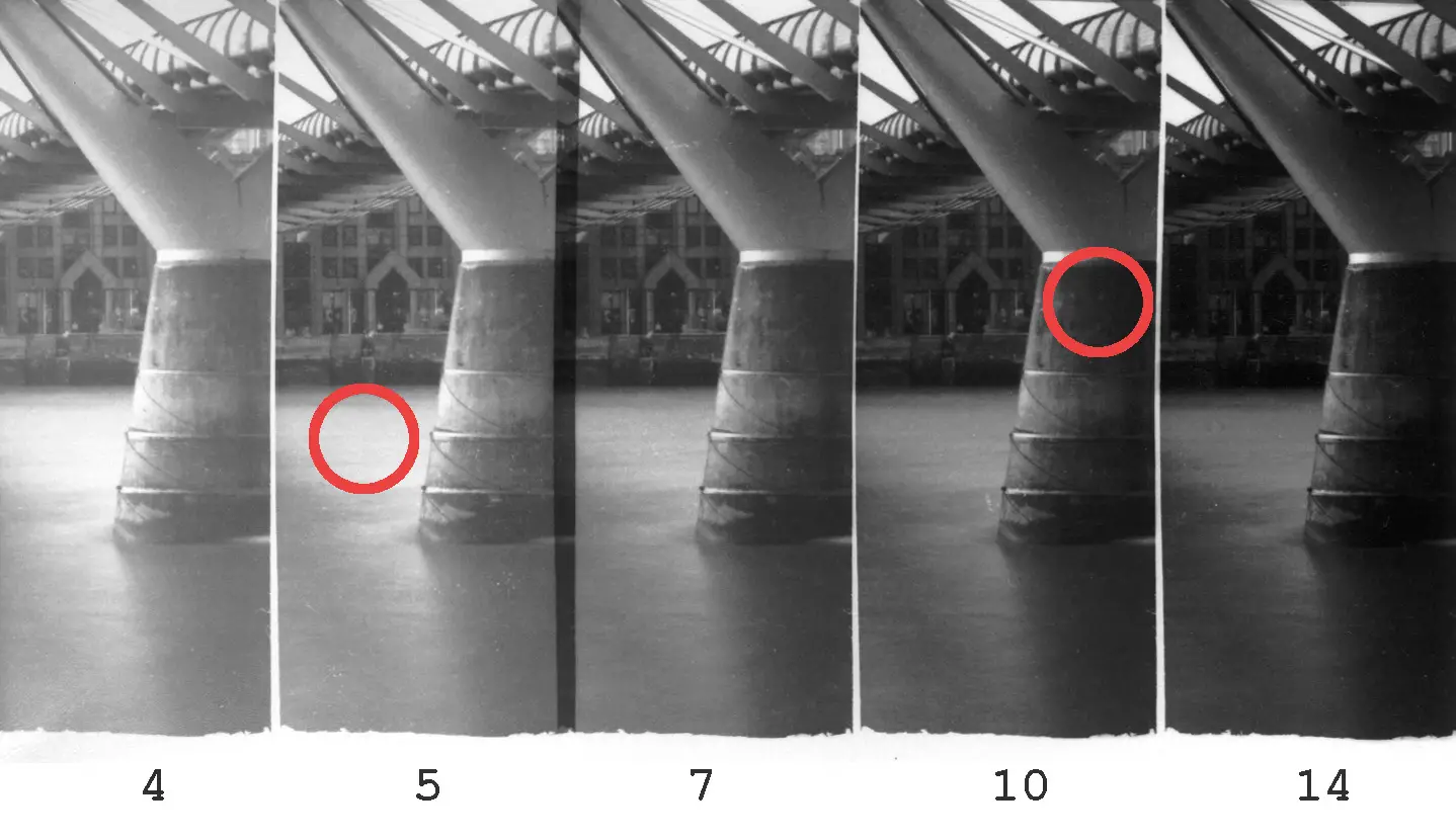
Anyway, back to the print. Next I did a test strip at Grade 4 (as a result of my contrast tests which I explain later, I no longer use Grade 3 on my enlarger; in fact, I believe my Grade 4 is actually closer to a Grade 3). For the new strip I also changed the angle, still including the highlight and shadow areas of interest, but now also a bit of St Paul’s and the sky.
The Grade 4 test strip had exposures of 4, 5, 7, 10 and 14 secs at f/8 (the same times as Grade 2, but with a one stop wider aperture). Thanks to my tests, I had a good idea of what the Grade 4 exposure would be, and I could make the test strip around that exposure. Otherwise, I would probably do the Grade 4 test strip with the same exposures as Grade 2 (4, 5, 7, 10 and 14 secs at f/11), discover that only the higher exposures look right, and do another Grade 4 test strip placing those exposures near the middle. This is only a slight waste of time and paper – nothing catastrophic.
In the Grade 4 test strip, the highlights and the shadows ‘arrive together’, which is what we like to see. 4 and 5 secs are too light, and 10 and 14 secs are too dark. 7 secs looks just right, in terms of both exposure and contrast.
The final print
I made the final print at Grade 4, with an exposure of 15 secs at f/11 (equivalent to 7.5 secs at f/8, a smidge darker than step 3 of the second test strip). Please overlook the dust specks – I could have fixed them in Photoshop, but I left them in as a warning to other printers and a reminder of my folly. Clean your negatives before you print!
Test-strip parsimony
Now think about what we’ve just done. We went from negative to final print using just two small test strips, or one-third of a sheet, to determine both exposure and contrast (three strips if you count the Grade 1 test strip I made, thanks to my wrongheadedness). I could do this by carefully selecting an area with both important highlight and shadow detail (which I can do with quite a lot of prints, though not always) and by using what I know of the exposure/contrast relationship, as opposed to making random stabs in the dark. The long-term savings, in terms of both paper and time, are substantial.
Exposure compensation test
To test or not to test
I mentioned earlier that a few books describe exposure compensation tests for contrast grades, but the ones I’ve seen all use expensive sensitometric equipment. Not having access to a densitometer and step tablet, I devised a test which is only slightly less accurate, but seems to work for me (as demonstrated below). I made up this test on my own, so if you spot any loopholes, please let me know.
The test itself takes about 30 minutes to perform, and analysing the results takes another 30 minutes to an hour. My enlarger has a colour head, but the test is useful whether you use multigrade or colour filters (as I e, multigrade filters also need exposure compensation unless you’re equalising for a specific, light midtone value).
I did the test because I wanted to save time in the long run, and because I was curious about how filters, contrast and exposure interact. Apart from this section and the next, nothing else I say in this series relies on testing. If you dislike testing, don’t do it! I sympathise completely – I can never summon up the enthusiasm to test lenses, for example, though I like looking at MTF charts and optical formulae.
Setup
The test is simple. In the enlarger’s negative carrier, I inserted a piece of clear negative from the end of a developed roll of Ilford HP5 Plus, shot at box speed and developed in my usual way with Kodak D-76 1+1 at 20°C. (I used HP5 because it’s the film I use most, and the film-base for various films often have a slightly different tint which I thought might influence contrast. But in practice, I’ve found that my HP5 test results are applicable to other black-and-white films too.)
I moved the enlarger head to the highest setting, to make the test easily repeatable, and also to increase the exposure times for highlight-testing which can otherwise be very short.
The test is in two parts – first for whites and then for blacks, all done with the same paper, chemistry and developing process (temperature, agitation and time).
Testing for whites
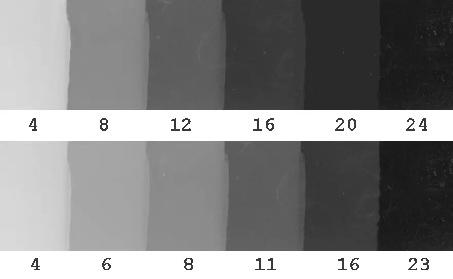
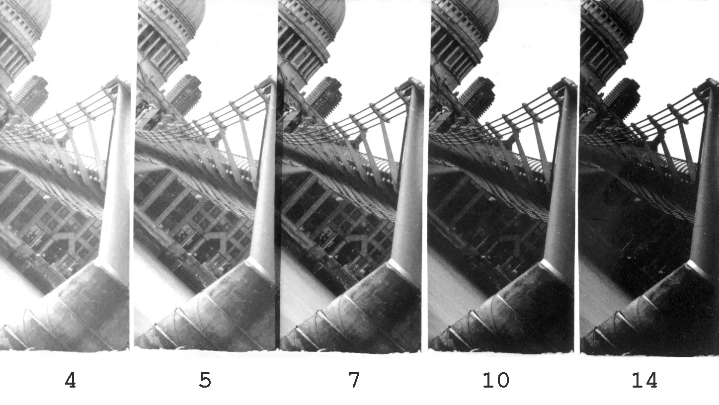
For the whites test, I exposed a series of strips in five half-stop increments, looking for the minimum exposure time for highlight tones at each contrast grade. To be exact, I was looking for the first step which shows faint highlight tone (call it the ‘W step’).
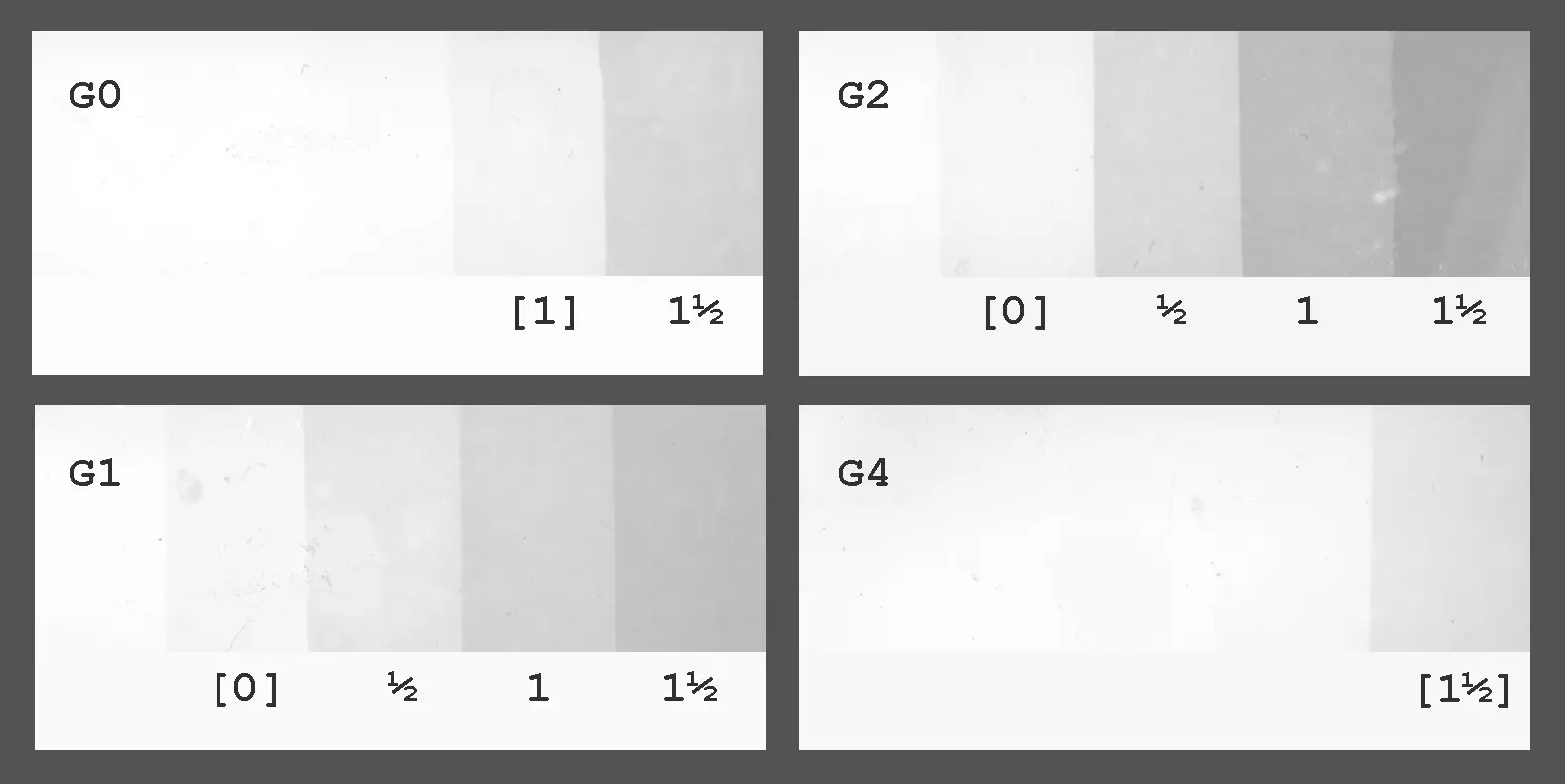
I got the test strips shown above, all exposed for 1.5, 2, 3, 4 and 6 secs at f/11. (My enlarger doesn’t cover the two extremes, namely Grade 00 and Grade 5, while G3 is excluded for reasons explained below.)
The steps are benchmarked against the W step for Grade 2, which required an exposure of 2 secs at f/11, designated as 0. So a step which got half a stop more exposure than 0 is denoted as ½, a step which got one stop more is denoted as 1, and so on.
For each grade, the W step is identified with square brackets. For example, at Grade 0, W tone first appears at [1], i.e. when the paper gets one stop more exposure than what is needed to produce W tone at Grades 1 and 2. At Grade 4, W tone only appears with 1.5 stops more exposure.
Analysis and verification
The test immediately tells us something extremely useful in terms of applying expose-for-the-highlights or SERC. Now, once we determine the exposure needed to produce highlight tones at Grade 2, we also know the exposure compensation needed to reproduce that same tone at any other contrast grade. All we need to do is read off the number in square brackets for the relevant grade.
The Millennium Bridge print offers a nice corroboration. At Grade 2, highlight tone appeared at 5 secs at f/11. The whites test tells us that when we move to Grade 4, highlight tone will appear at 5 secs+1.5 stops. This equates to 5×2^1.5, or 14 secs at f/11.
And indeed, in the Grade 4 test strip for that print, highlight tone appeared at 7 secs at f/8, which is equivalent to 14 secs at f/11.
Testing for blacks
The second and final step is to test for blacks. Again, I exposed a series of strips in five half-stop increments, this time looking for the minimum exposure time for black tones at each contrast grade. To be exact, I was looking for the last step which shows faint shadow tone (call it the ‘B step’), faintly distinguishable from the pure black step to its right.
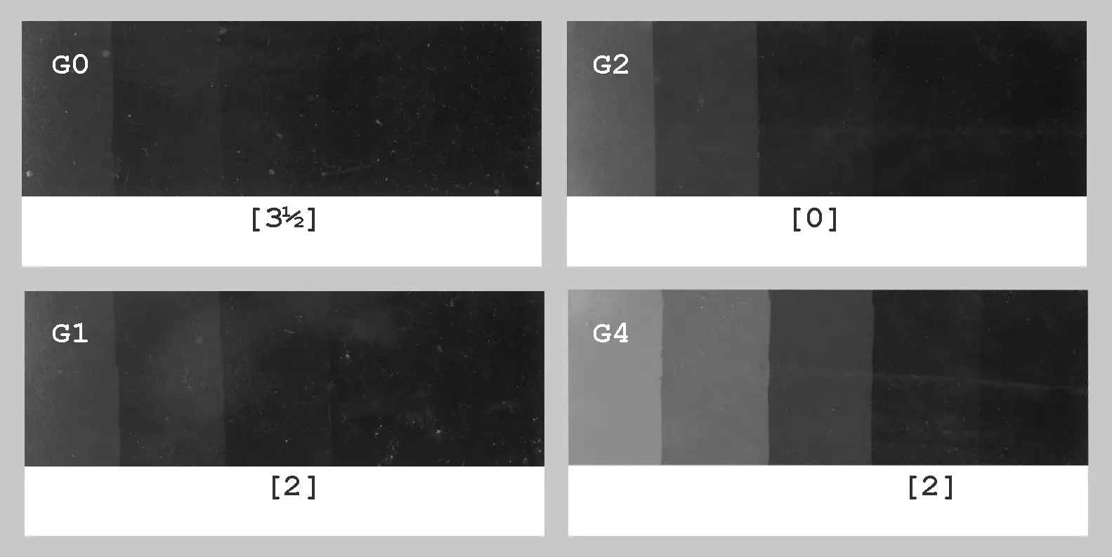
In the strips shown above, the shortest exposure for B tone was at Grade 2 – 11 secs at f/8. As with the whites test, this exposure is designated as 0, and the B exposures for other grades are benchmarked against it. The longest exposure was for Grade 0 – 32 secs at f/4, or 3.5 stops more than the B exposure for Grade 2.
Compensation table
Finally, I tabulated my test results as follows:
| W | B | Range | |
| Grade 0 | +1 | +3.5 | +2.5 |
| Grade 1 | 0 | +2 | +2 |
| Grade 2 | 0 | 0 | 0 |
| Grade 4 | +1.5 | +0.5 | −1 |
For both W and B, Grade 2 is benchmarked as 0. So for instance, when going from Grade 2 to Grade 0, keeping highlight exposure constant requires an exposure compensation of +1. Going from Grade 2 to Grade 4, keeping shadow exposure constant requires an exposure compensation of +0.5.
In fact, the table lets you calculate the exposure compensation for shadows or highlights from any grade to any other grade. Simply subtract the compensation for the new grade from that for the old grade. For example, going from Grade 1 to Grade 4, keeping shadow exposure constant requires an exposure compensation of 0.5−2 = −1.5.
Range
Finally, the right column in the table, Range, tells us the difference between the B exposure and the W exposure for each grade, relative to that for Grade 2. For example, at Grade 2, producing B tone requires 3.5 stops more exposure than producing W tone (11 secs at f/8 versus 2 secs at f/11).
On the other hand, producing B tone at Grade 0, 1 and 4 respectively needs 6, 5.5 and 2.5 stops more exposure than producing W tone at those grades. Benchmarking against the 3.5-stop range for Grade 2, the relative range of Grade 0, 1 and 4 works out to 2.5, 1 and −1 respectively.
This slightly convoluted calculation gives us an incredibly useful result. If on the Grade 2 test strip the shadows arrive before (or after) the highlights, so far, using SERC, we could only predict that we need less (or more) contrast. But now, by counting the number of steps between the desirable shadow and highlight exposures and then consulting the Range column, we can also predict which contrast grade we need.
For example, in Millennium Bridge, the highlights arrived two steps before the shadows. Since my test strips are in half-stop increments, the highlights are one stop ahead. Therefore the range needs to be compressed by one stop, and the Range column tells us that this is exactly what Grade 4 does (Grade 4 has a relative range of −1). If, say, the shadows were two stops ahead, we would instead move to Grade 1.
This is something that neither expose-for-the-highlights nor SERC can tell us on their own. They tell us how to select the appropriate exposure at Grade 2, and whether to increase or decrease contrast. But after doing the exposure compensation test, the W column tells us what the exposure at the new contrast grade should be. And the Range column – based on how close or far apart the highlights and shadows appear on the test strip – tells us which contrast grade to move to.
Refinements
After testing, I found that Grade 3 on my enlarger has the same range as Grade 2. In other words, it doesn’t increase contrast, just lightens the tones like a neutral-density filter would. I don’t know why – perhaps it’s a problem with some of my magenta filters, or the way the enlarger light source interacts with the filters or the paper. In any case, I stopped using Grade 3, and if I want to increase contrast, I jump straight to Grade 4. The rest of the grades appear to work as they should.
By testing intermediate filter combinations, I could in theory find appropriate yellow and magenta filtrations with a relative range of 0.5, 1, 1.5… as well as −0.5, −1, −1.5… Then I could simply check how many steps apart the shadows and highlights are on the Grade 2 test strip, and then jump straight to the appropriate contrast grade (currently I can only do this for a few grades).
This would require another round of testing, but I’m not sure if I want to invest the time and energy. That’s because, aside from the methods described here, there’s another way to achieve the right exposure/contrast combination – using split grade printing (which I cover in Part 4). I am relatively new to split grade, but with more practice, I think it may well become my default approach, and exposure compensation calculations wouldn’t play a big part in my workflow.
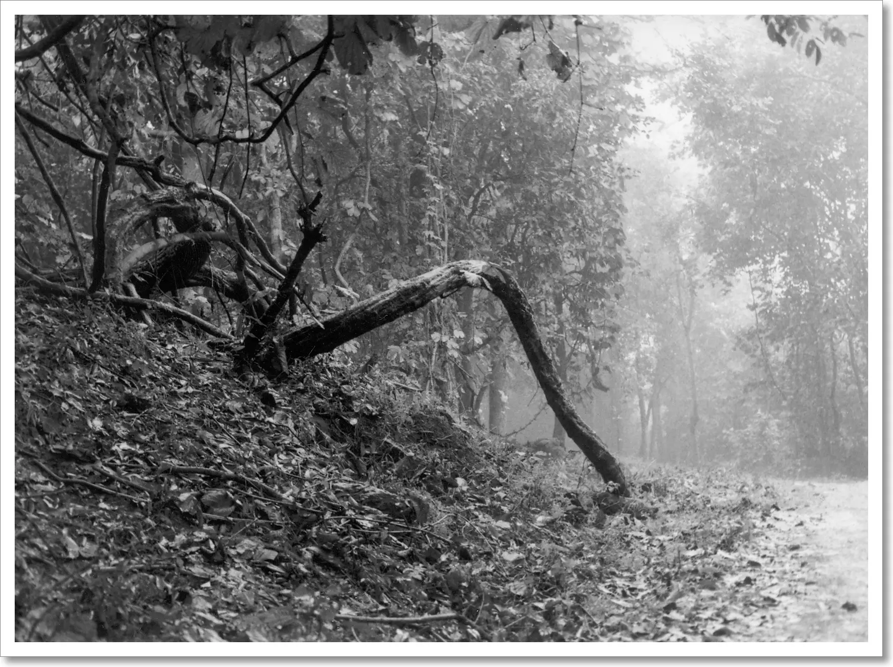
Print 2: Forest Path
Finally, here’s another print showcasing the value of the compensation table, and the kind of flexibility it offers.
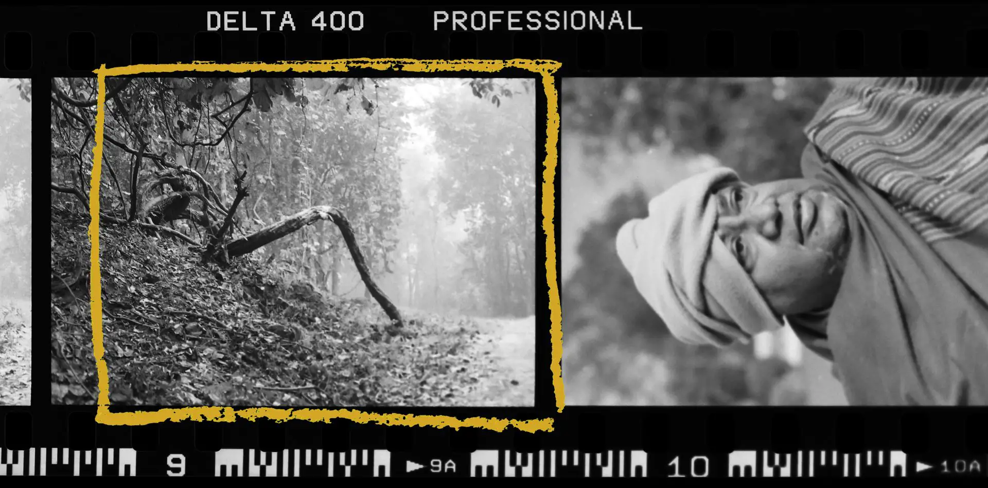
My father took this photo in the Dalma Wildlife Sanctuary in Jharkhand, India.
In the Grade 2 test strip, with exposures of 8, 11, 16 and 23 secs at f/8, the shadows look good at 11 secs, but the highlights look bleached even at 23 secs. 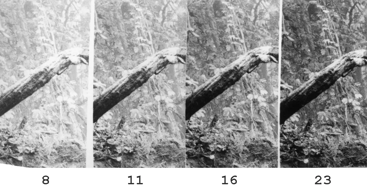
SERC suggests I should reduce contrast, but according to the approaches discussed earlier, I ought to do another test strip with higher exposures (e.g. 8, 11, 16 and 23 secs at f/4) in order to find the Grade 2 highlight exposure (when the sunlit parts of the tree trunk show textured highlights rather than pure white).
Instead, since I already know the Grade 2 shadow exposure (11 secs at f/8), relying on my compensation table, I decided to move straight to Grade 1. The B column of the table says that going from Grade 2 to Grade 1, to keep shadows constant we need an exposure compensation of +2. Accordingly, I opened up the aperture two stops to f/4, then did another test strip for 8, 11, 16 and 23 secs in a different part of the image (ideally I should have done it in the same part, but I wanted to see what the foggy background would look like).
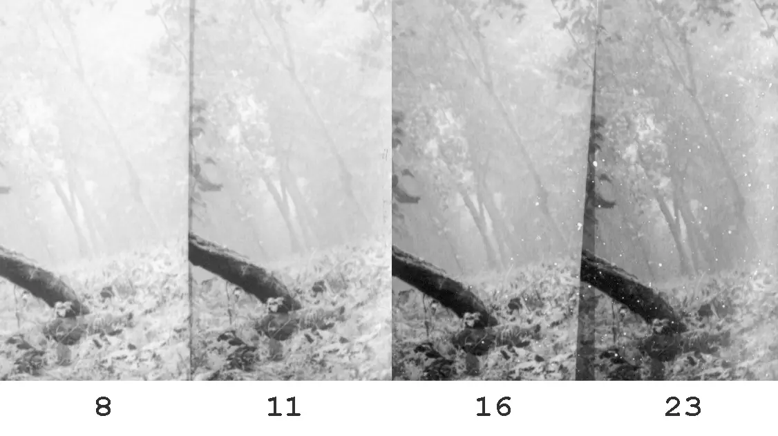
Once again, 11 secs looked good – the shadows look similar to the first test strip (as they should, according to the table), but the highlights show a lot more detail at the same exposure. On that basis, I went straight to the final print at Grade 1: 22 secs at f/5.6 (equivalent to 11 secs at f/4).
Thus, I determined the new exposure time not by reference to the highlights as we did before (indeed, I did not even bother to find out the Grade 2 highlight exposure), but by looking at the shadows. With the table, we can work with either the highlight or the shadow exposure at Grade 2. SERC tells us whether to increase or decrease contrast, and the table tells us what the new exposure should be.
But once again, if you don’t have the time or inclination to do an exposure compensation test, expose-for-the-highlights or SERC already provide a lot of guidance on how to select exposure and contrast, taking much of the guesswork out of the quick-and-dirty, trial-and-error process described in Part 2.
Tech notes
This section is just for completeness (and for nerds). Feel free to skip it.
Millennium Bridge was shot on a Leica M3 with a Voigtländer 28mm Ultron f/1.9 on Rollei Retro 80S at EI 80, developed in Kodak D-76 1+1.
Forest Path was shot on a Minolta X-700 with a 50mm MD Rokkor f/1.4 on Ilford Delta 400 at EI 400, developed in Kodak D-76 1+1.
Both photos were printed on Ilford Multigrade IV RC (Pearl) 8×10″, using a Paterson colour enlarger with Paterson 50mm f/3.5 lens, and developed in Adox Adotol Konstant.
I scanned the prints with an HP Scanjet G4010, with sharpening and other corrections turned off. I processed them minimally in Photoshop, mostly just setting the black and white points and annotating exposure times and contrast grades. An onscreen image will always look different to a silver gelatine print, but I would say the scans are close enough.
Next up: Part 4!
That’s it for now – see you next Monday for Part 4, which is about split grade printing. If there’s anything specific you’d like me to cover, let me know in the comments and I’ll see what I can do. Thanks for reading!
Share this post:


Comments
thorsten wulff on Cat-and-Mouse with Exposure and Contrast – Darkroom Technique Part 3 – by Sroyon Mukherjee
Comment posted: 20/04/2020
Comment posted: 20/04/2020
Comment posted: 20/04/2020
Comment posted: 20/04/2020
Mario on Cat-and-Mouse with Exposure and Contrast – Darkroom Technique Part 3 – by Sroyon Mukherjee
Comment posted: 20/04/2020
Comment posted: 20/04/2020
Stefan on Cat-and-Mouse with Exposure and Contrast – Darkroom Technique Part 3 – by Sroyon Mukherjee
Comment posted: 21/04/2020
Thank you so much!
Comment posted: 21/04/2020
Glenn S on Cat-and-Mouse with Exposure and Contrast – Darkroom Technique Part 3 – by Sroyon Mukherjee
Comment posted: 21/04/2020
Comment posted: 21/04/2020
Louis Malingrey on Cat-and-Mouse with Exposure and Contrast – Darkroom Technique Part 3 – by Sroyon Mukherjee
Comment posted: 22/04/2020
Cheers from France.
Comment posted: 22/04/2020
Ruediger Hartung on Cat-and-Mouse with Exposure and Contrast – Darkroom Technique Part 3 – by Sroyon Mukherjee
Comment posted: 23/04/2020
Splitgrade will do the job much better.
1. Expose a test strip with grade 0 (or 00) in the highlights and only look for the first appearing texture (not midtones!).
2. This time is the time and grade (0) you pre-expose the paper with in the shadows.
3. on top of that a second test strip with grade 5.
The best result is your setting (times) for grade 0 (00) and 5.
You don't need to dead with calibration, different paper sensitivity - this is all leveled out by the 2 test strips. And you get the right contrast and brightness.
If your negative is too high contrast, subdivide this in 2 or more pictures and proceed in the same way for each sub-picture.
When printing start with the lowest overall grade 0 (00) and 5 times and then add the other times whilst dodging the areas that already got enough exposure.
Comment posted: 23/04/2020
Split Grade Printing – Darkroom Technique Part 4 – by Sroyon Mukherjee - 35mmc on Cat-and-Mouse with Exposure and Contrast – Darkroom Technique Part 3 – by Sroyon Mukherjee
Comment posted: 27/04/2020
Woll Newall on Cat-and-Mouse with Exposure and Contrast – Darkroom Technique Part 3 – by Sroyon Mukherjee
Comment posted: 03/05/2020
Comment posted: 03/05/2020
Dodge, Burn and Other Heresies – Darkroom Technique Part 5 – by Sroyon Mukherjee - 35mmc on Cat-and-Mouse with Exposure and Contrast – Darkroom Technique Part 3 – by Sroyon Mukherjee
Comment posted: 04/05/2020
Carlos Diaz on Cat-and-Mouse with Exposure and Contrast – Darkroom Technique Part 3 – by Sroyon Mukherjee
Comment posted: 25/08/2020
Realicé las pruebas con mis propios filtros y me dan resultados super extraños, pero que a su vez, se condicen con en manual de los filtros de contrastes. Desde el grado 0 al 3 no casi no existen diferencias de tiempos de exposición, desde el grado 4 al 5 se compensa con un paso de luz. Los rangos 5 van desde los 5 1/2 pasos para el filtro 5 hasta los 8 pasos para el filtro -1. NO se si estaré considerando bien el primer blanco y el último negro. Saludos
Comment posted: 25/08/2020
Tim Hall on Cat-and-Mouse with Exposure and Contrast – Darkroom Technique Part 3 – by Sroyon Mukherjee
Comment posted: 24/12/2020
Thanks for introducing me to this forum. I've read a couple of posts and found it interesting. Hamish has set me up to post the article that you suggested I write and will be sending me instructions on how to post it.
I just quickly read what you wrote above and thought I'd comment. I realize that most members of this forum are very much interested in film photography and are in it for the sake of their own enjoyment and personal satisfaction, and I am surprised at the amount of technical advice that you gave. The readers seem to "eat it up" so to speak.
About 3 - 4 years ago after I retired my photo business I started posting videos on YouTube. I wanted to share some of the techniques that I've learned throughout the years, and I wanted to make it available to those who were interested in film. I didn't want some of the basic technical darkroom skills to be lost since there was indication (at the time) that film was not dead and there were those highly interested in learning the skills that took so many years to develop.
My videos are basically done now and I don't suppose I will be adding any more although I did post the slide shows of my current project "Portraits of Growing Up Asian." Initially I wanted to break down my videos into 3 sections. The first was how paper responds to exposure. The second was how to expose film to best utilize the paper's response when exposed with the negative. Basically it is a shortened explanation of the zone system as used in the field. And lastly (and this was the main point of the videos), how to use film masking to modify an existing negative to best expose photographic paper to get the result you want, It's a full circle kind of thing. I talk about how paper responds to exposure and wind up explaining how to get your negative's density range to fit the photographic paper you are printing on.
It's all very technical and I don't have a lot of subscribers, but the group here may be interested in watching some of the videos. Some are very long and requires repeated viewing. I fully intended this as what I learned was by the seat of my pants. It took me many years to come up with the system I use. I didn't study photography; I got me degree in music. But I first went in the darkroom at 8 years old and have kept it up. I chose to become a professional darkroom printer and wound up owning my own color lab. I thought that posting lessons would help others and save them time.
In any case I thought I'd place a couple of links to my channel on YouTube. It's titled Timi Hall Film Photography. The 2 links are to videos that touch upon the subject you wrote about. I do suggest using an on easel light meter to keep exposures constant, something you didn't mention and perhaps have not used.
https://www.youtube.com/watch?v=pICu1kDeAMU&t=1093s
https://www.youtube.com/watch?v=YNOmPwlmOfY&t=1196s
Have a wonderful Christmas and New Year.
Tim Hall
Comment posted: 24/12/2020
Elizabeth Hagan on Cat-and-Mouse with Exposure and Contrast – Darkroom Technique Part 3 – by Sroyon Mukherjee
Comment posted: 03/05/2021
Comment posted: 03/05/2021
Comment posted: 03/05/2021
Comment posted: 03/05/2021
Christopher Takeda on Cat-and-Mouse with Exposure and Contrast – Darkroom Technique Part 3 – by Sroyon Mukherjee
Comment posted: 24/05/2022
I like this idea but am wondering how you work with this device in a paper easel? I guess it can be done without an easel but then you need to refocus, etc, once you put the easel in. Or am I missing something?
Comment posted: 24/05/2022
Massimo Ugolini on Cat-and-Mouse with Exposure and Contrast – Darkroom Technique Part 3 – by Sroyon Mukherjee
Comment posted: 31/10/2023
in your test I couldn't understand some things.
I was able to understand the test for whites, but not for the blacks!!
You selected the dark part on grade 2 as [0] and for grade 4 [2].
why did you put [2] and not [1/2] since there is only one jump?
You did not specify in this test to make these strips whether you used the same aperture and initial speed for all of them, I assume so as for the White test.!
Also for grade 1, why did you put [2] which is equal to the grade 2 stripe??
Another thing I don't understand is the COMPENSATION table, how you calculated the Range and how to use it.
I'm sorry and I hope you can make me understand better.
Thank you
Massimo Ugolini
Comment posted: 31/10/2023
Comment posted: 31/10/2023
Massimo Ugolini on Cat-and-Mouse with Exposure and Contrast – Darkroom Technique Part 3 – by Sroyon Mukherjee
Comment posted: 26/11/2023
-1 or -2?
When will you publish the new, more recent test than this one?
Thank you
Comment posted: 26/11/2023
Comment posted: 26/11/2023
Comment posted: 26/11/2023
Massimo Ugolini on Cat-and-Mouse with Exposure and Contrast – Darkroom Technique Part 3 – by Sroyon Mukherjee
Comment posted: 27/11/2023
Do you already know the title of when it will be published so I don't miss it?
I'll take this opportunity to purchase the stouffer, thanks
massimo
Comment posted: 27/11/2023