Kodachrome 64 – Digitising for the “Look”? – By David Hume

By David Hume

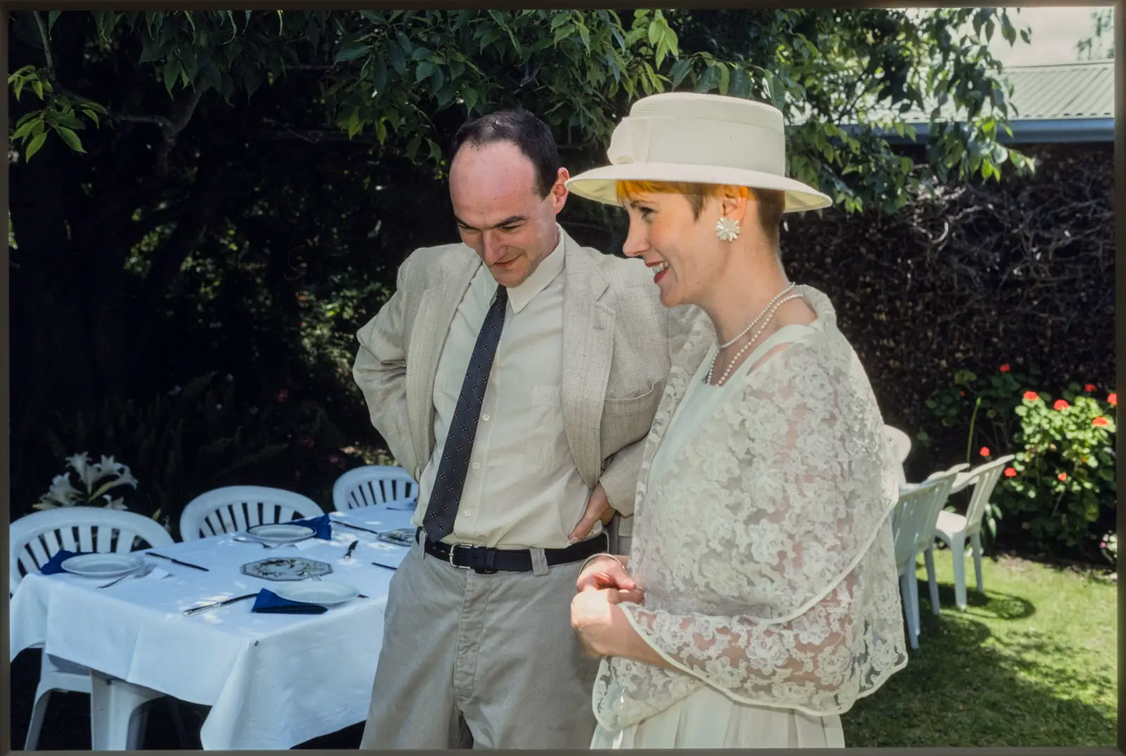
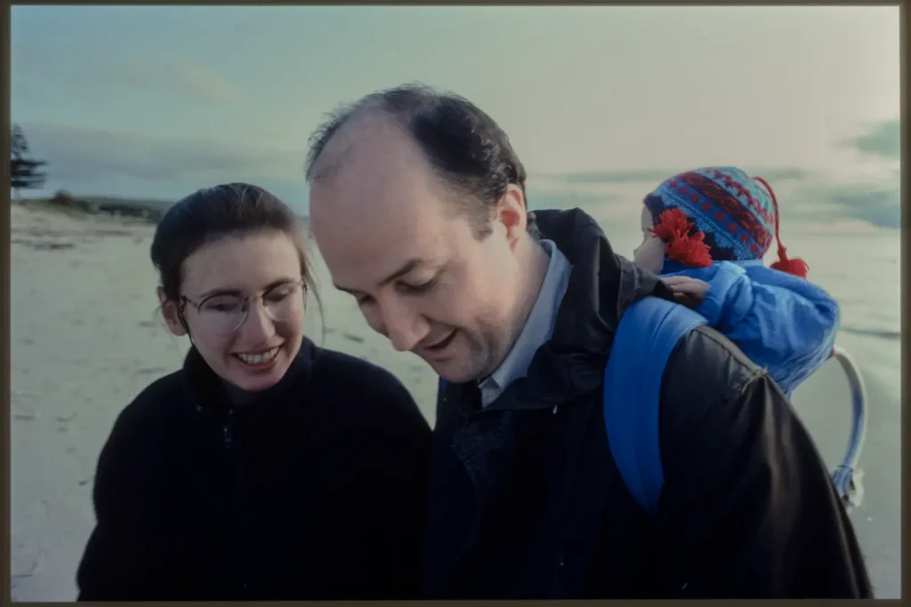
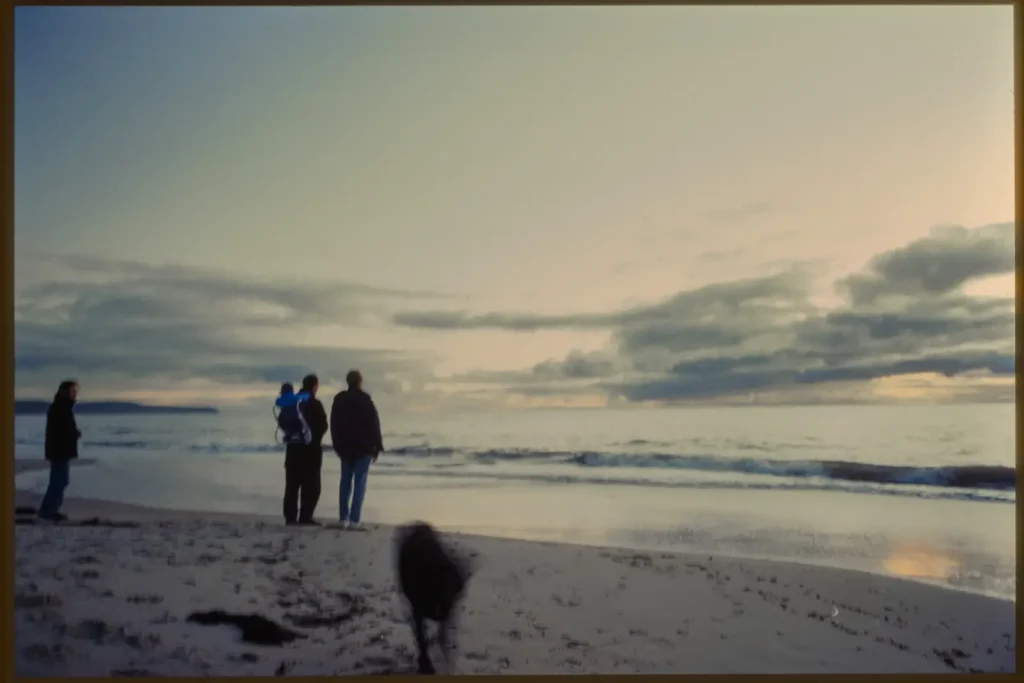
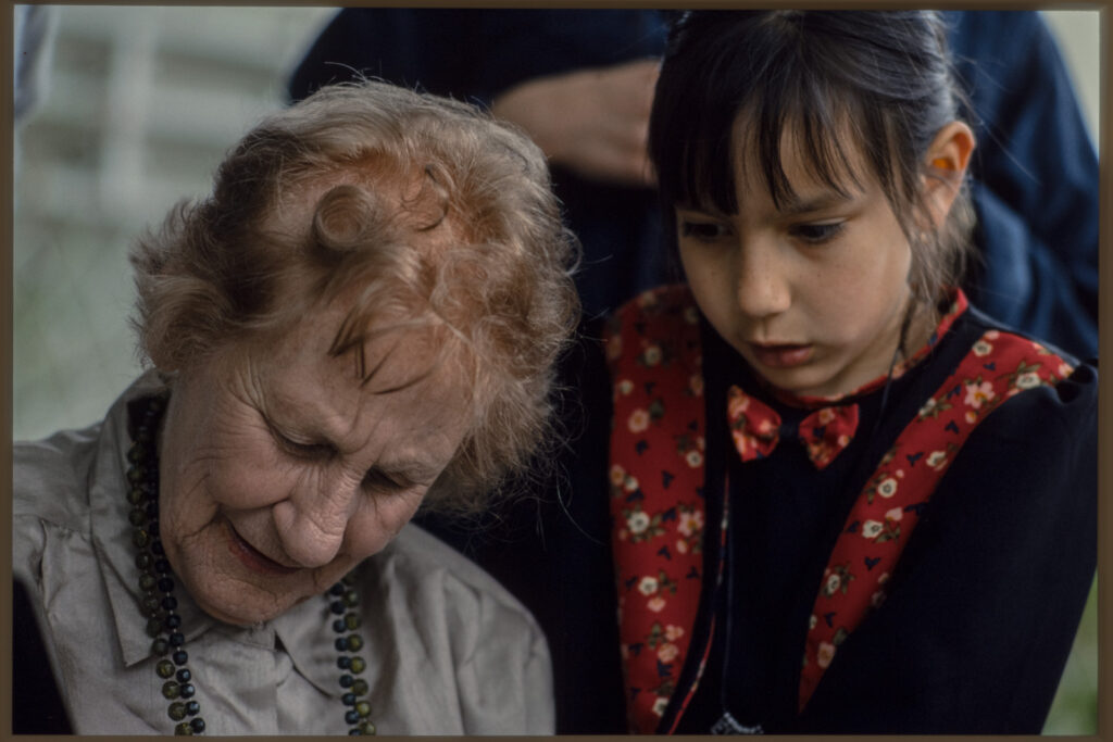
It started with a kiss… You see, my wedding photos are on Kodachrome 64 (PKR). Just one roll, and a roll of HP5 as well. My brother-in-law and I shot them between us. I processed and printed the black and white myself on fibre based paper and I had some Cibachromes made of the colour. Our album has twelve 6 x 8 prints in it, which is all you need; proof being we’re still married.

Hmm – how do we get out of this? Kodachrome 64 in a Canon T90 with some fill-flash.

It was our anniversary recently so I took that little yellow box with WEDDING written on it out of the cupboard and digitised the whole lot; many of which I’d never really looked at.

My sisters decided they’d belly-dance. Kodachrome 64 in a Canon T90 with some fill-flash.

And this is where the trouble started, because I wanted to make scans that looked like the trannies and I couldn’t. I couldn’t get that KODACHROME LOOK from my Kodachrome!

We still live here and we’ve had 28 Christmases under that tree.

I’ve expressed views here before that we can’t get too hung up about fidelity in digitising film – but this was a bit different. I wanted to archive them and I wanted to recreate – as exactly as I could – the look of these slides as they appeared on a colour-balanced lightbox. Surely I can’t be the first to try this?

Beach Holiday 1994. Poor Ruby has lots of mozzie bites. Kodachrome 64 in a Minox 35GT in open shade. My zone focus not so good.
Same jetty as above. I reckon there’s more shadow detail here than you’d expect from tranny – but nice and blue. Kodachrome 64 in a Minox 35GT. And look – even here there’s a bit of motion blur in the fingers.

As soon as I starting searching Kodachrome I came across a seemingly endless number of presets and recipes for simulating it on digital. There was very little I could find about digitising film with a camera. There were a few things about dedicated film scanners and targets, but nothing useful to me.  That made me think it might be worth doing this piece to show what real Kodachrome looks like.

Of course I’m only simulating on a screen what the stock looks like on a lightbox, and light through an emulsion is not the same light popped out of LCDs in a screen.  Given that Kodachrome hasn’t been processed for ten years, most of the people (well, all of the ones I saw actually) who are making the presets and telling the world to buy them have never actually shot Kodachrome. I haven’t tried any of these presets yet; it might be fun, but I’d be wary of  anyone telling you their Kodachrome preset was written by the finger of God on a stone tablet. And I’d urge skepticism of any claim that you can get Kodachome out of digital in one click. Or any number of clicks for that matter.

The scans you’re seeing in this piece are the best I can offer, and to me they look close enough to the original PKR slides on a lightbox that they might be useful, but that’s the only claim I’ll make for them.

Our good friends on the beach at dusk. Kodachrome 64 in a Minox 35GT. I love the moulding of that light but there’s not much light if you’re at ISO 64
I really like how the faces glow here. Reminder to anyone who uses a Kodachrome 64 preset on digital – make sure your ISO is set to 64. Shutter speeds got low in them days.

I still wanted to look at my wedding photos on a screen – so what could I do?

Kodachrome 64 in the Minox again. I really like the light on Margot’s face. You probably need to see this one big to see how they’re looking at one another.

I invite you come with me down a Kodachrome rabbit hole…

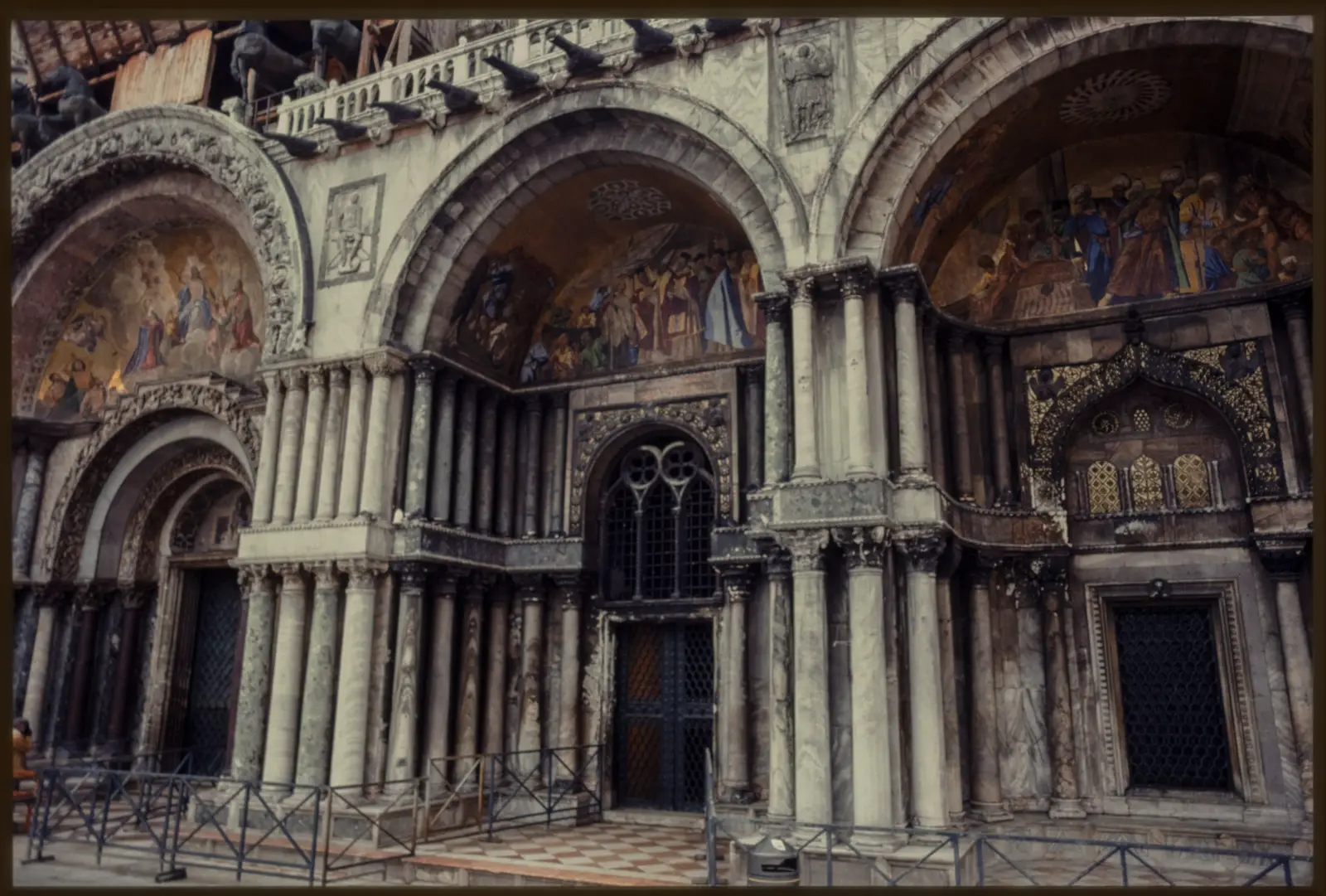
Flashback to 1985-1995. That is when I shot Kodachrome.

I like the way the sunlight on the browns of the horse are rich and how they play with the blues. Kodachrome 64 in a Minox 35GT

Firstly – what IS Kodachrome? There were lots of different kinds. The only kind I ever shot was Kodachrome 64. The last iteration. The Steve McCurry “Afghan Girl” Kodachrome. (Her name is Sharbat Gula and there’s a story there worth reading btw.)  Kodachrome was different from films like Ektachrome, Fujichrome, Agfachrome and the other E6 slide films. It needs a different and complex kind of processing that is no longer done. I won’t explain it because I can’t. I don’t understand it myself and I haven’t tried to learn.

Why did I shoot it? It was not for the KODACHROME LOOK. Mostly it was for permanency and accuracy.

Here is what I observed back then. This was the time of mini-lab prints and Kodak Instamatics etc, and I had noticed something in my own family. In the change from B+W to colour, our family narrative was being eroded.

Photos were not really cared about – they came back from processing, some went in to albums, the rest got lost. The negs got lost. The prints faded. The albums were cheap and they fell apart. The plastic in them stuck to the prints and ruined them.

So, for important stuff I wanted to use Kodachrome because it lasted. (And it’s true, it does last.)

El watches her grandmother open a present on her 80th birthday. Kodachrome 64 in a Nikon FM2

There’s how it worked:

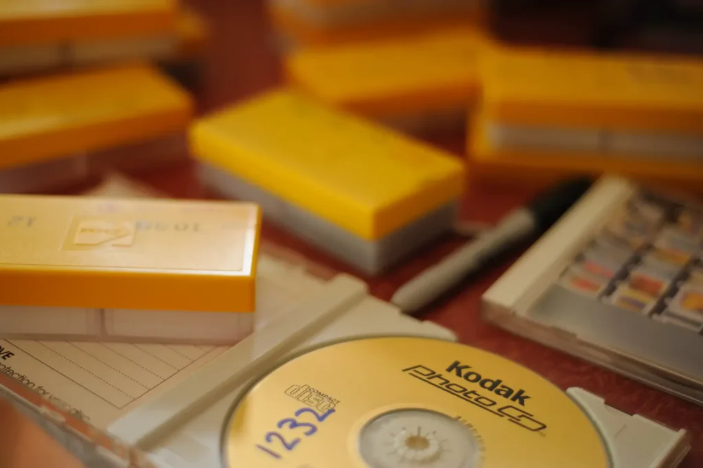
I’d go to the shop and buy a three-pack of 36. (Or was it a four-pack? I think it cost $60 but I’m not sure) That included film, processing and postage. The main point was that it was a bit dearer than negs and prints, but not prohibitive. Maybe it was 20% or 30% more. When you shot a roll you’d put the film in a little yellow pre-paid envelope, write your own address on it, and put it in the letterbox addressed to the Kodak lab in Sydney. A couple of weeks later a yellow-topped box would turn up in your letterbox, and bingo – your memories were safe forever.

This is a dingo. Say it with me – “A dingo took my baby.” Kodachrome 64 in a Nikon FM2.

I also shot it for travel because of its stability. You didn’t need to worry so much about heat or – as a low ISO film – going through X-ray machines.

Having said I wasn’t after the look, I did want more control over my images than I would have got with mini-lab prints. I also wanted colour accuracy.

Drunken yobbos in the Todd River at about 10 am. Alice Springs 1995. They started jeering at me because they said I had a silly hat (Irony much fellas?) It was a little tense but I made friends with them through the magic of photography.

I think I have maybe three dozen rolls of Kodachrome 64 (PKR) shot between 1985 and 1996.

More from the great Aussie outback. Colours from direct sun on camels. Kodachrome 64 in an FM2

I don’t want to pay the big money needed for high-end professional scans; I want to try to solve this for myself, and as my flatbed is crap (and any flatbed too slow) this really means digitising at home with a camera. Theoretically that should not be too hard, but my first attempt on the wedding shots was a total failure; the colour balance and tonal range were completely out of whack.

Maybe, given my previous rants on digitising colour neg and on film simulations and how our scans are our own beautiful and unique snowflakes, I should clarify a bit here.

As a starting point I want to digitise this PKR so that looking at it on the screen is as close as I can make it to what I see on a lightbox through a loupe. It’s an archive, and a catalogue. After that it can become a base for whatever I might want to do with it later

My lightbulb moment came when I realised I had about 20 PKR slides digitised to Kodak PhotoCD in 1996. This was the bridge time between film and digital when things needed to be digitised but were still shot on film. Kodak PhotoCD was pretty good. I think the scanners cost a lot (as in A LOT) of money and they had special film profiles etc etc. The service depended on how much you paid to have them done – and it’s too long ago for me to be sure exactly what service I got for these.

Lightbulb moment – my reference scans made in the 90s on Kodak PhotoCD

The place that did them had a special deal whereby they’d give you a good price if you had a certain number done, so I would pad out other jobs with my personal stuff, and hence I have this lot.

Re-digitising and referencing the scans with the trannies on the lightbox.

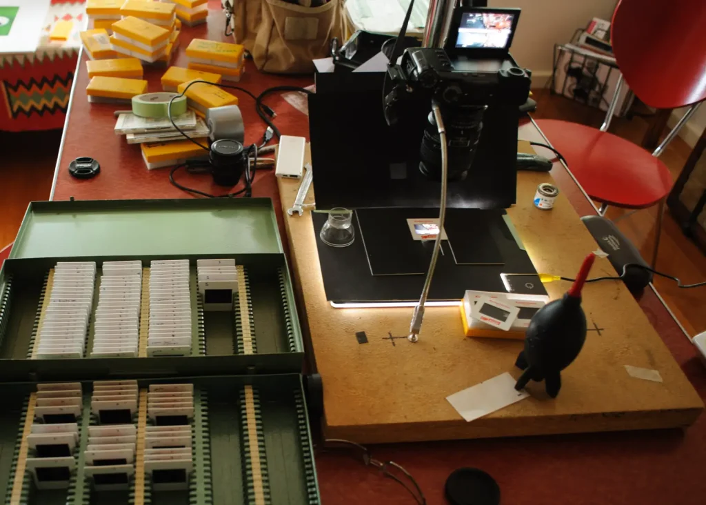
So – armed with these original PhotoCD scans from the 90s I digitised the same slides again on my lightbox, and tweaked the colours as well as I could to match. I then tweaked again on different slides to get the best balance I could, and saved this as a preset.

This came off the Kodak PhotoCD – A trip to the Northern Territory to visit Uluru.
And this it how I digitised it. You’ll notice the yellows and reds are a bit weaker. I had to back them off in this shot because other shots came out with the yellows too strong. It was a juggling act over different shots in different lighting conditions with different subjects. It was hard to get the initial preset – without a few reference scans I think I would have given up.

This preset formed a base for digitising each batch of slides. I then refined the preset as I went, and changed the presets a bit for different batches of film, depending on where they were shot.

I could then test my import settings against other slides and tweak it. Kodachrome 64 in a Nikon FM2. Polarising filter.

I had never used presets before – but I’m becoming a bit of a fan. (Or Not: “Get our Preset Packs for stunning photos in one click!” Hmm – shall I buy the Warm Morocco set? The Bright Food set? Rustic Autumn set or Winter Green set? I have to tell you; as a swimsuit model and travel blogger I want more time for creating content with less time spent editing!)

So much depends on the nuances of the light.  A couple of seconds after this was taken the sun popped through the clouds…
And it looked like this.

Enough.

OK – So how did it work out for me?

Well – it’s not quite that simple. There were still decisions to be made.

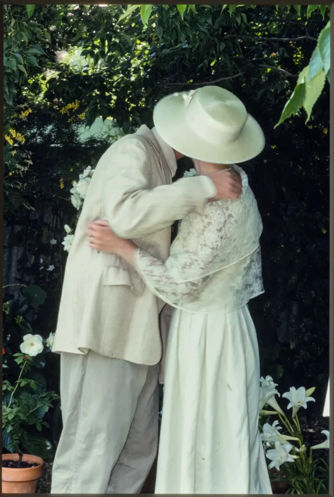
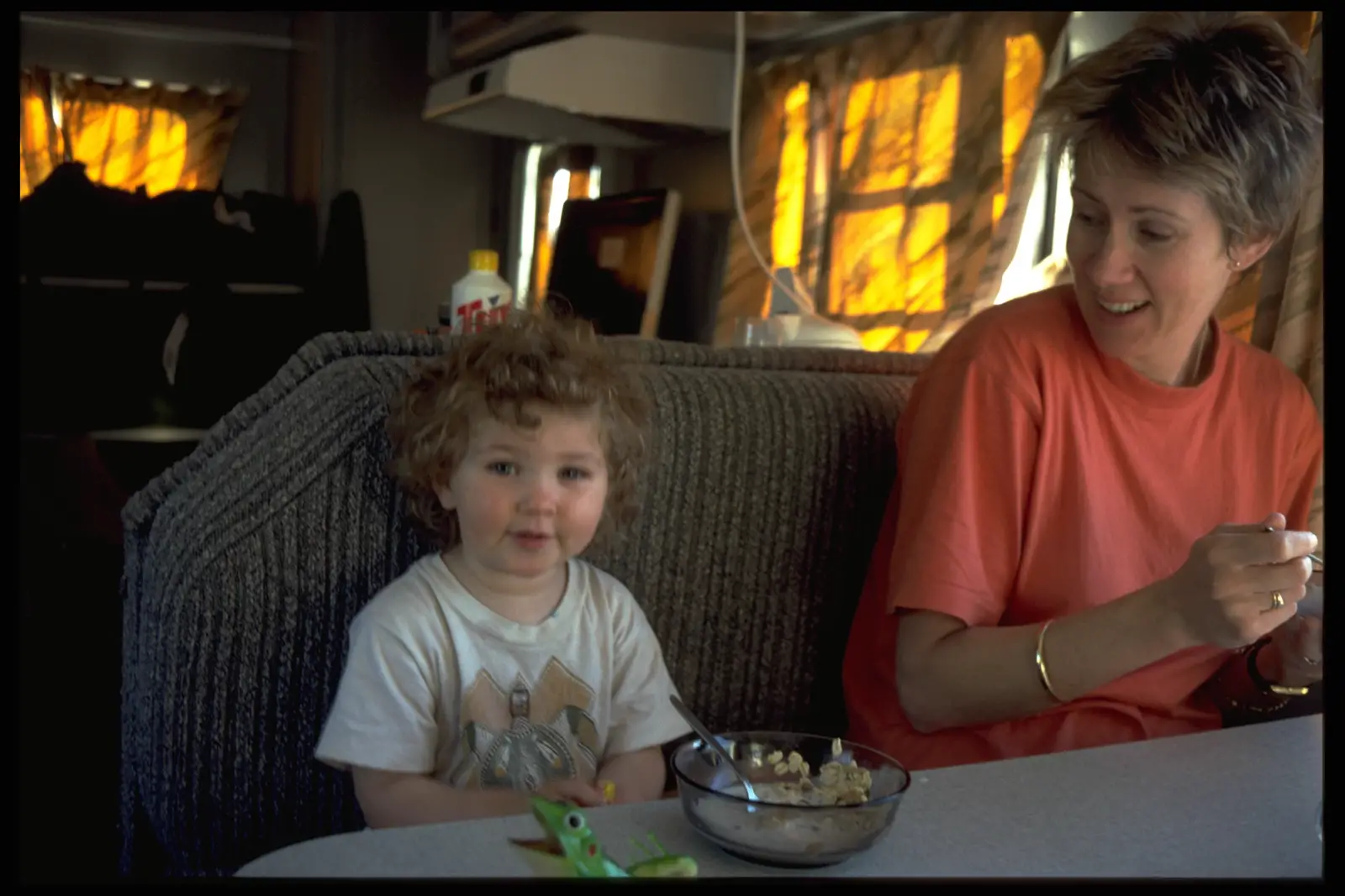
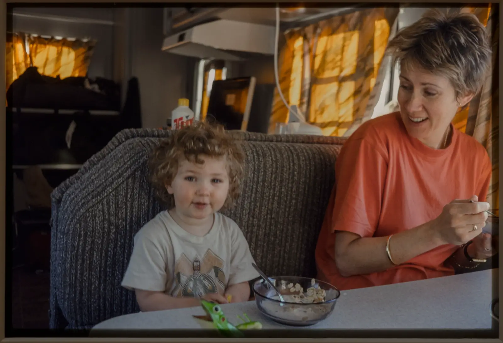
In our wedding shot under the tree, Margot’s hat has a green cast. Of course it does – we are standing under a tree and the light is coming off the leaves above and the grass below and it’s – you guessed it – green.

In a print you’d correct that. The Lab DID correct it a bit in the Cibachromes. Hell – even my EYES correct it when I look at the slide on a lightbox, just like our eyes correct things in real life. We still have that hat, and I know what colour it is, so my brain corrects for that when I’m looking at the slide – it’s really hard not to.

I did my best with these and I got to a point where I thought, “You know what? I’m done here.” As I went through the process of digitising all these slides again it became easier, my preset seemed to work better as I refined it. I’m happy now with how these scans represent the originals.

So – The good thing is I can now have fun with a whole bunch of slides I have not looked at for years. I’ve got the raw scans now and I can go back over them. If I ever get better at this I can tweak the preset some more and re-work them without re-scanning them.

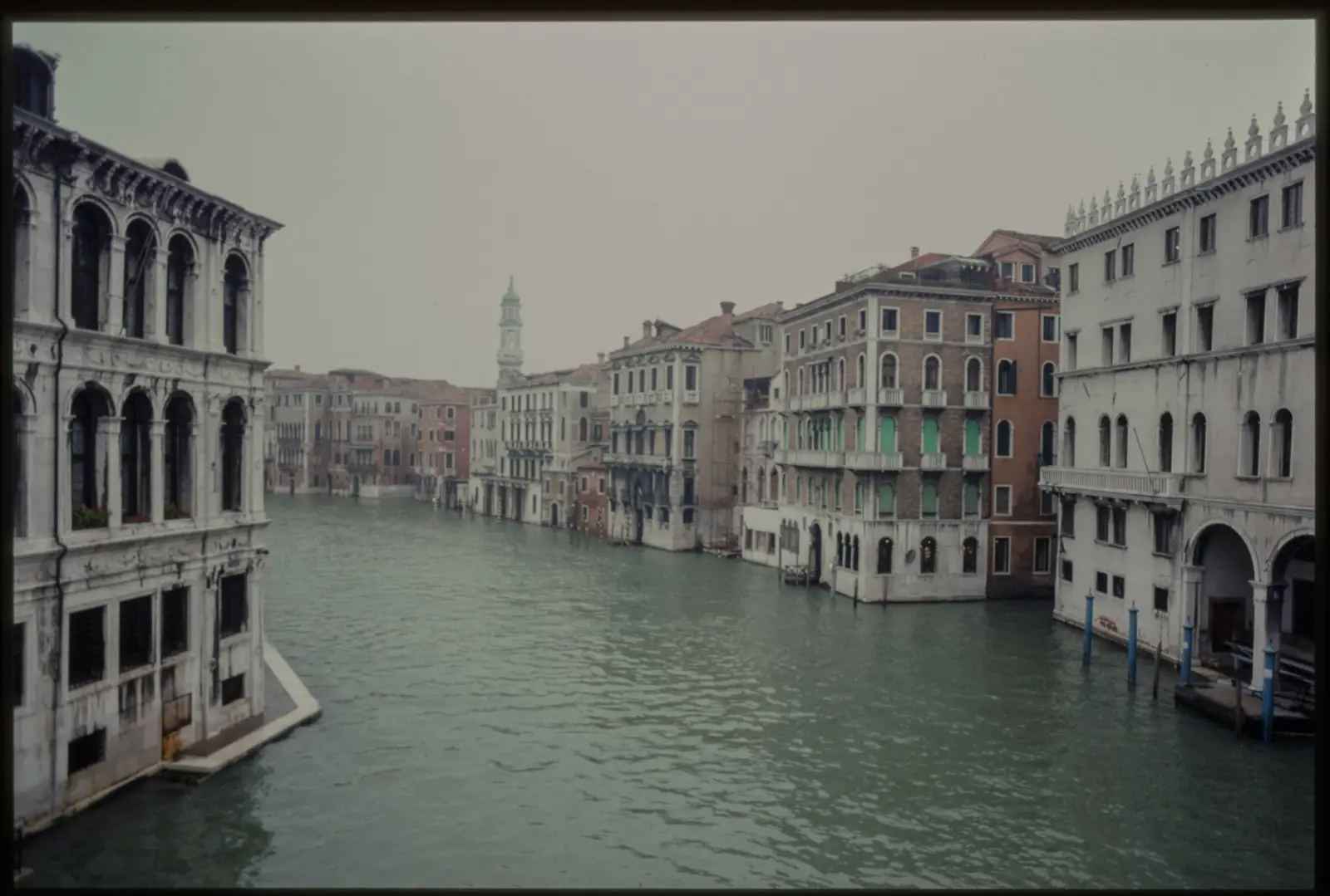
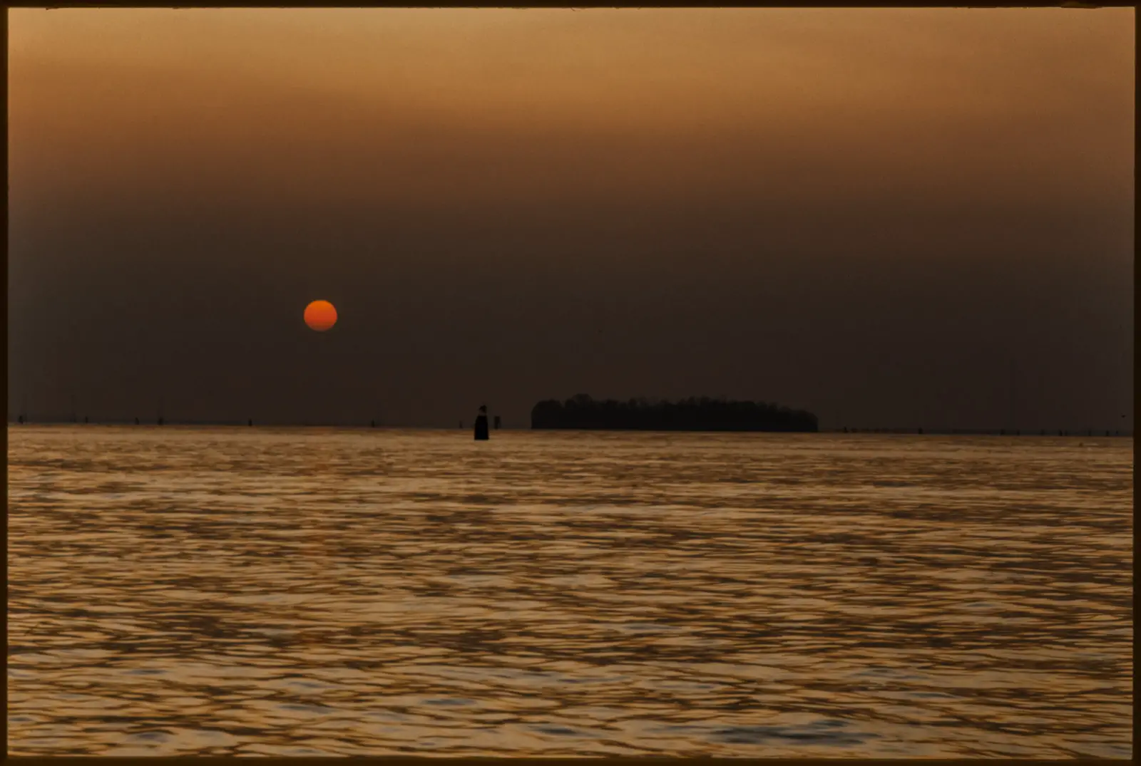
Case in point: I shot a couple of rolls of Kodachrome in Venice in the 90s and digitised them in 2012 on a lightbox on my D700. They were pretty bad  (I realise now) so I went back and re-did them. I actually started off just improving the settings I used on my D700, and that made them significantly better but I then decided I might as well go back and do the whole lot again on the X-Pro3. It was an opportunity to get them back in order after all these years and make a bit of a narrative out of them. I also wanted to be really critical with how the scans compared to the originals.

From Rialto. Kodachrome 64. I can’t remember if this was the Minox or the Nikon but I think the Minox. To me the most important colour in this shot is the water. This is how I remember it.
I walked up to San Marco every morning and after a few trips I started to really see all the different colours in the marble.
And how is this blue with the red? The red in the  Kodachrome  actually is this vivid.
Yep – this is the colour of the slide. Kodachrome 64

At the risk of becoming the kind of misty-eyed romantic I often complain about – I will say this:

There is a magic about these slides for me. I can’t separate the look and the emulsion from the times they record. Most of the shots in these boxes are crap. When I shot them I was not trying to be arty or do anything great. I was just trying to make a record. In those days there was no nostalgia about Kodachrome because it was just what photographers shot. I was not a photographer back then and I did not see photography the way I do today. But these Kodachromes do have something special about them. When I think about them a certain colour palette comes in to my brain. I actually do see a sort of lump of colour floating in my head that I can switch on and off by thinking about Kodachrome. It’s hard to describe but it’s nice to play with.

OK! If you enjoyed this article then please buy my preset pack from the link below. (JOKE – This is a joke.)

The question is though – will I try making my own colour profiles for digital? I don’t know.

There’s more I could say on what I like about this film compared with other films.  Part of the fun of writing this piece has been that it has changed the way I see the colour negative images I’ve been shooting these past couple of years, and made me think about what I might like to do with colour next.  But having come this far with the article it now seems this has inadvertently become a Part Two  to the first one I did on digitising film, and now is the time wrap it.

To be continued… (Perhaps. We’ll see)

Share this post:

Find more similar content on 35mmc

Use the tags below to search for more posts on related topics:

Contribute to 35mmc for an ad-free experience.

There are two ways to contribute to 35mmc and experience it without the adverts:

Paid Subscription – £2.99 per month and you’ll never see an advert again! (Free 3-day trial).

Subscribe here.

Content contributor – become a part of the world’s biggest film and alternative photography community blog. All our Contributors have an ad-free experience for life.

Sign up here.

About The Author

By David Hume
David Hume is an Australian visual artist and photographer, best known for work depicting the Australian landscape. He also worked as a commercial editorial photographer for over 25 years, and has held a number of photographic exhibitions. He currently exhibits both painting and photography.
View Profile

Comments

Nik Stanbridge on Kodachrome 64 – Digitising for the “Look”? – By David Hume

Comment posted: 21/12/2020

Fascinating. And lovely photos. I'll go and read part one now.
Reply

Leave a Reply

Your email address will not be published. Required fields are marked *

David Hume replied:

Comment posted: 21/12/2020

Cheers Nik!

Reply

Leave a Reply

Your email address will not be published. Required fields are marked *

Nick Clayton on Kodachrome 64 – Digitising for the “Look”? – By David Hume

Comment posted: 21/12/2020

Kodachrome has become so mythic and legendary that any foray into the topic these days can be quite perilous - the nostalgia you describe brings up some visceral emotional responses in people. It is true that, with time, the characteristics (flaws) of any medium become its most cherished (i.e. 8mm film filters on instagram). The Kodachrome blues and reds are something very special. I wonder if someday we’ll wax nostalgic about the look of iPhone photos?

The stability and permanence of slides also add to the emotional investment in this film. Nan Goldin, who worked for in Cibachrome for 40 years, said “a scan has no magic”. That’s what I believe you’re grappling with in this article.

Best,

Nick
Reply

Leave a Reply

Your email address will not be published. Required fields are marked *

David Hume replied:

Comment posted: 21/12/2020

Indeed! If we're using photography to create mood, then a collective past is part of that. And it is a tricky thing; how far to go with it? Now I've got a set of base scans to work with I'll be able to have a play, and use this experience to inform further work. All good fun.

Reply

Leave a Reply

Your email address will not be published. Required fields are marked *

jeremy north replied:

Comment posted: 21/12/2020

Kodachrome is neither a myth nor a legend. It was real, I know I used it and it was splendid.

Reply

Leave a Reply

Your email address will not be published. Required fields are marked *

David on Kodachrome 64 – Digitising for the “Look”? – By David Hume

Comment posted: 21/12/2020

What a wonderful story and very nice images. Kodachrome for me is the very top of the mountain of film colour. Such a beautiful thing we have lost.
Reply

Leave a Reply

Your email address will not be published. Required fields are marked *

David Hume replied:

Comment posted: 21/12/2020

Thanks David. It is a beautiful thing. Funny thing is, I could have shot it a lot more but I didn't. At the time it was usually too long to wait because of the send-away processing, so I shot Fujichrome for editorial work. You could get 1 hour processing on E6 then. Those shots are fine too. I'm glad I have these though, both as a record and as a standard to use to make new work.

Reply

Leave a Reply

Your email address will not be published. Required fields are marked *

Gil Aegerter on Kodachrome 64 – Digitising for the “Look”? – By David Hume

Comment posted: 21/12/2020

Thank you for this Kodachrome 64 memoir -- the shot of the child and her grandmother is just wonderful and shows the fantastic range of the film. I shot a lot of that back in the day -- I took 40 rolls on a trip to Africa back in the 80s. The only problem is you needed a lot of light!
Reply

Leave a Reply

Your email address will not be published. Required fields are marked *

David Hume replied:

Comment posted: 21/12/2020

Thanks Gill - I'm developing a bit of an idea- embryonic at this stage - that Kodachrome shot in low light is not bad; just different. Lot's of people (Steve McCurry included) concur with the "lots of light" ethos, and I think that does give us that particular - let's call it the "Nat Geo" look. But some of the low-light shots were pretty interesting; reds and blues popped. Like that one of the boat - I had to tell myself not to back it off because it was almost too much. Next thing I'm going to do is play around with E100 and low-ISO dig and much about with the colours in those.

Reply

Leave a Reply

Your email address will not be published. Required fields are marked *

Matt on Kodachrome 64 – Digitising for the “Look”? – By David Hume

Comment posted: 21/12/2020

A timely article - I've just this evening started scanning a box of my grandad's Kodachrome slides! Lots of aerial shots of Iraq in the 1950s in this box. I've been scratching my head a bit as to how to approach this particular challenge. I've never shot kodachrome, nor have I ever visited Baghdad.
Reply

Leave a Reply

Your email address will not be published. Required fields are marked *

David Hume replied:

Comment posted: 21/12/2020

Well - I'd say it it will be an enjoyable challenge! Are you using a camera and lightbox or a scanner? If it were me i'd just start with the aim of getting as much info off the slides as you can, just checking the histograms to see your'e not clipping anything, and take it from there.

Reply

Leave a Reply

Your email address will not be published. Required fields are marked *

Huss on Kodachrome 64 – Digitising for the “Look”? – By David Hume

Comment posted: 22/12/2020

Excellent article and those shots in Venice are reminiscent of the ads of the day. My favourite photo is the one of the barren stumps/trees in front of Ayres Rock.

But I have to ask. How silly was your hat? Lager louts are known to have discriminating taste.
Reply

Leave a Reply

Your email address will not be published. Required fields are marked *

David Hume replied:

Comment posted: 22/12/2020

Well Huss, I think it must be said that the lager louts did have a point. It was a red bucket hat that I bought at Sportsgirl. Hmmm. Not as bad as that statement sounds though. Actually maybe it was; I still have the hat and I still get grief.

Reply

Leave a Reply

Your email address will not be published. Required fields are marked *

jeremy north on Kodachrome 64 – Digitising for the “Look”? – By David Hume

Comment posted: 22/12/2020

Kodachrome in low light was not a problem. I shot my last couple of rolls at night using a tripod with results that were fine. One of those rolls was an aged 25asa too! Sticking my neck out, I'd suggest that the 'mystique' of Kodachrome is probably perpetrated by people who never used it, repeating what they'd read somewhere on the internet. I think your Venice pictures show how it was, no obvious colour bias, just a nice rendition.
Reply

Leave a Reply

Your email address will not be published. Required fields are marked *

David Hume replied:

Comment posted: 22/12/2020

Yes, it does seem to have acquired mythic status from people who didn't get the chance to shoot it. It's difficult to say that though without sounding a bit lofty. Summed up nicely by a tongue in cheek comment I saw about some PKR scans. "OMG - I'm nostalgic for something I never had!" And yes - some of those Venice shots are pretty low light; dawn from Rialto from memory (no boats) and dusk of the red boat across the lagoon. This was dead winter too. I have a bit of a theory, and wonder if you agree, that the McCurry, or Nat. Geo." look" that has become synonymous with PKR is how it behaved in strong light, and in subdued light the reds came out strongly against the blues. I'm going down to the coast today and will shoot some Portra 160 and some E100 in very low light and have a play with those to compare. And yes - I'm happy with how the Venice scans here represent the film, and with how that film recorded the scene. Very neutral, very true. I've gos a bunch of raw Nikon D700 files shot in Venice that I might play with. Also shot a bit of Velvia 50 there in the 90s and Portra 400 there recently. Current Portra is a great look too; just different. In fact I reckon a case could be made just to shoot Portra these days and be done with it. Such a forgiving film to digitise and tweak to taste.

Reply

Leave a Reply

Your email address will not be published. Required fields are marked *

Bill on Kodachrome 64 – Digitising for the “Look”? – By David Hume

Comment posted: 23/12/2020

My first serious introduction to film was through Kodachrome 64. In 1976 I started working as a print finisher at Meisel Photochrome in Dallas, Texas and this would be the path I would remain on till present day. I went to bed at 4:30 this morning after retouching and printing the last Christmas job for my main client. In those early days as I began to sponge up all I could about photography it became quickly apparent that Kodachrome was the go to film for any serious work. We were one of the top labs in the world and we printed and finished the work of many renowned photographers. I eventually was given full responsibility for prints 20"x30" up to murals as big as 12x16 feet. Seeing first hand prints that big produced from Kodachrome originals left a permanent impression on me. Naturally I chose Kodachrome 64 because it was a guarantee for world class images, NOT! I shot with Kodachrome until the early 1990's but was eventually lured to the negative camp because of its greater latitude and faster speeds. I do wonder about the permanence though. Anyone else remember Ektar 1000? I also shot with Ektar 25 because of the low grain. All this to say that I now shoot Portra 160 almost exclusively because after those years with Kodachrome I'm still a low grain enthusiast. I still miss the moment of opening that yellow box to see those glorious colors and experience that rush as I placed the slides on a light table.
Reply

Leave a Reply

Your email address will not be published. Required fields are marked *

David Hume replied:

Comment posted: 23/12/2020

It's great to hear of your experiences Bill. My head tells me "just shoot Portra!" but I'm still dabbling a bit with transparency. I really like Portra 400 in 120, and have shot a lot in 135 but find it a tad grainy for my taste. I'm just about to shoot a few rolls of the 160 next in 135 so we'll see how that goes.

Reply

Leave a Reply

Your email address will not be published. Required fields are marked *

Bill replied:

Comment posted: 23/12/2020

I find shooting with a slower film impacts how I see what I want to photograph. I don't consider it a hindrance as such, just thinking more about the type of shot that works within its parameters. For me personally I can't justify the trade-off of more grain in the 400 just to be able to photograph a few times in lower light situations. The one caveat is medium format as you mentioned. The increased grain seems much less detrimental in the larger surface area of 120 film but the bulk of my shooting is 135. I always have my tripod at the ready and enjoy longer exposure scenes as they allow me to get on film what I can't see with my natural eye. Some of my favorite Kodachromes are long exposure cityscapes. The light just seems to burst from the glass buildings. Best to you in your scanning and 160 adventure and thanks for writing about the beloved Kodachrome.

Reply

Leave a Reply

Your email address will not be published. Required fields are marked *

Ken Burg on Kodachrome 64 – Digitising for the “Look”? – By David Hume

Comment posted: 10/01/2021

Great photos - and a great attempt to digitize them as accurately as possible. You're right that films all have different color "signatures" but so do camera sensors. Kodachrome is a warm film yet most of your digital copies (not including the Photo CD) are very cool. I almost exclusively shot Kodachrome starting with Kodachrome II which became Kodachrome 25 before switching to Kodachrome 64. 25 was more neutral while 64 was warmer. I actually sold my Nikon D3 shortly after getting a D700 because the D700 had the same sensor in a smaller body. The image quality is amazing but I think you're complicating the process by adding the sensor colorations with the film colorations. I've recently been scanning my old chromes with a Nikon 5000 film scanner and VueScan software. Perfect! The only problem is, like B&W, you can't use the dust removal because of the way Kodachrome is made. Perhaps see if you can try this combo?
Reply

Leave a Reply

Your email address will not be published. Required fields are marked *

David Hume replied:

Comment posted: 10/01/2021

Cheers Ken. Thanks for your input! Yeah, I remember when I first digitized anything when I had the D700 I thought wow I can see these on a screen! And that was about as far as it went. Only later did I get more critical of my results. I did have access to a Nikon Coolscan 5000 at one point. The results were brilliant but I think from memory that the drivers don’t work with anything more modern than Windows XP? Might be time to look into that again. Cheers.

Reply

Leave a Reply

Your email address will not be published. Required fields are marked *

David Sommer on Kodachrome 64 – Digitising for the “Look”? – By David Hume

Comment posted: 14/02/2023

Hi David,

Your article said things I think and feel better than I could say it. Thank you. I have started the same journey of digitizing Kodachrome, about 2000 to 3000, plus some other kinds, most of which have not aged as well as Kodachrome. At the time I was using Kodachrome I thought I was making great photography; looking at them now I see I was making snap shots to trigger my memory. The memories are good and very worth having.

It took me awhile to understand that my real goal is to transfer as much information in the slide to digital as possible, editing can happen later. So I concentrated and being sure I know the best aperture, the best exposure, and the best focus. I can be tedious, and sometimes I take time to work through something so I really understand it, even though others have already worked it out, that is what I have done. I thought I was doing well in the beginning but see I am doing much better now, and expect to keep getting better.

The earliest slide I have digitized yet is from late 1950s or very early 1960s. It was shot on my first “good camera”, an Argus C3 with adjustable aperture, shutter speed, and focus that I bought used for about $15. The film was Ektachrome that I processed myself at home and it has held up very well, much better than many other Ektachromes. The shot is of my dad relaxed in a very tranquil setting, something he seldom had a chance to do. It is priceless to me and justifies all the effort.

While transferring the information to digital is the goal, seeing pleasing results is also good. And through a loupe on a 99CRI light table I can tell the colors are not right and I have spent far too long trying to get them right. I have heard from two experts, they are in the business of digitizing major museums and use very expensive cameras; they both said to get an IT8 chart shot on Kodachrome and it will improve the color very noticeably. At $800 for the slide, if I can find it, I not inclined to do it. I keep hoping to find a generic ICC camera profile from an IT8 Kodachrome. I feel sure I could modify it with my specific camera profile.

So thank you for your article. In the sea of content disguised as information on the internet, your article was a refreshing one.

Dave
Reply

Leave a Reply

Your email address will not be published. Required fields are marked *

David Hume replied:

Comment posted: 14/02/2023

Thanks for your kind words David; it is gratifying to hear that my thoughts were useful. And I agree with your assessment of what you have done... I think now that while my results could be better, I at least have taken a good deal of information from the originals, and if I have the desire or acquire some new insights I can tweak the results further at some point. With best regards, David.

Reply

Leave a Reply

Your email address will not be published. Required fields are marked *

Leave a Comment

Leave a Reply

Your email address will not be published. Required fields are marked *