In Part 1 of this three-part series, I used histograms of famous photographs to introduce some fundamental ideas about contrast and tonality. In this part I’ll talk about software curves, and what contrast means in the context of photography. The next and final part will be about characteristic curves for film and paper. The idea is that these three parts, taken together, will introduce and explore some key concepts, which I can refer back to in my future posts on darkroom printing. And of course, hopefully also serve as a good explanation of contrast and tonality in general.
My darkroom technique posts are all about black-and-white film photography, but this post, like Part 1, is also relevant for those who favour colour film, or even digital only. The first section of this post is about Curves, which is in fact a digital tool, generally used for editing digital images (I’ll shortly explain why it’s also relevant to film). The second section is about what contrast really means – or rather, the many meanings it can have. And whether we shoot on film or digital, black-and white or colour, contrast is something we are all concerned with.
Software curves
It may seem odd, using a software tool (Curves) to introduce posts about darkroom printing – that most analogue of processes. But I chose to do this for three reasons. First, the basic theory is surprisingly similar. I’ve found that an understanding of digital concepts is also helpful for my analogue workflow, and vice versa. Second, if you’ve used software like Photoshop (or GIMP, which is free and open source), you may be more familiar with the Curves tool than with characteristic curves for film and paper (which is the subject of my next post). At least, that was my situation three years ago when I first got into developing and printing. Third, playing with the Curves tool in software – even if you’re not yet familiar with it – is quick, easy and free, and therefore a great way to internalise the fundamentals of tonality and contrast. You can drag the curve this way and that, and see in real time what effect it has on your image. Doing this with film and paper can be time-consuming and expensive.
The Curves dialog
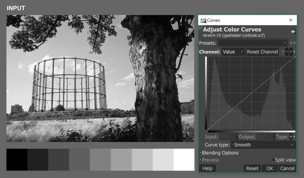
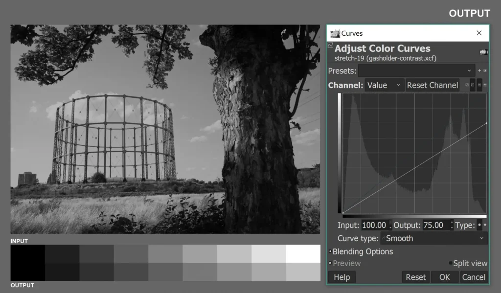
The image I’m using for my demo is a scanned and inverted copy of a 35mm film negative, chosen because it has a full tonal range from black to white, with detail in both shadows and highlights. I opened the image in GIMP as shown below, and brought up the Curves tool (Colors>Curves in GIMP; Image>Adjustments>Curves in Photoshop).
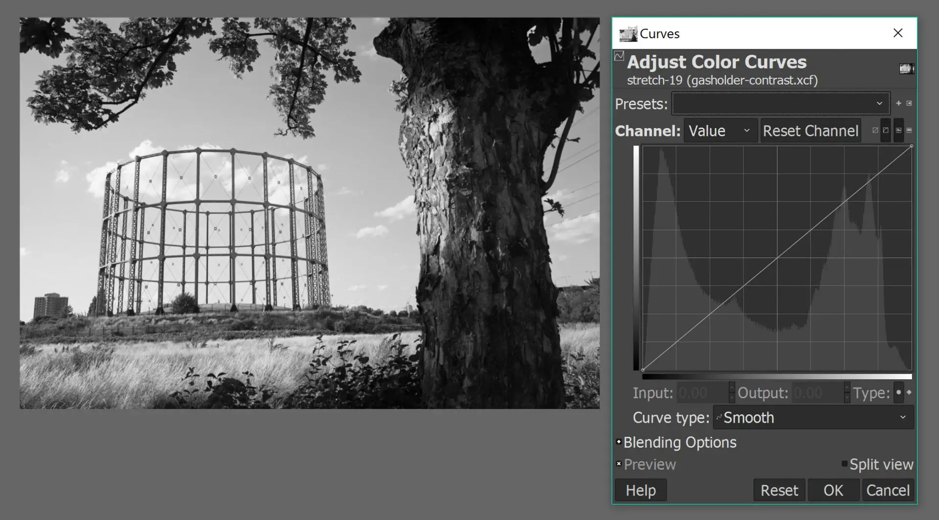
The Curves dialog (above right) shows a straight line, sloping up from left to right. You can click anywhere on the line to create a “control point”, and drag it around to change the shape of the curve, which in turn changes the tonal properties of the image. You can also click and drag the two existing control points at either end of the curve (black: bottom-left; white: top-right).
You can simply play around with the curve at random and get a sense of what it does. But it’s helpful to understand a bit of the theory behind it.
The horizontal axis represents the input image (the original), and the vertical axis represents the output image (the edited version). Both axes have a range of grey tones from pure black to pure white, as shown on the bars below and to the left of the graph. The shape of the curve – which you control – defines the relationship between the tones in the input and output images. How so?
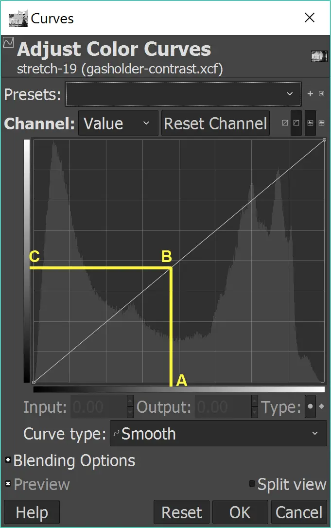
Take any point on the input axis (say A, a sort of middle grey). Find the corresponding point on the curve (B), and then the corresponding point on the output axis (C). Anywhere in the image, an input-image pixel with a brightness of A is converted to an output-image pixel with a brightness of C.
The default curve, shown above, is a straight line connecting the bottom-left and top-right corners. A and C are identical – and this is true at all points on the default curve, including at bottom-left (pure black) and at top-right (pure white). So if we stick to the default curve, the input and output images are also identical.
But why stick to the default. Let’s play.
Linear adjustments
In the first four edits, I’ll move only one point on the curve, and I’ll keep the line straight (hence “linear”).
Clipping
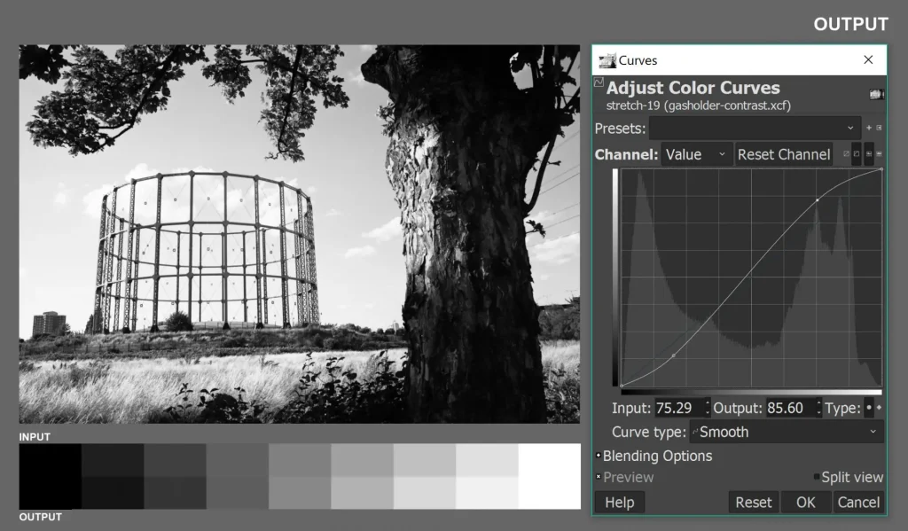
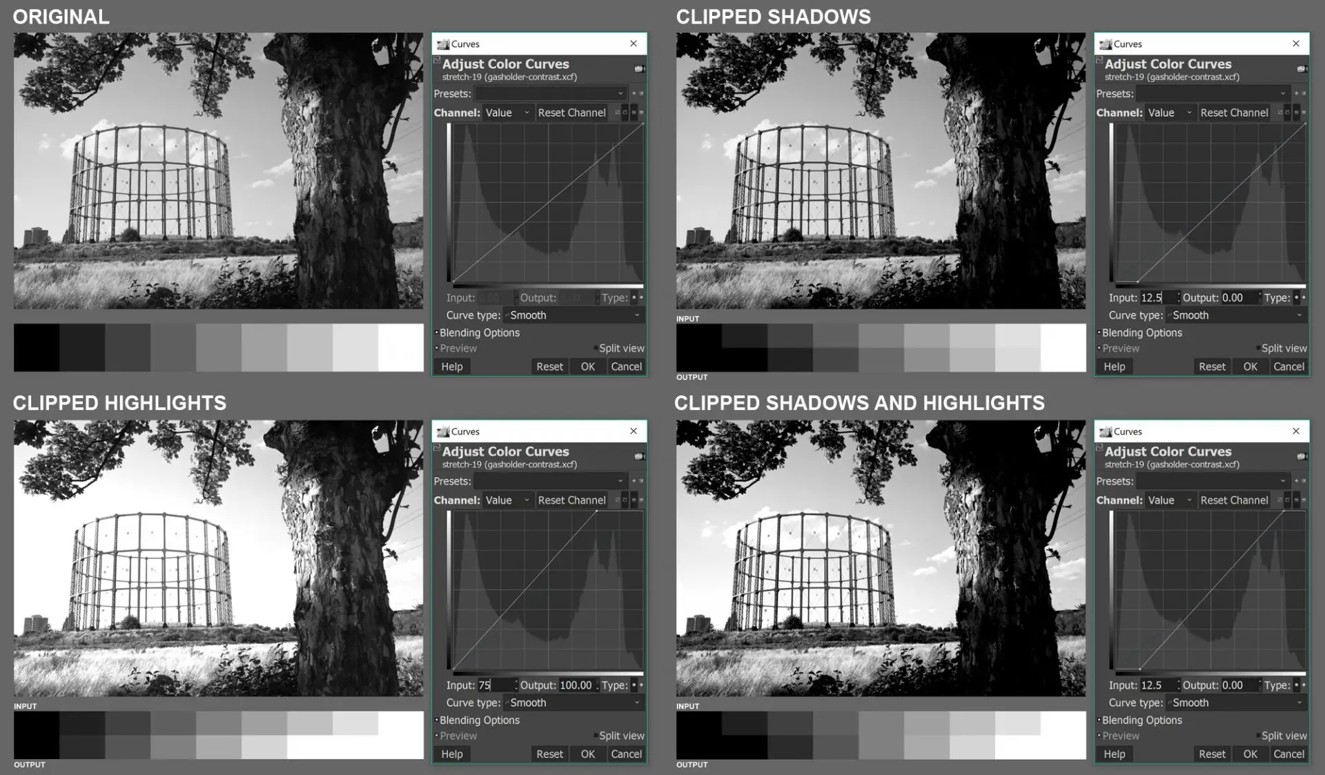
In the edit below, I dragged the black point (bottom-left, marked B) to the right.
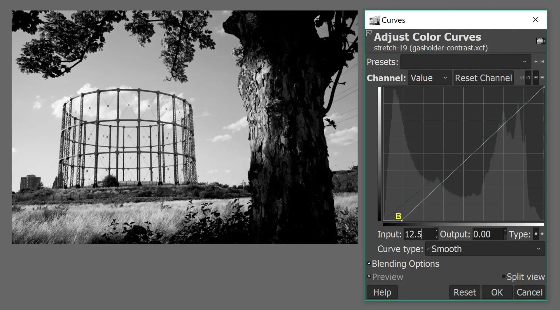
The original location of the black control point was at the bottom-left corner, which corresponds to pure black on both the horizontal input axis and the vertical output axis. The new location, B, is dark grey on the input axis and pure black on the output axis. So all pixels in the input image which have a brightness between pure black and B are now rendered, in the output image, as pure black.
The white control point (top-right) has not been moved, so the pure white pixels are unchanged. All other points of the curve have been dragged down (relative to the default curve), which means all other pixels have been darkened.
Below is a comparison between the input image (left) and output image (right):
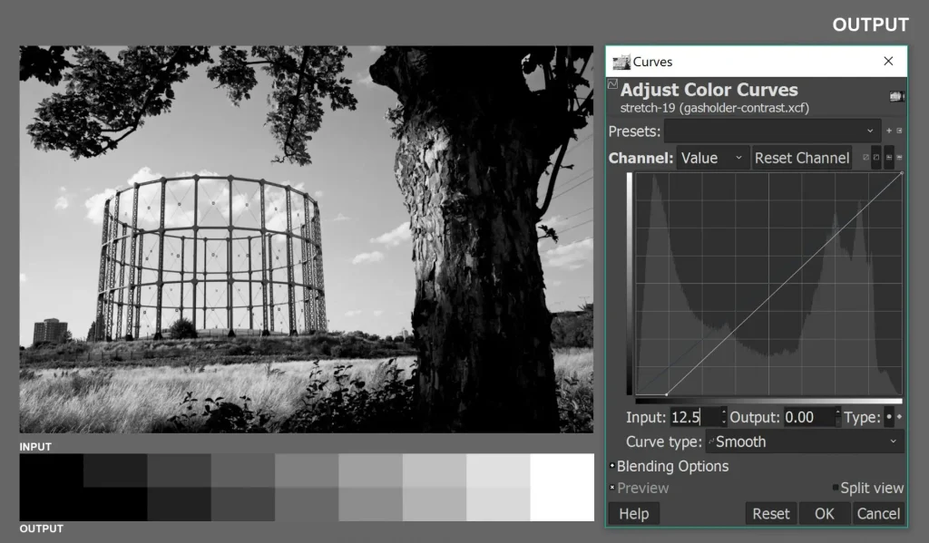
I added a strip below the image, which is another (possibly easier) way to see how the tones are changing. The first two bands in the input image (pure black and dark grey) are both converted to pure black in the output image. All other bands are darkened – except pure white, which is unchanged.
In the photograph itself, the effect is most obvious in the lower part of the tree-trunk; the edit has much less shadow detail. To use a term introduced in my previous post, the shadows have been clipped.
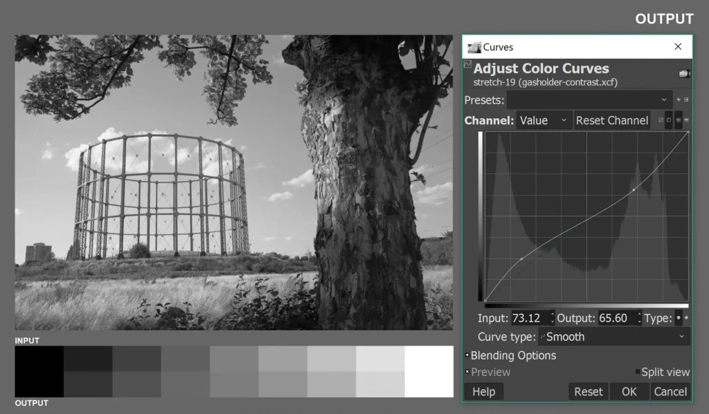
In the next edit, I dragged the white control point (top-right) to the left:
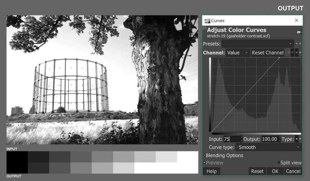
This time, I didn’t move the black control point (bottom-left), so the pure black pixels are unchanged. All other points of the curve have been dragged up (relative to the default curve), so all other pixels have been lightened. The lightest tones in the input image (to the right of the new point) are all converted to pure white.
In the strip, the last three bands in the input image are all converted to pure white in the output image. All other bands are lightened – except pure black, which is unchanged. In the photograph, the effect is most obvious in the sky; due the clipping of highlight detail, the clouds are basically invisible in the edit.
Dipping
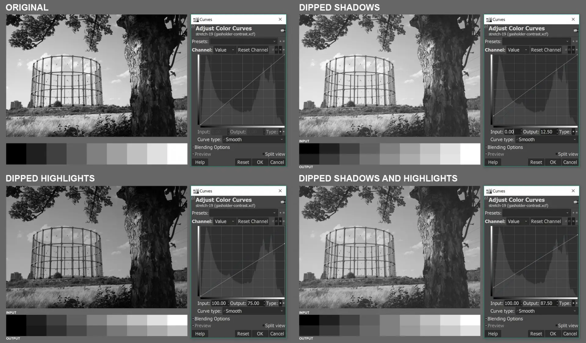
I think you get the idea by now, so I won’t describe the next two edits in detail. In the first, I dragged the black control point upwards. Pure blacks are converted to dark grey, all other pixels are lightened, but pure whites are unchanged. The output image has no pure black. To use a term introduced in my previous post, the shadows are dipped.
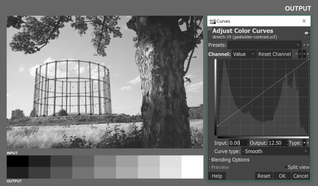
In the next, I dragged the white control point downwards. Pure blacks remain unchanged, all other pixels are darkened, and pure whites are converted to light grey. The output image has no pure white; the highlights are dipped.
In the examples above, I moved just one point at a time. But you can also clip both shadows and highlights (drag the black point to the right and the white point to the left), or dip both shadows and highlights (drag the black point up and the white point down). You can see these two edits in a later section which is about defining contrast.
S-curve and inverted S-curve
The next two edits are different in two ways: (a) I’ll move not one but two points at a time, and (b) I’ll create a curve rather than a straight line.
There are two classic curve adjustments: the S-curve and the inverted S-curve (architects call them cyma recta and cyma reversa). Typically, the S-curve and the inverted S-curve leave the black and white control points unchanged (so the histogram is neither clipped nor dipped) but they do change the tones in between.
The S-curve drags down the shadows and lifts up the highlights:
In the strip, pure black stays the same, the next three bands are darkened, the four bands after that are lightened, and pure white stays the same.
The inverted S-curve lifts up the shadows and drags down the highlights:
In the strip, pure black stays the same, the next three bands are lightened, the four bands after that are darkened, and pure white stays the same.
Defining contrast
Notice that so far in this post (except in the introduction), I haven’t used the word “contrast” at all. Contrast seems straightforward. Surely we can all look at two versions of a photo and say which one has more contrast? But it’s a surprisingly slippery term, and depending on the context, it can mean different things. And contrast is so crucial to darkroom printing – to photography in general – that it’s good to be precise, and to ensure that we’re all on the same page. That’s what I’ll try to do in this section.
Contrast is relative
Contrast is essentially a relative term. This is most obvious when we’re comparing more than one version of the same image.
But even when we talk about contrast in seemingly objective or absolute terms – for example, when we say a single image (or real-life scene) has high or low contrast – we are implicitly comparing it to some subjective benchmark: an image we have in our heads of what a “normal contrast” image (or real-life scene) looks like.
Technical definitions of contrast are also relative, but being technical, they are defined with respect to an objective benchmark. For example, an outdoor scene is said to have normal contrast when the brightest zones are around 7 stops brighter than the darkest zones. A negative is said to have normal contrast – I’ll go into this in more detail in my next post – when it has an average gradient of around 0.57. And so forth.
Change-based definition
For purposes of darkroom printing, I am less concerned with absolute definitions; more with changes in contrast. So here’s a working definition based on contrast changes.
Contrast is increased when:
- Shadows are darkened, no change to highlights; or
- Highlights are lightened, no change to shadows; or
- Shadows are darkened and highlights are lightened.
The graphic below shows the original image, plus the three changes I just mentioned (two of which – clipped shadows and clipped highlights – you’ve already seen in the earlier section on Linear adjustments).
Contrast is decreased when:
- Shadows are lightened, no change to highlights; or
- Highlights are darkened, no change to shadows; or
- Shadows are lightened and highlights are darkened.
The graphic below shows the original image, plus the three changes I just mentioned (two of which – dipped shadows and dipped highlights – you’ve already seen in the earlier section on Linear adjustments).
Slope-based definition
My second working definition of contrast is based on slope, that is, the steepness of the curve. It’s short and sweet: Steep curve: high contrast. Flat curve: low contrast.
Look again at the two graphics above. Note how in the three scenarios where contrast is increased (first graphic), we have a curve which is steeper than the default curve. And in the three scenarios where contrast is decreased (second graphic), we have a curve which is flatter than the default curve. In short, a steeper curve increases contrast, and a flatter curve decreases contrast. This is true for software curves, and also for characteristic curves for film and paper (which I’ll cover in the next post).
Armed with not one but two working definitions of contrast, let’s now explore some nuances.
Contrast vs separation
In the two graphics above, the adjustments are all linear, i.e. the new curve is a straight line. Compared to the default curve, the new curves are steeper (in the first) and flatter (in the second) throughout the range. Things get more interesting with the S-curve and inverted S-curve.
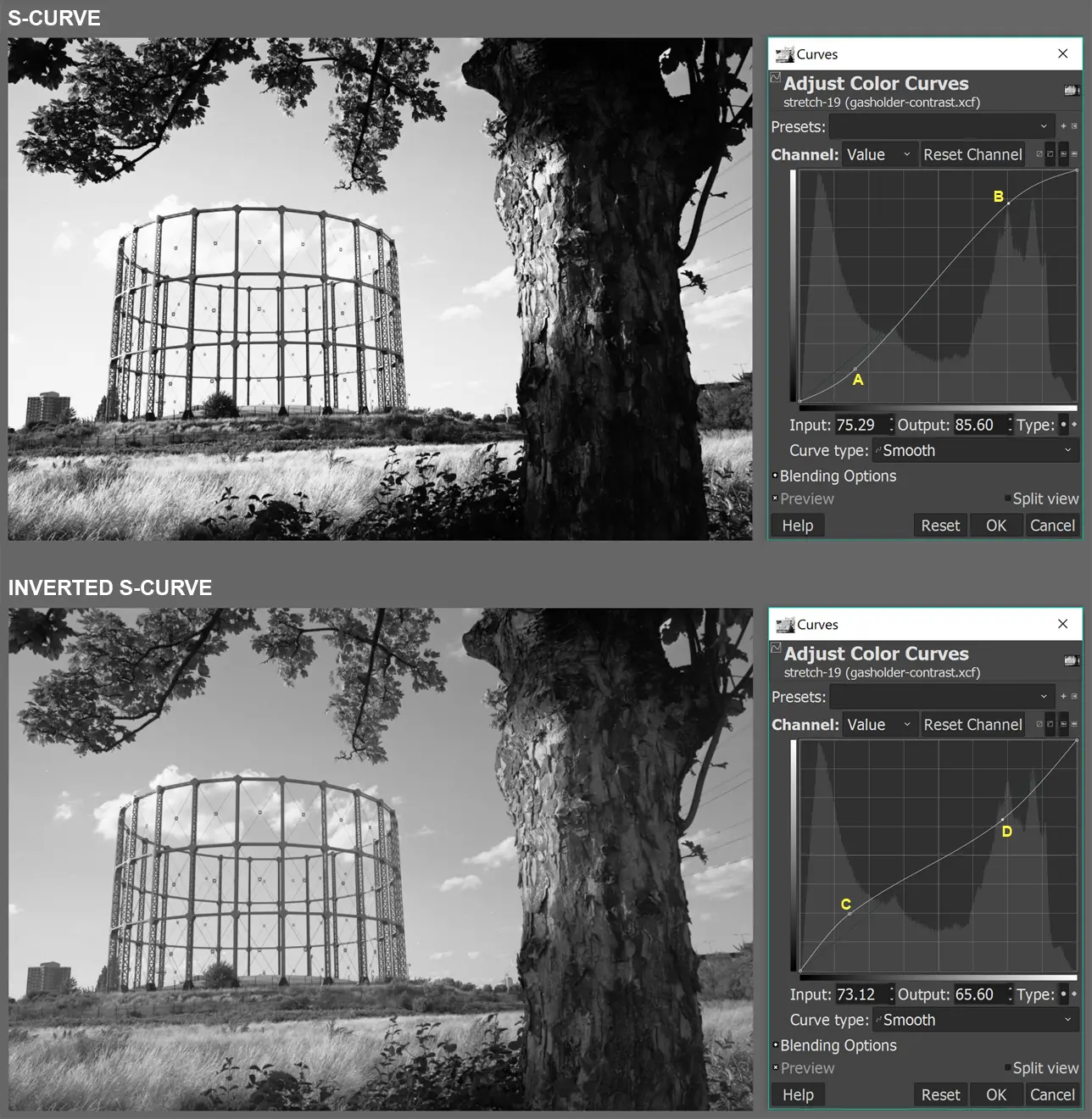
Let’s first look at the S-curve (top). As you move from left to right (dark to light) on the horizontal (input) axis, the S-curve is:
- Flatter than the default curve in the shadow region (up to point A);
- Steeper in the midtone region (A to B);
- Again flatter in the highlight region (after B).
So although the S-curve creates an overall impression of increased contrast, what it really does is to:
- Decrease contrast in the shadows and highlights (recall from the slope-based definition that a flatter curve means less contrast); and
- Increase contrast in the midtones (steeper curve means more contrast).
The inverted S-curve, on the other hand, is:
- Steeper than the default curve in the shadow region (up to point C);
- Flatter in the midtone region (C to D);
- Again steeper in the highlight region (after D).
So although the S-curve creates an overall impression of decreased contrast, what it really does is to:
- Increase contrast in the shadows and highlights; and
- Decrease contrast in the midtones.
Contrast in a specific section of the tonal range (e.g. shadows, midtones or highlights) is often referred to as separation. This may not always correspond to overall contrast. For example, the first image above (S-curve) has more overall contrast, but less separation in the shadows and highlights. The second (inverted S-curve) has less overall contrast, but more separation in the shadows and highlights.
Global and local contrast
The point about separation is clearer if you look at specific parts of the image, rather than the image as a whole. The main image below shows the original photo before curve adjustments. I selected a highlight area and a shadow area (marked by red squares), magnified them and applied an S-curve and inverted S-curve.
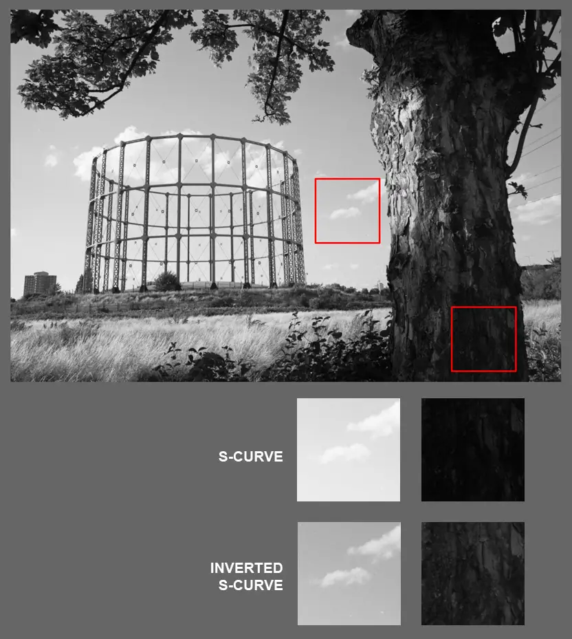
The inverted S-curve clearly has more contrast (separation) in the highlights and shadows even though, as we saw in the previous graphic, it has less overall contrast.
Contrast of a specific part of the image (like the squares above) is often referred to as local contrast, as opposed to overall contrast of the whole image, which is called global contrast.
Often, as in the example above, looking at local contrast helps emphasise separation (or lack thereof). But the concepts are not quite the same. Local contrast is about looking at a specific part of the image. Those parts may have shadows, midtones, highlights, or any combination thereof. Separation, on the other hand, focuses on a specific part of the tonal range (shadows, midtones or highlights, which are often spread out throughout the image).
Contrast of what?
So far I’ve mainly been talking about contrast in different digital edits of the same image. But in more general discussions, it’s good to be clear about the type of contrast in question. In my darkroom printing posts, I will talk about five main types of contrast.
Subject contrast
Objects may:
- Emit light (a lot, like the sun, or only a little, like a candle); or
- Transmit light (most of it, like a transparent windowpane, or only some, like a lampshade); or
- Reflect light (most of it, like a white wall, or only a little, like a black coat).
For objects which reflect light, their brightness depends on two factors: how much light is falling on them (incident light, which is an external factor), and how much of it they reflect (reflectance, which is a property of the object itself). Real-life scenes often have uneven incident light, or objects with varying degrees of reflectance. Frequently, they have both.
Due to variations in incident light and reflectance, most scenes have a range of brightness values. (Technically, “luminance” is the objective measure, while “brightness” refers to our subjective impression of it. But I’ll just use the more common term “brightness”, so as not to sound like a nerd.) Subject contrast – technically luminance range – is the range of brightness values in the scene being photographed.
Subject contrast is usually measured in stops. For example, a contrast range of 7 stops means that the brightest zone of the image reflects or emits 7 stops (or 128 times) more light than the darkest zone.
Film contrast
Film has its own contrast characteristics which depend on two main factors: the emulsion itself, and how it was processed (there are other factors, such as how old it is and how it was stored). Accordingly, the same scene may produce a more contrasty or less contrasty image.

Contrast, in the context of film, refers to the difference in density between the shadow and highlight areas. On negative film, shadow areas have low density (almost transparent) while highlight areas have high density (almost opaque). Positive (slide) film is the opposite.
Negative contrast
In my darkroom printing posts, I will sometimes talk about the contrast of a particular negative. This is a function of both subject contrast and film contrast (there may be other factors too, such as lens flare, or the use of filters). A low-contrast subject can produce a high-contrast negative, and vice versa.
Print contrast
For my darkroom work I use multigrade paper (fixed grade papers are also available, but I don’t use them). On multigrade paper, we can use enlarger filters to change the contrast. So the same negative may produce a low, medium or high-contrast print.

Contrast, in the context of paper, refers to the difference in density between the shadow and highlight areas. Shadow areas have high density while highlight areas have low density (the opposite of negative film).
Of course, print contrast depends not just on enlarger filtration, but also on the contrast of the negative itself. There are other factors too, such as the brand of paper, its age (expired paper typically has lower contrast), how the paper is processed (developer, temperature and developing time), and whether the print is tinted or toned. But I generally use the same brand of paper (Ilford MG RC Pearl – fresh, not expired), process it identically (developed to completion in Fomatol P), and I don’t tint or tone. So these factors are not relevant for me. And that, for now, is all I have to say about the different meanings of contrast!
Conclusion
In the first section of this post I talked about about software curves. I explained what the Curve tool does, and demonstrated the effect of some typical adjustments – linear adjustments which clip and dip shadows and highlights; plus S-curve and inverted S-curve adjustments which increase and decrease contrast while leaving the black and white points unchanged.
The second section was a deep-dive into the idea of contrast. I gave two working definitions of contrast. I also distinguished between contrast and separation, global and local contrast, and finally, subject, film, negative and print contrast. Hopefully, you now have a solid grasp (if you didn’t already) of what contrast really means – or rather, the many meanings it can have.
See you soon for the next part of this series, where I’ll talk about characteristic curves of film and paper. For more nerdy content, feel free to check out my Instagram.
Share this post:


Comments
Paul Brant on Contrast and Tonality Part 2: The Curves Tool, and What We Talk About When We Talk About Contrast – By Sroyon
Comment posted: 25/10/2021
Great articles
Comment posted: 25/10/2021
Rich on Contrast and Tonality Part 2: The Curves Tool, and What We Talk About When We Talk About Contrast – By Sroyon
Comment posted: 26/10/2021
--Rich
Comment posted: 26/10/2021
Pete on Contrast and Tonality Part 2: The Curves Tool, and What We Talk About When We Talk About Contrast – By Sroyon
Comment posted: 26/10/2021
Comment posted: 26/10/2021
Khaled_IM on Contrast and Tonality Part 2: The Curves Tool, and What We Talk About When We Talk About Contrast – By Sroyon
Comment posted: 26/10/2021
Comment posted: 26/10/2021
George on Contrast and Tonality Part 2: The Curves Tool, and What We Talk About When We Talk About Contrast – By Sroyon
Comment posted: 26/10/2021
But, what about one of those Adox CSM II negatives developed with a regular developer.
Comment posted: 26/10/2021
Comment posted: 26/10/2021
Comment posted: 26/10/2021