Let’s face it, “analysing” photos with histograms can only take us so far. A hundred years later, people may or may not look at your photographs and gasp in admiration. But if they do, they almost certainly won’t say, “Wow, they had beautiful histograms.” Nevertheless, here we are.
Introduction
Objectives
The real reason for this post is because I’m thinking of reviving my Darkroom Printing series, incorporating what I learned in the year-and-a-half since I started the series (which in turn was a year-and-a-half after I set up a home darkroom). And in my draft posts I found myself saying things like “The negative has high global contrast but low local contrast,” or “I wanted a print with more separation in the shadows.” But then I wonder if that would just confuse or alienate some readers. So I thought I’d write an intro where I expand a bit on contrast and tonality generally, and flesh out some concepts which I can refer to in my darkroom printing posts. Soon enough that “intro” had grown into a full-fledged post, and then a three-part series. C’est la vie.
But a nice bonus: unlike the rest of the series, these introductory posts – especially the first two parts – are potentially interesting also for people who are not into darkroom printing, or who shoot mainly in colour. Because whether or not we print our own photos, and whether we shoot in black-and white or colour, tonality is something we are all concerned with. In fact, in parts 1 and 2, I’ll talk about tonality mainly using digital concepts and tools, namely histograms and curves. So they may even be useful for those who shoot mainly on digital.
In this post (Part 1), I’ll talk about contrast and tonality using histograms, with some famous photographs as examples. I was going to use my own photos, but then I thought using famous photographs would be more fun – and of course, they are much better than mine.
In Part 2, I’ll talk about software curves, and what contrast means in the context of photography. Part 3 will be about characteristic curves for film and paper.
Copyright and software
A note on use of images. I’m using these images for purposes of criticism and review, which is a copyright exception. But to be doubly sure, I’ll only share small, low-res versions (only 610px wide). Where possible, I’ve linked to higher-res versions for your viewing pleasure. In all cases, copyright remains with the photographer or agency, as applicable.
For many of these photographs, there are multiple versions floating around the web. And sometimes artists themselves interpret the same photograph in very different ways. So the versions I’ve shared here, and their tonal characteristics, are representative, not definitive.
To analyse the images in this post, I have just used the Levels tool. This is available on Photoshop, Lightroom and many other image-editing software. I often use GIMP, which is free and open-source. The Levels tool (Colors>Levels in GIMP; Image>Adjustments>Levels in Photoshop) lets you see the histogram for any digital image (including digital copies of film photos).
It may seem odd, using digital concepts to introduce posts about darkroom printing – that most analogue of processes. But I learned to use Photoshop long before I discovered the darkroom, so I sometimes tend to think (and talk) about negatives and prints in digital terms. Besides, I think a good grasp of digital concepts can help us in the darkroom, and vice versa. They are not that different after all. Stay with me.
The histogram
What it is
Most readers of this site are probably familiar with what histograms look like, but just in case, here’s an example – a woodblock print, not a photograph, but the idea is the same:
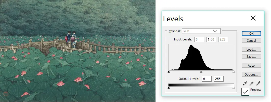
The histogram, shown on the right, is simply a graph of the tonal values in the image. The left side of the histogram corresponds to dark tones (shadows), the middle part is for midtones, and the right side is for light tones (highlights). The height of the histogram represents the number of pixels throughout the tonal scale.
Too much information? Let’s look at a few simpler examples: graphics rather than photographs. Here’s the histogram for a checkerboard graphic:
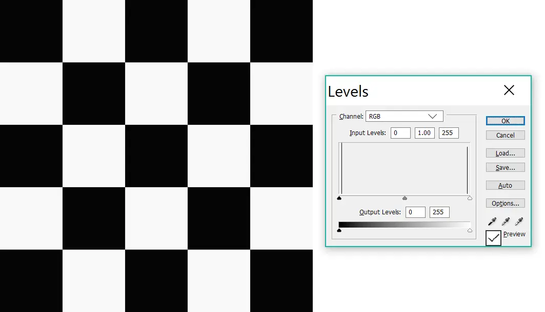
Note the two spikes, corresponding to the black and white squares. In fact, the black squares aren’t pure black, and the white squares aren’t pure white; that’s why the spikes are near the edges, not at the extreme edges (I made it this way so that the spikes are easier to see). There are no other tones in the image, which is why the histogram has just these two spikes, and nothing else. Also, see how the black spike is higher than the white spike? That’s because the 5×5 grid has 13 black squares and 12 white squares, so the image has more black pixels than white.
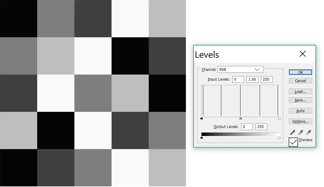
Now let’s add a few more shades. The next graphic has five tones, five squares each. Lo and behold, the histogram now has five equal spikes:
And finally – last graphic I promise; then we move to photographs – a continuous gradient covering the full range of tones from black to white.
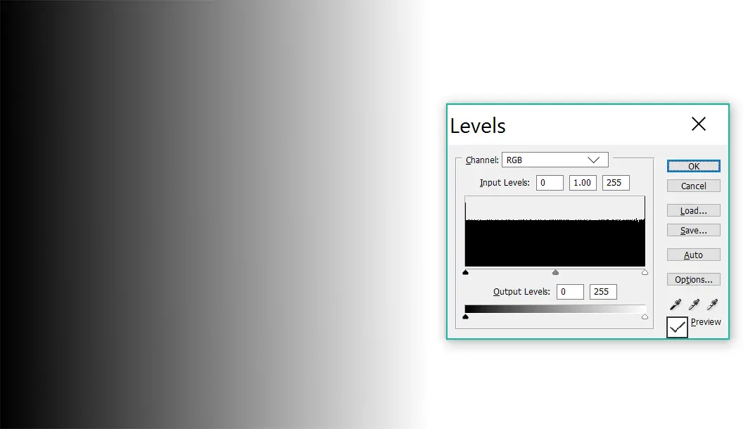
Now the histogram no longer shows isolated spikes. All tones are represented, so the histogram – like the gradient itself – is continuous.
I used a black-and white graphic for simplicity, but colour works the same way. Except there are three separate histograms for the red, blue and green channels. I’ll use some colour examples in this post too, but I’ll limit myself to the combined RGB channel.
No such thing as a perfect histogram
Some photography tutorials talk of “perfect histograms”. Here’s an example at random: “Photographers normally aim for a reasonably balanced histogram with the traditional bell-shaped curve“. To be fair they did say “normally”, but I think even that is a stretch. To me, aiming for a certain histogram shape is to put the cart before the horse, like saying a great novel should have 17 words per sentence (Hemingway begs to differ).
To state the obvious: a bad photo may have a “perfect histogram”, and a great photo may have a histogram which is all over the place. I said I would use famous photographs and not my own, but I’ll make an exception. Here’s a photo I took while camping in Norway:
In focus, sharp, well-exposed, with a perfect bell-shaped histogram. And boring as all get-out.
Clipped histograms
All a histogram does is show us the distribution of tonal values in an image. Nothing more, nothing less. By learning to “read” the histogram, we can interpret that information. For example, if a histogram is “clipped” to the left (or right), it means there are areas of pure black (or white), which in turn often indicates loss of shadow detail (or highlight detail). But here’s the thing: what we do with that information is up to us. I think there’s little point in following arbitrary rules.
Here’s a book (again, random example; nothing personal) which says “there is no such thing as a perfect histogram” (which I agree with) but then in the very next sentence, “a good exposure will never be clipped or too close to the black or white limits”. As an expression of personal taste, that may be defensible (just about). But as a rule…? A good exposure, to my way of thinking, is simply an exposure which produces the desired visual and emotional effect. If that means clipping, so be it.
“Nice composition, Ansel, but your shadows are clipped” …said no one ever.
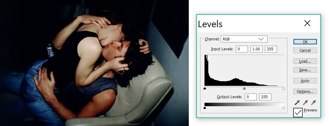
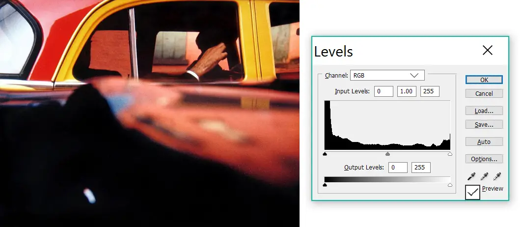
Now here’s an example in colour – from Nan Goldin, serial rule-breaker.
On the other hand, Rinko Kawauchi has a high-key style, often clipping the highlights:
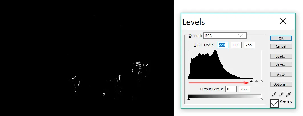
Okay, but these photographers all clipped either shadows or highlights. Surely, clipping both would be too much? “Hold my beer,” says Bill Brandt:
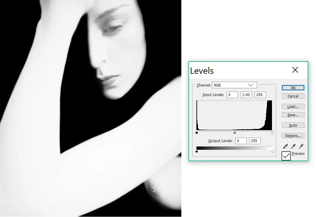
And to round off this section, a less extreme example from Saul Leiter. Clipped shadows galore: large parts of the image are pure black with no detail whatsoever. But notice the highlights are clipped too – in the reflection at top left.
Of course, I picked examples to support my points. But it’s not hard to find famous photographs which sacrifice shadow detail or highlight detail, sometimes both.
It’s also worth distinguishing between the histogram of the original image (e.g. the RAW file or film negative) and of the form in which it is shared with the world (e.g. a hard-copy print or processed JPEG). Here’s my two cents. If you don’t want areas of pure black or pure white in your photo, avoid clipping the histogram by accordingly exposing (in camera), developing (in case of film), editing (in software) or printing. Shadows and highlights can be clipped in post, both with software and when printing in the darkroom. But if they’re clipped in camera or during developing, they generally can’t be recovered. However, that doesn’t mean you shouldn’t do it. If clipping matches your intent, go forth and clip. The histogram police are not coming for you.
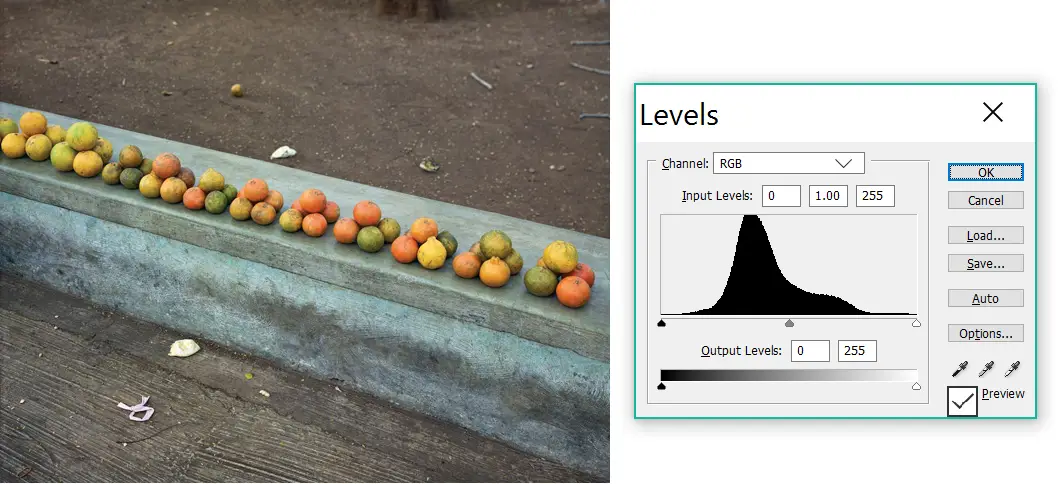
Narrow, wide and skewed histograms
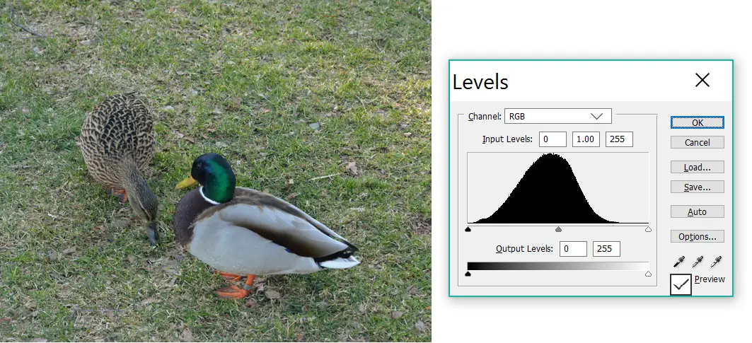
The shape of the histogram also provides clues as to whether an image is (a) low-contrast or high-contrast, and (b) low-key or high-key.
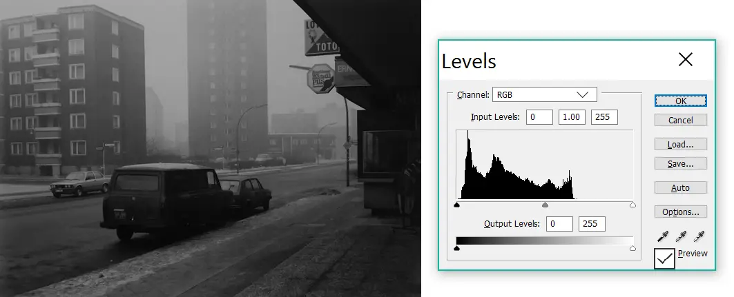
Low-contrast images tend to have relatively narrow histograms, and they don’t always span the entire range from black to white. High-contrast images, by… er, contrast, often have wide, “valley-shaped” histograms with significant “pixel volume” at both ends. Compare these two (admittedly extreme) examples, both from Japanese photographers:
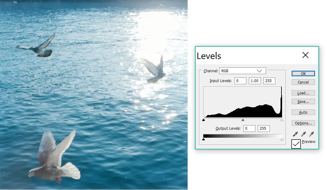
And now a couple of colour examples.
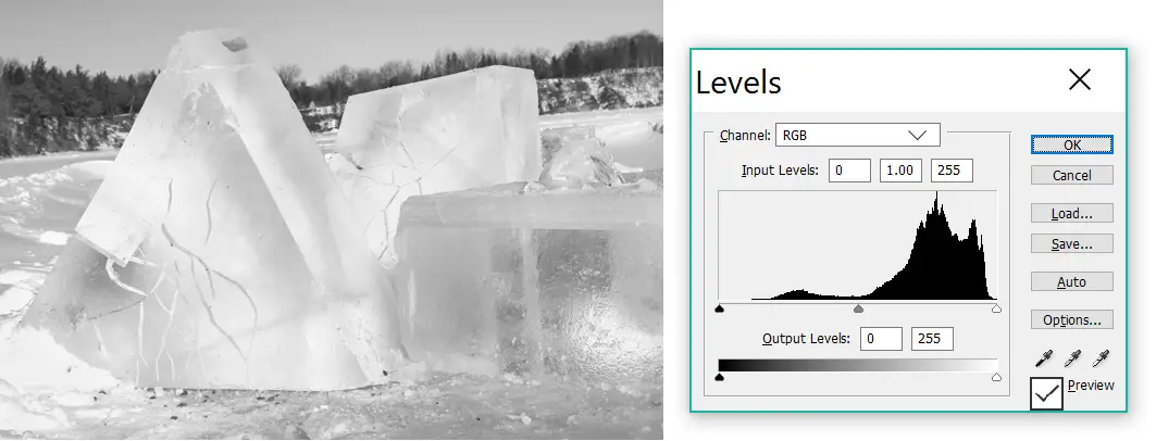
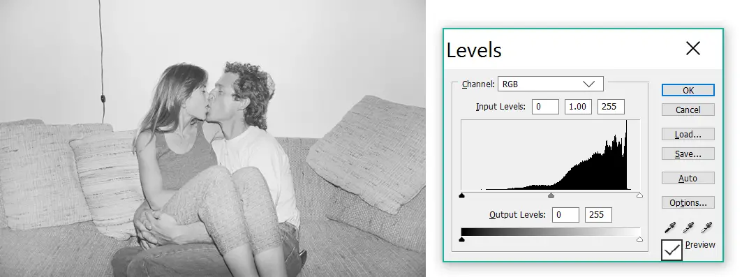
Low-key (predominantly darker) images have histograms which are skewed to the left – more dark pixels than light. High-key images are the opposite, with histograms skewed to the right.
Pure black and pure white
There’s an old photography-school dictum that a photograph should have pure black, pure white and a full range of tones in between. This is sometimes casually attributed to Ansel Adams. However, this is what Saint Ansel actually said:
True, a note of pure white or solid black can serve as a “key” to other values, and an image that needs these key values will feel weak without them. But there is no reason why they must be included in all images, any more than a composition for the piano must include the full range of the eighty-eight notes of the keyboard. Marvelous effects are possible within a close and subtle range of values. —Ansel Adams, The Print (1983).
Amen to that! Nevertheless, in my experience, the “pure black and pure white” rule is largely respected. If you look carefully, even low-key images tend to have accents of pure white, and high-key images will often have accents of pure black.
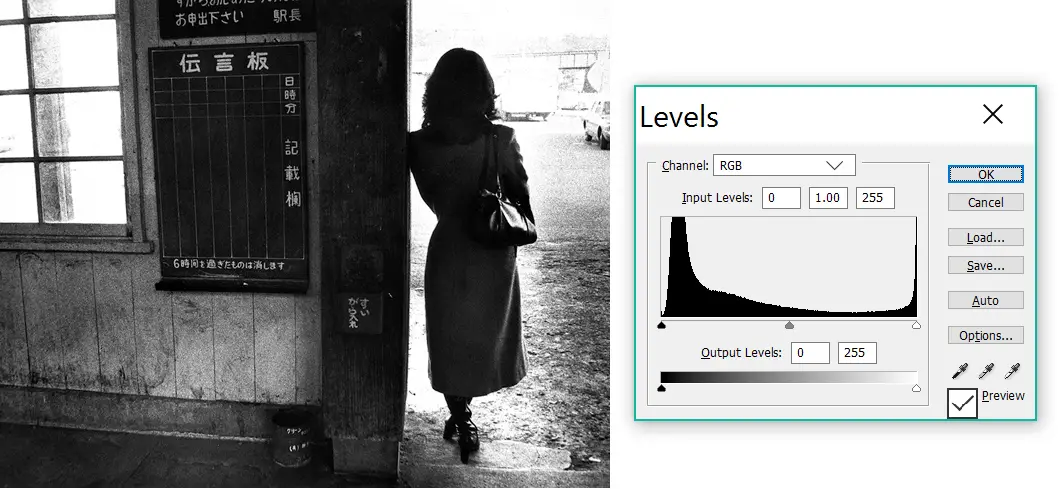
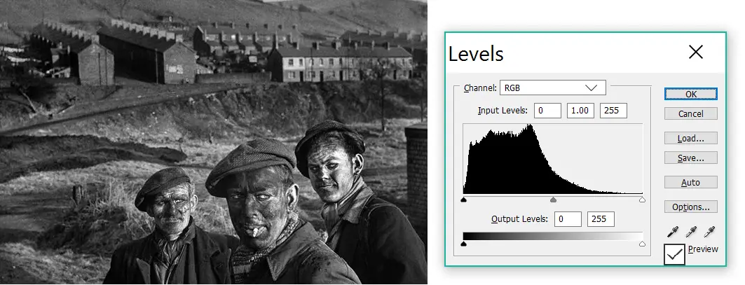
To locate these pure black or pure white areas, you can use the input sliders in the Levels tool. Push the right (white) slider to the left, and the image will start to get brighter; eventually, only the darkest zones will remain. Conversely, push the left (black) slider to the right to locate the brightest zones. Let’s try the latter with Gene Smith’s photo of the Welsh miners, shown earlier as an example of a low-key photograph.
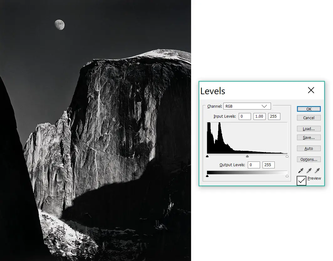
An interesting (albeit well-documented) phenomenon: bright areas against a dark background look brighter than they actually are, and vice versa. Photographers can exploit this effect – a double-trick. An object (for example, the moon against a dark sky in Ansel Adams’ later prints of Moonrise over Hernandez, New Mexico) can be made to look eye-catchingly bright due to relative contrast, but also retain details and texture, because in absolute terms it’s not as bright as it looks. A reverse example: black coats in the snow, in this photo from Sohrab Hura’s Snow series.
This is also why, at least at my level of experience, using Levels sliders is a more reliable way to locate dark and bright zones. Instead of, you know, just looking at the image.
Dipped histograms
If an image does not have pure blacks or whites, the histogram will stop short before it gets to the extreme end. This is kind of the opposite of clipping. I don’t know an established term for this, but I call it “dipping” (because the histogram appears to dip below the axis – and of course, it rhymes with “clipping”).
As I said, this is relatively rare, especially in black-and-white. But I was still able to find some examples where the histogram dips to the right, that is, a picture with no pure white:
…and where the histogram dips to the left, that is, a picture with no pure black.
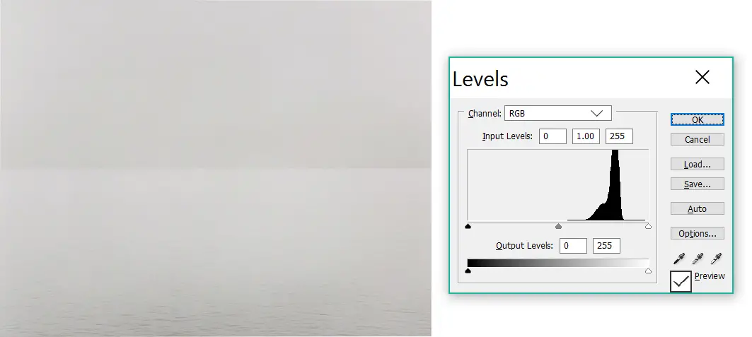
Which, finally, brings us to images which dip in both directions – the opposite of the Bill Brandt photo shown earlier (which, if you remember, was clipped in both directions). Sugimoto’s Lake Superior – also shown earlier – is like that: no pure black and no pure white, just shades of grey. You can see some less extreme examples in Henry Wessel’s Californication series:
Conclusion
A table for easy reference:
| Histogram shape: | Generally indicates: |
| Clipped on the left | Areas of pure black; missing shadow detail |
| Clipped on the right | Areas of pure white; missing highlights detail |
| Dips on the left | No pure black |
| Dips on the right | No pure white |
| Narrow | Low-contrast |
| Wide, valley-shaped | High-contrast |
| Skewed to the left | Low-key |
| Skewed to the right | High-key |
I’ve deliberately refrained from trying to define terms like “narrow”, “skewed”, etc. For purposes of this post, I’m not that interested in the finer, technical aspects of histograms. Rather, I see them as a good entry point for talking about contrast and tonality. In that sense, I think they can be helpful in two key ways: looking at photographs, and making photographs.
Looking at photographs
In terms of looking at photographs, I think of contrast and tonality as just another aspect of visual literacy – similar to (but arguably more important than) noticing which parts of an photo are in focus, being able to tell if it was taken with a wide or tele lens, and so forth.
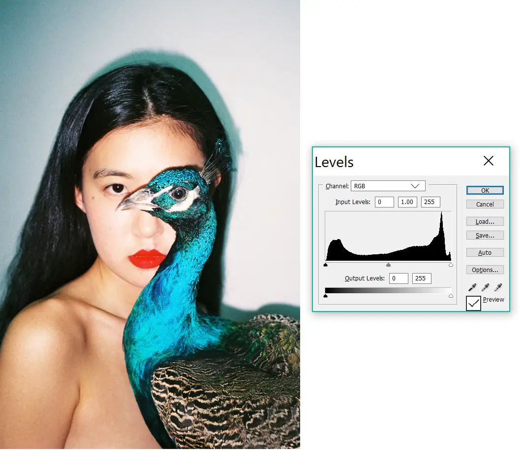
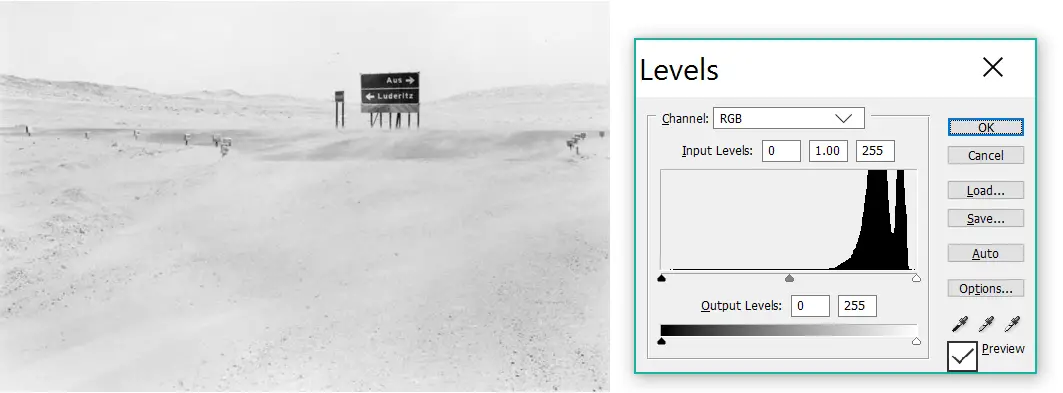
Images speak to our conscious and subconscious minds. Michael Schmidt’s Berlin Nach 1945 series creates a dark, brooding mood, while the harsh desert light of Santu Mofokeng’s Aus/Luderitz, Namibia makes us almost physically squint. The high-contrast punch of Ren Hang’s Peacock complements its exotic subject matter, just as Stephen Shore’s subdued shades evoke the beauty of the mundane. These pictures convey these moods, elicit these emotions, even if we have never seen a histogram in our life. But when we are more attuned to contrast and tonality, we begin to see “how the trick was done”. To me, that only makes it more magical – not less.
Making photographs
Can we replicate the magic? I think a better understanding of contrast and tonality can help us see (and perhaps express) the visual and emotional potential in a scene – or for that matter, in a negative or a digital file. Of course, it’s not like if I see a picture that I like, I immediately look at its histogram. Well I sometimes do (nerd alert), but it’s rare. But overall, I think I am getting better at noticing tonality in general, subjective terms – noticing, for example, that an image is low-contrast with no pure white, or high-key with clipped highlights. This in turn has made me more aware of the choices which went into making great pictures, and at the same time, expanded my horizon in terms of the choices which I too have. But can I realise them in practice? That’s the technical part – a work in progress, which I’ll share in subsequent posts on darkroom printing. Watch this space!
Last but not least, I should thank Mike Johnston (The Online Photographer) for his posts about B&W tonality and in praise of low contrast. I discovered these posts well after they were published, but they got me thinking along these lines (and introduced me to the work of Henry Wessel whom I used as one of my examples). The comments on those posts are a goldmine too.
Speaking of comments, I am curious if you (the reader) have noticed a preference in terms of contrast and tonality, in the photographs you take or photographers you admire? Personally, I like (and can work in) many different styles. A blessing – but also, I sometimes think, a bit of a curse. Thanks for reading.
Share this post:


Comments
Floyd Takeuchi on Contrast and Tonality Part 1: Histograms of Famous Photographs and What They Can Teach Us – By Sroyon
Comment posted: 20/09/2021
Comment posted: 20/09/2021
Thorsten Wulff on Contrast and Tonality Part 1: Histograms of Famous Photographs and What They Can Teach Us – By Sroyon
Comment posted: 20/09/2021
Comment posted: 20/09/2021
John Fontana on Contrast and Tonality Part 1: Histograms of Famous Photographs and What They Can Teach Us – By Sroyon
Comment posted: 20/09/2021
Comment posted: 20/09/2021
Stewart Waller on Contrast and Tonality Part 1: Histograms of Famous Photographs and What They Can Teach Us – By Sroyon
Comment posted: 20/09/2021
For digital I just try not to blow anything out. The same editor thought my work was the best of the day in the end, but it had more to do with composition and emotion, and the fact that many of the amateur photographers were afraid of intruding on a stranger, while I had decades of experience shooting people in both the studio and on the street. Of the three NatGeo editors present, I don't think one of them talked about tonality at all in the final critiques.
But now I'm going to go back and examine some of my own personal favorites and look at the histograms, to see if I am clipping anything, and if the picture might be better using a more objective tool to evaluate while I'm shooting.
Thanks for the post!
Comment posted: 20/09/2021
Rich on Contrast and Tonality Part 1: Histograms of Famous Photographs and What They Can Teach Us – By Sroyon
Comment posted: 20/09/2021
Thanks for a very good article.
--Rich
Comment posted: 20/09/2021
Bob Janes on Contrast and Tonality Part 1: Histograms of Famous Photographs and What They Can Teach Us – By Sroyon
Comment posted: 20/09/2021
Comment posted: 20/09/2021
Comment posted: 20/09/2021
Comment posted: 20/09/2021
Comment posted: 20/09/2021
Pete on Contrast and Tonality Part 1: Histograms of Famous Photographs and What They Can Teach Us – By Sroyon
Comment posted: 20/09/2021
Comment posted: 20/09/2021
Bill Brown on Contrast and Tonality Part 1: Histograms of Famous Photographs and What They Can Teach Us – By Sroyon
Comment posted: 22/09/2021
If you want to talk about unforgiving printing methods I was the print finisher for photographer Bank Langmore whose work was printed point light source. Some of those prints took me upwards of 4-6 hours with some even pushing towards 8 to spot but the final print sharpness made the effort worthwhile. Print spotting is an art unto itself at this level and few photographers have access to a technician capable of completing the task in a seamless/invisible manner.
Comment posted: 22/09/2021
Neil W on Contrast and Tonality Part 1: Histograms of Famous Photographs and What They Can Teach Us – By Sroyon
Comment posted: 22/09/2021
Comment posted: 22/09/2021
Joris on Contrast and Tonality Part 1: Histograms of Famous Photographs and What They Can Teach Us – By Sroyon
Comment posted: 30/09/2021
Also really curious for the next edition about curves. These are really lifting the veil for me. One thing I did miss, when you talked about in camera and editing, is the developing (in case of film), because it also has such a large effect on the shadows and highlights.
Comment posted: 30/09/2021
Kira on Contrast and Tonality Part 1: Histograms of Famous Photographs and What They Can Teach Us – By Sroyon
Comment posted: 05/12/2021
Comment posted: 05/12/2021
Bruce P Parker on Contrast and Tonality Part 1: Histograms of Famous Photographs and What They Can Teach Us – By Sroyon
Comment posted: 07/02/2022
Warren Ganser on Contrast and Tonality Part 1: Histograms of Famous Photographs and What They Can Teach Us – By Sroyon
Comment posted: 31/08/2022