Recently I thought I would give colour negative film a try again having used a great deal of this film type in the past, which I used to process myself in Neofin Colour chemistry. This was a very convenient kit of single use glass phials of concentrate which had snap off ends, now no longer available. Probably, and no doubt justifiably, they fell foul of no end of health and safety concerns, a nicked finger on the broken end could have been very nasty. The results were good but negatives were much redder than the usual dull orange making filtration for printing tricky in darkroom days.
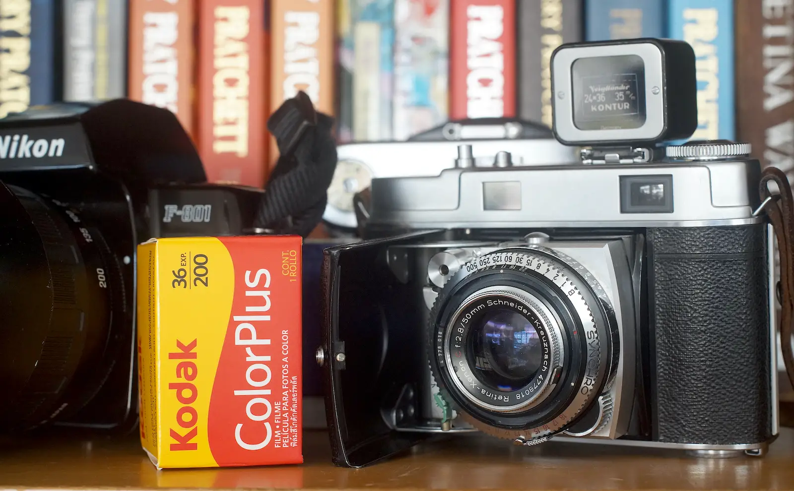
Down here in New Zealand, two of the most reasonably priced 35mm colour neg films today are Kodak’s Pro Image 100 and ColorPlus 200 along with Kodak Gold. The more professional types, like Ektar, are around double the price so as an experiment and a budget friendly buy I thought I would see how the ISO 200 film performed.

The film
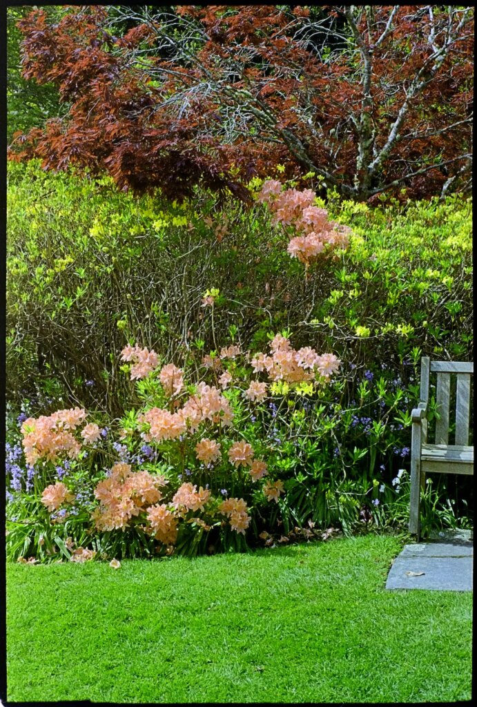
Kodak claim wide latitude for the film and my results would seem to bear this out. I wouldn’t rely on it for very relaxed exposure setting though, it can only be pushed so far. Some of the examples give an idea of the latitude available. Certainly, getting even close to correct colour is really tricky with thin negatives the way I go about it, though the built in conversions with a film a scanner would be less trying I imagine. From past experience, I must say that the best results from colour negative emulsions usually come from negatives exposed on the generous side.
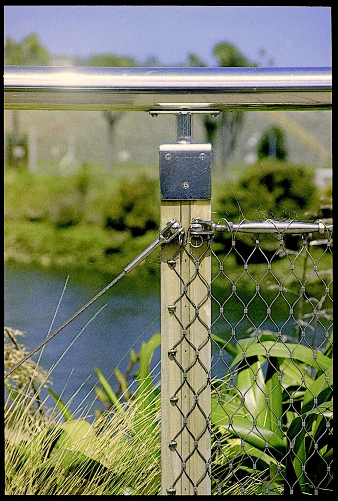
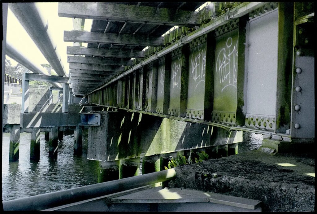
Colour is nicely, but not overly saturated and realistic when given full exposure, with good definition, moderate grain, and good sharpness. Generally the film delivers very acceptable results, adequate for all but the most demanding of applications.
Out and about
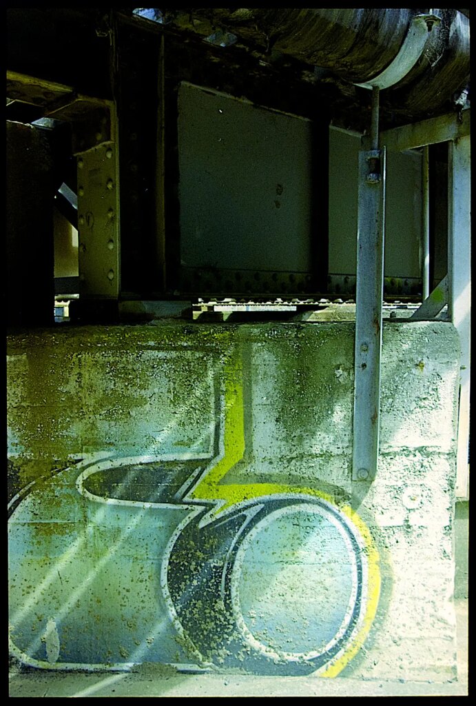
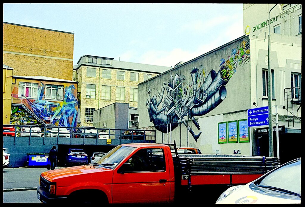
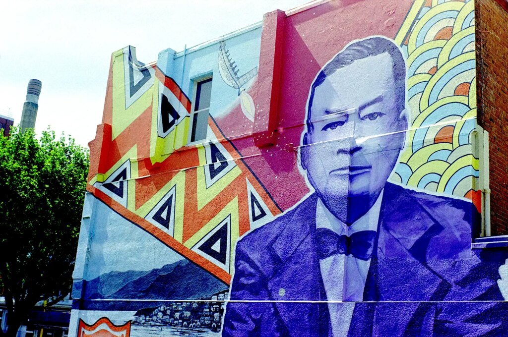
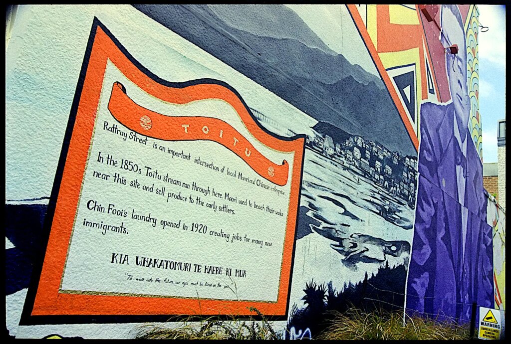
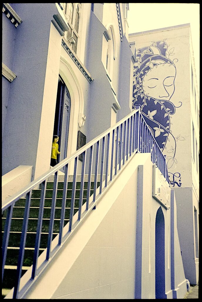
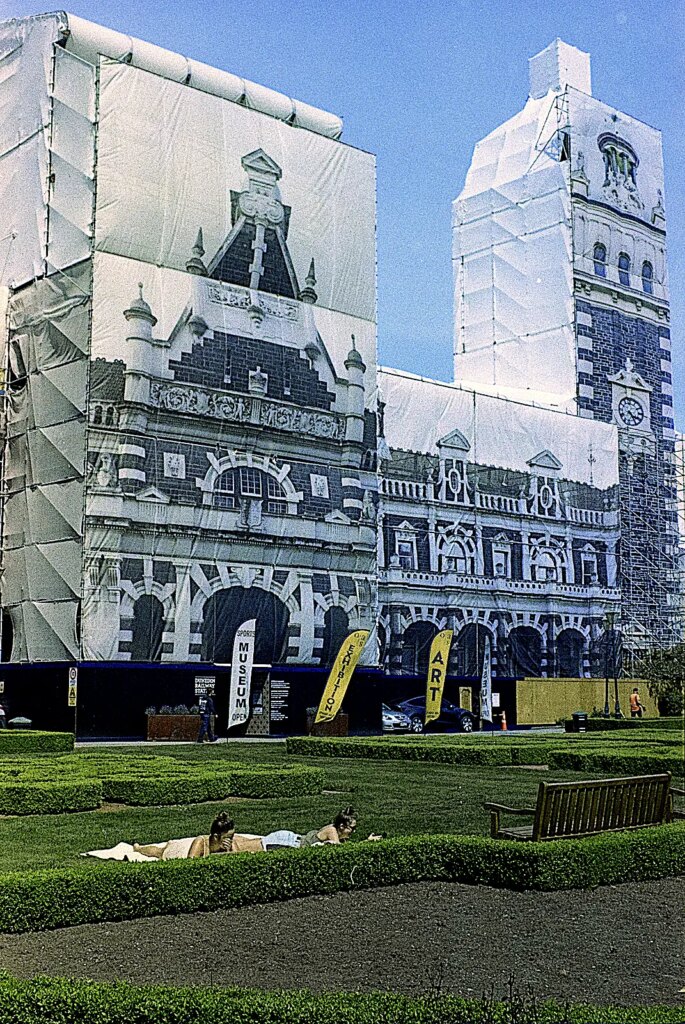
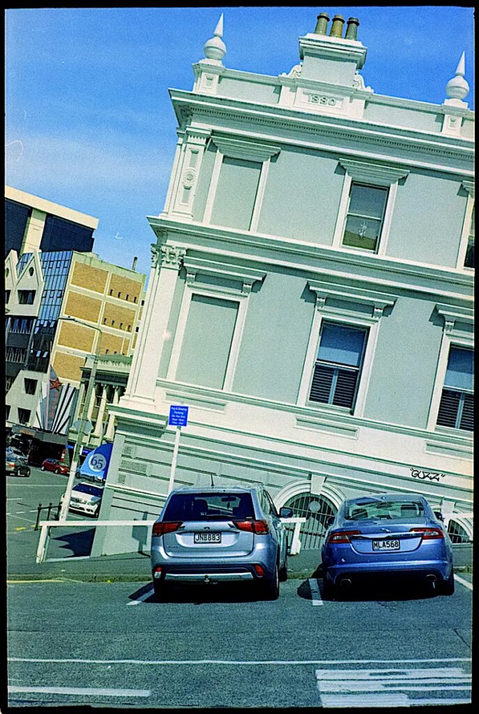
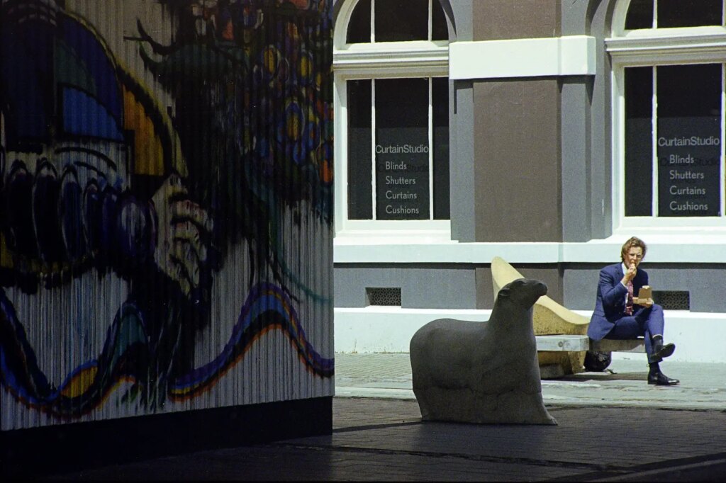
I ran a roll through my Retina IIc on a walk around Dunedin including the rhododendron display in the Botanic Gardens and the urban wall art that has been encouraged, and the graffiti that hasn’t been, around the city centre and elsewhere.
Post processing comment.
I was initially very disappointed with the grain until I realised that Unsharp Masking (USM) plus Clarity that I would usually apply to a digital file when processing in Affinity Photo brings out the grain to an alarming extent. I now use the High Pass filter to do most of the initial sharpening, only having a controlled effect on edges as it does, finishing off with a very light application of USM as a final step after adjustments are complete, avoiding Clarity completely. A little extra contrast can punch things up without the grain becoming too noticeable.
In conclusion.
Overall, Kodak Colorplus 200 Colour Negative is a very good, reasonably priced all rounder, not super fine grained but more than adequate for most purposes.
(Photos of the cameras and film box and digitised copies of negatives are produced with a Sony A3000 with 55mm Micro Nikkor and adapters processed in Affinity Photo.)
Share this post:


Comments
Lance on Kodak Colorplus 200 Colour Negative Film Mini-Review
Comment posted: 26/07/2023
Comment posted: 26/07/2023
Martin on Kodak Colorplus 200 Colour Negative Film Mini-Review
Comment posted: 26/07/2023
The clours in your pics are strong yet natural.
Thanks for sharing
Martin in Austria
Comment posted: 26/07/2023
Dan on Kodak Colorplus 200 Colour Negative Film Mini-Review
Comment posted: 26/07/2023
Comment posted: 26/07/2023
Daniel Castelli on Kodak Colorplus 200 Colour Negative Film Mini-Review
Comment posted: 27/07/2023
I’m not a color guy, but I love urban landscapes. Well done. My favorite is the steep hill house. I’d hate to park in front of that house, get my groceries out of the car, drop a melon and have it till down the hill…
Comment posted: 27/07/2023
William on Kodak Colorplus 200 Colour Negative Film Mini-Review
Comment posted: 27/07/2023
Comment posted: 27/07/2023
Niall Morrissey on Kodak Colorplus 200 Colour Negative Film Mini-Review
Comment posted: 31/07/2024
The Retina is a beautiful piece of mechanics, and the one I picked up recently is just so silky smooth in its movements. One thing I want to do is to get the aperture numbers where they should be - at the top of the lens, as in your photo. Th viewfinder is tiny, but that's the only issue with the camera - other than the user!
I'm glad to see someone else who uses and enjoys both analogue and digital. I've had those who would try drag me into a heated debate about the two, but I absolutely refuse to get involved. Both forms have their strengths, so I simply exploit those, rather than rant at length about why the camera I'm holding is better than someone else's camera. I simply use one or other depending on how I feel and enjoy the images when they turn out roughly as expected.
Comment posted: 31/07/2024