
When creating the above image, I sought a very specific aesthetic, one informed by years of enjoying video games. Indeed, friends have told me they thought this image was a highly detailed computer rendering. Maybe you thought that too? Of course it’s a photograph. A slightly uncanny photograph. I want to make more of these, so I’m curious to understand: What makes this image uncanny? I have some ideas.
Often[1], as photographers, we strive to create realistic representations of the world, or at least accurate representations of how the world appears to us[2]. But what makes an image seem “real” is subjective, or at least highly context-dependent. I want to discuss how two artistic fields approach this question in completely opposite ways, and I want to use that contrast to understand the aesthetic properties of the photograph above. And then I want to leverage that understanding to make more—and I hope maybe you’ll feel inspired too.
In photography, manufacturers strive to give us equipment capable of ever-greater fidelity: Increased sharpness, flatter fields of focus, more rectilinear perspectives, decreased optical aberration. This increasing technical perfection[3] allows us as photographers to focus exclusively on the subject in front of us, by removing the limitations of our technical apparatus from the final image[4]. Our images appear less like photographs, and more like what we see in our mind.
This all seems reasonable enough, right? But it’s only one perspective. There are others.
The Uncanny Valley
Computer imagery, as I’m about to argue, seeks to create images that are “photorealistic”—images that appear more like photographs, and less like the result of mathematical perfection. Digital artists often turn to simulating the flaws in optical glass to make a scene more believable, adding back in all those things that the camera manufacturers sought to eliminate. Why? Because they want to escape the Uncanny Valley.
The notion of the Uncanny Valley originates with Masahiro Mori, and his observation that humanoid robots elicit unexpected patterns of acceptance and revulsion: Robots that bear only the faintest resemblance to humans might be accepted as cute, like pets. But robots that bear a very close resemblance to humans are often met with outright disgust, even fear.
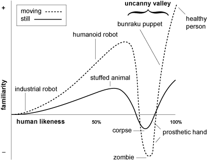
The x-axis of the chart represents the degree of human likeness: No resemblance at all on the left, and absolutely perfect replication of human features on the right. The y-axis represents the emotional acceptance, with strong rejection towards the bottom, and strong acceptance towards the top—revulsion versus empathy. The “valley” in “Uncanny Valley” comes from the trough in this graph where nearly (but not quite) perfect features creates a strong sense of revulsion, rejection, anger, or fear.
Climbing out of the trough requires constructing a robot that is essentially indistinguishable from human.
The Uncanny Valley and Imagery
The notion of the Uncanny Valley was meant to describe a phenomenon observed with robots. But of course, we can see the Uncanny Valley effect in computer-generated imagery and video as well, especially but not exclusively in images of humans.
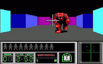
Let’s start with a look at early 3D computer games. Hovertank 3D is one of the first PC games in which the player explores a maze from the first-person perspective. Its primitive graphics convey only the most minimal sense of immersion or realism[5]. There’s just enough going on in those color pixels to trigger the mind into thinking it is exploring a fully three dimensional environment, and that’s about it. It’s cute. Or anyway, it’s not objectionable. It’s sitting far to the left of the Uncanny Valley.
At the other extreme, consider the 2004 movie The Polar Express, which sought to create highly realistic renderings of humans and scenes. But the technology wasn’t quite there, and the result is an unintended celebration of the uncanny with virtual actors moving awkwardly and wearing stiff expressions, giving the characters the appearance of the reanimated dead. What was intended as a charming Christmas movie for children accidentally became a Tom Hanks-led creepypasta horror flick.
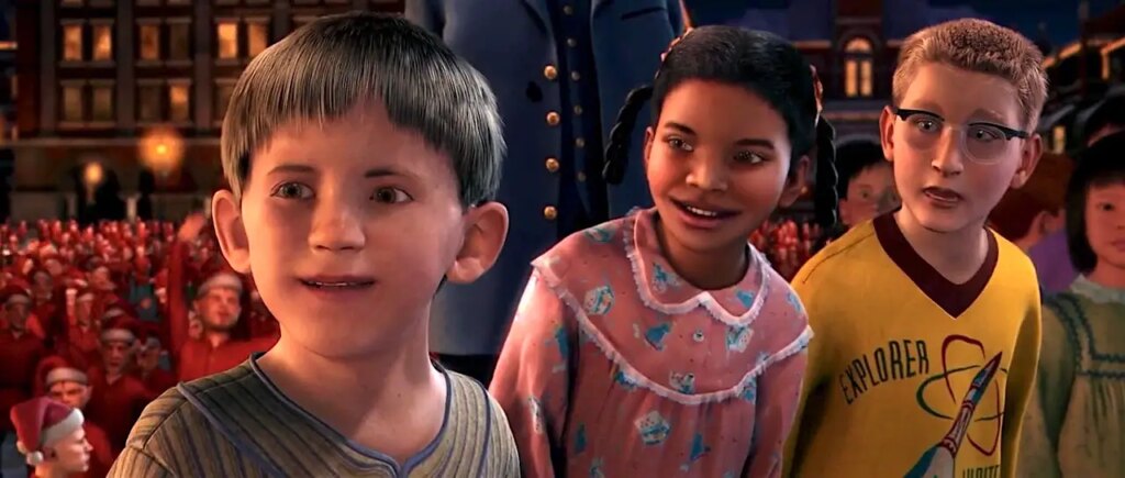
Of course, you’ll note the technical quality of the image is much improved over the graphics in Hovertake 3D: Instead of flat polygonal walls, we have fully-fleshed out models representing a rich environment, and characters portrayed with detailed skin, hair, and clothes. The Polar Express has, predictably, plunged itself right to the bottom of the Uncanny Valley.
Climbing Out of the Uncanny Valley
The Uncanny Valley is absolutely unavoidable, but it’s not insurmountable. How do digital artists move from the left-hand hill (unrealistic but cute) to climb up the right-hand hill (believably realistic)? Computer game designers are quite open about the tools that they use, so let’s have a look at their toolkit for achieving what they call “photorealism”.
The use of this term is already quite revealing: We can see the strategy in play. Their goal isn’t to climb out of the Valley by creating images so perfect that they are indistinguishable from our perceptions of the real world. Instead, photorealism aims at something more easily achievable, by creating a convergence with photographic equipment to create an image that looks like a photograph, by using all the cues created by less-than-perfect optics. But before we can reach that point, digital artists had to do some work to simulate how light works in the real world first.
Unlike with photographic optics, creating “perfect” images on a computer is trivial. The mathematical models of light used in the earliest 3D rendering pipelines, such as in Hovertank 3D, rendered everything perfectly in focus, perfectly sharp, without imperfection, to the limits of the screen’s (very low) resolution.
Their only concession human perception was to create a sense of scale by adding linear perspective. This makes things further away appear smaller, and forces parallel lines to converge in the far distance. But not all games used (or still use) linear perspective: So-called isometric games eschew converging parallel lines to give a sense of hovering over the game from above.

If you have seen many computer games, you can imagine some of the next steps. The addition of texture maps allows digital artists to paint on the surfaces of the modeled objects, giving walls the appearance of being made of brick or stone for example.
But everything in this scene is perfectly evenly lit (and without shadows). The next step was to develop basic mathematical models of how light creates tonal variations, such as the Phong reflection model.
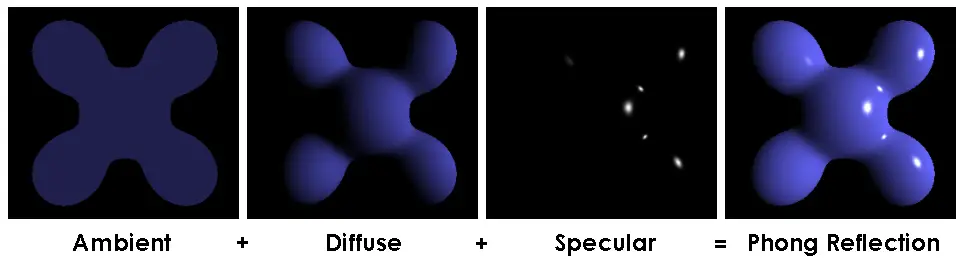
Such simplistic lighting models create objects that appear made of plastic, and don’t account for shadows (which are considerably more difficult to compute).
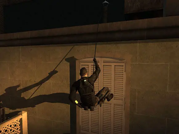
Earlier experiments with shadows, like in “Splinter Cell” above were only able to render extremely hard shadows from single light sources. As technology and computational power advanced, multiple light sources, and softening of shadow edges became increasingly common.
But with all these advances in photorealism, computer games were approaching, and starting to fall into the Uncanny Valley. How to get back out? By seeking convergence with photographic prints by adding back in what physical lenses had sought to remove: Imperfections. By leaning on broadly, if unconsciously, understood limits of using glass to capture images, developers hoped to create images that felt more true-to-life.

Recent games such as No Man’s Sky have used heavy vignetting, chromatic aberration, field curvature, light bloom and other effects simulating dirt on the lens, and simulated scan-lines[6]. All of these effects get added back in specifically to immerse the viewer by creating a heightened sense of realism—by making the image appear to be something other than a rendering on your screen.
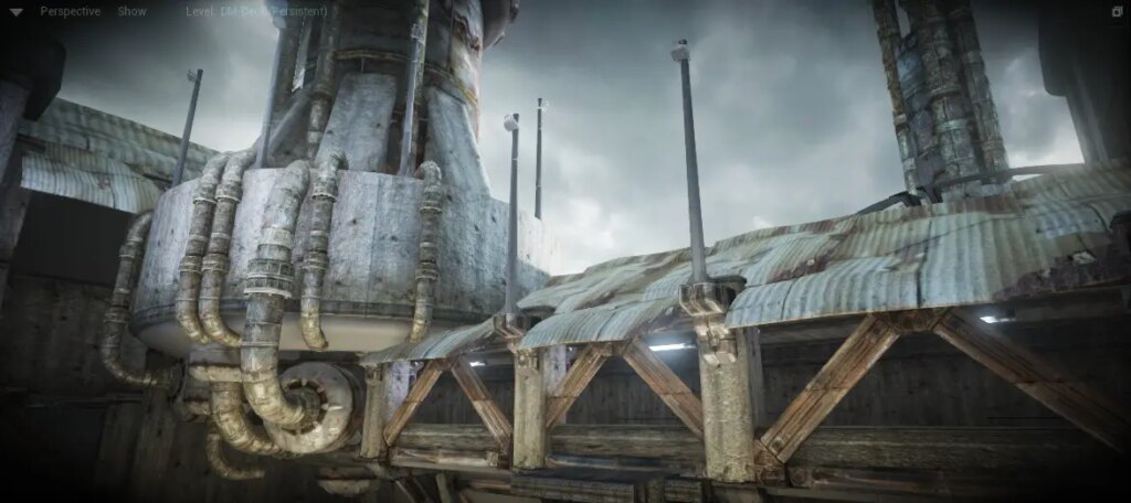
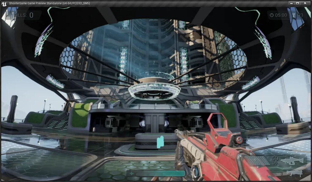
Here are some more examples taken from the documentation for a popular game rendering engine called Unreal:


And, as you have no doubt noticed, all of these effects are generally things that lens manufacturers—and users—seek to avoid in their optics[7]. Which gives rise to a fascinating paradox: Adding imperfections helps computer graphics feel more real, more authentic, to climb out of the Uncanny Valley. Yet in photography we strive to remove imperfections for precisely the same reasons.
(If you really want to head down the rabbit hole, there are a lot of resources out there! Here’s a worthwhile video that goes over how computer game designers leverage these kinds of effects to create a heightened sense of realism.)
Diving Into the Uncanny Valley on Purpose
I am a photographer, and I want to plunge headfirst into the Uncanny Valley. Applying these lessons, we can see we have a number of levers at our disposal:
- Perspective and converging lines
- Distortion
- Complexity of surface texture
- Depth of field
- Chromatic aberration
- Bloom and glow
- Field curvature
- Haze
- Usage of hard shadows
- Image resolution
And we have the tools for wiggling those levers:
- Simplified backgrounds
- Subjects with flat, colorful, glossy surfaces
- Adding or removing perspective (e.g. using long lenses with very small subjects to remove converging lines)
- Inexpensive, low-element count lenses for chromatic aberration.
- Low-quality lenses for vignetting and field curvature (blurry image edges)
- Dirt and dust (perhaps simulated with filters) for bloom, glow, and softness
- Hard lighting for creating hard shadows (e.g. small strobes placed far away)
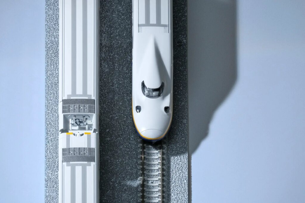
What can we achieve when we start playing with these levers? The images below are part of “Isometrica”, a photo series the contains my early experiments, tentative steps at most. But the results are promising!


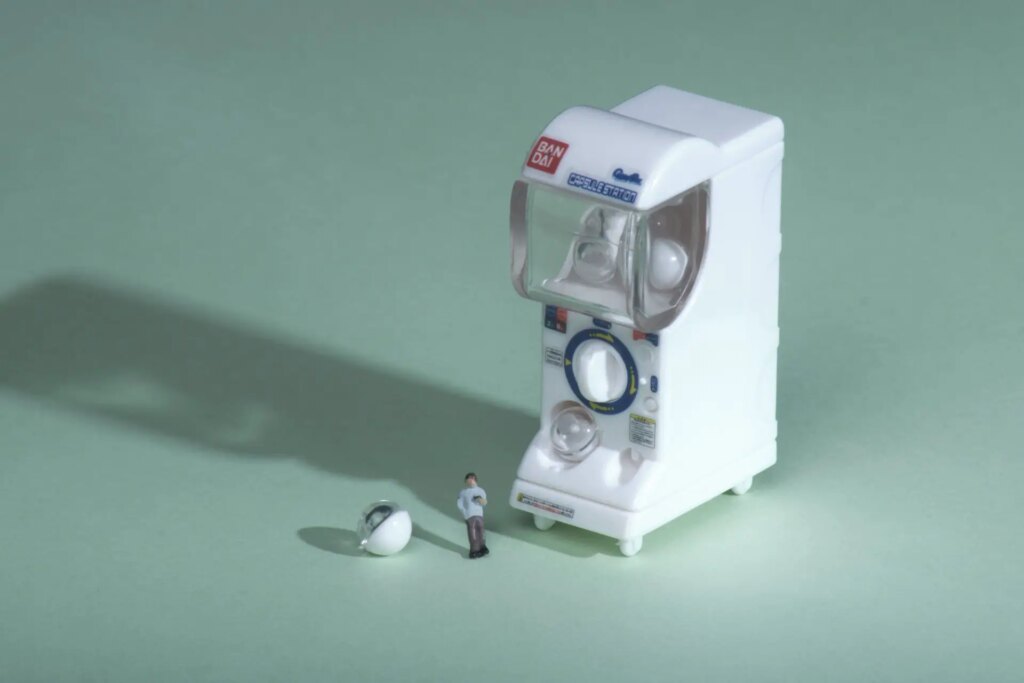

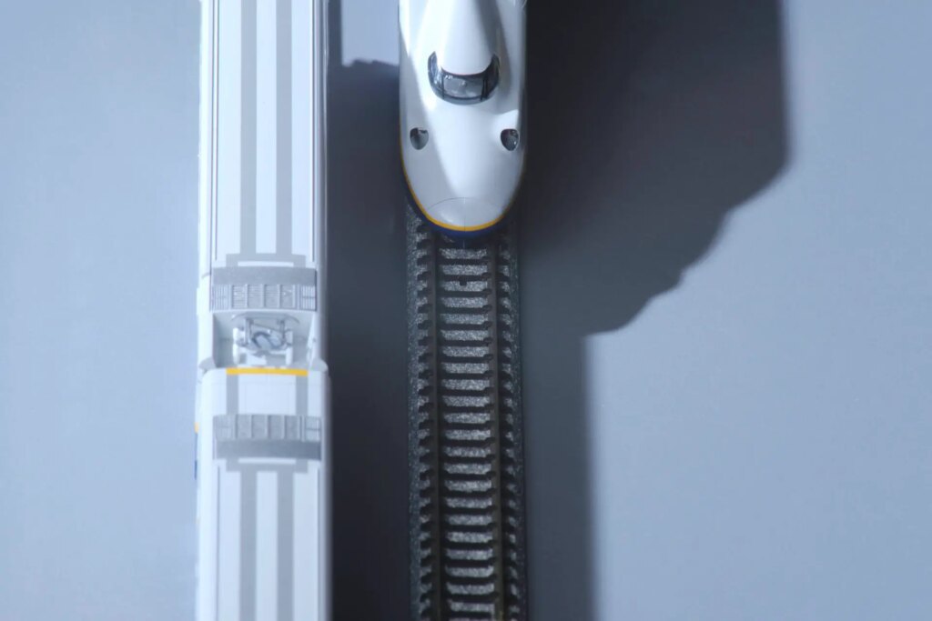
The photos in this gallery were shot with a Vivitar 100-300mm f/5 from the early 80s (it’s…not a great lens) with a ton of trapped dust and even a cracked element. I just happened to have this lens lying around, but it has provided some good initial results in removing perspective from the scene. A pair of Godox strobes provides very hard light. And the subjects are very small, very far away, and definitely plastic.
To be completely honest, I’ve stumbled across all of this by accident, simply in virtue of having this craptastic lens. But I didn’t fully understand what I had until, discontent with the results, I decided to reshoot them with a modern lens (the otherwise delightful Fujifilm XF 100-400mm f/4.5-5.6 R LM OIS WR). The results were so clean, so clinical, so optically perfect. I hated them, but I didn’t know why. Hence this article.
It’s clear to me now why the image above is so unsatisfactory: No one would mistake this image for a computer render. There’s nothing uncanny about it. It’s just a photo of a toy.
For my own part, I continue to experiment. Having identified the levers above, I want to start wiggling more of them. I’ve since acquired a class SMC Pentax-A 400mm f/5.6 that shows huge amounts of chromatic aberration and purple fringing wide open, and even less perspective (in virtue of being longer than my 100-300mm). Some effects (like haze, vignetting, and lowering the resolution) can be added in post or with filters. And I continue to experiment with lighting, composition, and selecting suitable subjects.
I’m interested to see where this could go. I hope you are too!
You can view more of my experimentation, and support my work by purchasing prints at my portfolio. Or you can keep up to date with my uncanny experiments (and street photography) by following me on Instagram.
Footnotes
- But not always, or even most of the time. (return)
- Yes, these are very different things, a topic I hope to return to in the future. (return)
- Some say, derisively, “clinical”. (return)
- As we are repeatedly told, we can always add it back in in post, but we can’t remove it if it’s baked in. (return)
- Although the recent trend in Instagram “museums” seems to be taking this as inspiration. (return)
- Not something typically seen in photographs per se, but clearly a nod to the experience of viewing imagery on old CRT monitors. (return)
- Except you Leica shooters who spend so much money in the pursuit of the trademark Leica Glow. (return)
Share this post:


Comments
Steven G on Hiking the Uncanny Valley – By Don Goodman-Wilson
Comment posted: 06/06/2022
Comment posted: 06/06/2022
Yuze on Hiking the Uncanny Valley – By Don Goodman-Wilson
Comment posted: 06/06/2022
Comment posted: 06/06/2022
Sroyon on Hiking the Uncanny Valley – By Don Goodman-Wilson
Comment posted: 06/06/2022
Comment posted: 06/06/2022
ºColor-Solinarº on Hiking the Uncanny Valley – By Don Goodman-Wilson
Comment posted: 09/06/2022
And the title for your photo "He is Entirely Out of Fucks" is nothing short of a total revelation! I guess I'm a noob as I've never heard that statement before and I gotta say I love it! It's going to be a struggle to not insert that into conversations going forward. ;-)
Comment posted: 09/06/2022