Seeing in B&W

Seeing in Black and White

By Geoff Chaplin

I was photographing in colour for over 50 years. Occasionally I’d put a B&W film in the camera but I was still photographing in colour, there just happened to be B&W film in the camera. Of course, the results were unimpressive.

For the past couple of years I have moved to trying to tackle B&W properly. Because I’m a beginner I can probably explain my starting steps better than a seasoned expert who might find it harder to remember the process he/she went through.

So how do you ‘see’ in B&W? Simple. You can’t. And setting B&W mode on a digital camera doesn’t help. Let me explain.

First, what are you photographing? Flowers? People? Landscapes? Architecture…? No, none of these. You’re photographing light and absence of light. A photography book I came across years ago made a big impression on me because of its title – “The Keepers of Light” (by William Crawford). Colour or B&W, we are always photographing light and absence of light. For B&W you absolutely need to change your mindset to think about light and its absence not the object you are pointing the camera at.

Second how do you meter? Do you know what your meter is doing and how to interpret the results? In my view the best meter is Sunny 16. If you can use Sunny 16 you are beginning to understand light, and know the difference between incident light and reflected light. Incident readings will make dark areas with highlights look like just that (when converted to a positive), whereas a simple reflected meter will overexpose unless you understand how to correct it.

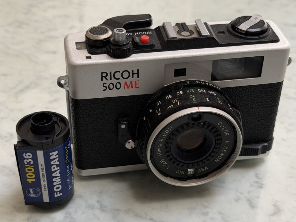
Third, choose a film and stick to it. While you are practicing use an inexpensive film (e.g. Kentmere, Foma, outdated stock) and shoot lots thinking about the first two points above. I suggest 100asa – this is fine for day or night and generally very flexible. Don’t be afraid to open your lens up to keep exposure times manageable hand held. And don’t be afraid to go to 1/15 or 1/8 second with a 50mm lens.

Fourth – processing your negatives [see the note below]. A hybrid process – film capture and development, digital processing of the negatives to a digital image – offers greater flexibility and ease than a purely analogue workflow. For 35mm, a digital camera and macro lens offers higher quality and is quicker than using a flatbed scanner. The scan may be a raw file which you need to interpret in software as a film negative (the software then converts to a positive), remove residual colour by clicking B&W mode, then tackle the tone curve. Note that whether your capture was on film or digital the B&W image shown will probably have a camera or software chosen tone curve – get rid of this and start with a straight line tone curve. If you make any adjustments at all generally make very minor changes (e.g. adjusting black or white points and a slight ‘S’ curve). Usually the straight line curve will be good for many situations.

Finally, “seeing in B&W” is a misnomer. What you have to do is “pre-visualise” – think how the scene will appear when converted to B&W the way you want it. You will only be able to pre-visualise after taking negatives and making positives many times. It’s a learning process. It’s also surprising that often images which are nothing in colour are striking in B&W so don’t stick to your usual subject matter, experiment.

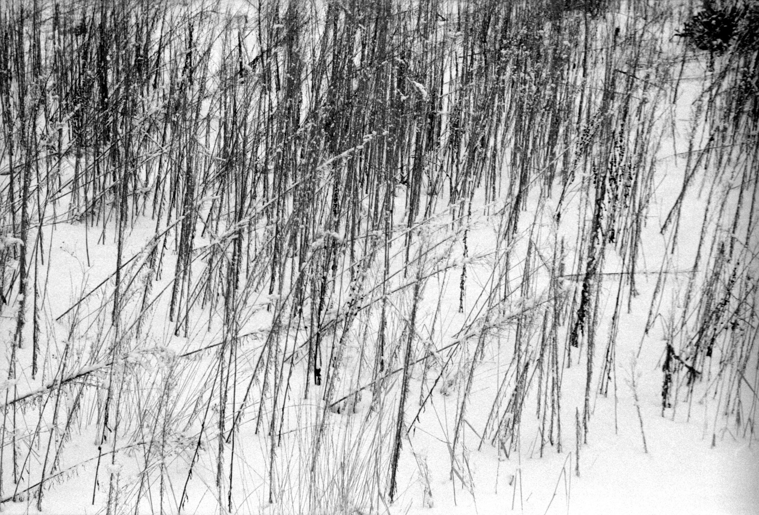
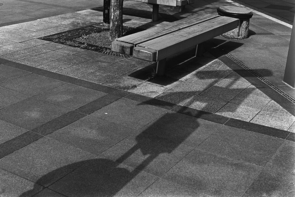
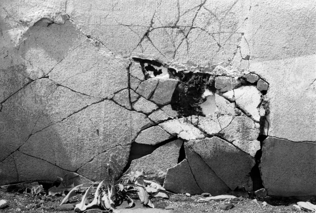
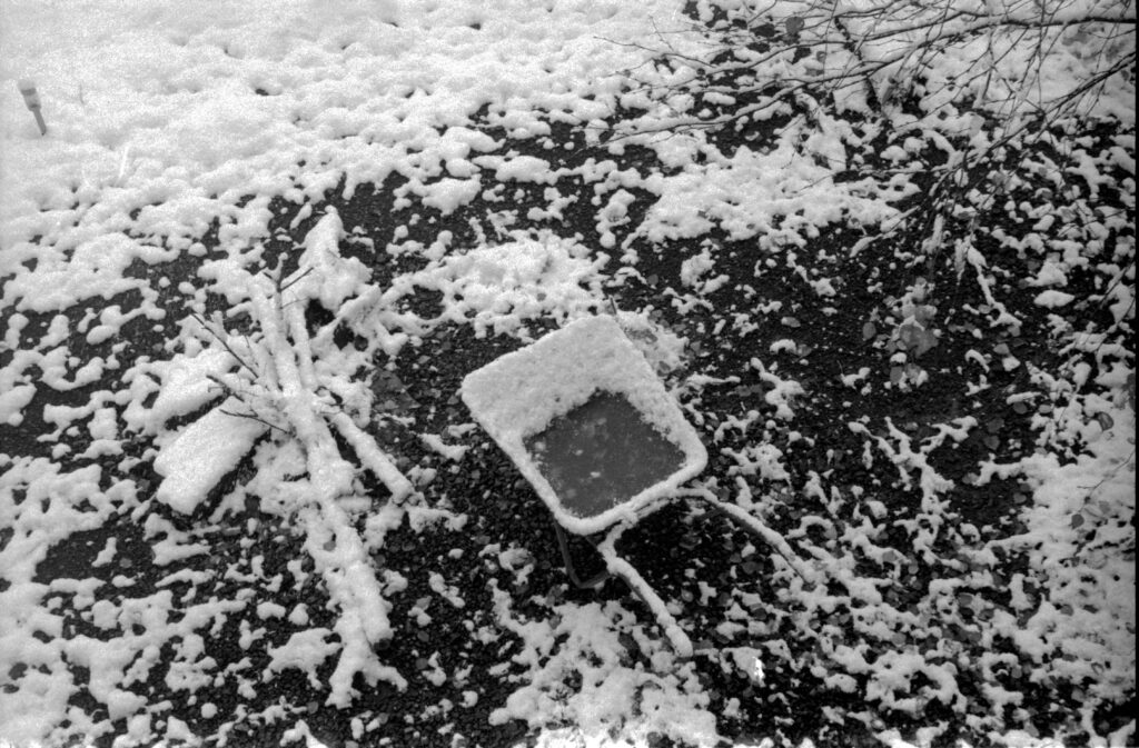
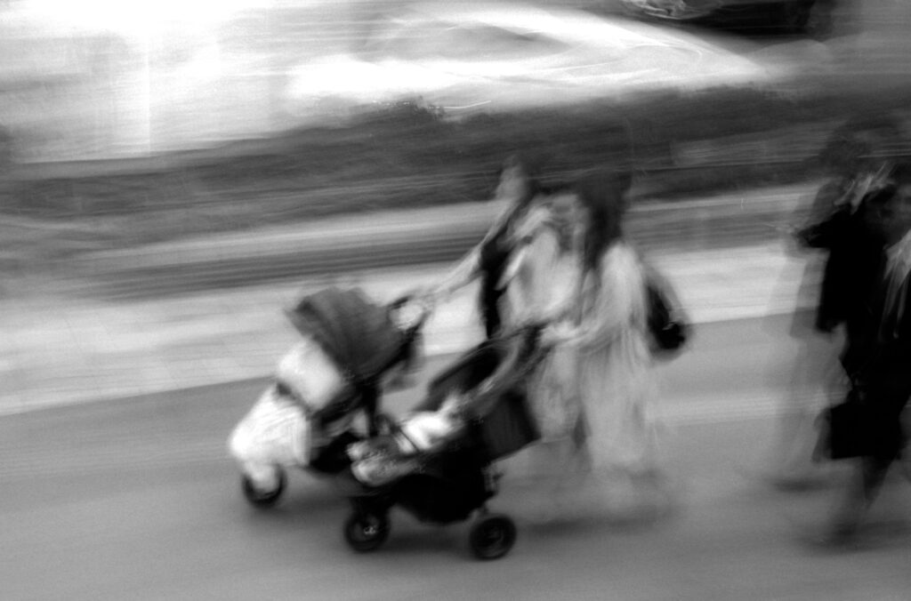
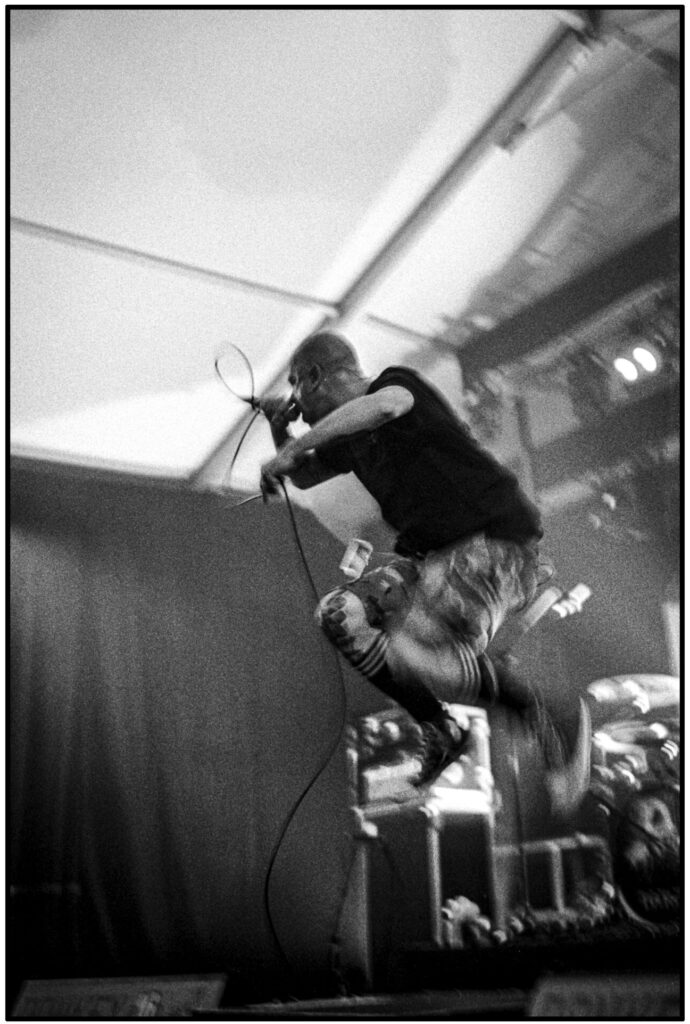
The images are from various times over the last 18 months, taken with a Pentax LX, Leica iiig, M3 or MP, on Ilford FP4 or Fomapan 100.

Seeing in B&W
Cirrus clouds at sunset, red filter
Seeing in B&W
Bench and shadow
Seeing in B&W
Winter junction
Seeing in B&W
Crumbling
Seeing in B&W
Wheelbarrow
Seeing in B&W
Bauhaus coffee
Seeing in B&W
Pinhole

Note on negative processing. See my articles on Rodinal (Adonal) on this site. I recommend stand development using 100:1 dilution – simple, reliable, automatically compensating for over and under-exposure. Use distilled or pre-boiled water for the final wash with only a few drops of rinse aid, and hang to dry in a still-air area.

Thanks for reading.

Share this post:

Find more similar content on 35mmc

Use the tags below to search for more posts on related topics:

Contribute to 35mmc for an ad-free experience.

There are two ways to contribute to 35mmc and experience it without the adverts:

Paid Subscription – £2.99 per month and you’ll never see an advert again! (Free 3-day trial).

Subscribe here.

Content contributor – become a part of the world’s biggest film and alternative photography community blog. All our Contributors have an ad-free experience for life.

Sign up here.

About The Author

By Geoff Chaplin
Primarily a user of Leica film cameras and 8x10 for the past 30 years, recently a mix of film and digital. Interests are concept and series based art work. Professionally trained in astronomical photography, a scientist and mathematician.
View Profile

Comments

Manuel on Seeing in Black and White

Comment posted: 31/05/2024

Thank you Geoff. Quite interesting.
Reply

Leave a Reply

Your email address will not be published. Required fields are marked *

Geoff Chaplin replied:

Comment posted: 31/05/2024

Thanks Manuel.

Reply

Leave a Reply

Your email address will not be published. Required fields are marked *

Jeffery Luhn on Seeing in Black and White

Comment posted: 31/05/2024

There are many ways to 'see' in B&W. I have my students shoot a quick monochrome image on a cell phone to see if the scene has 'strong bones.' Meaning a dramatic graphic structure comprised of strong highlights and shadows. A brilliant red rose against green foliage will look like a gray flower against a gray background. BORING. I took a one week workshop with Ansel Adams and he had one word of advice for previsualizing in B&W. I heard him say it at least 50 times 'Squint.'
Reply

Leave a Reply

Your email address will not be published. Required fields are marked *

Geoff Chaplin replied:

Comment posted: 31/05/2024

Now you mention it I think I might have read it in one of Adams' books, but my memory is a sieve ....

Reply

Leave a Reply

Your email address will not be published. Required fields are marked *

Markus Larjomaa replied:

Comment posted: 31/05/2024

"A brilliant red rose against green foliage will look like a gray flower against a gray background. BORING." Yes, without filtration it's boring. That's why we use those coloured filters on our lenses when working in monochrome. To turn that boring grey on grey into either brilliant on black (or rather very dark gray) or black against brilliant.

Reply

Leave a Reply

Your email address will not be published. Required fields are marked *

Jeffery Luhn on Seeing in Black and White

Comment posted: 31/05/2024

Geoff,

Very nice B&W examples. I especially liked the walls and the night shot!
Reply

Leave a Reply

Your email address will not be published. Required fields are marked *

Geoff Chaplin replied:

Comment posted: 31/05/2024

Thanks Jeffrey. I tried to show a range of different subject matter, some images more to my tastes than others.

Reply

Leave a Reply

Your email address will not be published. Required fields are marked *

Fred Nelson on Seeing in Black and White

Comment posted: 31/05/2024

Thanks! Brought to light some interesting
Facts about B&W film photography.
Reply

Leave a Reply

Your email address will not be published. Required fields are marked *

Geoff Chaplin replied:

Comment posted: 31/05/2024

Thanks Fred, opinions definitely, not sure they are all facts!

Reply

Leave a Reply

Your email address will not be published. Required fields are marked *

Gary Smith on Seeing in Black and White

Comment posted: 31/05/2024

Although I started shooting 50+ years ago, it was mostly b&w (color cost too much because I could do all of my b&w myself). I often "see" a photograph while I'm out and about. I'm not sure that a "see" what will become a good b&w shot. While once again shooting film, I try to be aware that I'm shooting b&w and adjust to accommodate.

Geoff, your included images are great. I have trouble thinking of you as a "beginner".
Reply

Leave a Reply

Your email address will not be published. Required fields are marked *

Geoff Chaplin replied:

Comment posted: 31/05/2024

Thanks again Gary. Maybe I was cheating a little - my 8x10 work was mostly B&W but it was a very restricted subject matter, disintegrating architecture. Venturing out into the wider world I'm a beginner.

Reply

Leave a Reply

Your email address will not be published. Required fields are marked *

Peter Roberts on Seeing in Black and White

Comment posted: 31/05/2024

Plenty of food for thought here, Geoff. Thank you.
Judging by your work in previous posts I'd always considered you a seasoned and accomplished B&W shooter. Perhaps you ought to reconsider your self-imposed status of "beginner".
Reply

Leave a Reply

Your email address will not be published. Required fields are marked *

Geoff Chaplin replied:

Comment posted: 31/05/2024

Thanks Peter, I've admired your images so comment very much appreciated.

Reply

Leave a Reply

Your email address will not be published. Required fields are marked *

Ibraar Hussain on Seeing in Black and White

Comment posted: 31/05/2024

Excellent article and lovely photos (as always )
Thanks again Geoff
Yes we have to see in tones - see the relationship between tones rather than colour
The mistake many inexperienced BW shooters make is muddling tone so that the final photography even though composed well lacks tonal range and value and this doesn’t quite work
I recommend all new or struggling with this to look at John Garrett’s excellent The Art of Black and white photography
Reply

Leave a Reply

Your email address will not be published. Required fields are marked *

Geoff Chaplin replied:

Comment posted: 31/05/2024

Thanks again Ibraar. Indeed tones are difficult, contrast and pattern easier. I'll get a copy of Garrett's book and learn something!

Reply

Leave a Reply

Your email address will not be published. Required fields are marked *

Ibraar Hussain replied:

Comment posted: 31/05/2024

He has 3 in a series - all excellent! Taught me all I know

Reply

Leave a Reply

Your email address will not be published. Required fields are marked *

Geoff Chaplin replied:

Comment posted: 31/05/2024

Thanks Ibraar, one is on order already.

Reply

Leave a Reply

Your email address will not be published. Required fields are marked *

Ibraar Hussain replied:

Comment posted: 31/05/2024

Excellent! He’s probably my favorite photographer followed by Don McCullin David Bailey and Richard I’anson of Lonely Planet fame. Garrett teaching methods are essential for any young or new budding B&W photographer - and even old hands like us who want a refresh. I used his books when starting to print as well. And go over them yearly to keep myself in line

Reply

Leave a Reply

Your email address will not be published. Required fields are marked *

Jukka Reimola on Seeing in Black and White

Comment posted: 31/05/2024

Before the digital revolution, I mostly shot in colour, with a little b&w thrown in. Nowadays I shoot almost entirely in b&w. I feel that if you shoot mostly with one prime lens, say for example 35mm, or 50mm, or whatever, you will soon learn exactly where you need to stand to get the photo you want. Even before you look through the viewfinder. In my experience, it is similar with b&w. You soon will seek for texture, lightning, tones etc. All those elements that will make a good b&w photo. Call it seeing in b&w, or previsualizing, or what ever you will. Practise enough and it will become automatic. Repetition is the key. I do not know for sure, but I suspect that shooting digital and later converting photos to b&w might mess up this automation. So, my advice, pick your film, camera, prime lens and shoot 10 000 photos. You will eventually make some great ones.
I think that the photo of the snowy street is just one of those pictures, that might look more mundane in colour. It looks great in b&w. There are blinding whites, pitch blacks and almost every tone in between. Of course composion is also just spot on, in typical Geoff fashion.
Reply

Leave a Reply

Your email address will not be published. Required fields are marked *

Geoff Chaplin replied:

Comment posted: 31/05/2024

Thanks Jukka, I completely agree - know your focal length and practice, preferably with film thinking before you shoot.

Reply

Leave a Reply

Your email address will not be published. Required fields are marked *

Marco Andrés on Seeing in Black and White

Comment posted: 01/06/2024

Your images show a wide range of tonalities/subjects/views. The work shows you’re no longer a beginner but close enough to the experience to provide pointers for beginners [and others].
.
Both colour and b/w photography provide different ways of « seeing » a world as are film and digital. Since they respond to light in different ways. They don’t « see » the way we do. But I do not « see » the way you do, literally and figuratively..
.
As for transforming the negative into a positive, to paraphrase Ansel Adams:
.
The negative is the score, the print the performance.
.
Your points apply to colour as well… [4] just scan to DNG … [5] remember that some subjects/scenes lend themselves to colour [ b/w ] while others work in both, revealing different aspects. After all, it really depends on intention.
.
Perhaps one could express the concept as learning « to feel in b/w [colour] ».
Reply

Leave a Reply

Your email address will not be published. Required fields are marked *

Geoff Chaplin replied:

Comment posted: 01/06/2024

Thanks Marco, I agree with your points particularly the importance of intention.

Reply

Leave a Reply

Your email address will not be published. Required fields are marked *

Keith Beven on Seeing in Black and White

Comment posted: 01/06/2024

Geoff, your exposures are clearly well judged - and if you have worked with 10x8 in B&W you will surely have had an appreciation for the Zone System but you mention only Sunny 16 rules. But that, together with any exposure meter, is based on the Kodak 18% grey standard. I only ever took one B&W course (about 45 years ago now) and learned what I needed to know in the first 10 minutes - that if you take a picture at the meter reading it will produce a negative averaged to 18% grey. If you want lighter or darker tones, you have to change the exposure. The Zone System developed by Ansel Adams and Fred Archer is a simple way of learning how to do so. There are much more complicated ways of doing so (see Phil Davis Beyond the Zone System) but for most of us the original is good enough! Having learned that my negatives improved immensely, in part because it also results in more thought about what you are trying to achieve.
Reply

Leave a Reply

Your email address will not be published. Required fields are marked *

Geoff Chaplin replied:

Comment posted: 01/06/2024

Thanks Keith. What fun that was! Zone system, plus/minus development, half an hour setting up the camera, taking light readings, calculating best exposure, noting how to develop the film and making print making notes. Been there, done that, now I'm lazy! 35mm, incident reading, compensating development and generally digital post! If you're still doing it then please continue and enjoy, and let's see some of your work (though agreed its hard to convey the full beauty of a wet process print digitally).

Reply

Leave a Reply

Your email address will not be published. Required fields are marked *

Ken Rowin on Seeing in Black and White

Comment posted: 01/06/2024

Geoff - great article and interesting photos. After 50 years of b&w photography, I am soften surprised by what I obtain from a given roll of film. Sometimes quite pleasantly surprised by a negative that has it all - great tones, good contrast and that prints easily. But more often by a negative that should have been superb, but just is blah in tones and contrast and prints poorly (usually after many wasted sheets of paper). Maybe someday I will get it right. Thanks again for a great article.
Reply

Leave a Reply

Your email address will not be published. Required fields are marked *

Geoff Chaplin replied:

Comment posted: 01/06/2024

Thanks Ken and interesting to hear. I had one surprise, even shock, from one recent film getting totally unexpected results from the entire roll (upcoming article).

Reply

Leave a Reply

Your email address will not be published. Required fields are marked *

Tony Warren on Seeing in Black and White

Comment posted: 01/06/2024

You are singing my song Geoff over and over again with this piece.

I would say an incident meter is the best teacher if you have one and is in a way a mechanised Sunny 16. It tells you the strength of the light falling on an average grey at any level within its range. From that you can judge how much to adjust exposure to render the important tones best. I would also suggest that investigating the effect of varying development is worthwhile. The old adage "expose for the shadows, develop for the highlights" was something I was always told.

And "Keepers of Light" - I bought it around the time it first came out around 1980 and is a constant source of inspiration still. I would also recommend Bill Brandt's work, he turned me on to monochrome very early on. He really used light and the lack of it. And of course Ansel Adams is worth a study if you really get into it - visualisation was his thing.

Like you I digitise with copying rather than scanning for maximum control as you say with post processing doing way more than could be achieved in the darkroom in terms of tone control.

Thank again for an insightful article.
Reply

Leave a Reply

Your email address will not be published. Required fields are marked *

Geoff Chaplin replied:

Comment posted: 01/06/2024

Thanks very much Tony. Yes, Sunny 16 is an incident 'meter' and indeed I do carry an incident meter around for when I'm lazy or befuddled. I like Sunny 16 particularly as a teaching tool because one learns about light so much faster by having to think rather than just pull out a meter. I agree exposure and development go hand in hand, though lazy-me, I like the ease of compensating development largely (not entirely) taking one aspect out of the equation.

Reply

Leave a Reply

Your email address will not be published. Required fields are marked *

Marco Andrés replied:

Comment posted: 01/06/2024

KISS – minimalism/simplicity [acronym for keep it simple stupid”].

Reply

Leave a Reply

Your email address will not be published. Required fields are marked *

Tony Warren replied:

Comment posted: 01/06/2024

The KISS principle - I am all for that Geoff.

Reply

Leave a Reply

Your email address will not be published. Required fields are marked *

Geoff Chaplin replied:

Comment posted: 01/06/2024

Ha, ha! Yes indeed, I love to KISS!

Reply

Leave a Reply

Your email address will not be published. Required fields are marked *

ACesa on Seeing in Black and White

Comment posted: 02/06/2024

Greats pictures !
My two cents about "seeing" in black & white : using colored filters with an SLR helps a lot as the viewfinder than displays a monochrome version of the scene you are trying to capture.
Reply

Leave a Reply

Your email address will not be published. Required fields are marked *

Geoff Chaplin replied:

Comment posted: 02/06/2024

Yes, I tried deep red acetate sheet just held in from of my eyes (I know the lens framing). Better than squinting but more hassle. Thanks Alexandre.

Reply

Leave a Reply

Your email address will not be published. Required fields are marked *

Leave a Comment

Leave a Reply

Your email address will not be published. Required fields are marked *