
I prefer film. There… I said it! Man, it feels good to get that off my chest. Even in 2026 when digital cameras and phones are awesome, I always pick up a film camera. But why?
After a number of losses recently in my life – the big ones that change you, I have gone through the inevitable and utterly un-unique questioning of what matters. I offer nothing more than the senseless confusion with it all; so I try to make the best of it.
For me, that’s filling my time with creativity. AI can go to hell. I have found that in any creative pursuit from writing, painting, photography, sculpture or learning a musical instrument, the joy for me is in the process – making it and all the challenges and failures along the way is the value to me.
So now we all agree film is best, the natural next question is, which film?
Sadly we are not quite as spoilt for choice as when I first started shooting film almost 40 years ago (with a digital break in between – sad, I know), but we still have a lot of fun options. When I first started getting back into film photography, I excitedly rushed out and bought a big bag of all sorts of color and black and white films. I couldn’t wait to explore all the different offerings and see what clicked for me. In hindsight, this may not have been the best first step into shooting film. I ended up with a lot of mediocre shots as I got to know none of the film rather than learning the qualities of a few. On the positive side though, it did offer me a first stumbly step into what was out there.
Working in Feature Film Animation by day, I am a HUGE movie buff, and nothing is better than seeing a film in the theater on the original 35mm or 70mm print. It got me thinking about the choices made by the Director and Cinematographer – the same kinds of choices we make when making films and deciding upon a look and color palette for our movies – a huge amount of thought and experimentation is undertaken to decide what is best to help tell the film maker’s story.
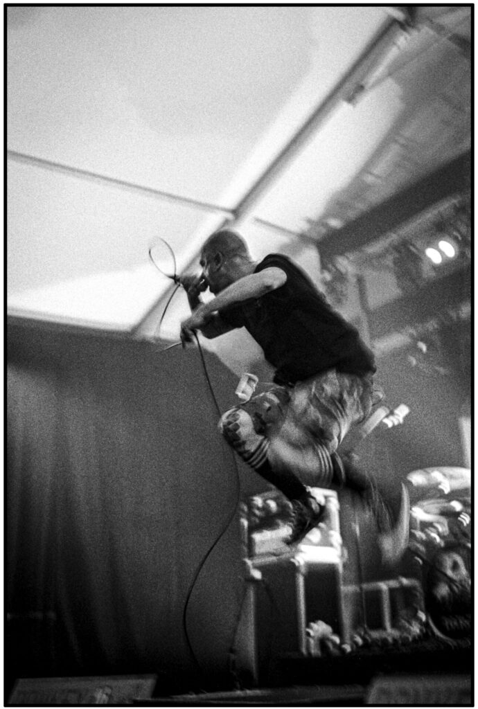
Robert Doisneau, the incredible French photographer, talks about the world as a theatre and Paris is his stage where the story unfolds in front of him, just waiting to be captured. The very best photos, he describes, as the ones that drop you into the middle of the action. Being thrust right into the middle of the story the viewer is left to fill in all the wonderful open-ended possibilities of where the story might take us.

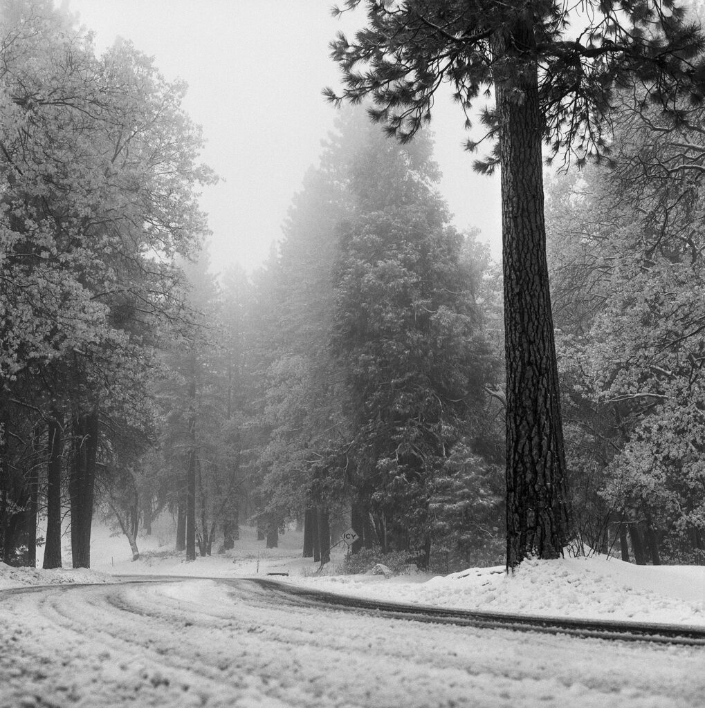
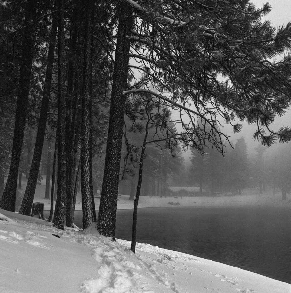
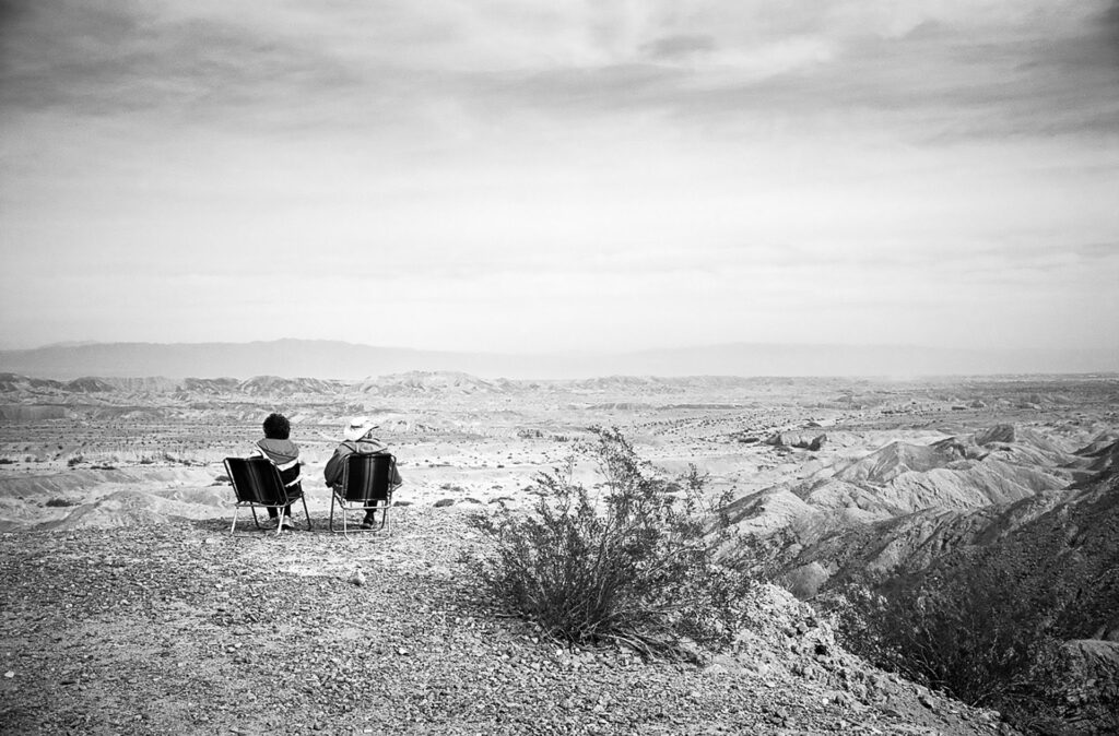
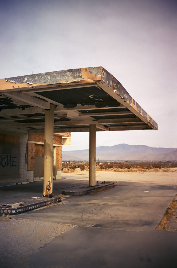
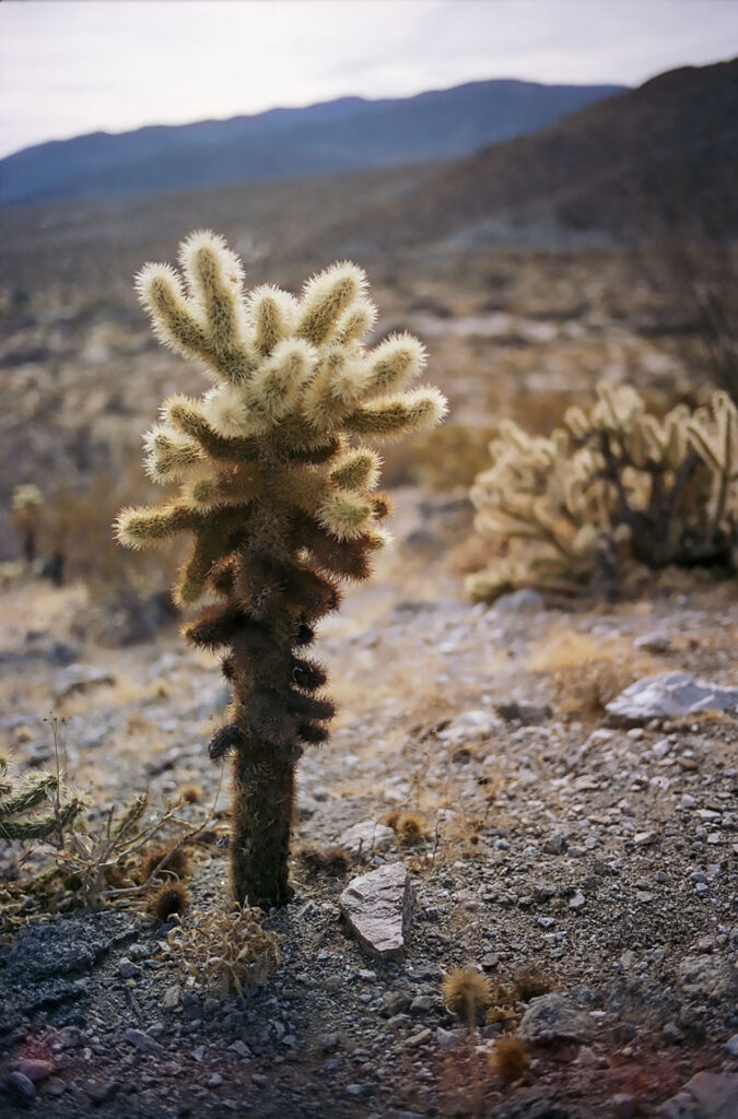
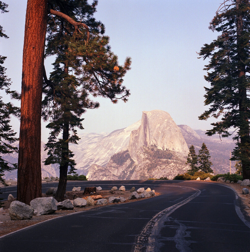
With this idea of storytelling in mind, and that the very look of the film, be it the grain, the contrast levels, the color palette and saturation or even lack of color helps to set a mood. I decided to start thinking about what film I would pair up with different locations or subjects to best conjure the narrative I planned on telling. My feeling is that I shoot film to create a look, something different and special, outside of the norm of digital. These different looks and styles can compliment and create different feelings in different locations.
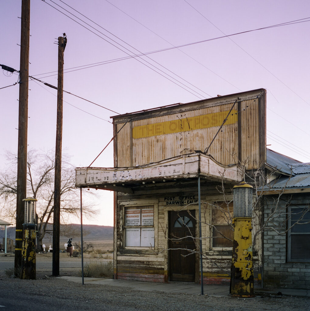
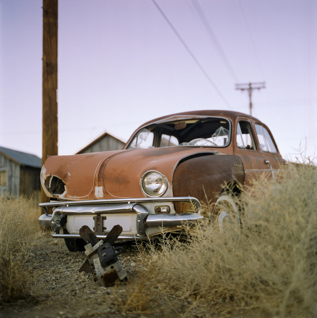
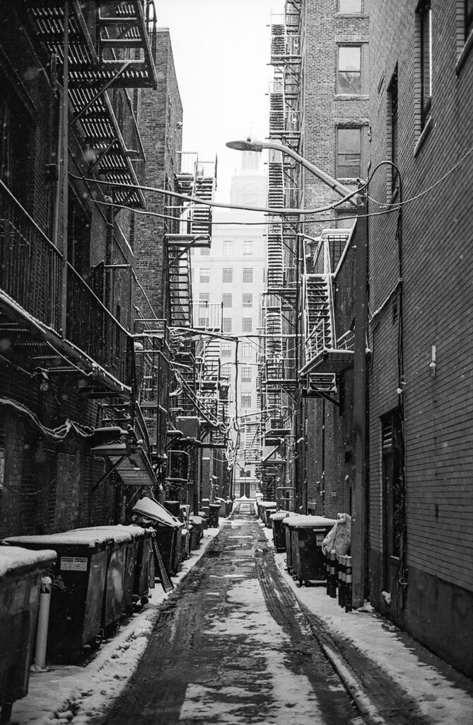
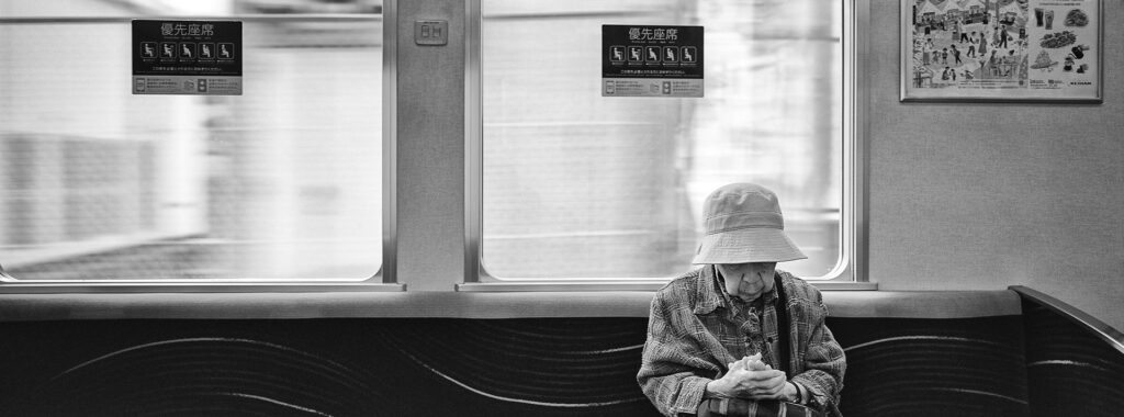
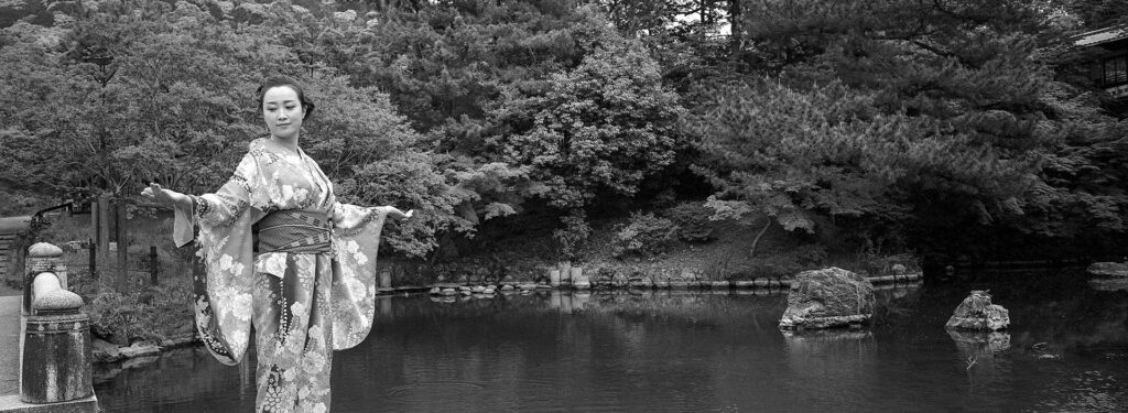
For example, Kodak Portra 400, to me, is great in Los Angeles. Cinestill 50D and Ektar 100 in New York, and in Tokyo Cinestill 800T, Ektar 100 and Ilford Delta 100.
This is, of course, totally subjective. But there is a color palette and a quality of light that is different in each location and I try to marry up films to go with that based on my personal preferences and looks that I am trying to capture.
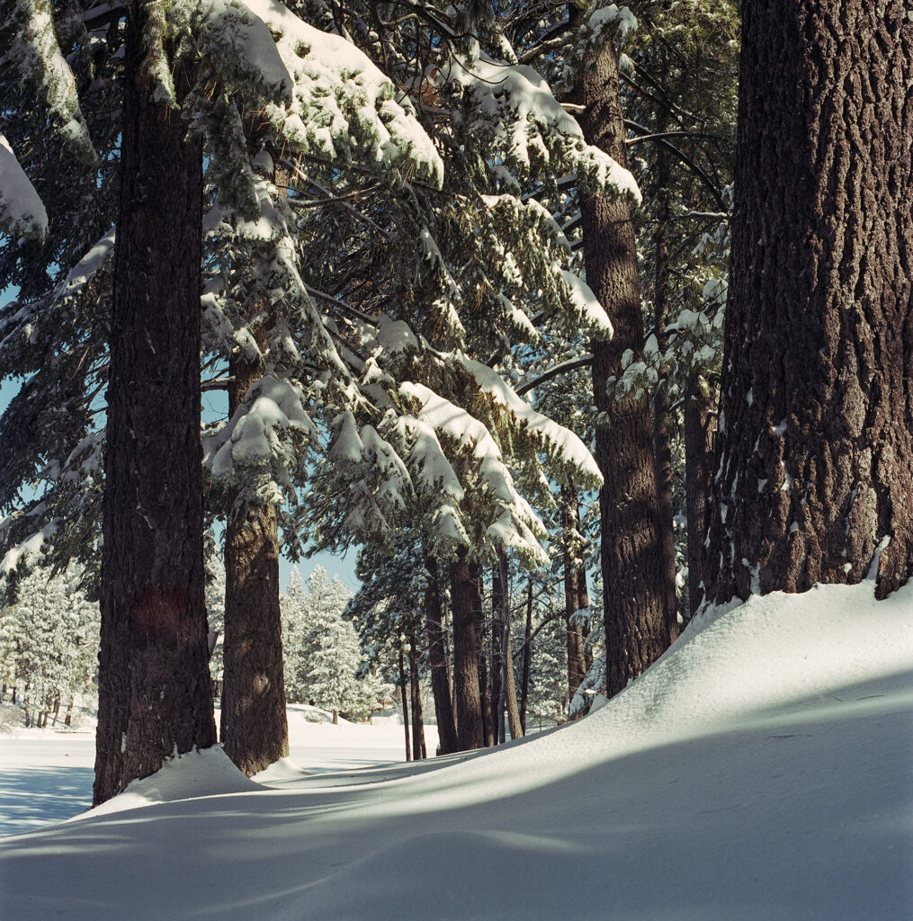
But it is more than just that. Higher levels of grain can add a level of grittiness to the location, a more washed out color palette like Portra 160 or Cinestill 50D can create that wonderful pastels of Wes Anderson compared to rich saturated colors of a movie like Amelie. Black and white can add nostalgia or even romance to a scene depending on the levels of contrast – I would not pick Ferrania P30 – a super high contrast monochrome film for a moment that needs to be soft and delicate.

I recently attended an amazing exhibition of photographs taken in steam baths. The photos were stunning and it was an ongoing series the photographer had been working on throughout the transition from film to digital. The film photos in the series, for me, with the higher ISO rated film stock added a level of grain that combined with the dark wood environments and brilliant white steam, worked far better than those shot digitally later. Not because the photos were any better on film vs digital, but because the medium of film brought another element to the image, one of atmosphere. The grain and slightly softer focus compared to the perfect clean crispness of digital helped to bring the location, the materials and the feeling of the heat and water to life. The chosen film helped to tell the story of the place and people.
I certainly don’t profess to be any kind of expert, there is enough of that already on the internet. I started writing not for the intention of posting on a website but to at least force myself to collate and articulate or justify my thinking to myself.
I started this article with an inflammatory cry of sending AI to hell. For me, AI takes away everything that I love about the creative process. The brainstorming, the decision making, the process and problems we face and often fail before mastering until we meet the next hurdle in the artistic journey. And of course the fingerprints of the artist behind the work. Their unique choices rather than a prompted machine spitting out stolen regurgitated slop.
Film adds that imperfect and additional physical layer – something removed from the digital system that the artist has to choose, load, develop and eventually scan or print – and to me there is nothing more valuable and wonderful as an audience member and lover of photography to enjoy all the decisions and struggles of a real human photographer in the face of this AI digital uprising.
Thanks so much for reading and checking out my photos. More of my work can be seen on my website.
Share this post:


Comments
Art Meripol on Storytelling with Film
Comment posted: 05/02/2026
Comment posted: 05/02/2026
Neal Wellons on Storytelling with Film
Comment posted: 05/02/2026
I enjoyed the photography on your website and love the title and theme of "Before Color was Forgotten." But the desert series was my favorite work on the site.
Comment posted: 05/02/2026
Bob Morgans on Storytelling with Film
Comment posted: 05/02/2026
Your photos are fabulous…..loved looking at them.
Great clarity and colour, and lovely contrast in the black and white photos.
Thanks for sharing.
Comment posted: 05/02/2026
Curtis Heikkinen on Storytelling with Film
Comment posted: 05/02/2026
Comment posted: 05/02/2026
Walter Reumkens on Storytelling with Film
Comment posted: 05/02/2026
Comment posted: 05/02/2026
Charles Young on Storytelling with Film
Comment posted: 05/02/2026
Comment posted: 05/02/2026
Giuseppe on Storytelling with Film
Comment posted: 05/02/2026
Giuseppe P
Comment posted: 05/02/2026
Jens Kotlenga on Storytelling with Film
Comment posted: 05/02/2026
Comment posted: 05/02/2026
Erik Brammer on Storytelling with Film
Comment posted: 05/02/2026
Comment posted: 05/02/2026
Michael Jardine on Storytelling with Film
Comment posted: 05/02/2026
Film is splendid, and shooting/ wasting many rolls over recent years has been a salvation of sorts. I do love this process, and it brings so much reflection and joy (and a process which with its patience can absorb a Hellish and miserable internal state). I've also started doing some research before travelling: can I buy film locally? If so, then you'll see an amazing side of wherever by going and finding who and where sells it.
More power to your shutter finger.
Comment posted: 05/02/2026
Scott Ferguson on Storytelling with Film
Comment posted: 05/02/2026
These are remarkable photos! I'm very interested to know more about how you've gotten such super sharp and gorgeous images on film, including which stocks you are using as well as cameras & lenses. I'm guessing the square images are on Hasselblad or some MF camera and your panoramic shots are on an X Pan or a Fuji TX 1, but some of your 'portrait shots' look like they could be MF to me, either with a 645 back or maybe on 35mm with a fairly high end lens of recent vintage? It also feels like you are very meticulous about how you shoot and probably spend a fair amount of time setting a frame and making a shot just so in great light. Super impressive!
I think they are gorgeous and you have an amazing eye. I'd love to see more or your terrific photography (I took a look at your website and it's full of similarly first class work!). I'm also filmmaker, but don't have the long history in photography that you do -- it's a relatively recent hobby/pastime that happened more through serendipity than by planning when a couple of very old and well used cameras, a Leica and a Hasselblad, fell in my lap. I've been shooting quite avidly ever since, midway into my second year shooting film. I've been having a blast and sharing my learning curve in public here on 35mmc, warts and all. I have a long way to go and I lot I think I could learn from you, so please keep sharing!
Best,
s
Comment posted: 05/02/2026
Comment posted: 05/02/2026
Comment posted: 05/02/2026
Comment posted: 05/02/2026
Comment posted: 05/02/2026
Ibraar Hussain on Storytelling with Film
Comment posted: 05/02/2026
Not a fan of C41 but just shot a roll of Cinestill 800T in Panoramic and really liked it.
Great photogrrpahy!
More pls
Comment posted: 05/02/2026
Comment posted: 05/02/2026
Neil Lloyd on Storytelling with Film
Comment posted: 06/02/2026
Comment posted: 06/02/2026
David Pauley on Storytelling with Film
Comment posted: 06/02/2026
Comment posted: 06/02/2026
Comment posted: 06/02/2026
Bill Brown on Storytelling with Film
Comment posted: 06/02/2026
Comment posted: 06/02/2026
Geoff Chaplin on Storytelling with Film
Comment posted: 06/02/2026
Needless to say i loved the shots especially the opening shot and the snow dusted vertical street image. Thanks gor the story snd images, beatiful work.
Comment posted: 06/02/2026
Simon Foale on Storytelling with Film
Comment posted: 07/02/2026
Comment posted: 07/02/2026
cdlinz on Storytelling with Film
Comment posted: 08/02/2026
Comment posted: 08/02/2026
Alexandre Kreisman on Storytelling with Film
Comment posted: 24/03/2026
I really loved your piece, and could say : Amen!
You have found your touch and your vision, and that is wonderful for you. I think your pictures are beautiful. The technique is there and the emotion and story telling of those images are brilliant.
Just a question, what camera are you using to scan your negatives? I’ve tried several, but still, am not satisfied.
Continue shooting and making beautiful articles please.
Happy shooting Alex
Comment posted: 24/03/2026
Comment posted: 24/03/2026