“But we come now to the worst point, that of color.”
—Hermann Wilhelm Vogel, On the Correctness of Photographs (1875)
Colour is surprisingly relevant to black-and-white photography.
You may have come across terms like orthochromatic, panchromatic, infrared and so on, which are used to describe the various types of B&W emulsions which are out there. These terms refer to different spectral sensitivities – how sensitive the film is to various wavelengths (colours) of light.
The term spectral sensitivity might sound boring and/or scary – the kind of jargon which photography veterans use to bamboozle and discourage newbies. In this article, I’ll try to demystify the term, and to explain how an understanding of film characteristics can help us get the kind of results we want.
Why would you want to know this stuff? Well, there are so many different types of B&W film out there, and exploring their variety and complexity can expand our creative options. Besides, it’s fun!
Overview
Colour Theory for B&W Photography Part 1, published two years ago, was about using digital and analogue filters. This article is Part 2 of that series, where I’ll analyse and compare five different types of B&W film:
- Blue-sensitive
- Orthochromatic
- Panchromatic
- Orthopanchromatic
- Extended red-sensitivity
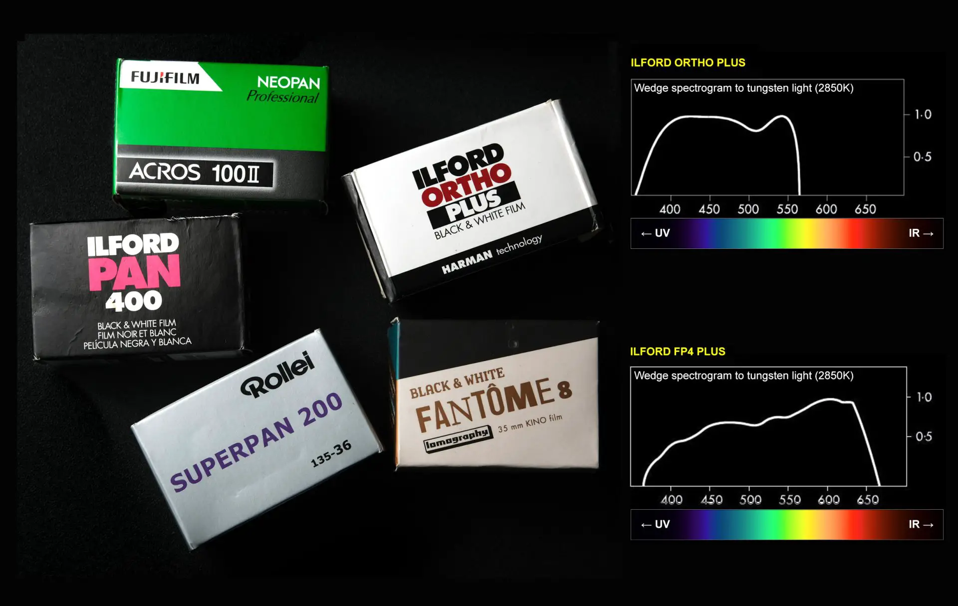
The header image, by the way, shows one example of each type: Lomo Fantôme (blue-sensitive), Ilford Ortho (orthochromatic), Ilford Pan 400 (panchromatic), Fuji Acros (orthopanchromatic) and Rollei Superpan (extended red-sensitivity).
This article came about because I was looking for a comprehensive online resource on spectral sensitivity. Having tried and failed to find such a resource (and having underestimated how much work it would entail), I rashly decided to write an article myself.
In the process, I also came up with a quick-and-dirty test which I’ll describe in this article. The rainbow film test, as I call it, is a 10-minute experiment which you can perform at home. It gives you a rough idea of the spectral sensitivity of any B&W film that you might be interested in. All you need is a film camera, a computer, and preferably, a tripod.
All set? Let’s do this.
Preliminaries
A black and white photograph “translates” the colours of the original scene into shades of grey.
This “translation”, as I described in Colour Theory for B&W Photography Part 1, can be affected by filters – both analogue filters attached to the lens, and digital filters in software such as Photoshop. A red filter, for example, makes blue skies look darker. It “translates” red to a darker shade of grey.
In case of B&W film photography, the translation depends not just on filters but also on the film itself. Specifically, it depends on the film’s spectral sensitivity, that is, its response to various wavelengths (colours) of light. And that’s what this article – Colour Theory Part 2 – is all about. How do various B&W films respond to different colours of light? What impact does that have on our images? And how can we ascertain (or at least estimate) the spectral sensitivity of a B&W film?
Spectral sensitivity of film
Not all B&W films record colour in the same way. But before we get into the technicalities, let’s look at a visual comparison. Spectral sensitivity curves have their place, but photography, after all, is a visual art.
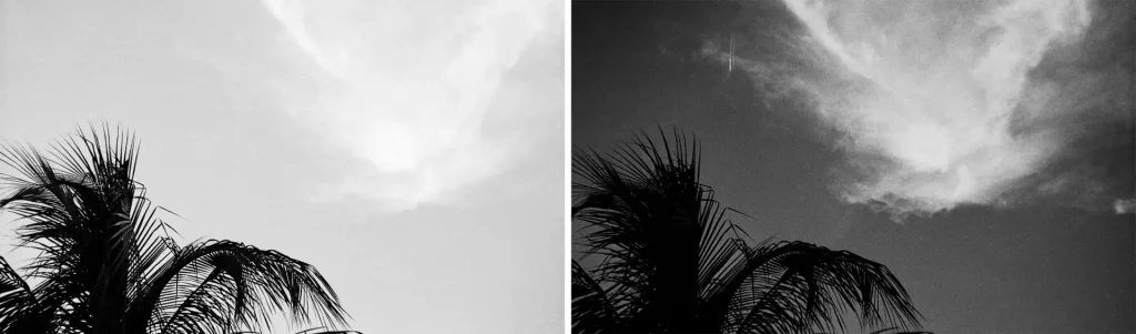
The comparison below shows a digital image in colour, followed by two B&W images shot on panchromatic film (Ilford FP4 Plus) and orthochromatic film (Ilford Ortho Plus).
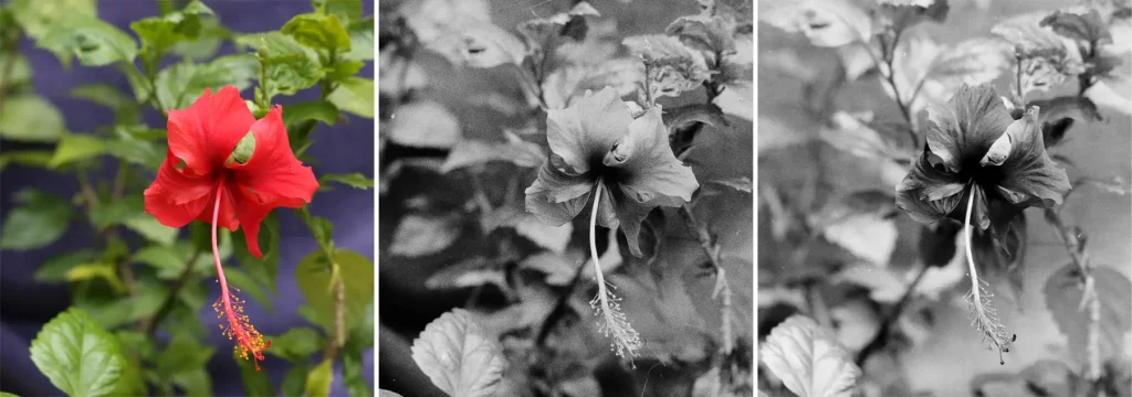
On panchromatic film, the hibiscus is slightly lighter than the blue background, while on orthochromatic film, it’s darker. Why is that?
I will keep the theory as short and sweet as I can.
Colour theory
Visible light consists of different wavelengths. Violet light has a short wavelength (~380-450 nanometers), and red light has a long wavelength (~630-700 nanometers). Other colours of light are in-between.
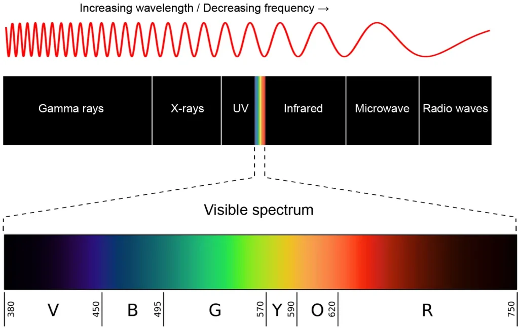
A typical human eye is sensitive to wavelengths from approximately 380 to 700 nanometres. This range is called the visible light spectrum. Our sensitivity peaks at around 555 nanometers, a yellowish-green color.
What about film? Well, it depends.
Spectral sensitivity curves
Most film manufacturers publish datasheets with various technical details, including spectral sensitivity curves –graphs which show how sensitive the film is to various wavelengths (colours) of light. Lina Bessonova has compiled quite a few spectral sensitivity curves from various manufacturers, which is a good resource.
Below, for example, are the curves for the two films used in my earlier comparison with the hibiscus:
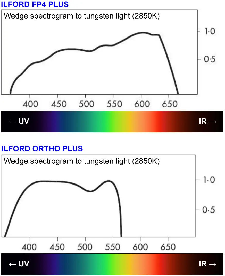
The horizontal axis represents wavelength (nanometres), and the vertical axis represents sensitivity. The rainbow band, which I added, shows how wavelengths correspond to colours. For each wavelength or colour, the height of the curve tells you how sensitive the film is to that colour.
As you can see, Ilford Ortho is more sensitive to blue light, but has little or no sensitivity to yellow, orange and red. This explains why, on orthochromatic film, the red hibiscus (shown above) looks darker. The film can’t “see” red, so it’s almost as if the flower is reflecting no light at all.
So the spectral sensitivity curves tell us how the two films are different, and the flower photos corroborate that with real-world results. But curves are not always available. With off-brand, respooled or other obscure films, you may not even know whether you’re dealing with panchromatic, orthochromatic or some other type. Or sometimes, even if you have all the data, you might want to test a film under controlled conditions to see how it renders colour. This is what prompted me to devise the rainbow film test.
The rainbow film test
This test – which I call the rainbow film test – involves displaying a test target (a graphic with coloured bands) on a computer screen, and photographing it with a test film, i.e. the B&W film which you want to test. By observing how the bands are rendered in B&W, and comparing that with the rendition on some standard panchromatic film (e.g. Ilford HP5), you can get a sense of what the test film is like.
Now let’s get into more detail.
Test target
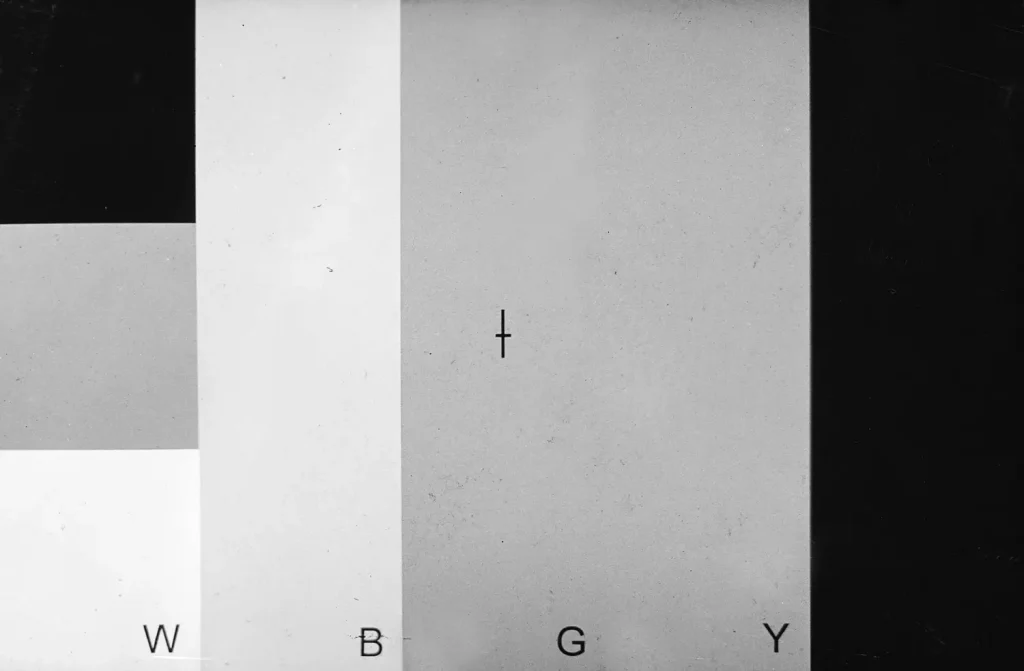
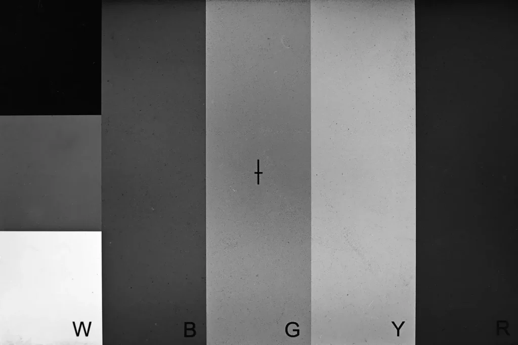
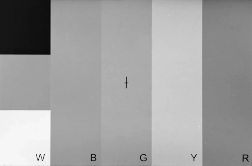
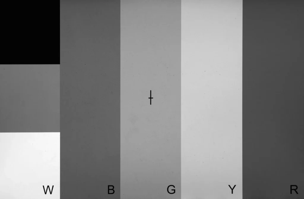
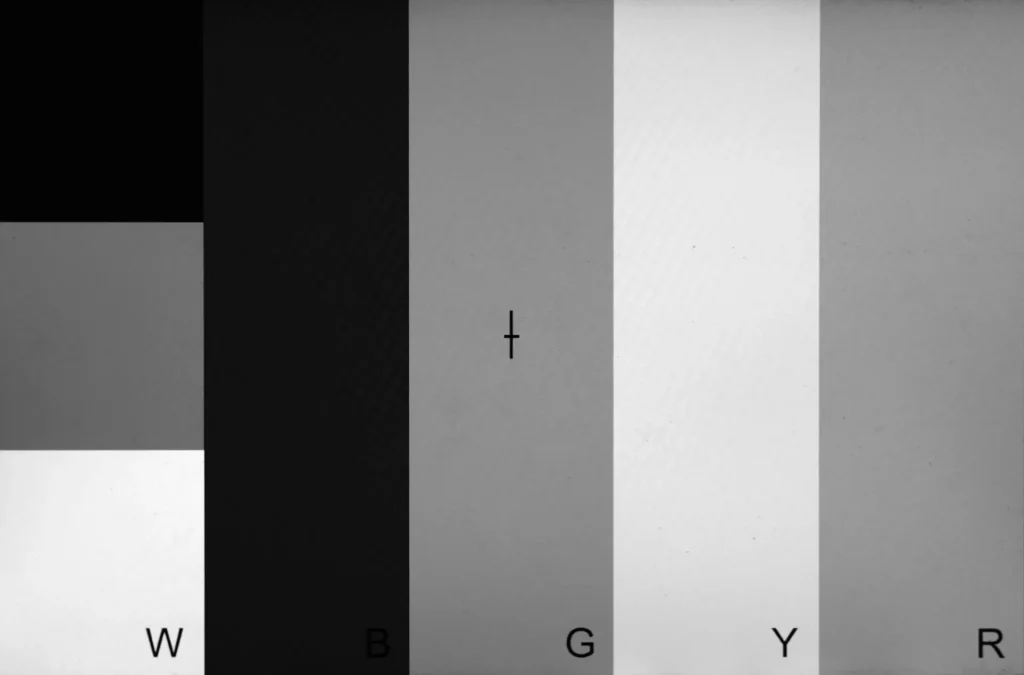
Here is the test target which I made (feel free to download or adapt it for your own use):
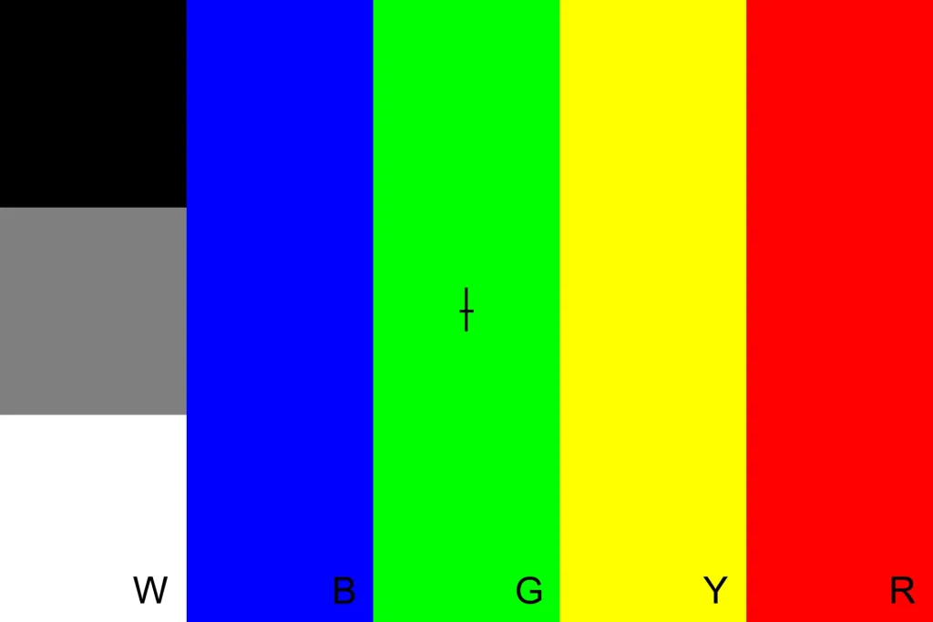
The cross in the middle is to help with focusing. The aspect ratio is 3:2, for 35mm film, but it’s easy to convert it to square (6×6) or any other format.
If you want to create your own test target, the hex codes I used are:
- Black: #000000
- Grey: #7f7f7f
- White: #ffffff
- Blue: #0000ff
- Green: #00ff00
- Yellow: #ffff00
- Red: #ff0000
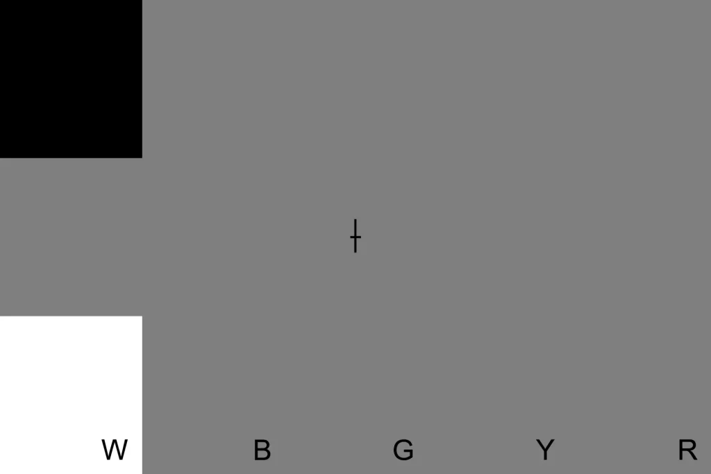
The colour values are chosen such that if you do a straight desaturation in Photoshop, the four coloured bands are all converted to the same shade of grey.
Test procedure
The test itself is very simple. For consistency, I always do the test on the same laptop screen, set to maximum brightness. I calibrate my screen from time to time (this is good practice anyway, if you work with images). I use free online tools for calibration, but if you want more precision, dedicated calibration devices are also available.
If possible, use the same lens for all your tests, because lenses – especially vintage ones – can affect colour rendition. Make sure there are no filters on the lens, as they can influence the result too (skylight filters, for example, have a subtle magenta cast).
It’s best to do the test in a darkened room, so that there are no reflections off the screen. Display the test target on your screen. Set up your camera so that the film plane is approximately parallel to the screen (this ensures that the resulting image is not distorted or partly out of focus). A tripod is helpful, but not essential.
Fill the frame with the test target, and focus. Depending on your minimum focus distance, and especially if you have a small screen, the target may not fill the frame. But as long as it’s clearly visible, it should be fine.
Set the aperture to a middle value (say f/4) for a sharp image. Meter off the grey square. You can also use your camera’s built-in light meter, or failing that, an external meter (I use a free light-meter app). If your test procedure and display are consistent, you only need to meter once. Later on, if you are testing a film with a different ISO, just adjust the shutter speed to compensate. If your shutter speed ends up being longer than 1 second, remember to account for reciprocity failure too.
Shoot and develop the film.
Analysis
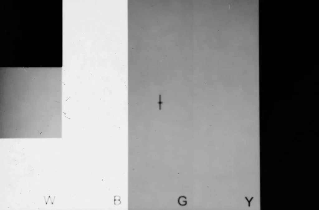
OK, so now you have a B&W version of the test target – a rainbow in greyscale. But what does it tell you?
The next two images show my test results for a typical panchromatic film (Ilford HP5 Plus) and an orthochromatic film (Ilford Ortho Plus).
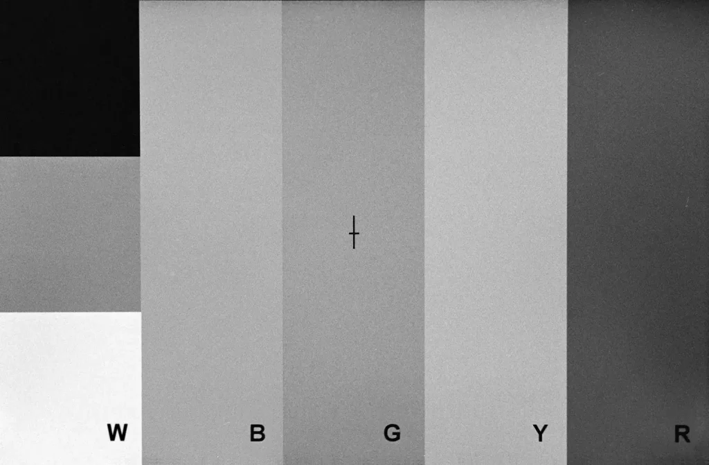
What you should be looking at is the order of the coloured bands from light to dark, as they appear on film. We’re less concerned with the fact that, say, Blue looks only slightly lighter than Green on HP5, and significantly lighter on Ilford Ortho. These are differences in band contrast, which could be influenced by exposure, development and scanning. But none of these will affect the band order, so that’s what I focus on.
In this case, the main difference in band order is that on HP5, Yellow is the lightest of the colour bands, whereas on Ortho, Yellow is darker than Blue (and about the same shade as Green). This confirms what we saw from the spectral sensitivity curves which I discussed earlier. Compared to panchromatic film, Ilford Ortho is more sensitive to blue light, but has little sensitivity to yellow. As for red, the Ortho film cannot see it at all. On the Ortho negative, the red band has no visible density, just like the black square.
The 5 main film types
Having described my rainbow film test, I’ll now analyse and compare the five main types of B&W film, categorised by spectral response:
- Blue-sensitive
- Orthochromatic
- Panchromatic
- Orthopanchromatic
- Extended red-sensitivity
For each type, I’ve included:
- A few brand names, if you want to try them out
- Spectral sensitivity curves from manufacturers (where available)
- Rainbow film tests (done by me)
- Sample images
- Comparisons with digital (colour) or other B&W film photos.
Blue-sensitive
This is the oldest type of emulsion, with the most limited sensitivity.
As Encyclopedia Britannica explains, “The earlier emulsions were most sensitive to violet and blue light (…) Toward the cyan and green, sensitivity drops rapidly. (…) The result of such a characteristic is that in a natural scene reds and yellows appear black in the positive, and green appears too dark.”
Such emulsions are called blue-sensitive, natural or ordinary. In fact, the effect is anything but “natural” or “ordinary” – but as we shall soon see, film terminology is not always logical.
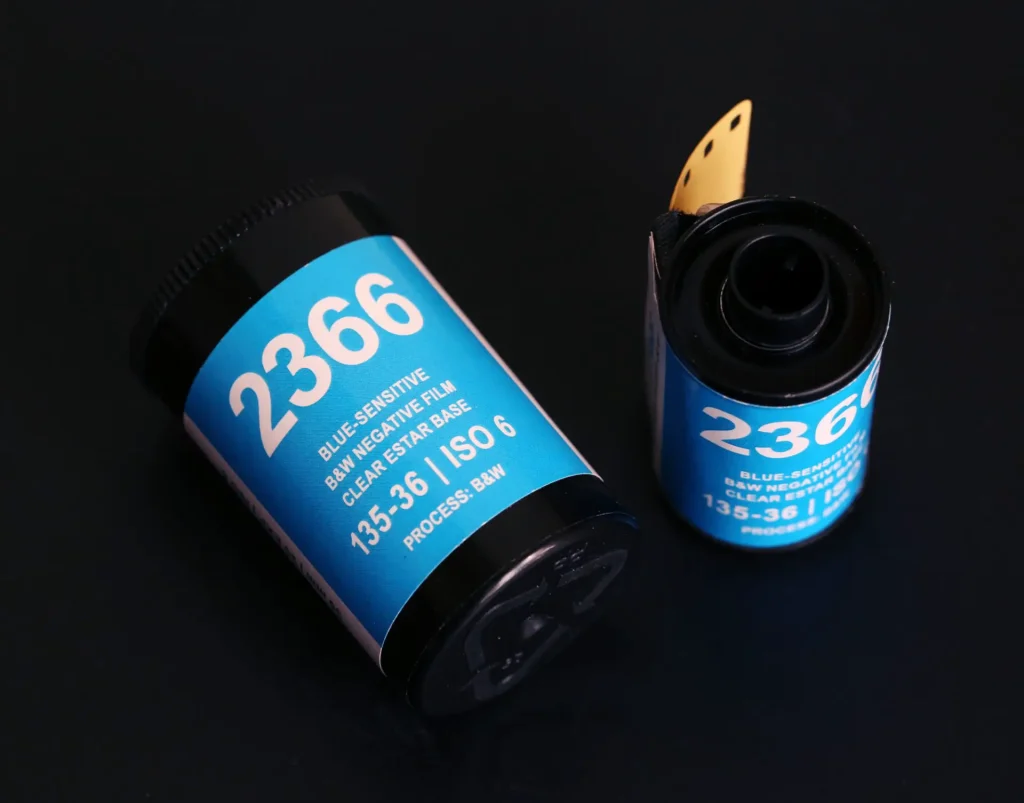
Some of the oldest photographic processes, such as daguerreotypes and wet-collodion, were also blue-sensitive. If you want to make like it’s 1865 but without the inconvenience of plate cameras, blue-sensitive film is still(!) available in 35mm format. Options include Argenti 2366 (pictured above, available from Foto-R3), and FPP Blue Sensitive.
Here’s the spectral sensitivity curve for Eastman 2366 (you can read my full review here). As before, I added a rainbow band to show approximately how wavelengths correspond to colours.
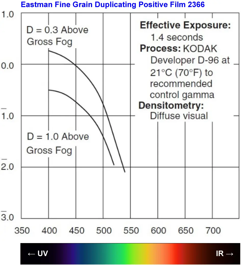
Notice how it falls off a cliff in the blue-green zone? The film’s sensitivity in the visible spectrum is narrower than panchromatic and even orthochromatic film.
Now let’s look at the rainbow film test for this blue-sensitive film. As before, I’ve compared it with panchromatic Ilford HP5 Plus film.
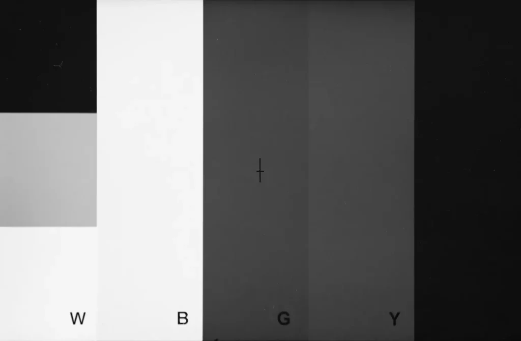
Blue is slightly darker than yellow on HP5, but significantly lighter than yellow on Eastman 2366. This is exactly what you’d expect from a blue-sensitive film. On the Eastman 2366 negative, the red band has no visible density; the film can’t see it at all.
What effect does this have on real-life photos? Yellow chrysanthemums, for example, look almost black – strikingly different from the desaturated digital image (below-right).
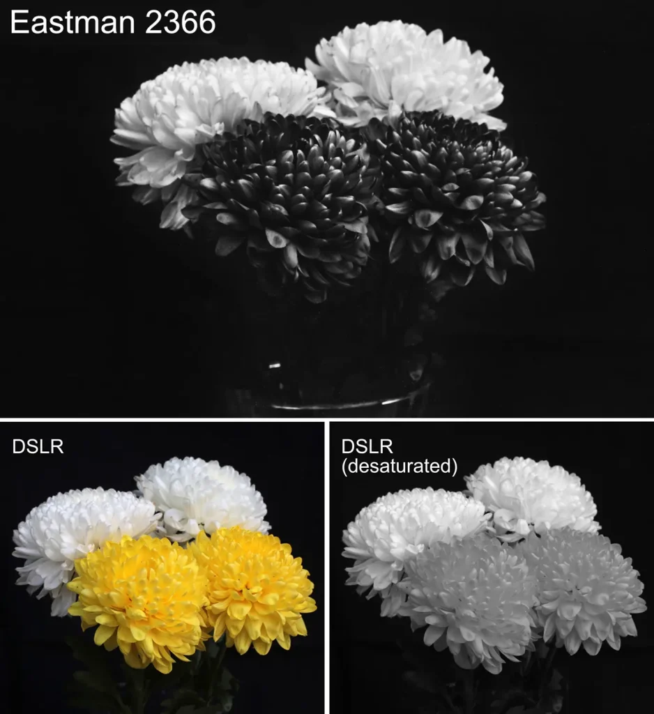
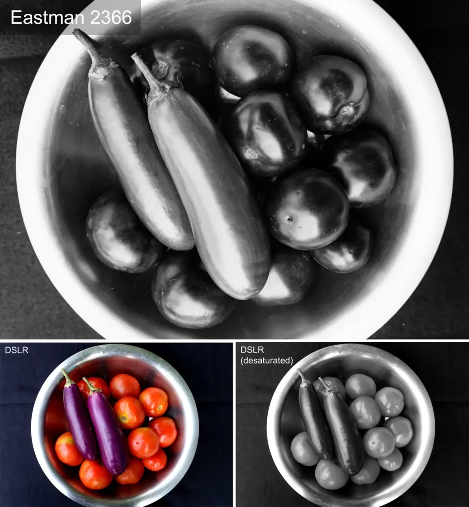
Here’s another example. Note how on Eastman 2366 film, the aubergines are lighter than the tomatoes? Since the film can’t “see” red, the tomatoes look like black plums. In the desaturated digital image, the tonal relationship is reversed (tomatoes are lighter than aubergines).
The Eastman 2366 effect is similar to using a blue filter on panchromatic film. A blue filter passes blue light while blocking other colours, whereas blue-sensitive film is more sensitive to blue with little or no sensitivity to other colours. The net result is similar.
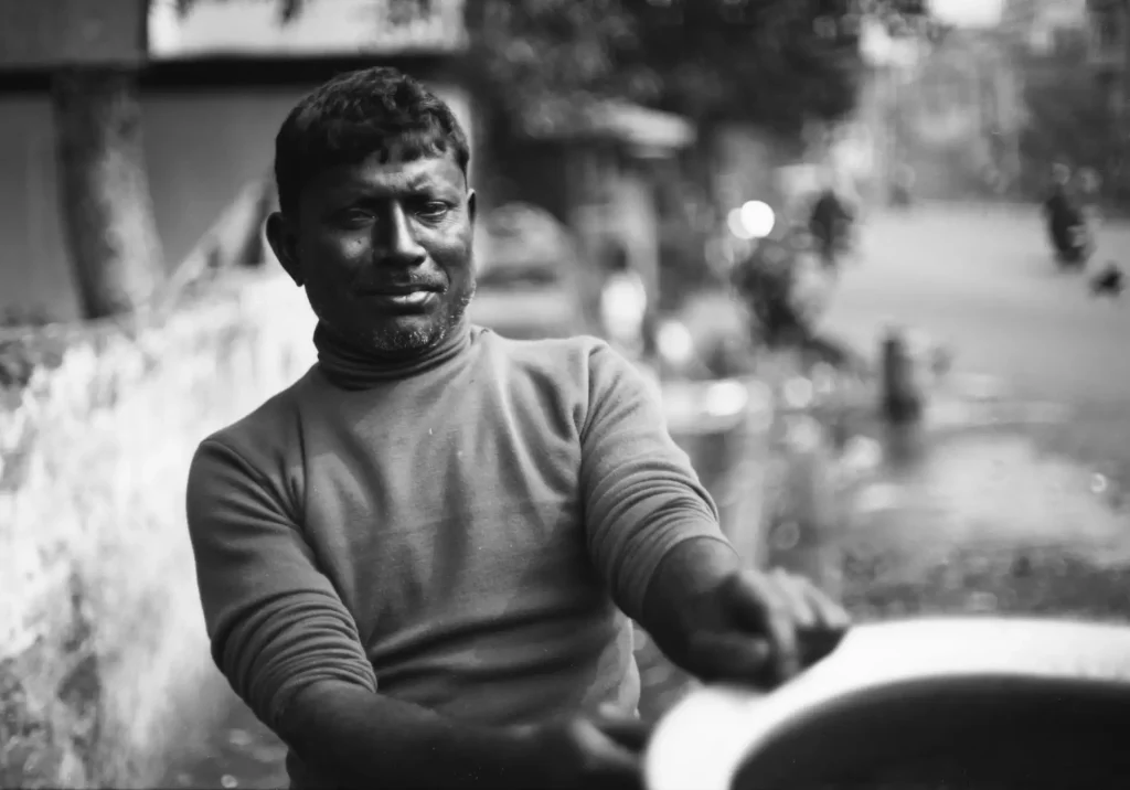
Darker skin has a higher proportion of red, which blue-sensitive film can’t see. The portrait below, of an Indian man, has a strange, almost metallic skin tone.
Orthochromatic
The quote at the top of this article is from German photo-chemist Hermann Wilhelm Vogel. The full quote goes: “But we come now to the worst point, that of color. Photography gives the cold colors—blue, violet, and green—too light, and the warm colors too dark.”
The problem described by Vogel is typical of early emulsions, which had little or no sensitivity to longer wavelengths (i.e. warmer colours). But in 1873, Vogel himself made a revolutionary discovery: by adding small amounts of various dyes to an emulsion, it was possible to make the emulsion sensitive to a wider range of colours. This process, known as dye sensitisation, paved the way for orthochromatic, and later, panchromatic films.
The word orthochromatic is derived from Greek orthos, meaning “correct”, and chromos, meaning “colour”. Unlike the earliest films which were sensitive to violet and blue light only, orthochromatic films are also sensitive to green and yellow, and therefore have a more “correct” rendition. Of course, correct is relative; ortho films were still not sensitive to orange and red light. But the limited sensitivity has a silver lining. One advantage of orthochromatic (and also blue-sensitive) film is that they can be handled under appropriate safelights, and even developed by inspection.
Orthochromatic films which are currently available include Ilford Ortho Plus and Rollei Ortho 25.
I’ve shown both spectral sensitivity curves and rainbow film test for Ilford Ortho, so I won’t repeat myself here. Instead, I’ll share another example of how Ortho film performs in the real world.
On Ortho film (bottom), the red lorry looks almost black. As a result, there’s enhanced contrast with the white markings, and with the “Helper” in blue paint. The green and orange circles on the extreme right also make for a nice demonstration. In the straight desaturation, they have similar tonality; if anything, orange is lighter than green. On Ortho film, the orange is significantly darker.
A word of warning: special care is needed when shooting ortho films under tungsten or other warm light. The recommended rating for Ilford Ortho Plus, for example, is ISO 80 in daylight and ISO 40 in tungsten. Warm light is comprised mostly of longer wavelengths, so the film is less sensitive to it.
Likewise, yellow filters, which are often used in B&W photography, will cut out most of the light that ortho films are sensitive to. Orange and red filters are to be avoided altogether, as the film will record almost nothing.
Panchromatic
The evolution of film technology is a story of gradually expanding from violet to red – of emulsions being able to see more and more of the visible spectrum.
Blue-sensitive films, as I mentioned, could only see violet and blue. Ortho films extended that to green and yellow. The next step was panchromatic film. Panchromatic films are sensitive to essentially the whole range of the visible spectrum, and therefore produce – generally speaking – a more natural tonal rendition.
The term orthochromatic (meaning “correct colour”) was already taken, so scientists had to come up with something else. Panchromatic is derived from Greek pan, meaning “every”, and chromos, meaning “colour”. As this DPTips article explains, the first panchromatic films were made in the early 1900s, but it was only around the 1930s that they became widely available for amateur use. Today, most B&W films on the market are panchromatic. Examples include Kodak’s Tri-X and TMax series, and Ilford’s HP5, Ilford FP4 and Delta series.
I’ve already shown the spectral sensitivity curve for a panchromatic film (Ilford FP4), so I won’t repeat myself. But what’s interesting is that not all panchromatic films render colours in the exact same way. This is something I realised as a result of doing rainbow film tests on a variety of films. For example, here’s my test for Argenti Nanotomic-X, which is marketed as a panchromatic film. As before, I’ve compared it with panchromatic Ilford HP5 Plus film.
As you can see, Blue is lighter than Green on HP5, but darker than Green on Nanotomic-X. I couldn’t find a spectral sensitivity curve for Nanotomic-X – not all manufacturers spoil us with the level of data that Ilford and Kodak provide – but I’m pretty sure it’s less sensitive to blue than your average panchromatic emulsion.
Argenti Scale-X is another such film where the Blue band was darker than the Green. I don’t want to cram this article with too many rainbow film tests, but if you’re interested, check out my full review.
Unfortunately, I don’t have a direct real-world comparison between Argenti Nanotomic-X and any other panchromatic film. I suspect that in most cases, the difference would not be super obvious. But here’s a photo shot on Nanotomic-X, just to show you how it looks.

Orthopanchromatic
I mentioned that the evolution of film technology is a story of gradual expansion from violet to red. The logical conclusion would be an expansion into infrared – wavelengths which lie beyond red, longer than what we can see with the naked eye. But before we get to that, I want to talk about orthopanchromatic films.
As I mentioned, film terminology is not the most logical. Ortho means “correct”, but pan film, which came later, is actually more correct in its tonal rendition. Anyway, if you thought that stuff was confusing, wait till you hear about orthopanchromatic.
To say that orthopanchromatic is confusing would be an understatement. In my research, I found at least eight different senses in which the term has been used (though some of these meanings are overlapping or mutually compatible):
- An intermediate historical step, after orthochromatic but before panchromatic film – more sensitive to green, but not sensitive to red. —T.F. Lourie, The How and Why of Photographic Filters (1938)
- Film which is sensitive to all visible wavelengths, but relatively less sensitive to red (yielding darker skin tones). —Alexis Van Hurkman, Color Correction Look Book (2013); Handbook for Photo Lab Processing (1960)
- Film which is sensitive to all visible wavelengths, but with an “evenly balanced red sensitivity” as opposed to the “excessive red sensitivity of some high-speed panchromatic emulsions”—Focal Encyclopedia of Photography (1960)
- Film which renders correct tonal value for all colours except blue, which is still a little light. —Wolfgang Freihen, Modern Photographic Techniques (1976)
- The same as panchromatic film. —Frank R. Fraprie, The Secret of Exposure (1937)
- One of three sub-types of panchromatic film (the other two being ordinary panchromatic and hyper-panchromatic). —US War Department Technical Manual (1940)
- One of two sub-types of panchromatic film (the other being hyper-panchromatic). —US Navy, Photographer’s Mate (1966)
- Film whose spectral sensitivity most closely resembles that of the human eye. —Consumers’ Research Bulletin (1945); Popular Science (Sep 1939)
Clearly there’s no consensus, but the most common interpretation seems to be that orthopanchromatic is similar to panchromatic film, but with lower red sensitivity (meanings 2 and 3 above).
The Kodak Reference Handbook (1946) has this helpful chart:
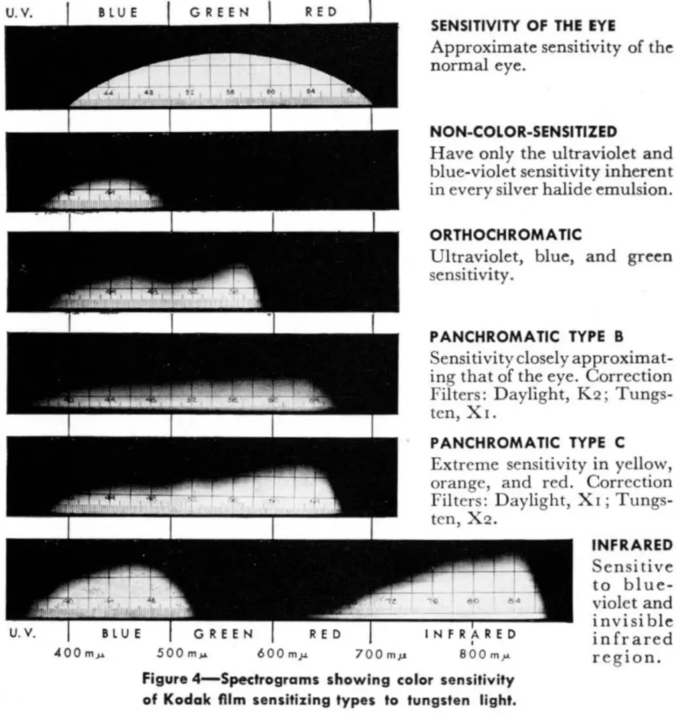
Photographer’s Mate (1966), published by the US Navy, reproduced the Kodak chart above, and added that Panchromatic Type B and Type C emulsions are sometimes referred to as orthopanchromatic and hyper-panchromatic respectively. Note that Type B emulsions, according to the Kodak chart, have lower red sensitivity than Type C. This matches the common interpretation I described earlier, namely that orthopanchromatic films are similar to panchromatic films, but comparatively less sensitive to red.
Current B&W films which are marketed as orthopanchromatic include Fuji Neopan 100 Acros II (B&H, for example, calls it orthopanchromatic, though I wasn’t able to find this term on the Fuji website or datasheets), Adox CMS 20 and Adox CHS 100. The latter is described as having “reduced red sensitivity and a curve gap between blue and green, producing deeper skies with standing-out clouds and a balanced tonal reproduction in portraiture.”
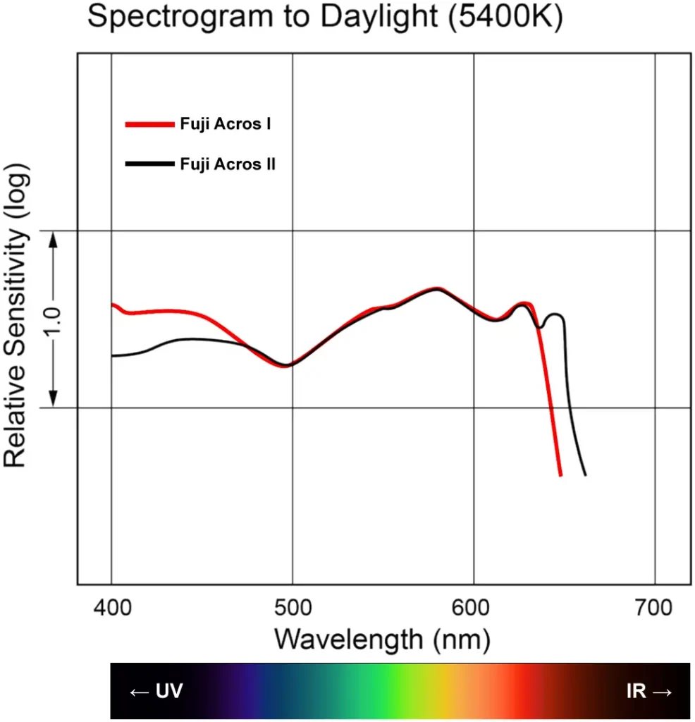
Fuji Acros was discontinued in 2018 and brought back in 2019. The old and new films, which I’ll refer to as Acros I and Acros II, are subtly different. There are various comparisons of the two films, as well as rumours about the true provenance of Acros II. But for now, our focus is on spectral sensitivity, and in this respect, the two films are almost identical.
In the graph below, I combined the curves from the Acros I and Acros II datasheets, and added a rainbow band to show approximately how wavelengths correspond to colours.
The curve for Adox CHS 100 (PDF), which as I mentioned is also marketed as orthopanchromatic, looks broadly similar, with a valley around 500nm (cyan). Adox CMS 20 is different still, with two valleys – around 480nm (blue) and 550nm (green).
Unfortunately, there is not much point comparing the Fuji Acros or Adox curves to the Ilford curves, because the light source is different – tungsten (2850K) for Ilford and daylight (5400K) in case of Fuji. Adox does not specify the light source at all.
So let’s look at my rainbow film tests. Here’s a comparison between Ilford HP5 Plus and Fuji Acros II.
The main difference I can see is that Blue is lighter than Green on Ilford HP5, and darker than Green on Fuji Acros II. This suggests that Acros may be slightly better at, say, separating blue sky and white clouds – something which on ordinary panchromatic film, often requires a yellow or orange filter.
I don’t have a direct real-world comparison between orthopanchromatic and panchromatic film (if I make such a comparison in future, I’ll update this article). But I do think that Fuji Acros has a special look, and personally I love it. I’m not sure if the unique tonality is down to grain (or lack thereof), contrast or spectral sensitivity – I’d have to do controlled blind tests to be completely sure. What I do know is that on Facebook groups, I can often identify the “Acros look” just from photos, i.e. before I read the caption and find out what film was used. Skin tones look especially good; this is my favourite film for portraits.

Extended red-sensitivity
I mentioned that a typical human eye is sensitive to wavelengths from approximately 380nm (violet) to 700nm (red). Extended red-sensitivity films respond not just to the visible spectrum but also the infrared spectrum – wavelengths beyond 700nm, longer than what the human eye can see.
William Herschel discovered infrared light in 1800, but the term was probably coined by William de Wiveleslie Abney, who, in 1880, sensitised a photographic plate up to 1200nm – the limit of what can be achieved with a photographic emulsion.
In 1910, Robert Wood developed a filter, Wood’s glass, that blocked visible light but was transparent to both ultraviolet and infrared (the Wood effect – the surreal glowing appearance of foliage in infrared photos – is named after him). If you want to read more about the history of infrared photography, there is a great article over on Invisible Light.
Extended red-sensitivity films can also be used without filters (more on that below), but if you want the Wood effect, you need an infrared filter. These filters block visible light below a certain wavelength. For example, a 720nm “standard infrared filter” will block wavelengths shorter than 720nm. The film is then exposed only to infrared light, and that’s what creates the surreal effects of infrared photography. Blue sky, for example, transmits very little infrared light, while green foliage reflects lots of it.
Human skin also reflects a good deal of infrared, which gives it an unusual glow.

I won’t go into too much detail about infrared photography, which is a fascinating rabbit-hole in its own right. If you’re interested, here are some good articles:
- Chuck McKern (Vivid Light)
- Christopher Schmidtke (Emulsive)
- Aloy Anderson (Ilford website)
- Ilija Melentijevic (Kolari) on choosing an infrared filter (in the context of digital infrared photography, but much of it applies to film too).
My focus here is on spectral sensitivity. Not all “infrared” films have the same sensitivity. Among commercially available films, as far as I know, the ones which extended furthest into the infrared spectrum were Kodak HIE (B&W) and Kodak Aerochrome (colour). Both these films were sensitive up to 900nm, well beyond what the human eye can see. Unfortunately both films were discontinued in 2009, and the remaining rolls (now expired) are rare and expensive, so I will probably never get to try them.
I believe Kodak HIE is the only commercially-produced B&W film which is regarded as “true infrared”. Fortunately, there are a few films still in production which are sensitive to part of the infrared spectrum (their limit is typically somewhere between 720-820nm). Because their sensitivity does not extend as far as “true infrared”, these films are commonly known as extended red-sensitivity, near-infrared or superpanchromatic films.
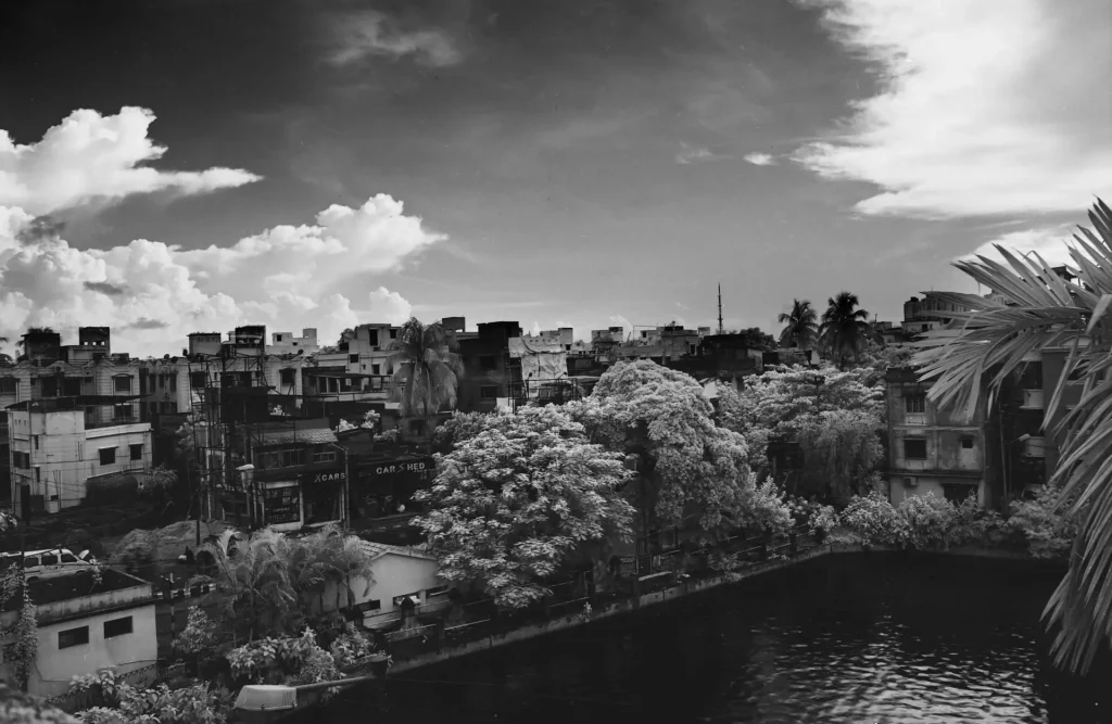
Currently available extended red-sensitivity films include Argenti Noa Noa, Ilford SFX, Rollei Retro 80s, Rollei Superpan 200 and Rollei Infrared 400. As you can see, for some of these films, the extended red-sensitivity is not necessarily obvious from the name; for that you have to dig into the datasheets or user reviews.
In the graphic below, I’ve compiled the spectral sensitivity curves for the five currently-available films mentioned above, as well as Kodak HIE.
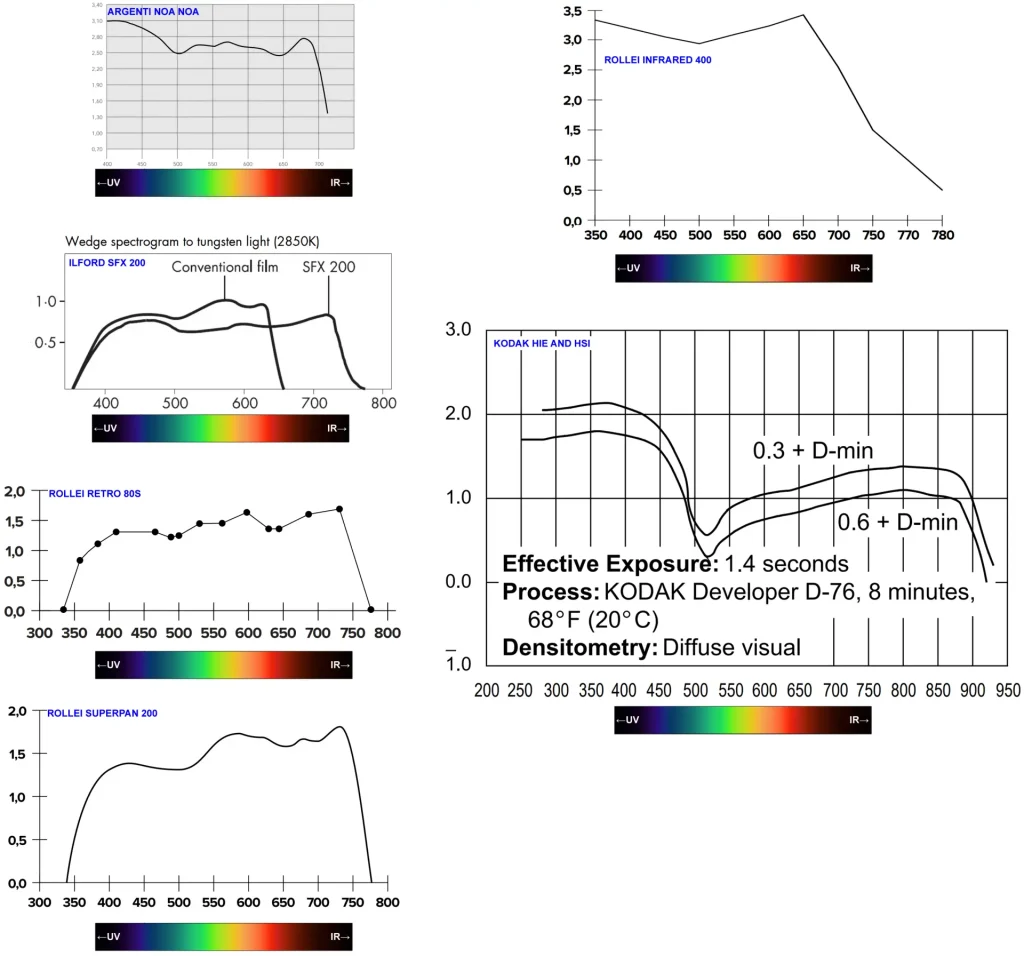
The curves are arranged in increasing order of red sensitivity, and the wavelengths are aligned for easy comparison. Superimposed with the Ilford SFX curve is the curve for a conventional panchromatic film, which only extends to about 650nm.
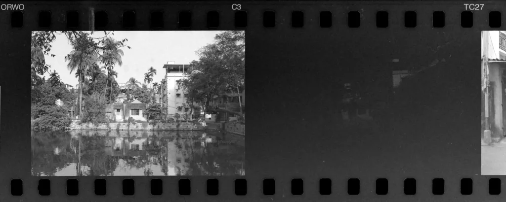
Argenti Noa Noa (rebranded Orwo TC27, formerly also sold as sold as Maco Cube 400c) has the least extended red-sensitivity, tapering off around 720nm. As reported in my review, I tried shooting Argenti Noa Noa with a 720nm filter, and even with +5 stops exposure compensation, I got a virtually blank image.
This is a good example of the fact that not all “infrared” films are equal. They may be sensitive to longer wavelengths than panchromatic film, but their range varies – from around 720nm for Argenti Noa Noa to 900nm for the discontinued Kodak HIE. To produce IR effects, you need to know the film’s actual range, and use an appropriate filter. With Noa Noa for example, a filter in the 550-665nm range would probably be appropriate (based on the datasheet that is, I haven’t tried it myself).
Most people buy extended red-sensitivity films for the unique effects they can produce with an infrared filter. But you can also use these films without a filter, in which case they behave almost like normal panchromatic film.
Almost, but not quite. The Gevaert Manual Of Photography (1962) by A.H.S. Craeybeckx describes how extended red-sensitivity films, used without filters, are good for portrait photography. “With emulsions of this type skin blemishes and even wrinkles more or less disappear since they are reproduced almost as light as the normal face tones.”
This has been my experience too. When I shot and developed my very first roll of Rollei Retro 80s, I noticed that it seemed particularly well-suited for portraits, with a subtly different look which I couldn’t put my finger on. I didn’t know about its extended red-sensitivity at the time; it was only later that I found out, and put two and two together.

Rainbow film tests with digital and paper
So far I’ve focused on different types of film, but I was also curious about “monochrome mode” on digital cameras.
There are some digital cameras – like the Leica Monochrom and the more recent Pentax equivalent – which have a true monochrome sensor. These cameras can’t capture colour photos at all. But this is a niche market; what the vast majority of digital cameras do is to capture a colour photo and, if you are in Monochrome or B&W mode, convert it to greyscale using in-camera software.
Here is a rainbow film test with a Fujifilm X-E4 digital camera in Monochrome mode:
The film that Fuji Monochrome mode is most similar to is the panchromatic Argenti Nanotomic-X (see above): from light to dark, the order is White-Yellow-Green-Grey-Blue-Red. It’s different from my “reference” panchromatic film, Ilford HP5 Plus, where the blue band is rendered lighter than both grey and green.
The next test is with the Fujifilm X-E4 in Monochrome red filter mode (this is an in-camera digital simulation, not a “true” red filter).
The final test that I want to share is with Ilford Multigrade RC Deluxe (photo paper for darkroom printing). I loaded a small piece of paper in my camera, metered at ISO 6, and took a photo of the test chart. The result is very similar to blue-sensitive film (see above). The blue band is very light and the red band is black, because photo paper is insensitive to red (which is why it can be handled under red safelights in the darkroom).
This particular test was of interest to me because I often use photo paper for my homemade pinhole cameras. In the image below, the tomatoes (at centre) look almost black, similar to what we saw with blue-sensitive film. (The image is blurry because it was a ~2 minute exposure with a pinhole camera, on photo paper rated at ISO 6.)
Final Thoughts
This article is a follow-up to Colour Theory for B&W Photography: Part 1, which was about analogue and digital filters. This part is about spectral sensitivity, i.e. how B&W films respond to different wavelengths (colours) of light. I analysed and compared the five main types of B&W film, classified according to spectral sensitivity:
- Blue-sensitive
- Orthochromatic
- Panchromatic
- Orthopanchromatic
- Extended red-sensitivity
I also explained how to interpret spectral sensitivity curves, and described a test I came up with – the rainbow film test – as a simple way to check and compare spectral sensitivity.
The purpose is not to draw simplistic conclusions such as “Film X is better than Film Y”. Rather, I wanted to give an overview of the different types of B&W film that are out there, and how spectral sensitivity can make a difference to the overall look and feel of an image. Blue-sensitive film may be far more “limited” than extended red-sensitivity film, but any film is a creative tool, and in the right hands, can produce exceptional results.
Thanks for reading! For more of my work, feel free to check out my website and Instagram.
Share this post:


Comments
RGJ on Spectral Sensitivity of B&W Film – A Deep Dive into Orthochromatic, Panchromatic and All the Rest
Comment posted: 02/05/2023
Comment posted: 02/05/2023
David Hill on Spectral Sensitivity of B&W Film – A Deep Dive into Orthochromatic, Panchromatic and All the Rest
Comment posted: 02/05/2023
Thank you.
Dave
Comment posted: 02/05/2023
John Feole on Spectral Sensitivity of B&W Film – A Deep Dive into Orthochromatic, Panchromatic and All the Rest
Comment posted: 02/05/2023
jason fleece on Spectral Sensitivity of B&W Film – A Deep Dive into Orthochromatic, Panchromatic and All the Rest
Comment posted: 02/05/2023
Comment posted: 02/05/2023
Ibraar Hussain on Spectral Sensitivity of B&W Film – A Deep Dive into Orthochromatic, Panchromatic and All the Rest
Comment posted: 02/05/2023
Very good reference indeed and the charts are so helpful
Rollei retro 80s is very good for portraits isn’t it? Used with a deep yellow / yellow gives a really nice glow to the face and skin - but eyes can turn out black!!
Comment posted: 02/05/2023
Sroyon on Spectral Sensitivity of B&W Film – A Deep Dive into Orthochromatic, Panchromatic and All the Rest
Comment posted: 02/05/2023
Richard Noll on Spectral Sensitivity of B&W Film – A Deep Dive into Orthochromatic, Panchromatic and All the Rest
Comment posted: 02/05/2023
Mike Brooks on Spectral Sensitivity of B&W Film – A Deep Dive into Orthochromatic, Panchromatic and All the Rest
Comment posted: 02/05/2023
Comment posted: 02/05/2023
Julian Tanase on Spectral Sensitivity of B&W Film – A Deep Dive into Orthochromatic, Panchromatic and All the Rest
Comment posted: 02/05/2023
Comment posted: 02/05/2023
Murray on Spectral Sensitivity of B&W Film – A Deep Dive into Orthochromatic, Panchromatic and All the Rest
Comment posted: 02/05/2023
Comment posted: 02/05/2023
Stefan Wilde on Spectral Sensitivity of B&W Film – A Deep Dive into Orthochromatic, Panchromatic and All the Rest
Comment posted: 02/05/2023
Just while you're at it, is there a way to teleport you back in time so you can be my physics teacher? That would probably have changed my life. This is an astoundingly well written piece. Thanks so much for all the work!
Stefan
Comment posted: 02/05/2023
Aaron Yang on Spectral Sensitivity of B&W Film – A Deep Dive into Orthochromatic, Panchromatic and All the Rest
Comment posted: 02/05/2023
Comment posted: 02/05/2023
Afzal Ansary on Spectral Sensitivity of B&W Film – A Deep Dive into Orthochromatic, Panchromatic and All the Rest
Comment posted: 03/05/2023
Comment posted: 03/05/2023
James on Spectral Sensitivity of B&W Film – A Deep Dive into Orthochromatic, Panchromatic and All the Rest
Comment posted: 04/05/2023
Comment posted: 04/05/2023
Kodachromeguy on Spectral Sensitivity of B&W Film – A Deep Dive into Orthochromatic, Panchromatic and All the Rest
Comment posted: 09/05/2023
Comment posted: 09/05/2023
Alasdair J Mackintosh on Spectral Sensitivity of B&W Film – A Deep Dive into Orthochromatic, Panchromatic and All the Rest
Comment posted: 19/05/2023
GeWilli on Spectral Sensitivity of B&W Film – A Deep Dive into Orthochromatic, Panchromatic and All the Rest
Comment posted: 26/05/2023
Let me frame my background, I'm an imaging scientist, microscopes, laser Confocal, fluorescence, filters and wavelengths of light are my 'thing' which leads me to the screen test limitation. Specifically the wavelength range in a monitor. LED screens are great but limited by using only three primary color diodes of limited spectral range. Specifically the red is often only about 630nm. Different 'analog' sources all have various color spectrum (tungsten, metal-halide, arc lamps). It can get more complicated and unnecessary for a base level exploration like this (your test is fabulously useful and best, approachable by anyone), but perhaps a full independent spectral test using a prism and a full spectrum source (sun?) of available films might be an incredibly valuable and informative database. Granted as you mentioned. Lens coatings and elements all change the spectral shift and speed of wavelengths differently (just look into microscope objective corrections and designations, pan, neo-fluar, apochromat for examples). Perhaps a pinhole rig (no glass) set up for film (partial roll benefit, ie low cost, leaving most of the roll for actual photos) and a full spectrum source would be best and 'easiest' test?
I appreciate this article and your effort, great thought price and test, absolutely is a useful and informative home test for film. Hopefully readers will try this with film you used and compare to film you didn't use in the article.
DANIEL ALEXANDRE on Spectral Sensitivity of B&W Film – A Deep Dive into Orthochromatic, Panchromatic and All the Rest
Comment posted: 30/05/2023
Great article indeed, which I found while looking for the decent B&W rendering of skintones after having watched this : https://youtu.be/d16LNHIEJzs
And how about this Leica workshop ?
https://youtu.be/RIwqOxWZJe4?list=PLy_zO64rpBO8r55ObbU_eEKutA6Goi5hf&t=2370
So which film could we use to do justice to the various skin tones of our common humanity ?
I understand that the key is in the red
I use Rollei retro too, but I'm thinking of getting rid of IR with a low pass filter (IR CUT)
I'm a scientist btw, playing with microscopes just like GEWILLI