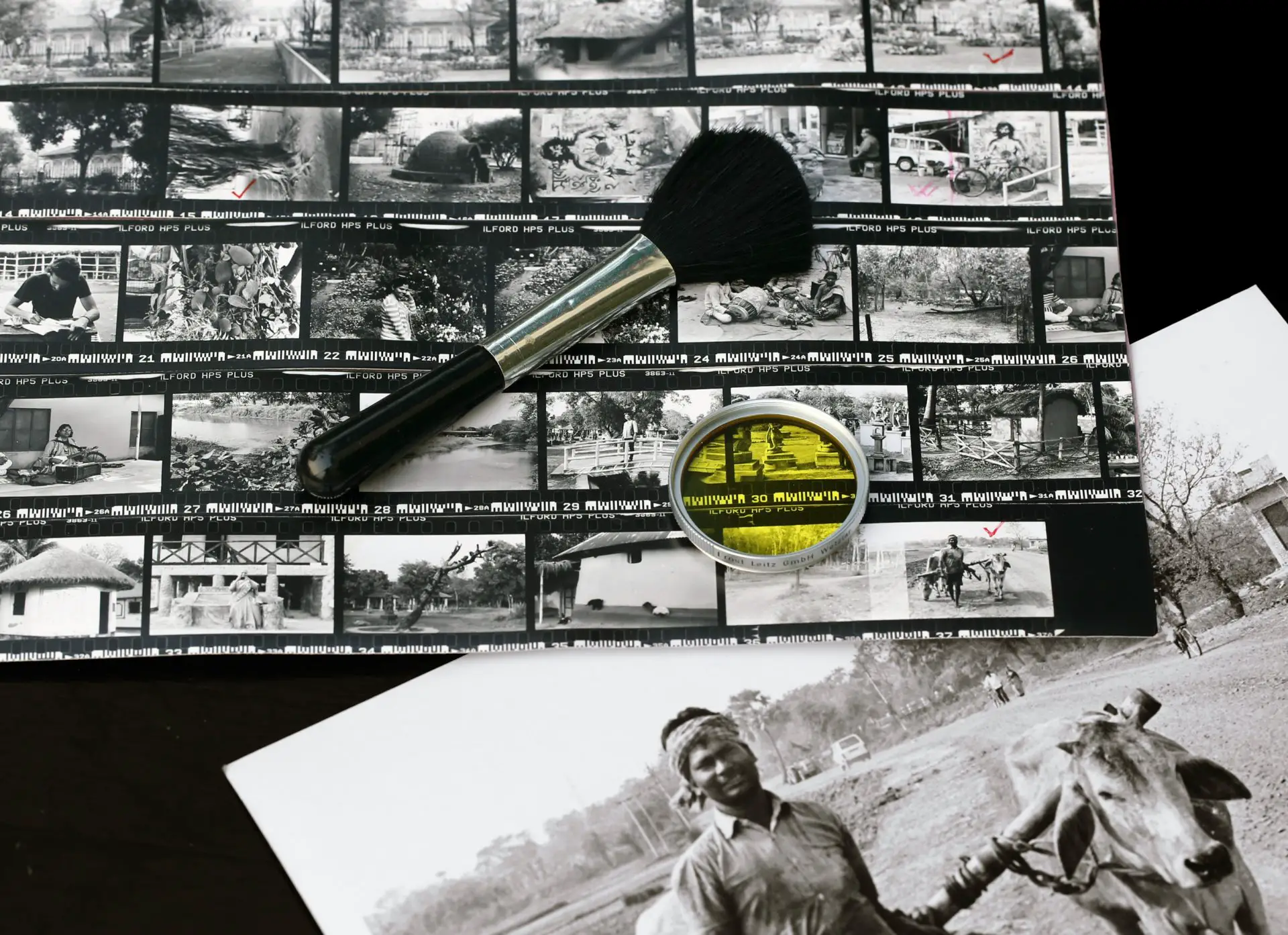
I originally conceived my Darkroom Printing series as a five-part affair, but I figured I’ll add more as I learn, especially if I find something that’s not covered in most online tutorials or books. Guess what, it turns out that contact sheets is one such subject. Well not quite: contact sheets in general are covered in lots of tutorials, but I am yet to see one which has a detailed description of more than one way to make a contact sheet. Prescribing one way to do something furthers the impression that it is the way to do it, which is something I always try to question.
I would say there are at least three, possibly four different ways to make contact sheets, each with their own advantages. Which one is best for you will depend on what your goals are. In this post I’ll briefly explain what contact sheets are, and why they are useful. I’ll then describe the various ways, and what we can learn from each, using my own negatives as examples.
Preliminaries
What are contact sheets?
A contact sheet, also known as a proof sheet, is a sequence of film negatives printed directly onto photographic paper. The negatives are printed not by enlargement, but by placing them directly on – in contact with – the paper.
Ansel Adams’ classic book, The Print, has an interesting historical aside:
Until the end of the last century, nearly all printing was done with the negative in contact with the paper, often using sunlight for the exposure. The albumen printing-out papers of the late nineteenth century were far too slow for practical enlarging … Among later practitioners, Edward Weston contact-printed his negatives using the most basic equipment – a simple printing frame and a bulb suspended from the ceiling.
This post, however, is about contact printing roll-film, not large-format negatives like Weston (watch him at work in this video). In my demonstrations I’ve used 35mm film, but whatever I say also applies to 120 (medium-format) film. As with the rest of this series, I’ll only cover black and white film.
What you need
If you’re reading this post, perhaps you already have access to a darkroom for black and white printing (if not, here’s my guide on how to set one up in a small space, on a limited budget). For making contact sheets, the only additional thing you need is a piece of clear glass, at least as big as the paper you will print on. You can also buy dedicated contact sheet frames, but I don’t think they are really necessary (I have one but I don’t use it).
Most tutorials use at least one full sheet of 20×25cm (8×10″) paper for the test print, and another for the final contact sheet. I always try to use as little paper as necessary (as Ctein says, “Save a tree: learn to print.”) Or maybe I’m just a cheapskate. In any case, for the three main methods I describe here, the test print uses just a small piece of paper, 7.5×1.5cm (or 2.5×0.5″).
Why make contact sheets
There are many reasons to make contact sheets. I’ve listed some of the main ones, because I think it’s worth reflecting on your reasons for making them – which, in turn, will determine what type of contact sheet you should make.
- Reviewing all photos on a roll at a glance, to pick the ones you want to print.
- To evaluate exposure and development: All photos on a contact sheet get printed at the same setting, so exposure and development errors are easier to spot.
- As a guide to printing: Contact sheets can give us pointers on how to print individual images, for example, how much exposure or contrast they might need.
- Archival purposes: Some people file the contact sheet with their negatives, as a ready reference to what they contain.
- Because they look cool.
Overview of the methods
In this post, I cover three main ways to print contact sheets: (a) proper proof, (b) highlights proof and (c) shadows proof.
I believe the term “proper proof” was popularised (perhaps coined, I’m not sure) by Fred Picker, author of Zone VI Workshop. A proper proof is printed at contrast grade 2 (for an explanation of contrast grades, see Part 2 of this series), and it is given just enough exposure to print the unexposed areas of a negative as maximum black. This is the approach described in Tom Halfhill’s excellent guide (Shutterbug magazine, 1991) and in YouTube videos by The Naked Photographer and Shoot Film Like a Boss.
Some sources – for example, Bruce Barnbaum’s The Art of Photography – recommend using lower contrast (unlike proper proofs, which are printed at grade 2). “Highlights proof” and “shadows proof” are my own terms, referring to two different types of low-contrast contact sheets.
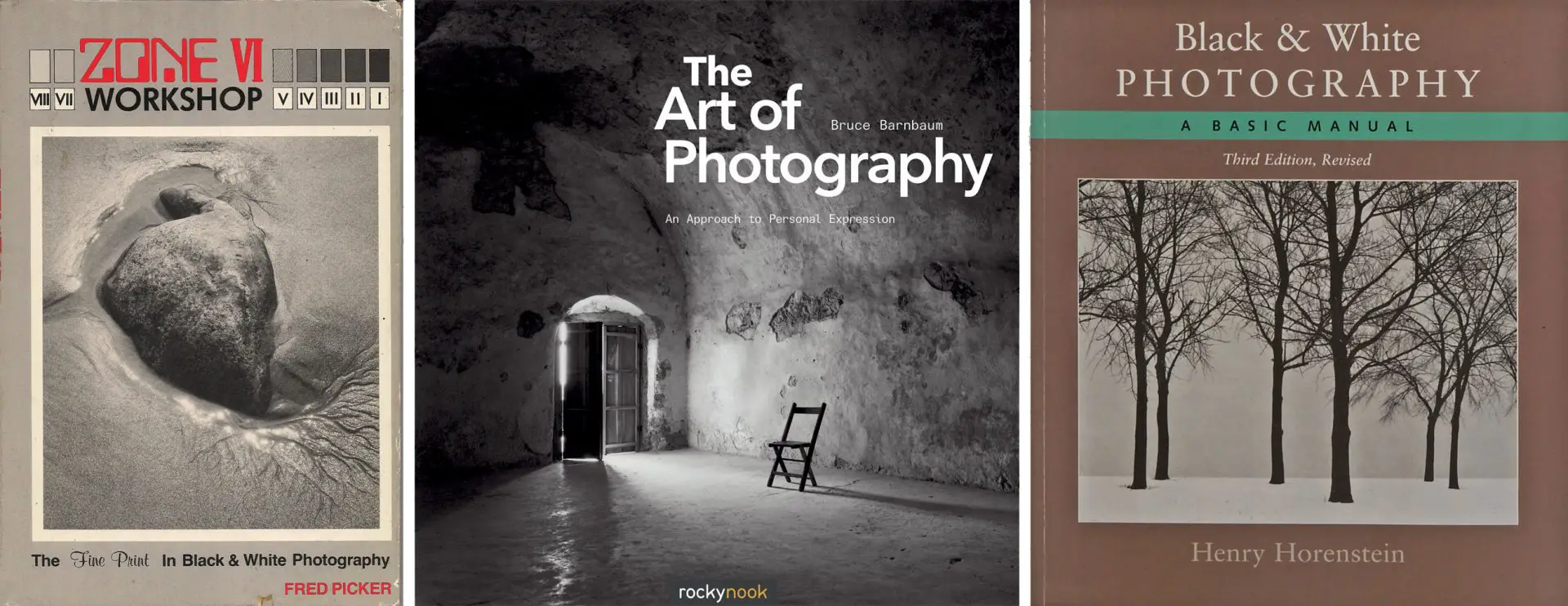
Of course, you can also take a more subjective approach – just do some tests and pick the exposure and contrast grade which “look right”. Some tutorials – for example Henry Horenstein’s Black & White Photography, and Ilford’s YouTube video – suggest this approach, which may be useful if your main objective is to make a contact sheet which looks visually pleasing. But I will only touch upon this briefly, because what “looks right” is ultimately subjective.
Right, so much for preliminaries. Let’s make some prints!
Proper proof
Making the test-strip
A proper proof is printed at grade 2, with just enough exposure to print the unexposed areas of a negative as maximum black. First I’ll explain how to do this, and then why we do this.
We start out by making a test-strip. This procedure is essentially the same for all three methods, so I’ll only describe it once. It sounds complex when written down, but it’s really very simple.
Raise or lower the enlarger to project a rectangle of light, a bit larger than the sheet of paper on which you want to print the final contact sheet (no need to focus the enlarger lens). Set the lens to f/8, with no filtration (grade 2). Turn the enlarger off.
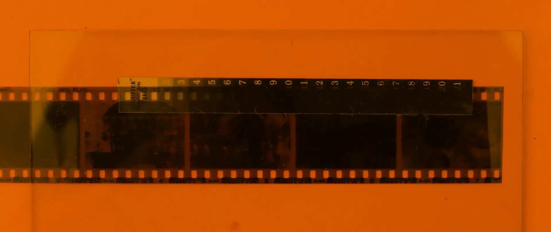
Cut a 7.5×1.5cm (or 2.5×0.5″) strip of photographic paper. With a ballpoint pen, make small marks along one edge at 1.5cm (or 0.5″) intervals, on the emulsion side of the paper. These marks will serve as guides.
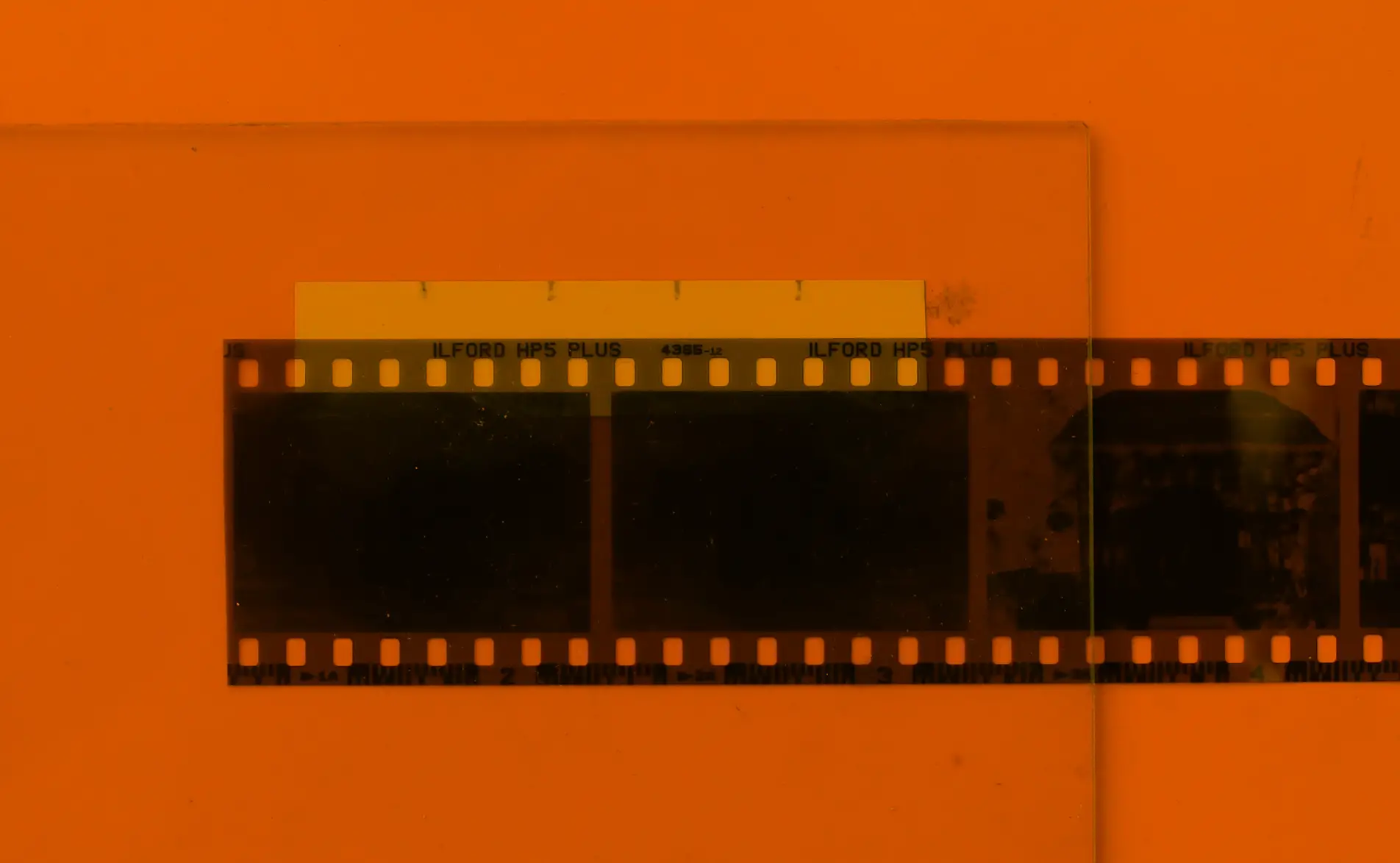
Place the paper, emulsion side up, on the easel. Place one of your negatives on the paper, emulsion side down, positioning it so that the top part of the paper (with the guide marks) is uncovered. The lower part of the paper should be covered partly by the film rebate (the unexposed edge of the negative), and partly by the exposed frames. Gently place the glass on top, making a sandwich, as shown above.
Using the guide marks as reference, make five exposures at 2-second intervals, just as you would make a regular test-strip. (5, 7, 9, 11, 13 sec is a good starting point.)
I personally use – and strongly recommend – f-stop timing (described in my earlier post), where each step gets ⅓ stop more exposure than the last (feel free to use my online calculator to find the times). Accordingly, my strip was exposed at f/8 for 5, 6, 8, 10 and 13 sec. Here’s a scan of the result (the times were added later, for this post).
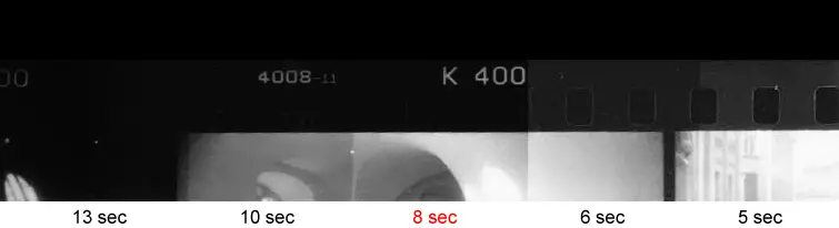
Develop, fix and wash the strip as usual. Let it dry (use a hair-dryer or fan if you’re in a rush; wet strips are hard to assess accurately). Starting from the shortest time (5 sec in my case), look for the first step where the film rebate is as black as the uncovered paper above it (also known as maximum black). In my strip above, the rebate reaches maximum black at 8 sec (though you may not see it in the scan). This gives us the standard printing time or SPT.
If the rebate is maximum black at all steps, it got too much exposure. Close the aperture by one stop and repeat the experiment. If it never reaches maximum black, it got too little. Open the aperture one stop and repeat.
With this method, you’re using only one or two small strips of paper to find the exposure – not a whole sheet as many tutorials show.
The SPT, by the way, is only really valid for this particular roll of film. The density (or the degree of opacity) of unexposed film depends on the film stock, and also to some extent, on how it was processed. This is why you should base your SPT on a negative from the same roll which you’re making a contact print of. SPT also depends on other variables like the paper, developer, temperature, agitation method and so on, but those are easier to control if you make the test-strip and the contact sheet in the same session.
Transmission step-wedge method
If you have a transmission step-wedge, making the test-strip is even easier. By the way, I highly recommend Stouffer’s 21 Step Transmission Guide ½×5″. It is only $8 (it was $6 when I bought it) and it’s useful for all sorts of things.
You’ll probably need a different-sized test-strip than before. I cut one which is the same dimensions as the step-wedge, but it can also be bigger. No need for guide marks this time.
Position the negative as before – on (and partially overlapping) the strip of paper. Place the step-wedge above the negative, aligned with the top edge of the paper. Finally, place the glass on top, as shown above. Expose it for 32 sec at f/8. This is what I got:
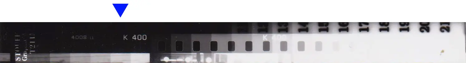
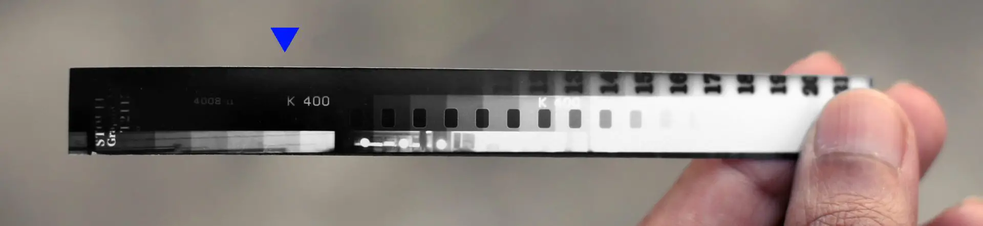
Look for maximum black as before. In the strip above, the rebate reaches maximum black – merges with the darker paper above – at step 5 (again, you may not see it in the scan). On the step wedge, each step is ½ stop denser (blocks ½ stop more light) than the previous step. So step 5 is 2 stops denser than the transparent step 1. This tells us that SPT is 2 stops faster than our exposure time, that is, 32×0.25=8 sec – the same result as before.
Making the contact sheet
Now comes the easy part: making the contact sheet itself. Place your negatives in sequence on a sheet of unexposed paper. Cover them with glass. Expose the sandwich at SPT (in my case, 8 sec at f/8). Develop, fix and wash as usual.
What the proper proof tells us
A proper proof – a contact sheet printed at SPT at grade 2 – may not be the most visually pleasing. You might find, for example, that your proper proof looks too dark (or too light). And you might then be tempted to use a shorter (or longer) exposure time to “fix” this. But what this really means is that your negatives are underexposed (or overexposed). If you want to read more about this, I recommend Tom Halfhill’s excellent article (the section titled “Maximum Black”).
Or, you might find that your contact sheet looks more pleasing if you use a lower (or higher) contrast grade. Again, what this really means is that the roll is over-developed (or under-developed). Like a good critic, unequivocally but without judgment, the proper proof tells us what we did right, and what we got wrong.
This is not to say that dark, light, low-contrast or high-contrast frames are a write-off. Often, decent prints, or even good prints, can be made from suboptimal negatives. But negatives which look good in a proper proof are generally the ideal. They are easy to print, with deep shadows, rich midtones and brilliant highlights. Because they print well at a normal grade (recall that we use grade 2 for proper proofs), we have leeway to increase or decrease contrast as needed, for expressive or artistic effect. On the other hand, if a negative has to be printed at a high contrast grade just to look “normal”, there is no room to make a high-contrast interpretation. So a proper proof has important information about our negatives, which a “pretty” contact sheet doesn’t.
This is also not to belittle “pretty” contact sheets; it’s an entirely valid approach if a pretty contact sheet is what you’re after (I make them too). At the end of this post, I’ve included a bit about “pretty proofs”.
Case study: Evaluating a proper proof
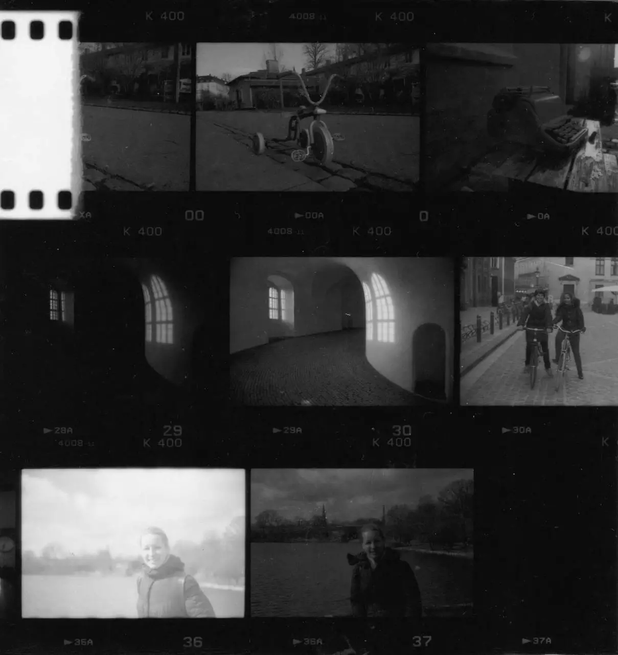
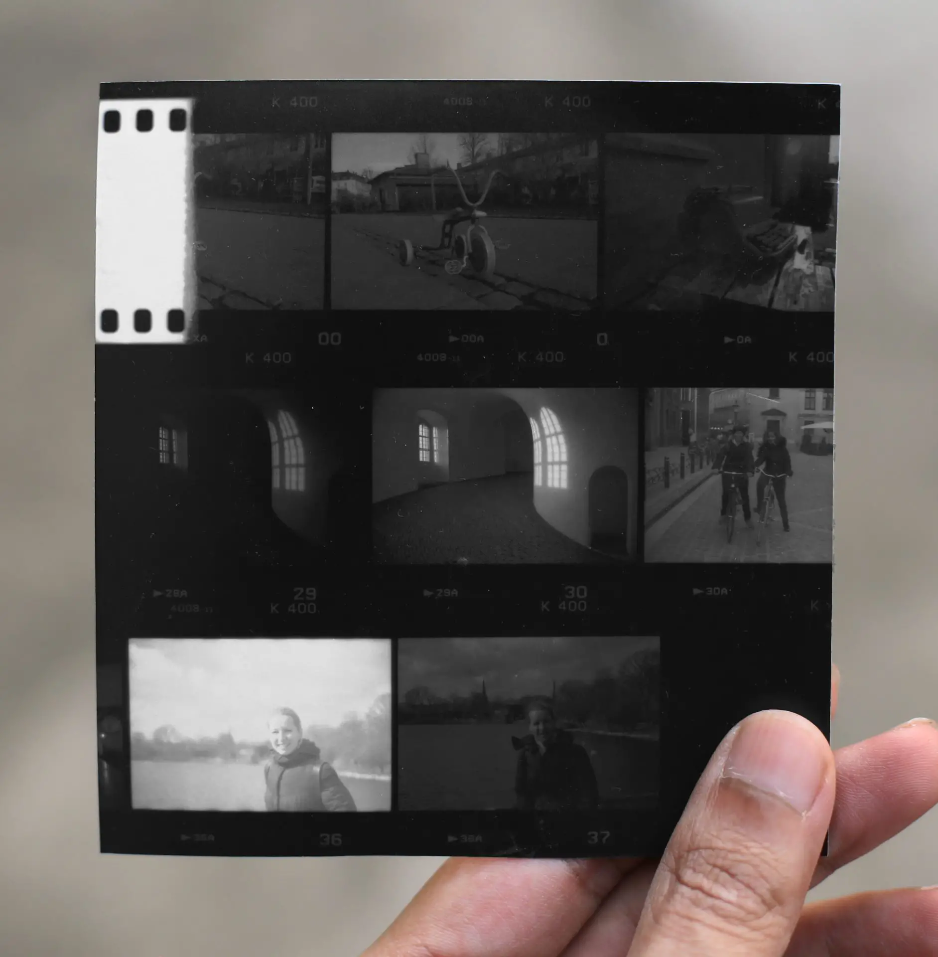
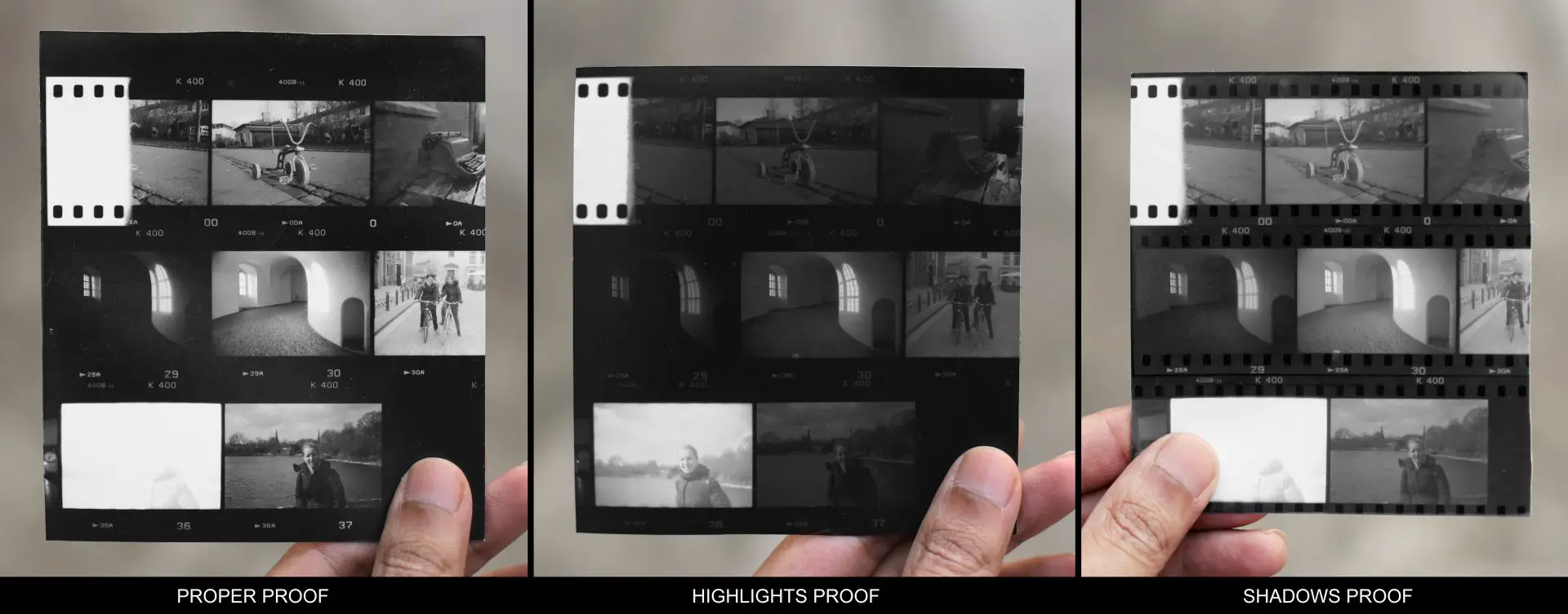
Let’s look at a proper proof made from one of my rolls: Kentmere 400, developed in ID-11 at 1:1 dilution. For this post, instead of a full sheet, I contact-printed only a few frames. I picked these frames because they show a wide range of exposures, as well as a few mistakes.
I’ve included both a scan and a photograph of the contact sheet, though of course, neither is a perfect representation.
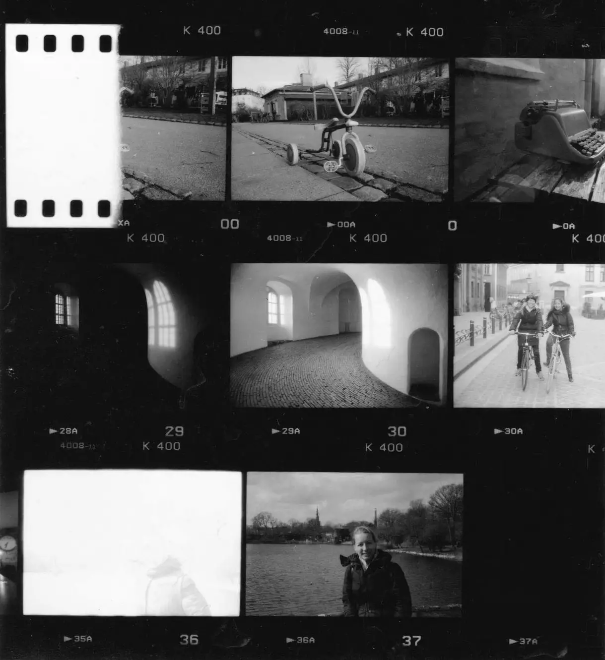
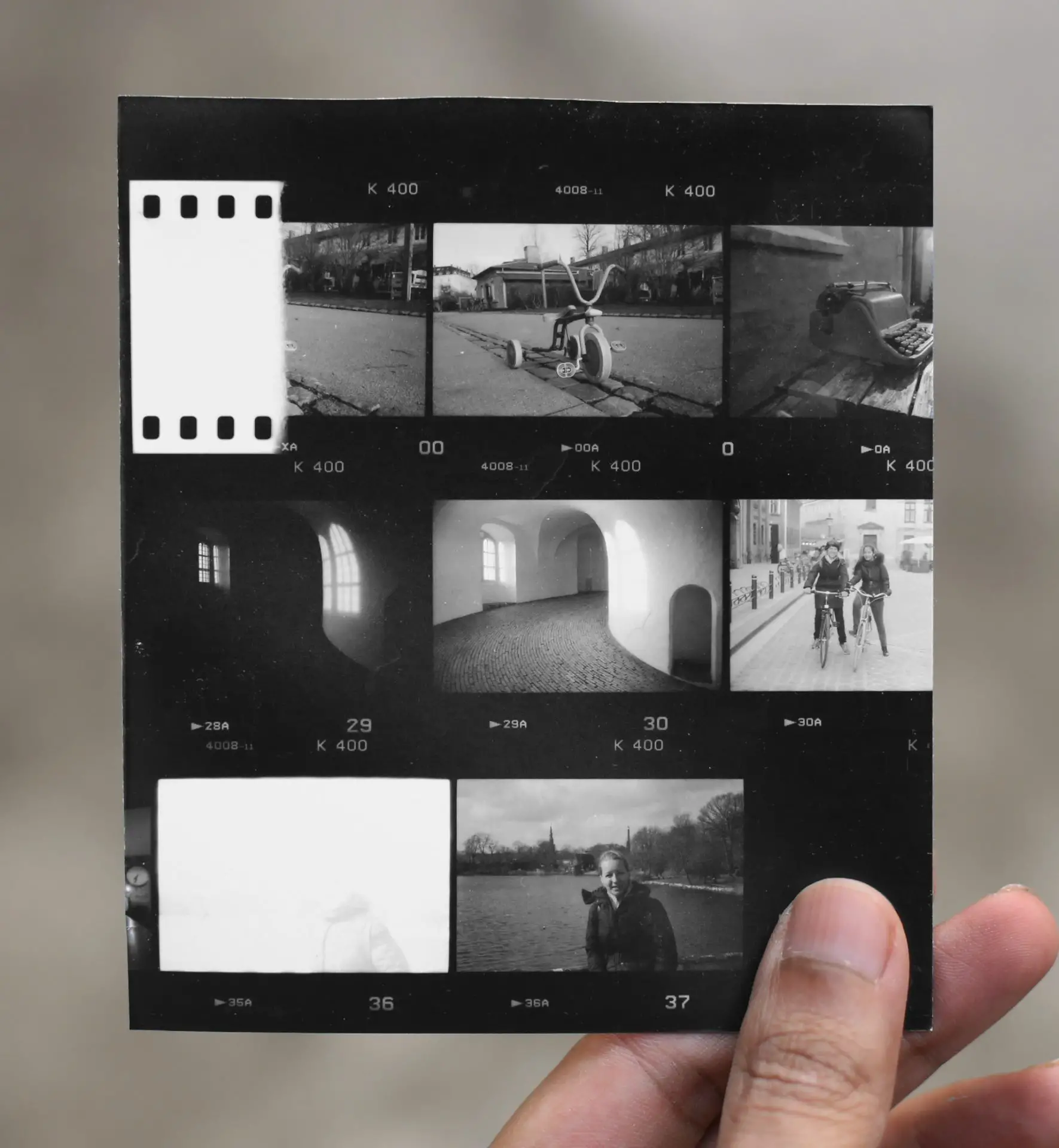
Part of frame 00 was exposed to light when loading the film. I generally file this with the negative because it’s a reference for maximum negative density (just as the unexposed rebates represent minimum density).
Frame 0 is a repeat of the previous photograph, because I knew frame 00 would be partly burned. It was a sort of William Eggleston homage. Not one of my better photographs, but in terms of exposure, it’s spot on.
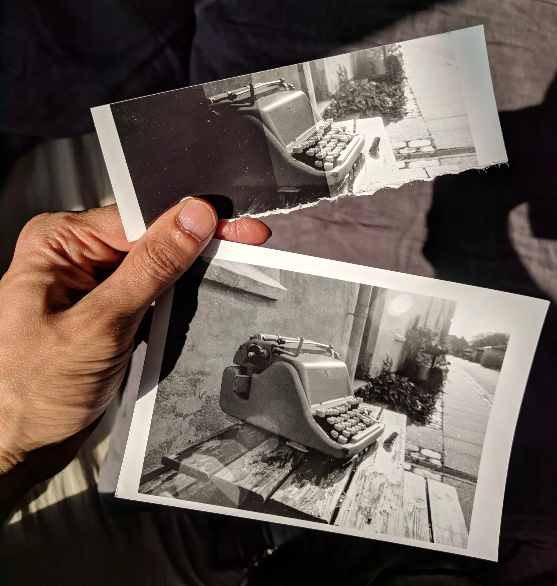
Frame 1 (the typewriter) looks a bit dark, but we’re actually looking at the darker half of the frame. The right half is brighter, and indeed, the photograph prints beautifully at grade 2.
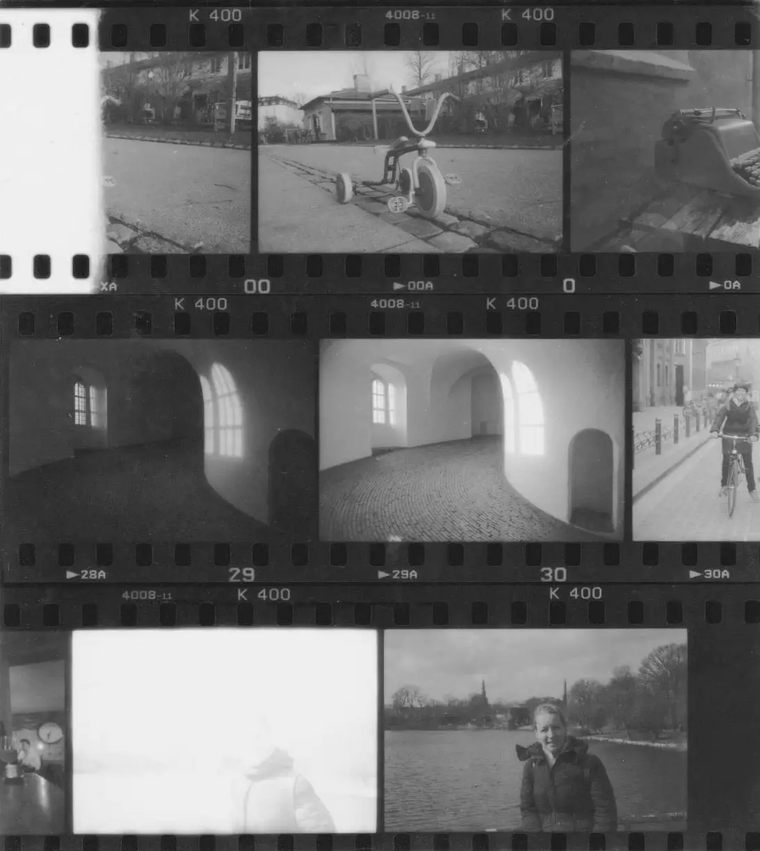
Frames 29 and 30 are from the Rundetårn in Copenhagen. Here they are again, for reference. I’ll talk about them in the reverse order.
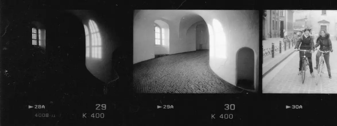
For frame 30, I metered for the floor. It was a high-contrast scene, with bright light shining through the window, and deep shadows at the far end of the ramp. I should say at this point that my primary camera, a Leica M3, does not have a light meter, and my approach to metering is pretty slapdash. Half the time I guess the exposure, and other times I use a free phone app. This might seem shocking to purists, but it works for me – by and large.
Anyway, back to frame 30. As I was saying, I metered for the floor, wanting to capture good tonality in the cobblestones. I knew that by doing so, I would overexpose the wall, but I hoped that this would reproduce the feeling of an airy, light-filled space. The shadow cast by the window on the right-hand wall looks blown out (but more on this later).
In fact, I did want some detail in the window-shadow – to be able to see the bars, like you can in frame 29 – but metering for the floor was always going to blow it out. Given the effect I wanted (good tonality on the cobblestones without blowing out the window-shadow), the proper proof tells me that frame 30 is technically over-developed – shadows look right, but highlights are blown. In order to “tame the highlights”, I’d have to develop for less-than-normal time (“pull” the roll). But then I’d end up with low contrast on the other photos, most of which had normal contrast. These are the downsides of shooting roll-film.
For frame 29, I underexposed by a whopping 3 stops relative to frame 30. I was going for a darker, more mysterious look. And I wanted to capture detail in the window, and its shadow on the opposite wall. But I also wanted to capture some shadow detail on the ramp, which looks non-existent – at least on the proper proof (more on this later, too).
For frame 31, I guessed the exposure because my subjects were impatient to start riding their bikes. It’s about 1 stop overexposed, but nothing which can’t be fixed in the darkroom (or in Photoshop).
Frame 36 was a disaster. I was going for f/16, but I forgot to turn the aperture ring and accidentally shot at f/2. So the photo is 6 stops(!) overexposed. But luckily I had one shot left on the roll. Frame 37 looks maybe a half-stop underexposed, but I was trying not to lose detail on the sunlit side of my friend’s face.
Of course, most contact sheets look more consistent than my sample shown here. As I was saying, I deliberately picked frames which show a wide variety of exposures, including mistakes. To sum up, it has a burn (frame 00), good exposures (0 and 1), underexposure (29 and 37), overexposure (31 and 36) and over-development (30). The proper proof can tell you all this and more – if you only know how to read it.
So why on earth would you want to make any other kind of contact sheet? Read on.
Highlights proof
A highlights proof is printed at grade 0, with just enough exposure to print the unexposed areas of a negative as maximum black.
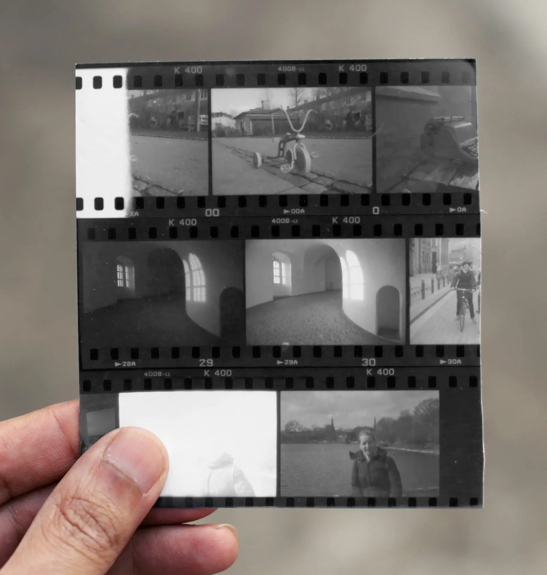
A highlights proof is made in the same way as you would make a proper proof, but at contrast grade 0 (90 units of yellow filtration on my enlarger, which has a colour head). Test for SPT as before, but at grade 0. The exposure time will be higher because of the added filtration. In my case, SPT (as determined by a test-strip) was 32 sec at f/5.6, that is, 3 stops more exposure than the proper proof (which was 8 sec at f/8). Here’s my highlights proof of the same negatives; as before, I’ve included both a scan and a photograph.
Clearly, the highlights proof looks too dark, but that is only to be expected – we held the shadows at the same level as the proper proof, but drastically reduced the contrast. What it does do is give us important information about the highlights.
Look at frame 30, for example. Unlike in the proper proof, the window-bars in the shadow are now clearly differentiated. Now we know that though the photo was over-developed, the highlight detail is still there on the negative; it’s just too dense to show up in the proper proof. So when I make an enlargement, I can try and bring out that detail if I want.
Even more surprising is frame 36, which if you recall, I overexposed by 6 stops. The highlights proof shows that it has recognisable detail, if only just. (By the way, I’m actually thinking of writing a post on how to salvage bad negatives in the darkroom. If this is something you’re interested in – or if there’s anything specific you’d like me to cover – please let me know in the comments.)
So the highlights proof is a good tool to check what details, if any, there are in the highlights, which don’t show up in a proper proof. To be fair, you can also get this kind of information from directly inspecting negatives; I just find it a lot easier to see on a contact print.
Shadows proof
A shadows proof is also printed at grade 0, but with a lower exposure than a highlights proof. Find SPT at grade 0 (you’ll know it if you made highlights proof already) and close the aperture by 1½ stops. Alternatively, you can use the same aperture but reduce the time by 1½ stops (multiply SPT by 0.35), which is what I did.
My SPT for the highlights proof was 32 sec at f/5.6. My shadows proof, therefore, was exposed for 11 sec at f/5.6 (32×0.35=11). Here’s my shadows proof of the same negatives; as before, I’ve included both a scan and a photograph.
The shadows proof looks muddy – partly because it’s a low-contrast print, but mainly because there’s no true black anywhere on the negative, not even in unexposed areas like the film rebate (see how the sprocket holes are clearly visible now). Nevertheless, it does give us important information about the shadows, especially in the underexposed frames.
On frame 29, you can now see the outline of the ramp against the wall, and even some texture on the cobblestones. On frame 37 (the last frame), you can see much more shadow detail on my friend’s jacket. So if I want, I can try and bring out these details in an enlargement.
A “full” contact sheet is useful for records, or if you want to review the whole roll. But if you’re curious about shadow detail (or highlight detail) in some frames, you can selectively make shadow (or highlight) proofs just of those frames, similar to what I did here.
Pretty proof (bonus fourth way)
But what if your main objective is to make a pretty contact sheet – not to check if your negatives are properly exposed and developed, or how much shadow and highlight detail they have. That’s a valid approach too, but it’s hard to write a tutorial for, because what “looks right” is ultimately subjective.
To start with, I would suggest making a test-strip to find SPT at grade 2, as described above. Then print the contact sheet at ½ stop below SPT (close the aperture by half a stop, or multiply SPT by 0.71). The sprocket-holes will be just about visible, which I think is a nice effect.
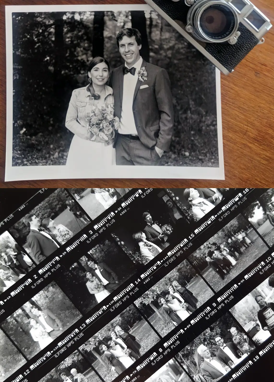
With that as a starting point, play around all you like. Increase or decrease the exposure if needed, try a few different contrast grades, even dodge or burn certain frames if they are under- or overexposed. I once photographed my friends’ wedding on film, and along with the prints, I sent them a contact sheet. I don’t remember my settings, but I do remember that I printed the contact sheet for aesthetic appeal, not for SPT.
Summary
There’s no One Right Way to make contact sheets. In this post, using my own negatives as an example, I described three main approaches – proper proof, highlights proof and shadows proof – plus a bonus fourth way (pretty proof). Here’s a summary:
| Type | Grade | Exposure | Purpose |
| Proper proof | 2 | SPT | Evaluating exposure and development; guide to print times and grades |
| Highlights proof | 0 | SPT | Checking highlight detail |
| Shadows proof | 0 | SPT–1½ stops | Checking shadow detail |
| Pretty proof | Subjective | Subjective | Looks pretty |
If you’re interested in more darkroom content, check out my earlier posts in this series. If you don’t have a darkroom yet but are thinking of setting one up, Part 1 is a good place to start. And if you have any ideas for new topics to explore, please let me know in the comments. You can also find me on Instagram where I sporadically post about black and white photography and darkroom stuff. Thanks for reading.
Share this post:


Comments
justin compton on 3 Ways to Make Contact Sheets and What They Can Tell Us – Darkroom Technique Part 6 – by Sroyon
Comment posted: 18/01/2021
I've read all of your articles and they're all excellent, this is really useful, i fall into the mistake of lightning and darkening contacts so that the contact sheet looks 'pleasing' to the eye. I will definitely be trying the methods suggested here. Thanks for writing this! Justin
Comment posted: 18/01/2021
thorsten on 3 Ways to Make Contact Sheets and What They Can Tell Us – Darkroom Technique Part 6 – by Sroyon
Comment posted: 18/01/2021
Comment posted: 18/01/2021
Oliver on 3 Ways to Make Contact Sheets and What They Can Tell Us – Darkroom Technique Part 6 – by Sroyon
Comment posted: 18/01/2021
You might also think about turning those articles into a printable compendium to take to the darkroom for quick reference.
All the best,
Oliver
Comment posted: 18/01/2021
Terje Viken on 3 Ways to Make Contact Sheets and What They Can Tell Us – Darkroom Technique Part 6 – by Sroyon
Comment posted: 18/01/2021
Comment posted: 18/01/2021
Stefan on 3 Ways to Make Contact Sheets and What They Can Tell Us – Darkroom Technique Part 6 – by Sroyon
Comment posted: 18/01/2021
Maybe with a start-to-finish walkthrough on some more challenging prints?
Or some a lessons learned on some mistakes you made on your darkroom journey so far?
Most useful darkroom gadgets (like the transmission guide you mentioned)?
Relation between film development and darkroom printability?
Lith printing or other alternative processes?
Just brainstorming here :)
I also second the idea of cheat sheets / printable compendiums!
Comment posted: 18/01/2021
MIchael J on 3 Ways to Make Contact Sheets and What They Can Tell Us – Darkroom Technique Part 6 – by Sroyon
Comment posted: 18/01/2021
I started printing at home early summer last year, shortly after starting to process my own film, and found myself locked in an epic battle with some of the negatives. I ended up slightly discouraged- how could it be this difficult? I came across the Halfhill article and went back and did proof contacts of those early films that I'd processed and those just before that were professionally done* The scales fell from my eyes as it became evident that although the negatives looked impressive when hanging up to dry (partly because I was so proud of them) they were actually pretty horrible. This made me think a good deal about exposure and processing and helped enormously to improve both of them. As you say, you can beat a poor negative into a half-decent print, but wouldn't you rather spend the effort making a good negative into a lovely print?
So yeah, I'd back you up very much- sometimes contact proofs feel like a bit a grind but they tell you so much about every stage from pulling out a camera and taking a view on framing and exposure, through process and on to print.
*going back and doing contact sheets of films from various points in the last 27(!) years is really interesting- when film photography was pretty much a necessity of studying architecture, some films were high-street 1-hour jobs and some were done by some super pro labs and the difference in the quality of the negatives is huge...
Comment posted: 18/01/2021
Michael J on 3 Ways to Make Contact Sheets and What They Can Tell Us – Darkroom Technique Part 6 – by Sroyon
Comment posted: 18/01/2021
It's interesting to note that the 'new school' lab (https://www.exposurefilmlab.com/) that I've been using most recently for colour, and B&W before I brought that in-house (;p), actually do as good à job as anyone in my negative file. I was a bit underwhelmed by one of the last few surviving West End London labs with B&W film- there used to be many good small outfits within walking distance of UCL in the '90s. I think Jessops and Snappy Snaps are probably much of a muchness, and much like cask ale on a pub-by-pub basis, can suffer from no-one quite caring enough to whisper sweet nothings to the machinery to get the best out of it!
Comment posted: 18/01/2021
Holly Gilman on 3 Ways to Make Contact Sheets and What They Can Tell Us – Darkroom Technique Part 6 – by Sroyon
Comment posted: 19/01/2021
Comment posted: 19/01/2021
nachetelovespain on 3 Ways to Make Contact Sheets and What They Can Tell Us – Darkroom Technique Part 6 – by Sroyon
Comment posted: 22/01/2021
Comment posted: 22/01/2021
nachetelovespain on 3 Ways to Make Contact Sheets and What They Can Tell Us – Darkroom Technique Part 6 – by Sroyon
Comment posted: 25/01/2021
I am explaining how I expose my negatives (DSLR scanning) after reading your post: Camera in steady tripod, live view mode, negative in its mask, light table on, focused achieved to the grain of the film as possible, camera connected to remote shutter. I select the nominal ISO of the camera, 100 in my case. Aperture to f11 to get good depth of field and get the most of the sharpness of the lens. Once all this is done, I reduce the shutter speed step by step observing the back screen of the camera until the rebate of the film is clipped (highlights are blown out). My A7III mark the blown out areas with a flashing zebra mask, but it can be also observed in the histogram. Then I increase the shutter speed two thirds of stop, and voila: I got exposure to be used for the full roll.
Does it sound some how equivalent to the proper proof method in the darkroom?
Comment posted: 25/01/2021
David H Thurman on 3 Ways to Make Contact Sheets and What They Can Tell Us – Darkroom Technique Part 6 – by Sroyon
Comment posted: 24/03/2021
to arrive at a computer print out which would mimic a traditional contact sheet? Has anyone thought about this?
Any suggestions? THANKS!
Comment posted: 24/03/2021
Winston on 3 Ways to Make Contact Sheets and What They Can Tell Us – Darkroom Technique Part 6 – by Sroyon
Comment posted: 12/07/2023
With linear timing, I just set to the lowest increment and punch expose over and over while covering or uncovering strips of paper. With f stop timing the increases are not all the same. For 13, 10, 8, 6, 5 I could expose the whole strip for 5, expose all but the first strip for 1 second, cover the next strip, expose for 2 seconds, 2 seconds again and finally 3 seconds.
I would screw that up. With the LSD device, it's fantastic, I just write the times on the test strip and change the enlarger timer each exposure. I could make a teeny tiny one for contact sheets I guess, or just use linear timing when doing non-LSD test strips...