Lomography’s LomoChrome Metropolis has admittedly been a wildcard among the options in my film drawer. Introduced in 2019 with a successful Kickstarter campaign, it was heralded as “the first new color negative film in over 5 years” and was made available in a wide arrangement of formats including 35mm, 120, 110 and 16mm.
With its subdued, muted color palette, Metropolis is advertised as ideal for cosmopolitan cities, hence its namesake. But I wondered: what would Lomography’s “city” film look like when shot in a lush, colorful tropical setting?
A deeper shade of sol
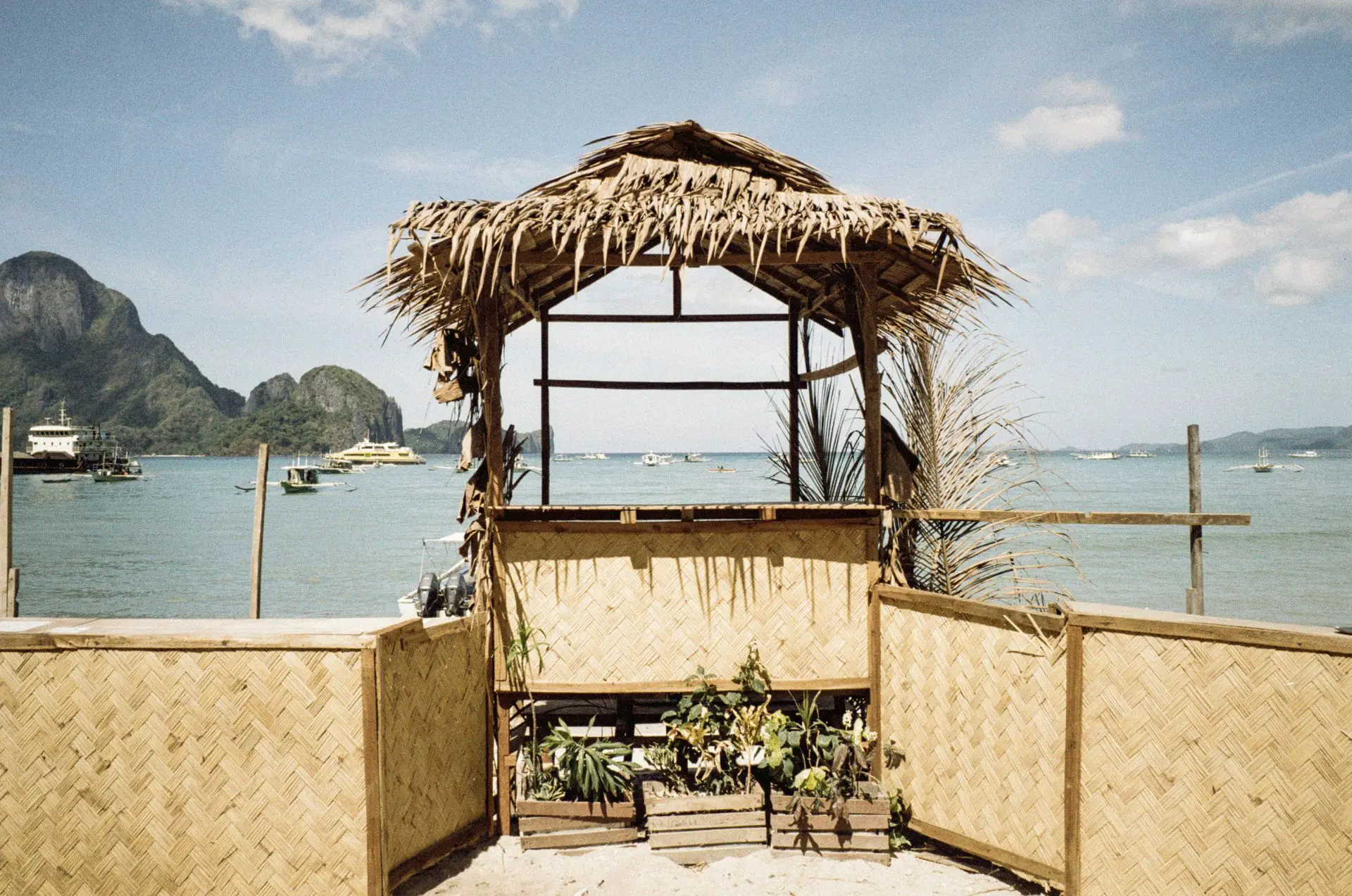
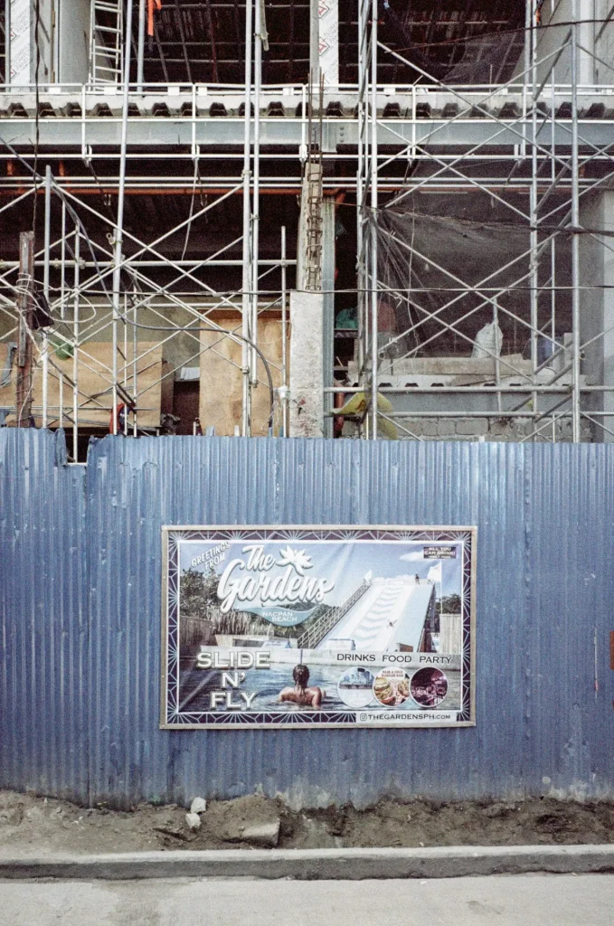
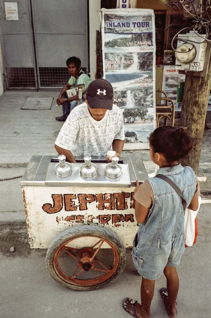
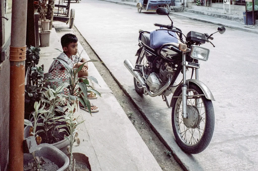
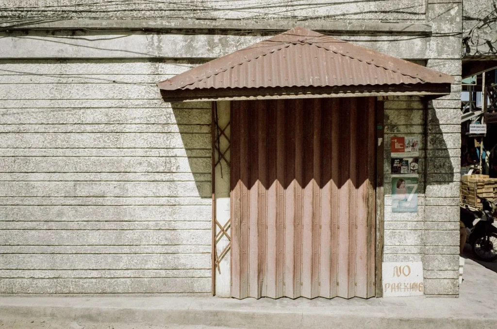
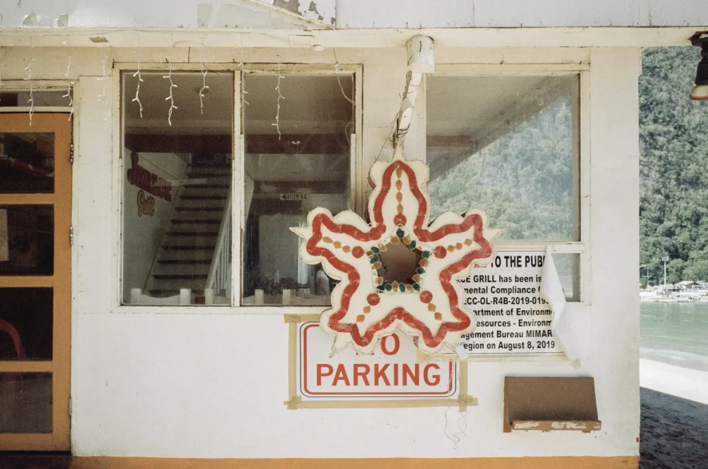
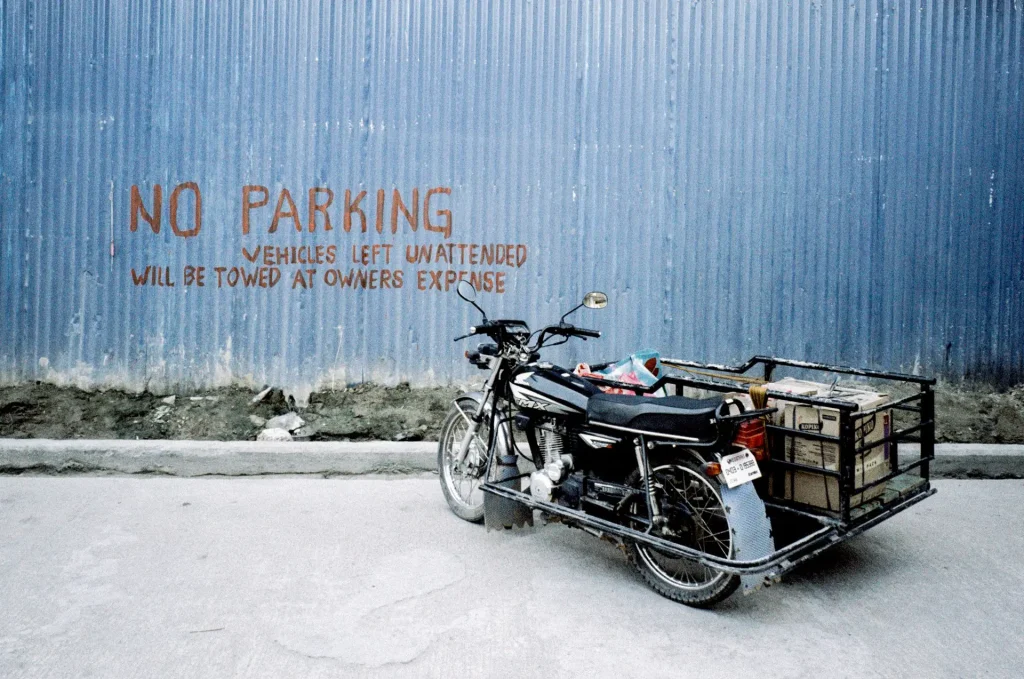
In 2020, I traveled across the Philippines with two film cameras which became the body of work for my photo book, Kuya. On the beautiful, colorful island of Palawan I loaded up a roll of 35mm Metropolis in my Fujifilm Klasse W point-and-shoot camera and made my way to the town of El Nido for a mix of street and landscape-style photography. As I walked around taking pictures, I hopelessly wondered how the photos would render on Metropolis’ unique color palette. After a few exciting weeks of anticipation, I received the scans back from the lab and was quite pleased with the results.
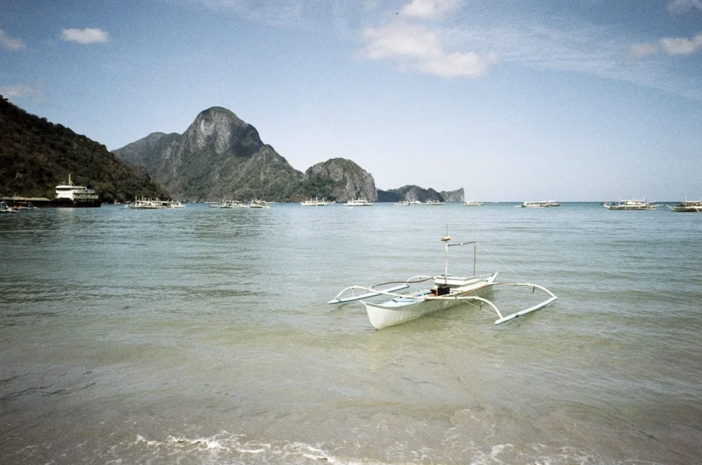
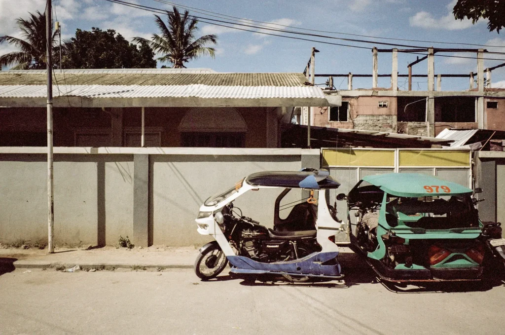
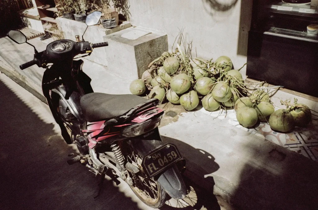
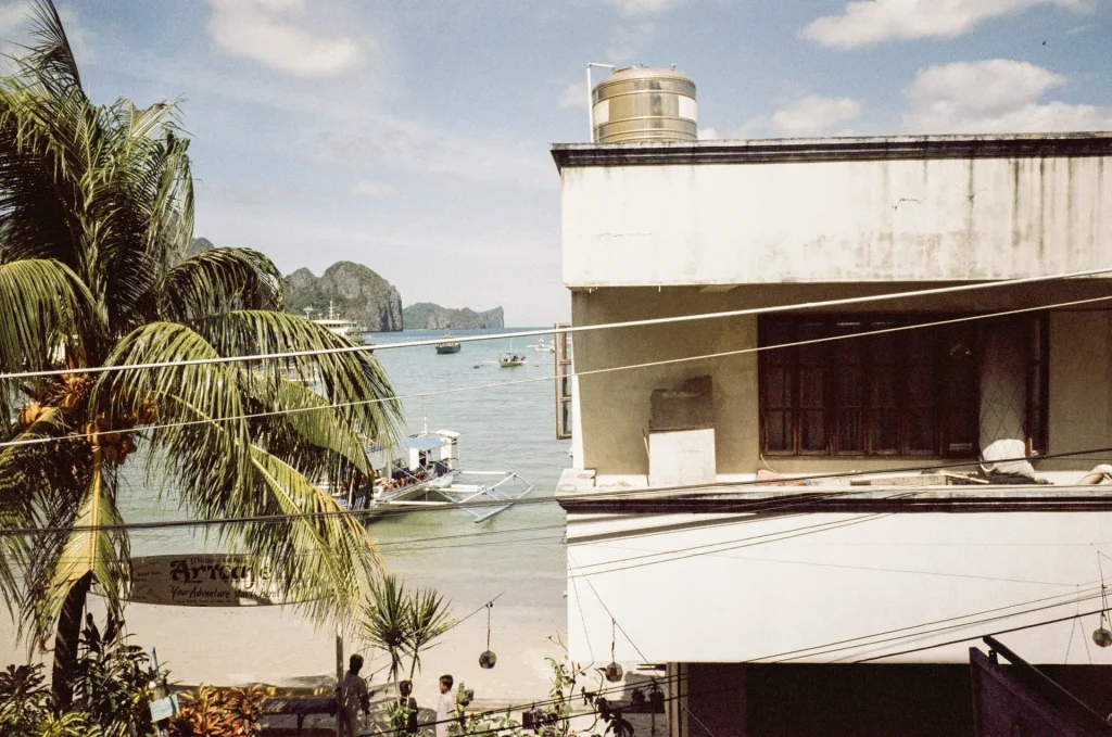
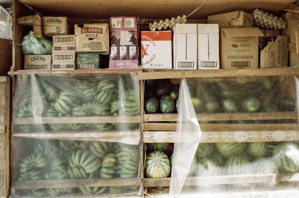
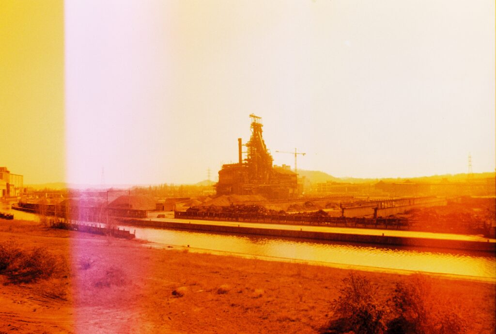
Metropolis’ muted tones are evident, for sure, but a subtle warmth to the photos remains true to how I recall my memories of that day. Skin tones appear pleasing with perhaps a bit of heightened exaggeration. Somewhat surprisingly, blues really pop. The crispness of the ocean is wonderfully rendered, as are the bright blue skies. Other colors stand out, green among them. From the palm trees, melons, coconuts and unripe bananas scattered among shops on the main commercial road, greens appear lush and nearly true to nature. Elsewhere in town colorful tuk-tuk rickshaws with their imaginative mashup of colorways appear as lively as they do in person, although reds are not as expressive on Metropolis as I had hoped.
The film’s latitude is impressive: I overexposed by one stop, rating the “variable speed” film at 200 iso (Lomography claims it can be rated between 100-400). But even on this extremely sunny day none of my highlights were overblown. Shadow detail was faithfully preserved and film grain appears pleasing to the eye. Anecdotally, some of the shots charmingly remind me of tones captured on my beloved, expired Agfa films.
Final thoughts
As a film photographer in an unpredictable market that seemingly constricts and expands year-to-year, I appreciate having different options available and I particularly love that Lomography provides many creative tools for artists.
Its name may arguably be limiting in a way that does it few marketing favors, but LomoChrome Metropolis deserves to be explored outside of strictly an urban city’s boundary. With an announcement at the end of 2021 that Lomography would soon introduce an updated formula of Metropolis with more contrast and punch (and seemingly sultry reds), I think “v2” of the LomoChrome brand’s “city” film may just be the formula that convinces more people to step outside of its concrete jungle.
Yameen is a photographer and sifter in the land of fun. Based in San Francisco, California, he is always looking to capture the beautiful, the gritty, the absurd & the unexpected.
Share this post:


Comments
Fred Nelson on LomoChrome Metropolis in the Philippines – by Yameen
Comment posted: 23/01/2022
Comment posted: 23/01/2022
James Evidon on LomoChrome Metropolis in the Philippines – by Yameen
Comment posted: 23/01/2022
As for the images posted by Yameen, very very nice!
Comment posted: 23/01/2022
Scott Gitlin on LomoChrome Metropolis in the Philippines – by Yameen
Comment posted: 24/01/2022
Comment posted: 24/01/2022
Juan Suarez on LomoChrome Metropolis in the Philippines – by Yameen
Comment posted: 25/01/2022
Comment posted: 25/01/2022
K on LomoChrome Metropolis in the Philippines – by Yameen
Comment posted: 15/05/2022
Comment posted: 15/05/2022