So we’ve built a darkroom for black-and-white printing (Part 1 of this series), and learnt to control both exposure (i.e. brightness) and contrast – first through trial-and-error (Part 2), and then with a more methodical, calculated approach (Part 3).
Discovering split grade
As I read and learnt more about printing, a mysterious phrase appeared on my radar – split grade (or split filtration) printing. Its advocates claim miraculous benefits – fast and precise control over exposure and contrast, fewer test strips, enhanced dodging and burning possibilities, and unlocking secret tones which are beyond the reach of ordinary printing techniques (the first three are mostly true; the last is mostly false). On the other hand, sceptics like David Vestal (The Art of Black and White Enlarging) dismiss split grade as ‘tricks’ and ‘distractions’.
My own thoughts on the pros and cons are set out below, but the technique itself is so interesting and powerful that once you have a grasp of basic darkroom technique, I recommend trying it out. What you do next is up to you – embrace split grade unconditionally, save it for certain situations, or reject it and revert to your old ways.
But ‘try it out’ is easier said than done. In the last year or so, I’ve read over a dozen books on darkroom technique, and only one of them – Way Beyond Monochrome by Lambrecht and Woodhouse – describes split grade in workable detail. Websites and videos do a slightly better job, but almost everyone has a different take on it. I tried several approaches, and the one I present here is an amalgamation of a few different ones (for more details, see the sources section below). This is what works for me (so far), but if you prefer a different approach, obviously that’s totally fine.

Where it gets confusing is that different tutorials describe slightly (and sometimes significantly) different techniques as split grade printing, often without acknowledging that alternatives exist.
Three definitions
In fact, split grade printing is not a single technique, but a set of techniques. They all have one thing in common: printing an image on the same sheet of paper at two or more different contrast grades. Split grade printing, therefore, requires variable contrast paper and some form of contrast control, typically using filters. It does not work with graded paper.
It’s helpful at this stage to define a couple more terms. First, a straight print is a print where no part of the image has been locally manipulated – for example, by dodging or burning. All parts of the image are printed with the same exposure and contrast settings. So far in this series, I’ve only discussed straight prints, and that’s the plan for this part too. Dodging and burning are covered in the last and final part.
Second, a base exposure is an exposure made on the paper with the intention of further manipulation. Manipulation is typically done before the paper is developed, which is why I’m calling it ‘base exposure’ rather than ‘base print’ (the print only emerges after development).
A house with many rooms
Split grade techniques – at least the ones I have seen – fall into two categories. The first is what I call integrated split grade printing, where the print is created, from the ground up, by a split grade process – that is, using two or more (but typically two) different contrast grades. Integrated split grade printing in turn encompasses a few different approaches (see sources below), but I’ll describe and demonstrate the one that works best for me. Henceforth, this is what I mean when I simply say ‘split grade’. But in reality, it is only one of several split grade techniques.
The second is what I call split grade manipulation. Here, the base exposure is made at one single contrast grade – for example, using one of the methods described in Parts 2 and 3 – but further local manipulations, like dodging or burning, are done at higher or lower contrast grades. I’ll give an example of this too, but since it involves local manipulation, I’ll save it for the next part.
Incidentally, an integrated split grade print can be a straight print (which is what I cover in this part), but – as if things weren’t complicated enough already! – it can also be further manipulated by dodging and burning (for that, see the next part).
My approach
The split grade printing approach which I follow involves making two exposures of the same negative on the same sheet of paper – a soft exposure at a low contrast grade (I use Grade 0) and a hard exposure at a high contrast grade (I use Grade 4.5). On my colour enlarger, these correspond to 90Y (90 units of yellow filtration) and 140M (140 units of magenta filtration) respectively.
The soft exposure produces highlight detail, but light and weak shadows. The hard exposure ‘burns in’ the shadows, giving them richness and density, but has little or no effect on the highlights. Increasing the soft exposure lowers contrast, and increasing the hard exposure raises contrast. I do the exposures in this order – first soft, then hard – but the order doesn’t affect the final result.
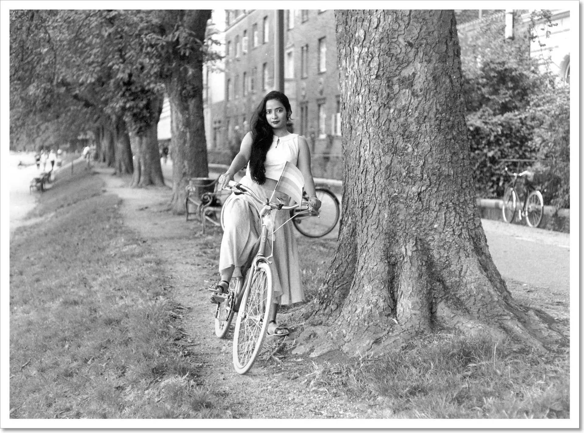
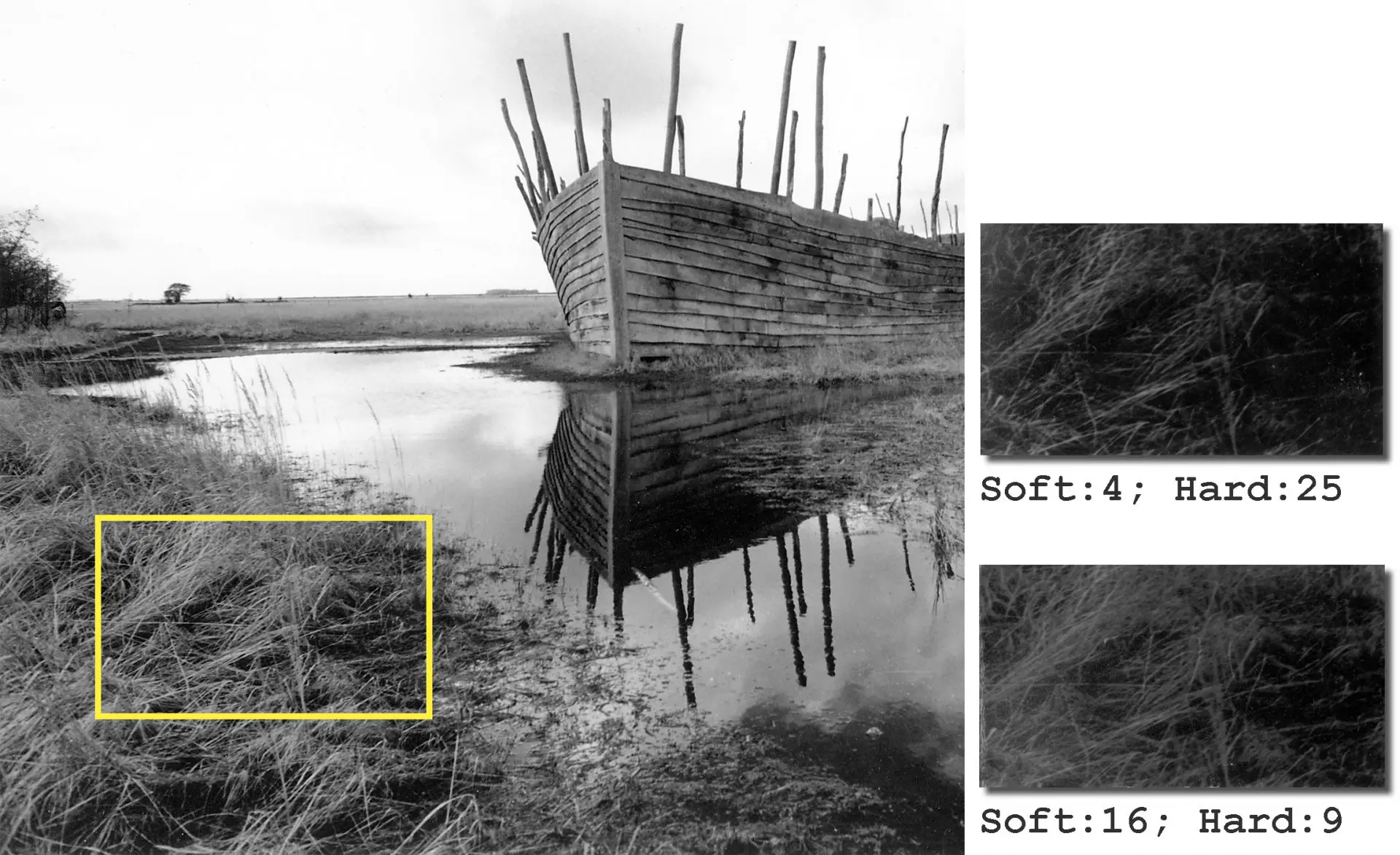
Print 1: Anasua by the Lakes
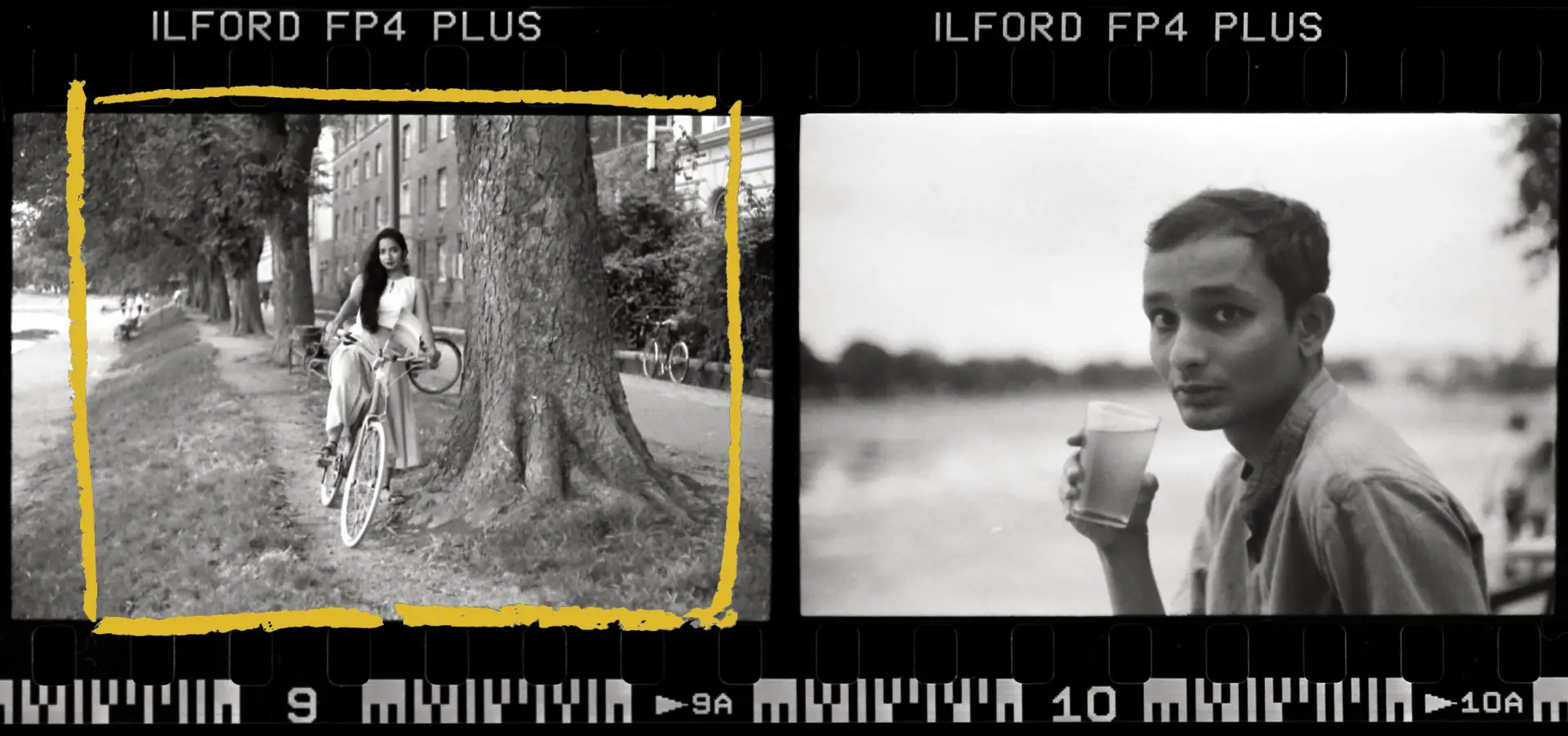
On our way back from Copenhagen Pride, my girlfriend and I stopped for a beer by the lakes (you can see a Pride flag on her bike). I was still getting used to a rangefinder and I was impatient for the beer, which probably explains the basic composition error (if you haven’t spotted it, here’s a hint). This annoys me no end, because otherwise I really like the photo. In the next frame which she took, I have the long-awaited beer in my hand.
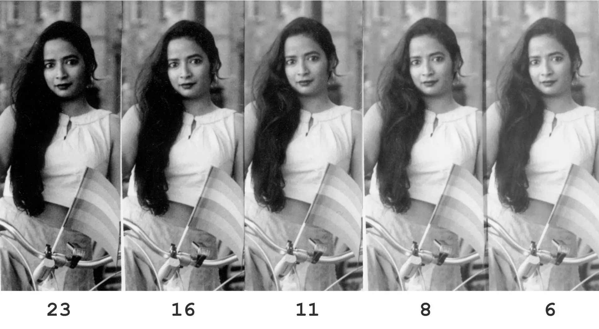
Soft exposure
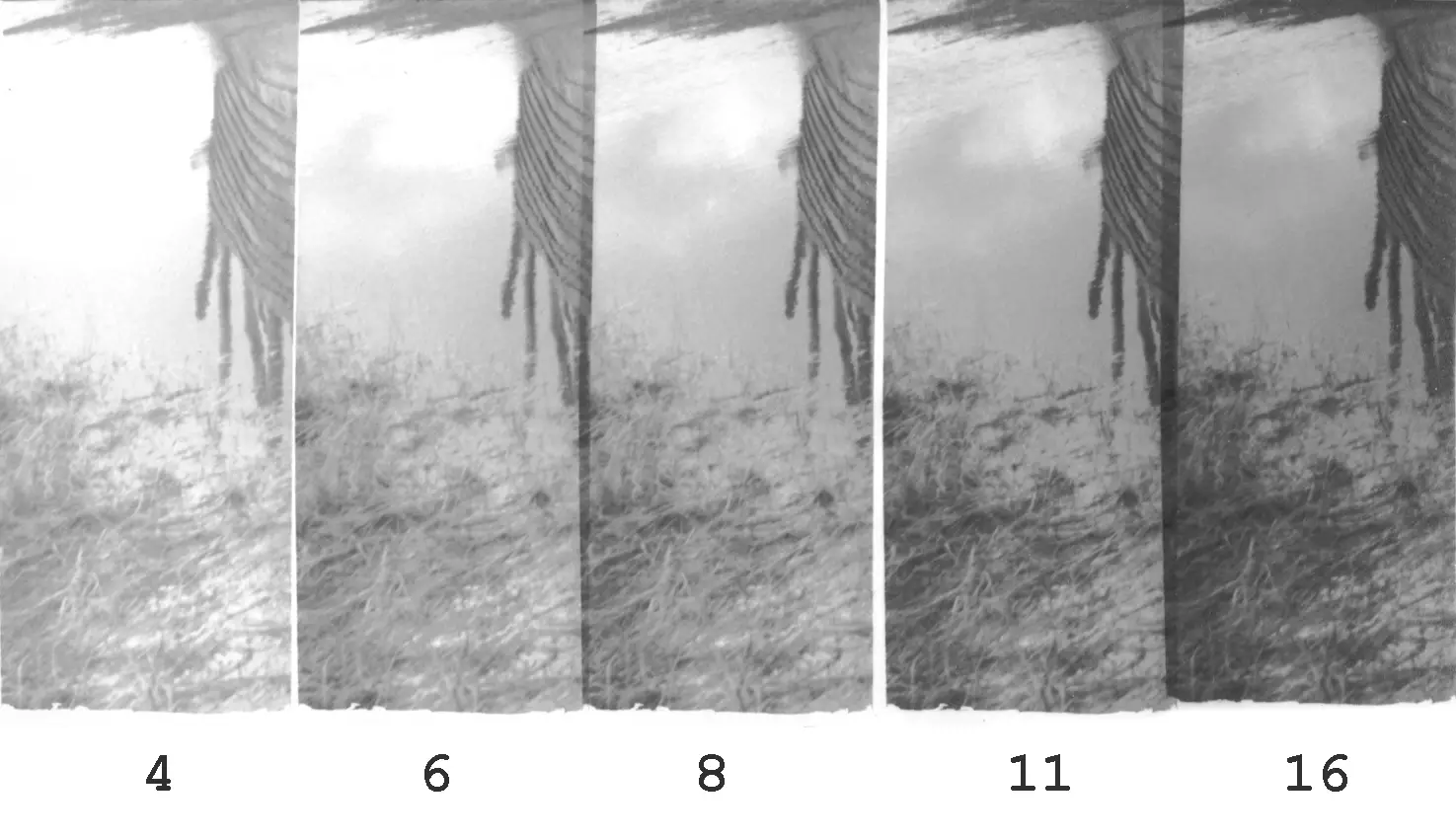
 I first did a test strip at Grade 0, with exposures of 4, 6, 8, 11 and 16 secs at f/8. (I’m using localised test strips and f-stop timing, both of which I explain in Part 3. But these are not essential for split grade; you can also use the more traditional continuous test strips and linear timing.)
As with the expose for the highlights method described in Part 3, I chose the soft exposure based on when the textured highlights areas (not pure whites) first start to show tonality. I err on the lighter side because the subsequent hard exposure will add a bit more density.
Delicate highlights first appear around 8 secs – see how the bands on the Pride flag start to separate. That step still seems a shade light, so I chose 9 secs. (I resisted the temptation to judge by her top, because parts of it are pure white (as opposed to textured highlights), while the fabric folds are more like midtones or shadows.) Of course, at 9 secs her hair is still far too light – indeed there is no true black in the whole strip. But that’s okay; we have the hard exposure for that.
For me, evaluating the soft exposure is the trickiest part of the split grade process. In this case I think 9 secs was the right choice, but I get it wrong about 50 percent of the time. Hopefully with time, my strike rate will improve.
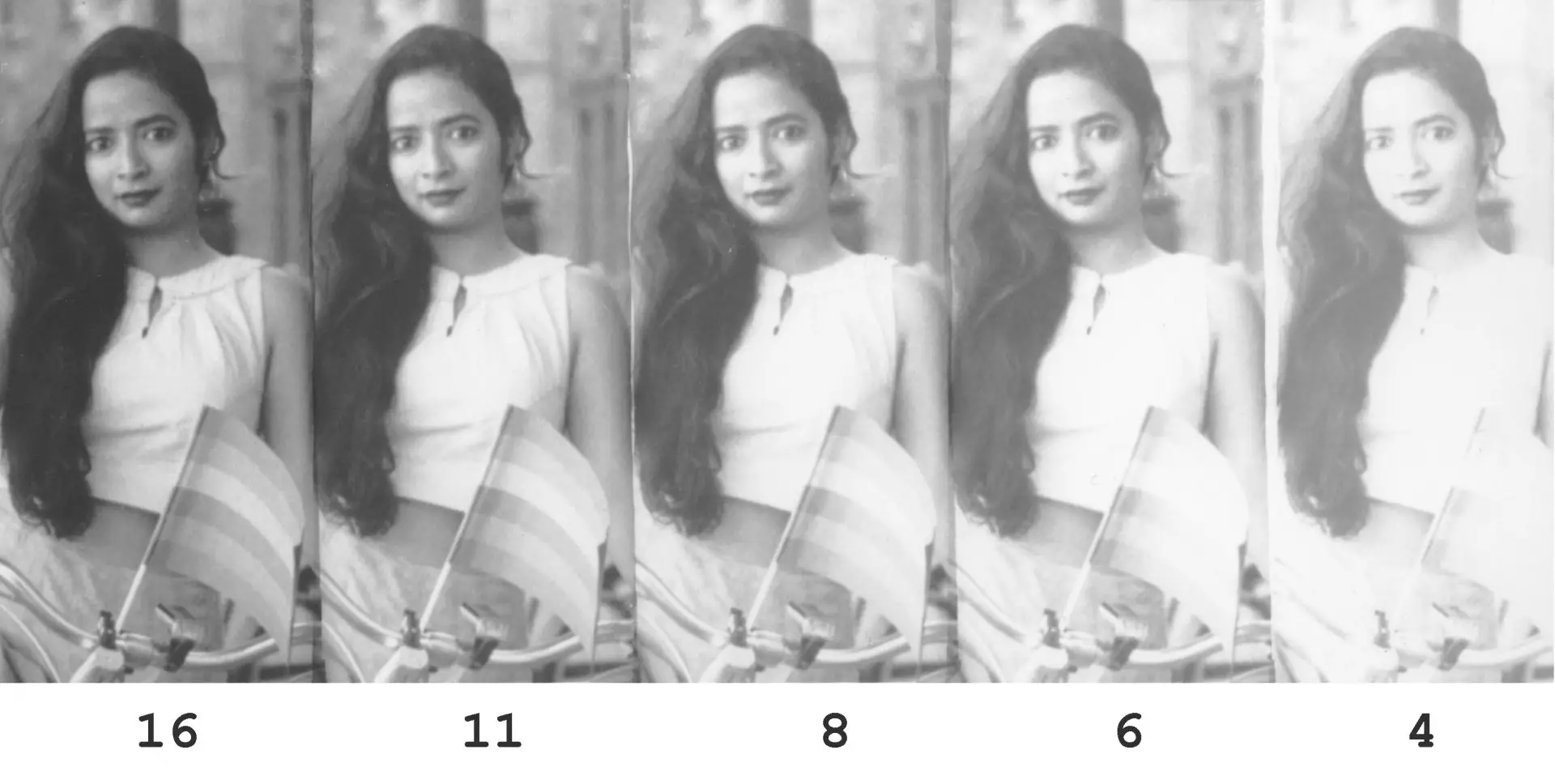
Hard exposure
 I then did a second test strip for the hard exposure (Grade 4.5), with exposures of 6, 8, 11, 16 and 23 secs at f/8. On each hard exposure, I overlaid the pre-selected 9-sec soft exposure. In this case, the part of the image which had important highlight detail (bands on the Pride flag) coincidentally also had important shadow detail (her hair). Otherwise, I could have picked any other part of the image for the hard-exposure strip (which is what I do in the next print).
This time, I looked at the shadow detail in her hair. That detail is still there at 11 secs, but blocked up at 16. I picked 12 secs to make the blacks inkier, but without losing texture. Notice how the midtones – on her face and skirt, for example – fall neatly into place, though I didn’t account for them at all.
Process
If you make localised test strips as I do, the hard-exposure step is a bit complex, because you have to change the filtration multiple times. I do it as follows:
- Expose the first step for 9 secs at Grade 0, switch to Grade 4.5, expose for a further 6 secs.
- Staying with Grade 4.5, expose the second step for 8 secs, switch to Grade 0, expose for 9 secs.
- Staying with Grade 0, expose the third step for 9 secs… and so on.
With progressive test strips, you can simply do a series of hard exposures, and then give a uniform soft exposure to the whole strip. Localised test strips, as you see, are more complicated. It gets easier with practice, but I cannot emphasise how helpful it is to have a plan before I start. Once I switch the enlarger on, the clock is ticking, and mistakes have a price. For this reason I recommend…
Making notes
I find making notes is very useful for any method of printing (trial-and-error, expose for the highlights, SERC…) but for split grade, it’s essential. Otherwise I lose all track of aperture, grade and time. You can see my system below (I also use it for methods other than split grade).
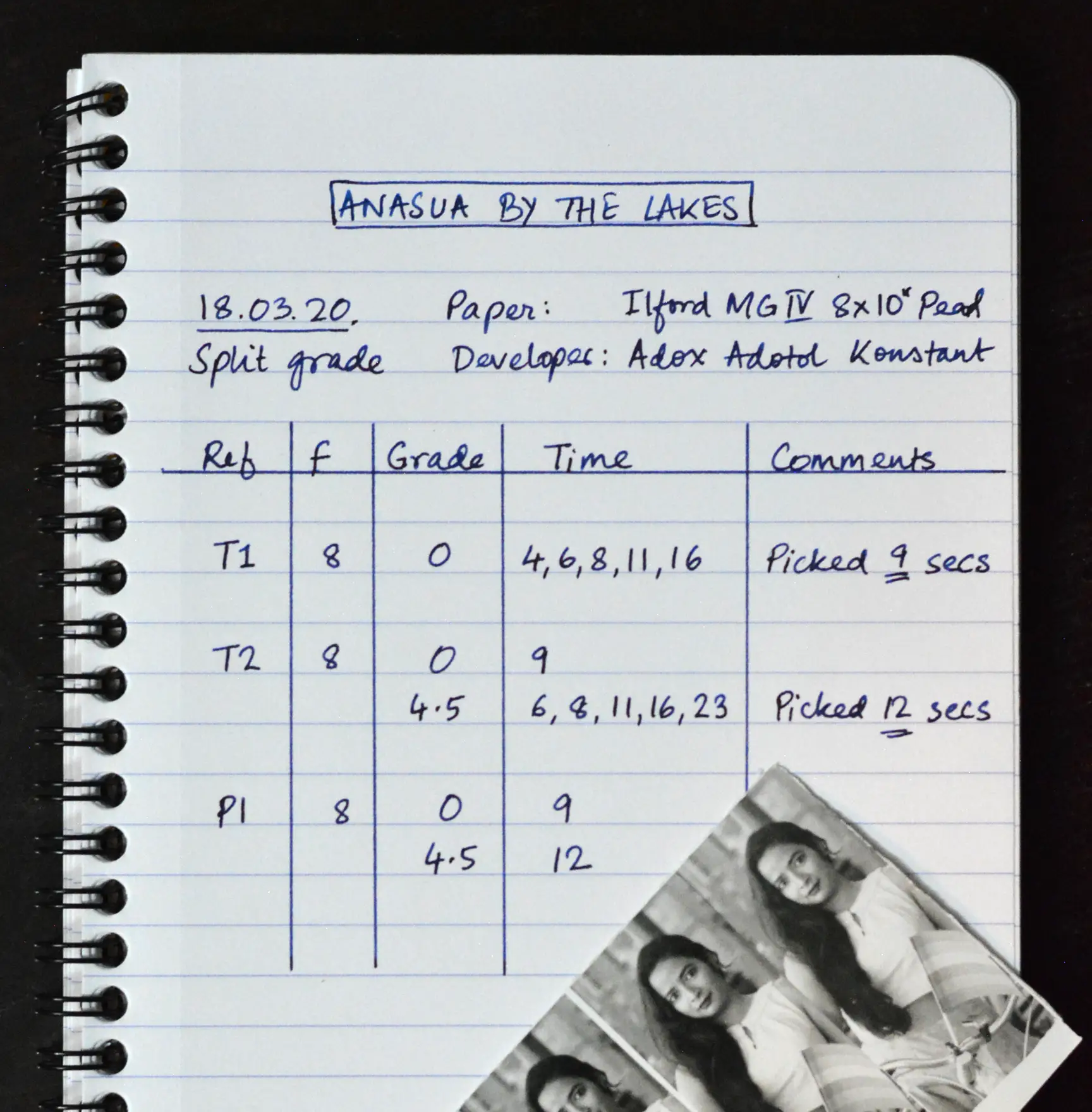
In my notebook, I write down what I’m going to do before I switch on the enlarger. That way I can see the aperture, grade and time just by glancing at the table, which means a few less things to keep in mind. My 15W safelight, which was only £2, is bright enough for the purpose.
The left column is a reference – T1, T2… for test strips, and P1, P2… for prints. Before putting any paper under the enlarger, I write down the reference on the back with a ballpoint pen. That way, it’s easily identifiable later on, and by consulting my notebook, I know what exactly I’m looking at. The other columns are self-explanatory.
In the interests of full disclosure, this is a cleaned-up version of my notes. My regular notes, as my friend remarked, look like a serial killer’s diary. But they follow the same logic.
Final print
Using the times determined from the soft- and hard-exposure test strips, I made the final print with a soft exposure of 9 secs and a hard exposure of 12 secs, both at f/8.
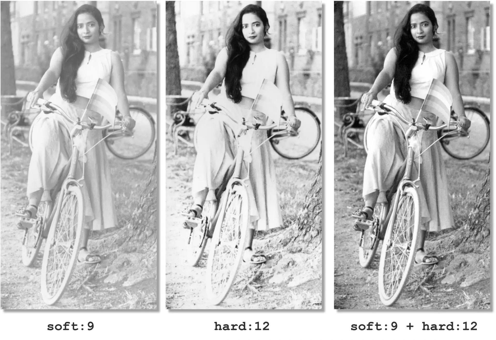
Split grade deconstructed
Finally, for no good reason except to better understand the technique, I exposed three strips with (a) the soft exposure only, (b) the hard exposure only, and (c) both exposures superimposed. I think this comparison might explain how split grade works better than my textual explanation could.
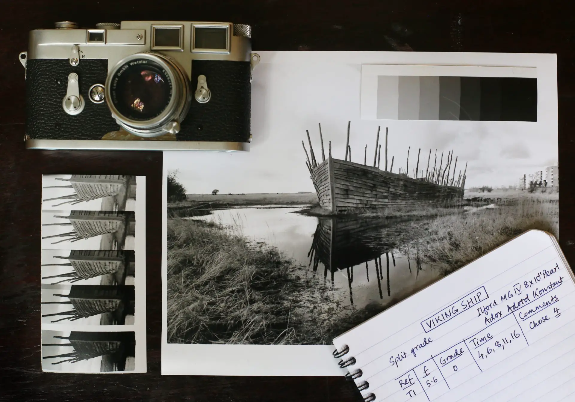
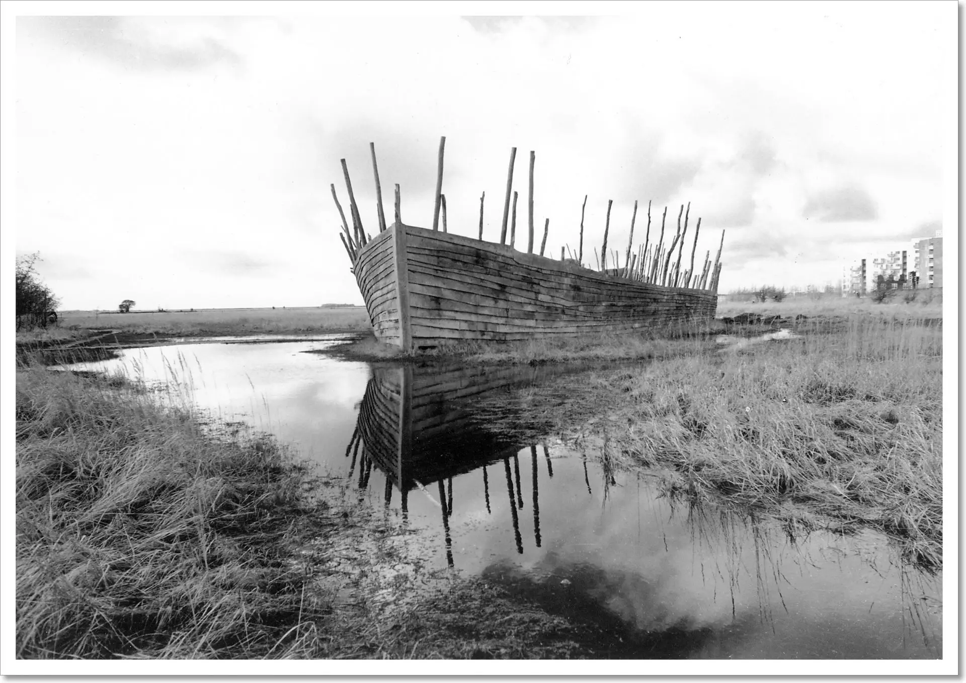
Print 2: Viking Ship
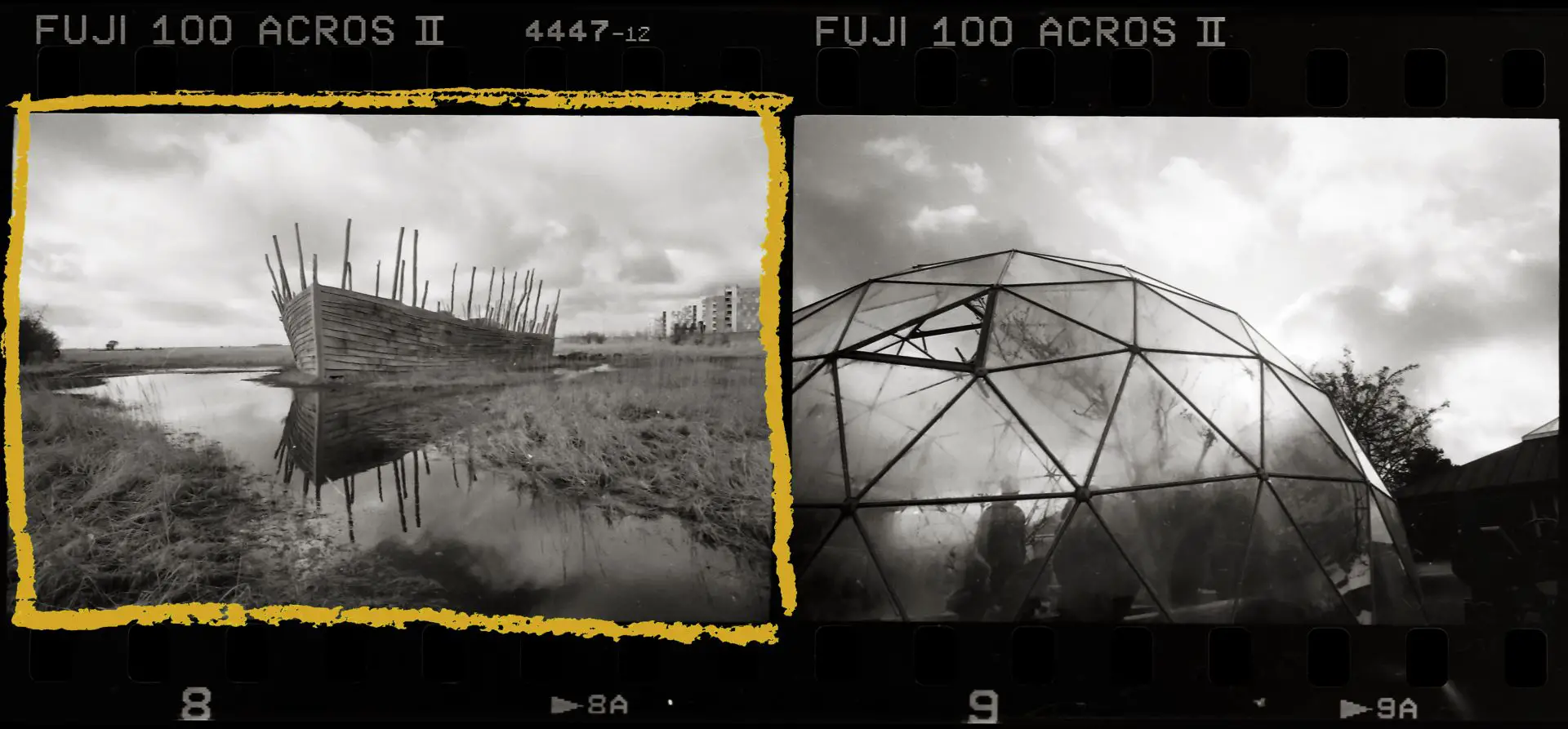
This reconstructed Viking ship looms over Kalvebod Fælled, a marshland on the outskirts of Copenhagen. In the distance is an incongruous modern housing estate.
Soft exposure
 I made a soft (Grade 0) test strip with exposures of 4, 6, 8, 11 and 16 secs at f/5.6, looking for highlight tones in the water. The first 4-sec step already shows tonality (as usual, I try to err on the lighter side). Ideally, I should have done another test strip placing the 4-sec step in the middle (2, 3, 4, 6 and 8 secs, for example). But I had a strong hunch that a sub-4-sec exposure would be too light, so I moved straight to the hard-exposure strip.
Hard exposure
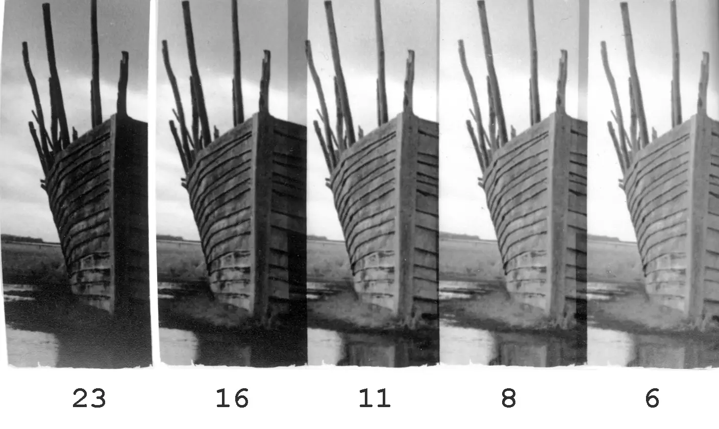 For the hard-exposure (Grade 4.5) test strip, I picked a different part of the image, looking at the shadows under the slats. This strip had exposures of 6, 8, 11, 16 and 23 secs at f/5.6. On each exposure, I overlaid the pre-selected 4-sec soft exposure.
At 6 secs, the shadows still look light, like pencil lines. At 11 secs, they start to ‘smudge’. To me, 8 secs looks about right, perhaps a shade too light. Accordingly, I picked 9 secs for the hard exposure.
Final print
I made the final print with a soft exposure of 4 secs and a hard exposure of 9 secs, both at f/5.6.
The limitations of straight printing
Of the prints I’ve made so far, Viking Ship is one of my favourites. I may disown it in a year’s time when I know better, but it seems to me that at least on paper, it looks almost three-dimensional, alive.
Nevertheless, on the negative I can see a lot more cloud detail than there is in the straight print reproduced above. I wanted to see if that detail could be revealed with longer exposures.
If you recall, the final print had a soft exposure of 4 secs and a hard exposure of 9 secs, both at f/5.6. I made two separate progressive test strips for the clouds. In the first I held the soft exposure constant and increased the hard exposure. In the second I did the opposite.
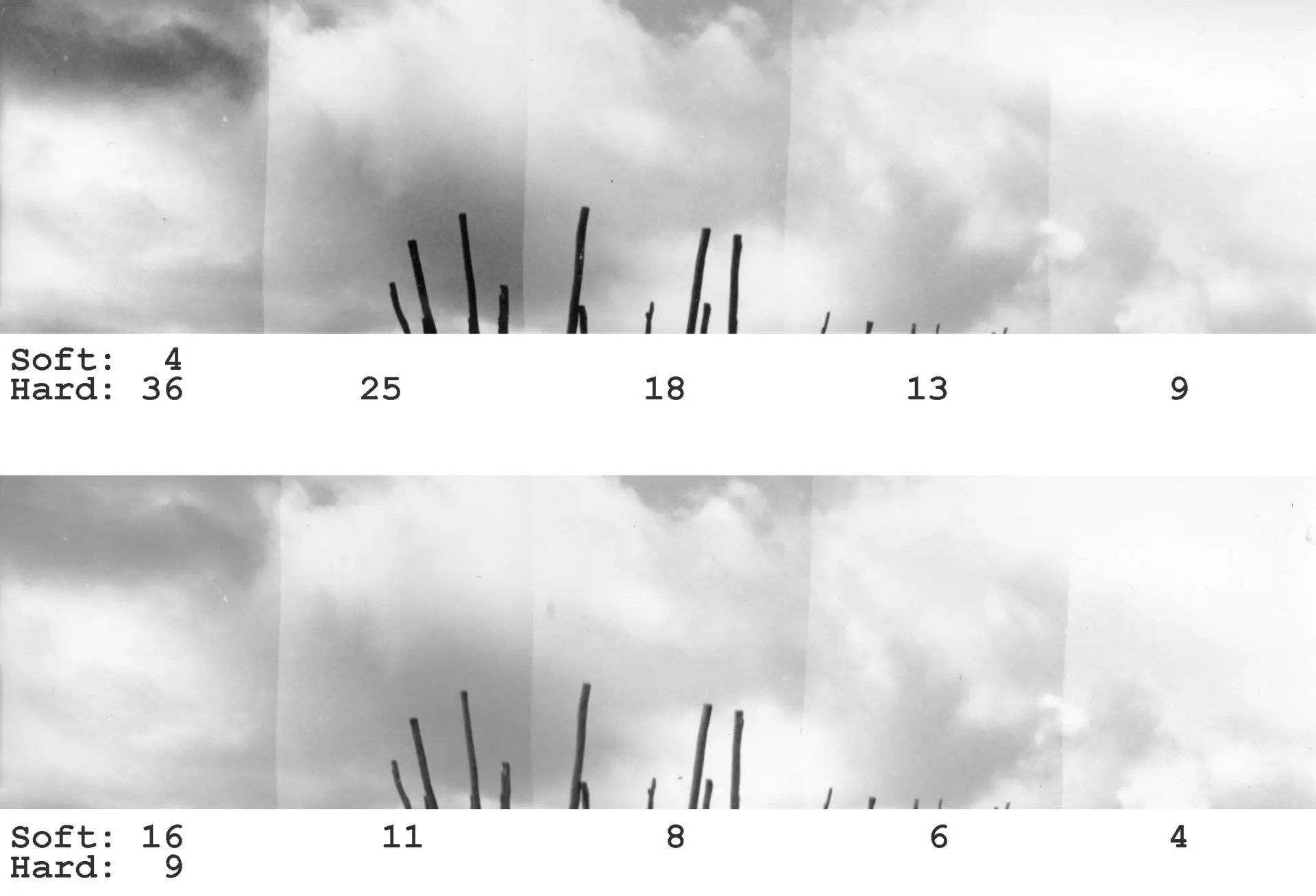
In the first strip, as we might expect, the increased hard exposure creates a more high-contrast sky. In the second, the increased soft exposure has a gentler influence. The wooden masts are also much darker in the first, since the hard exposure disproportionately darkens the shadows. But in both cases, with additional exposure, the clouds look far more dramatic than in the straight print.
I liked the second step from left in the first strip, and the leftmost step in the second. So as a trial, using those exposures, I did two tiny test squares of the grass at bottom left.
Look what the longer exposures do to the grass. In both cases, compared to the straight print on the left, the grass looks dull and muddy. More exposure brings out the clouds but kills the sparkle of the grass, which, for me, is what gave the print much of its lively quality.
The problem is that on the negative, the darker shades in the clouds have about the same density as the highlights in the grass. With a straight print, no amount of split grade wizardry can print the former to look dark while the latter looks light. We’re forced to choose between cloud and grass. There’s only one way out, but I’ll come to it in the next part.
The lure of split grade
Split grade promises a lot. Surprisingly, for the most part, it also delivers.
First, it’s economical in terms of both time and paper. For each print, I determined both exposure and contrast with just two test strips (I cut 8×10″ sheets into sixths to make test strips, so that’s just one-third of a sheet).
Second, by varying the proportion of the hard and soft exposures, we can achieve an almost infinite range of intermediate contrast grades, no longer being limited to the traditional half-grade increments of 1, 1.5, 2 and so on.
Third, it offers powerful dodging and burning possibilities. I discuss this in more detail in the next part, but split grade printing makes it possible to dodge or burn parts of the print during either the soft exposure, or the hard exposure, or both. This means we can, for example, selectively burn certain highlights (by burning during the soft exposure) or dodge the shadows (by dodging during the hard exposure), in each case leaving the other tones relatively unaffected. This is a game changer.
Last but not least – and this is just my personal view – using low contrast for the highlights and high contrast for the shadows is just an incredibly clever and elegant strategy. I realise this is a subjective and not-entirely-rational argument, but split grade printing just feels cool.
It is perhaps this indefinable coolness of split grade which leads some printers to make exaggerated claims on its behalf. The idea that it can ‘unlock secret tones’, for example, is a misconception. Any straight split grade print can be replicated with a single exposure using the right combination of colour filters (finding that combination, however, is a formidable task). And even otherwise, the method has its downsides. (“There are no solutions, only trade-offs,” said the economist Thomas Sowell.)
First, making test strips, as we saw, is more complicated. Even with a relatively methodical approach, I sometimes mess up the times or forget to change the filtration.
Second, there’s a risk that the enlarger head gets knocked out of position while changing filtration midway through the print, resulting in misaligned exposures.
Third, if you’re unhappy with the exposure or contrast of the final print, using the methods described in Part 3, it’s easier to change the exposure while holding the contrast constant, and vice versa. With split grade, increasing the hard exposure, for example, will increase both exposure and contrast.
Fourth, at least with my relative lack of experience, it doesn’t always save time and paper. For the two prints shown here, I guessed right. But sometimes I don’t, and then it’s back to the drawing board. In such cases, split grade can be less economical than my old methods.
All I can say is, try it out if you haven’t already, and make up your own mind. Having started printing just a year and half ago, I can’t even say for sure if split grade works for me, let alone if it will work for you.
Sources
This section is to credit my sources and introduce some other methods. If that’s overkill, feel free to skip it.
I first learnt split grade printing from Way Beyond Monochrome by Lambrecht and Woodhouse; they combine it, as I do, with localised test strips and f-stop timing. The best description is in the book itself (which I really recommend), but the technique is illustrated in an article on The Online Darkroom (note that he uses continuous test strips and linear timing). The website is no more, but fortunately the page is archived.
The Way Beyond Monochrome method makes separate soft- and hard-exposure test strips and combines them in the final print. A modification is to overlay the chosen soft exposure on top of each hard exposure in the second test strip, creating steps which look more like the final print. I learnt, and swiftly adopted, this modification from David McCormack’s comment on the Online Darkroom article.
This ‘overlay’ approach is also used by Les McLean who uses continuous test strips and f-stop timing, and by the Naked Photographer (video) who uses continuous test strips and linear timing.
I haven’t found a source which uses my exact method – the overlay approach with localised test strips and f-stop timing. But part of the fun(?) of darkroom printing is trying out different methods and finding the unique combination which works for you.
Then there are other, quite different approaches, like the Ilford method described on their website and in a video. I won’t describe it here; personally I find it more complicated, but maybe it will work for you.
All of the above fall under the integrated split grade category, but finally, there is also split grade manipulation – that I will cover in the next part.
Tech notes
This section is just for completeness (and for nerds). Feel free to skip it too.
Anasua by the Lakes was shot on a Leica M3 with a 50mm Summicron f/2 (collapsible version 1) on Ilford FP4 Plus at EI 125, developed in Ilfosol 3.
Viking Ship was shot on a Leica M3 with a Voigtländer 28mm Ultron f/1.9 on Fuji Neopan Acros II at EI 100, developed in Kodak D-76 1+1.
Both photos were printed on Ilford Multigrade IV RC (Pearl) 8×10″, using a Paterson colour enlarger with Paterson 50mm f/3.5 lens, and developed in Adox Adotol Konstant.
I scanned the prints with an HP Scanjet G4010, with sharpening and other corrections turned off. I processed them minimally in Photoshop, mostly just setting the black and white points where necessary and annotating exposure times and contrast grades. An onscreen image will always look different to a silver gelatine print, but I would say the scans are close enough..
Next up: Part 5!
That’s it for now – see you next Monday for the fifth and final part, which is all about dodging and burning. For the first time in this series, I won’t show any new prints; I’ll be dodging and burning prints you’ve already seen. So which prints from Parts 2 to 4 would you like to see me work on? What manipulations would you employ, based on the straight prints you’ve seen?
Thanks for all your comments so far – it’s really encouraging. And thanks for reading!
Share this post:


Comments
Alex on Split Grade Printing – Darkroom Technique Part 4 – by Sroyon Mukherjee
Comment posted: 27/04/2020
You might be able to make your life easier by printing at grade 2 first up and assesing the time for a reasonable print.
Then to split grade I half the time and do a first print at grade 0 and another grade 5 (I use ilford multigrade filters)
To adjust contrast I just vary the time for the blacks (the grade 5 print) or the time and/or grade for the highlights (the grade 0 print)
Dave Butcher is and Ilford Master printer and has done a YouTube video on it worth checking out. It speeds up the process drastically but I like your method as it gives a lot more control earlier on.
Thanks for the interesting read
Al
Comment posted: 27/04/2020
Ashley Carr on Split Grade Printing – Darkroom Technique Part 4 – by Sroyon Mukherjee
Comment posted: 27/04/2020
Another way of altering the contrast, which I find more effective than raising the high contrast exposure time (not good if you start to lose shadow detail) is to actually increase the low contrast grade from say 0 to 1.
By doing this you’re not sacrificing shadow detail by raising the exposure time of the high contrast grade.
Comment posted: 27/04/2020
Comment posted: 27/04/2020
Comment posted: 27/04/2020
Paul Elcock on Split Grade Printing – Darkroom Technique Part 4 – by Sroyon Mukherjee
Comment posted: 27/04/2020
Comment posted: 27/04/2020
Ken R on Split Grade Printing – Darkroom Technique Part 4 – by Sroyon Mukherjee
Comment posted: 27/04/2020
Comment posted: 27/04/2020
Richard on Split Grade Printing – Darkroom Technique Part 4 – by Sroyon Mukherjee
Comment posted: 28/04/2020
Comment posted: 28/04/2020
Glenn S on Split Grade Printing – Darkroom Technique Part 4 – by Sroyon Mukherjee
Comment posted: 28/04/2020
Comment posted: 28/04/2020
Comment posted: 28/04/2020
Geoff on Split Grade Printing – Darkroom Technique Part 4 – by Sroyon Mukherjee
Comment posted: 28/04/2020
Comment posted: 28/04/2020
Dodge, Burn and Other Heresies – Darkroom Technique Part 5 – by Sroyon Mukherjee - 35mmc on Split Grade Printing – Darkroom Technique Part 4 – by Sroyon Mukherjee
Comment posted: 04/05/2020
Marko Jelic on Split Grade Printing – Darkroom Technique Part 4 – by Sroyon Mukherjee
Comment posted: 20/05/2020
Comment posted: 20/05/2020
Photographic Darkroom Paper: A Complete Guide – The Photography Professor on Split Grade Printing – Darkroom Technique Part 4 – by Sroyon Mukherjee
Comment posted: 18/01/2021
Thuc on Split Grade Printing – Darkroom Technique Part 4 – by Sroyon Mukherjee
Comment posted: 11/10/2021
Comment posted: 11/10/2021
Split grade printing | Vladography on Split Grade Printing – Darkroom Technique Part 4 – by Sroyon Mukherjee
Comment posted: 07/12/2021
Digoy on Split Grade Printing – Darkroom Technique Part 4 – by Sroyon Mukherjee
Comment posted: 19/09/2022
Comment posted: 19/09/2022
Comment posted: 19/09/2022
Comment posted: 19/09/2022
Comment posted: 19/09/2022
Rajkumar Krishna on Split Grade Printing – Darkroom Technique Part 4 – by Sroyon Mukherjee
Comment posted: 08/10/2022
Your thought ?
Thanks
Comment posted: 08/10/2022
Greg Pantelides on Split Grade Printing – Darkroom Technique Part 4 – by Sroyon Mukherjee
Comment posted: 08/06/2023
Comment posted: 08/06/2023
Marvin I Droz on Split Grade Printing – Darkroom Technique Part 4 – by Sroyon Mukherjee
Comment posted: 27/01/2024
Comment posted: 27/01/2024