So far in this series I’ve only talked about ‘straight printing’, which is to say, no part of the image was locally manipulated. I tweaked exposure and contrast of course, but those tweaks were applied uniformly to the whole image.
Part 5 is about two classic techniques for local manipulation of exposure and contrast – dodging and burning. Dodging lightens certain print areas by blocking enlarger light from reaching them. Burning darkens certain print areas by giving them additional exposure. Local manipulation can also be classified into same-grade and split-grade; I’ll explain the distinction later, along with examples of both types.
Why manipulate
In the last part, I talked about some of the limits of straight printing. Viking Ship, a print I made using the split grade technique, has less detail in the sky than was captured on the negative. In a straight print, the clouds can be teased out with increased exposure, but only at the expense of making the grass look muddy and grey. We’re forced to choose between cloud and grass. But with dodging and burning, we can have the cake, and eat it.
There are plenty of reasons for local manipulation – revealing important details (as I would like to do in Viking Ship), suppressing distracting details, guiding the viewer’s eye around a frame or drawing their eye to a part of it, balancing – or unbalancing – a composition, conveying a mood or evoking an atmosphere, making a photograph more realistic, making a photograph less realistic… the list goes on. As far as I’m concerned, these are all legitimate reasons. In fact, short of deliberate deception for propaganda or fraud, I’m hard pressed to think of what I’d consider an illegitimate reason.
On online forums, you often see proclamations about the ‘purity of film photography’, and how even cropping, let alone contrast and exposure adjustments, are despicable and sacrilegious. I won’t even get into that debate. Whether you manipulate, or how much, is up to you. As David Vestal says, “It isn’t a moral issue.”
Tools, techniques and planning
Tools
Hands
For both dodging and burning, hands are often the best tool. Dodging and burning near the edge of the frame is especially easy. Central areas can also be burned by putting your palms together and letting light through a hole between your fingers.
Some enlarger timers automatically switch the light off at the end of the preset time. Since I don’t have a timer and listen to a ticking clock instead, I sometimes also use my hands to end exposures. With straight printing, I simply turn off the switch at the appropriate time. If both my hands are occupied with dodge/burn motions, it’s more accurate to swiftly block the enlarger light with one hand and then switch it off with the other.
Dodge tool
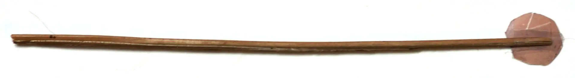
But sometimes hands are not enough – for example, if I want to dodge an area in the middle of a print. I use the classic homemade dodging tool shown below. It’s a stick from a coconut broom (you can also use wire) to which I taped a piece of cardboard (I swap it out for bigger pieces or other shapes as needed). This is a close-up; the stick is narrower than it looks. Thick holders can leave a tell-tale shadow.
Burn tool
For burning, I made this cardboard tool, based on a design in Barnbaum’s The Art of Photography. The big card, with the hole blocked, can be used to shade larger sections of the image. Gently folding it creates a convex or concave edge. In combination, the two pieces can make an even wider variety of shapes. Oftentimes the simple tools are the most versatile.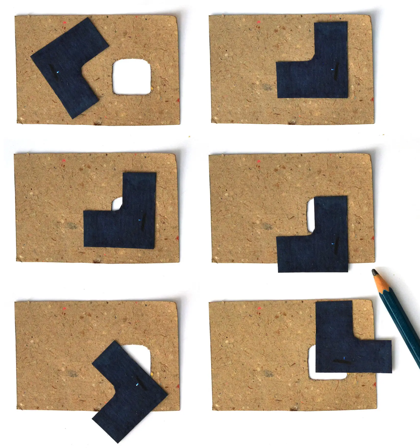
Techniques
The guiding principle behind all dodging and burning techniques is “leave no trace”. (At least that’s what the textbooks tell us. Deliberately heavy manipulation can also be used for creative ends, but I’m not quite there yet.) Classic examples of poor technique include a halo around a subject which has been dodged, or darkened treetops which were burned along with the sky.
There are a few common strategies to avoid such errors – dodging and burning precisely and not in a casual or haphazard way, keeping hands or tools in constant gentle motion to create gradual transitions, and the careful use of shadows (holding a tool higher produces softer-edged shadows, but holding it too high reduces precision).
Planning
Work print
Ansel Adams’ advice in The Print still holds good seven decades later:
No matter how experienced you may be in printing, [the first print] should be a straight print, without burning or dodging, to allow you to make a full and objective judgment about the additional steps needed.
From this straight print or work print, I try to figure out which parts need dodging or burning.
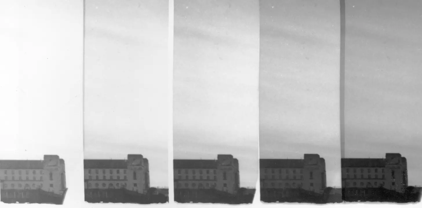
Test strips
Test strips made earlier can provide useful information. Say I chose the 4-sec step for the final print, but I like how the sky looks at 8 secs. This tells me that the sky needs an additional 4-sec burn. Alternatively, I sometimes make a new test strip for the area which I want to dodge or burn.
Many of my 8×10″ prints have an inch or more extra space at the bottom, because the paper is ‘squarer’ than the 35mm negative. To avoid waste, I often cut off a 1×10″ strip under the safelight and save it for dodge/burn tests (I got this tip from Vestal’s The Art of Black and White Enlarging). Test strips made from these spare strips can be small. Really small. But sometimes that is all I need to see.
Dodge/burn map
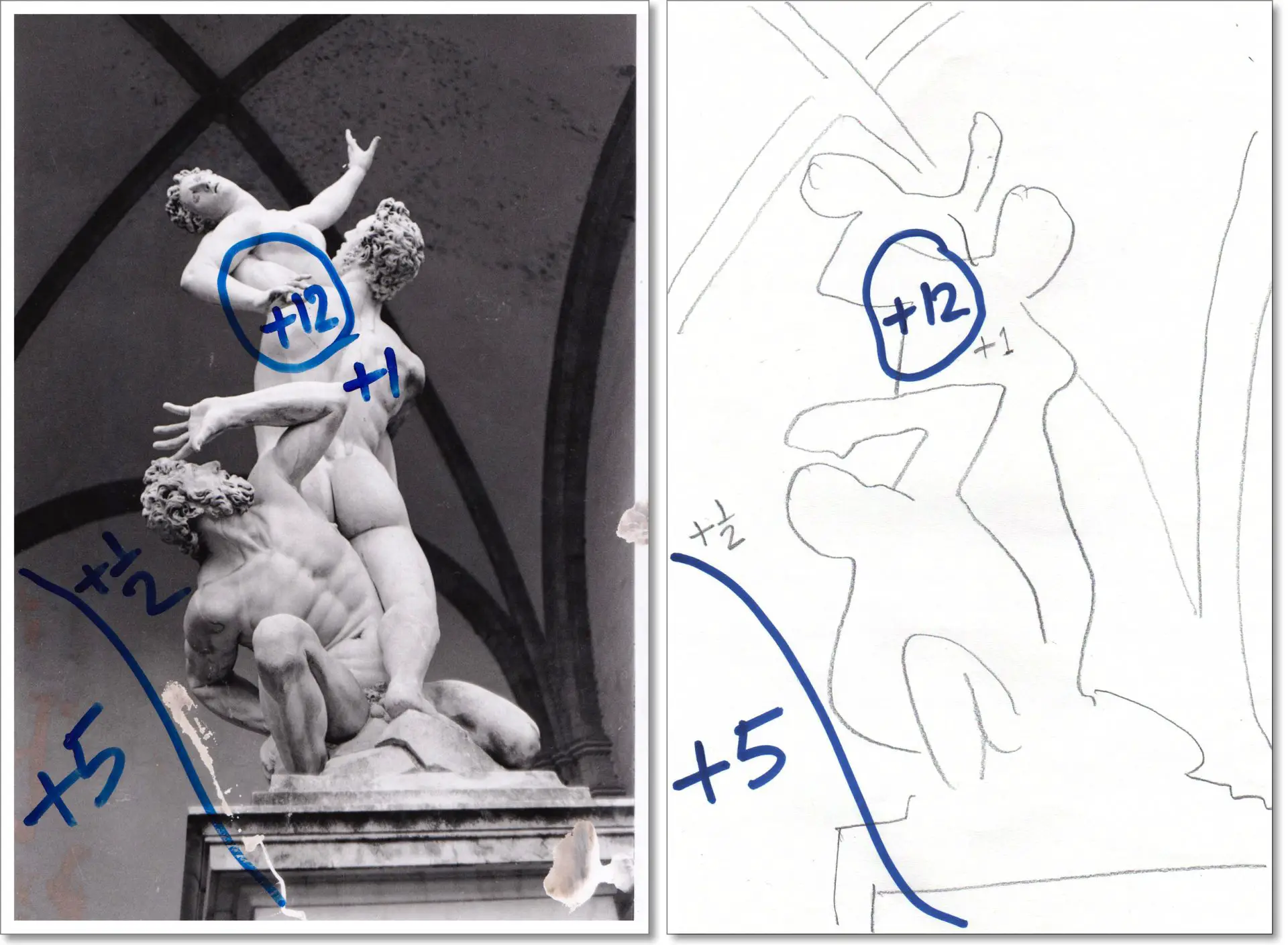
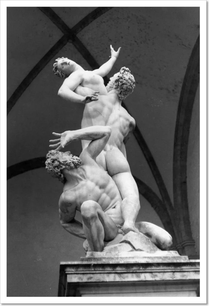
For all but the simplest prints, I then make a dodge/burn map, which I keep next to the easel when making the final print. Some people draw the map directly on the straight print (see below left). I generally like to keep the straight print, but I accidentally spilled some chemicals on my first straight print of Abduction of a Sabine Woman, so I repurposed it as a map.
An alternative method is to put a sheet of plain (not photographic) paper under the enlarger, roughly trace the projected image, and use that as the map (see above right). I got this from Bartlett’s Black and White Photographic Printing Workshop, which, by the way, has an amazing section on dodging and burning.
F-stop timing
In the hand-drawn map, the numbers in pencil represent stops, relative to the base exposure of 12 secs. I plan in stops but then translate to seconds, because for actual dodging or burning, I need to know the times. I write the times with a marker for easy reference.
But thinking in stops is useful (see the bit about f-stop timing in Part 3). Over time I’ve developed a sense of what a half-stop burn, for instance, will do. On the other hand, a 5-sec burn on a 5-sec base exposure (1 stop) is far darker than a 5-sec burn on a 25-sec base exposure (0.25 stops). Also, stops remain constant if I change the enlargement size, which means I don’t have to make fresh test strips or recalculate from scratch.
Dry run
My final step for complex prints is to do a quick dry run with the enlarger on and a sheet of plain paper underneath. I practise the shapes I’ll make with my hands, going through the motions of dodging and burning. With photographic paper under the enlarger, hesitation and mistakes have a price.
For complicated dodge/burn sequences, it’s also helpful to plan breaks. For example, if there’s a series of complex burns I need to make, sometimes I just switch off the enlarger after the base exposure, get my hands in position, and switch it on again for the first burn. The switch it off again, repeat for the next burn, and so on. The sequence is also irrelevant – if it’s simpler to do the burns before the base exposure, I’ll do that.
Types of manipulation
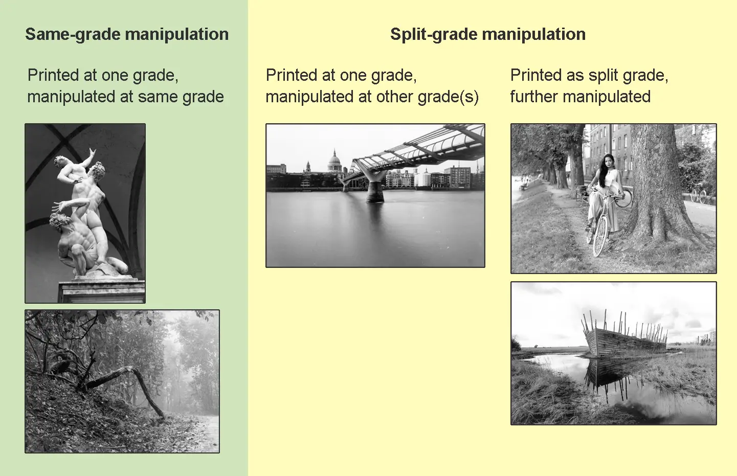
Dodge/burn manipulations fall into two main categories (that I know of). The first is what I call same-grade manipulation – dodging and burning at the same contrast grade as the base exposure. This is the traditional way, and also the only option if you’re using graded papers or don’t have any means of contrast control. It is also the most straightforward. I’ll share two examples of same-grade manipulation: Abduction of a Sabine Woman and Forest Path.
The second is split-grade manipulation. This again falls into two sub-categories. The first is where the base exposure is made at one contrast grade, but further local manipulations are done at one or more different contrast grades. I’ll share one example of this: Millennium Bridge.
The second sub-category is where an integrated split grade print (a straight print created by a split grade process, i.e. using more than one contrast grade) is further manipulated. I’ll share two examples: Anasua by the Lakes and Viking Ship.
All five examples are of prints I’ve shared in the last three parts, but only as straight prints.
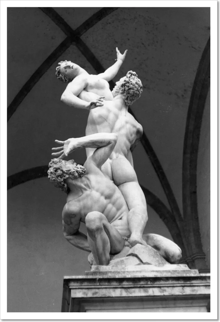
Print 1: Abduction of a Sabine Woman
I described how I printed Abduction of a Sabine Woman in Part 2. The straight print was made at Grade 2, with an exposure of 12 secs at f/8. Below you see the straight print, and my dodge/burn map.

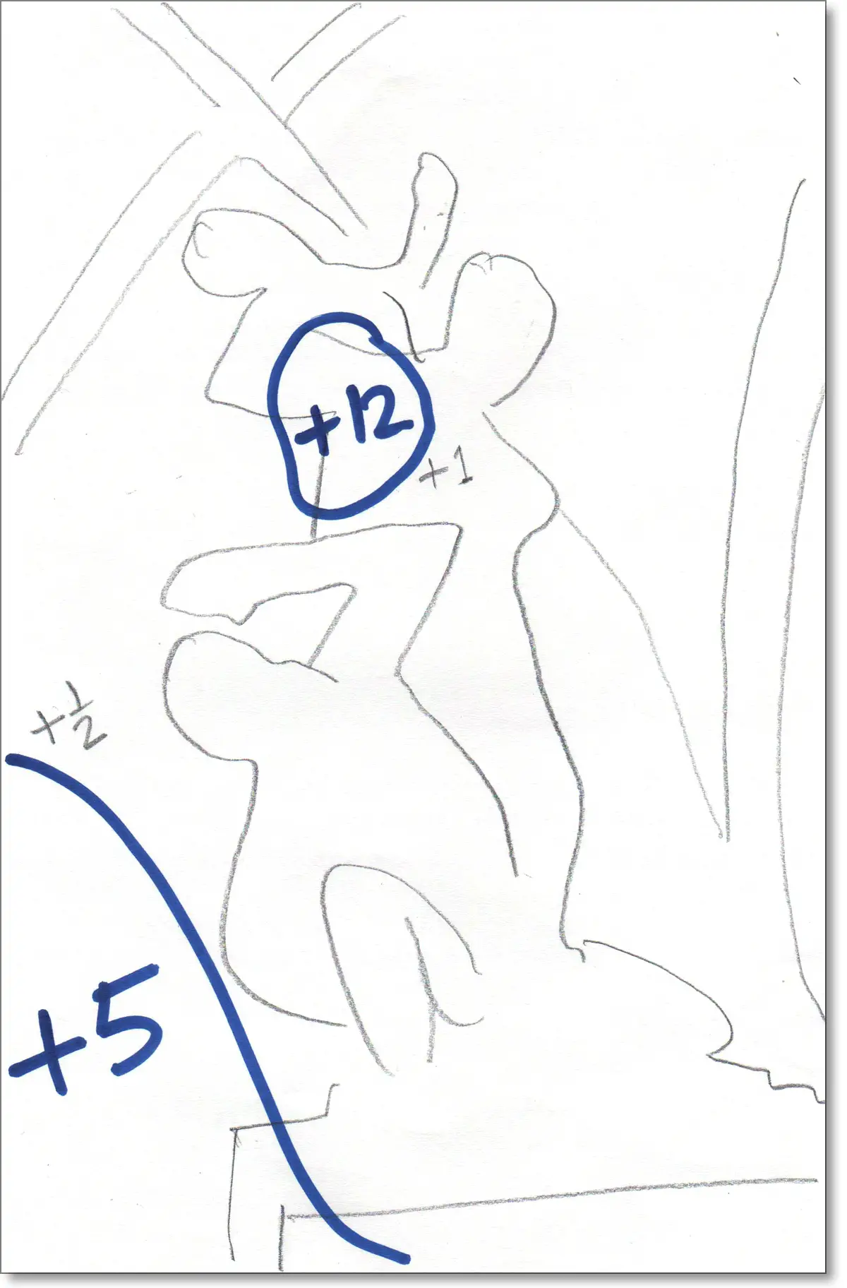
The burn at bottom-left was to give it a similar tone to the rest of the background so that it no longer draws the eye away. The burn also darkens the left side of the pedestal, creating a more three-dimensional effect. I did it by simply by blocking the rest of the image with my angled palm, gently moved back and forth.
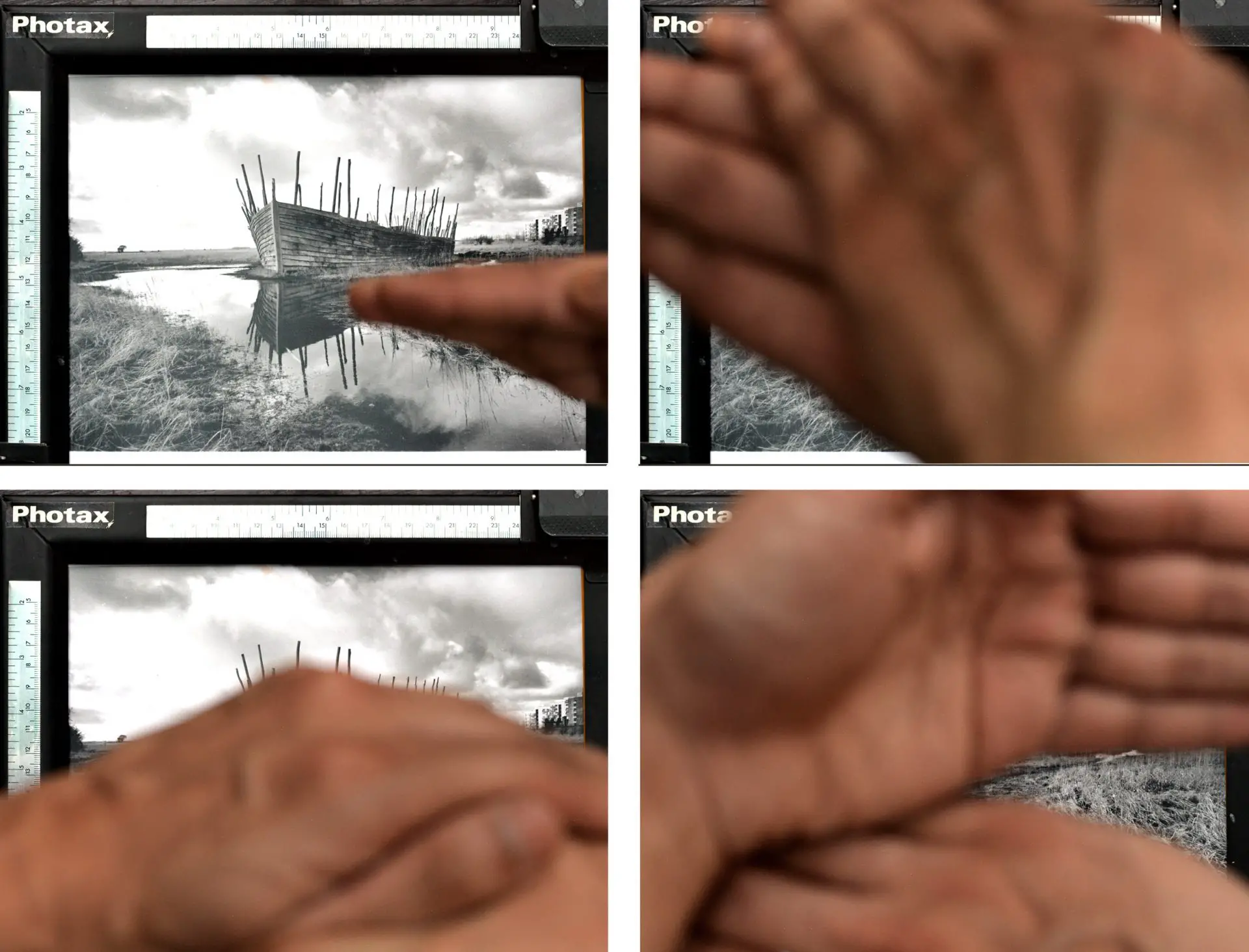
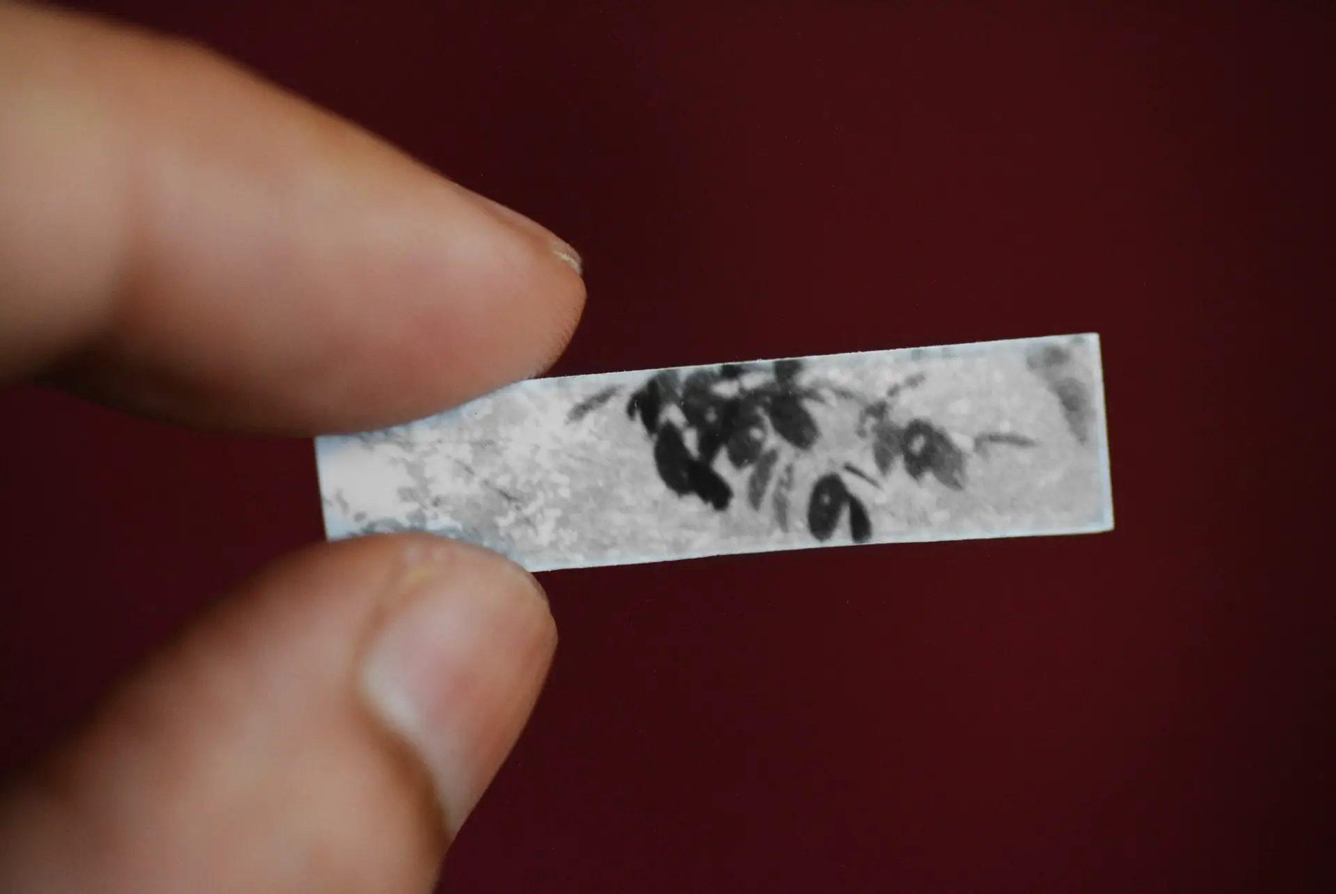
 To determine the burn time, I made a tiny test strip (see right) of 17 and 24 secs (+0.5 stop and +1 stop relative to the base exposure of 12 secs). From this, I selected 17 secs (a 5-sec burn, as shown on the map).
The central burn was to give more definition to the top figure’s right hand and the middle figure’s back muscles, and also to create a little more separation between the top figure’s torso and the middle figure’s shoulder. I resisted my initial impulse to burn the top figure’s upper arm. It can be tempting to dodge or burn the whole print into uniformity, but I wanted to preserve the impression of more light illuminating the upper part of the sculpture, which is how I remember the scene.
12 secs for the central burn may seem long, but I made that burn using a small opening in my cupped hands and moving it around like a searchlight. I tend to make a small opening and move it quite a bit, so the amount of light hitting any one area is relatively small. To build up the desired density, I find I usually need double the time I think I need. Your mileage may vary.
Here’s a comparison between the straight print on the left, and the new print on the right.
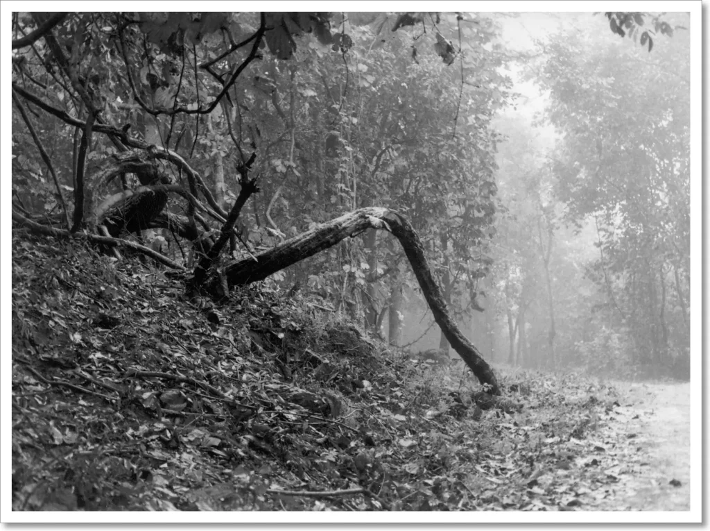
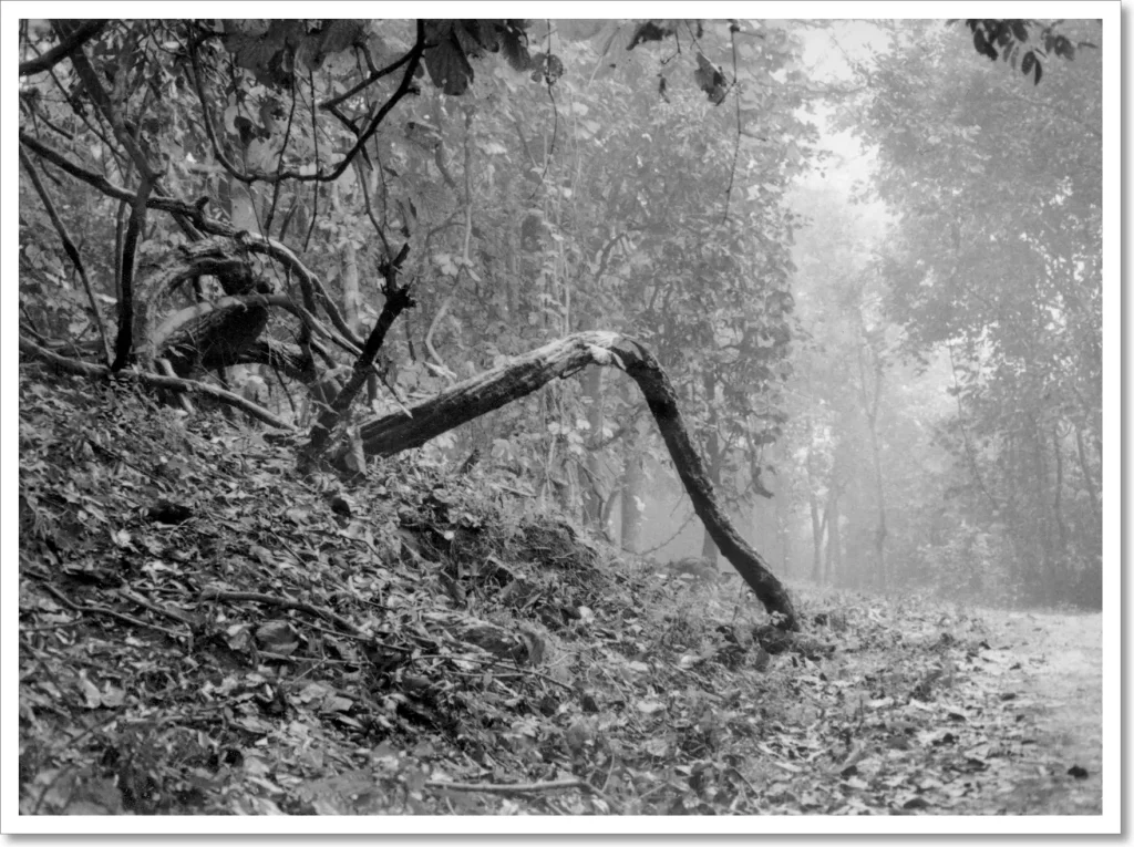
Print 2: Forest Path
I described how I printed Forest Path in Part 3. The straight print was made at Grade 1, with an exposure of 22 secs at f/5.6. Below you see the straight print, and my dodge/burn map.

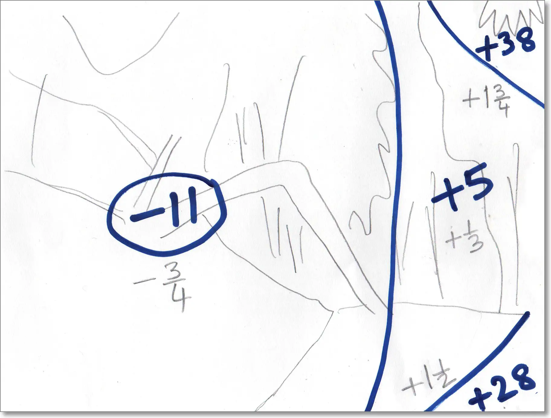
For the new print, I decided that I wanted to lighten the left two-thirds of the print, but keep the right one-third (the foggy background) at about the same level. Accordingly, I reduced the base exposure from 22 secs to 18 secs (–0.25 stops), but burned in the right side for an additional 5 secs to bring it back to about the same level (slightly darker) as the straight print. (You could equally think of this as a base exposure of 23 secs, with the left side dodged for 5 secs.)
During the base exposure, I also dodged the base of the tree trunk with my dodging tool for 11 secs, to open up some more of the shadow detail. 11 secs may seem long, but I move the tool constantly, so the effect is not as pronounced.
To sum up (and as you can hopefully see in the comparison below), the net effect of the aforesaid manipulations was to (a) keep the right side of the frame at about the same level, (b) lighten the left side, and then (c) lighten the base of the trunk even more.
Finally, I burned in the top-right and bottom-right corners. Burning the top-right recovered some of the lost highlight detail in the foggy background, also adding more solidity to the overhanging leaves in front. Burning the bottom-right gently ‘leads’ the eye into the print and up the path.
Here’s a comparison between the straight print on the left, and the new print on the right.
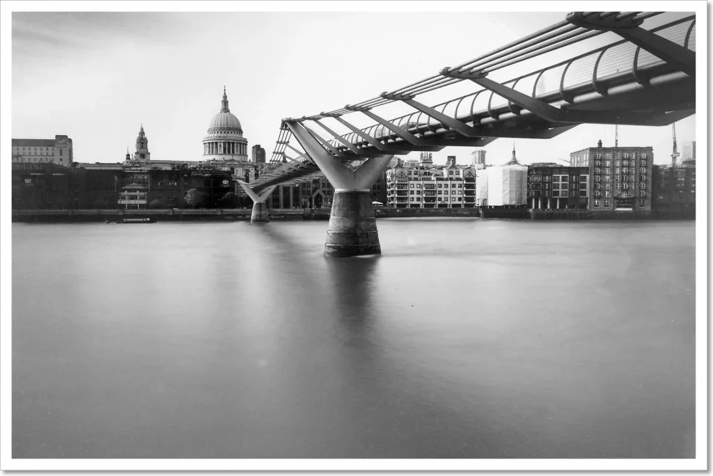
Print 3: Millennium Bridge
I described how I printed Millennium Bridge in Part 3. The straight print was made at Grade 4, with an exposure of 15 secs at f/11. Below you see the straight print, and my dodge/burn map.
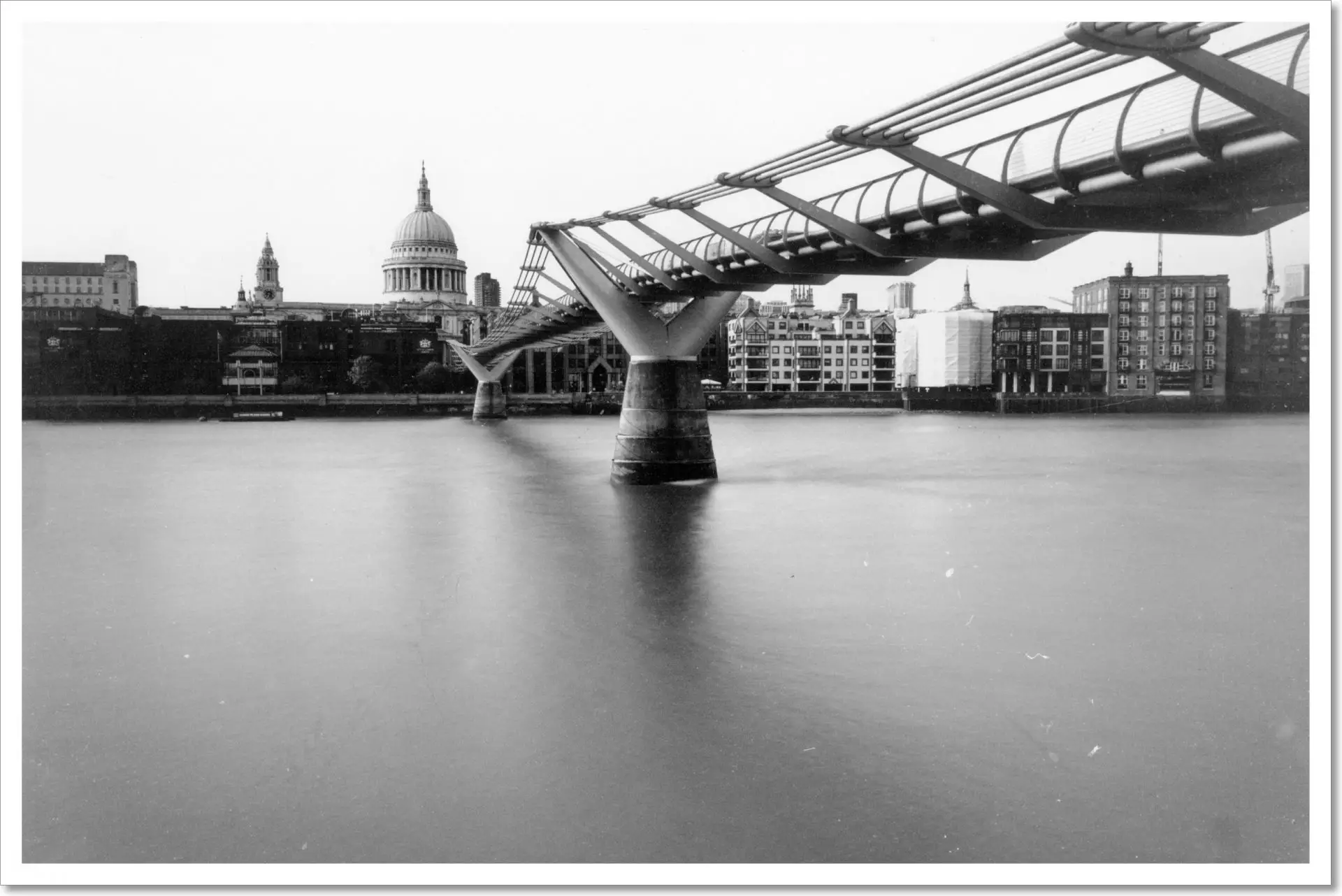
For this print, I used split-grade manipulation. The base exposure was at Grade 4, but I used a separate Grade 1 exposure for subsequent burning in. I put circles around the Grade 1 exposure times so that they can be distinguished at a glance.
For the first 4 secs of the base exposure, I dodged the buildings on the left with an outstretched finger to recover some of the shadow detail. For the last 6 secs (9 to 15 secs of the base exposure), I also dodged the top-right corner with my palm, to compensate for the Grade 1 burn to be applied in the next step.
I then switched to Grade 1 and, again using my angled palm, burned in the top-right for 6 secs. The net effect of the last two manipulations at top-right – the Grade 4 dodge and Grade 1 burn – is to ‘replace’ part of the Grade 4 exposure with a Grade 1 exposure. As I explained in Part 4, softer grades create more highlight detail, but without adding much shadow density. So the Grade 1 burn allowed me to subtly darken a corner of the sky, drawing the eye into the frame. Had I tried to burn in the sky in the same way with a Grade 4 exposure, it would have made the bridge extremely dark. As an unanticipated side-benefit – though you may or may not be able to see it depending on the size of your screen – the Grade 1 burn made the thin cables on the bridge railing look crisper (they’re almost invisible in the Grade 4 straight print which is short on highlight detail).
Finally, I added a 10-sec Grade 1 burn to the top-left corner, having first made a localised test strip to determine how much exposure I wanted.
The ‘soft burn’ reveals subtle cloud detail which was lost in the Grade 4 print. It leads the eye in, adds an element of drama, and compositionally balances the bridge on the right.
Here’s a comparison between the straight print on the left, and the new print on the right.

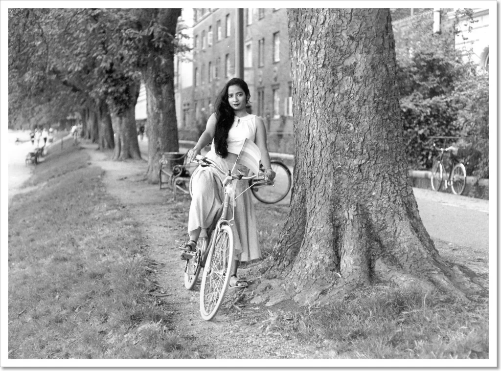
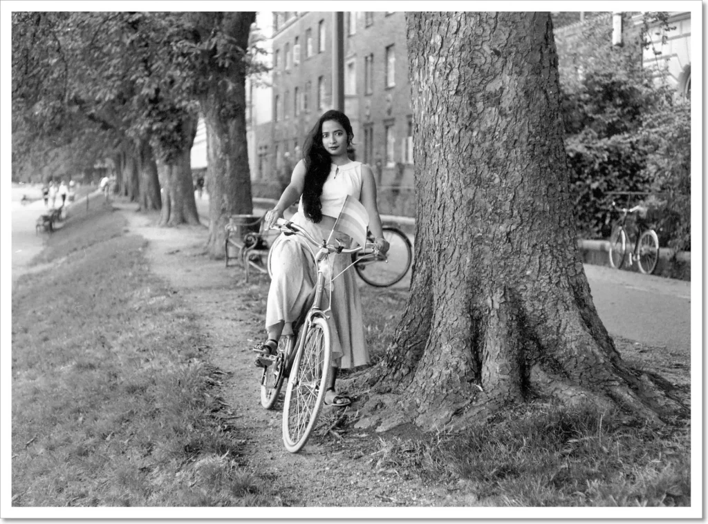
Print 4: Anasua by the Lakes
I described how I printed Anasua by the Lakes in Part 4. The straight print was a split grade print, made with a soft (Grade 0) exposure of 9 secs and a hard (Grade 4.5) exposure of 12 secs, both at f/8. Below you see the straight print, and my dodge/burn map.

As I hinted in Part 4, split grade printing offers powerful dodging and burning possibilities – we can dodge or burn parts of the print during either the soft exposure, or the hard exposure, or both. This allows local manipulation of both exposure and contrast (same-grade manipulation can only modify exposure). In fact, we can also burn at other intermediate contrast grades, though I rarely do this myself.
In split grade maps such as this one, for ease of reference while printing, I use circles for the soft exposures and squares for the hard exposures.
In addition to the soft and hard base exposures, I added a soft burn to the white building at top-right, the road on the right and the lake-path on the left. I also burned in her bike’s front tire for good measure. These soft burns all add more highlight detail (especially evident in the building at top right) and suppress some of the more distracting peripheral patches. But they add very little shadow detail – for example, the benches on the left are nearly unchanged though the lake-path is darkened.
I also gave a hard burn to the foreground, to add more definition to the tree roots and the grass in the foreground. This darkens the shadows, but doesn’t muddy the highlights like a Grade 2 or Grade 0 burn would do. Finally, I subtly burned in the top-left corner to lead the eye into the image.
Here’s a comparison between the straight print on the left, and the new print on the right.
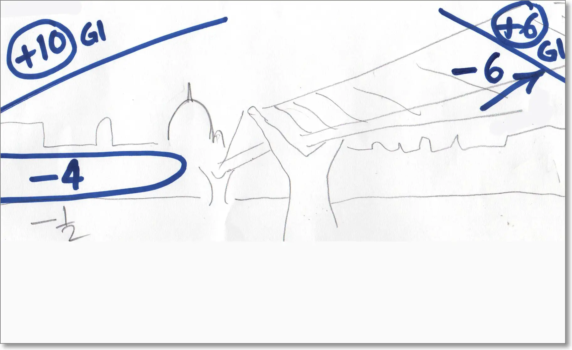
Print 5: Viking Ship
The fifth and final print is Viking Ship, also described in Part 4. Below you see the straight print, and my dodge/burn map.
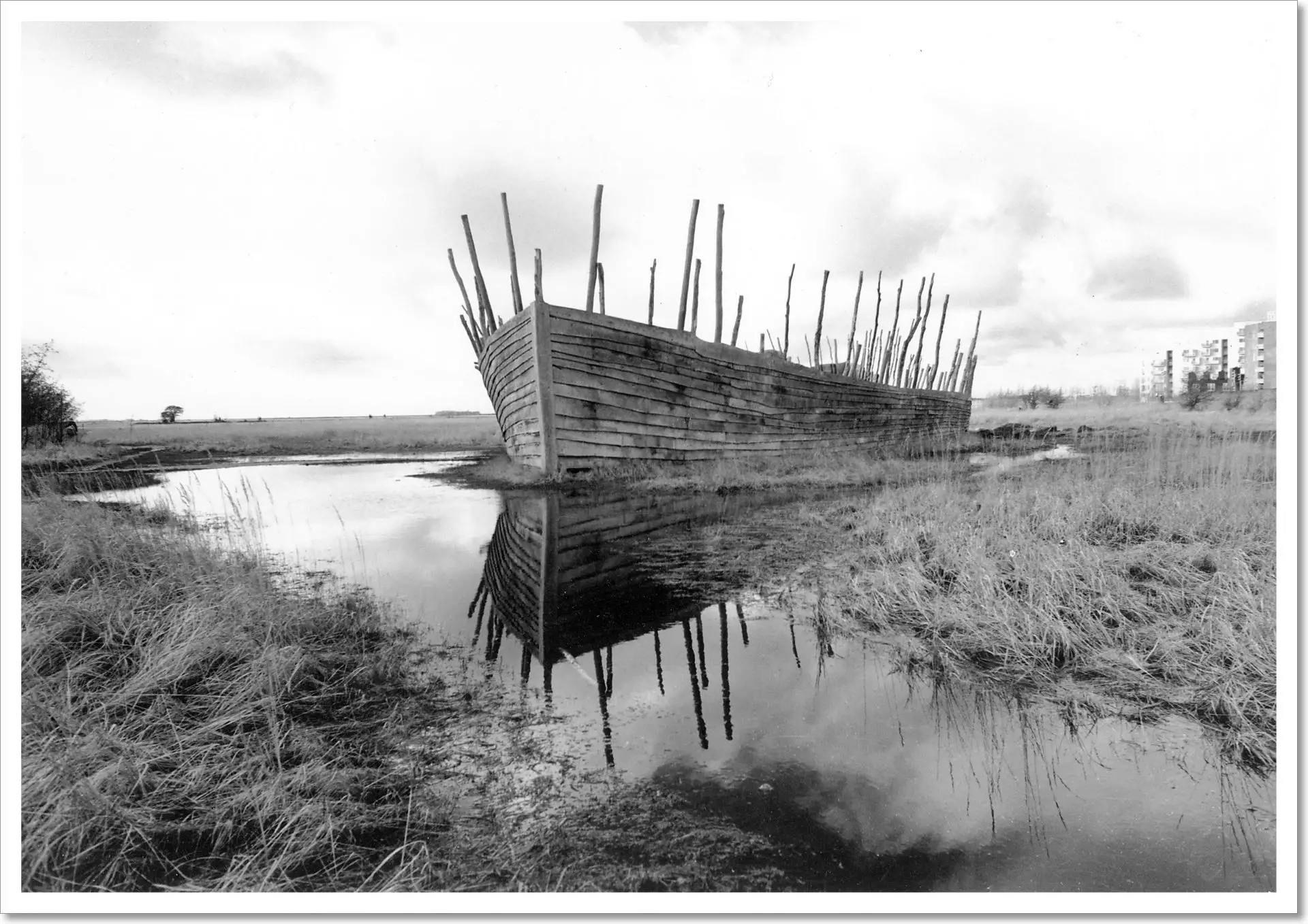
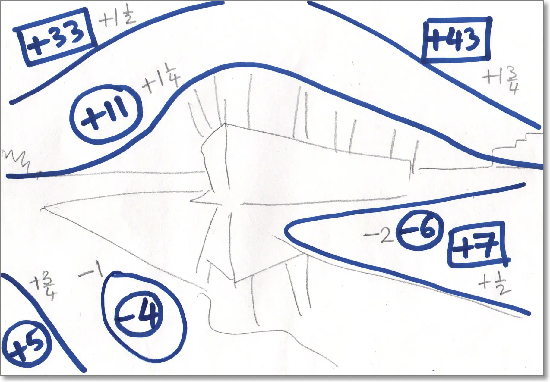
The straight print was a split grade print, made with a soft (Grade 0) exposure of 4 secs and a hard (Grade 4.5) exposure of 9 secs, both at f/5.6. For the new print, I stopped down to f/8 to make the exposures longer, giving myself more time for dodging and burning. So the new base exposures were 8 secs (soft) and 18 secs (hard). As usual, in the map I use circles for the soft exposures and squares for the hard exposures.
Since this print had several dodge and burn operations, I took some photos for illustrative purposes. This is, of course, just a simulation under natural light with a developed print.
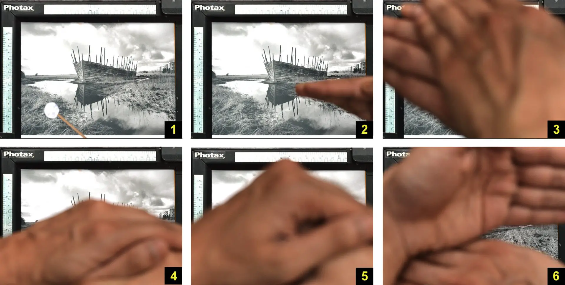
During the soft exposure, I dodged a small patch of grass in the foreground for 4 secs with my dodging tool (Fig 1). Combined with the hard exposure, this increases the contrast in that patch, adding a subtle area of foreground interest – almost like a patch of sunlight.
I also dodged the right bank for 6 secs (Fig 2), with a view to eventually burning it back in during the hard exposure to create more contrast.
Since there were two separate dodges during the base exposure, I had to use both my hands. The sequence of operations was as follows:
- 0 sec: Switch on the enlarger.
- 2 secs: Start dodging the right bank with my right hand (do this from 2 to 8 secs).
- 4 secs: Start dodging the grass patch with the dodging tool held in my left hand (do this from 4 to 8 secs).
- 8 secs: Swiftly move my right hand to block the enlarger light, then switch it off with my left hand.
After the soft exposure, I added a soft burn to the bottom left to lead the eye in (Fig 3). I also added another, longer soft burn to the sky (Fig 4), to reveal more of the cloud detail which I could see on the negative.
As you can see from the dodge/burn map, I burned the sky in two layers. The soft burn reaches further down, and because of the way I moved my hand up and down, it actually overlaps the masts of the ship. Being a soft burn, it adds highlight detail in the clouds, but without significantly darkening the masts which would have been a tell-tale sign of clumsy manipulation. It also creates nice separation between the buildings and the sky.
The hard burn darkens the top corners even more, adding deeper and more dramatic shadow detail but without muddying the highlights. I burned both corners simultaneously for 33 secs (Fig 5), and then the top-right corner only for an additional 10 secs.
Finally, I gave a (much shorter) hard burn to the left bank (Fig 6). This ‘replaces’ some of the exposure I took away by dodging the soft burn (Fig 2), creating more contrast and separation in the grasses.
Here’s a comparison between the straight print on the left, and the new print on the right.

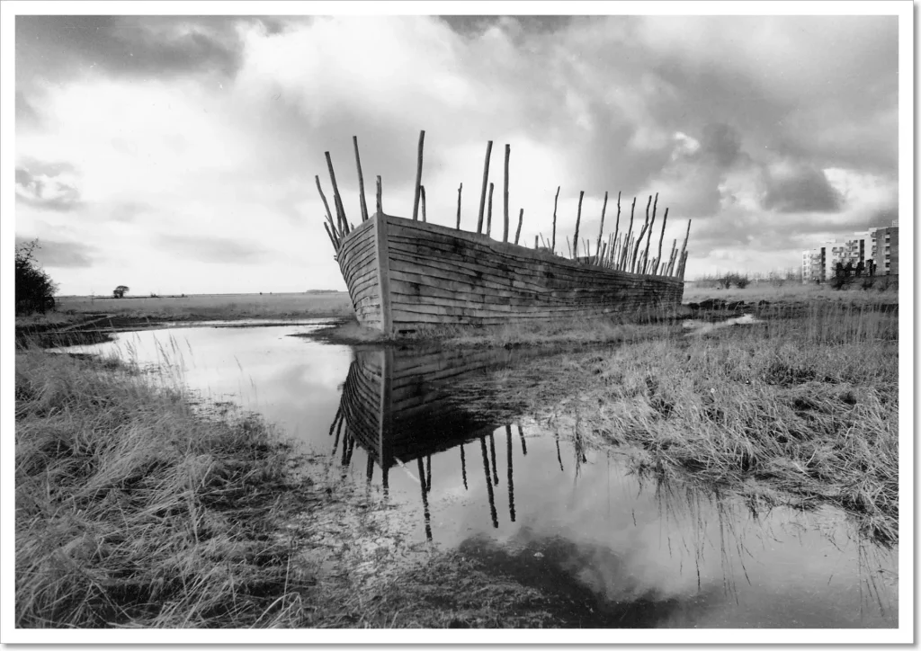
Viking Ship is one of the more complicated dodge/burn operations I’ve done so far (though it pales in comparison to, say, W Eugene Smith’s Schweitzer in Leper Village which took him five days and five nights to print). You might think I overdid it; I’m sort of on the fence about it myself. But I wanted to see how far I could go, so I threw everything at it. As Brooks Jensen said, “You don’t know if you’ve gone far enough unless you’ve gone too far.”
The Photoshop heresy
Since I’ve risked incurring the wrath of analogue purists with this lengthy discourse on dodging and burning, I may as well admit to an even dirtier secret: using Photoshop (or GIMP, which is free and open-source) to plan what I’ll do in the darkroom.
I mostly make contact sheets because I think they look cool, rarely to evaluate a roll. Instead, I tend to scan negatives as soon as possible after developing, and choose what I want to print by looking at the scans.
I also make liberal use of the Photoshop Crop tool, as well as the Levels and Curves tools to adjust brightness and contrast – all to try and work out how I want the finished darkroom print to look. In the Levels tool, by moving the black input slider to the right (or the white input slider to the left), I can quickly identify the lightest (or darkest) parts of a negative.
For some photos, I might do more advanced manipulations, for example, modifying the brightness or contrast of specific parts of the image using the Dodge and Burn tools (you can manipulate highlights and shadows selectively, mimicking the effect of split grade burning) or with graduated layer masks. As with everything else I’ve said here, this is just what I do. If you think it’s cheating, you don’t have to do it!
The good news is that when I get it right in the darkroom, even with my limited skill and experience, the finished print invariably looks better than the Photoshopped version on screen.
It may as well be me
So that brings this five-part series to a close. To sum up, I talked about how build a makeshift but fully-functional darkroom for black-and-white printing on a tight budget in a small flat (Part 1). I then moved on to darkroom technique – how to control exposure and contrast, first through trial-and-error (Part 2), and then with a more methodical, calculated approach (Part 3). Next, I covered split grade printing (Part 4) and finally, dodging and burning using both same-grade and split-grade approaches (Part 5).
There are various other techniques – for example, masking, bleaching, spotting, toning and factorial development – which I haven’t covered, not least because I haven’t tried them myself. But the ones I did cover – exposure and contrast control, split grade printing, dodging and burning – are probably the most important ones in the metaphorical darkroom toolkit. My plan is to try and get to grips with these before trying other techniques, and I have a long way to go before I do.
As I said in Part 1, I am far from being an expert. I’ve only been printing for a year and a half, so I clearly have a lot to learn. Am I qualified to write a darkroom tutorial? No – and is why I wrote this series more in the spirit of show-and-tell than a tutorial. However, my own experience was that after I figured out the bare basics, I found myself stuck in terms of where to go next. There are many online resources on the absolute basics, but vanishingly few on intermediate and advanced techniques, and none them detailed enough for my liking.
That knowledge, I found, is mostly locked up in books and journals, many of which are hard to find or out of print. Having read what I could lay my hands on and tried to absorb and apply some of that knowledge, I thought I’d share what I learned, and hopefully also get some feedback from others. To quote one of my favourite Belle and Sebastian songs, “Nobody writes them like they used to / So it may as well be me.”
So long, and thanks for reading!
For various reasons I never set up a darkroom in my own flat, but always in other people’s spaces. So I would never have written this series if not for my girlfriend, Anasua, and also my family, who allow me – indeed, practically expect me – to set up a makeshift darkroom whenever I stay with them.
I’d also like to thank my friend Saha for introducing me to darkroom printing, Mr Bikash Bose (a professional darkroom wizard who has printed for some of India’s top photographers) for letting me observe and learn from him, the Barbican Library in London with its wide-ranging collection of photography and darkroom books, my Facebook darkroom group for being a source of inspiration and knowledge, and of course, you – the excellent community of 35mmc readers.
Last but not least, I’d like to thank Hamish/35mmc for encouragement, clever and thorough editing, and most of all, for giving me the space to share my thoughts and experiences (at great length!) over five whole weeks. Writing down what I learned forced me to consolidate my knowledge and be more methodical. I also got tons of useful feedback, both in comments to the posts themselves, and also when I shared them on social media. So I personally found the exercise immensely helpful – and wherever you may be in your darkroom journey, I hope you found it (at least somewhat) helpful too. Thanks for reading. May the dark be with you.
Share this post:


Comments
thorsten on Dodge, Burn and Other Heresies – Darkroom Technique Part 5 – by Sroyon Mukherjee
Comment posted: 04/05/2020
Comment posted: 04/05/2020
theo vervloet on Dodge, Burn and Other Heresies – Darkroom Technique Part 5 – by Sroyon Mukherjee
Comment posted: 04/05/2020
Comment posted: 04/05/2020
Richard on Dodge, Burn and Other Heresies – Darkroom Technique Part 5 – by Sroyon Mukherjee
Comment posted: 04/05/2020
Comment posted: 04/05/2020
Khürt Williams on Dodge, Burn and Other Heresies – Darkroom Technique Part 5 – by Sroyon Mukherjee
Comment posted: 04/05/2020
I think the example images turned out great. My favourite is the photo of the woman on the bicycle. Her gaze penetrates the frame.
Comment posted: 04/05/2020
Anders on Dodge, Burn and Other Heresies – Darkroom Technique Part 5 – by Sroyon Mukherjee
Comment posted: 04/05/2020
Comment posted: 04/05/2020
James T on Dodge, Burn and Other Heresies – Darkroom Technique Part 5 – by Sroyon Mukherjee
Comment posted: 04/05/2020
Comment posted: 04/05/2020
Geoff T on Dodge, Burn and Other Heresies – Darkroom Technique Part 5 – by Sroyon Mukherjee
Comment posted: 04/05/2020
Comment posted: 04/05/2020
Glenn S on Dodge, Burn and Other Heresies – Darkroom Technique Part 5 – by Sroyon Mukherjee
Comment posted: 05/05/2020
Comment posted: 05/05/2020
Jose Lucero on Dodge, Burn and Other Heresies – Darkroom Technique Part 5 – by Sroyon Mukherjee
Comment posted: 05/05/2020
Comment posted: 05/05/2020
Sroyon on Dodge, Burn and Other Heresies – Darkroom Technique Part 5 – by Sroyon Mukherjee
Comment posted: 14/06/2022
“If I want to dodge and burn a split-grade print, how to identify which grade should be manipulated and the exposure thereof? I guess you can also use intermediate grades (not strictly 0 or 5) to do this, but it sounds quite wild in terms of guessing which grade and exposure should be suitable to do that.”
OK, my thoughts! It’s now over two years since I wrote my split-grade article for 35mmc, and it’s still one of the first couple of hits if you do a Google search for ‘split-grade printing’. However, my current preference is not to use a pure split-grade approach (by which I mean, making the base print by a combination of a very low and a very high contrast grade, i.e. “integrated split-grade print” as I termed it in my article).
There’s nothing wrong with integrated split-grade printing (ISGP). If it works for you, please carry on. But personally, I almost always find it easier and faster to make the base print at a single contrast grade, accompanied by dodging and burning as necessary at the same or other contrast grades. In fact the latter, i.e. printing at one grade and burning at another, can also be seen as a form of split-grade (in my article I called it “split-grade manipulation”). Why I have come to prefer split-grade manipulation over ISGP is a topic for another day.
But the question is about dodging and burning in a pure ISGP approach. So let’s talk about that. In ISGP, you superimpose a soft (low-contrast) and a hard (high-contrast) exposure, thus creating a print which has a contrast grade that lies somewhere in between.
Now you have four basic options for local manipulation:
1. Burn the soft exposure. Shadows will be only slightly darkened; midtones and highlights will be darkened more significantly. This has a muddying effect; it can be used to add highlight detail without significantly impacting the shadows. Imagine a dark-skinned person wearing a white cap. And let’s say, when you expose for their skin, the cap is still too white (lacking highlight detail). So you want to add more detail to the cap by burning in. But burning often entails some spill, and you don’t want to make the person’s skin to get any darker. This is a good time to burn the soft exposure.
2. Burn the hard exposure. Shadows will be significantly darkened; midtones and highlights will be darkened only slightly. This can be used to make the shadows more prominent without significantly impacting the midtones and highlights. Imagine a light-skinned person wearing black-framed glasses. And let’s say, when you expose for their skin, the glasses are not sufficiently dark and punchy – perhaps a dark grey rather than black. By burning the hard exposure, you can darken the frames without significantly impacting the skin-tone.
3. Dodge the soft exposure. Shadows will be slightly lightened; midtones and highlights will be lightened more significantly.
4. Dodge the hard exposure. Shadows will be significantly lightened; midtones and highlights will be lightened only slightly.
Of course, you can (probably would) do more than one of the above, possibly all four. It depends on the effect you want in different parts of the picture.
Finally, as the question suggests, it’s also possible to burn at other contrast grades (dodging at other contrast grades is not possible; by definition, we’re making the base exposure at a very soft and very hard grade, so we can only dodge at those two grades). However, in my opinion, burning at other grades over-complicates things. The whole idea behind split-grade is that you can use two extreme grades to simulate any intermediate grade. To use a painting analogy, it’s like using pure white and pure black to simulate any intermediate shade of grey. So rather than burning at some intermediate grade, the same effect can be attained (and generally more easily) by burning either the soft exposure, or the hard exposure, or both.
I described above what impact soft and hard burns have on a local area. The same principles can be used to determine the appropriate burn time. Is burning making it too muddy (adding too much highlight density and not enough shadow density)? Reduce the soft burn or increase the hard burn (or both). Is burning adding too much shadow density and not enough highlight density? Increase the soft burn or reduce the hard burn (or both).
All this sounds complicated when written down, but with practice, the decisions become easy and automatic. When I was learning, I found it easier to practice with small pieces of paper, maybe a quarter sheet or even smaller. Once you have dialled in the exposures and dodge/burn times, make a full-size print. Second, I found it helpful to change one variable at a time. For example, if you want to see what a hard burn does, make a test strip where the soft exposure is constant, but progressively increasing the hard exposure. And so on...
Hope that helps!
5 Photo Editing Tips for Adobe Photoshop - 5eLifestyle on Dodge, Burn and Other Heresies – Darkroom Technique Part 5 – by Sroyon Mukherjee
Comment posted: 20/07/2022
人們出於各種錯誤的原因對三星的 Space Zoom 登月計劃感到恐懼 - TNGD on Dodge, Burn and Other Heresies – Darkroom Technique Part 5 – by Sroyon Mukherjee
Comment posted: 14/03/2023
ผู้คนคลั่งไคล้ภาพถ่ายดวงจันทร์ Space Zoom ของ Samsung ด้วยเหตุผลผิดๆ - TNGD on Dodge, Burn and Other Heresies – Darkroom Technique Part 5 – by Sroyon Mukherjee
Comment posted: 14/03/2023
Les gens paniquent devant les clichés lunaires Space Zoom de Samsung pour toutes les mauvaises raisons - TNGD on Dodge, Burn and Other Heresies – Darkroom Technique Part 5 – by Sroyon Mukherjee
Comment posted: 14/03/2023
As pessoas estão enlouquecendo com as fotos lunares do Space Zoom da Samsung por todos os motivos errados - TNGD on Dodge, Burn and Other Heresies – Darkroom Technique Part 5 – by Sroyon Mukherjee
Comment posted: 15/03/2023