Those of you who frequently read 35mmc probably already read my recent review of the Simera 35mm f1.4 launched by Thypoch, a newcomer in the lens making business. Their 35mm f1.4 is based on an already used optical formula (thank you Leica for the hard work) and they added their own personal touch with pretty advanced mechanical construction and features. Thypoch announced and released another lens, the Thypoch Simera 28mm f/1.4, this review talks about this latest one. Judging by the optical quality offered by the Simera 35mm lens, I was pretty curious to see how this one compares, especially considering the fact that fast wider lenses are usually harder to make.
What is pretty interesting is that the only other fast 28mm lens that was available available for Leica users – besides the Leica Summilux- was the 7 artisans one that is known for being sharp but pretty damn big. Voigtländer recently announced their newest Nokton 28mm f1.5, in a relatively compact form factor and apparently pretty sharp. I feel this will now be the main competitor for this Simera’s 28mm future.
Comparisons with the 35mm Simera
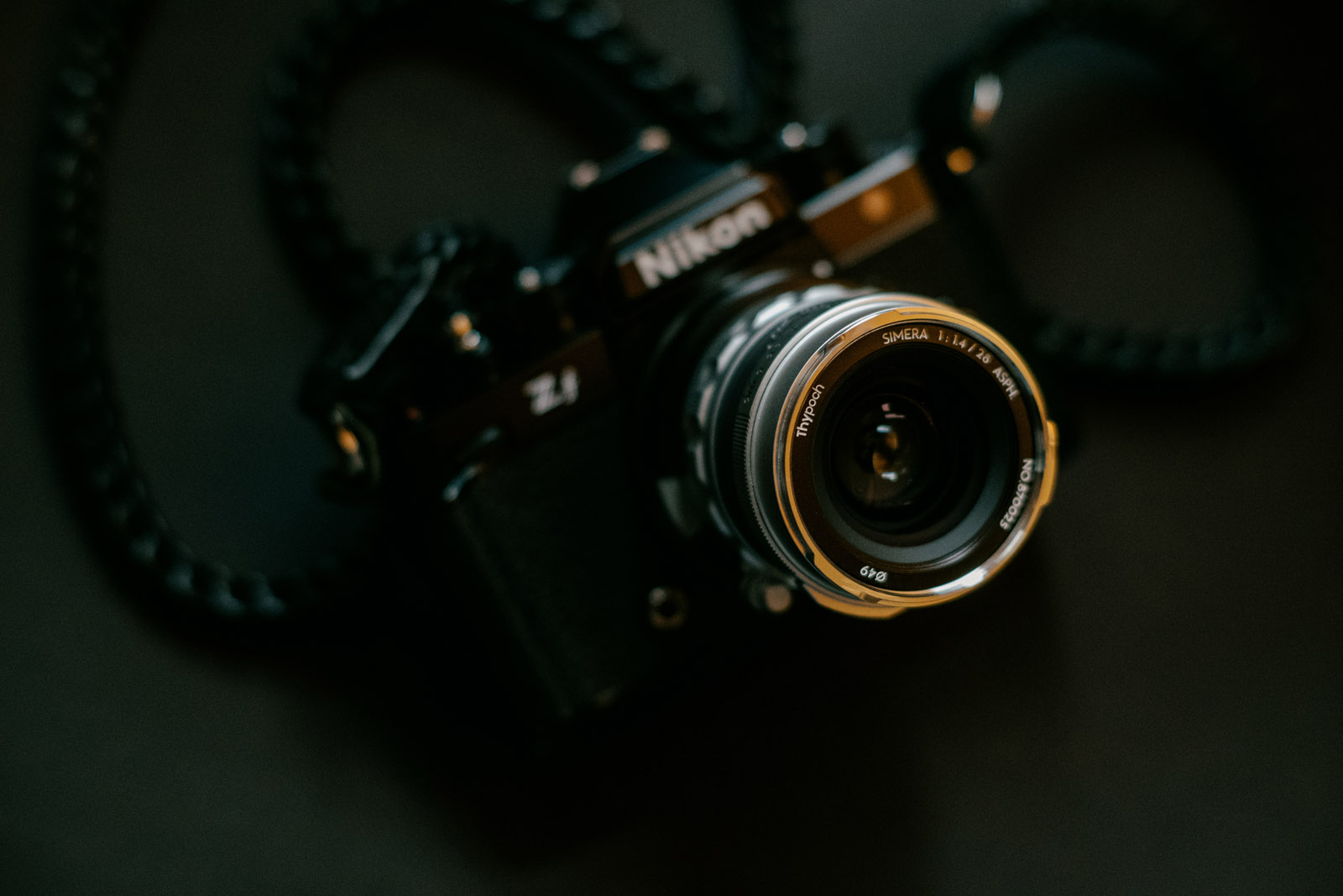
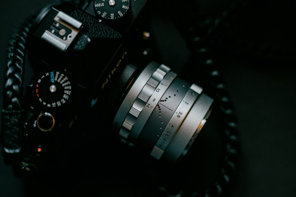
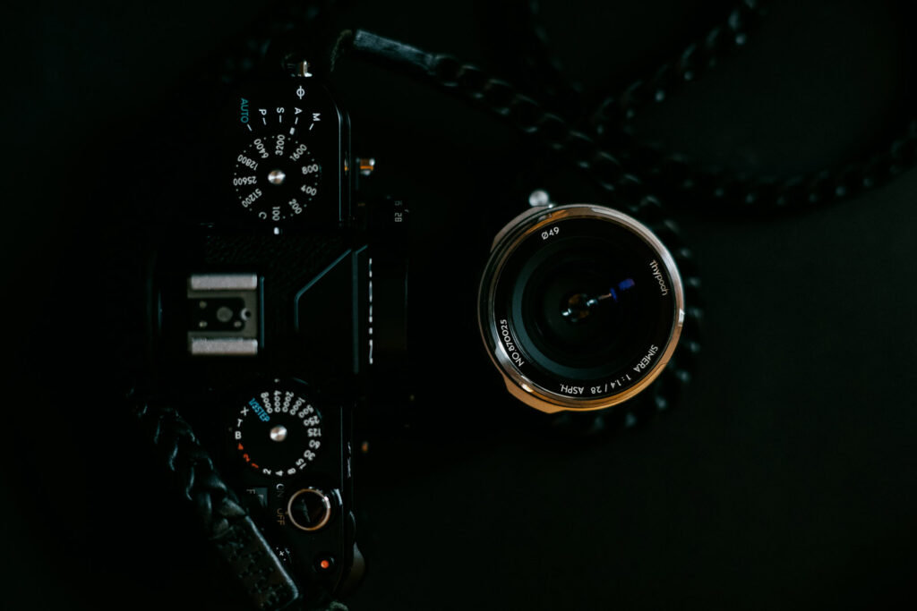
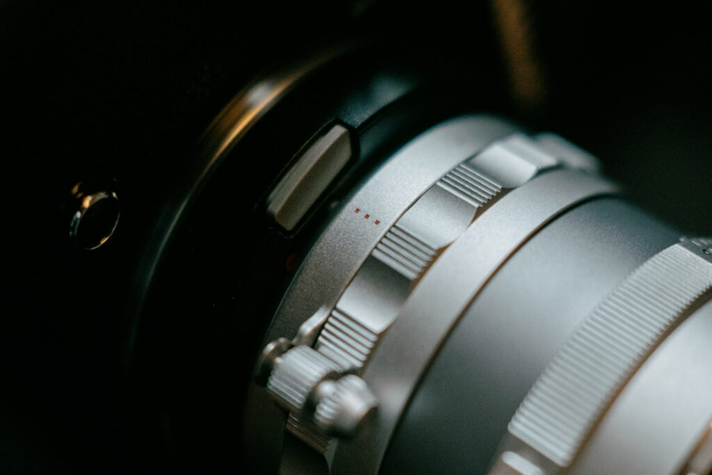
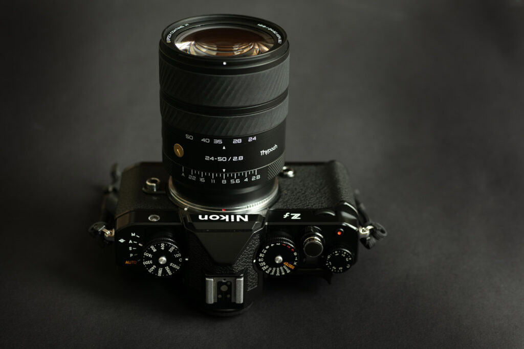
Compared with the other 35mm, the Thypoch Simera 28mm is slightly bigger and longer, but not that much compared with the existing alternatives. Its overall feeling is very similar with its 35mm counterpart. The build quality is top notch (no self-unscrewing levers nor disengaging aperture clicks like I had with the 35mm version) and I had no issues with it so far except one small detail: it doesn’t mount on my Leica M6, ha. Fortunately, I have been told that this issue is specific with the lens version I have -a very early pre-production model- that had some quality check issues. This issue will apparently not occur with the final production model, as I have been checking with Bastian Kratzke (great reviewer from philipreeve.net) who confirmed me that his own sample, which is a final production one, fits his own M6. That being said I will unfortunately not be able to evaluate its behaviour on film. The rest of this review will be concerning EVF cameras use only. I am personally using it on my Nikon Zf, with the amazing TTArtisan 6bit Z to M adapter that allows me to tell the camera the focal length and use subject detection with real time eye tracking and focus confirmation. Yay.
Optical Quality
The optical formula of this lens consists in 11 elements in 7 groups and seems pretty original. The closest I found is the vintage line ultron 28 mm f2, but the rear group differs from it. This is the proof that people behind Thypoch know what they do and don’t just do copycats. Making such fast and wide lens while keeping its size reasonable is definitely not easy. Let’s take a look at my bookshelf and backyard to get a better idea of its characteristics. As usual, you will find all full size files on this drive.


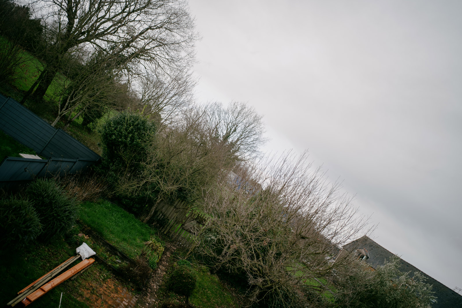
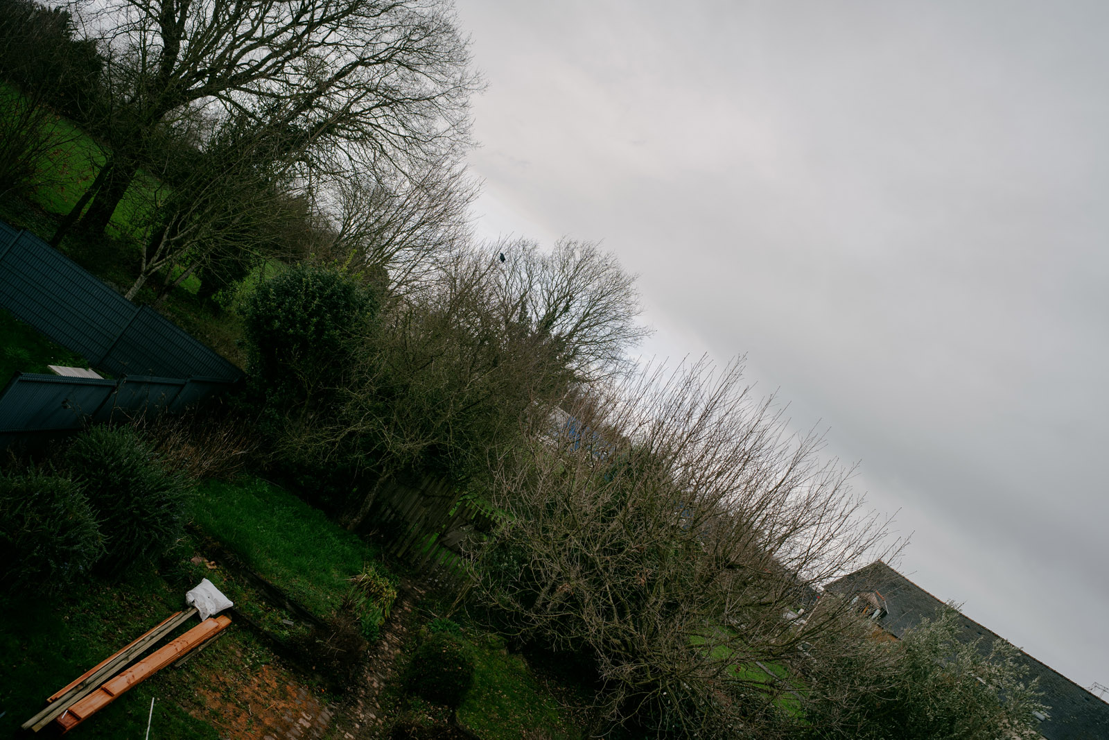
Infinity, f1.4 vs f4
Here are my observations on the Thypoch Simera 28mm:
- Very sharp in the center whatever the f stop is.
- Field flatness is pretty good also considering the focal length.
- Sharp to the corners from f4.
- A tiny bit of de-centering on my sample, but not that bad.
- Surprisingly smooth transitions for a fast 28.
- Pretty nice rendering.
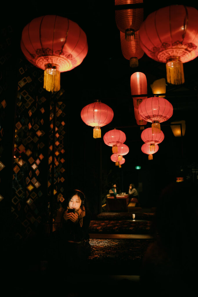
This lens impressed me as much as its 35mm sibling. Quality is there already wide open, with strong contrasts, character is definitely modern and out of focus areas are pretty appealing resulting in a very nice 3d look, close to medium format pop. I like it a lot. You will find more about its bokeh in the Pictures section.
Construction and handling
Just like its 35mm brother, the Thypoch Simera 28mm is very well made and most of the things I said in the 35mm Simera remain true. As noted beforehand, I could not use it with my Leica M6 so I cannot speak about its calibration accuracy. But I see no reason why this lens would be different from the 35mm one so I suggest you to simply read what I wrote about its 35mm sibling to know how it feels. To summarize, you will have to consider its ergonomics as it is not as straightforward as some other lenses, but mechanically it’s very very good!
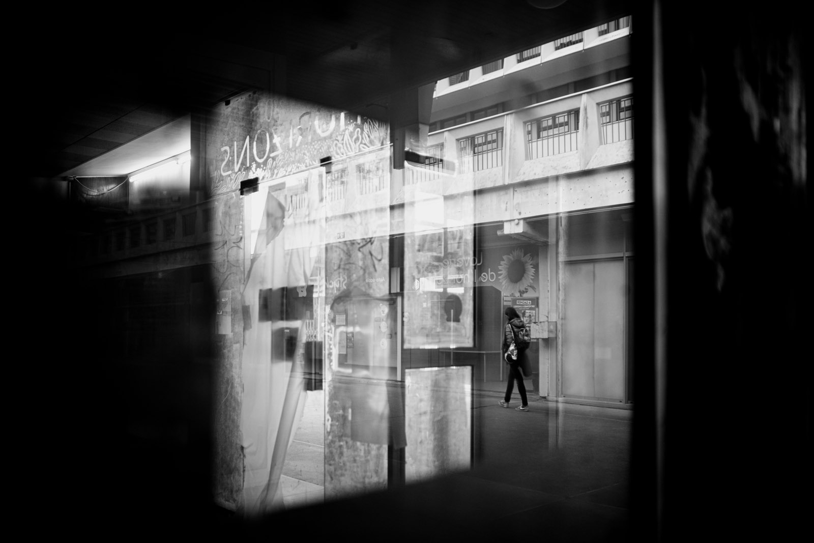
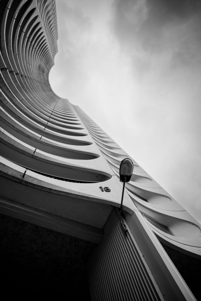
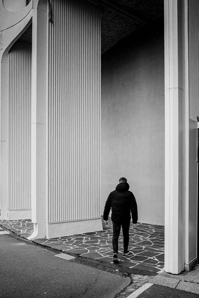
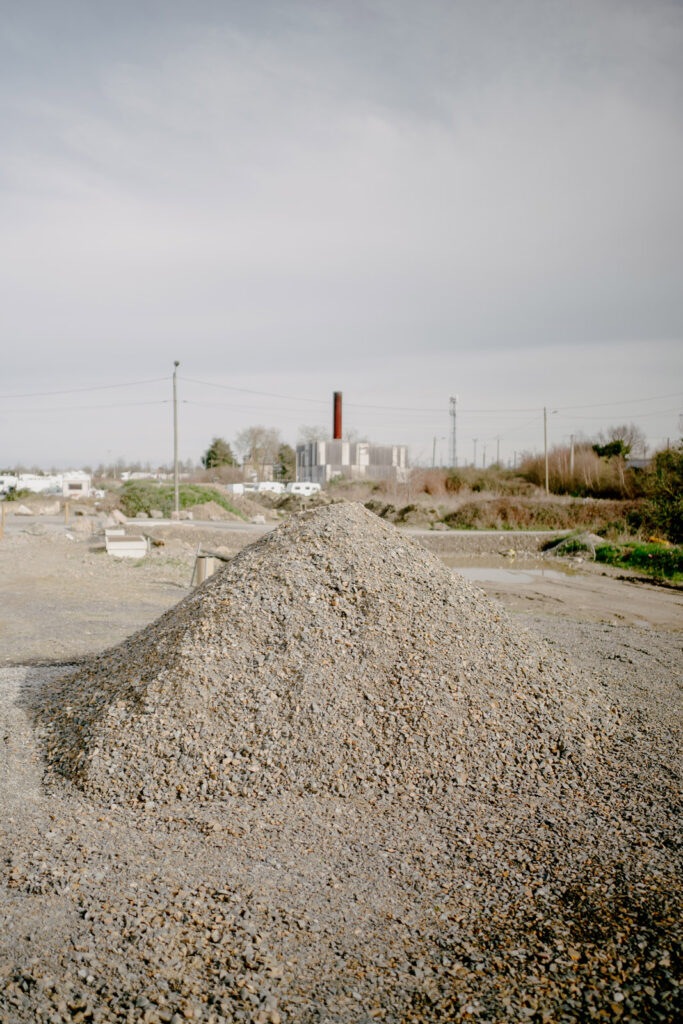
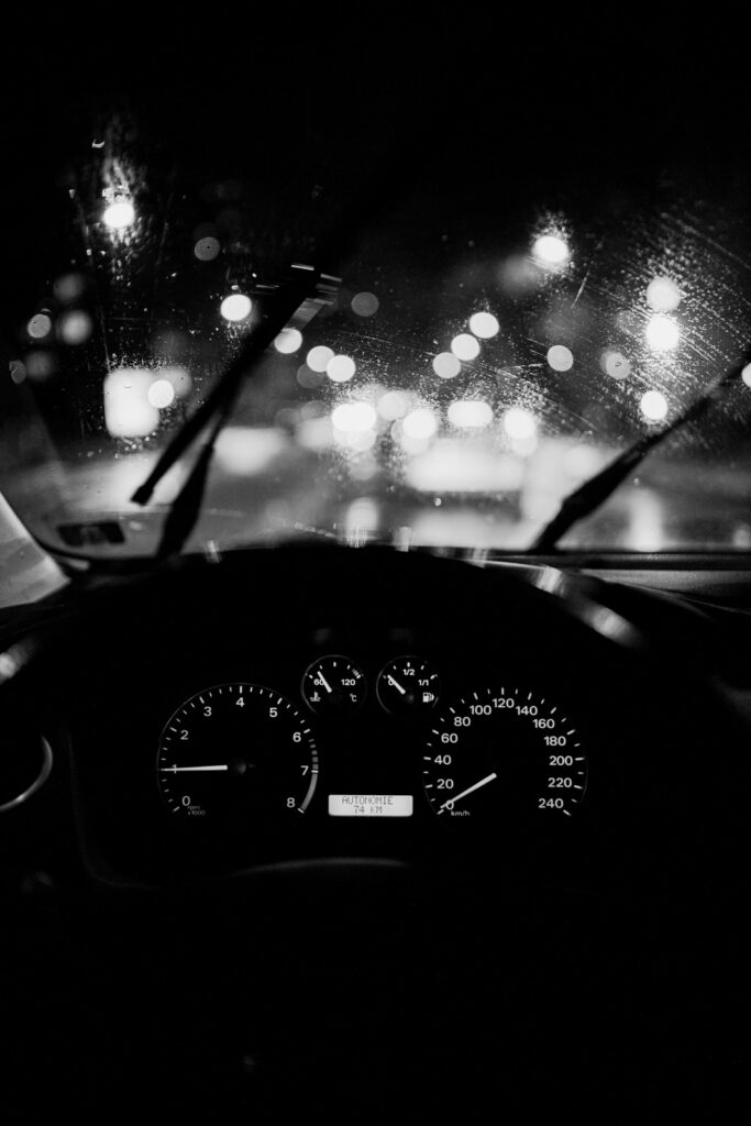
Pictures
Here are some pictures I could take in my city’s streets. Full resolution, and more pictures available in this drive.


Thypoch Simera 28mm ASPH Summary and conclusions
Pros:
- Nicely built lens
- Very nice imaging capabilities, sharp at all range, modern rendering.
- Ok size for a 28mm f1.4 lens, even if it starts to get a bit chunky
- Floating lens elements system + 0.4m minimum focusing distance.
- Unmatched price / performance ratio.
Cons:
- Still the typeface…
- Hyperfocal dots system that, despite being ingenious is not very readable easily.
- F-stops not equidistant that forces you to look at what you are doing.
The Thypoch Simera 28mm is the second lens I have been offered to review for Thypoch. And just like the 35mm Simera, I very much enjoyed using this 28mm f1.4 variation. There is no real flaw considering its price and it really feels like this lens is capable of making very serious work if you enjoy this focal length, if you can live with its kind of complicated ergonomics. Moreover, considering the actual options you have, I see no obvious reason to pay more than this one as you will not get really significant advantages to get a more expensive lens. The only question you might actually ask yourself is whether you need or not such a fast 28 instead of a slower one, but probably much more compact.
That being said, Thypoch, while being newcomers, offed us all a pretty admirable opening with their Simera range, and I do hope they will add some other focal length to it that, I am sure, would make a lot of sense, as a 50mm ASPH FLE, a 21mm and maybe a 75 or 90mm? That would be very interesting and would certainly make Voigtlander a bit anxious.
Anyway, future will tell. Thanks for reading!
Check out my personal instagram, and if my Leica handles interests you, you can check my website or go on kamerakraft instagram. I do have some very exciting projects to come for 2024.
Share this post:


Comments
Dave Powell on Thypoch Simera 28mm f/1.4 ASPH review
Comment posted: 22/04/2024
Comment posted: 22/04/2024
Gary Smith on Thypoch Simera 28mm f/1.4 ASPH review
Comment posted: 22/04/2024
Comment posted: 22/04/2024
Comment posted: 22/04/2024
Gabriel on Thypoch Simera 28mm f/1.4 ASPH review
Comment posted: 07/06/2025
Comment posted: 07/06/2025
Hung Vu on Thypoch Simera 28mm f/1.4 ASPH review
Comment posted: 30/03/2026
I’m currently using a TTArtisan M-Z 6bit adapter with the Thypoch Simera 35mm f/1.4, and I’ve noticed that the focus confirmation doesn’t seem very accurate. Sometimes it still shows red even when focus is correct, and other times it turns green even though the focus isn’t quite there yet.
Have you experienced a similar issue? And is there any way to fix or improve this?
Thanks!
Comment posted: 30/03/2026