

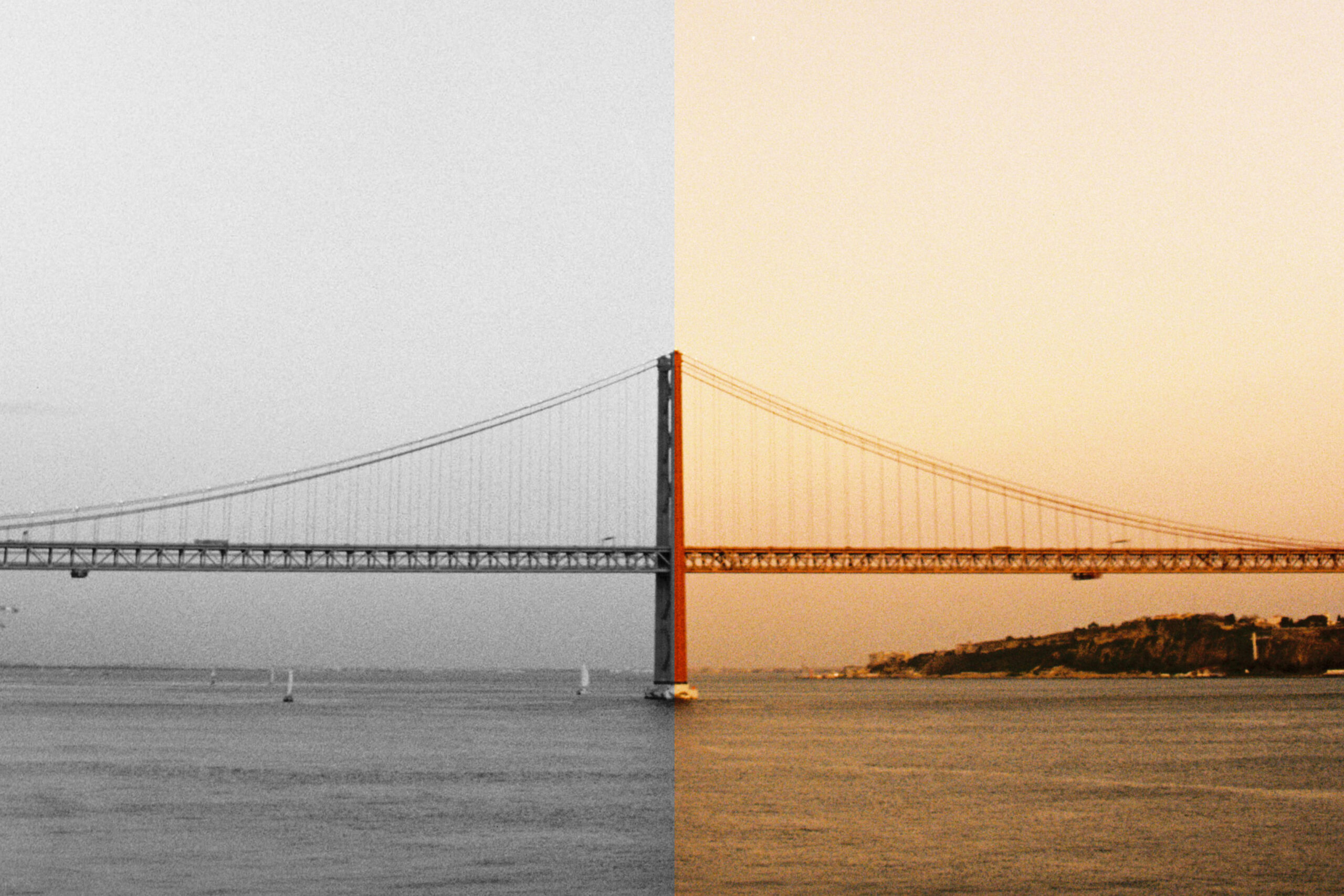
I want to talk about something that has been going through my mind lately. I’ve been thinking a lot about the basic film photographer’s decision: Color or B&W?
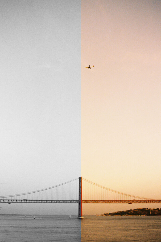
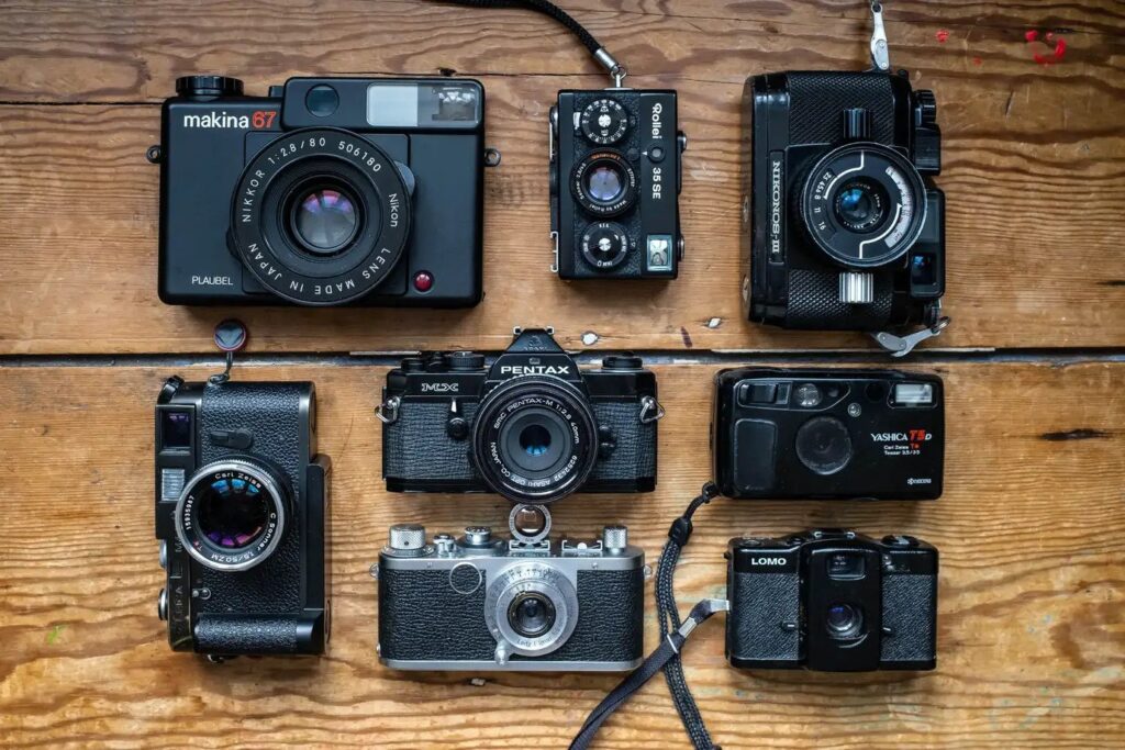
It’s funny how most photographers talk about what camera to use and only after that comes the choice of a lens and even after that, the film stock. Interestingly, the camera (in analog world) usually makes the smallest difference in the outcome. The choice of the film stock and the lens make a far greater impact on the image. Today, I want to talk about the former.
First and foremost, color film has color and B&W doesn’t. Duh! The world we see is obviously not black and white. Choosing black and white represents an intentional choice of stripping reality to light and shape. So why would you want to limit yourself to only capturing B&W? There is something about it. Why would you want to limit yourself and shoot film? It’s more complicated than pure rationality.

Color film stock has so much to show to win this fight vs. B&W.
It represents what we see in a beautiful way (I’m looking at you Kodak Gold and Portra). They have a gorgeous charm and life-like characteristics that feel like a memory, rather than just pixels on the screen. Skin tones are lovely, inviting and real. When the light, subject and composition align, the color image looks like a stunning painting.

Color looks more real than B&W. Of course, the image is not the complete representation of reality, but a construct of what the photographer wants to capture. Obviously, a colorful image looks more like reality than the same B&W image. Notice I used the word looks, not feels. Here is where B&W fights back.
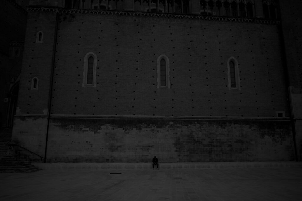
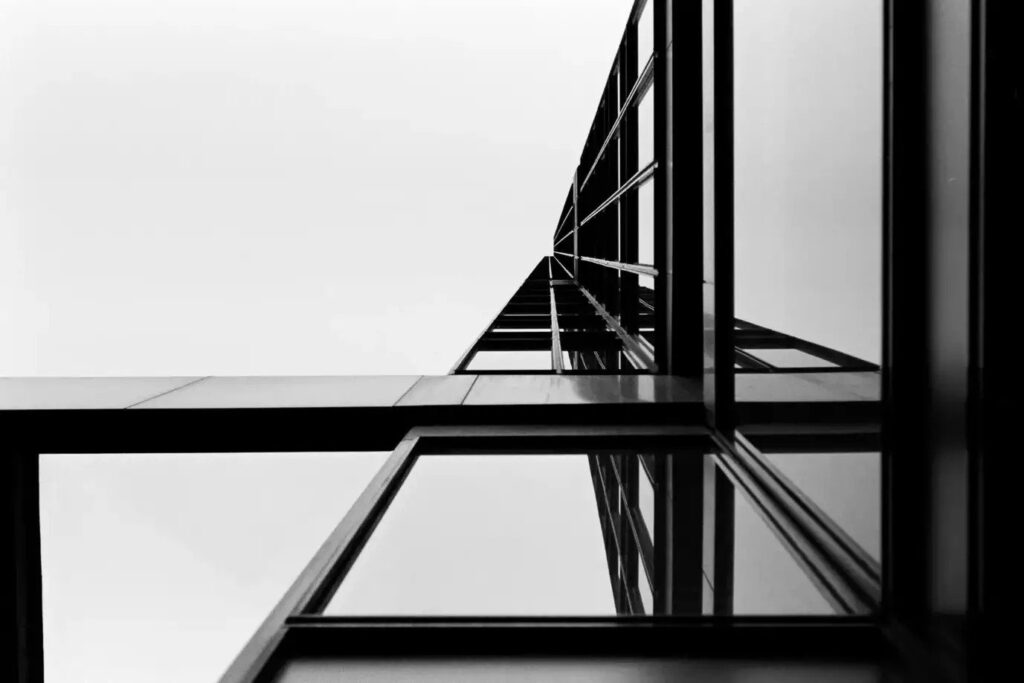
Contradictorily, B&W might not look like the subject on the image, but might feel more like it. One of the strengths of B&W images is the fact that striping the image of color can help convey the emotion to the viewer. B&W can remove distractions and help focus the viewer on the story. For example, a bright yellow sign in the background of an image might drag the viewer’s eye away from the subject. That is why B&W can sometimes feel better – when the emotion is not being transferred through color, but rather through shape and light.
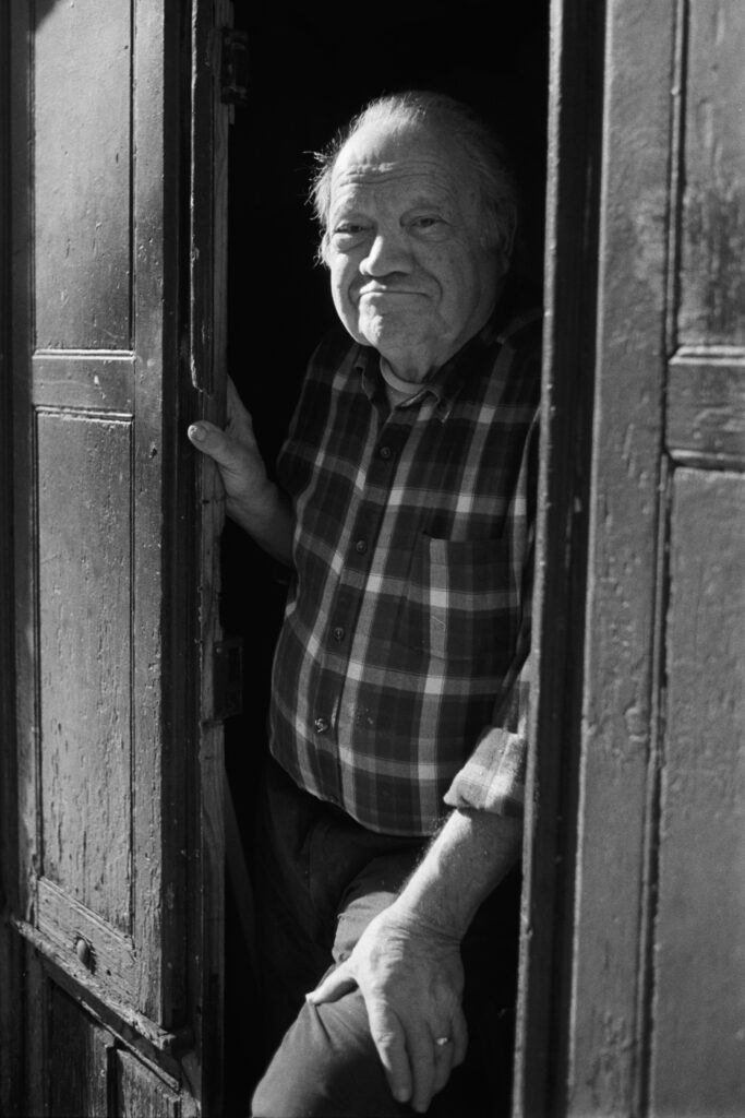
I found this quote by Elliot Erwitt: “Color is descriptive. Black and white is interpretive.” It sums up another strong point B&W film stocks have. Absence of color makes the images more interpretive. The viewer’s imagination comes into play. He/she can imagine the colors that best complement the emotion of the image, so the message of the image is conveyed even clearer.
B&W can also feel (more) timeless. Photography started as B&W and it has so much history. A lot of the historical images have been shot in B&W. Even after some time after color film came to the scene, most photographers stayed with B&W and considered this the only option for “real photography”. B&W can feel timeless, because of its rich history and our collective memory of the past.
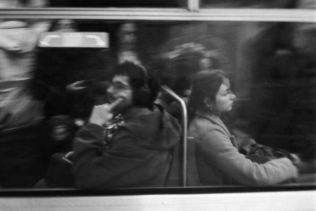
With what seems like never-ending rise of film prices, the cost also plays a role. My film stocks of choice at the moment are Kodak Gold 200 for color and Kentmere 400 for B&W. Both are one of the cheapest options. Altogether 1 roll of Gold costs around 15 EUR (including developing in the lab) and Kentemere 400 costs around 8,5 EUR (including in-home developing). Almost half the price of the Kodak Gold. Yes, the price also plays a role.
Another positive side of B&W is the darkroom part. I develop films myself and add another step in the analog process. I love that. Also, you can print B&W in the darkroom much easier and with less hassle.
Some might suggest just shooting in color and converting to B&W, when you so desire. Yes, I am not against that. But somehow, I try not to do that. If I decide for color, I keep it in color most of the time. And if it is in B&W, well, obviously I keep it in B&W. 🙂 It is also a matter of what my brain is looking for; I feel like I am thinking differently when shooting with color or B&W. With B&W I try not to see color and focus more on textures, light and shape and with color I try to concentrate much more on, you guessed it, color. And I enjoy both!
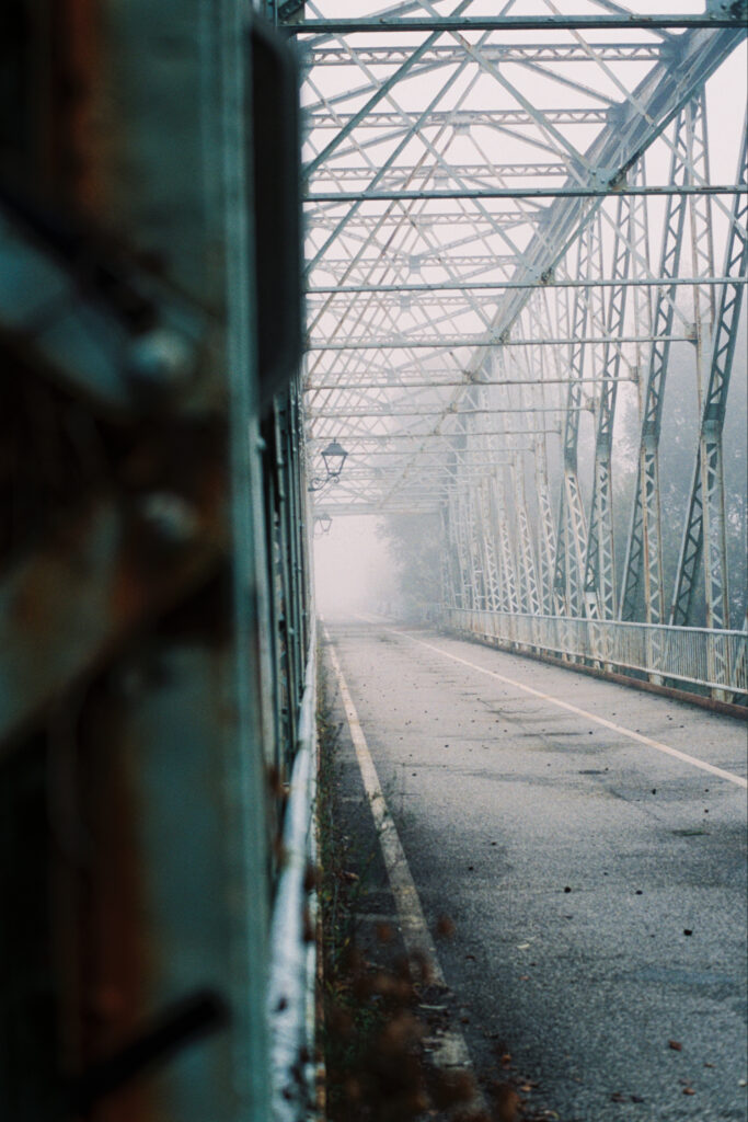
It’s actually funny how I would get completely excited to shoot color after I see photographs of Alex Webb and his brilliant use of color and tell myself I will only shoot color for some time, but a day later I would flip through a Salgado B&W book and be completely hooked on B&W again. I will tell you one thing; the passion for both is here and I hope it stays.
At the end of the day, it matters to go out, take pictures and keep the skills evolving. Choose what you like and keep creating.
Thank you for taking the time to read this blog. If you have any thoughts, I would love to hear them.
All the best,
Domen
If you liked this post, I just want to mention that I recently started a newsletter, where I share more pictures and shorter reflections on photography. If you want, I would be really glad if you sign up here on my website: Newsletter
Website: domen.nan.si
Instagram: domen_nan_photography
Share this post:



Comments
Gary Smith on Color or Black & White – A Few of my own thoughts on the choice
Comment posted: 02/07/2026
Thanks for your post, looking forward to your next article!
Comment posted: 02/07/2026
Jeffery Luhn on Color or Black & White – A Few of my own thoughts on the choice
Comment posted: 02/07/2026
Thanks for the article. I especially like the opening shot split in half. At first I thought it was the Golden Gate bridge. The shot of the old man in the doorway is very good. I agree that B&W is an interpretation of the scene. I've printed color and B&W in the darkroom and prefer B&W for many reasons. Among the top reasons is that I never got great results in color. No better, and often worse, than the budget prints from color labs. On the flip side, my B&W darkroom prints are pretty damn good! And fun to make. If I have the need to shoot color, digital is the best for me.
Comment posted: 02/07/2026
Derek Zhao on Color or Black & White – A Few of my own thoughts on the choice
Comment posted: 02/07/2026
I'd also like to suggest another process of deciding. What are you (generic you, the photographer) trying to say or show? Is color necessary for saying or showing it? If not, maybe it is a distraction in this instance.
Comment posted: 02/07/2026
Fab on Color or Black & White – A Few of my own thoughts on the choice
Comment posted: 02/07/2026
And processing yourself - especially pushing film in the case of black and white - is really what makes a photographer's true ideas come through. The same way you decide between color or black and white - you can decide to push or pull. Black and white is always going to have more grit, more fire, more strength than color does. Because it strips bare your intentions, it forces you to have something to show that is more raw than contemplative. It prioritizes grain and expressions without the distractions of color.
Comment posted: 02/07/2026
Geoff Chaplin on Color or Black & White – A Few of my own thoughts on the choice
Comment posted: 03/07/2026
Comment posted: 03/07/2026
Erik Brammer on Color or Black & White – A Few of my own thoughts on the choice
Comment posted: 03/07/2026
Comment posted: 03/07/2026
Paul Quellin on Color or Black & White – A Few of my own thoughts on the choice
Comment posted: 03/07/2026
Comment posted: 03/07/2026